 Cascading Style Sheets (CSS) is the language of Web design, and the next generation of CSS design properties are just chomping at the bit to be released.
Are you eager to start using them, but don’t know where to start?
Although many of the new properties are not yet “official”, some browsers have already implemented many of the features of the coming CSS Level 3 specifications.
The problem is that many browsers—most notably Internet Explorer—have not.
The trick to using these new CSS3 features is to treat them as design enhancements.
A design enhancement (which I discuss in my new book Speaking In Styles: The Fundamentals of CSS for Web Designers) is any flourish you add to your site designs that increases its visual appeal without diminishing its usability if the style is not rendered.
This can be a tricky call, with there being a fine line between enhancement and not diminishing usability:
- Design Enhancement Example: Using border-radius to round box corners, creating a more appealing design. However, if the corners are not rendered, the site is still just as usable.
- Example of Design Diminishing Usability: Using an RGBA color value in the backgrounds of overlapping elements that all need to be visible, expecting the upper elements to be semi-transparent. This will make it impossible for some people to use the site, thereby diminishing the page's usability.
Let’s take a look at 5 different CSS3 properties that you can start playing with right now, provided that you always keep in mind that they should only be used to enhance your design, and not be relied upon for site usability.
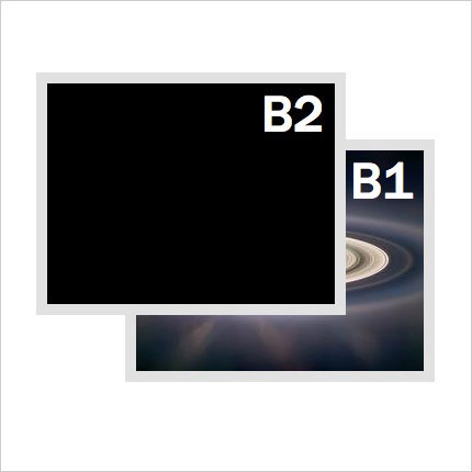
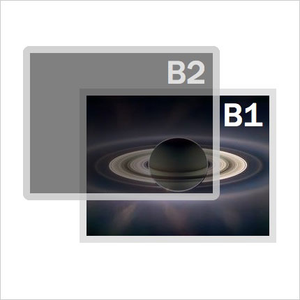
This is the original design, before applying any CSS3 design enhancements
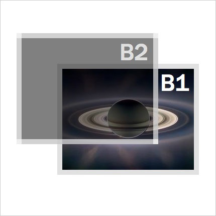
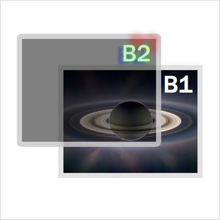
1. Transparent Colors
Supporting Browsers: Apple Safari 4, Firefox 3.0.5, Google Chrome 1
RGBA allows you to control the opacity of a particular color fill, whether it is for text, background, border, or shadow colors.
Setting the color transparency requires you to specify the color value using RGB notation—hexadecimal values are not allowed—with an additional A value being from 0 (transparent) to 1 (opaque).
rgba(0-255,0-255,0-255,0-1)
You should also include a simple RGB, or hex color value as a fallback for other browsers to use:
.topbox {
color: rgb(235,235,235);
color: rgba(255,255,255,0.75);
background-color: rgb(153,153,153);
background-color: rgba(0,0,0,0.5);
border-color: rgb(235,235,235);
border-color: rgba(255,255,255,0.65);
}
The good news is that there is also a fallback solution—at least for background colors—in Internet Explorer, which supports transparent colors using a filter and conditional styles:
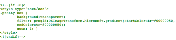
Note: Due to the fact that WordPress could not display the above code in the content of this post, it has been included as an image, therefore you will need to type this code manually.
2. Rounded Corners
Supporting Browsers: Apple Safari 3, Firefox 1, Google Chrome 1
Border radius sets the curvature of each corner of the box, as if there is an imaginary circle on the corner with a specific radius (r):
border-radius: r;
Although border-radius will be a part of the coming CSS3 specification, both the Mozilla Project (Firefox) and Webkit (Safari and Chrome) implemented their own versions which have to be included for maximum cross-browser compatibility:
-webkit-border-radius: 10px;
-moz-border-radius: 10px;
border-radius: 10px;
You can also set the radius for the corners individually:
CSS3 |
Mozilla |
WebKit |
border-top-right-radius |
-moz-border-radius-topright |
-webkit-border-top-right-radius |
border-bottom-right-radius |
-moz-border-radius-bottomright |
-webkit-border-bottom-right-radius |
border-bottom-left-radius |
-moz-border-radius-bottomleft |
-webkit-border-bottom-left-radius |
border-top-left-radius |
-moz-border-radius-topleft |
-webkit-border-top-left-radius |
border-radius |
-moz-border-radius |
-webkit-border-radius |
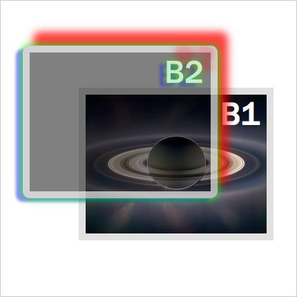
3. Text Shadows
Supporting Browsers: Apple Safari 3, Firefox 3.0.5, Google Chrome 1
Add a shadow underneath any text, controlling the left/right and up/down offset, as well as the color:
text-shadow: x y blur color;
You can combine the text shadow with a transparent color to control the darkness of the shadow:
text-shadow: -2px 2px 10px rgba(0,0,0,.5);
You can also include multiple text shadows just by repeating the values separated by a comma:
text-shadow:  0 0 10px rgba(0,255,0,.5), -10px 5px 4px rgba(0,0,255,.45),
15px -4px 3px rgba(255,0,0,.75);
4. Box Shadows
Supporting Browsers: Apple Safari 4, Firefox 3, Google Chrome 1
Adding a drop shadow to any box on the screen follows the same format as adding a text shadow:
box-shadow: x y blur color;
Just like text-shadows, Mozilla and Webkit have implemented their own vocabulary in advance of the final CSS standard:
-webkit-box-shadow: 0 0 10px rgb(0,0,0);
-moz-box-shadow: 0 0 10px rgb(0,0,0);
box-shadow: 0 0 10px rgb(0,0,0);
You can add multiple shadows just by including multiple values separated by spaces:
-webkit-box-shadow: 0 0 20px rgb(0,255,0), -10px 5px 4px rgba(0,0,255,.45),
15px -20px 20px rgba(255,0,0,.75);
-moz-box-shadow: 0 0 20px rgb(0,255,0), -10px 5px 4px rgba(0,0,255,.45),
15px -20px 20px rgba(255,0,0,.75);
box-shadow: 0 0 20px rgb(0,255,0), -10px 5px 4px rgba(0,0,255,.45),
15px -20px 20px rgba(255,0,0,.75);
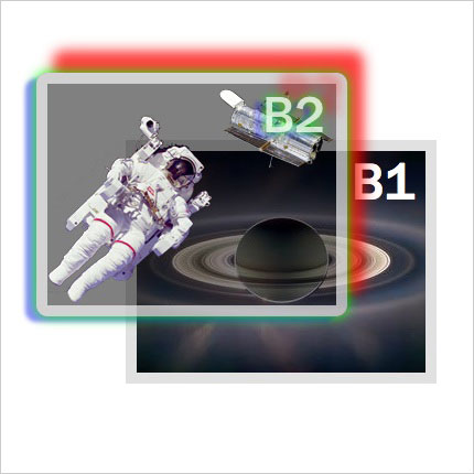
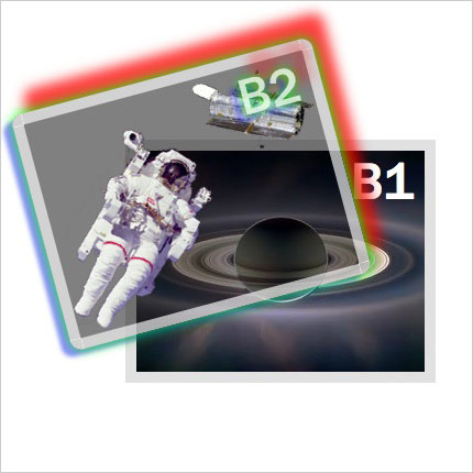
5. Multiple Backgrounds
Supporting Browsers: Apple Safari 1.3, Google Chrome 1
Including multiple background images in a single element simply requires additional sets of values to be added to the background properties, separated by commas. You should include a single background image as a back-up for other browsers:
background-image: url(astro-127531.png);
background-image: url(astro-127531.png),url(Hubble-112993.png);
background-repeat: no-repeat;
background-position: bottom left;
background-position: bottom left, top right;
SPECIAL BONUS
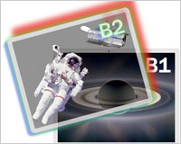
Rotate Anything!
Supporting Browsers: Apple Safari 4, Firefox 3.5, Chrome 1
Although not even a part of the CSS3 specification yet, Webkit has implemented its own transformation property, which Mozilla is following suit with. Transform can include a number of different value types, but one of the most intriguing—and useful as a design enhancement — is rotate:
-webkit-transform: rotate(-15deg);
-moz-transform: rotate(-15deg);
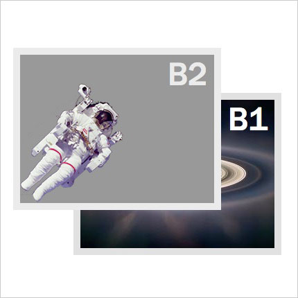
Appearance as seen in browsers that do not support CSS3 (e.g. Opera 9)
See the live working example (requires Safari 4+, Firefox 3.5+, or Chrome 1+)
Jason Cranford Teague is the author of Speaking In Styles: The Fundamentals of CSS for Web Designers. Get it now from Amazon for 27% off the cover price.
Do you use any design enhancements in your websites? Please share your examples with us!
WDD Staff


Read Next

3 Essential Design Trends, May 2024

How to Write World-Beating Web Content

20 Best New Websites, April 2024

Exciting New Tools for Designers, April 2024

How Web Designers Can Stay Relevant in the Age of AI

14 Top UX Tools for Designers in 2024

What Negative Effects Does a Bad Website Design Have On My Business?

10+ Best Resources & Tools for Web Designers (2024 update)

3 Essential Design Trends, April 2024

How to Plan Your First Successful Website

15 Best New Fonts, March 2024
