 Dark web designs are very popular and can have an elegant and creative appeal.
They are also perfect for many types of client work however, they are not suitable for every website and should be used only when appropriate.
In spite of the striking visual impact that these dark designs can have, many designers don't know how to effectively pull them off without turning off the visitor.
With a dark design comes less readability, less appeal for most readers and less opportunity for conventional design elements.
In this post, we'll discuss a few tips to make your next dark website design appeal to a broader audience, while letting you, the designer, express your creativity.
A recent poll suggests that light designs are preferred by the general web-going audience by a whopping 47%. The main reason is readability. Most people don't like viewing light text against a dark background on websites because it strains their eyes, making for a much less enjoyable experience.
By contrast, 10% of those surveyed said that they always preferred dark backgrounds for websites, while another 36% said that the best choice would depend on the type of website.
So, what's the right answer? When it comes down to it, everyone has their own opinion, and that's that.
But with such a large percentage of users saying that dark website designs are tolerable and sometimes even preferred, we as web designers have to learn how to create effective dark designs for ourselves and our clients.
This means convincing all of the true believers of light backgrounds that dark design can be more readable and user-friendly.
Dark web designs are very popular and can have an elegant and creative appeal.
They are also perfect for many types of client work however, they are not suitable for every website and should be used only when appropriate.
In spite of the striking visual impact that these dark designs can have, many designers don't know how to effectively pull them off without turning off the visitor.
With a dark design comes less readability, less appeal for most readers and less opportunity for conventional design elements.
In this post, we'll discuss a few tips to make your next dark website design appeal to a broader audience, while letting you, the designer, express your creativity.
A recent poll suggests that light designs are preferred by the general web-going audience by a whopping 47%. The main reason is readability. Most people don't like viewing light text against a dark background on websites because it strains their eyes, making for a much less enjoyable experience.
By contrast, 10% of those surveyed said that they always preferred dark backgrounds for websites, while another 36% said that the best choice would depend on the type of website.
So, what's the right answer? When it comes down to it, everyone has their own opinion, and that's that.
But with such a large percentage of users saying that dark website designs are tolerable and sometimes even preferred, we as web designers have to learn how to create effective dark designs for ourselves and our clients.
This means convincing all of the true believers of light backgrounds that dark design can be more readable and user-friendly.
Use More White Space
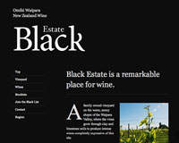
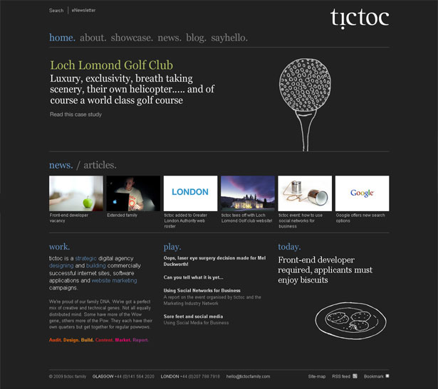
Or should it be called "black space"? Effective use of white space is important for any type of design, but it is essential for websites with dark backgrounds. Dark designs have a tendency to feel "heavy", and cluttering them up can reinforce that feeling. Take a look at some popular dark web designs below, and note their liberal use of white space to great effect. Black Estate is seen all over the Internet in dark web design showcases. It is indeed a beautiful design and worthy of all the attention. A great deal of white space is used throughout the design, and what makes this particular design unique is how the white space is used to outline certain elements so efficiently. The logo has a lot of white space around it and is the first thing we see as visitors. We see the main content and bottle on the right next. As you see, white space is used perfectly to highlight the text on the bottle and the headline of the main content.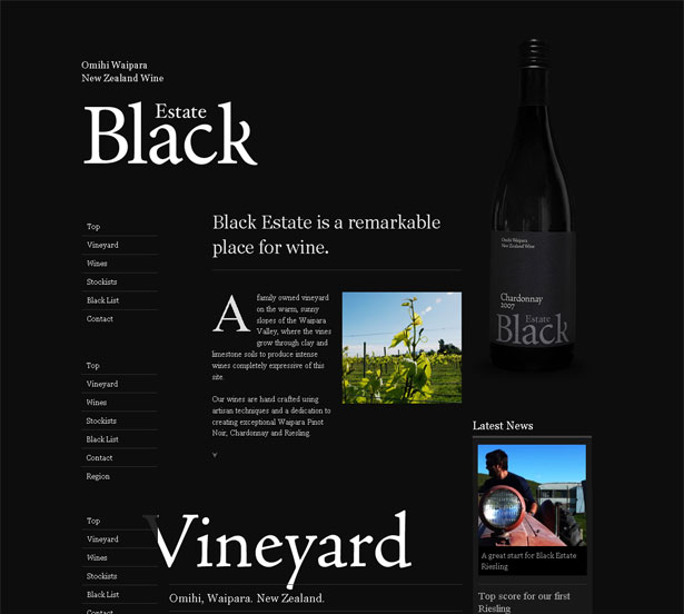 The featured content in Tictoc and accompanying image in this design are framed with the most white space. As we move down, we see less white space, which makes us pay attention to the content being shown.
The point here is that white space gradually guides the user down to the end of the page.
The dark background adds depth to the design. Because the website relies so heavily on white space, it would be less interesting without the creative effect of the dark background.
The featured content in Tictoc and accompanying image in this design are framed with the most white space. As we move down, we see less white space, which makes us pay attention to the content being shown.
The point here is that white space gradually guides the user down to the end of the page.
The dark background adds depth to the design. Because the website relies so heavily on white space, it would be less interesting without the creative effect of the dark background.
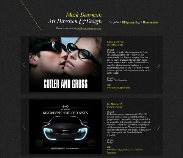
 The Mark Dearman website has liberal and evenly distributed white space throughout its layout.
The white space framing each portfolio piece provides plenty of breathing room for the content it holds, and it is a nice resting point before moving on to the next piece.
Plenty of white space is essential to dark designs because it aids not only in de-cluttering the layout but in framing important elements and adding elegance to the overall look.
The Mark Dearman website has liberal and evenly distributed white space throughout its layout.
The white space framing each portfolio piece provides plenty of breathing room for the content it holds, and it is a nice resting point before moving on to the next piece.
Plenty of white space is essential to dark designs because it aids not only in de-cluttering the layout but in framing important elements and adding elegance to the overall look.
Textual White Space
Because readability is the number one concern of those who dislike dark backgrounds, designers must pay extra close attention to the text itself. Just as in the overall design, one way to improve readability on dark websites is to increase the white space by adjusting paragraph size, kerning and leading. The example below shows what a difference the spacing between and around characters makes in comparing dark and light layouts.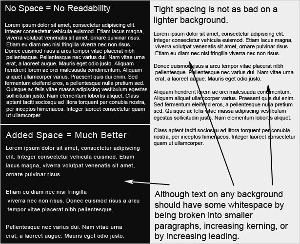 Another way to improve readability in dark web designs is to increase the font size. Like most of the other rules in this post, larger font sizes mean more white space. The bigger the letters are, the more white space will appear around and within each letter.
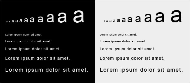
For example, the letter "a" below gets more white space as it gets larger, both in the area around it and in the space inside the a's enclosure and under the overhang.
Note how reading small text is so much easier on a light background than on a dark one. When setting the typography for a new website, be sure to look at some dummy text to make sure it is legible. If not, see if increasing the text size helps.
Another way to improve readability in dark web designs is to increase the font size. Like most of the other rules in this post, larger font sizes mean more white space. The bigger the letters are, the more white space will appear around and within each letter.
For example, the letter "a" below gets more white space as it gets larger, both in the area around it and in the space inside the a's enclosure and under the overhang.
Note how reading small text is so much easier on a light background than on a dark one. When setting the typography for a new website, be sure to look at some dummy text to make sure it is legible. If not, see if increasing the text size helps.
Text Contrast
Many people would agree that the most poorly conceived dark websites cause eye-strain. Too much or too little contrast is usually the culprit. How does one find the perfect balance? If you are in a room that is pitch black, suddenly looking directly into light is not pleasant. But looking at a less bright light in a less dark room is just fine. The same principle applies to web design. Finding the perfect contrast means balancing the darkness of the background with the lightness of the text. Below is a (very) rough guide that shows how contrast between text and background works. One notices that as the background gets lighter, so does the text. Finding a pleasant contrast for text is much more difficult with a pure black background. To find the perfect balance, experiment with different shades. The best result is usually a background that isn't pure black and text that isn't pure white.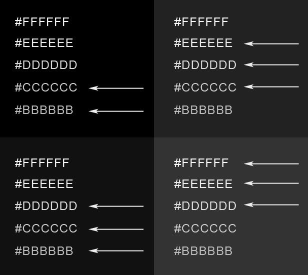
Dealing with Fonts
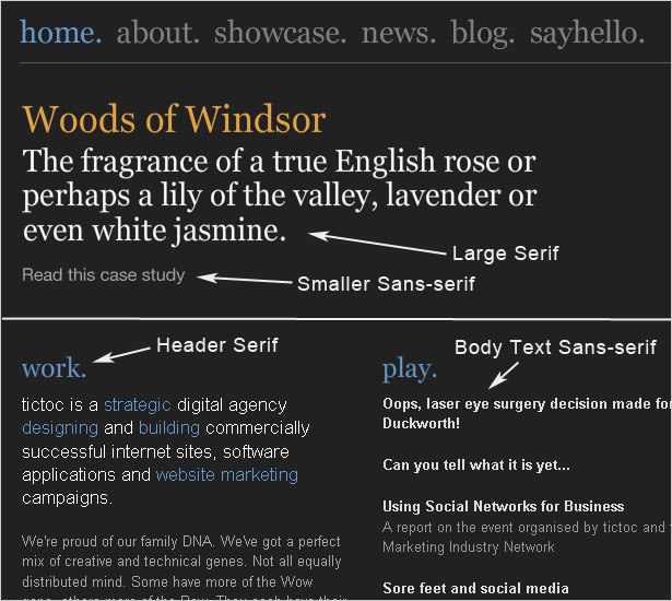
Fonts plays a big role in design and should definitely be taken into thoughtful consideration with dark layouts. The image below shows a 14 point font on a dark background in both serif and sans-serif fonts. The sans-serif font is obviously more legible. But many designers still choose serif fonts for their elegance. The trick, though, is to put only larger text in serif fonts, so that the extra white space floods around each character and makes the text very legible.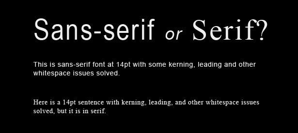 The screenshot below is of a website discussed earlier in this article. It features both serif and sans-serif fonts, but uses them in a smart way.
Larger text, such as headlines, navigation and headers, is in a serif font for added elegance. For better contrast and improved readability, the body text is in a clean sans-serif font.
The screenshot below is of a website discussed earlier in this article. It features both serif and sans-serif fonts, but uses them in a smart way.
Larger text, such as headlines, navigation and headers, is in a serif font for added elegance. For better contrast and improved readability, the body text is in a clean sans-serif font.
Use Minimal Color Schemes
To give their dark designs a clean and uncluttered look, designers should always opt for minimal color schemes. From the few examples below, we can see that busy color schemes really get in the way of dark backgrounds, because the contrast is too sharp. Stick to one or two colors. To add more color, try a dark-colored background.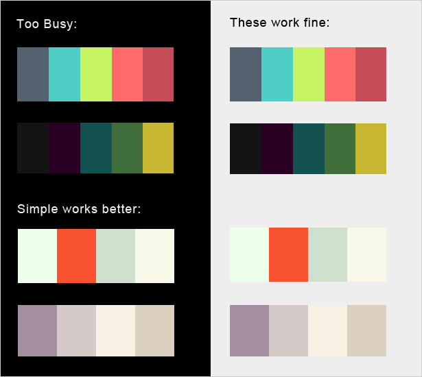 Granted, many dark web designs have more exciting color schemes. So this rule is often broken, but only with the right techniques.
In general, though, color is often what makes a website look too busy. Because darker websites already have depth, use color with caution.
Granted, many dark web designs have more exciting color schemes. So this rule is often broken, but only with the right techniques.
In general, though, color is often what makes a website look too busy. Because darker websites already have depth, use color with caution.
Offer a Style Switcher
While we have many good practices at our disposal to make dark web designs more appealing, no amount of effort will satisfy every user. Be sure to include a style switcher, so that users ultimately have the option of viewing dark text on a light background. Two style sheets are required for this, one for the default dark layout, and one for the alternative light layout. SitePoint has an excellent tutorial on this: Build a Simple Style Switcher in CSS. Instead of using the "orange," "blue" and "white" versions in the tutorial, just use "light" and "dark" style sheets.When Dark Web Design Works Best
As stated, a large proportion of web users believe that a dark web design could work for certain types of websites. But the study is vague on what exactly these types are. Generally speaking, dark works best for creative or elegant designs. For modern sleek websites, dark backgrounds add elegance. For grungy or hand-drawn styles, dark backgrounds enhance the creativity of the layout.Elegant Dark Design
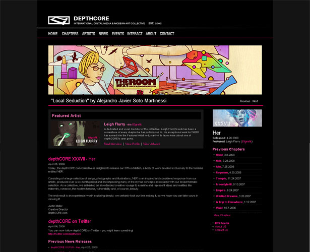
Dark can be deep, authoritative and strong, and often looks elegant when used appropriately. Here are a few examples and some techniques for bringing out the elegance in a dark design. The website for Larissa Meek has a simple vintage-style pattern in the background, setting an elegant tone. Other quirkier features add a personal touch to the design. This technique can be used for many kinds of websites. Vintage or classic patterns and textures can create a look that is both elegant and age-appropriate. Most of us associate vintage patterns with high class, so creating a high-class website in this way is easy.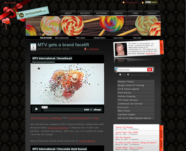 Depth Core has a very clean design, with a dark background that adds style and class. A sense of authority is also evident in the design. This elegance may also make a designer's portfolio work appear more valuable as a result.
Note that this design has no texture or images other than the portfolio pieces and logo. Otherwise, the design would have been far too busy; as it is, the content is knit together well.
A good process to follow is to add essential content first and then bring in design elements as needed. The designer can then pause and reflect as each new element is added, making sure the layout is not being over-powered.
Depth Core has a very clean design, with a dark background that adds style and class. A sense of authority is also evident in the design. This elegance may also make a designer's portfolio work appear more valuable as a result.
Note that this design has no texture or images other than the portfolio pieces and logo. Otherwise, the design would have been far too busy; as it is, the content is knit together well.
A good process to follow is to add essential content first and then bring in design elements as needed. The designer can then pause and reflect as each new element is added, making sure the layout is not being over-powered.
 Just as artwork can appear more valuable in an elegant design, so can products. A dark and sleek design, like Tapbots and so many others, helps showcase the product being sold.
The design reflects the device itself, with its gradients and lighting effects; some designs even mimic the texture of their high-tech products.
Just as artwork can appear more valuable in an elegant design, so can products. A dark and sleek design, like Tapbots and so many others, helps showcase the product being sold.
The design reflects the device itself, with its gradients and lighting effects; some designs even mimic the texture of their high-tech products.

Creative Dark Design
Beyond just appearing elegant, dark website designs can also elicit more emotional responses than standard light designs, making them ideal for creative projects. Let's look at some examples of the kinds of creative designs that are possible. The site below has very little content but has a unique layout and dark colors for depth. Dark backgrounds are perfect for websites with very little content. And because they require more white space, the designer has more room to work with.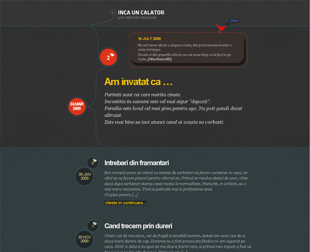 Grunge web design comes in many forms, and because grunge is "dark and dirty," dark backgrounds are one of those forms.
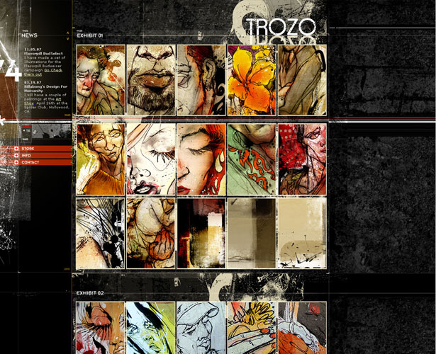
Dark grunge designs like Trozo seem to break all the rules: busy textures, crowded layout and a wide range of colors. And yet this website still works. How is that possible?
With so many messy elements to work with, grunge design can be tricky for beginners. What makes this one work is its organization.
The background has clearly laid-out blocks that guide the user's eye and help divide the content into manageable sections.
Secondly, it has a ton of white space. The background may be textured, but the repeated pattern is seen by the user as white space, helping to lighten the design.
This white space is most apparent to the left of the logo, under the navigation and along the right side.
Even between "Exhibit 01" and "Exhibit 02" is more white space than one would usually find on a website like this.
The white space evens things out, even though it doesn't look like white space because it has texture. The minimal text and few sections (only three) also contribute to this appearance of simplicity.
Grunge web design comes in many forms, and because grunge is "dark and dirty," dark backgrounds are one of those forms.
Dark grunge designs like Trozo seem to break all the rules: busy textures, crowded layout and a wide range of colors. And yet this website still works. How is that possible?
With so many messy elements to work with, grunge design can be tricky for beginners. What makes this one work is its organization.
The background has clearly laid-out blocks that guide the user's eye and help divide the content into manageable sections.
Secondly, it has a ton of white space. The background may be textured, but the repeated pattern is seen by the user as white space, helping to lighten the design.
This white space is most apparent to the left of the logo, under the navigation and along the right side.
Even between "Exhibit 01" and "Exhibit 02" is more white space than one would usually find on a website like this.
The white space evens things out, even though it doesn't look like white space because it has texture. The minimal text and few sections (only three) also contribute to this appearance of simplicity.
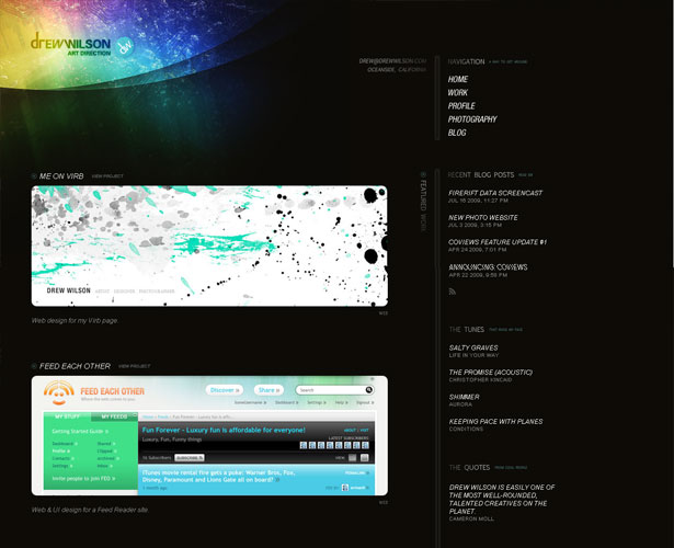
 The design of Drew Wilson definitely breaks the rule of using minimal color. It still works, though, because the brightly colored header is one of the few features in this sparse design, so nothing over-powers it.
And the dark background makes the header appear even brighter and more extraordinary.
Dark backgrounds are often used to make lighting effects and bright colors stand out more.
Such designs are a wonderfully creative exception to the rule of minimal color. But the rule should be broken with caution: avoid distracting gradients, textures and color further down the page.
The design of Drew Wilson definitely breaks the rule of using minimal color. It still works, though, because the brightly colored header is one of the few features in this sparse design, so nothing over-powers it.
And the dark background makes the header appear even brighter and more extraordinary.
Dark backgrounds are often used to make lighting effects and bright colors stand out more.
Such designs are a wonderfully creative exception to the rule of minimal color. But the rule should be broken with caution: avoid distracting gradients, textures and color further down the page.
Wrapping Up
Dark backgrounds give an elegant and creative feel to web designs, making them perfect for some portfolios, but they're not suitable for every site. For larger websites, especially ones for people with visions impairment and other disabilities, dark designs are a no-no, even with a style switcher. Hopefully when the time comes that you need to design a website with a dark background, these tips and strategies will help. Written exclusively for WDD by Kayla Knight. There are many more techniques and strategies for improving dark web designs, so please share the ones you've picked up in the comments section below.WDD Staff
WDD staff are proud to be able to bring you this daily blog about web design and development. If there's something you think we should be talking about let us know @DesignerDepot.


Read Next

3 Essential Design Trends, May 2024
Integrated navigation elements, interactive typography, and digital overprints are three website design trends making…

How to Write World-Beating Web Content
Writing for the web is different from all other formats. We typically do not read to any real depth on the web; we…
By Louise North

20 Best New Websites, April 2024
Welcome to our sites of the month for April. With some websites, the details make all the difference, while in others,…

Exciting New Tools for Designers, April 2024
Welcome to our April tools collection. There are no practical jokes here, just practical gadgets, services, and apps to…

How Web Designers Can Stay Relevant in the Age of AI
The digital landscape is evolving rapidly. With the advent of AI, every sector is witnessing a revolution, including…
By Louise North

14 Top UX Tools for Designers in 2024
User Experience (UX) is one of the most important fields of design, so it should come as no surprise that there are a…
By Simon Sterne

What Negative Effects Does a Bad Website Design Have On My Business?
Consumer expectations for a responsive, immersive, and visually appealing website experience have never been higher. In…

10+ Best Resources & Tools for Web Designers (2024 update)
Is searching for the best web design tools to suit your needs akin to having a recurring bad dream? Does each…
By WDD Staff

3 Essential Design Trends, April 2024
Ready to jump into some amazing new design ideas for Spring? Our roundup has everything from UX to color trends…

How to Plan Your First Successful Website
Planning a new website can be exciting and — if you’re anything like me — a little daunting. Whether you’re an…
By Simon Sterne

15 Best New Fonts, March 2024
Welcome to March’s edition of our roundup of the best new fonts for designers. This month’s compilation includes…
By Ben Moss

LimeWire Developer APIs Herald a New Era of AI Integration
Generative AI is a fascinating technology. Far from the design killer some people feared, it is an empowering and…
By WDD Staff