How to Create an Organic Web Design <br/> (and Showcase)
 Organic design is commonly applied to products such as chairs, electronic equipment, books and home décor.
Following the same principles, organic web design has recently emerged as a trend.
Professional designers and companies have taken a more natural approach to creating their websites, logos and packaging, leaving behind the overtly technological sheen of the early 2000s.
Yes, fellow designers, it is safe to say that the new age of organic design for websites and corporate logos has taken effect.
Whether overt or subtle, whether scanned elements or graphics that mimic nature, organic web design has taken on many forms. But what constitutes organic design? What makes it successful? Let’s find out...
What Makes an Organic Web Design?
Though the name suggests that some kind of ecological statement is being made, organic web design is more about bringing natural elements into a technological environment.
These elements could be the representation of natural materials in a design (wood grains, fabrics, earthy textures) or something more abstract that captures the ebb and flow of nature (items, materials, colors, shapes). Organic web design is a broad concept and can be divided into four categories.
- Using materials, textures and fabrics that hint at organic elements
Objects such as muslin, burlap, papyrus, paper, tape and wood. These items come from the natural environment and thus give a layout a natural appeal. - Using abstract essences of nature
Colors, shapes, graphics, materials and brushes that mimic the "flow" of nature. These are subtler than wood grains and muslins and are intended to give but a hint of an organic essence. We see this on websites that have modern streamlined graphics and a soft natural touch. Oddly, plastics are the most common materials used to achieve an organic look: unlikely materials are fair game in web design. - Creating a whole that is greater than the sum of its parts
If an image is created that uses only brushes or graphics in order to create another image, we can say that we get more out of the image as a whole than the sum of its parts: the brushes or graphics. This comes more frequently in negative space, as brushes may be used to outline or fill in another image. When we add up the parts, we get one thing — the brush — but when we look at the whole, we are getting two things: the brush and the image created. This is common among typographies, as we may use them to create a totally different image, be it by playing with the negative space or adding brushes. - A looser interpretation of "organic" web design
We generally define organic as something coming straight from nature, but it can also be something created (and then neglected) by humans, such as an abandoned piece of wood from a building or materials that once decorated a home and are now stained. Organic in this sense means something completely different: it takes over objects that are left behind by society. Old photographs, ripped cloths, distressed wallpaper: these all can be as organic as a piece of wood or leaf.
In recent years, organic design has taken on an "essentialist" quality. Essentialist organic design is a more minimalist ideal: use only what you need to achieve what you're after.
For instance, if we wanted to create an image of negative space and brushes, we could use only the amount of brush necessary to create that image. Essentialist organic design leads to a more contemporary look and is spreading in the web design field.
These four categories can be played with and manipulated to get the feel that is right for you and your client. Mix and match any of these: they can all work together successfully.
Hints for Successful Organic Web Design
- Earthy colors can be vibrant
Burnt oranges, deep gray-purples and olives can be just as exciting as light yellows and bright reds. Plus, they work better together, and because you will more likely use neutral tones in your organic design, you can use more of these colors without overwhelming the design. - Vibrant colors can be organic, too
Fire-truck red or cobalt blue can be just as earthy and organic as browns and grays. Find these colors in a vintage image or natural pattern or distress a pattern that has these tones. They can be refreshing when used with a muted palette. - Balance, balance, balance
The environment remains stable through a careful balance of elements, and design is no different. This is even more important in organic design. Balance those gray hues with more colorful ones. Calm that wood background with flat, large or simple tables or div layers, or even a monochrome paper texture. One trap with organic design, as with all design, is that you can have too much of a good thing, and the line between successful and overdone can be fine. - Organic doesn’t mean scrapping the modern
Just because you want an organic design doesn’t mean you have to abandon your modern influences. You can keep your chrome-looking background, purple complementary color or non-organic fonts. Softening a modern design doesn't take much, nor does it need a floral vector. A simple curl of a graphic, brush or vector can achieve a natural essence just fine. - Think differently
There is much more to nature than the obvious. Pick unlikely items that are natural but are less common, like light. - Urban areas are environments too
Just because it is removed from the forest does not mean it is no longer an 'environment'. Think concretes or damask.
To see organic web design in action, check out the following websites. These websites illustrate all, or some of the four categories of organic web design explained above.
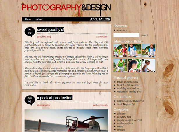
Mooi's background, an intricate wood pattern, is the main- and natural- element here. To this, Mooi adds a vibrant red hue, just one of the few modern touches in this design that don't strip away its organic feel.
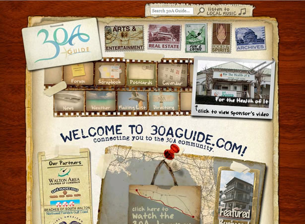
30A Guide plays with the more abstract interpretation of organic design, involving rustic papers, old photograph negatives and stamps. In addition, 30A makes us feel we have stumbled upon an already existing, non-digital environment.
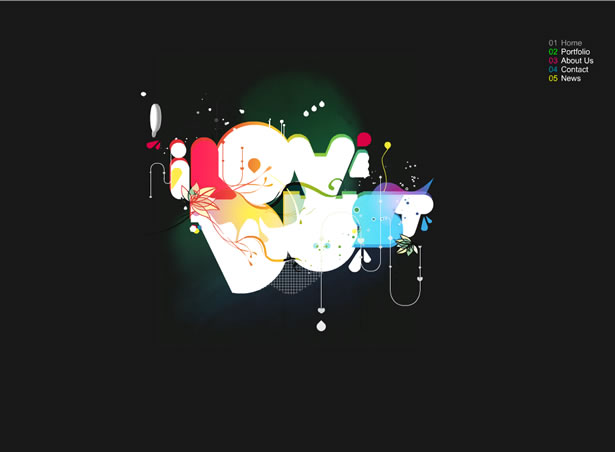
I Love Dust includes many modern elements, but it does have organic hints: the animated tear drop, the circular fonts and the floral-shaped vectors.
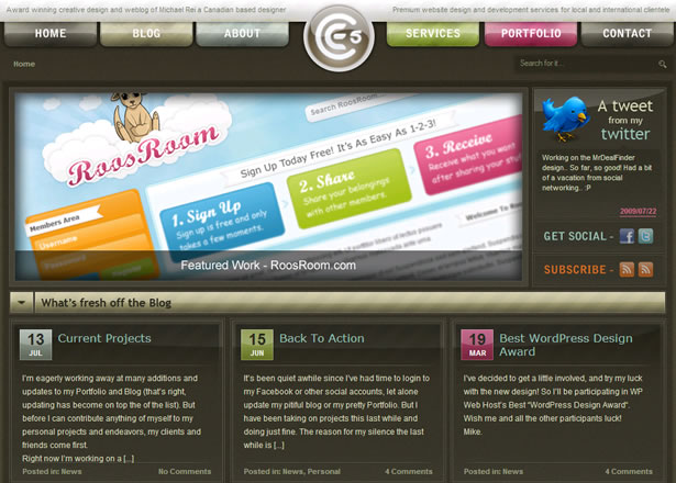
While the influence is not obvious, Entry 5 Productions' layout does incorporate organic design: We get rounded edges on the header links and logo, as well as a good amount of soft, natural tones. While subtle, these organic qualities take the edge off Entry 5 Productions' modern look.
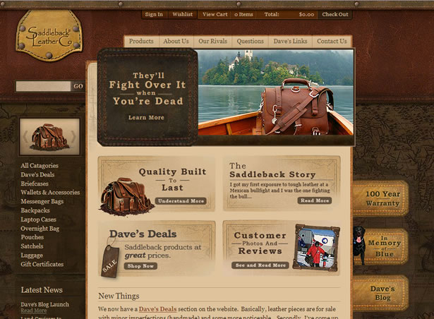
We may typically think of papers, woods and cloths to portray organic design, but materials such as leather are equally natural and less commonly used in web design. In addition, Saddleback Leather gives us an organic feel by using old maps, tags and upholstery.
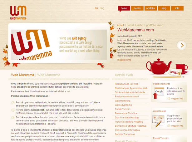
Web Maremma is a good example of how a whole is more than the sum of its parts. If we look at the logo, we see what is intended: a 'W' and an 'M.' However, when we break the whole into its individual parts, we get incomplete letters. Thus, what we gain as a whole is, you guessed it, more than the parts combined.
This modern piece includes a cement backdrop, rounded edges and organic-looking backgrounds for the bottom text areas. These types of additions are typical in organic design.
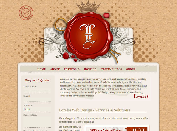
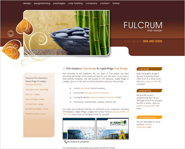
Not only is the background a rough paper texture, but Lorelei Web Design incorporates a red drip or spill of some kind. An unlikely element, yes, but it is natural.

Hub's white bricks stand out here, but what's more important to note is the dropshadow on the images and the soft movement of these images when you hover over them. The shadow makes us feel as if the images have always been there, and the movement of the images when hovered upon mimics the flow of nature. The green, though vibrant, is clearly organic as well.
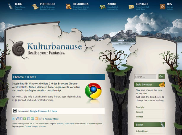
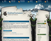
What stands out for Kulturbanause is the broken wall, implying that this wall has crumbled away over time. In addition, we have water seeping in from the other side onto the islands of land. This uses two forms of organic design at once: the use of overt natural images and settings and the use of something that is worn and decaying.
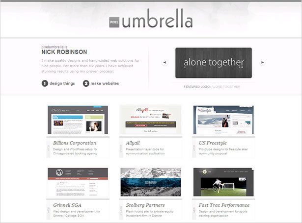
Pixel Umbrella's natural appeal is in its barely-there background- a textured gray wall that hints to concrete or plaster- and the soft curves of the font (namely, the 'b' in 'umbrella).
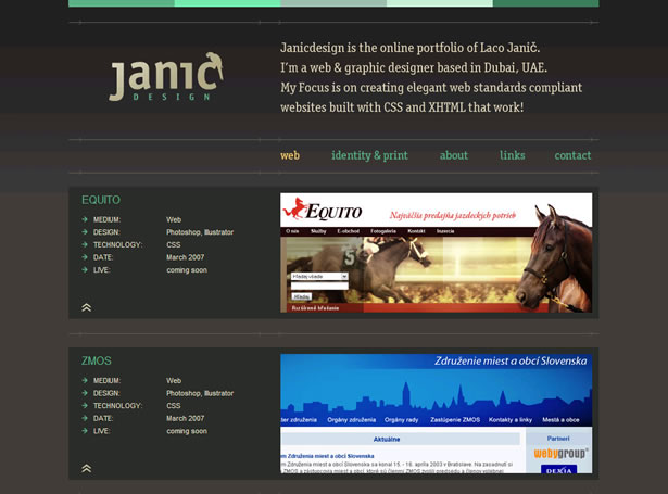
The bird may be a good addition to gain organic flare, but the colors of font are what drive Janic Design's layout. The CSS is a focus in this kind of layout, and Janic Design adds organic appeal by using different shades of greens, teals, yellows, browns and deep gray-blues.
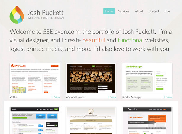
When all else feels modern, add a little natural feel in your logo. Josh Puckett's raindrop logo is overtly organic, and the colorizing of the droplet only enhances its natural essence.
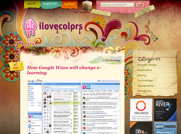
What is not organic about I Love Colors' site design? The colors, the vectors, the ripped papers and the textured background are all adding to the organic appeal of this layout.
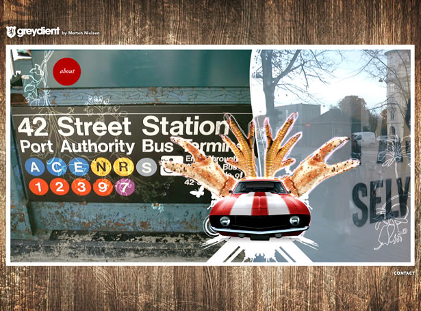
Greydient uses a rotation in the large images, but each one has organic appeal, with additions including dilapidated items, like what you see here, and floral brushes.
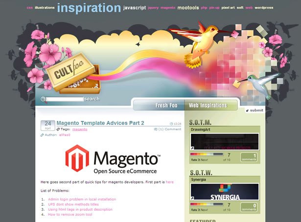
Flowers, birds and cloud-like imagery. An organic design that's so overt you can't miss it.
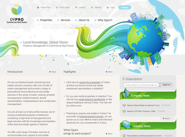
The globe image is nice, but the Oypro logo - which looks like a few leaf petals - and the soft edges on the links are what finish off the organic feel. The swirls of natural color help too, of course.
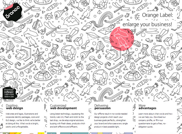
Orange Label's layout has many modern qualities, with the use of squared text areas and a simple color scheme. However, Orange Label adds in organic design with its use of outlines of natural objects, soft edges and, most notably, text areas that feel as if they are made from negative space.
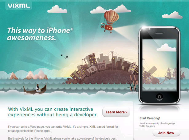
Another example of overt organic design, VixML's layout consists of watery and cloudy imagery, a city setting and rounded edges galore.
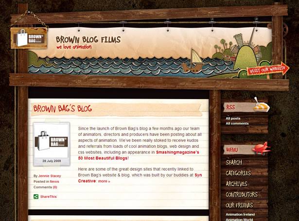
Brown Blog Films may have a heavy use of wood in its design, but the wooden planks as links and the 'hung' picture of the logo are what top off the organic charm here.
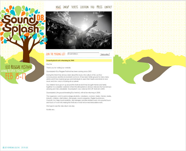
Aside from the tree and the curvy font on the logo, there are two organic items to note: the handwritten font on the navigation and main background.
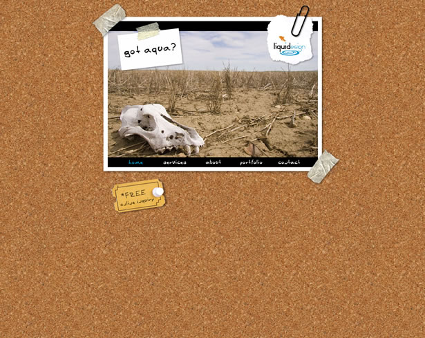
What makes Got Aqua a particular example of organic design is not the image of the skull or the handwriting, but rather the cork background. It is an interesting choice for a natural feel, but it is natural and a great neutral texture.
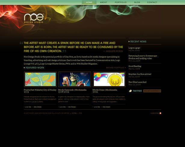
What is fun to remember about nature is that it does not only consist of bark and birds (and the like). It also consists of light waves, gases, sparks, light, among (clearly) other things. Noe Design plays with these unlikely sources of inspiration, giving us intensified ribbons of color and text that seems illuminated.
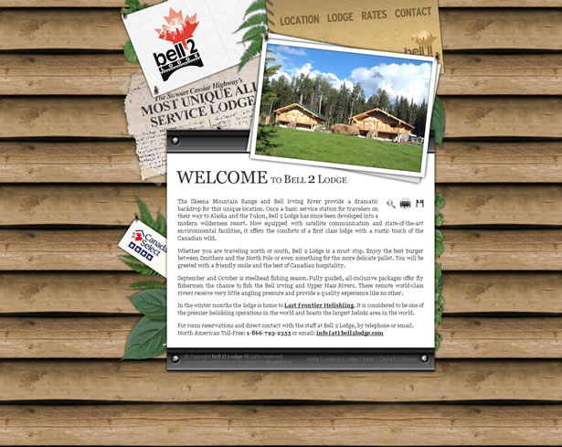
Bell 2 Lodge sets itself apart in that the graphics are large and are an obvious combination of vector and photo. We can see that the wood is an image of actual wood, whereas the leaves used are clearly graphics that were built in a program. It is an exemplary play on what is man-made and what, essentially, is not.
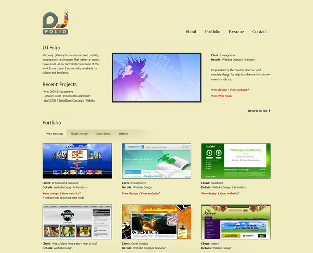
DJ Folio's logo is the main organic component on the site, using simplified, rounded shapes that possess a natural feel. Also, through the separate circles and graphical bits of the 'J,' we get a product that is more than the sum of the individual shapes.
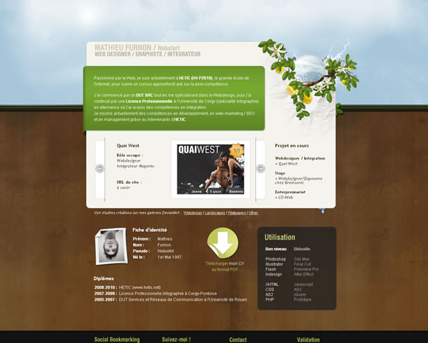
The coding is what is of note here, aside from the overt organic additions such as color, leaves and sky. The coding used to run Mathieu Furnon's portfolio makes the transition from image to image seamless and natural.
The combination of dark tones with cooler blues and creams, as well as the 'drawn' effect on half of the logo add subtle organic touches to the obvious woods and papers.
The addition of 'handwritten,' off-kilter font flanking the more graphical font is just one aspect of organic design here.
Natural auburns, oranges, melons and browns soften the crisp, modern white in this layout.
Look beyond the trees; the water colors and the deep-but-earthy hues in the header image add a dramatic but organic appeal.
Written exclusively for WDD by Sarah Thompson.
What textures and tones do you prefer when creating an organic feel? As a user, which do you think is more appealing: subtle or overt organic themes?
WDD Staff


Read Next

3 Essential Design Trends, May 2024

How to Write World-Beating Web Content

20 Best New Websites, April 2024

Exciting New Tools for Designers, April 2024

How Web Designers Can Stay Relevant in the Age of AI

14 Top UX Tools for Designers in 2024

What Negative Effects Does a Bad Website Design Have On My Business?

10+ Best Resources & Tools for Web Designers (2024 update)

3 Essential Design Trends, April 2024

How to Plan Your First Successful Website

15 Best New Fonts, March 2024
