• 20 Oct

    As you search the web you’ll come across a wide range of interactive and graphical maps.

    Deciding when, where and how to integrate or display a map on your site is the first step, the second should be what technology and illustrations to use.
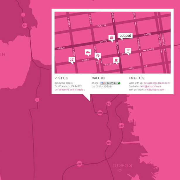
    If you’re all about interaction, JQuery, Ajax, or Flash are all effective technologies that hold their own ground.

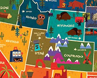
    Map illustrations are a dime a dozen however, a strong and balanced display of graphics, information, and colors is what makes an infographic stand out and reach its target audience effectively.

    As designers, we’re constantly searching for ways to improve and style our designs, this is exactly what the following 30 infographics and sites display below; the breaking of rules.

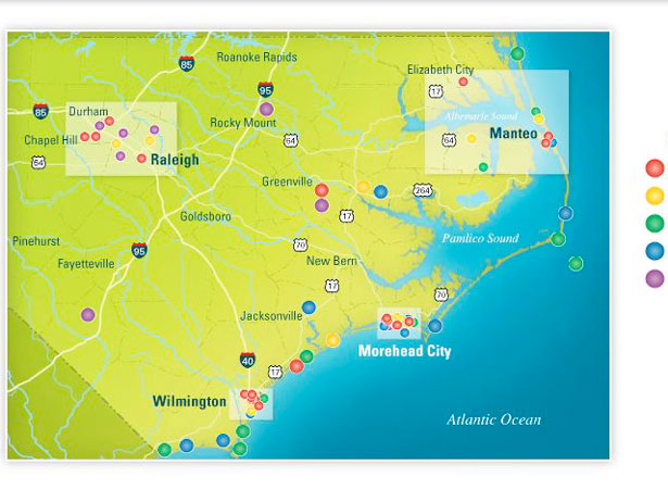
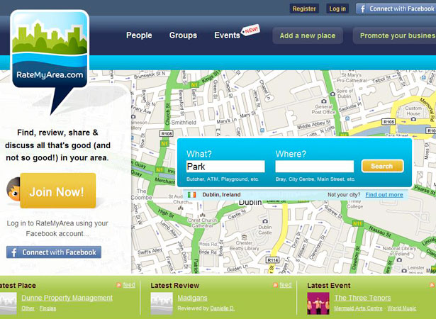
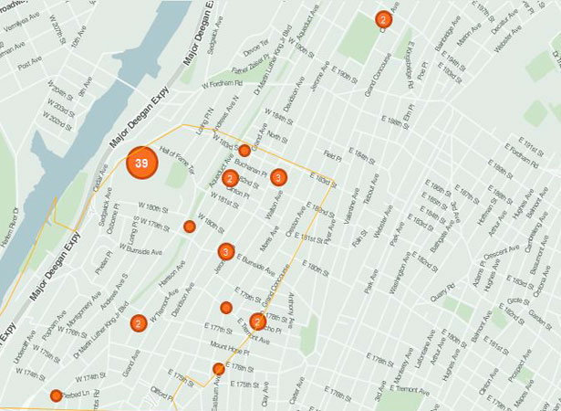
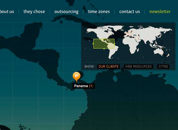
    Sites with Interactive Maps


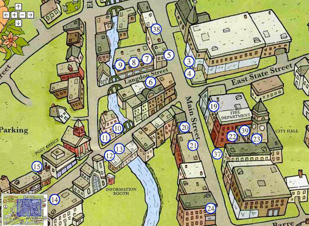
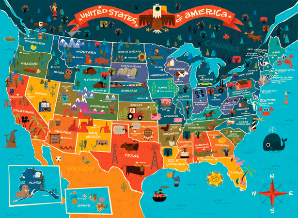
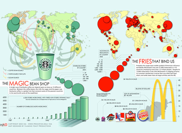
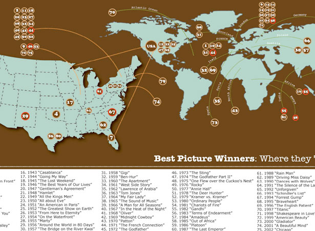
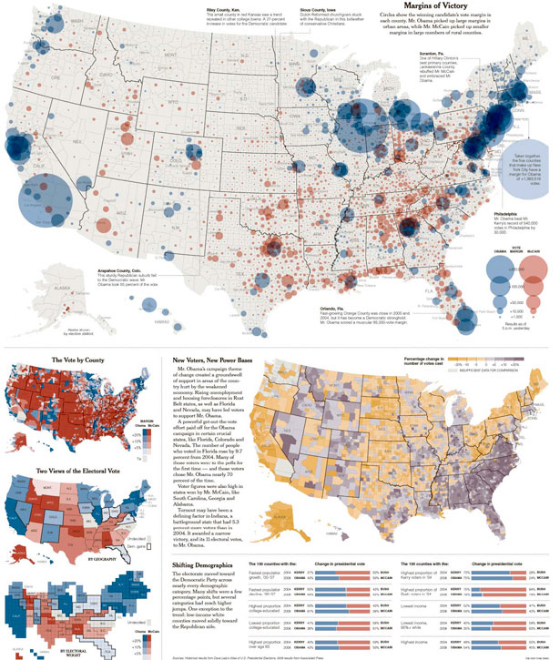
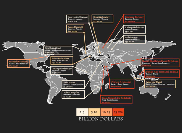
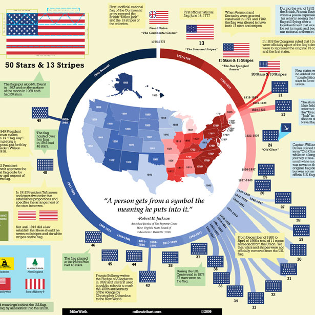
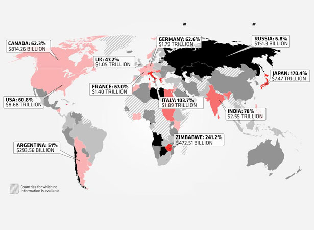
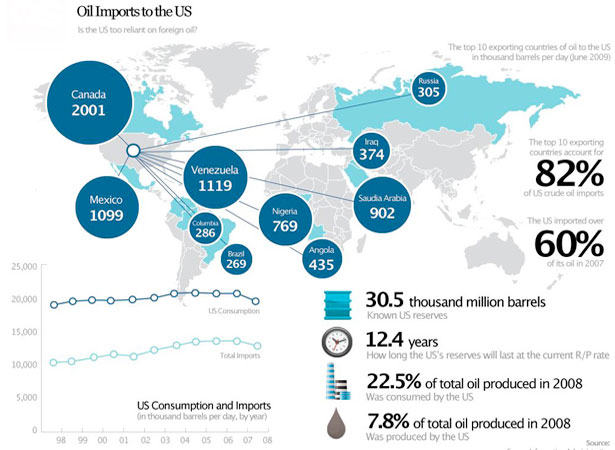
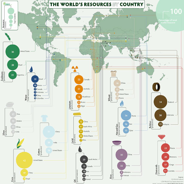
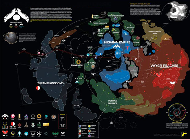
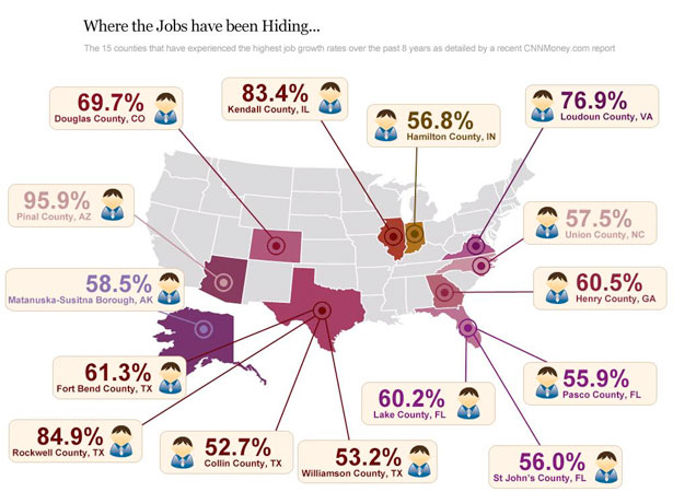
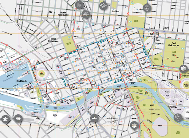
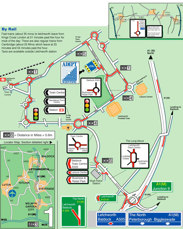
    Illustrative Infographics


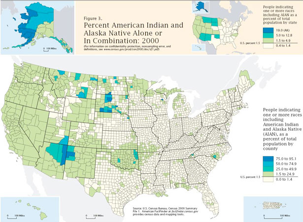
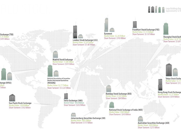
    Compiled exclusively for WDD by Liz Fulghum.

    Did we miss any great examples? Please post them in the comments’ area below…


  • 37 Comments »

     
    #1
    Sean Clarke
    October 20th, 2009 at 9:22 pm

    Nice — all I need now is to learn how to draw maps !


    #2
    Evan Jones
    October 20th, 2009 at 9:23 pm

    I love info-graphics like these! Such a beautiful organization of data :)


    #3
    Jad Graphics
    October 20th, 2009 at 9:57 pm

    Great examples. I recently wrote a blog post about infograpics as well. They are awesome!


    #4
    Paul Randall
    October 20th, 2009 at 10:04 pm

    As a visual learner, these are great, and much more interesting than tables and pie charts!


    #5
    Most Interesting Ideas
    October 20th, 2009 at 10:06 pm

    Cool maps


    #6
    Web Design Maidstone Kent
    October 20th, 2009 at 10:24 pm

    Wow, what a great way to display info, I remember doing demographics using a 3d uk map, took forever but looked great… site no live anymore though which is a masisve shame!


    #7
    Greg
    October 20th, 2009 at 10:26 pm

    Amazing Maps!!!!
    This can really bring clarity to information in a way charts just cannot


    #8
    Joel Sutherland
    October 20th, 2009 at 10:51 pm

    Here is a link to a writeup on the second map. It was done entirely in jQuery and is driven by a CMS:

    http://www.newmediacampaigns.com/page/jquery-vs-flash-for-interactive-map


    #9
    Web Design Kilkenny
    October 20th, 2009 at 11:15 pm

    Thanks for putting all this together – I’m always looking for inspiration when it come to maps – trying to get away from the plain vanilla google maps.


    #10
    Oscar Martell
    October 20th, 2009 at 11:40 pm

    Wow, I´m very impresed, great recopilation. Thanks for sharing


    #11
    Sean
    October 21st, 2009 at 12:07 am

    Can anyone provide a good link for the Hurricane Hugo graphic?


    #13
    Dzinepress
    October 21st, 2009 at 8:18 am

    really superb examples which you mention in post titile, there is all graphs fulfill requirements, me also getting idea because now a days i am also working on an project which belong to same idea and your article helping me too much.


    #14
    s.holstens
    October 21st, 2009 at 10:34 am

    Thank you for inspirating me =) and thanks for this nice collection.


    #15
    pesho
    October 21st, 2009 at 10:54 am

    Thanks,these are very amazing


    #16
    2expertsDesign
    October 21st, 2009 at 1:33 pm

    LOOKS GREAT!!! really very impressive. Anyway, really enjoyed the post.


    #17
    Scarlett
    October 21st, 2009 at 2:03 pm

    Beautiful maps! Makes figures less boring =]


    #18
    Sami Susiaho
    October 21st, 2009 at 2:17 pm

    I cannot believe you just posted this, without including the classic example of an infographic map. Made by Harry Beck in 1933 and widely known, it also made headlines a few weeks ago, as a very important part of it was removed
    http://www.bbc.co.uk/london/travel/downloads/tube_map.html
    It is ofcourse, the London tube map and the part that was removed in august was the Thames. As the Thames is a very integral part of the map, it cannot be removed and will be reinstated. The alpha and the omega of the infographic maps, portraying just the information you need in an understandable (yet abstract) form.


    #19
    aledesign.it
    October 21st, 2009 at 2:39 pm

    Thank for this post..The firs adn second examples are so nice.


    #20
    RoaldA
    October 21st, 2009 at 6:46 pm

    Great stuff!


    #21
    Designerkan
    October 21st, 2009 at 7:09 pm

    Perfect Maps Thank you…


    #22
    wien
    October 21st, 2009 at 8:25 pm

    nice post


    #23
    Julia
    October 21st, 2009 at 9:18 pm

    Really impressive and gives a lot of inspiration. :-) The best demonstration at all – infographics don´t have to be boring! ;-) Thanks WD!


    #24
    Inside the Webb
    October 21st, 2009 at 11:33 pm

    These are some pretty cool designs, glad I checked out the post :)


    #25
    sushil
    October 22nd, 2009 at 6:17 am

    Link on last map’s in the list (about stock markets) is wrong, click takes to a wrong map.

    Good collection


    #26
    Edu
    October 22nd, 2009 at 10:53 am

    Hi people !

    Check this site of mapping:

    http://www.cercalia.com

    We have our own API…


    #27
    James
    October 22nd, 2009 at 11:28 am

    Making a map interesting is something I know I always struggle with. This collection definitely gives some brilliant ideas, and even the tube map posted in the comments is a great example.

    I’ll be sure to check back here next time I need to be fancy with my map display!


    #28
    Alex Mathers
    October 22nd, 2009 at 6:52 pm

    These are all very inspiring. I’m thinking, as an illustrator, to get into working on more infographic type stuff.


    #29
    NBA
    October 22nd, 2009 at 9:16 pm

    Making a map interesting is something I know I always struggle with. This collection definitely gives some brilliant ideas, and even the tube map posted in the comments is a great example.


    #30
    SashaKa
    October 23rd, 2009 at 11:30 am

    Having a detailed interactive map on your website is realy good marketing tool. This list is wonderful and full of fresh ideas)) only I can add is this map http://www.hiltonhead360.com/Hilton-Head-Map.html done by this guys http://www.sibers.com


    #31
    oxidizzy
    October 23rd, 2009 at 12:10 pm

    Amazing !!! Give me an idea to make some thing like these (map) for my mini shop.


    #32
    accessoire
    October 23rd, 2009 at 4:57 pm

    If you think that’s great then check out the website of the german agency “Kircher Burkhardt” http://www.kircher-burkhardt.com/

    Go to “Kunden” -> “Infografik”


    #33
    CSS
    October 23rd, 2009 at 6:58 pm

    Very nice collection.


    #34
    Grafiker
    October 26th, 2009 at 8:15 pm

    Great Inspiration. Thank you.


    #35
    Alvaro Hernandorena
    October 26th, 2009 at 9:57 pm

    great!, i work with maps most times, i work as a designer in a real estate in Punta del este – Uruguay, so i do a lot of work with maps and animation.

    here is a link http://www.alejandroperazzo.com/edificiosnuevos/ that one is nice but the map doesen’t move and it has a BAD moving water effect =D

    here is another http://www.alejandroperazzo.com/clubdellago/ moving but with less animation.

    regards


    #37
    Deja
    November 3rd, 2009 at 3:16 am

    I’m fascinated with Infographics and this is a great source of new inspiration. Much appreciated!

     
    Name (required)

    E-mail (required - never shown publicly)

    Web-site

    Your Comment (smaller size | larger size)

Home| Advertising| About| Contact

© 2009 All Rights Reserved