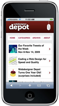
 Today we're pleased to announce the official launch of the mobile version of Webdesigner Depot.
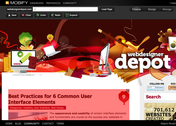
Thanks to the awesome team and service of Mobify, we were able to easily deploy a mobile version for WDD, which loads extremely quickly and makes it easy to browse our content when you're on the go on your mobile phone.
Why did we create a mobile version? Mobile access is growing 30% every year. While WDD was optimized to load quickly on your desktop, the same format is not best suited to a mobile device. A more streamlined version was needed, and that's when Mobify came to our rescue.
The mobile version now carries specially optimized images that load quickly on your mobile phone as opposed to loading the full sized images which are better suited for broadband connections.
Mobify is a service that makes WordPress, Drupal and other websites mobile-friendly. Supports iPhone, Android, BlackBerry and 5000+ other devices. It includes some great features such as Google Analytics, custom domain and branding, CMS plugins and SSL security.
The basic service is free and there are paid plans available for advanced options. How does it work? Mobify doesn't like 'complicated' - the process is kept simple and easy.
To get started, you'd simply click on the different elements of a live website to make them a part of the mobile layout.
Then, deploy one of the mobile device detection plugins provided by Mobify.
Whenever a mobile user visits, Mobify generates a real-time mobile version, optimizing images, styles and advertising for the small screen.
Designing for mobile used to be difficult, requiring style hacks and support for many screen sizes.
Mobify allows web designers to reuse existing CSS, working with familiar classes and elements.
It's also possible to add content just for mobile, like maps or contact information.
Mobify stores the mobile layout and optimizes content in real-time for devices used by the visitors.
The service integrates with the full site, capturing mobile traffic originating from Twitter, Google and social networks. Since every page gets a mobile version, users get exactly the content they were looking for.
JavaScript, WordPress, Drupal, ExpressionEngine and Apache device detection plugins are provided.
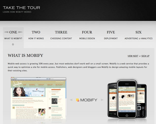
For more information, take the tour below:
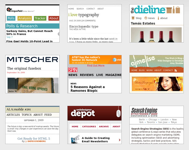
Although Mobify is barely a year old, its success speak for itself with many leading websites in the web development industry adopting Mobify's technology. Check out some of them below:
Here are some testimonials from well known webmasters:
“Extremely impressed with how easy it was! The entire process has been incredibly enjoyable and I have already begun recommending Mobify to my friends and colleagues.” Matt Bango, The New York Times.
"It looks sharp and still feels very light. Everything fits perfectly on the iPhone's screen, and it feels very true to the original. It's brilliant!" - Veerle Pieters, Duoh.com
"OH MY HEAVENS TO GOD, IT'S FREAKIN' GORGEOUS. And works perfectly. And it's so damn smart! AWESOME!!!!!!!!!!!!!!!!!!!!!!!" - Jeffrey Zeldman, AListApart.com
It was really easy to set up the mobile version of JustCreativeDesign through Mobify's dashboard... the interface behind the scenes of Mobify is quite easy to use and I had the mobile version customized within 20 minutes of signing in to their site. - Jacob Cass, JustCreativeDesign
I worked extensively to customize everything for the best possible results.
A very special thanks to the Mobify team: Igor Faletski, Nick Foster, John Boxall and Peter McLachlan. Thanks guys for helping us out to deliver WDD in the best possible way to our mobile users!
To check out the mobile version, simply point your mobile phone 's browser to www.webdesignerdepot.com and it will redirect you automatically, or you can enter the mobile version directly by going to m.webdesignerdepot.com on your phone.
I highly recommend Mobify's service to port any of your websites to the mobile world, I couldn't be happier and I'm sure it will do the same for your sites.
What do you think of WDD's new 'mobified' version? Share your comments and questions below...
WDD Staff


Read Next

20 Best New Websites, April 2024

Exciting New Tools for Designers, April 2024

14 Top UX Tools for Designers in 2024

What Negative Effects Does a Bad Website Design Have On My Business?

10+ Best Resources & Tools for Web Designers (2024 update)

3 Essential Design Trends, April 2024

How to Plan Your First Successful Website

15 Best New Fonts, March 2024

LimeWire Developer APIs Herald a New Era of AI Integration

20 Best New Websites, March 2024

Exciting New Tools for Designers, March 2024
