24 Clever Website Designs That Combine jQuery and Illustration
 Thanks to the might of JavaScript, the words "dynamic" and "illustration" no longer apply exclusively to Flash-based websites.
Now that dynamic HTML is a reality in most commonly used browsers and that a lot of fancy JavaScript libraries exist to make using it easy, CSS websites can take back some of the street cred held so tightly by Flash.
Of these new JavaScript libraries, jQuery has become one of the most widely adopted because of its ease of use, breadth of features and initial focus on visual uniqueness.
Here are 24 clever examples of website designs using jQuery and Illustration.
1.Form Fifty Five
Features: Changing header illustration; multiple small slideshow windows.
Description: Not only does this website have a lot of genuinely good design-related content, but jQuery is used in a variety of ways to enhance the website's appearance and usability. Add in a periodically changing illustrated background and some nice circular interface controls and you have a beautiful marriage of jQuery and illustration.
Home page with header illustration: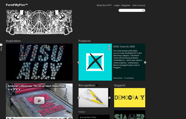
Left column with tags toggled on: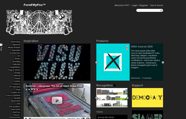
Window shade header for logging in: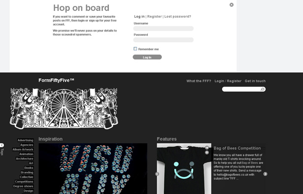
2. Frozn
Features: Vertical and horizontal sliding.
Description: Other than the big, brightly colored circles with numbers, the feature I noticed most was the illustrated profile pictures. So, I clicked them. That's when the magic happened: vertical and horizontal window-shading that opened a full set of blog entries with embedded Vimeo videos. The persistent footer gradient is an interesting effect when you scroll down.
Big circles and author illustrations on the home page: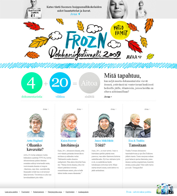
Vertically expanding content: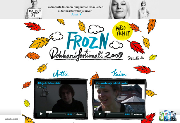
Author illustrations expand to reveal blog entries and video: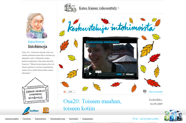
3. iPhone Mockup
Features: Drag and drop, targeting
Description: If you've ever thought of creating an app for the iPhone (and which Web developer hasn't?), then this might be a website to check out. It allows you to drag and drop sketched or computer-drawn interface elements onto a sketched or computer-drawn iPhone outline. Although it is pretty bare bones in design, it is an innovative use of illustration that could only have been pulled off previously with Flash.
Computer-drawn iPhone editor: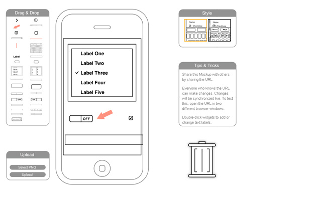
Sketched iPhone editor: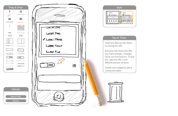
4. Florida Flourish
Features: Mouseovers with transparency, slideshow
Description: The brilliant colors and detail of the illustrated tree on this splash page are immediate attention-grabbers. Click on any of the categories branching from the tree and you'll get not only descriptive jQuery-driven content but a completely different tree, too. Scroll down and you'll see a nice centered slideshow and a footer that takes the natural motif underground.
Full view of home page, with big tree, slideshow and footer: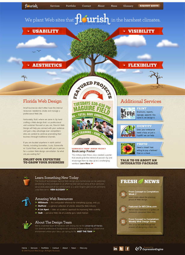
"Usability" tree: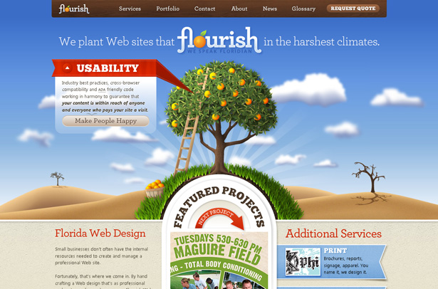
"Flexibility" tree: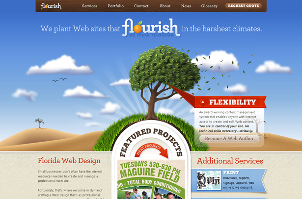
5. Tea Round App
Features: Slideshow, minor animation, sliding objects
Description: Maybe it's me or a sign that Apple has brilliant designers, but I like websites that have cropped iPhone photos. This website has an animated one, with an in-screen slideshow triggered by mousing over some well-crafted buttons. The rounded Helvetica type blends in well with the design of the phone and buttons. The tea-themed illustrations on the page and in the screenshots of the app tie everything together.
Animations within the iPhone graphic on the page: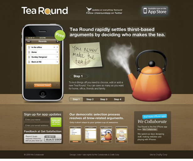
Pop-up window displays the app's screen: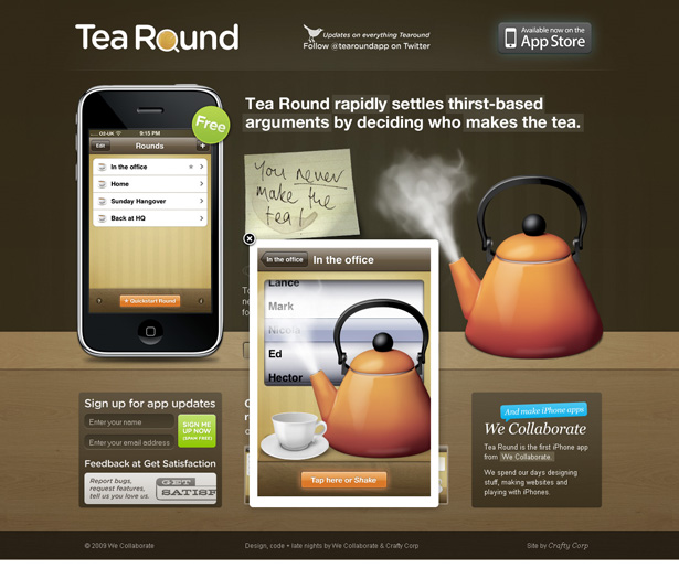
Another Tea Round app screen shown in the iPhone graphic: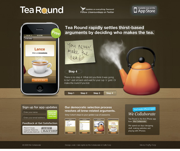
6. Best Before
Features: Screen positioning, navigation animation
Description: If websites could take jQuery steroids, this would be the Barry Bonds of the web. With all the dynamic visuals, this website could easily be mistaken for a Flash website. After careful inspection, though, you'll find that the page is neither Flash nor complex from a programming standpoint. But the realization that not a trace of Flash exists will remain etched in your psyche.
The home menu: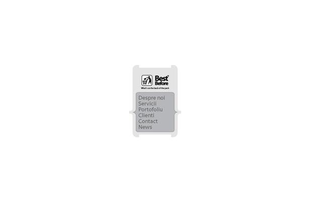
More stuff in curly braces: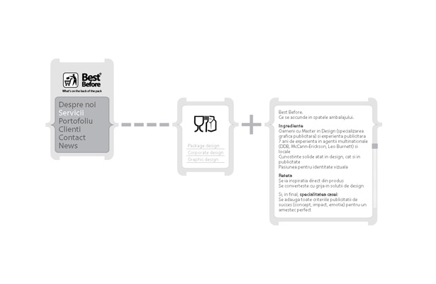
Sub-menu and portfolio:
Animation
Finding a website design for which DHTML was chosen to create the animation is always a surprise. The best part for me is that I can see it on my iPhone. I'm sure that's not the main reason why the designers chose to ignore Flash and its animation-friendly tools. I don't know how much they relied on jQuery to code their animations, but they had to have had sadistic tendencies of some kind to pull it off.
7. Tori's Eye
Features: Origami birds flying horizontally.
Description: Who thinks to use origami on a Web page? And who thinks to use blue origami birds to represent tweets, rather than the standard blue illustration? And who thinks to animate tweets? The answer to these questions is, the creators of Tori's Eye. Build a website with any one of those features and you'd have something completely original. For these creators, having all of these features wasn't enough. They made the counter-intuitive decision to do all of the animation without Flash!
Origami Twitter birds flying across a landscape: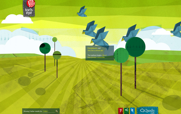
8. Bags
Features: Slideshow and footer animation with one-color icons.
Description: The use of jQuery here is most obvious when the slideshow is triggered by a click in the navigation area. The expansive white space, black type and matching icon illustrations make for a nice-looking website. But lo and behold, an animation in the footer hasn't stopped working since your arrival. Right-click the solid black animations and you'll discover the secret to the website's long-running movie: Sprites and DHTML.
Home page with a lot of white space: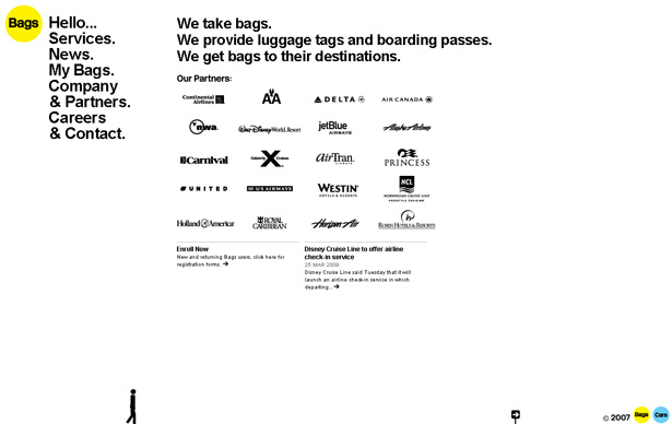
Big icons scattered throughout the slideshow content: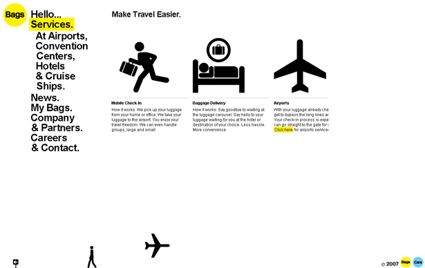
Footer animation runs continuously, regardless of where you are on the website: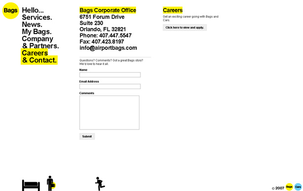
9. Kidd 81
Features: Header animation traveling horizontally.
Description: The bright-colored winter-themed drawings here catch your attention immediately, and the design has continuity all the way down to the footer. Like some of these other websites that use jQuery to animate objects, the smooth-moving images seem indistinguishable from Flash at first glance. The icing on the cake, though, is the draggable "Wow! I can't believe you can drag these" icons.
Home page header animations: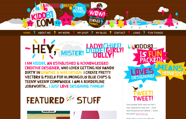
A footer with the same illustrated theme: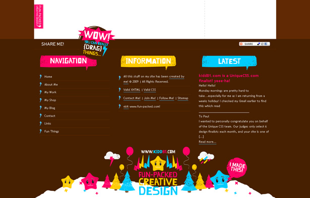
The store section has the same character and colors: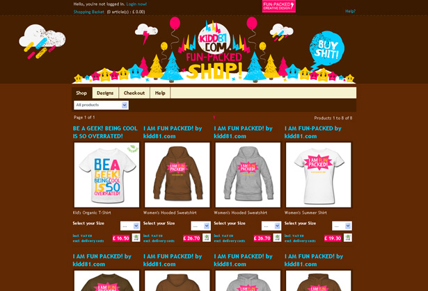
Vertical Scrolling
A few JavaScript tools are capable of triggering smooth scrolling between sections of a page. jQuery, of course, is more than capable of performing this effect, and at least a few of the websites in this section take that route. Dynamic scrolling is a nice effect, but combined with creative and detailed illustrations, the feature is but one part of the bigger picture.
10. Tomas Pojeta
Features: Sky, ocean, underwater.
Description: Like a few other websites in this section, Pojeta adopts a motif that goes from high altitude to below the surface. The top of the website is in outer space, with its highly detailed rocket and monkey. Scroll down and you'll see aliens and balloons in the lower atmosphere. Further down is an Easter Island-looking piece of land in the middle of the water, which leads to an underwater view with a submarine. Each illustration fits, and the transitions are about as seamless as it gets.
Rocket and monkey in space: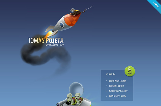
Easter Island and toucan: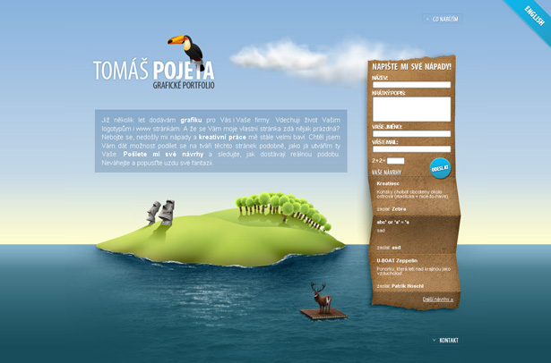
Submarine underwater: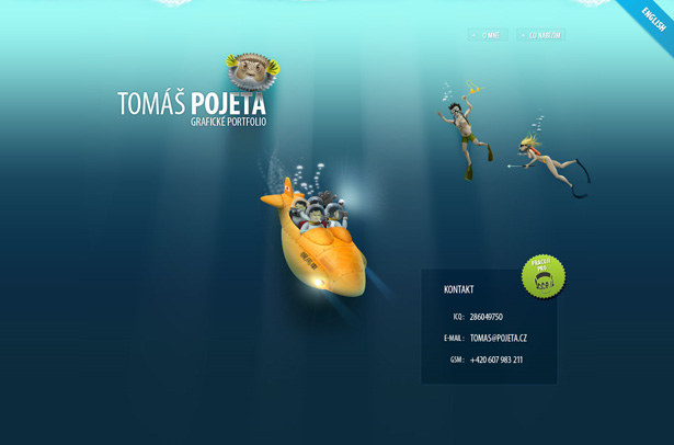
11. Morphix
Features: Space, sky, land, underground.
Description: Morphix also begins with some upper atmospheric action, but then transitions to land instead of sea, and finishes with an underground cutaway. The style is obviously different, but the illustration for each layer spans the width of the page, like the last one, creating a sense of horizon. And again, the transition from sky to underground flows smoothly, especially with the dynamic scrolling.
Upper atmosphere, with portfolio: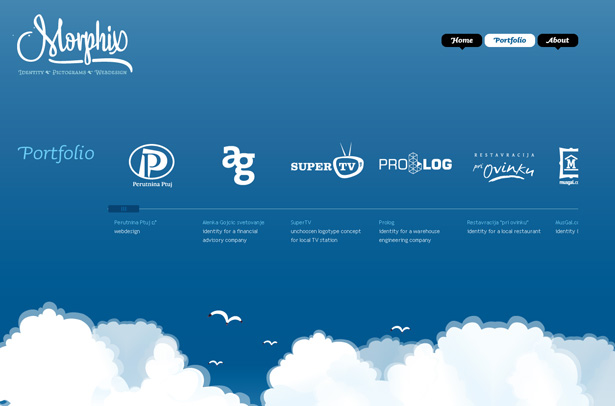
Ground level, with cows and skyscrapers: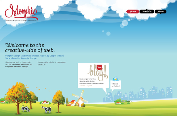
Underground, with tree roots and groundhog: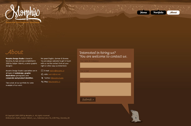
12. GANDRWeb
Features: Various infographics.
Description: Unlike the previous two websites, this one uses infographics in place of characters, landscapes and backgrounds. Each section of the page explains the accompanying graphic. The bottom of the page features, unsurprisingly, a big web form. A purely sales-related website that uses so much good illustration is rare. The jQuery-triggered transitions add gloss to the message.
Infographic explaining benefits and pricing: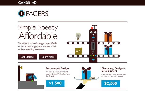
Infographic explaining the design process: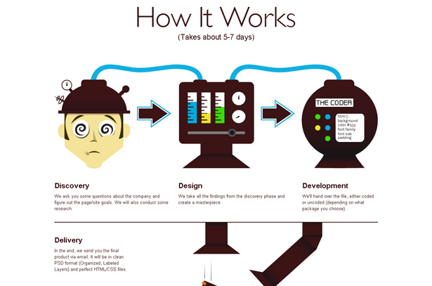
Web form: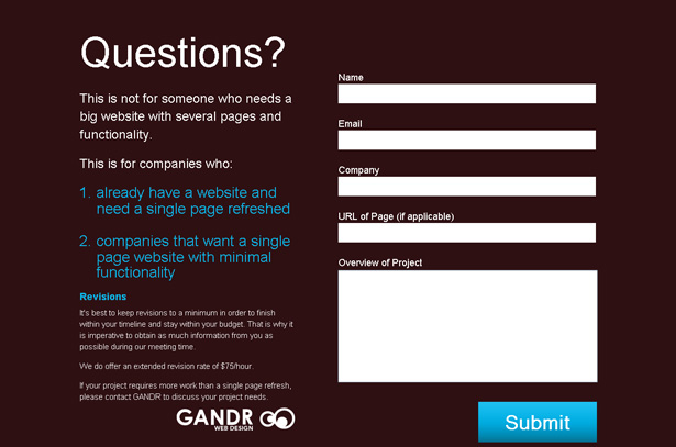
13. Orman Clark
Features: Clouds, ground and flying objects
Description: Like the first two websites in this section, Orman Clark's website begins with sky, but the tall page sticks with cloud sky all the way to the footer, where we hit the ground. A noticeable difference between this page and most of the others in this article is the fixed position of the main navigation and illustration. This is accentuated by the starburst at the top of the background that highlights the floating egg. The website also features a well-integrated jQuery slideshow for the portfolio.
Balloon, cow and egg: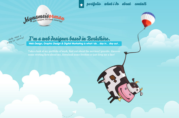
Biplane and jQuery portfolio slideshow: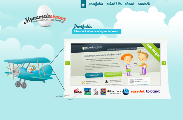
Web form, footer and fixed navigation: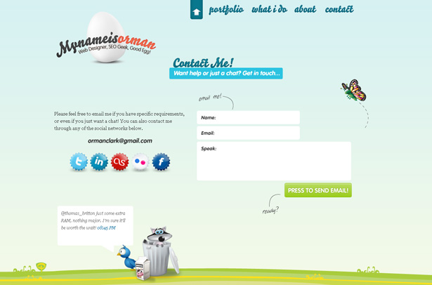
14. Dreamerlines
Features: Various collages.
Description: The Dreamerlines site takes a discrete approach. Like GANDRweb, each section has a distinct graphic that is tied to its neighboring sections only by white space. Each section, though, is unique, detailed, colorful and attention-grabbing. Heavy illustrations, big bold text and background coloring set the tone.
Big text to begin: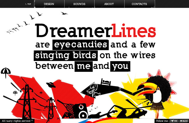
In-your-face collage: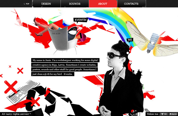
Web form surrounded by a lot of visuals: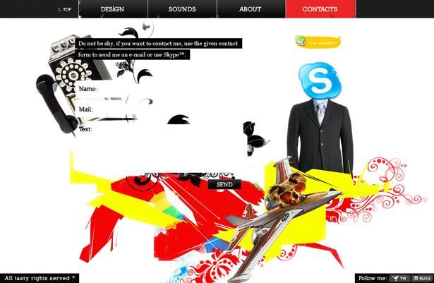
15. Social Snack
Features: Wire, birds and ground.
Description: The sky motif never gets old, and designers can choose from any number of palettes to color their horizon. Social Snack's horizon is a bit hazy, with a pronounced green and brown. Birds sit on wires that are scattered vertically throughout the page to separate sections. The website finishes with a rooftop. Although the blog doesn't have smooth jQuery scrolling, the fun illustrated header with cute characters deserves mention.
The color palette and bird motif at the top: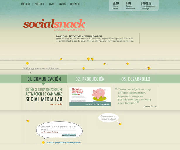
The frames for the team photos hang off a bird wire: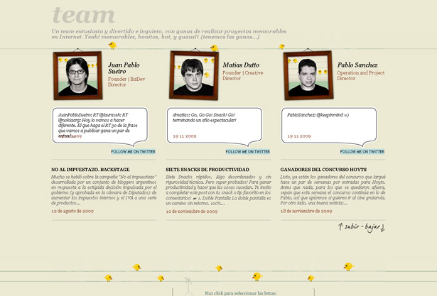
Cute characters in the blog section: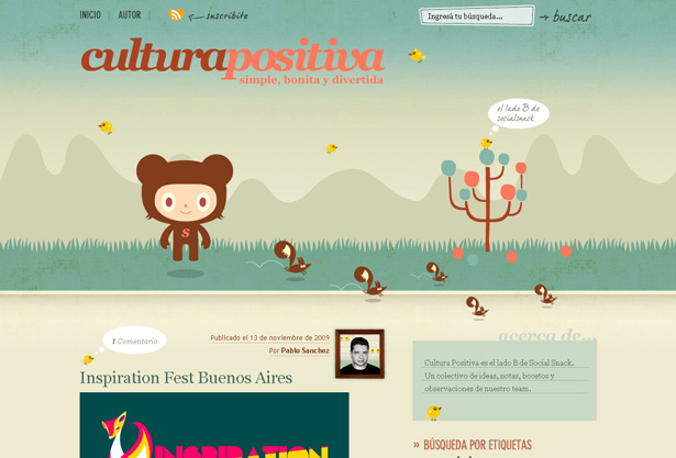
Slideshow
One of the most frequent and recognizable uses of jQuery is for the venerable slideshow. Whenever you see content gliding across the screen after a mouse click, and no Flash can be found, it's probably jQuery. You'll find slideshows on corporate websites, landing pages, agency portfolios, e-commerce websites, everywhere. They are that ubiquitous. Below are a few examples of slideshows that come alive because of sharp illustrations.
16. GoSiteWave
Features: Vertical slideshow with horizontal navigation and attractive icons.
Description: The vertically scrolling slideshow, combined with the icons and images, are the real story here. Slideshows are expected to scroll horizontally, so the opposite here is eye-catching. The bright blues and oranges, slick rounded buttons and dark background with skillfully placed streaks of light add to the effect. Of course, if the icons weren't so well done, the website might not have made the cut.
Home page slide graphics: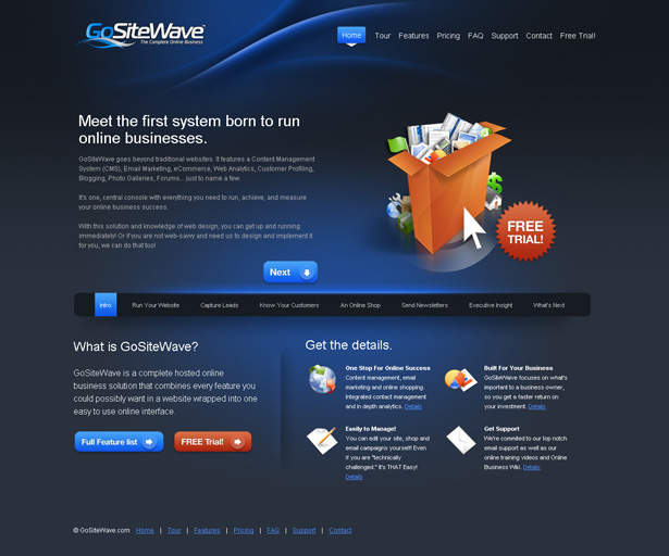
Another slideshow: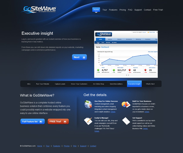
17. Sketchen
Features: Horizontal slideshow of Flash movies, with pre-loaded content, big text and illustrations.
Description: If you like yellow, you'll love this website. This slideshow features big cropped illustrations that keep the yellow background intact. An additional slideshow in the pop-up "lightbox" contains the portfolio. Did I mention that the illustrations were big? They take up a lot of space, but they're very well done. The background color and images are accented by the green and white navigational elements, and the sharp contrast ensures that usability is not a concern.
Megaphone: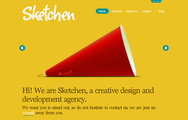
White footer: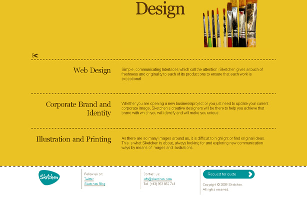
Apple: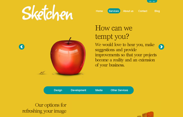
Portfolio in "lightbox":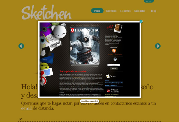
18. Form Fifty Five
Features: Smooth vertical scrolling, dynamically generated blog content, slideshow, main navigation highlighting,
Description: Don't let the monochrome color palette and the simple line drawings fool you. This agency site has everything. Smooth vertical scrolling, a fixed footer that overlays content, a portfolio slideshow, dynamically embedded blog content, etc. With all of these functions going for it, what really sets the site apart is the total number of random illustrations, and the fact they're all pretty funny. Along those lines, a visit to the site isn't complete without sampling the hilarious "About" video.
Lots of illustrations in the start screen
Typefaces match the illustration style
Portfolio slide show
Footer navigation titles highlight as you scroll
Horizontal Scrolling
Unlike the slideshow, which is usually confined to a section of a website, horizontal scrolling (as defined here) happens at the browser level, or at least feels that way. Dynamic horizontal scrolling does not have as many great examples as vertical scrolling; but as you'll see, designers who think horizontally have great imaginations.
19. Serial Cut
Features: Large illustrations for portfolio; horizontal and vertical scrolling.
Description: This slideshow is really designed to take up the browser's viewing area. You can't scroll left or right, but does it matter? The illustrations and design are so outstanding that the developer could have had criss-cross, upside-down or any other unintuitive method of navigating and people would still spend the effort figuring out what's coming next. What really helps is the size of the navigation icon and that the portfolio photos and images take up the entire screen.
Trains: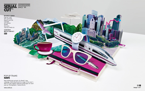
CD cover:
3-D guy with shoes:
20. Tyler Finck
Features: Horizontal transitions, with animations created out of the background.
Description: Here's a great example of using the background image to create an animation effect for the dynamic horizontal scrolling. The color palette is primarily black and white. The typefaces are bold and have thick blocky backgrounds in certain places, and the image-based type has a sketchy look. The complete package works well.
A minimalist home page:
Bio: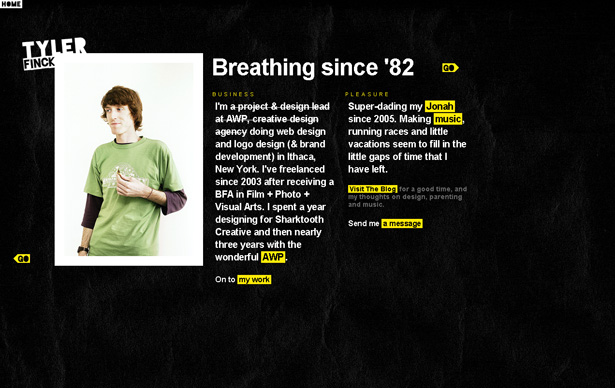
The money shot: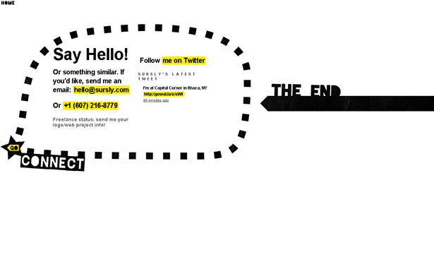
Other Functionality
Some websites that use jQuery are not easily categorizable. They might have uncommon features or make subtle use of jQuery or adapt a common technique in an unusual way. Pre-loading, automatic text-completion, fading in and out, and layering text over images are some of the tricks found in the final set of websites in this collection.
21. Orange Label
Features: Image pre-loading.
Description: Image pre-loading is the extent of Orange Label's use of jQuery. As you scroll down, portfolio items are added to the page (with a rotating graphic telling you that they're pre-loading). From a usability standpoint, this convenient feature keeps the page from automatically loading bandwidth-hogging content. The illustration at the top is big, colorful, highly detailed and delicious eye candy.
The illustration: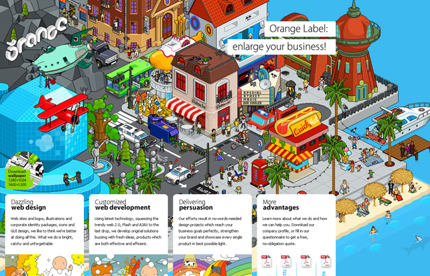
Illustration zoomed in: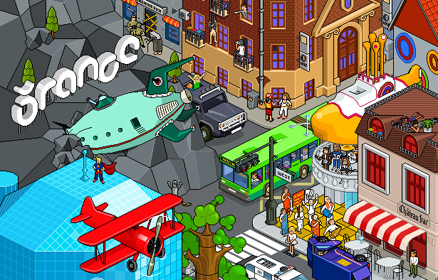
Portfolio item and footer: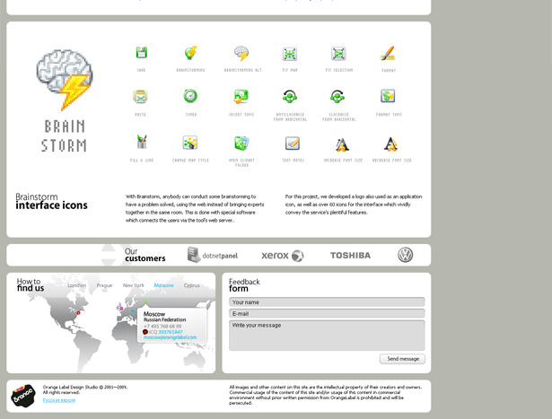
22. Silk Icon Finder
Features: Text completion.
Description: Type in the name of an icon, and this website sorts its icons based on possible results of what you've typed so far. The quality of icons is pretty good, and the service is quite convenient on the whole. Because the design is really about search results, it has little in the way of visual distraction, which is a big plus.
Default view: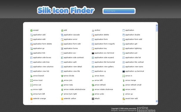
Search results for "light":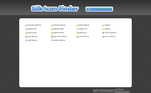
23. Vyniknite
Features: Fades.
Description: This website begins with a great dandelion illustration, good layout and nice selection of typefaces. The only noticeable jQuery action happening is the fading and out that happens when navigating the tabs. Another little slice of heaven is the way the dandelion stems overlap both the active and inactive tabs. And if you look closely at the background, you'll see some elaborate wind swirls accompanying the floating fauna.
Dandelions galore: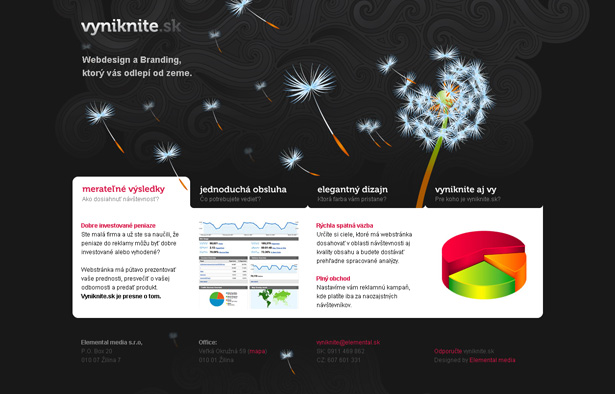
24. Halo Agency
Features: Automatic slideshow with background illustration; text over images.
Description: Backgrounds, backgrounds, backgrounds. Navigate through this website and you'll find a variety of decorative ones full of colorful 3-D illustrations. An impressive portfolio can be accessed through a jQuery slideshow on the home page. Alternatively, you can find information about each item in the portfolio (or "work") section from the text overlay on the thumbnail.
Home page with slideshow: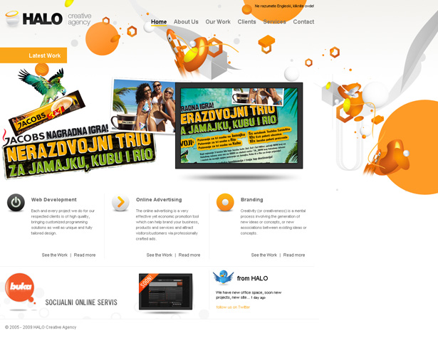
The portfolio overlays text on images: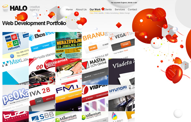
Another colorful background: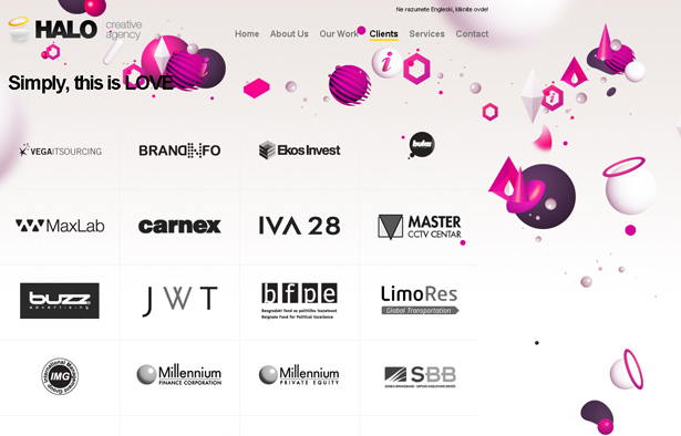
Written exclusively for WDD by Maurice Wright. He is a web developer and designer and creator of Moluv.com. Since 2000, Moluv has been a source of design inspiration for creative minds looking for the best-looking websites on the Internet.
How has jQuery changed the way you design your websites? Please comment below...
WDD Staff


Read Next

3 Essential Design Trends, May 2024

How to Write World-Beating Web Content

20 Best New Websites, April 2024

Exciting New Tools for Designers, April 2024

How Web Designers Can Stay Relevant in the Age of AI

14 Top UX Tools for Designers in 2024

What Negative Effects Does a Bad Website Design Have On My Business?

10+ Best Resources & Tools for Web Designers (2024 update)

3 Essential Design Trends, April 2024

How to Plan Your First Successful Website

15 Best New Fonts, March 2024
