 As designers, we all know that a minimalist design can achieve beautiful results.
Still, many designers have trouble creating one; either they have a hard time making a page with so few elements look good or the final result just doesn't look "complete."
There are many articles on the Web about minimalism and this article aims to help you achieve a minimalist design that is beautiful but not bare.
To top it off, we'll present a small showcase of minimalist designs, so that you can analyze why some designs work and others don't.
What Is Minimalist Design?
Minimalist design has been described as design at its most basic, stripped of superfluous elements, colors, shapes and textures.
Its purpose is to make the content stand out and be the focal point. From a visual standpoint, minimalist design is meant to be calming and to bring the mind down to the basics.
The design movement began in Switzerland and was then applied to a variety of media: graphic design, architecture, music, literature, painting and, more recently, web design.
Although minimalist design took off decades ago, the early days of the Internet did not show it. Even without the rotating logos, marquees and bright colors, website designs were cluttered and overbearing.
We'll go over the basic principles of minimalist design. But even if you choose not to pursue a minimalist aesthetic, the lessons here can help you simplify your design, whatever your style.
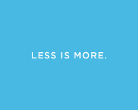
Less Is More
As mentioned, minimalism brings the most important content to the forefront and minimizes distractions for the user. If a page has too many elements, the viewer will be confused about where to look or misinterpret the priority of each element. A minimalist design puts the focus squarely on the content.
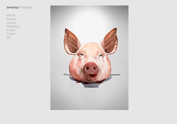
Any splash of color on a black-and-white design, for example, is sure to get the user's attention. The color itself becomes the focal point. Let's look at a specific example:
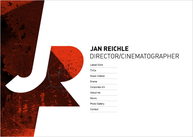
You've probably seen this kind of design before: plain white background, one block of content and one graphic element.
The graphic element brings color, texture and shape. It is clearly the most important element on the page, and it defines the designer's brand and identity.
With the complexity of this particular graphic element, more content on this page would have made it less noticeable, and less important. Keeping the content to a minimum, the designer has achieved the perfect balance.
How to Minimize Content
The first step to creating a minimalist design, or just simplifying a layout, is not simply to cut out most of the graphics, but rather to rethink the content and strip it to the bare requirements. Only then will the most important elements on the page achieve their intended effect.
Just as you would plan any website, write down what content you need: logo, introduction, navigation, etc. Cut out anything else that is not essential. Throw out as much as possible.
Below are some elements you probably do not need. Keep in mind that this is just a guide. Your exact requirements will depend on your particular design. Some of the items below may not be required for your website.
- Icons or graphics for social media, or a social media section at all
- Taglines and supplementary descriptions or introductions
- "Featured," "Popular" and "Recent" lists (including Twitter and RSS feed lists)
- Pages with more than three major sections (e.g. "Introduction," "About" and "Services")
- Secondary navigation pages.
The point here is not to make the website less functional, but rather to cut out unnecessary elements (and thus highlight the necessary ones) or to combine sections into a simpler layout (for example, by incorporating your social media links into the "About" or introductory section).
You could also divide content into separate pages, giving each piece of content more attention.
How to Simplify the Design
Now it's time to simplify the design as much as possible.
Minimalist designs should have little texture, color, shape, lines, content or type. Go too bare, though, and the design will be boring. Rather than dumping everything out, give the design appeal by making just one important feature the focal point.
Choose what that focus will be, and keep the tips below in mind as you work through your design.
Use a Great Wireframe
In browsing the showcase section below, we see that some designers have added visual interest with subtle bursts of color, unique typography or interesting shapes. Perhaps the most important element they have all relied on, though, is a unique wireframe.
Creating a wireframe for such a bare page requires a bit of extra attention. With the correct wireframe, you can achieve the right hierarchy and organization and create visual interest.
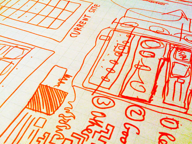
To come up with a wireframe, follow these steps:
- Decide on what content you absolutely need
- In a list, prioritize the content
- Sketch a few wireframes based on your list to experiment with the best visual hierarchy.
When working out the wireframe, consider placement but also visual treatment. For example, if your logo has a color that you do not reuse elsewhere in the design, you have to account for that.
White Space
White space is practically synonymous with minimalism.
No matter how creative you are with it, a minimalist design without plenty of white space is not really minimalist at all. So, be sure to add more white space around elements than you normally would.
The space is needed to balance the few elements that will appear on the page.
Balance, Alignment, Contrast
While much of the load can be carried by white space and a good wireframe, special care should be taken with the fundamentals of design. The three biggest related to minimalism are balance, alignment and contrast.
Be sure that your design adheres to these principles and that it does not need supplementary visual aids to look "finished."
Keep other basic design principles in mind, too. Review them and experiment with different options to achieve the best result. Check out "The Principles of Design" for more ideas.
When Over-Designing Becomes a Habit
Over-designing sometimes becomes a habit. No matter how hard you try to keep a design simple, it comes out messy and complex. To fix this, we must form new habits.
Try reviewing the tips above before each project to keep them in mind during the process. Focus on developing one habit at a time. For example, work on reducing and simplifying the content before moving on to white space.
If you find yourself in a tough spot thinking, "Something's missing," first try taking something out, rather than putting something new in.
Every aspect of minimalism requires a different talent. Your designs will become simpler the more you put these principles into practice.
Taking it further, once you have applied the techniques discussed here, look at the finished product and see if you can find ways to simplify the result even further.
You could focus on areas that you were unsure of during the design process, and you could ask other designers to point out elements you may have missed.
Minimalist Showcase
Below is a brief showcase of minimalist designs. See how each of these implements the principles we have discussed. Also see which ones break our guidelines, and think of why they still work.
1. James Day Photo
2. Killswitch Collective
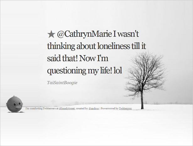
3. Lonely
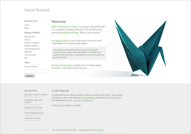
4. DBushell
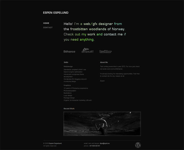
5. XPD.no
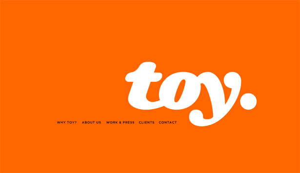
6. Toy NY
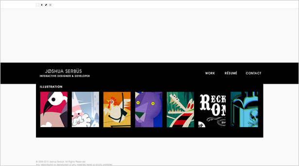
7. Joshua Serbus
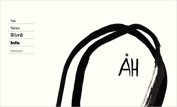
8. Ah-Studio
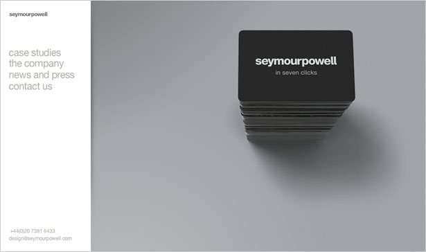
9. Symour Powell
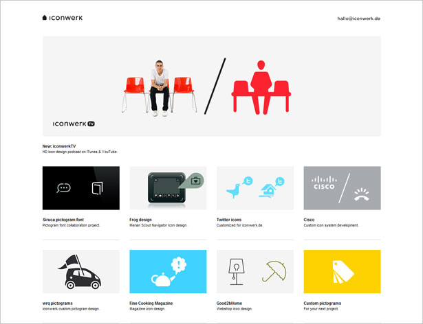
10. Icon Werk
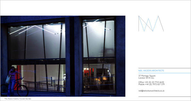
11. Neil Wilson Architects
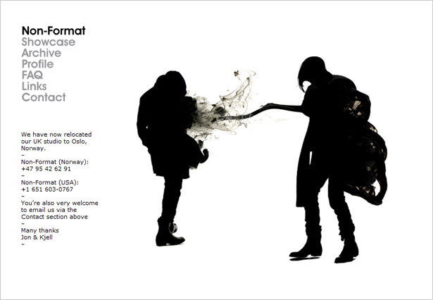
12. Non-Format
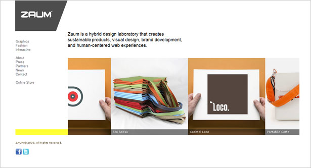
13. Zaum
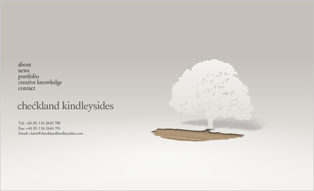
14. Checkland Kindlysides
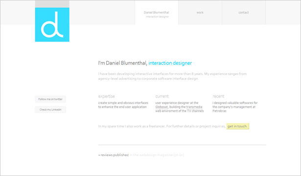
15. Blumenthal
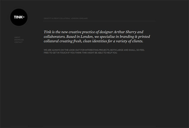
16. Tink London
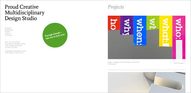
17. Proud Creative
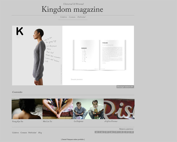
18. Kimag
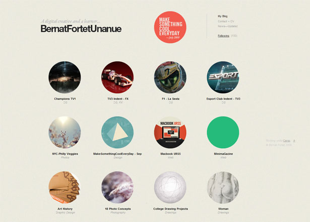
19. Bernat Fortet
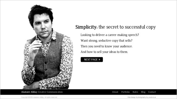
20. All Day
Some Trends
As you can see, minimalist web design has some clear trends. Being aware of these trends helps us improve our designs in a number of ways.
Not only are we able to take inspiration from the layouts that other designers have worked so hard on, but we can consciously break from these trends to forge our own innovative path.
Let's discuss a few of these trends in further detail.
Black and White
One of the most noticeable trends is extensive use of black and white. This is obvious enough: color should be simplified along with texture, shape and content. But it can be overdone these days and look a little boring.
Look at a few websites that have defined colors in the showcase above, and see how they stand out from other minimalist designs. Also, think of how they manage to stay minimalist even with such strong use of color. Here's one example:
Interesting Typography
Typography-based Web design is closely tied to minimalism.
When designers have very little else to excite the user, they often seize on interesting typography. You could even go so far as to use typography as the sole visual element.
This is a daring technique but still a trend in itself. Look for ways to make typography enhance the design while remaining unique.
Flash
A surprising number of minimalist web designs are Flash-based. With so little else for visual stimulation, a design could benefit from subtle animation (such as text fading in and out) without being overpowering.
Also, Flash removes certain limitations in the design process. Unconventional wireframes, typography and other elements can be easier to achieve with Flash than by traditional methods.
Wrapping Up
Minimalist design comes in many forms, and yet we too often see the same form repeated. Trends can become overbearing, and we must fight the urge to imitate while understanding what it is about a trend that makes sense.
In any case, minimalism can be beautiful and will be around for years to come, so learning some of its techniques can be incredibly beneficial, whether for your clients or for your own projects.
And even if you're not interested in the minimalist style, the lessons and principles involved can help you simplify your designs, which is always a good thing.
Written exclusively for Webdesigner Depot by Kayla Knight.
So, what makes minimalist design so effective, and when should we avoid it? Please share your comments below...
WDD Staff


Read Next

3 Essential Design Trends, May 2024

How to Write World-Beating Web Content

20 Best New Websites, April 2024

Exciting New Tools for Designers, April 2024

How Web Designers Can Stay Relevant in the Age of AI

14 Top UX Tools for Designers in 2024

What Negative Effects Does a Bad Website Design Have On My Business?

10+ Best Resources & Tools for Web Designers (2024 update)

3 Essential Design Trends, April 2024

How to Plan Your First Successful Website

15 Best New Fonts, March 2024
