 Print style sheets have been somewhat forgotten, and yet they remain important all the same. Many people print out articles to read while traveling or when they have no access to the Internet.
Print style sheets have definite benefits. For example, reading on paper is less tiring on the eyes than reading on screen.
Also, following tutorials is easier if you have one next to you, with your code editor open on the screen; that way, you don't have to switch windows every time to look something up.
In this article we'll point out 10 easy tips that will help you create better print style sheets.
In case you've forgotten, here's how to set up a print style sheet:
![]()
The media="print" attribute ensures that users don't see any of the styles defined in the print.css file.
Some attention is required, though: if your main style sheet has no media attribute, the print style sheet will inherit its style. To separate them, set your main style sheet as follows:
![]()
Here are 10 tips to get you started with the print style sheet.
1. Remove the Navigation
What is the main difference between paper and computer? Paper is static, while a computer is interactive. And to facilitate that interaction, websites have navigation, which becomes useless on paper.
Hide the navigation and other parts of your website that become pointless on paper, such as sidebars that link to other posts. The code for this is very easy: just set the element's display to none.
2. Enlarge the Content Area
With the navigation and sidebar removed, our content is now spread across the page. This makes the print style sheet look more like an ordinary document, instead of a paper version of the website.
All we need to do to expand the content is reset the float, remove any margins and set the width to 100%.
[css] #content { width: 100%; margin: 0; float: none; } [/css]3. Reset the Background Colors
Most browsers already ignore background properties to preserve ink. But to make sure that the entire background is white, we can set the body to white, and then give every child element still on the page a white background.
[css] body { background: white; } #content { background: transparent; } [/css]4. Reset Text Colors
By resetting the background, another problem pops up. What if you have a dark-gray "Author information" box at the end of your posts, with the text in light gray or white? With the background now set to white, this information will invisible.
To fix this, change any light-colored text to something darker: black or, preferably, dark gray.
[css] #author { color: #111; } [/css]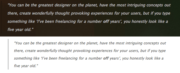
Take Sam Brown's blog above. Could you imagine what this would look like if he didn't reset the text's colors? Unreadable indeed.
5. Display the Destination of Links
Because paper is not an interactive medium, readers of course cannot click through on links to gather more information.
Say someone is reading a print-out about a fancy new product. Seeing "Click here for more information" all of a sudden would be rather irritating for them, wouldn't it? This is easily fixed by adding the link destination after the link text itself, giving you something like this: "Click here for more information (http://hereismore.com/information)."
What's more, for CSS 2-ready browsers, this can be done with plain old CSS. Here's the code:
[css] a:link:after { content: " (" attr(href) ") "; } [/css]You can spice things up with a smaller font size, italics or whatever else.
6. Make Links Stand Out from Regular Text
Readers need to be able to distinguish links from regular text. Basic usability rules apply here: blue and underlining is preferred, but I prefer to add bolding, too.
Remember that documents are often printed in black and white. Don't depend only on color difference. Here is the code for sensible printed links:
[css] a:link { font-weight: bold; text-decoration: underline; color: #06c; } [/css]#0066cc is a fresh blue color, and it looks like #999999 when printed in grayscale. With this, links will look good printed either in color or in black and white. They will also stand out from regular text.
7. What About Font Size?
In print, 12 points is the standard. But how do we translate that to CSS? Some say setting the font size to 12 points (pt) is good enough. Others recommend setting it to 100%. Still others say not to declare any font size in your print style sheet at all, because doing so would override the user's preferences.
Personally, I go with a 12-point font size most of the time:
[css] p { font-size: 12pt; } [/css]8. What About Fonts?
Most people prefer serif fonts because they are less tiring on the eyes, they better lead the reader through the text, and so on. Setting the font-family to serif in your print style sheet is probably a good idea, although some readers may be surprised to find that the font in their print-out is not the same as the one on your website.
Here is the code for a good print font stack:
[css] body { font-family: Georgia, 'Times New Roman', serif; } [/css]
One of the benefits of CSS 3's @font-face property is that your special fonts can be printed, too, making print-outs look a lot more like your website!
9. My Blog Has a Lot of Comments. What Should I Do?
Well, this is really your choice. On the one hand, think of all the trees you'd be saving just by adding #comments { display: none; } to your print style sheet. On the other hand, comments are of great value on some blogs and contain some great discussion.
By moving the comments to their own page, you give users the choice of whether to print them. CSS has a property that makes this very easy:
[css] #comments { page-break-before: always; } [/css]For example, if your article is two-and-a-half pages long, the comments would run from page 4 up to, say, 6. Users would be able to choose which pages to print, without losing any information.
10. Show a Print-Only Message
"Thank you for printing this article! Please don't forget to come back to mysite.com for fresh articles." Why not display a friendly message like this in the print-out? Or perhaps ask readers to recycle the paper they have used to preserve the environment.
Here is what that would look like:
Thank you for printing this article. Please do not forget to come back to mysite.com for fresh articles.
[css] #printMsg { display: block; } [/css]You could add a bit of styling, too, like a 1-pixel border. Don't forget to add #printMsg { display: none; } to your regular style sheet, to avoid confusing visitors.
Showcase
Here are some examples from well-known websites that have thought (or forgotten) about the print style sheet. Feel free to be inspired.
Looks Good:
Here are some websites that do a great job with their print style sheets:
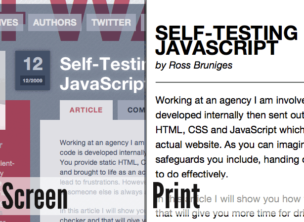
24 Ways: The website for this "advent calendar for web geeks" has a fancy design, but I wondered how it would look in print. The result is really nice. The slick CSS 3 stuff has been removed. The layout is clean and yet still slick. The big branding has been removed, replaced by a simple right-aligned "24 Ways" next to the post's title.
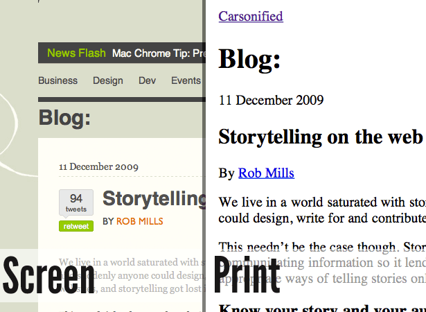
ThinkVitamin: Carsonified's blog is a good example of how to do print style sheets. No real weak spots except that the URL's destination is not shown.
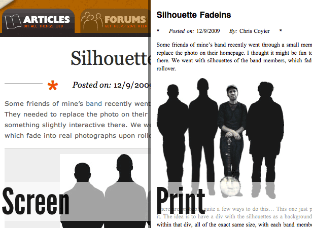
CSS-Tricks: Chris Coyier of CSS-Tricks.com has done a good job with his print style sheet. He has removed all the clutter and moved comments to a new page, so users can choose not to print them.
Could Use Some Work
Here are some websites that are already great but whose print style sheets could use a bit of polish. No offense to anyone in this section.
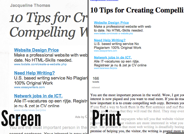
Webdesign Ledger: Webdesign Ledger seems to have neglected its print style sheet. When you click "Print," you end up with three pages of advertisements and related links.
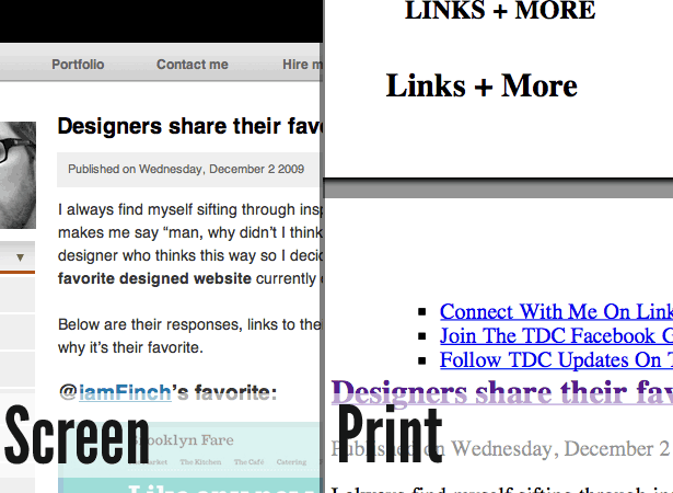
The Design Cubicle: Brian Hoff seems to have forgotten about his print style sheet, too. When you print out an article, you get the comment form, too.
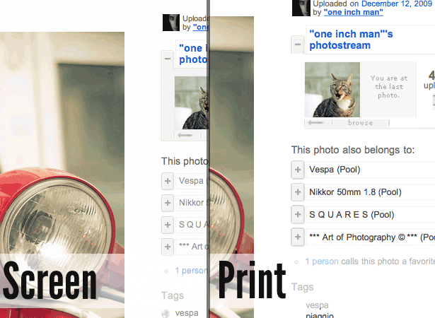
Flickr: Being able to print out photos to show to friends would be nice. Flickr could have removed everything but the picture itself and the copyright information in print-outs. But everything appears in plain unstyled HTML.
Resources
- Handy tips for creating a print CSS style sheet by Line25
- Print style sheet: The definitive guide
- CSS Design: Going to print
- CSS-Tricks finally gets a print style sheet
Written exclusively for WDD by Pieter Beulque. He is a student and webdeveloper, living in Belgium. You can follow him on Twitter too.
WDD Staff


Read Next

3 Essential Design Trends, May 2024

How to Write World-Beating Web Content

20 Best New Websites, April 2024

Exciting New Tools for Designers, April 2024

How Web Designers Can Stay Relevant in the Age of AI

14 Top UX Tools for Designers in 2024

What Negative Effects Does a Bad Website Design Have On My Business?

10+ Best Resources & Tools for Web Designers (2024 update)

3 Essential Design Trends, April 2024

How to Plan Your First Successful Website

15 Best New Fonts, March 2024
