Drop-Shadows and Gradients: Be Consistent in Your Visual Metaphors
 Drop-shadows and gradients are two of the most common design elements on the web.
You’ll find them accompanying many different styles. They’re handy effects for web designers because they’re attractive, useful and easy to create with any graphics program. But they have a dark side: they’re frequently abused.
Using amateurish drop-shadows or gradients is almost as bad as affixing a scarlet letter to your shirt to let the world know you’re a beginner or a hack. Even subtle, barely noticeable mistakes can create tensions that undermine otherwise beautiful and effective designs.
In this article, we’ll look at what drop-shadows and gradients do, we’ll talk about how to use them effectively and we’ll look at some examples of mistakes and how to fix them.
What Do Drop-Shadows and Gradients Do?
The job of a web designer is to create patterns of color for glowing two-dimensional screens. (There are a few exceptions to this: websites can be viewed on, say, a Kindle screen, which doesn’t glow; and websites can be printed out on paper.) These screens do not reflect the real world; they’re not even very much like the real world. For this reason, we have no real imperative to make the patterns on our websites bear any relationship to objects in the three-dimensional world we live in.
Operating systems like Unix and DOS have an interface that is nothing but colored text on a screen. Others, like Windows and Mac OS X, are filled with the illusions of real objects. OS X, for instance, has a dock that looks like a table with a shiny surface that recedes in the distance, a menu bar whose beveled edges make it look like it bulges out slightly, and scroll bars that appear to have translucent lozenges.
All of these effects are metaphors. They treat certain elements that we can interact with on screen as though they were three-dimensional objects that interact with light sources in the way that objects in the non-digital world do. It’s a funny thing to do, in a way: all of these light sources and edges and shapes are pure fantasy. Because the objects on the screen are imaginary, why should we relate them to the objects in the real world?
The illusion of space connects the imaginary to a world we are comfortable living in.
The most important reason why we relate imaginary objects to real-world ones is that we are experts at interacting with objects in our three-dimensional world. We have experience in dealing with three-dimensional objects, and we have accumulated knowledge of the visual code that tells us about the relationships of objects to each other in space.
It’s partially because the feat of interpreting light is so remarkable that we take such pleasure in illusion, or in creating the appearance of objects. We are often more engaged by dramatically life-like paintings of common objects like houses and apples than we are by the objects themselves. We humans have created drawings for thousands of years that are intended to present the ideas of objects. Illusory lozenges and tables on the screen are nothing but the most recent manifestation of this long tradition.
There’s more to it than pleasure, though. Shape and position give us information about how objects relate to each other. The long vertical lozenge shape of the scroll bar in the Safari window, for instance, creates the illusion that it sits "higher," or closer, to me than the elements surrounding it. This gives it greater importance in the design, which is appropriate because the scroll bar is an essential interface element for navigating the page.
Visual metaphors create perceived affordance.
By appearing as an object, the scroll bar creates "perceived affordance." That is, it links itself by way of metaphor to the properties of real objects that lend themselves to particular uses. A beveled button on a web page, for instance, communicates that it affords pressing. We can make anything on a page clickable, but associating a clickable element with the image of something pressable suggests its function in a clear, obvious and even pleasing way.
Drop-shadows and gradients are basic tools for creating the illusion of space.
Drop-shadows and gradients are two tools that help create the illusion of three-dimensionality and suggest the spatial relationships of objects on the page. When done well, this three-dimensional information makes a design more beautiful and more understandable.
In the real world, drop-shadows are created when an object blocks a light source from striking a surface that is behind it. This is one of the reasons why people say that drop-shadows make two-dimensional designs "pop": because they make objects appear to stick out from, or float above, other elements.
Gradients appear when one part of an object is closer to a light source than another part. As a result, the closer part appears lighter, and the farther part appears darker. (Gradients get more complex, of course, when multiple light sources interact or when light sources have different colors.)
So, by mimicking the effects of light in the real world, drop-shadows and gradients communicate information about metaphorical objects, imaginary light sources and their relationships.
How To Use Drop-Shadows and Gradients Effectively
Here is one possibility: don’t use drop-shadows or gradients at all.
I mean this, seriously. This is the surest way to avoid drop-shadow and gradient mistakes, and the option should always be considered.
Because tossing drop-shadows on random objects is so easy, they can be an excuse to avoid simpler, better solutions to problems. For bits of text that need to be more prominent, for example, designers will often neglect color, size, weight of the type and many other elements in favor of a drop-shadow.
Similarly, designers often use gradients to make a field of color seem less boring, without figuring out why the overall composition is not dynamic.
If you’re working on a comp for a website, save three-dimensional touches such as drop-shadows and gradients for the end, if at all possible. Use spacing, placement and color to make the design effective before adding the final layer of polish. If you focus on making your designs work without these tricks, you may find that you don’t need them as often, and that they are more effective when you do use them.
Before you plop in a drop-shadow or a gradient, ask yourself, "Is a three-dimensional metaphor necessary for this design?" Am I using it to add useful information about the way objects are related or as an effective component of a sound aesthetic approach, or am I using it as an excuse?"
The Subtler, the Better
For drop-shadows, almost never use Photoshop’s default settings. Photoshop's default drop-shadow is very dark and is cast to the lower-right corner of an object (the default global light source being 120°, in the upper-left).

Shadows tell you about the light in your environment. Suppose you’re in a dark room with no windows, and you turn on a flashlight. Any object that you shine it on will cast a shadow that’s almost black. That’s because the object is blocking light from the only light source, meaning that no other light is coming from anywhere else to brighten that area.
Now, the shadow won’t be completely black because of the reflected light. Some of the light from your flashlight will bounce off the walls and hit the shadowed area from a direction that’s not blocked by the object. And if you turn on a lamp in another corner of the room, the shadow will brighten considerably. The object will cast a second shadow: the new shadow will appear where the light from the lamp is blocked but will be filled with the light from the flashlight, while the area of the first shadow will still be blocked by the light from the flashlight but will be filled with the light from the lamp.
When we add drop-shadows to our designs, we suggest an imaginary environment for our web page. Dark, hard-edged drop-shadows suggest a dark room with a single light source. Light, soft-edged drop-shadows suggest a room rich with diffuse light.
A well-lit room is the most comfortable environment for users, because it is similar to the kind of environment where we use our computers: an office or study. Unless we deliberately want to avoid that comfort zone, we should bring the drop-shadow settings in Photoshop way down from their defaults. Bring the opacity down to 30 or 40%, or even lower.
Also, keep things simple so that people understand the metaphor without thinking about it. A light source at 120° does not makes much sense. Mac OS X, for instance, puts its light source at 90°, or straight above, which seems more logical. I like to make it even simpler and put the light source directly perpendicular to the screen. To do this, just bring the distance setting on your drop-shadow to zero (this represents the distance from the object that casts the drop-shadow to the object beneath it). At this point, global light doesn’t matter: it’s simply as if a big diffuse light source is coming from behind the user to illuminate the design.
This effect is very common in "trompe-l’œil" designs, the most common of which features the background image or frame of a desk surface, as if one were looking at it from straight above. Film directors such as Alfred Hitchcock, Martin Scorcese and Wes Anderson employ the same effect for their signature God’s-eye-view shots. Such web designs have a kind of effortless comprehensibility, and maintaining consistency across a design becomes easier for the designer.
If you’ve brought the distance setting down to 0 and the opacity down to about 30%, you’re at a good starting point for a drop-shadow. Play around with the size to change how far the surface of the object appears to be from the background on which it sits. Setting the size to 1 pixel, for example, gives you a beautiful effect that’s almost invisible but quite pleasing. Designer Dan Cederholm has made small, simple effects like this an integral part of his style (as demonstrated in his seminal A List Apart article on "Mountaintop Corners").
You can certainly bring the opacity up if the effect is invisible, but starting subtle and then dialing it up is much better than the opposite. The effect should not be the slightest bit more overt than it needs to be.
For gradients, Photoshop has a lot of fancy defaults. These may have some good uses, but they certainly have unlimited poor uses, so steering clear of them is usually wise.
Instead, select the default black-to-white gradient. Then select both the black and the white and make them both the base color of your element. Now that you have a base, pick either the dark side or the light side and adjust it to be just slightly darker or lighter. Again, the subtler, the better. (Some of the best gradients I’ve come across I had to verify with the eyedropper tool in Photoshop to make sure they were there at all!)
The greater the contrast between the light and dark, the rounder the surface will appear. For some things, such as navigation menus and buttons, some roundness is appropriate. But for objects that should appear flat, keep the contrast low.
And remember, the lighter side should face the direction of your light source.
This kind of gradient is wonderful because it mimics the gradients we see around us all the time. Nothing in the real world is truly a single color field, because it always has some kind of relationship to a light source. Look carefully at the pages in a book or at the ceiling around your overhead light: you’ll find gradients everywhere.
Examples of Mistakes and How to Fix Them
The web has many obviously ugly gradients, but these are not usually done by professional designers. Rather than show egregious mistakes, I'll illustrate a few ways in which subtle errors can create tensions in otherwise excellent designs.
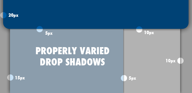
Uniform Shadows for Overlapping Objects
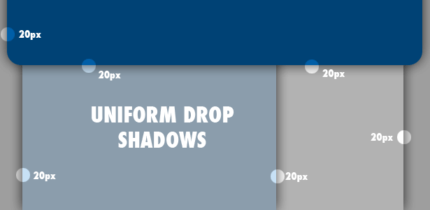
Overlapping objects imply a difference in their distance from you (determined partly by their thickness). Designers, though, frequently use identical drop-shadows for overlapping objects. So, the information conveyed by the drop-shadows conflicts with the information conveyed by the overlap, undermining the illusion of dimensionality.
Seeing conflicts such as these makes me uneasy, and the more I focus on them, the more my head hurts. Users should take pleasure in your design, not feel pain!
You can read more about this issue in "Build a Better Drop-Shadow," a guide by Jacci Howard Bear on About.com.
Abrupt Edges
The corners of real drop-shadows wouldn’t have hard edges unless they had absolutely no reflected light—which would be a very unusual situation. Rather, their corners are usually rounded by the rays of light that creep around them.
Here’s a drop-shadow with an unrealistically hard edge:


This otherwise lovely design has almost no dimensional illusion anywhere but has a drop-shadow along the right sidebar. The designer perhaps wanted to lower the sidebar's hierarchy on the page, an effect that its blue background helps achieve. Not only is it unnecessarily dark, though, but the implausibly hard edge stares the visitor in the face.
At the bottom of the sidebar, you can see a rounded transition, where the designer has created a more plausible effect. But you can see why he didn’t repeat it at the top, because it would jar with the clean horizontal line set by the well-aligned top elements. Rather than demand the realism of this rounded transition, let’s fix it by toning down the drop-shadow as much as possible.

Here, I have made the drop-shadow so light that it does little more than suggest it is sitting farther back. Because it’s so light, the clean line of transition isn’t ugly or distracting.
What the heck is going on behind that object?
Sometimes, a drop-shadow goes nuts for no obvious reason, as with the blue box surrounding the W3C logo below.

Why is the drop-shadow so far back from the object, and so rounded? The more I try to understand the story being told by this drop-shadow, the more confused I get. My guess is that the designer wanted to give more prominence and weight to the logo, which the drop-shadow helps accomplish, but it disrupts the harmony of the page so much that it’s not worth it.
Don’t let your gradients suggest different light sources.
In this otherwise excellent design for WolframAlpha, objects on the page have gradients ranging from white to pale orange. The problem is that the gradient in the header region has white at the top, implying light from above, while the page elements lower down have white at the bottom, implying light from below.
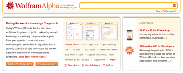
You could argue that I’m over-thinking this, that gradients don’t have to match up with light sources. That’s possible, but subtle gradients like these have an inherent metaphorical relationship to the gradients we see in the real world. Let’s switch the direction of the gradients lower down on the page so that they imply a light source from above:
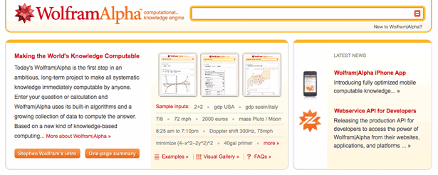
And we get light source harmony.
Ultimately, you’re free to do as you please.
Because the objects on a web page relate to real objects only by metaphor, their effectiveness is essentially subjective. The connection between an image of a button and an actual button has no reality beyond the mind of the user.
We designers are not required to make our metaphors consistent with reality, but being thoughtful and careful about the many levels of communication in a design helps us make our websites more harmonious.
And our care and consistency helps make the user's experience of the website comfortable and even delightful.
Written exclusively for WDD by Nate Eagle. He studied philosophy in college, an education that prepared him perfectly to design and develop web pages for PBS KIDS. You can read more from him and his PBS co-workers at Design.PBS.
Do you think this level of detail is important when designing drop-shadows and gradients? Do you have your own pet peeves about how drop-shadows and gradients are used?
WDD Staff


Read Next

3 Essential Design Trends, May 2024

How to Write World-Beating Web Content

20 Best New Websites, April 2024

Exciting New Tools for Designers, April 2024

How Web Designers Can Stay Relevant in the Age of AI

14 Top UX Tools for Designers in 2024

What Negative Effects Does a Bad Website Design Have On My Business?

10+ Best Resources & Tools for Web Designers (2024 update)

3 Essential Design Trends, April 2024

How to Plan Your First Successful Website

15 Best New Fonts, March 2024
