 Helvetica is one of the most popular typefaces in the world.
Technically speaking, it's a sans serif Grotesque typeface, inspired by and based on the Akzidenz-Grotesk typeface created by Berthold around 1898.
In practical terms, though, it's used by designers at independent firms, big corporations, and everything in between, from all over the world.
Helvetica has been featured by MOMA in New York and has received a number of awards and worldwide recognition. There's even a documentary and a few books about it.
But why is Helvetica so popular? What is it about this font that seemingly tries to be inconspicuous that has made it such a part of our culture and daily lives?
We see it dozens of times every day, from product logos, to websites, to packaging, and numerous other items. Read on for more information about Helvetica and why you might want to consider it in your next design project.
A Brief History
The original Helvetica was designed in Switzerland in 1957 by Max Miedinger and Eduard Hoffmann at the Haas type foundry (Haas'sche Schriftgiesserei). Haas was controlled by the type foundry Stempel, which was in turn controlled by Linotype.
Helvetica was originally called Die Neue Haas Grotesk, and was closely based on Schelter-Grotesk. It was created specifically to be neutral, to not give any impression or have any meaning in itself. This neutrality was paramount, and based on the idea that type itself should give no meaning.
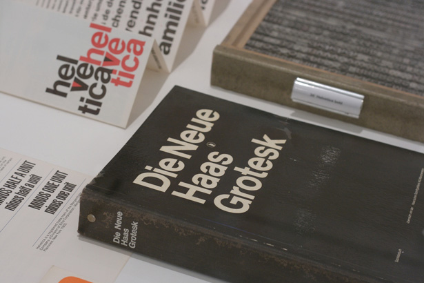
The original Helvetica brochure.
The marketing director at Stempel decided to change the name to Helvetica in 1960 to make the font more marketable internationally. Originally it was proposed that the typeface be called Helvetia (Latin for Switzerland), but the designers didn't want to name it after a country, and so it was called Helvetica instead (which is Latin for Swiss).
Helvetica Variations
There have been a number of Helvetica variations created, including a number of language variants (Cyrillic, Korean, Hindi, Japanese, Vietnamese, and Greek among them). Others variations include:
- Helvetica Light was designed at Stempel by artistic director Erich Schultz-Anker and Arthur Ritzel.
- Helvetica Compressed was designed by Matthew Carter that's similar to Helvetica Inserat, but with a few differences.
- Helvetica Textbook is an alternate design with a few different characters.
- Helvetica Rounded was developed in 1978 and includes rounded stroke terminators. It's only available in bold and black versions (including condensed and obliques), plus an outline version that wasn't available digitally.
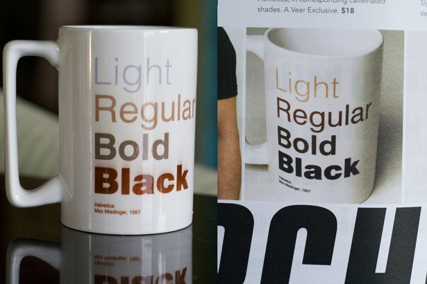
- Neue Helvetica was developed in 1983 and has more structurally unified heights and widths among its characters. It also has improved legibility, increased spacing in numbers, and heavier punctuation marks.
Rise In Popularity
Helvetica was designed in post-war Europe, and many companies were looking for a change. It was the opposite of all the kitschy, fancy, decorative typography that covered corporate materials and advertisements.
Helvetica's sleek lines and modern sensibilities were just what companies were looking for to remake their identities and set themselves apart from the past.
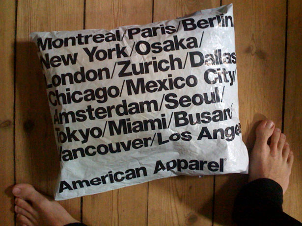
Corporations stick by Helvetica because of what they have invested in it. Because of this, it has become associated with corporate culture and business to some degree. This is one reason why American Apparel chose to use the font for their own brand identity to poke fun at corporate culture in America.
Compared to Arial
Arial is a very similar font to Helvetica, and was developed in 1982. To an untrained eye, the differences between the two fonts is almost undetectable. But there are key differences among certain characters, notably G, R, r, t, a, and 3. I Love Typography has a great comparison of how Arial and Helvetica differ.
Helvetica is somewhat more refined than Arial, even though each one has the same character width.
One of the key differences, though, is in the strokes for each character. Helvetica uses primarily vertical or horizontal strokes, while Arial often uses diagonal strokes.
If you're interested to see if you can tell the difference between Arial and Helvetica, Ironic Sans has a quiz that compares 20 popular logos originally designed with Helvetica redone in Arial and compared.
It's harder than you'd initially think, particularly if those characters mentioned above (with key differences between the two fonts) aren't present in the logos.
Technical Details of Helvetica
Technically, Helvetica is a very interesting font. There are a few things that set it apart from many other sans serif fonts, and make it unique.
- Helvetica's characters always have vertical or horizontal terminations on their strokes, never diagonal.
- Helvetica is as much about the negative space surrounding the letters than about the lines that make up the characters themselves.
- The negative space contained within the lowercase "a" closely resembles a teardrop.
- It has monotone stroke weights.
- It remains legible when in motion, one reason it's popular for signage and automaker and airline logos.
Designing with Helvetica
On of the best things about Helvetica is its neutrality. It was designed specifically not to give an impression or have any inherent meaning. And because of this, it's very adaptable to use for different design projects. That's one reason why it's been used by everyone from Post-It to American Apparel. It's also widely seen online, as it's a web-safe font on Macs.
If you're looking for a font that rides the line between classic and modern, conservative and edgy, or elegant and relaxed, Helvetica might just be your answer.
Depending on the design elements you include around it, Helvetica can be any or all of those things. Because it's a sans serif font, it does tend to sway a bit more into the modern category, but it's simple enough to fit in within a more traditional design.
Helvetica is particularly well-suited to signage and other designs where legibility is key. This is further reinforced by the wide variety of companies that have used the font in their logos or other corporate identity materials (American Apparel, American Airlines, Target, the NYC Subway, etc.).
Another of Helvetica's main advantages is that it's a very "safe" font. If you're unsure of how particular typefaces influence design, Helvetica can be a good fall-back option that will have little impact by itself.
This can be useful to designers who are just getting started or for those studying design. But just remember, because Helvetica is "safe", you're unlikely to win any awards for being edgy or daring when you use it, at least not for the typography itself.
Helvetica in the Wild
As already mentioned, Helvetica is used in graphic design and web design all over the place. Below are a few examples of Helvetica in the real world. For more examples, check out our previous post, "40 Excellent Logos Created with Helvetica".
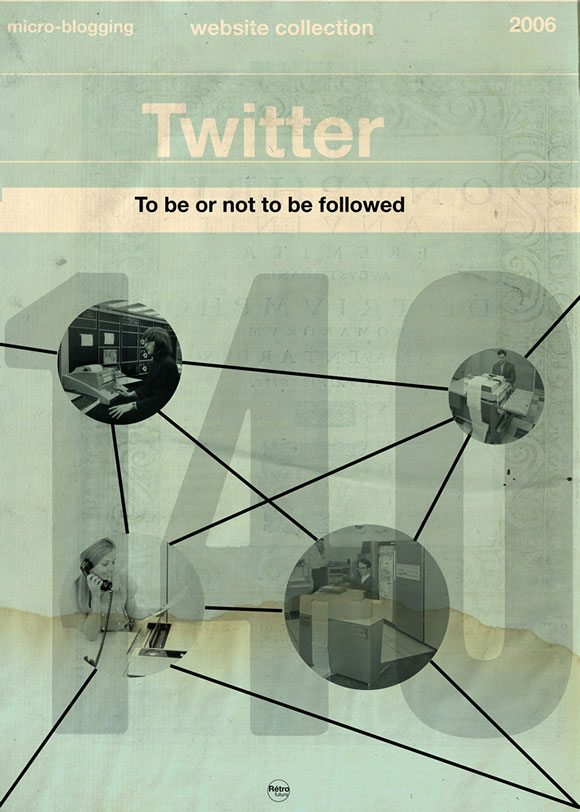
One of a series of vintage-looking covers for social media sites (available as posters).
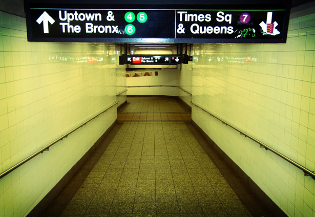
The NYC Subway system's signs and map were changed to Helvetica in the 1970s by Massimo Vignelli.
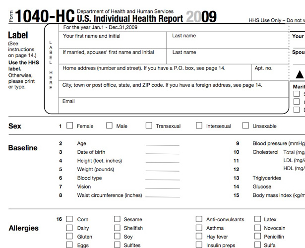
U.S. Government forms all use Helvetica.
Helvetica looks neutral yet refined when cut from copper (just ignore the Comic Sans flyer below).

The "Love Happens" cover is in Helvetica; the other is (probably) in Arial.

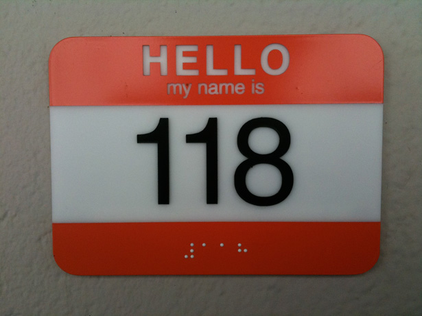
Helvetica is neutral enough that it works even on signs that would normally use a more traditional font.
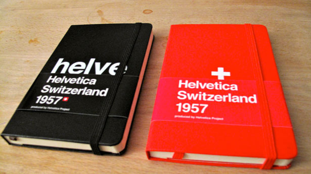
The commemorative Moleskine notebooks created for Helvetica.

Helvetica Light.
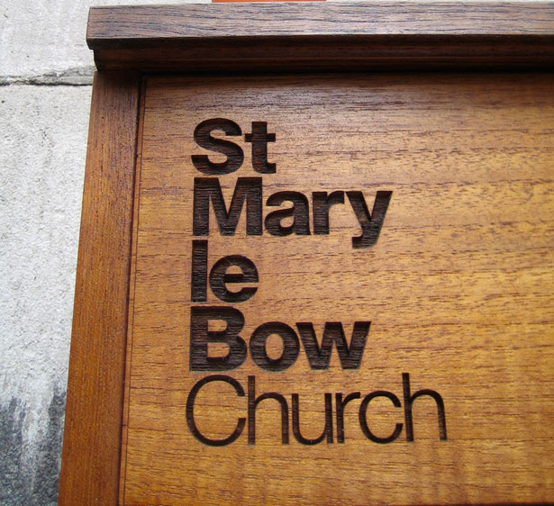
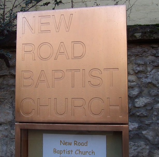
Another church sign in Helvetica.

Target has one of the more recognizable Helvetica logos.
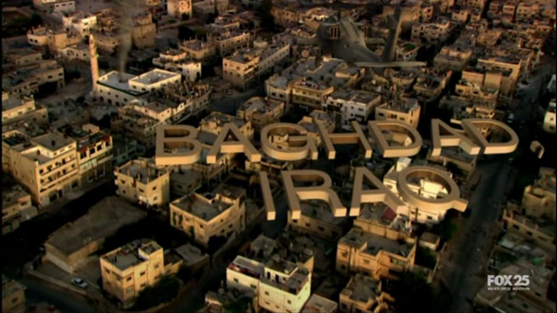
Fox's TV show "Fringe" uses Helvetica on their on-screen titles. It remains legible even at odd angles.
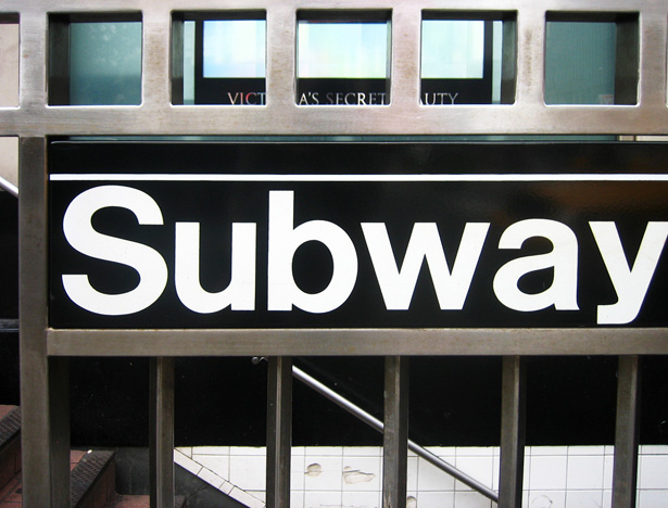
Another image from the NYC Subway.
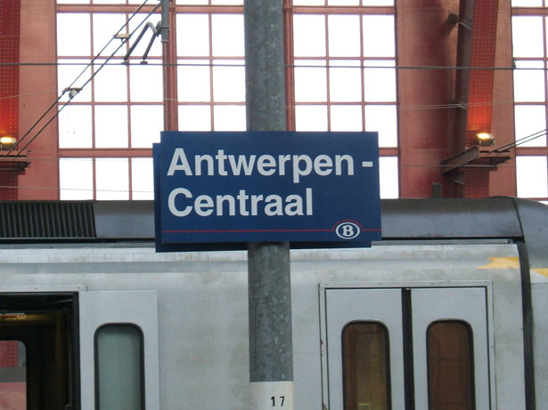
NYC is not the only city to use Helvetica for transportation signs.
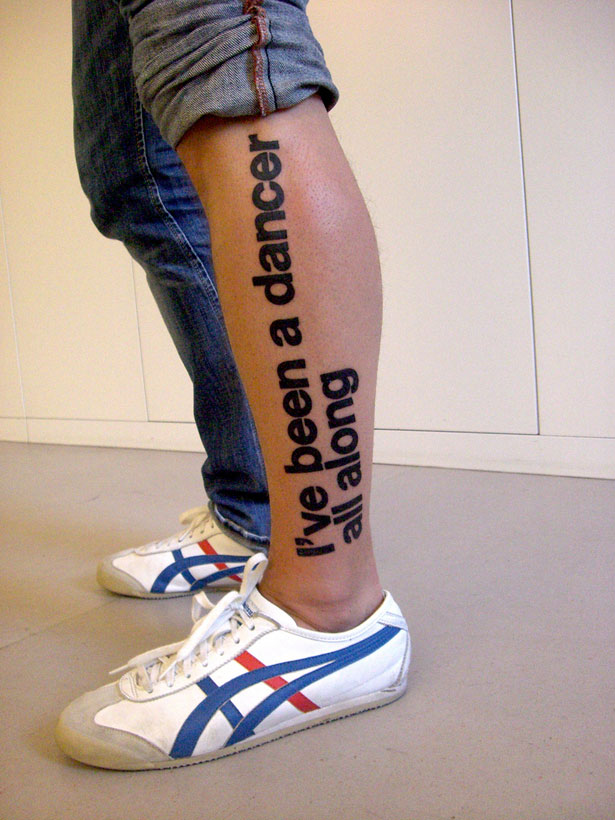
A tattoo in Helvetica.

A very early advertisement using Helvetica, dating to 1959.
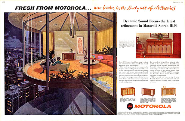
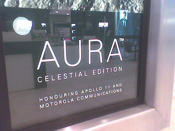
Another vintage advertisement; the Motorola logo was in Helvetica, along with the headline.
Further Resources
- Helvetica and Alternatives to Helvetica - A comparison from The FontFeed of Helvetica and similar fonts.
- For Logo Power, Try Helvetica - An article from BusinessWeek on Helvetica logos.
- Swiss Legacy - Swiss Legacy has an entire category dedicated to designs using Helvetica.
- Helvetica at 50 - A great article from BBC News on the 50th anniversary of Helvetica.
Image credit: iPhone Helvetica Wallpaper (used in the article intro)
Written exclusively for WDD by Cameron Chapman.
Do you use Helvetica in your designs? Why or why not?
WDD Staff


Read Next

3 Essential Design Trends, May 2024

How to Write World-Beating Web Content

20 Best New Websites, April 2024

Exciting New Tools for Designers, April 2024

How Web Designers Can Stay Relevant in the Age of AI

14 Top UX Tools for Designers in 2024

What Negative Effects Does a Bad Website Design Have On My Business?

10+ Best Resources & Tools for Web Designers (2024 update)

3 Essential Design Trends, April 2024

How to Plan Your First Successful Website

15 Best New Fonts, March 2024
