Happy Cog's Redesign of VisitPhilly.com: <br/>An Exemplary Modern Website
 In January, Jason Santa Maria sent out a tweet announcing that visitphilly.com had been redesigned by world-renowned design studio Happy Cog. My interest was piqued, and I couldn't help but take a look.
I can honestly say that I've never been more impressed with a website redesign than I was with this one.
That Happy Cog was able to turn such a large website into a beautiful, accessible, functional and inviting user experience testifies to the talent of the team at Happy Cog.
By no means am I in a position to offer a critique that does justice to the planning, design and development that must have gone into this project.
But I thought it would be useful to point out why this redesign epitomizes a beautiful and effective website design for today's market.
A Clear Purpose
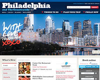
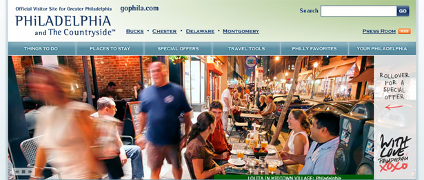
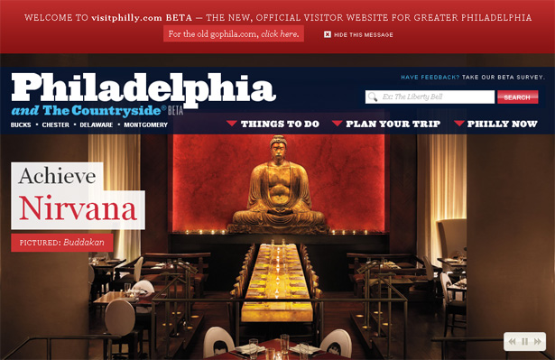
The domain name, eye-catching logo, clear drop-down menus, beautiful photography: all of this and more play key roles in communicating the website's distinct purpose (to encourage users to visit the city of Philadelphia) and in inviting users to explore via the website what is (rather surprisingly) a beautiful American city.
The first navigation items that the user notices are the mega drop-down menu links and the large text links that overlay the main rotating image.
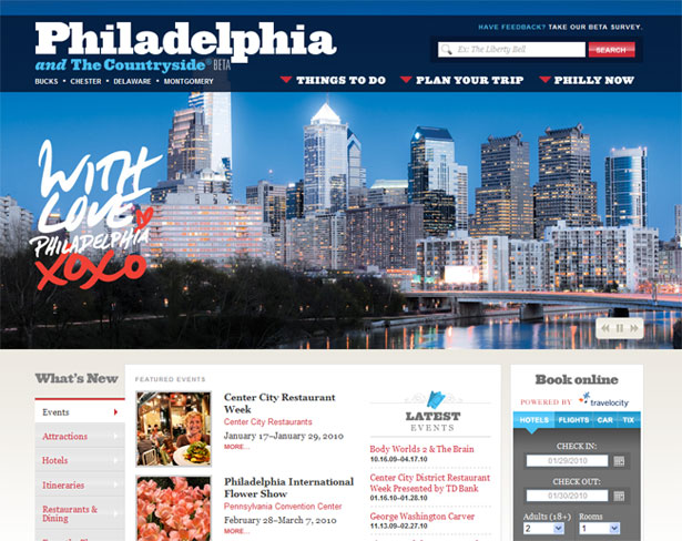
The screenshot below highlights these links, namely "Things to Do" (which is shown active), "Plan Your Trip," "Philly Now" and the image overlay "Power Lunch."

These items were obviously meant to be noticed immediately. In the shot below, I've mapped the most likely eye path of a user scanning the home page.
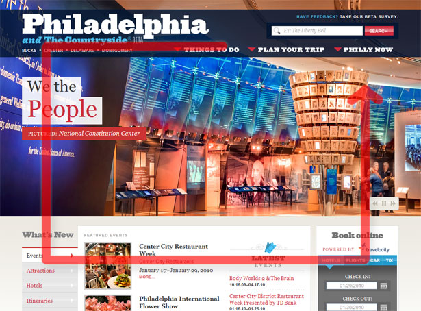
After noting (and possibly exploring) one or more of the drop-down menus, the user would scan the text related to the active image, and then naturally move down to the section labeled "What's New," finally coming back almost full circle to the header near the search box.
The content is organized so that the user can take an informative and visually memorable trek across the most important sections of the page in a matter of seconds.
The user would not likely be delayed, confused or overwhelmed, despite so much content being available to explore.
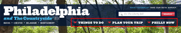
A Minimum of Primary Links
As mentioned, one of the most prominent areas is the drop-down menu. The decision to stick to a minimum number of primary links here is the right one.
Having only three links allows the items to be displayed in a larger font, thus holding the user's attention and demonstrating the website's focused structure.
The minimal navigation bar is one of the major changes in the redesign and brings great benefits. Compare it to the header section in the old design, which is not as focused:
Although the old header is not poorly designed or unusable, it is not as focused and not nearly as beautiful as the new one. Another weakness is the lack of drop-down menu indicators, which on the new website are clear and attractive.
When a user arrives at a website such as this one (often through a Google search), more often than not they will want to do one of two things: see what the city of Philadelphia has to offer or plan their trip.
The stripped-down navigation in the header helps the user accomplish these goals quickly and efficiently.
Beautiful Typography
Would we expect anything less from Happy Cog? I absolutely love the font used for the "Philadelphia and the Countryside" logo.
It has a subtly western feel but is still modern and dignified. To keep the branding consistent, the font is reused for many headings throughout the website, some of which are highlighted in the screenshot below.
Most of the text on the rest of the website is in Georgia font, with the occasional use of Arial, but done quite elegantly. The website's diverse mix of headings, body copy, captions and other descriptive elements is extremely readable and tastefully presented.
Despite the amount of content, even on internal pages, the user rarely if ever feels overwhelmed, unlike the experience on the old website.
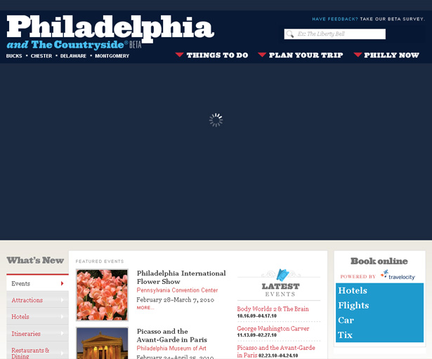
Increased Performance and Perceived Speed
A website with so much content and so many images inevitably takes a hit in performance. The developers were conscious of this and took great care to ensure that any delayed-loading content would not be distracting or cause visitors to give up and look to another Pennsylvanian city.
As shown below, when the user visits the home page, the last item to load is one of the most important elements in the new layout: the main rotating image. But the actual slowness is mitigated by the content-loading indicator (the spinning animated graphic):
This usability enhancement is not restricted to large images either. Because of the diversity of content in the drop-down menus, a similar content-loading graphic is displayed as the menu content loads via Ajax:
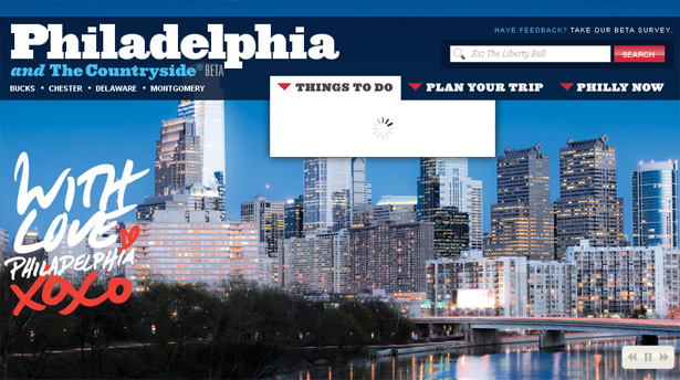
For this menu, the enhancement is imperative, because drop-down menus are normally not delayed when triggered.
No loading indicator would have caused confusion, possibly making the user mouse away and then mouse back, wondering why the functionality is stuck.
So, although the page does not actually load any faster, the perceived speed is increased. This is a lesson to all designers and developers to think not only of actual speed but of perceived speed.
User-Oriented Features
One of the most important features of the new website is the way the transition to the new design has been done, which ensures that returning visitors are not shocked by the drastic changes.
When you first visit the website, you notice a large red banner at the top of the page, informing you that the website has been redesigned and is still in beta. You are given the option to browse the website using the old interface.
Giving visitors who are accustomed to the old layout and structure the option to go back to it is critical, because it ensures they don't become frustrated trying to find familiar content.
On such a large website, especially one redesigned by a company known for its user-focused designs, such major architectural changes and enhancements are bound to throw off visitors who were used to the old style.
The message in the red banner, then, prevents any confusion or frustration on the part of visitors.
I didn't spend a lot of time comparing the old website to the new one, so I can't confirm how similar the contents and architectures are, but because we are given the option to visit the old website, the contents must be similar enough if we are able to access current events and other regularly updated items in both versions.
One common element is the link that appears above the search box, soliciting feedback on the new design by inviting users to fill out a "beta survey." This feature shows that the owners are concerned about how users experience and perceive the website.

Fully Accessible Content
Many of the members of the Happy Cog team are well known online for their advocacy of web standards and accessible content, so it's no surprise that this website is fully accessible to virtually any user on any platform.
With JavaScript disabled, the user's experience of the website is very similar, even though many enhancements are no longer available.
The CSS text-indent property is used to replace the text in the headings with images showing the custom font. This ensures that the pages stay semantic, SEO-friendly and visible to all users.
The image below shows a heading on an internal page, on the left with the style disabled, on the right with it enabled.
We can see how the headings are enhanced by images without losing their semantic value and without the designers resorting to unnecessarily complex font-replacement methods.
Another key accessibility feature is how the JavaScript enhancements are implemented. The home page has two tabbed content switchers, one called "Book Online," and the other connecting to visitphilly.com's social networks:
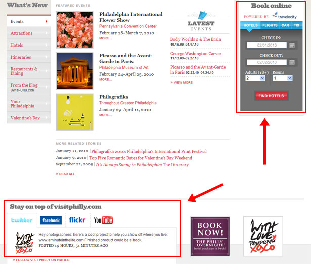
When JavaScript is disabled, all of the content in both tabbed boxes is displayed. Many websites with tabbed widgets display only one of the boxes when JavaScript is disabled, but that is generally not best practice.
This technique is used consistently throughout the website for a number of features, ensuring that the behavioural layer (i.e. the Ajax and JavaScript) is an enhancement, not a necessity.
This makes the content accessible not only to users who are browsing without JavaScript but to search engine spiders such as Googlebot.
Any Weaknesses in the Design?
Again, I am in no position to fairly critique a design done by a company such as Happy Cog. But I will point out (cautiously) two minor weaknesses in the new design and structure.
First, I find the wording of the third link in the primary navigation menu a bit vague ("Philly Now").
I didn't know right away what that meant. I had assumed it meant current events, but it's apparently a combination of events, weather and current photos. I'm still uncertain how to describe it, and I get the feeling the link will rarely be clicked.
The other weakness is the right-pointing triangles in the secondary navigation menu on internal pages:
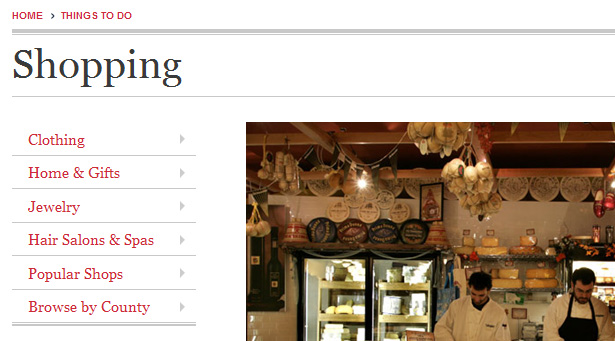
I assumed that those triangles indicated fly-out menus, but there are no fly-outs. The triangles are just pointers to draw the user's attention to the content area. Right-pointing triangles are best reserved for standalone links and fly-out menus, not vertical navigation such as this.
We find the same thing on the home page, but it's not as bad there because the arrows are part of a JavaScript-driven content switcher.
Neither of these "weaknesses" harms the user experience much. And the fact that I can find only two weaknesses shows how great a redesign this really is.
Worthy of Examination and Imitation
Much more could be said about the effectiveness of the design and the code of visitphilly.com, beyond the scope of this article.
In addition to what we've discussed here, I could point out the valid and well-commented code, the effective use of white space, the visual hierarchy, the excellent color choices, the virtually identical experience in IE6 and more.
I hope this analysis gives a decent overview of some of the key features of this new design and how it epitomizes modern web design in the industry.
Further Reading
- Greater Philadelphia Tourism Marketing Corp. launches brand new visitphilly.com
- Happy Cog Studios Portfolio
- Happy Cog's Review of VisitPhilly
This post was written exclusively for Webdesigner Depot by Louis Lazaris, a freelance writer and web developer. Louis runs Impressive Webs where he posts articles and tutorials on web design. You can follow Louis on Twitter or get in touch with him through his website.
Do you like the new visitphilly.com? Do any other features of the design, layout or architecture improve the user experience? Please offer your comments below.
WDD Staff


Read Next

3 Essential Design Trends, May 2024

How to Write World-Beating Web Content

20 Best New Websites, April 2024

Exciting New Tools for Designers, April 2024

How Web Designers Can Stay Relevant in the Age of AI

14 Top UX Tools for Designers in 2024

What Negative Effects Does a Bad Website Design Have On My Business?

10+ Best Resources & Tools for Web Designers (2024 update)

3 Essential Design Trends, April 2024

How to Plan Your First Successful Website

15 Best New Fonts, March 2024
