 Purists will say that great design is timeless. Yes, in an ideal world, we should ignore trends.
Pragmatically speaking, though, there is a lot of value in monitoring and incorporating design trends, especially with regard to websites.
Let's face it: the web changes at a rapid pace. Unlike in other media, design trends on the web are not just driven by aesthetics.
Technology is changing that can drastically alter the capabilities of the medium.
In 2010, we're seeing designers continuing to push the boundaries of web design, setting the following clear trends...
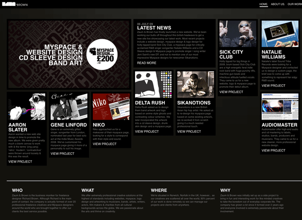
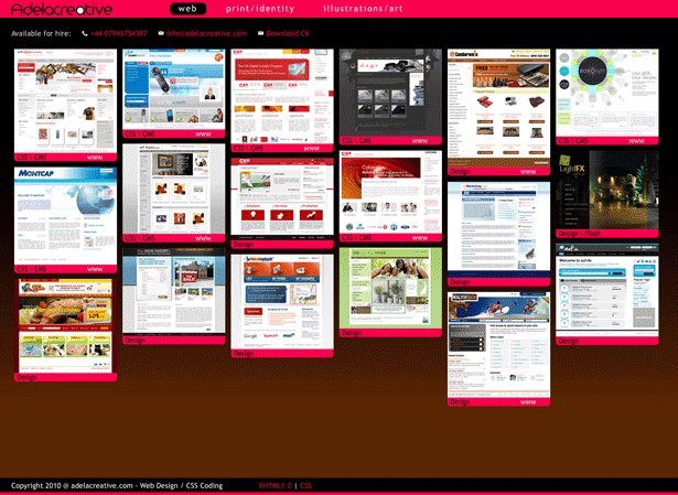
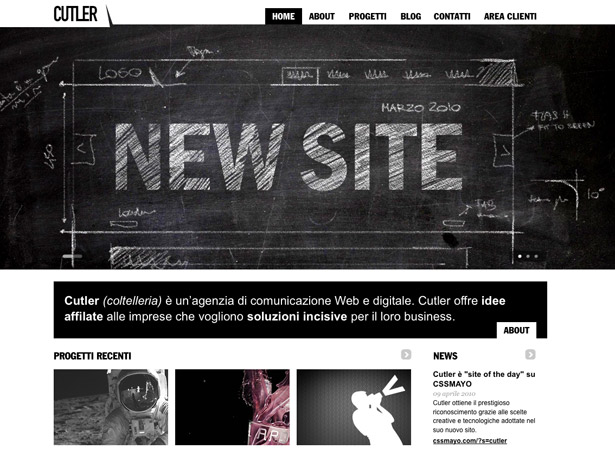
Print Design
Print design has always been a source of inspiration for the web. Web design has been around long enough now to cultivate a strong core of designers who have never worked in print. As a result, we are seeing more inspiration drawn from print, as these designers look beyond the web.
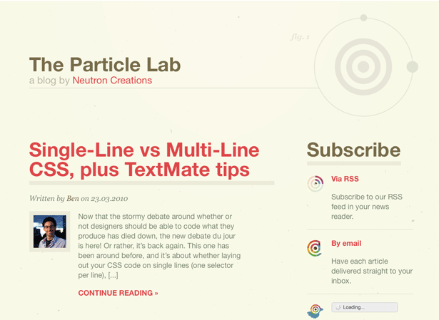
Serif Fonts
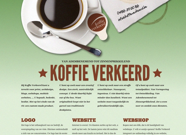
One of the most important issues of typography is legibility. Print designers have always favored serif fonts because the edges improve visibility and make letterforms easier to recognize.
Sans-serif fonts have generally been considered easier to read on the screen. But with more users browsing at high resolution and the improvements in font-smoothing technology, serif fonts have become very legible for body text.
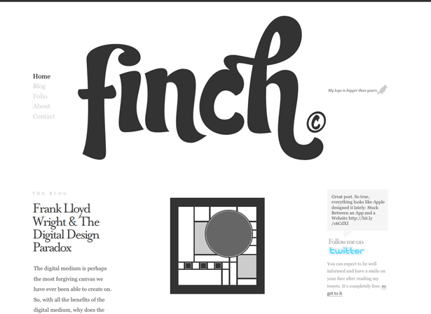
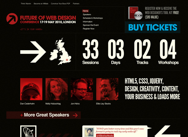
Big Headings
Print designers have been using big headings to grab attention for ages. Print material has had to be high impact if it was expected to be read at all. If you saw a dull brochure sitting on a desk, would you bother to pick it up? Probably not.
This trend started in 2009 and has only grown in popularity. Large headings have been proven to grab attention and communicate clearly.
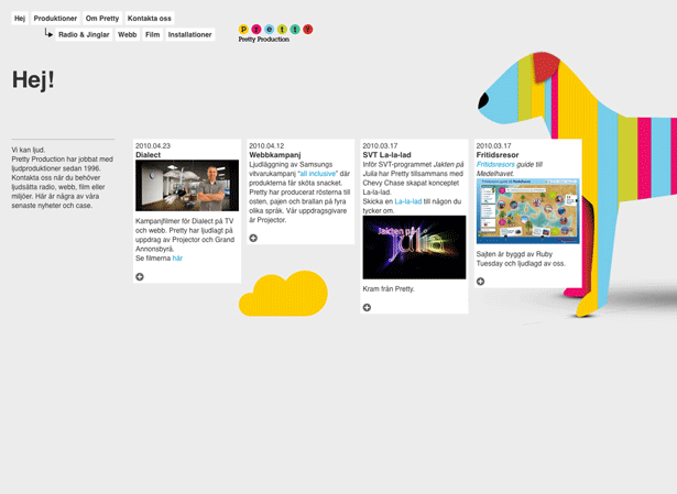
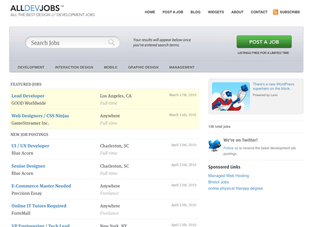
Multi-Column Layouts
Designers have to work within the constraints of their medium. Unlike the web, print offers no option for scrolling, being bound as it is by the dimensions of the paper. Using several columns allows you to fit more content in the same space.
Now, with increased screen resolutions and the advent of grid layouts, more designers are adapting this method to the web to make websites easier to use and to fit in more content.
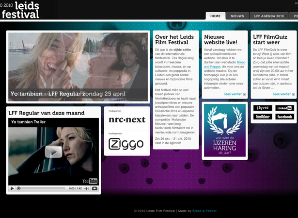
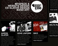
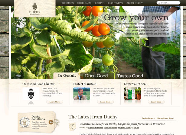
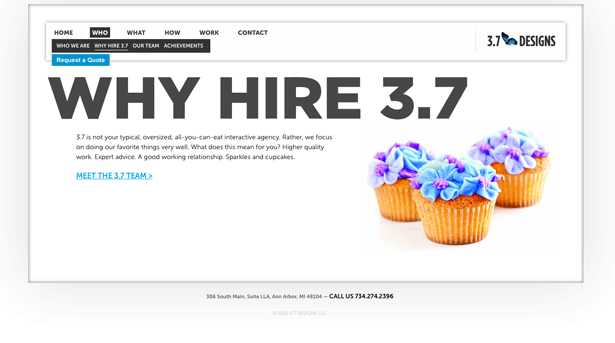
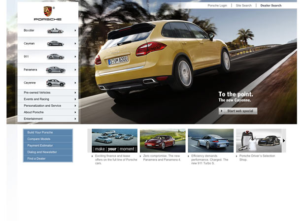
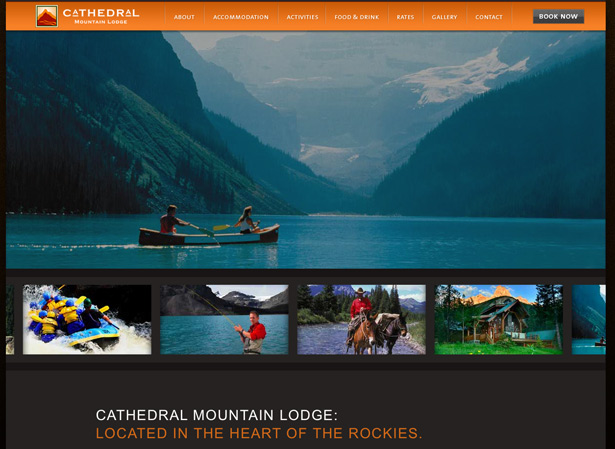
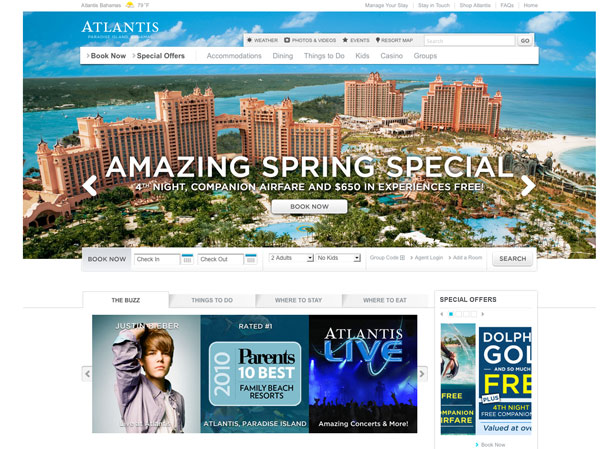
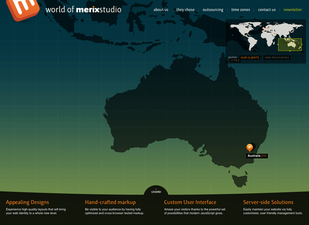
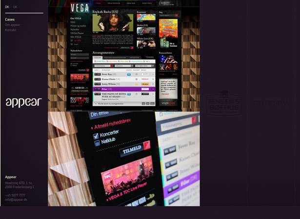
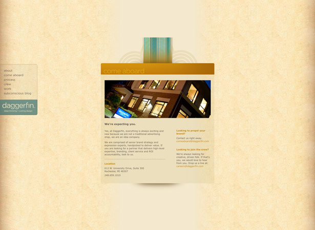
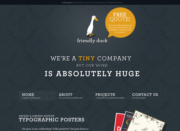
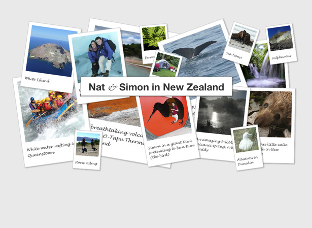
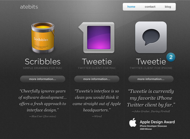
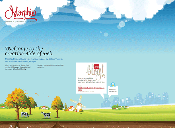
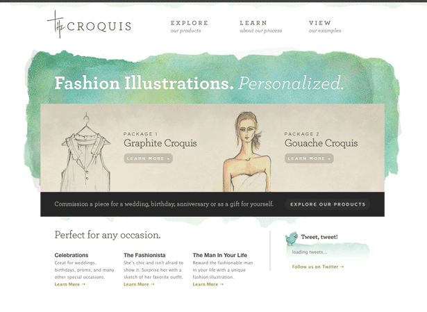
Big Lead Image
A picture is worth a thousand words. While it may be a while before a photograph has the same impact on the web as it does in print (which has much higher resolution), the adoption of broadband access has made big photographs more feasible.
We are seeing more websites use large, high-impact images to draw users in and create an immersive experience.
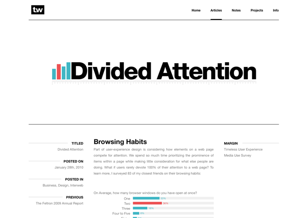
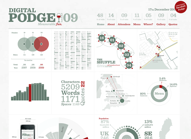
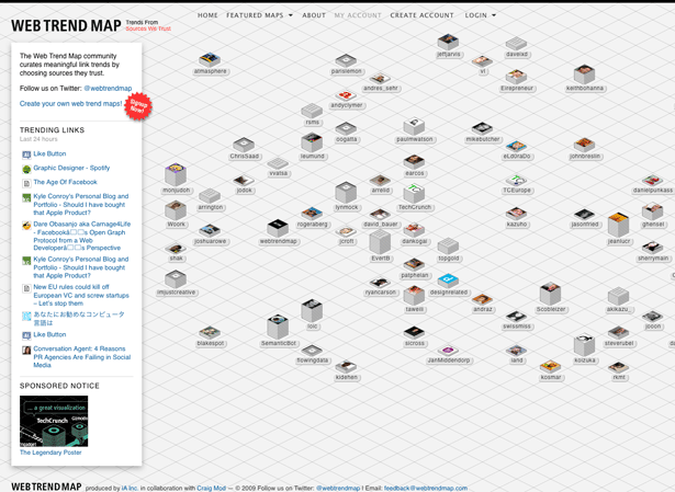
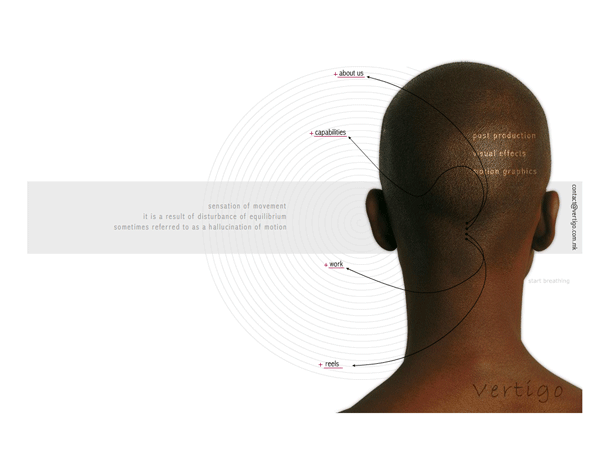
Diagrams and Infographics
Print designers have been using graphics to convey complex information for years. This is seen most commonly in magazines and annual reports.
Graphics can communicate complex relationships and ratios in a way that is too difficult to do with plain text. Infographics tend to have a simple yet visually rich appearance, and more designers are adopting infographics or mimicking the style in their designs.
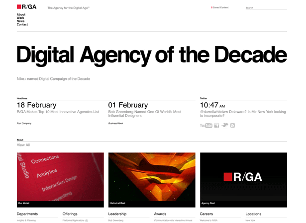
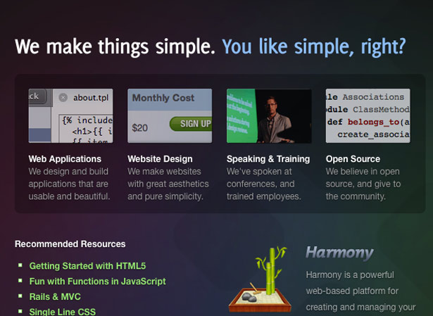
Simplicity
Antoine de Saint-Exupery once said, "Perfection is achieved not when there is nothing more to add but when there is nothing left to take away." The advantages of simplicity in design are many.
Hick's Law tells us that the time required to make a decision increases with every option. Additionally, the signal-to-noise theory tells us that anything that doesn't add to the message or function of a website (the signal) gets in the way and makes the design less effective (the noise).
Simple designs are easier to use and understand, and they allow for greater clarity in communicating messages.
Minimalist and Grid Design
Minimalism is powerful yet difficult to master. It contains nothing but the essentials. Everything else is removed, resulting in maximum impact of the elements that are present.
Minimalist designs require a strong grid system to be effective. Naturally, they will have plenty of white space, and so without that grid, a minimalist design would feel disconnected and sloppy. The grid gives it organization and structure.
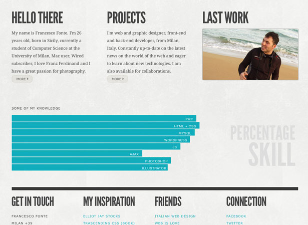
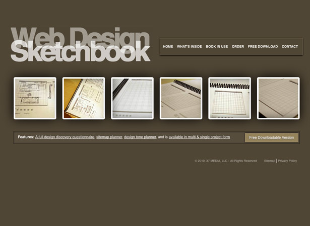
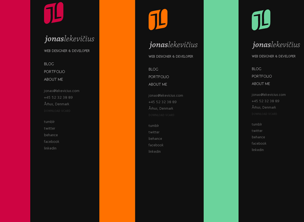
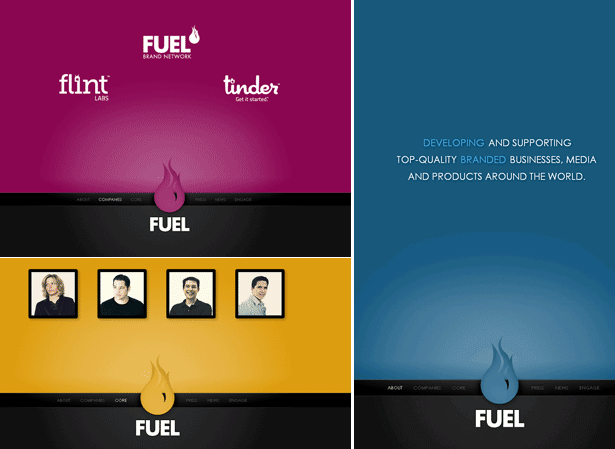
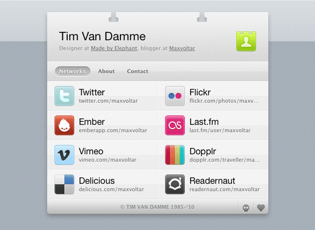
One-Page Layouts
There are several ways to simplify. A one-page layout exhibits two of these ways: hiding and removing.
Effective one-page layouts hide any elements that are not a priority. If a user wants to see one of those elements, they can click to uncover it. This is much more effective than leaving everything visible, which would make the page complicated and overwhelming.
Likewise, the principle behind one-page layouts makes additional pages unnecessary. With the availability of powerful JavaScript libraries and faster connections, many websites now have little need for several pages. Designers can easily fit information on one page, without bothering the user with a hierarchy.
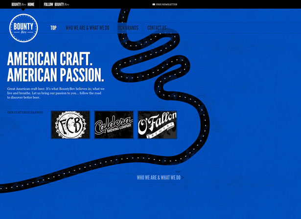
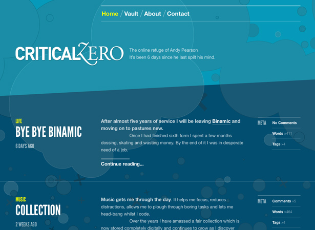
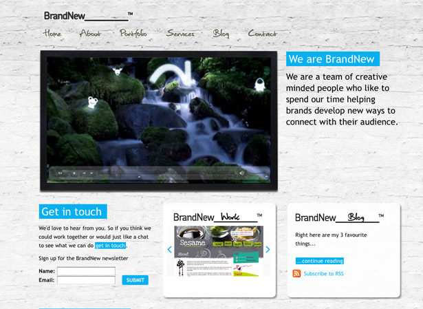
Massive White Space
In the early days of web design, we didn't have much screen real estate to work with, and so we didn't show much white space. If you've ever tried to design a website for a 640x480 resolution, you'll know exactly what I'm talking about.
Now that we have higher resolutions and the ability to hide and reveal elements with JavaScript, harnessing white space is much easier.
White space is critical to good design. It gives the eye a place to rest. It naturally improves the quality of a design. And it shows which elements are related to each other by way of proximity.
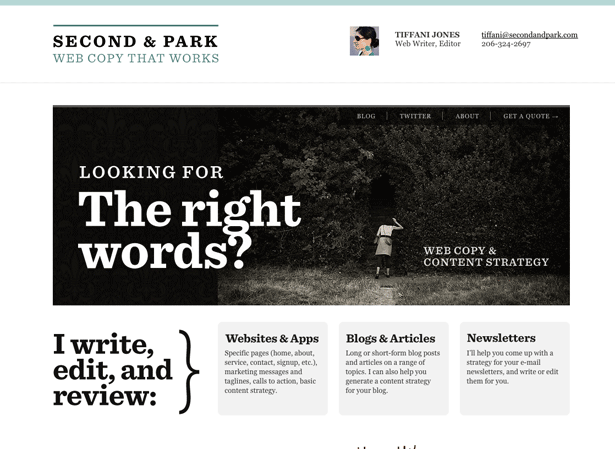
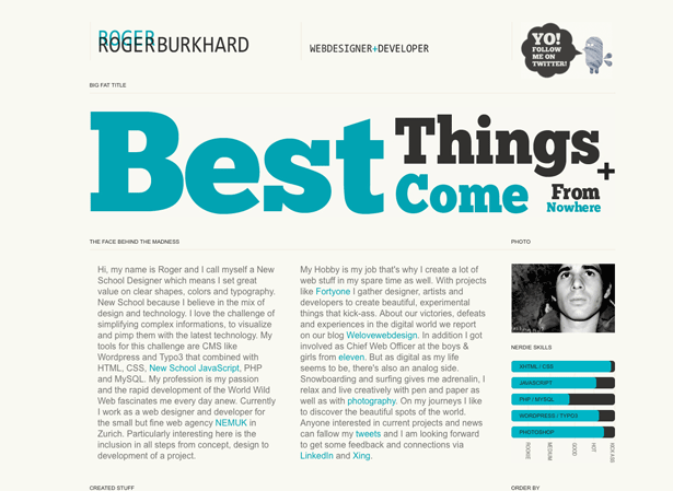
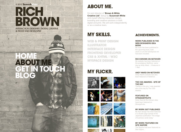
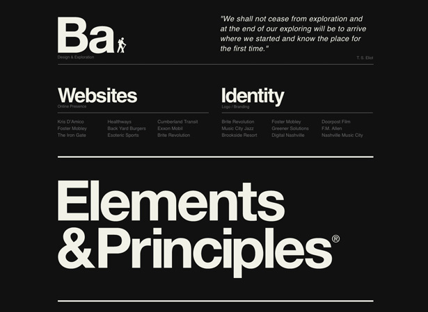
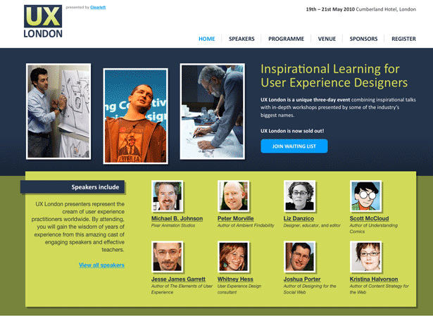
Typographic Layouts
Whereas we used to be confined to a few select "web-safe fonts" with very little control over how they were displayed, we now have a wide range of tools to enrich our typography.
Web designers have long enjoyed using type as a subtle tool to communicate messages. With increasing control and capabilities, we're seeing more designers focus on typography as the primary design element.
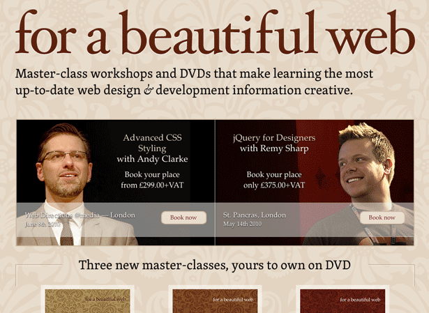
CSS3 Techniques
Not sure you can take advantage of CSS3 yet? Think again. Web pioneers such as Andy Clarke and Jeremy Keith have long preached about "progressive enhancement" in web design.
Progressive enhancement is about designing websites so that they are usable on older browsers, while being "enhanced" for users who commit to the latest technology.
Designing in this camp lets you take advantage of CSS3 properties such as rounded corners, border backgrounds and text and box shadows. Users on modern browsers will see the nicer version, and those on older technology (cough ¦ IE6 ¦ cough) will see the basic version.
CSS3 Animation
Animation on the web has gone through many stages. Initially, we could only animate with GIF image files. Then, we were pretty much limited to Flash. Now, we can select from Flash, Silverlight, GIF, JavaScript and even CSS3. Subtle animation can be memorable, and CSS3 makes it lightweight and easy.
Rounded Corners
The Web 2.0 style of 2005 and 2006 made rounded corners popular, to the point of being annoying. At the time, creating them was difficult. There was no set way to create truly rounded corners. Instead they were simulated with CSS, JavaScript hacks and image files.
CSS3 now allows us to generate rounded corners directly in the browser, making them not only easier to create but also much more efficient, because the user doesn't have to download additional images or JavaScript files.
Designers are increasingly taking advantage of this new browser capability in 2010.
Box and Text Shadows
Using shadows to create a sense of depth has been done (and sometimes overdone) since the earliest days of the web. But it was not always practical. To add shadows to text, you had to use images, which increased loading time and made maintenance more difficult. Box shadows required several images and CSS tricks like "sliding doors."
CSS3 has highly customizable shadow capabilities, which allow for a wide range of creative effects, including not only drop shadows but inner shadows, too. Creative designers have already been using these CSS3 effects to simulate both embossed and imprinted effects.
RGBa and Opacity
For years, working with opacity and transparency on the web was near impossible. You had three choices: simulate transparency using flat images, deal with PNG's cross-browser incompatibilities, or struggle with CSS' basic transparency selectors and filters.
CSS3 gives designers much better consistency and freedom in using opacity with the RGBa property. While you can take advantage of transparency in countless ways, one area that it has helped particularly is with complex backgrounds overlaid with semi-transparent colors. Previously, this effect was impractical or impossible to create without resorting to complex PNG images.
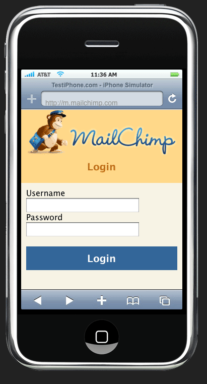
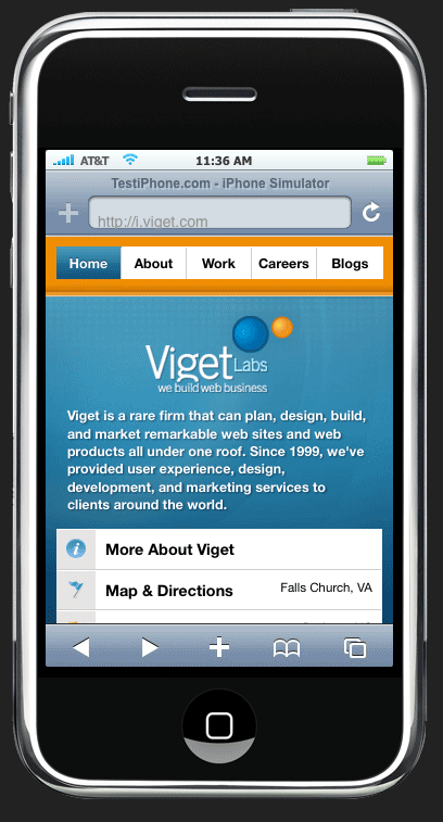
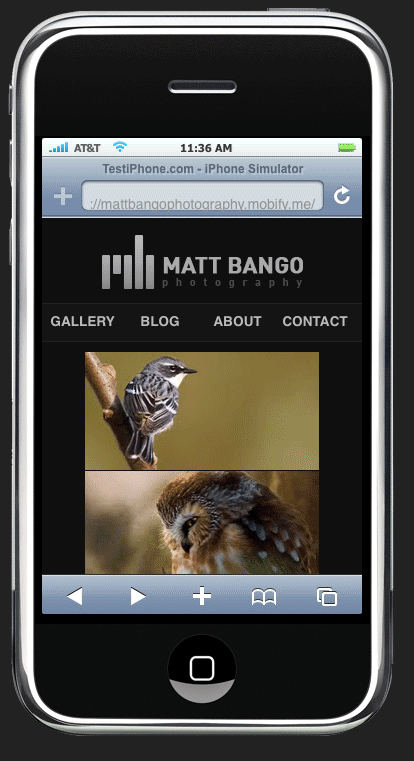
Mobile-Compatible Design
The mobile web has given millions of users the ability to check their bank account while waiting in line, look up the latest scores on the subway and update their Twitter status while driving. (Which one of these is a dangerous habit?) And the mobile web continues to grow rapidly.
We have gotten to the point that every company has to consider whether their website will be used on the go, and if so how. Innovative companies have already invested heavily in useful and user-friendly mobile versions of their websites.
Creativity
The explosive growth in use of social media is proof that people want to connect and share things they are passionate about.
In the design field, we have seen large growth in the sharing and browsing of other people's work. As designers, we are now bombarded by everyone else's creativity. Not only does this raise the standard of quality of design, but it encourages ideas to be shared, which contributes to a culture of creativity and innovation.
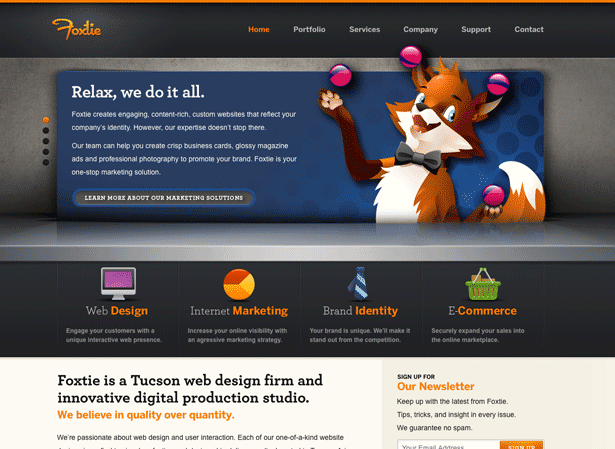
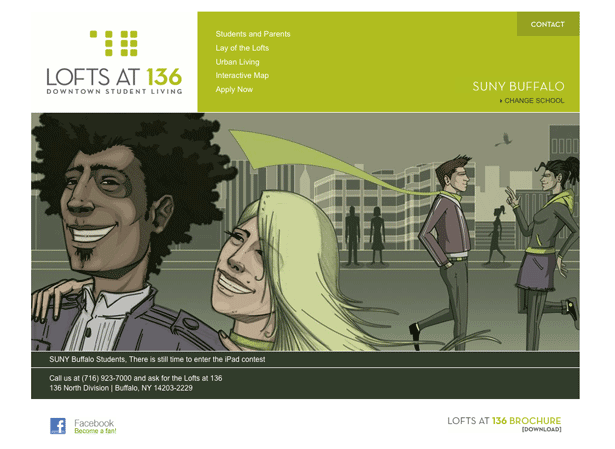
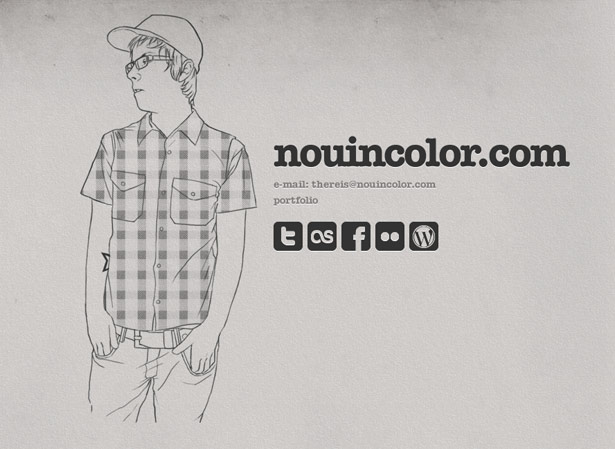
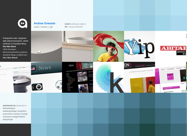
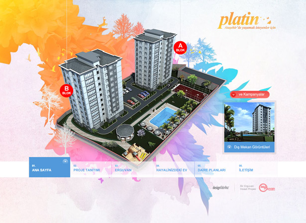
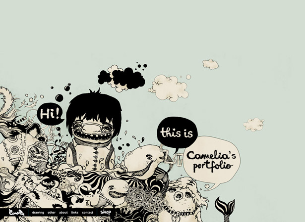
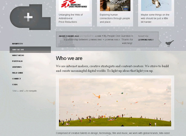
Clean Illustrations
If you're like me, you grew up watching Disney movies, admiring all the effort that went into creating each frame of animation. We are well past the days when illustration was done in ink and markers, and this evolution in tools has led to some very creative approaches to design.
Many designers are learning that smooth, clean, crisp illustrations create a distinctive feel that can't be replicated by photography or simple clip art. The result is a wide range of professionally illustrated designs that are engaging and inviting.
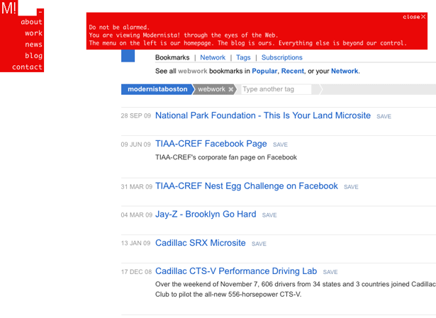
Textured Backgrounds
Textured backgrounds are nothing new on the web. But this technique has seen an interesting variation in the last few months. I refer to it as "micro-textures"which are subtle, barely noticeable textures in the background.
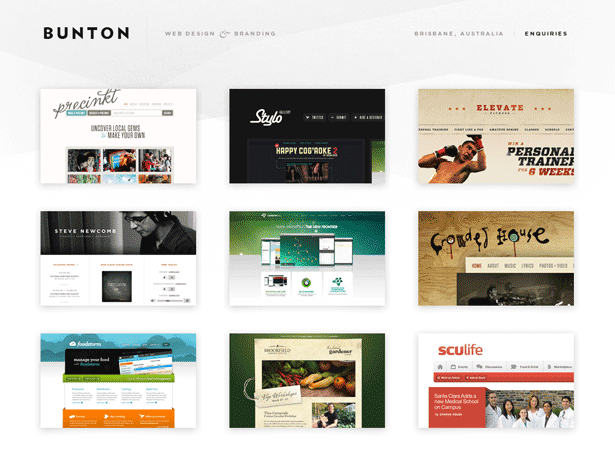
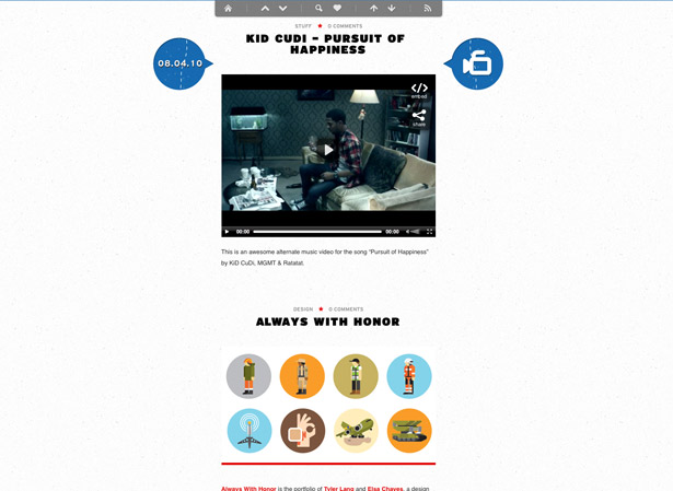
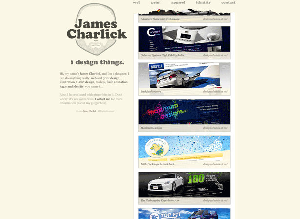
Thumbnails
You may be saying, "Thumbnails have been around since the dawn of the web. How is this a trend?" True, they have always been used, but only very simply. You would have a thumbnail that you could click on to get a bigger image. It did the job but was boring.
In the last few months, designers have started asking, "How can we make thumbnails more exciting?" This has led to an upswing in thumbnails that are both clever and usable.
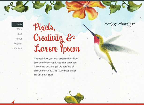
Watercolor
As the web evolves, we are seeing more designers being inspired by a variety of sources and media. No surprise that the fine arts are among these sources.
One of the styles that has emerged is the simulation of watercolors. The soft elegant look of this style is distinct and calming.
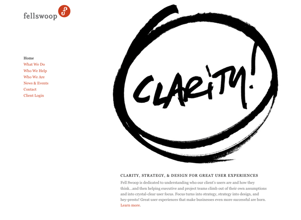
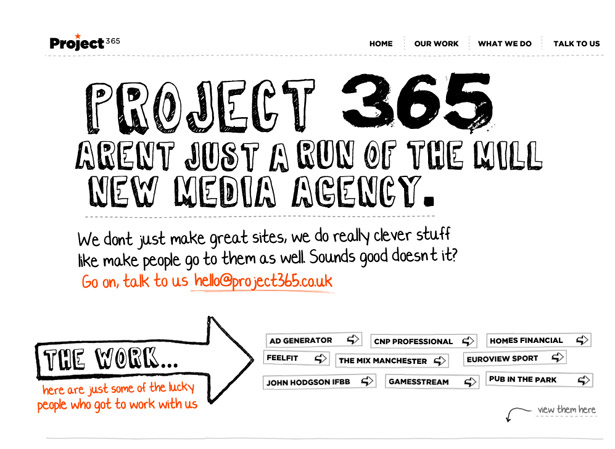
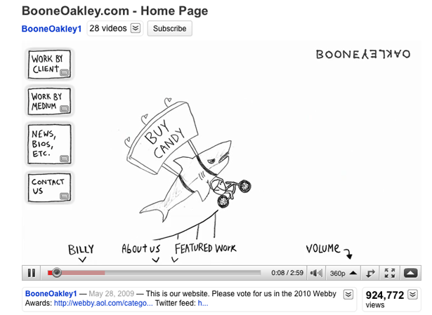
Handwriting
Handwritten and script fonts are abused the most. For this reason, many designers steer clear of both types either out of disgust or because of a fear of looking amateurish. But lately, many designers have found that, when used properly, the handwritten style conveys a sense of craft and planning. Used in the right context, it is a powerful way to communicate.
Social Media
With people spending more time on Facebook than Google now, no wonder designers are looking for innovative ways to integrate social media on their websites.
Some designers have gone so far as to publish their content on social media networks and then use their websites to aggregate it.
It is safe to say that as 2010 progresses, we will see more designers find creative ways to integrate social media onto their websites in order to better engage users.
Fixed Elements
Now that browsers better support the position: fixed element, we are seeing cleverer uses of it.
There are plenty of situations in which a fixed element (such as persistent navigation) could serve the owner's business objectives and make the website more usable.
Fixed elements are memorable and enhance the user experience. They have countless creative uses, and we will continue to see designers take advantage of them.
This guest post is a collaboration between the good folks at Web Hosting Search and designer and developer Ross Johnson. Check out Web Hosting Search for proper web hosting and 3point7designs for more web design awesomeness by Ross
Which of these trends do you follow most? What are some other emerging trends?
WDD Staff


Read Next

3 Essential Design Trends, May 2024

How to Write World-Beating Web Content

20 Best New Websites, April 2024

Exciting New Tools for Designers, April 2024

How Web Designers Can Stay Relevant in the Age of AI

14 Top UX Tools for Designers in 2024

What Negative Effects Does a Bad Website Design Have On My Business?

10+ Best Resources & Tools for Web Designers (2024 update)

3 Essential Design Trends, April 2024

How to Plan Your First Successful Website

15 Best New Fonts, March 2024
