 It's always so interesting when you go to a website you've been visiting for months or years to find they've been redesigned.
Some redesigns are immediately evocative of the old design, and can even leave you wondering if they have, in fact, been redesigned, or just done a little revamping. Others are so complete you have to double-check and make sure you've landed on the right website.
Remember that keeping some elements consistent from your old design to your new one can aid visitors in knowing they've arrived at the right place. Otherwise, they might assume your company has been bought out or closed and the domain has been taken over by someone else.
Below are thirteen awesome redesigns from the past year or so... Each one also has some in-depth analysis of what's been changed and what hasn't, and the effect that they may have on the site's visitors.

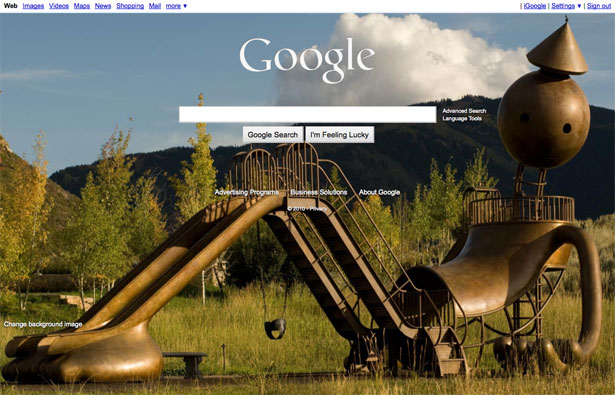
Google has rarely made design changes to their website (with the exception of their iGoogle personalized home page). But this month they've given users the option to use a custom background image.
Users can choose from a variety of images, including their own Picasa images. Another big change with this new design is the logo: it now appears in white rather than the multi-color version we're all so familiar with.
Google has kept everything else about the page pretty much the same, though. The links across the top are the same, the layout is identical (other than the "Change background image" link in the bottom left), and the language used on the page is unchanged. This gives visitors a sense of continuity with the new background designs.
One question begs to be asked, though: is the new Google background image option a response to the design of Microsoft's Bing search engine (which uses scenic background images, similar to the one shown in Google's new design)?
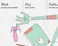
N.Design Studio
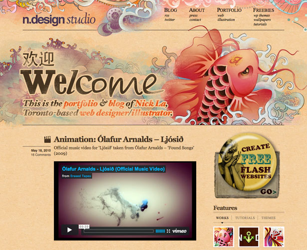
N.Design Studio has always had incredibly artistic, eye-catching designs for their website and blog. The multi-colored phoenix in their last design has been featured in countless web design posts and design galleries. And no wonder: it's beautiful. But it seems like everyone has seen it at least a dozen times, whether they frequent the N.Design site or not.
So Nick La made some updates, this time with an illustrated Koi fish and textured background. Even the logo is different.
For a design site, this kind of massive redesign can work well, showing off a designer's evolution and new talents. With non-design websites, though, keeping at least some elements similar or identical keeps returning visitors from wondering whether they've landed on the wrong site (or wondering if the site they've come to trust has been bought out or replaced by someone else).
Veerle's Blog 3.0
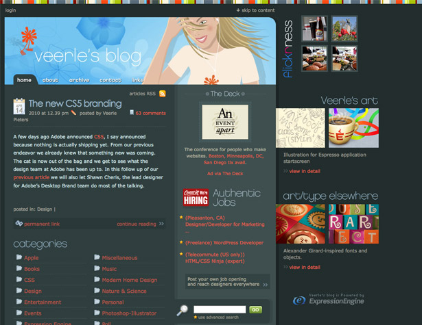
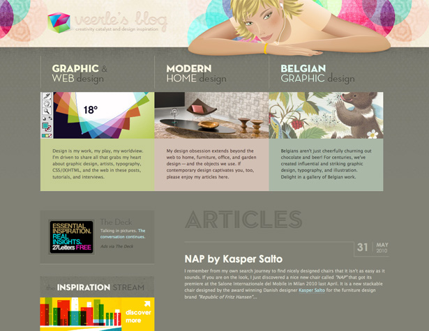
Veerle's Blog has undergone a massive redesign, with a new color scheme, typography and layout.
The new design is softer and a bit more elegant than the old design. Especially interesting is the new categorization of posts: Graphic & Web Design, Modern Home Design, and Belgian Graphic Design. The old design had a lot more categories, along with a more cluttered look.
The illustration in the header is different from one design to the next, but if you look closely you'll see it's the same woman, just with an updated haircut. This lends consistency between the new version and the old one, while still allowing for a complete aesthetic overhaul. Both designs also used a lot of bright accent colors, though in different ways.
DelCastillo
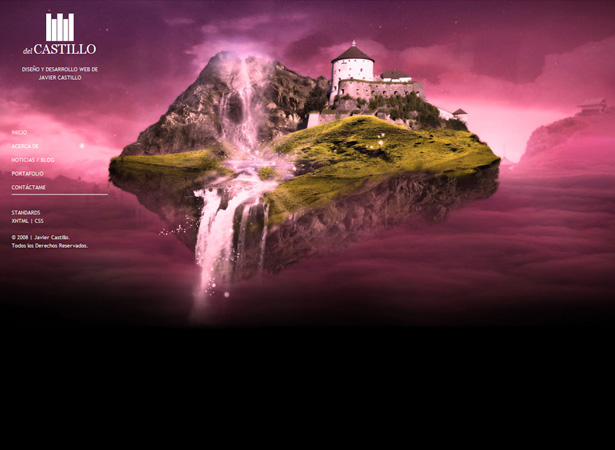
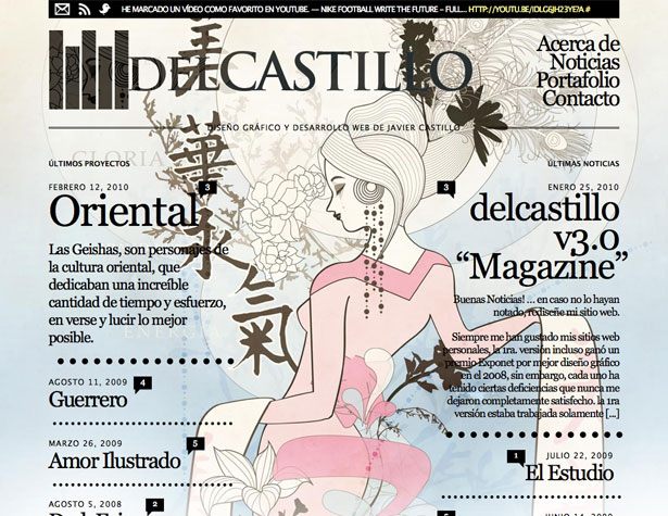
DelCastillo went from a traditional website design to a magazine-style format, with different posts having entirely different designs.
This is one of the most extreme redesigns on this list, and each post almost acts as a new design in itself. Another interesting feature of the new design is that the most recent post's design also serves as the home page design, something not often seen with this type of blog.
The typography between the old blog and the new one is similar, with the main header only changing slightly other than the increase in size. Overall, it's a very comprehensive redesign, with the new site bearing little resemblance to the old one.
Light CMS
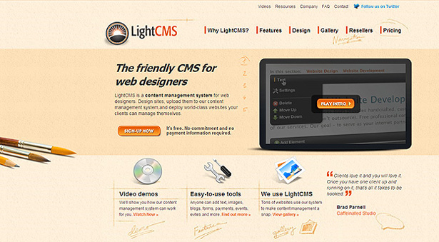
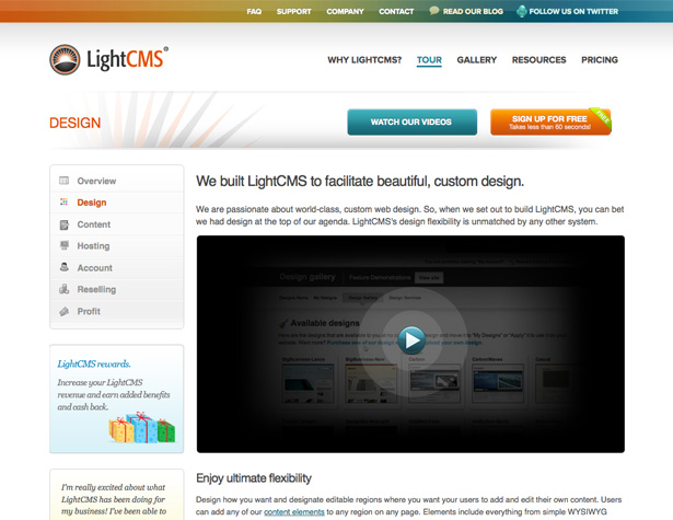
LightCMS's new website has a much cleaner, more minimalist design than their previous site, which used a textured background, hand-drawn elements, and lots of icons. The new design has a clean white background, minimal icons, and a much more streamlined design.
The header layout remains similar between the two designs, though the rest of the navigation elements have been updated.
The logo is also the same, though the proportion of the circle to the type has changed slightly and they've gotten rid of the drop shadow (all of which have strengthened the site's branding). Overall, the new design gives the impression of a much more sophisticated and established company.
BrightKite
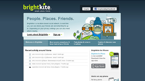
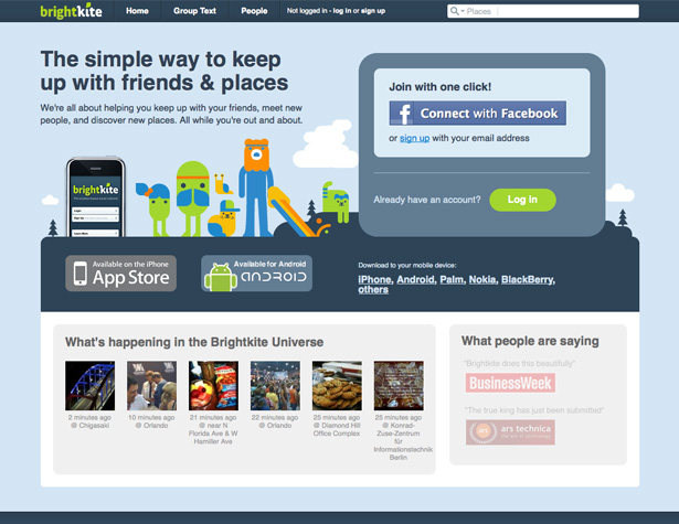
BrightKite's website has undergone a really fantastic redesign. They've kept a lot of the same elements while also giving it an entirely new look. Things they kept include the color scheme, the cartoon characters, and their logo.
The overall layout has changed significantly, though. They've also gotten rid of the heavy, dark blue background in favor of a much lighter version.
The cartoon characters in the new version are much better integrated into the overall design, as is the Facebook Connect icon. They've also taken up space on the home page with testimonials, something that was missing in the first design.
And they've added a link to their Android app in addition to the iPhone app. It's a much cleaner, more polished looking design than the original.
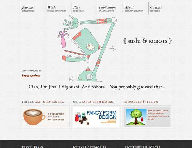
Sushi and Robots
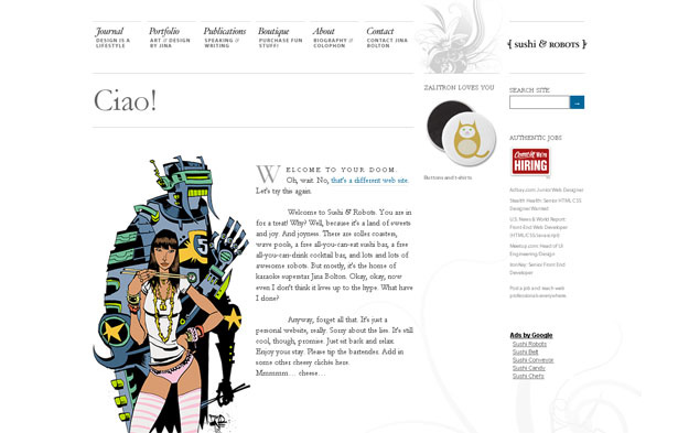
Sushi and Robots has one of the more subtle redesigns on this list. They've kept their typography almost identical, which lends consistency between the designs.
The new design has dropped the white background in favor of a paper texture with a subtle grid. The robot and girl illustration has also been replaced with a changing featured illustration.
The design has also been changed over from a two-column design to a grid design, with content areas of varying sizes. The dark footer also adds a bit more contrast to the new design.
The navigation options in the header have been changed slightly, too, and streamlined quite a bit. The biggest improvement though, is definitely in the grid design, especially when combined with that subtle background.
31Three
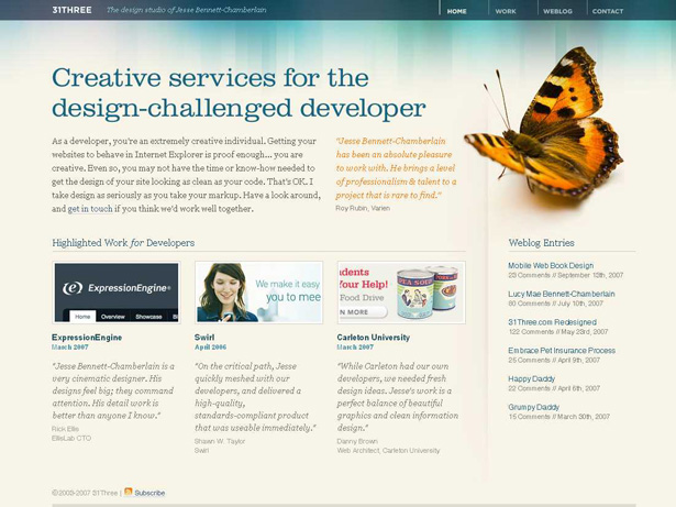
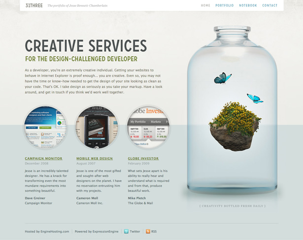
31Three made drastic changes to their layout, but kept a number of design elements constant between the old version and the new one.
The logo has been tweaked a bit, with a condensed version of the same typeface, which is repeated throughout the design. He also kept butterflies as a constant element between the two, though the newer design uses them in a different way. The new home page is also much more scannable than the old one, and has a lighter feel to it.
The color scheme has been adjusted, but is very similar between the two designs (the new one is a bit more muted). The new design seems infinitely more polished than the old one, though, which is accentuated by the glass bottle and the circular graphics.
Carbonmade
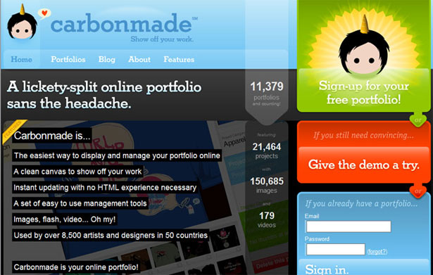
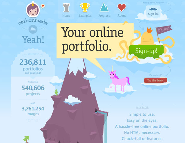
The new Carbonmade site is quite a bit different from the old one. They've updated their logo to a more detailed version, though the basic idea stays the same. They've also gotten rid of the heavy black content area on their home page in favor of a more inviting and relaxing illustrated mountain.
The mountain becomes the focal point of the home page, helping to illustrate the information they offer.
They've also added a number of other illustrated characters to highlight important parts of the site (like the "Sign-up" button). The light blue color has been carried over from the original design to the new one, which reassures visitors that they're on the correct site.
They've also de-emphasized the "demo" button in favor of making the "Sign-up" button much more prominent.
Buffalo
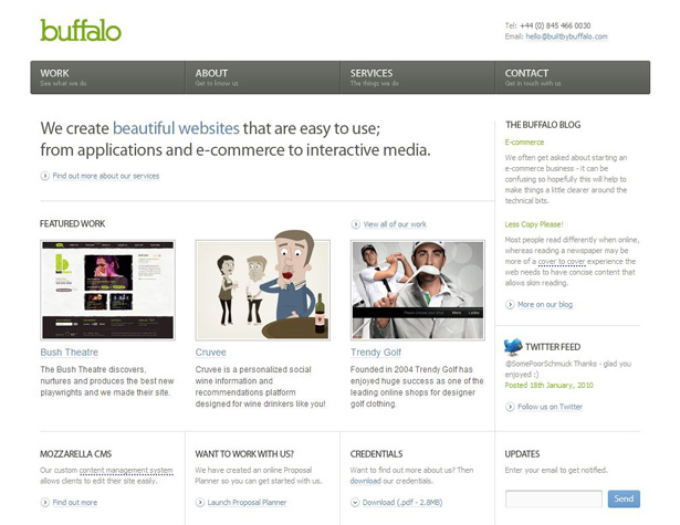
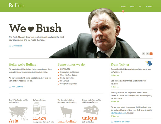
The new Buffalo website is a huge improvement over the old one (which was already a great design). The addition of the green bar across the top, as well as more green used throughout the typography in the design has given it a much more modern and inviting feeling than the original had.
The new design is still based on a grid, but they've changed it up a bit, varying the size of the content areas, which gives it a much more relaxed feeling.
The reduced size of the navigation links in the header also opens things up substantially. The images used at the bottom, which talk about water buffalo, only add even more to the kicked-back style of Buffalo.
Larva Labs
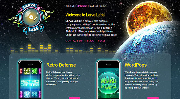
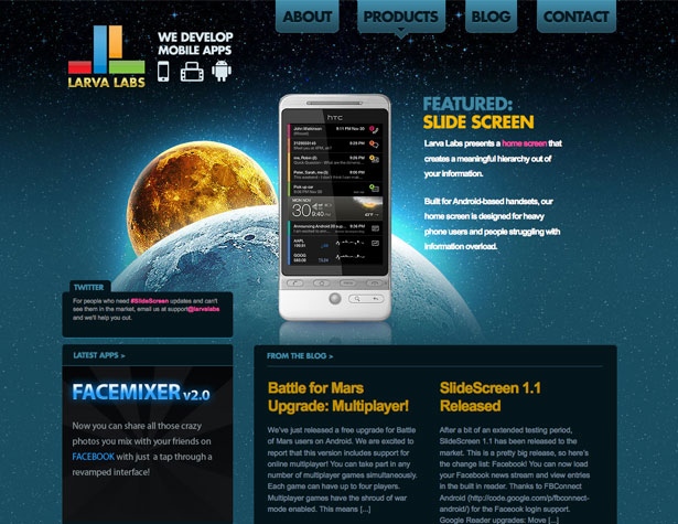
Larva Labs has used the same background image in their new design as they did in the old one, but has repositioned it to give it a more central role in the design.
They've also updated their logo into something much more modern, and have better compartmentalized their content for a more organized and polished look.
Adding more formal navigation links at the top have also added to the professionalism of the site. The color scheme has stayed very similar, though, and combined with the same background image, there's no mistaking that they're the same company from one design to the next.
Olliekav.com
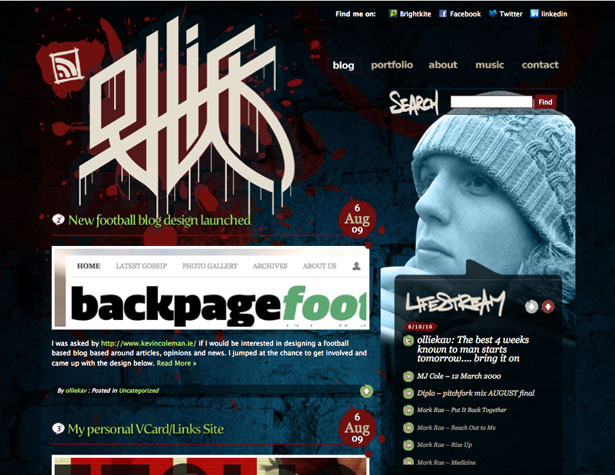
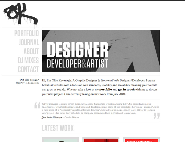
Ollie Kavanagh's site has undergone a substantial facelift. The old design was grungy and dark, while the new design is streamlined and light.
One of the coolest things is that he's kept a link to the old design for those who preferred it. What you can't see here is that each page on the new design uses a different background color, though the rest of the design remains the same.
Almost everything about the site has been overhauled, with cleaner typography, fewer images, and even the logo. The logo in particular is of interest, as he's taken the cleaner, graffiti-inspired logo from the grunge design (which was arguably the cleanest part of the old design) and morphed it into a slightly different shape with a more traditional dripping graffiti look, which contrasts nicely with the simplicity of the rest of the design.
The Design Cubicle
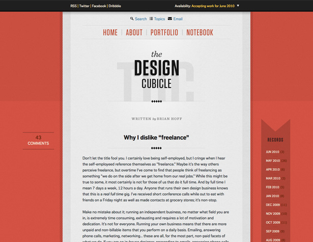
The first thing that strikes you about the new Design Cubicle design is that it's a lot brighter and has a lot fewer elements than the old design.
The original Design Cubicle site had a three-column design, and each column was filled to the hilt with content. While it was laid out well and managed to stay relatively uncluttered looking, it could be a bit overwhelming.
The new design, on the other hand, has much cleaner lines and has dropped most of the content in the sidebars. Now, there's just the comment information for each post in the left-hand sidebar, and the right-hand one just has links to the archives.
The center column has an aesthetically-pleasing gray background, which makes for excellent readability. Overall, it's one of the nicest redesigns on this list, and will almost certainly continue to look fresh for years to come.
Written exclusively for WDD by Cameron Chapman.
If you've seen any other great redesigns in recent months, please let us know in the comments below...
WDD Staff


Read Next

3 Essential Design Trends, May 2024

How to Write World-Beating Web Content

20 Best New Websites, April 2024

Exciting New Tools for Designers, April 2024

How Web Designers Can Stay Relevant in the Age of AI

14 Top UX Tools for Designers in 2024

What Negative Effects Does a Bad Website Design Have On My Business?

10+ Best Resources & Tools for Web Designers (2024 update)

3 Essential Design Trends, April 2024

How to Plan Your First Successful Website

15 Best New Fonts, March 2024
