 Logos can convey many ideas in one simple design and as designers we need to be fully aware of any hidden symbolism.
You should be in full control of your design and use symbolism to convey messages to your advantage as this will further the impact of your logo.
For this post, we've compiled some great logos that carry hidden symbolism that you can use for inspiration in your own designs.
Try to figure what the hidden messages are before reading the explanations. Have the designers manage to convey the right messages for these logos? Please let us know in the comments' area.
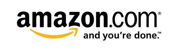
Amazon.com
The arrow from A to Z, symbolizes what Amazon is known for selling everything under the sun. It also serves as a smile, making the company feel friendly and approachable.
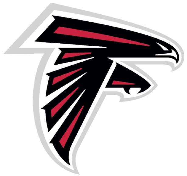
Atlanta Falcons
This logo doubles as an actual Falcon, and an 'F' for Falcons.
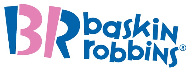
Baskin Robbins
This logo subtly incorporates the number "31" that was a big part of their older logo
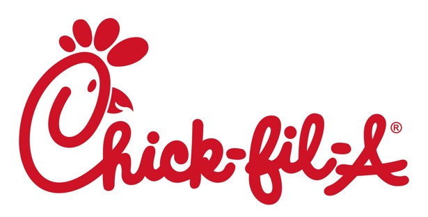
Chick-Fil-A
The Chick-Fil-A logo incorporates an illustration of a chicken with the 'C' in 'Chick-Fil-A' in a not so hidden way.
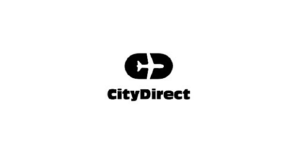
City Direct
Thiss one is really hard to see, but if you focus on the black part of the logo, the airplane is surrounded by the initials CD for City Direct.
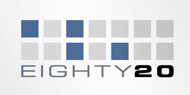
Eighty 20
This logo was complicated to figure out; the blue squares represent 1's and the gray squares represent 0's. This makes a 1010000 sequence on the top line, represent eighty in binary, and the bottom line reads 0010100, which represents 20 in binary.
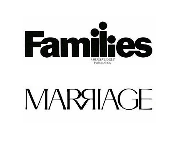
Families/Marriage
In the Families logo, the 'i', 'l', and second 'i' are all different sizes, representing the father as the long 'l' and the mother as the longest 'i' followed by the child. The upper case “R”s in the Marriage logo mirror each other with their ends sticking together, representing the bond of a relationship.
Fashion Center
One extra hole was added to the button, to make an 'F' for "Fashion Center".

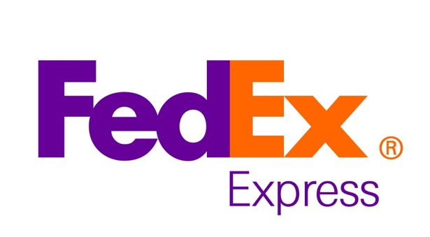
FedEx
At first glance it's hard to find the symbolism in this logo, but if you look closer you'll notice the right-pointing arrow in between the 'E' and the 'x', representing precision and speed at which FedEx works.
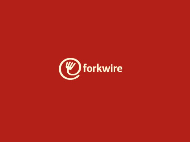
Forkwire
This online food delivery logo includes a combination of the internet key @ with a fork, representing food as well as the first half of the name – fork, making the utilization of technology in food delivery very clear and obvious for the customers
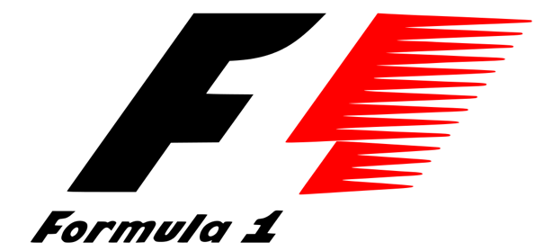
Formula 1
The negative space in the middle creates the number '1' for "Formula 1".
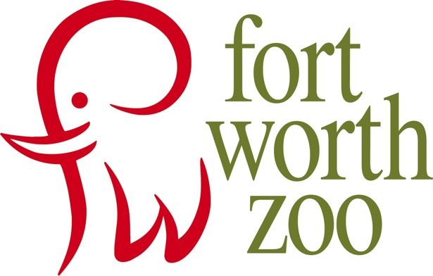
Fort Worth Zoo
The red 'fw' for Fort Worth also creates an elephant.
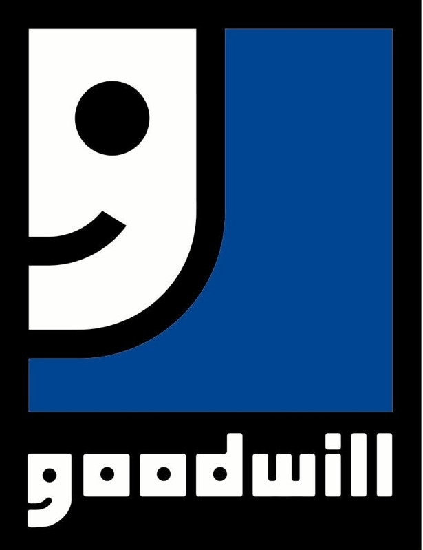
Goodwill
Instead of using an uppercase 'G', the logo designers cunningly used a lowercase 'g' to not only represent the first letter of the company name, but to represent a smiley face as well, giving viewers an unconsciously positive perception of the company.
Gotham Books
This one is pretty self-explanatory. The illustrations of a book are stacked on top of each other to simulate a skyscraper - a trademark of Gotham City.

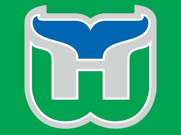
Hartford Whalers
This cleverly designed logo incorporates the tail of a whale, and the Hartford Whalers initials 'H' and 'W'.
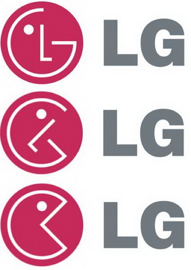
LG
Many people believe that the Pac-Man symbol is hidden within the LG logo.
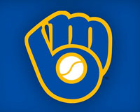
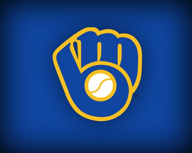
Milwaukee Brewers
The Milwaukee Brewers logo uses the team’s initials (M and B) to form a catcher’s glove holding a ball.
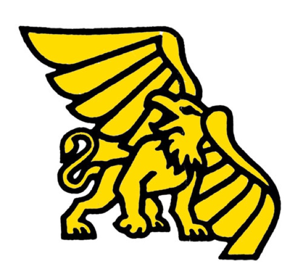
Missouri Western State University
The Missouri Western State University's logo has an illustration of the school's mascot-a griffon in the shape of the state of Missouri.
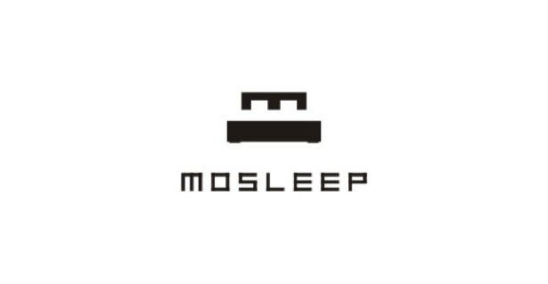
Mosleep
As the name suggests, Mosleep is an organization of doctors that deals with people having sleeping disorders. The logo, for this company is their intial 'M' that was also designed to look like a bed.
NBC
The NBC logo employs a hidden peacock looking to the right representing the company's motto to look forward, and not back.

Pakuy
The Pakuy logo consists of a simple 'P' made of an unfolded box, thus representing the work of the brand which is packaging.

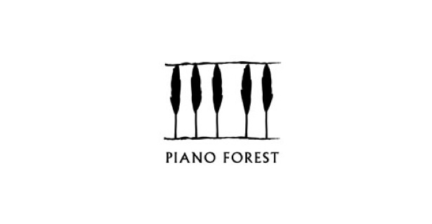
Piano Forest
This logo has the elegant design of piano keys that look like trees to resemble a keyboard
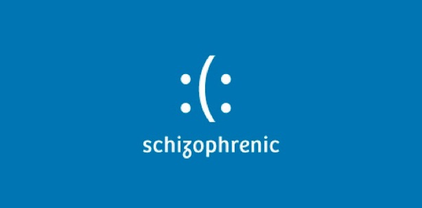
Schizophrenic
This logo shows the ambiguous emotions of a schizophrenic.
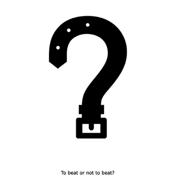
To Beat or Not to Beat?
The To Beat of Not to Beat logo uses a belt to make the shape of a question mark, posing the question: To Beat of Not to Beat?
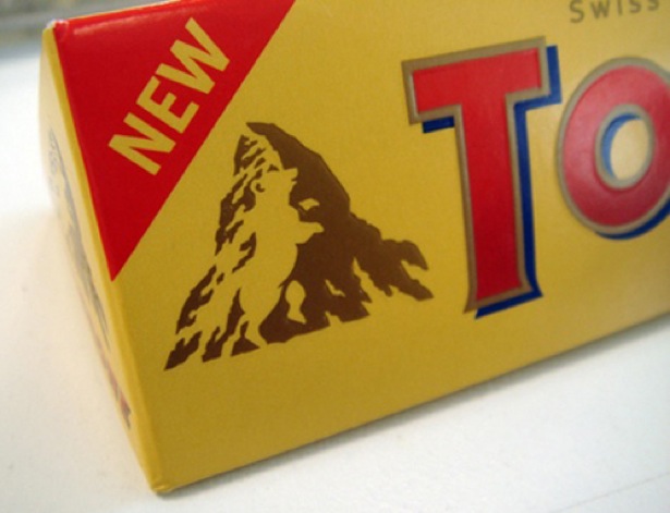
Toblerone
The image of a bear is hidden in the Matterhorn mountain, where the first Toblerone chocolate bar was created.
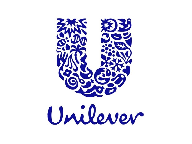
Unilever
Each icon within the logo represents an aspect of its business. For example, the shirt (below the heart) symbolizes "clothes" and represent fresh laundry and looking good.
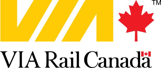
Via Rail Canada
The logo successfully incorporates train tracks in the middle.
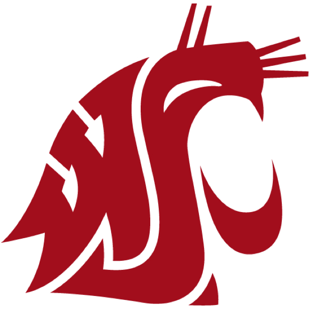
WSU
In this logo, WSU's initials form a cougar’s head.
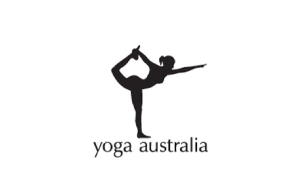
Yoga Australia
If you look closely, you can see that this woman is making a pose that forms the Australian continent.
Compiled exclusively for WDD by Zoe Ajiboye.
Did you discover the logo's hidden messages? Do you incorporate hidden symbolism in your logo designs?
WDD Staff


Read Next

3 Essential Design Trends, May 2024

How to Write World-Beating Web Content

20 Best New Websites, April 2024

Exciting New Tools for Designers, April 2024

How Web Designers Can Stay Relevant in the Age of AI

14 Top UX Tools for Designers in 2024

What Negative Effects Does a Bad Website Design Have On My Business?

10+ Best Resources & Tools for Web Designers (2024 update)

3 Essential Design Trends, April 2024

How to Plan Your First Successful Website

15 Best New Fonts, March 2024
