 A design may have impact. It may have style. But having these isn’t enough.
To work well, a design has to have elements that play off each other’s strengths. Fortunately, every piece of content has inherent guidelines.
Layout, or the arrangement of content on a web page, is critical to a design’s success. Among other things, layout prioritizes content to lead people from one element to the next.
If done right, people will be so interested in the content that they won’t notice anything else.
Read on for more details and tips for creating layouts that work in your designs.
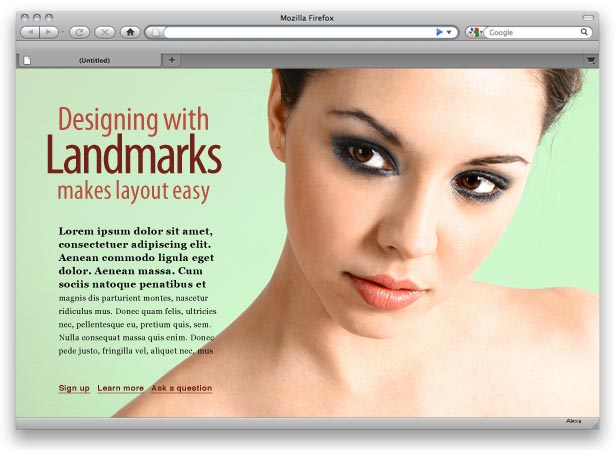
With the example below, most people will notice either the photo or the headline first, then the text and finally the links.
They may not notice that the headline, text and model’s face are set one third and two thirds into the page respectively (honoring the rule of thirds), or that the headline and links are written in colors sampled from the model’s lips, or that the curve of her shoulder leads the eye toward the calls to action.
Text, photo and headline make up a composition. If one falls out of place, the whole piece fails.
Arrangement Based on Mutual Respect
Where do we put things? Let them tell us. The quirks of graphics, photos and chunks of text become apparent when they meet on a page. Some work together better than others, and some work only when placed a certain way. For example, our layout technically works in two ways:
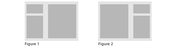
Figure 1 shows the layout used in our example above. Gray blocks represent the headline, photo and text.
Figure 2 shows how the same principles would apply to its inversion: one large element balanced by two smaller elements. This particular photo looks better on the right, though.
Our model is looking to the left. In figure 1, she’s looking at the text. In figure 2, she’s looking away from the text. That might have worked if she was looking at the camera, but because she’s looking away, it loses some impact. Not much, but enough to matter.
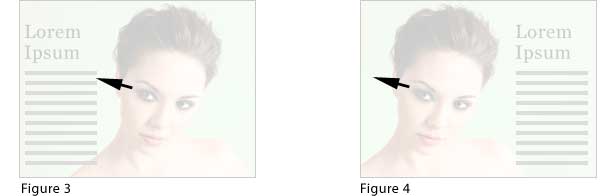
The model alternately shows interest in the text and, when inverted, ignores it. The arrangement of elements establishes either a positive or negative attitude.
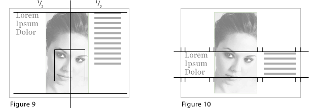
Alignment Based on Landmarks
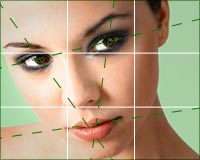
Sometimes the thing that makes elements work a certain way also provides clues about space and alignment. We noted how the model’s eyes point to the left, but the photo and text contain other visual cues.
Implied lines between landmarks in the typography and the image abound in this composition:
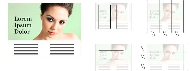
- The model’s eye and lips and the edge of her nose meet the edge of the right-hand column of text.
- The left-hand column of text meets the left edge of the headline. It almost reaches the edge of the model’s hair but falls short to stay consistent with the right-hand column.
- The model’s face (particularly the eyes and mouth) defines the vertical space of the headline.
- The bottom of the photo marks the bottom third of the composition (in the rule of thirds).
- The model’s eyes are one third from the top of the composition.
- The center of the model’s face and the right edge of the headline meet at the one-third and two-thirds points of the composition’s width.
Some landmarks have more power than others. Designers and photographers could debate, for example, whether the model’s eyes are more influential than her silhouette. But a layout based on any landmarks is better than a layout that ignores them.
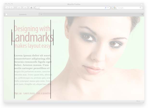
Using Features to Create Harmony
Non-designers who try their hand at layouts sometimes arrange elements based on how they fit onto the page. Space should be respected, but it doesn’t always lead to the best design.
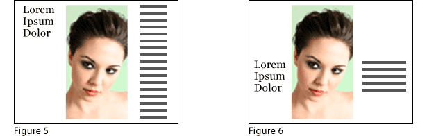
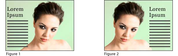
Figure 5 aligns elements to the page's space and bases everything on the boundaries of the canvas.
Figure 6, though, bases its layout on focal points in the photo. The result is a more streamlined appearance.
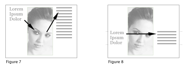
Figure 5 is inefficient because viewers bounce around between focal points: to the headline, down to the face, up to the text. The simplest line is straight. Hence, figure 6 guides the viewer's gaze easily from left to right, from one element to the next. The crux of the second layout is a narrow band running along the headline-face-text alignment.
In these images, readers are drawn to the model’s face, the headline and the text—usually in that order. That’s three different areas to look at. Aligning them gives the layout focus.
The Right Answer
All three layouts below use the same headline, photo and text elements:
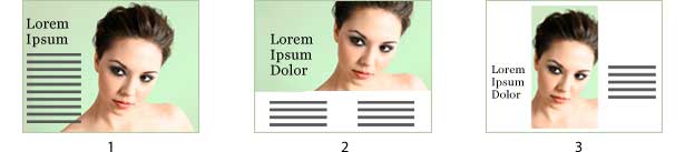
The first layout has the most "breathing room." The second respects the text. The third layout uses negative space to achieve balance. All three use landmarks but in different ways. Is one the best?
Hunting for an answer may blind us to the obvious: that multiple solutions can be equally valid when the elements work together. Visual landmarks are opportunities, not rules. Take another look at the first design.
The more the elements conform to implied lines, the more a non-conforming element will stand out. Here, the designer breaks the word “Landmarks” from the other text’s vertical alignment, thus emphasizing the keyword.
There’s no doubt about what the page is promoting. Success isn’t measured by how strictly elements conform to principles of design but by how well the page communicates its message.
Written exclusively for Webdesigner Depot by Ben Gremillion. Ben is a freelance writer and designer who solves communication problems with better design.
How do you follow landmarks on your designs? What works best for you and what doesn't?
WDD Staff


Read Next

3 Essential Design Trends, May 2024

How to Write World-Beating Web Content

20 Best New Websites, April 2024

Exciting New Tools for Designers, April 2024

How Web Designers Can Stay Relevant in the Age of AI

14 Top UX Tools for Designers in 2024

What Negative Effects Does a Bad Website Design Have On My Business?

10+ Best Resources & Tools for Web Designers (2024 update)

3 Essential Design Trends, April 2024

How to Plan Your First Successful Website

15 Best New Fonts, March 2024
