 When designing a website with a minimal number of pages and not a ton of content, a single-page design can be an innovative way to set the site apart.
Single-page websites often utilize JavaScript and Flash, along with HTML and CSS to fit more content on a page without substantially increasing load times.
Navigation has to be given some special consideration when it comes to single-page sites, to make sure visitors can get back to the home section of the page without issues, and navigate from any one section to any other section. This is often achieved through sticky headers or repeating navigation in each section.
The sites below are all excellent examples of single-page websites. They're both usable and aesthetically-pleasing, and take full advantage of the single-page format.
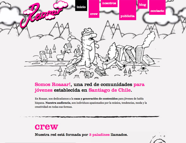
Roaaar
The Roaaar website includes a "return to top" link at the bottom of each section, which makes it easy for visitors to get back to the navigation in the header.
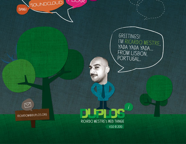
Duplos by Ricardo Mestre
The Duplos site takes a different approach, putting the main content at the bottom of the page. Navigation takes you further up the page, rather than down.
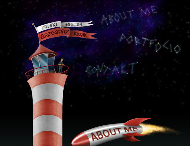
Grzegorz Kozak
The lighthouse motif here runs the entire length of the page, going from space down to ground level. Banners hanging out of windows on the lighthouse return you to the top of the page where the navigation is.
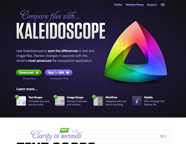
Kaleidoscope
The Kaleidoscope website uses different background images and textures behind each section of the site. This differentiates each content area from each other content area.
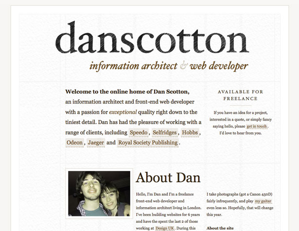
Dan Scotton
Short pages like this one with minimal content work particularly well. The navigation stays in the sidebar when you scroll down the page.
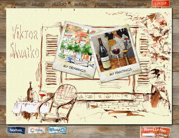
Viktor Shvaiko
This site uses a horizontal slider to load new content, sliding through other content to reach the page you've navigated to. The navigation bar stays on top regardless of what page you're on.
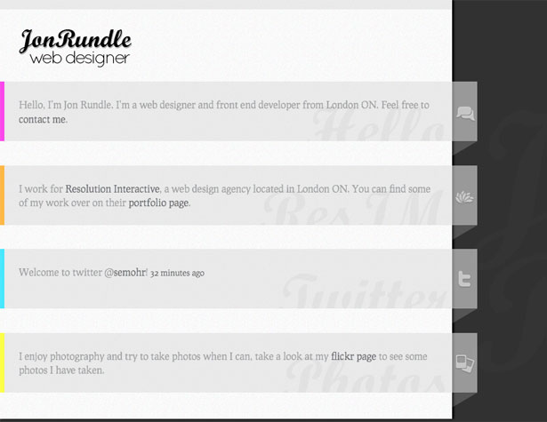
Jon Rundle
Simple, personal profile sites like this one are perfectly suited to a single-page design. The icons and accent colors add a bit more visual interest to the design, which is otherwise very neutral.
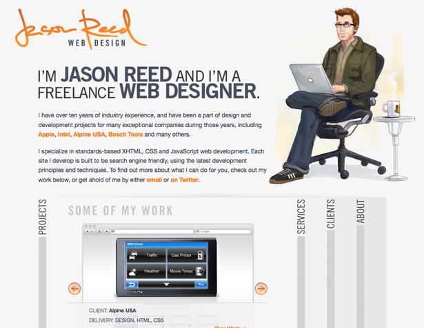
Jason Reed
Using an accordion effect to display new content works well when the content isn't too long. The illustrated header image and the gray and orange color scheme both make the site stand out.
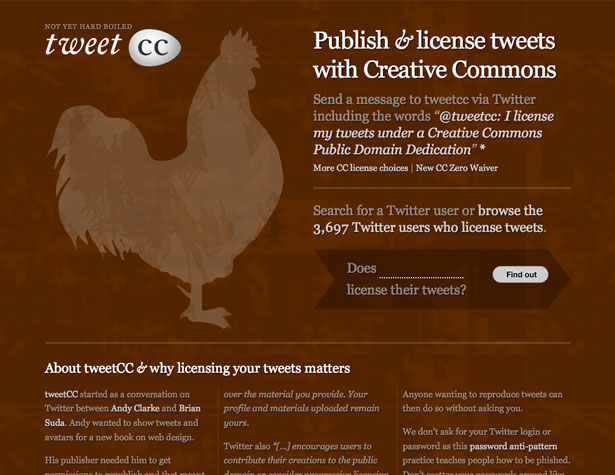
Tweet CC
Using textures and simple illustrations makes the Tweet CC site visually appealing while it's also kept simple with a monochromatic color scheme.
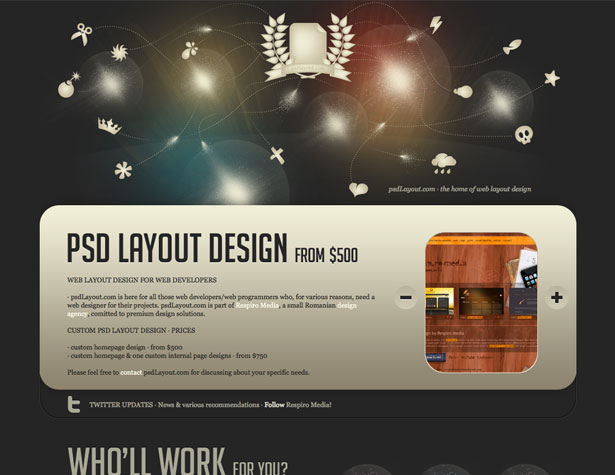
PSD Layout
Sites offering straight-forward services can work particularly well in a single-page format. There's not too much information to offer and keeping it all on one page makes it easy for potential customers to quickly find what they need.
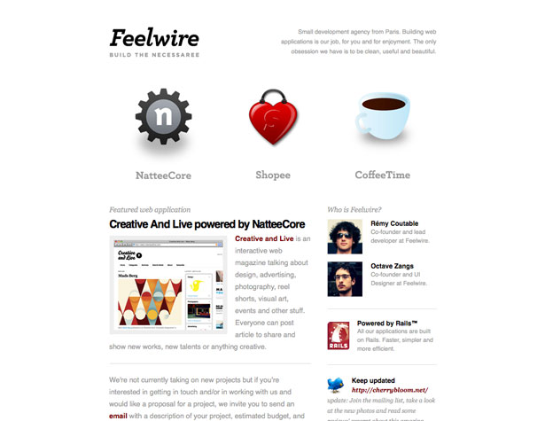
Feelwire
The Feelwire site keeps things simple, and offers extra information with tooltips. The white background keeps it minimalist and the bold icons add visual interest.
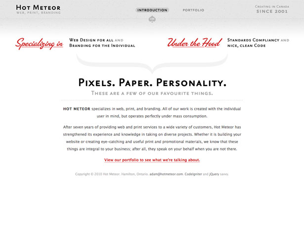
Hot Meteor
The Hot Meteor site uses a typography-focused, gray and red design. The header is sticky, keeping the navigation at the top of the page.
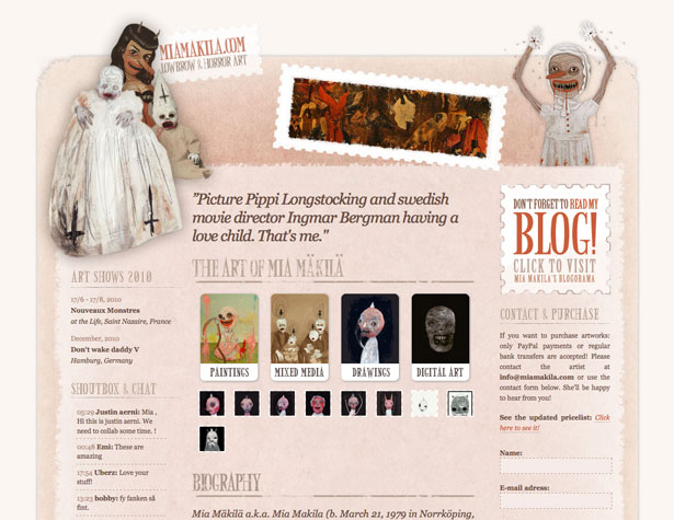
Mia Makila
The Mia Makila site is a bit different than most of the other sites included here, using a more traditional 3-column design. JavaScript is used to display artwork in each category.
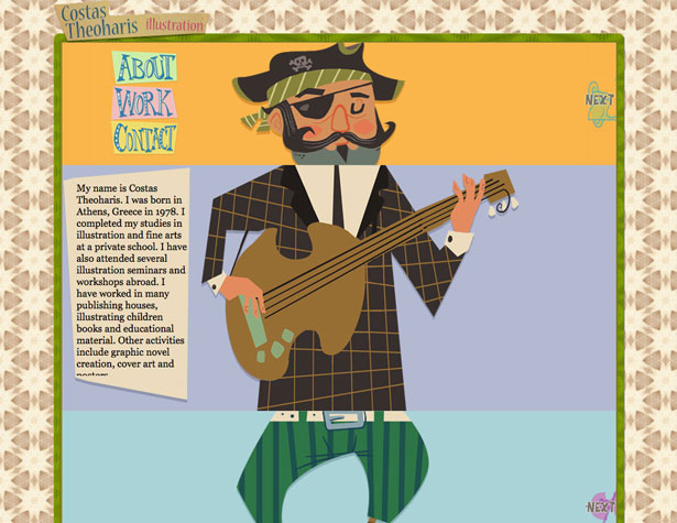
Costas Theoharis
This site uses an interesting slider effect, with each section (the header, main content, and footer) sliding separately from each other.
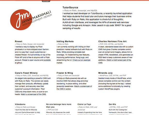
Javan Makhmali
The grid design used here isn't seen very often in single-page designs. But with plenty of white space, it works well to include a lot of different content in a very streamlined design.
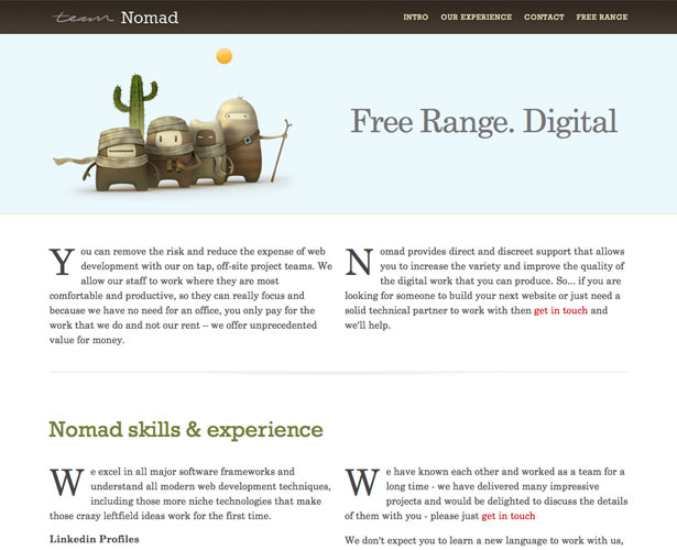
Team Nomad
The design here is simple and straightforward, and the 2-column design works well to fit more content on the page without making it look heavy.
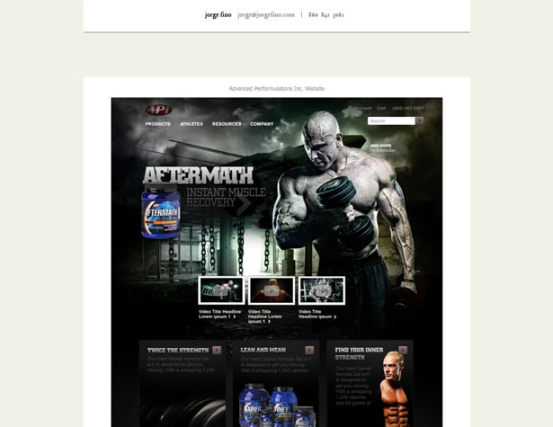
Jorge Fino
Jorge Fino's site puts the focus squarely on the designs. Navigation is nonexistent (other than scrolling) and the contact information is included in both the header and the footer.
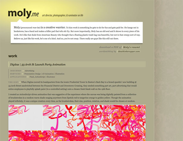
Moly Yim
Here's another site with no navigation. It's kept to a reasonable length, though, so it's not an issue.
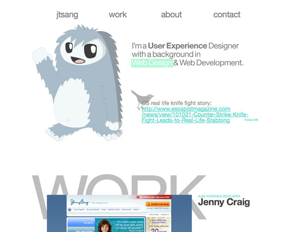
Justin Tsang
The navigation here is a bit different. Rather than including buttons that take you back to the top, or navigation on each screen, buttons are included next to each project and content area to go up or down one screen. There's also a navigation bar at the top to skip to each main section.
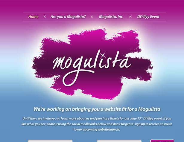
Mogulista
Temporary websites are a great time to use a single-page site. This site uses JavaScript to load new content for each "page" on the site.
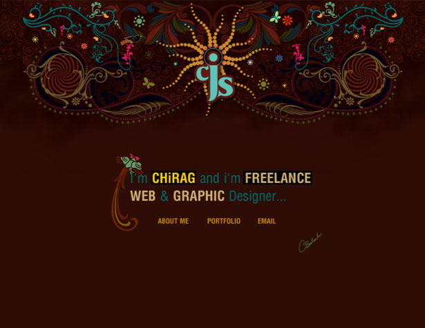
Chirag Solanki
Navigation on this site combines both main navigation and links at the end of each section to return visitors to the top of the page. Illustrated doodles link together each section, giving a sense of continuity to the entire page.
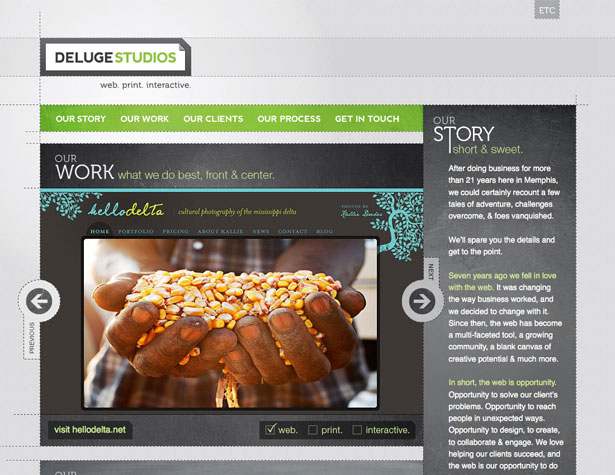
Deluge Studios
The layout of the Deluge Studios site is one of the most unique featured here. Two columns provide five content areas, all linked from the top navigation. Including main content sections in the smaller "sidebar"-style column makes the page significantly shorter.
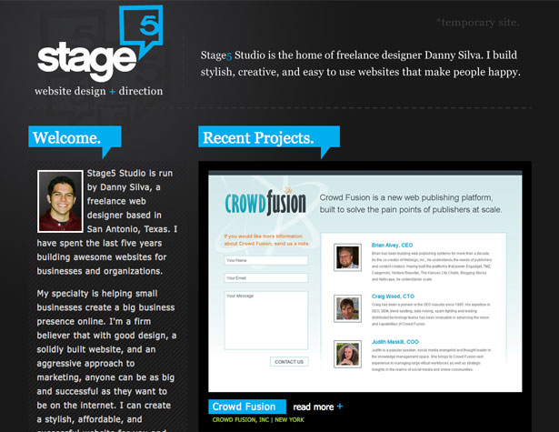
Stage 5 Studio
The Stage 5 Studio site is short, with no navigation. "Read more" links slide out more information about each project, while other content is kept in the "sidebar".
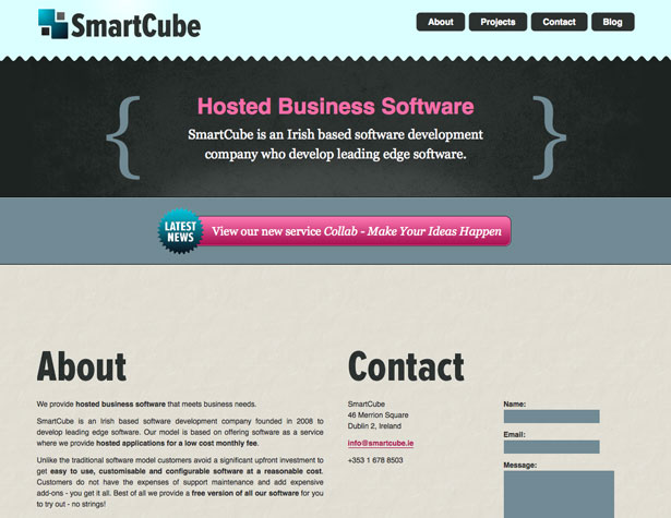
SmartCube
The SmartCube site uses a sticky header to keep the navigation on the screen at all times. It also uses a combination of 1- and 2-column layouts, depending on the content.
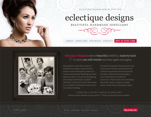
Eclectique Designs
The content sections here are differentiated by unique background textures. Typography pulls everything together throughout the page, and JavaScript is used to display additional products without taking up more space.
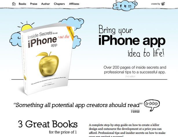
Inside Secrets to an iPhone App
This is one of the longer single-page websites featured here. It uses a sticky header with navigation to make it easy to get from one section to any other.
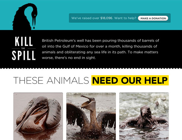
Kill The Spill
Keeping a charity site like this one short and to the point is almost sure to increase the number of donations coming in. The bold typography, graphic images, and inclusion of a donation form at the bottom all work perfectly together.
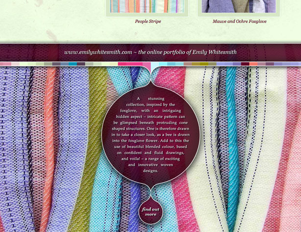
Emily Whitesmith
Here's another site that starts you out at the bottom of the page. Clicking on the "find out more" link scrolls the page up to a portfolio area. Modal windows there give close-ups of each fabric.
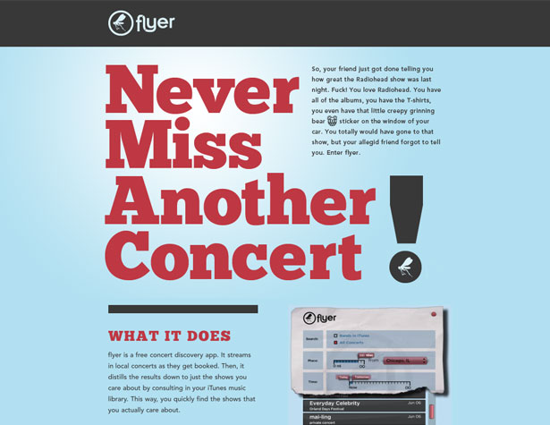
Flyer
App websites are well-suited to single page designs, as they often have limited content and only a screenshot or two for images.
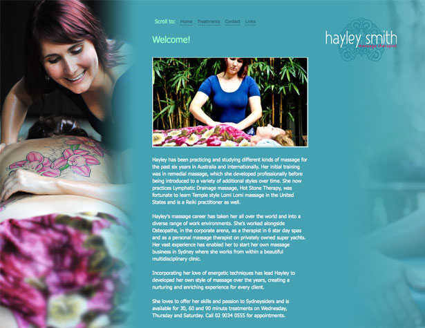
Hayley Smith
Here's another very long page. The navigation repeats at the top of each section, and the logo slides down the page as it scrolls.
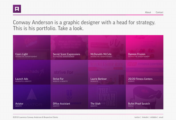
Conway Anderson
The Conway Anderson site uses a mix of sliders (for the about and contact info) and modal windows (for the work) to display content. The simple, grid-based design and monochromatic color scheme keep things simple and modern looking.
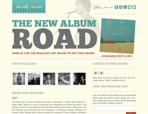
Daniel Moir
Daniel Moir's site is simple with minimal content and no navigation. The 2-column design organizes the different types of content on the site and keeps it shorter.
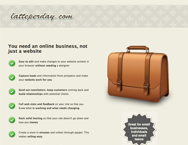
Latte Per Day
Pre-launch websites are very well-suited to single page designs, as is shown here. There's not enough content yet to justify a multi-page site.
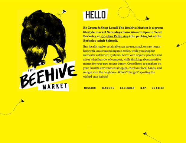
The Beehive Market
Here's another longer single-page site. The bright yellow background and bee illustrations tie the whole site together, and navigation repeats at the top of each section.
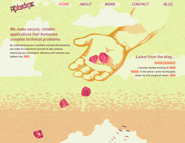
Rubidine
The Rubidine site uses a sticky header with a transparent background that blends in with each individual content section.
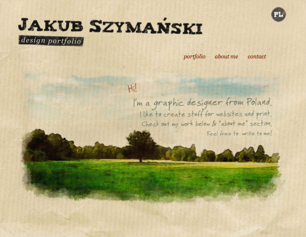
Jakub Szymanski
This site uses JavaScript to load new content and to slide down the page. A sticky footer appears after the home "page" with a "return to top" link.
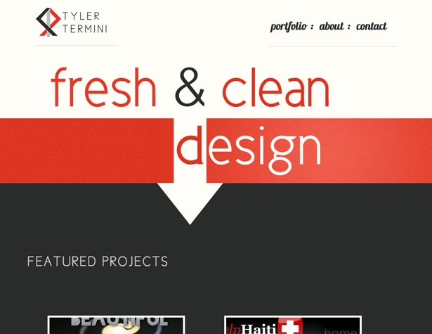
Tyler Termini
Tyler Termini's website is short, with navigation only in the header. Because it's not a very long page, it's not really a problem to have to scroll back to the top (or just scroll through each section without using the navigation at all).
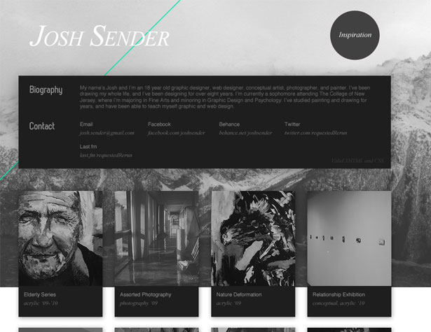
Josh Sender
The grayscale color scheme here looks great. The work displayed goes into full color when hovered over, and when clicked on a color modal window opens up with a larger version.
Written and compiled exclusively for WDD by Cameron Chapman.
What do you like best about single page websites? Have any favorites that weren't featured here? Please share in the comments below...
WDD Staff


Read Next

3 Essential Design Trends, May 2024

How to Write World-Beating Web Content

20 Best New Websites, April 2024

Exciting New Tools for Designers, April 2024

How Web Designers Can Stay Relevant in the Age of AI

14 Top UX Tools for Designers in 2024

What Negative Effects Does a Bad Website Design Have On My Business?

10+ Best Resources & Tools for Web Designers (2024 update)

3 Essential Design Trends, April 2024

How to Plan Your First Successful Website

15 Best New Fonts, March 2024
