 The semantic web has brought on a new generation of Internet technology. As designers and developers work together to redefine the rules of the web, the number of open-source projects and third-party APIs continues to grow.
The opinions of web scholars differ on the use of grid systems. Many argue that setting grid points limits the creativity of designers. Others contend that a grid provides a scientific basis for a design to be perfected.
Both sides provide interesting arguments. These ideas have become part of a unique web culture characterized by influential design rules and open-source projects.
The grid isn't a master key to perfect design. However, math has proven that certain design specifications provide the best ratios for page elements and layouts. If you've heard about any of this before, you may be familiar with the many options that grid-based layouts offer designers.
A Comparison to the Classic Web
Older generations used design as a control mechanism. Their designs presented information precisely and in a way that was easy to manage. This still holds true today, but these stale design principles are being uprooted.
In their wake, a new web culture is stirring. A culture of open standards and protocols, freely shared source code and powerful platforms run by programmers across the world.
One reason for this development is the significant increase in the number of people working on the semantic web. The underlying cause stems from the human drive to contribute to something more than ourselves.
Working for a pay day is satisfying, but not something to be passionate about. Developers who truly care about new standards want to leave their mark.
Where Grids Have Evolved
There hasn't been a major study comparing pre-standards and post-standards web design techniques. We are able to track, however, how grids have become more popular over time.

The grid system is based on current technological trends and advancements. This includes statistics on the number of people who access the Internet at a given time, the devices they use to access the Internet and the screen resolutions and operating systems of their devices. Grid systems provide a structural balance to website layouts. They provide consistent measurements and allow for flexibility between frameworks.
In the late 1990s, not many household machines ran a resolution higher than 800x600, and even fewer past 1024x768. In the past 20 years, intricate and complex OSes have been developed to display much higher resolutions. 1024x768 is a common setting these days.
Monitor resolutions are growing exponentially, and this trend does not appear to be slowing. Check out the data table from Web Statistics and Trends; it details screen-resolution measurements via W3Schools.
Visual Grid Designs
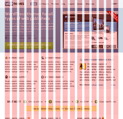
All web pages are based on grids, whether the designer is conscious of this or not. Digital work is comprised of pixels and as such will conform to a set width and height, also producing artistic effects visually with spacing and distance between points.
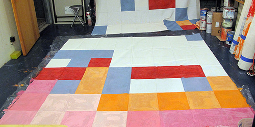
Instead of painting in the dark, so to speak, you are able to use grids to shine a light on the project. Grids first became popular with the emergence of Adobe Photoshop as the de facto tool for web designers. Tutorials around the web present ways to display and implement grid lines when creating mockups, logos, graphics, icons and other digital art.
Over time, developers picked up on this and began to implement systems in their own work. Designing a grid layout in Photoshop is much different than creating the same layout in HTML and CSS.
The work required for each path is vastly different, yet the grid system itself is universal. As open standards fall into place, current design culture is moving toward grid-based structures.
Basic HTML and CSS Rules
Grids use some of the most common properties of HTML web pages. HTML grid layouts generate the same overall template each time.
The structure starts with a containing wrapper just wide enough to contain all of the columns. Inside the wrapper division there should be a collection of subdivisions. The number of subdivisions should be the same as the number of columns you need.
For a two-column layout, you may have two divisions, classed as .left and .right. All of your internal columns should have their CSS float property set to left or right, while the wrapper should contain a clearfix class.
To get a feel for HTML code, you could check out a dynamic grid layout generator. The popular solution from Page Column offers a great structure and supports multi-column layouts. All HTML and CSS are generated instantly and pass standards-compliance testing.
Breaking Out with Padding
Padding and gutters are integral parts of any grid system. Pieces of content that are formatted next to each other require space between them, which could cause the layout to expand unnaturally, resulting in broken pages.
Create definition in padded areas by crafting a layout filled with dummy content. Place your columns on a page and give them 1-pixel outlines using various colors. This provides an accurate representation of what your design will look like, outlining each area's portion of content.
This technique works with both fixed and fluid layouts, making the integration to current grid frameworks much easier.
Gutters also don't need to follow a set framework. You may be willing to sacrifice content area to increase the space between a two-column split. Open-source frameworks are malleable and allow you to edit styles directly or even implement your own to overwrite rules and define properties.
Layout Grid CSS Property
The layout-grid property is an older CSS specification adopted by Microsoft. It is written in shorthand to set a multitude of grid properties. Specifically, they reference layout-grid-mode, layout-grid-type, layout-grid-line, layout-grid-char and layout-grid-char-spacing.
Each of these can be defined as its own property and can be written without the overarching layout-grid. Here is a short list explaining each:
layout-grid-mode
Controls which type or mode of layout grid is used. Possible values includenonefor no grid,linefor inline grid elements,charfor characters and block-line elements, andbothfor all-around support.layout-grid-type
Controls which grid is used to render page typography and internal text elements. Value pairs areloose, which is used for Chinese and Korean text,strict, which is used for Japanese characters, andfixed, which uses monospacing to apply equal distance between characters, regardless of language.layout-grid-line
Controls grid length granularity whenlayout-grid-modeis set tolineorboth. This property behaves similar toline-heightand can receive numerical values set in cm, px, pt, em or percentages.layout-grid-char
Controls the size of the character grid for an element's text content whenlayout-grid-modeis set tolineorboth. The values this property accepts are the same as above and directly affect the page's line height. The difference is thatlayout-grid-lineaffects the page grid, whilelayout-grid-charaffects the text and character spacing grid.layout-grid-char-spacing
Controls character spacing whenlayout-grid-modeis set tocharorbothand thelayout-grid-typeproperty is set toloose. This property behaves likeline-heightand should be used for block-level text areas.
The purpose of creating these properties is to adapt grid layouts for Asian-encoded pages. The characters in Asian languages often require custom page layouts.
When viewed in other countries, these characters could behave strangely and break your grid calculations. These unique properties enable better visual formatting by utilizing a one- or two-dimensional grid system.
Vertical Page Rhythm
Many graphic artists will gloss over the importance of vertical spacing in grid design. Gridlines support horizontal layout design and align vertical page elements and typography. Four important properties manipulate vertical spacing: font size, line height, top and bottom margins and padding.
Line height is the biggest factor in vertical spacing. Page text is scaled by how large individual letters appear and by how much space the lines in between require. Commonly, line height is defined in pixels or ems, depending on how flexible the layout is. Ems maintain typographic consistency across all resolutions and browsers. The best approach is to apply font styles to all major HTML elements, including headings, block quotes and paragraphs.
Vertical rhythm can be retouched once a grid has been set in place, making scaling for different environments simple. Desktop users will have a much different experience than laptop and mobile users, who are dealing with much smaller resolutions.
You can't plan the vertical alignment with exact precision, but in most cases an educated guess will produce quality results.
The Rule of Thirds
Divide a design into three horizontal and vertical spaces. This will create a grid of nine rectangles nestled in newly formed pockets. It is much easier to work with designs that are broken down into block areas with finite points.
The science behind this trend comes from the "divine proportion," also known as the "divine ratio." The ratio of 1.618, which is the divine proportion, is a mathematical constant. When we divide any fixed-size layout into this value we can calculate the most precise division for a two-column structure.
Take as an example a 960-pixel layout. If we divide 960 by 1.618, we get approximately 593. According to the golden proportion, then, we should set our primary column length to 593 pixels. This method goes back to artists centuries ago. Luckily, with the spread of open-source frameworks, most of the math has already been calculated.
Building a Golden Rectangle
This theory for creating beautiful grid-based rectangular layouts is based on the Rule of Thirds. Split rectangles are geometrically sound compared to the golden ratio. Numerical values for the width and height of the rectangle are in proportion to the golden rule.
These types of rectangles are known as "golden rectangles." The shorter and longer side should hold the values of variables a and b, respectively.
These rectangles are useful to build page layouts: they measure how large block elements should be. They are extremely easy to calculate, and the tools for many popular grid frameworks are built in.
These elements are very beneficial to web designers who use mathematical grids. Imagine the multiple scenarios in which a carefully structured golden rectangle would enhance a page's aesthetics. This could include page widgets, e-commerce product images and even content-rich tables.
Beginning With 960gs
With all of this information available to the public, web designers have started to define their own standards.
Of all of the frameworks, the 960 Grid System (960gs) is probably the best known. This isn't to say that it is the best-no grid system fits all criteria perfectly-but it is easy to work with. 960gs is adaptable and works well with almost any website. And it renders well on most browsers and devices

The math includes 12 columns at 60 pixels each, along with a 10-pixel margin on each side, producing a 20-pixel gutter. Most grid frameworks are based on 12- to 24-pixel columns. Of course, you aren't expected to incorporate 12 columns into your layout.
Eventually, you will combine the columns and gutters into a single grid unit. Publishing content is much easier when you can draft specific details for images, widgets, videos and other page elements.
960gs has garnered so much publicity because it adapts well to the web. Most screen resolutions can display a 960-pixel website without a horizontal scroll bar. Increasingly, layouts are fitting into this ratio, indicating that this is the future of the web. The extra width doesn't take away from the design and expanding or contracting a template is entirely possible.
Understanding a Full 960 Layout
Only so many columns can rationally fit into a design. A grid is not meant to lock you in a limiting mindset. Grids are guides to follow: they enhance user interactivity and page element placement.
The largest grid you could create is a 940-pixel content area with 20-pixel gutters. It's a goofy use of the grid, but it is good to understand the possibilities. Two-column layouts are pretty simple and provide plenty of room for content. Common examples include:
- 780 x 140,
- 700 x 220,
- 620 x 300.
Notice that these all add up to 920. The 40-pixel loss can be accounted for by gutters on each "block" of the layout. These spaces keep users focused and allow the content to break apart smoothly. With split content elements, we have gutters on the far side and between the blocks, each accounting for 10 of the 40 pixels.
These spaces increase as you add new blocks to the layout. A three-column design has slightly less room for content than a two-column design.
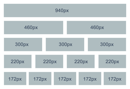
If this concept is still confusing, refer to the image above. The simplest way to work with grids is to design a reference sheet similar to the graphic above, with all possible breaks for content blocks. With this information, mix and match styles to determine the type of design that would best suit your project.
For example, say we want to design a mock-up using three columns and the largest possible content area. With the chart above, we can break down our content area into two parts: one full of content, but split in half to contain two columns. This would require a 450-pixel content block and two 210-pixel columns.
Again, these grids are not meant to stifle creativity. They allow for flexibility but keep your back-end structure secure. Most designers won't deliberate over the science of all this. The amount of time these open-source systems save a project is extraordinary, easily worth skimming through the documentation and implementing your own layout.
Fluid Grid Layouts
It's not common to see grids pinned to fluid layouts. Pixels are the most precise unit of measurement for a website. To move into a measurement such as percentages or ems would require careful consideration. Such layouts are possible with a few changes and additional CSS selectors.
Fluid 960 Grid System is well known, although most of the code isn't accessible to older versions of Internet Explorer. Through interactive prototyping and working on countless screen resolutions, you can scale a 960-pixel design across many screen resolutions. This open framework is not an exact copy of 960gs, and it comes with new documentation. If you're interested, check out the GitHub repository for active forum discussions and archived Q&A sessions.
Like the rest of the web design community, you're probably itching for something more stable. A few fluid frameworks that generate amazing layouts.
YAML Grid Layouts
Yet Another Multicolumn Layout (YAML) is one of the most popular CSS frameworks. It contains a large code base for manipulating flexible XHTML and CSS layouts. It's consistently updated by active community developers.
The framework is extremely versatile, offering numerous practical examples with code. The smallest fixed-width layout will conform to 740 pixels, fitting 800x600 screen resolutions. Maximum-width resolutions are set to 80 em, offering scalability between mobile and desktop browsing.
Set with standard web fonts, around 75% of layouts will conform to a 960-pixel maximum, although this can be overwritten.
Many of the bugs found in older browsers have been patched. YAML supports Google Chrome, Mozilla Firefox, Safari and all versions of Internet Explorer 5+. See the framework's overview and features for more in-depth information.
Yahoo! User Interface Library
YUI is a set of JavaScript and CSS libraries put out by Yahoo. Most of the project code and bug fixes have been written by professional developers from the YUI community. The most current revision is YUI2, though YUI3 API docs have been released to v3.1.1.
The YUI2 home page has links leading to the most popular projects. Toward the bottom, listed under "YUI2 CSS Tools," are four influential frameworks: CSS Reset, Base, Fonts and Grids. This article is concerned with CSS Grids, though many of these other frameworks have been referred to.

The download file is only 4 KB and offers over 1000 unique web page layouts. Built-in settings allow for both fluid- and fixed-layout width sizes. Columns are self-clearing, so whether you're running two- or four-way splits, the footer content will always remain underneath the primary content. Typographic properties are tied in together for flexible user-specific adjustments. Many core features are taken care of, which makes working in YUI2 so nice.
The CSS Grids framework offers a small number of mobile-based layouts. These render properly only on browsers with a relatively new version of the Webkit engine. This includes smartphones such as Android devices, the iPhone, BlackBerry and many Windows Mobile devices.
The integration is nice, but this new media hasn't been tested thoroughly and may still display improperly on some mobile devices. But at the end of the day it's worth the hassle, because the majority of mobile visitors who are willing to read the content on your website probably own a smartphone.
The Evolution of Web Culture
Web designers have become quite emphatic about open systems and rules. The early web wasn't much of a community at all. There were HTML and CSS standards, but the mentality behind most layouts was "whatever works." After significant developments in web technology, the Internet has become the best medium for publication worldwide.
Web designers and developers aim to simplify the process of creating websites without taking away from the quality or experience of a website. Grids are a harmonious instrument in that they give designs an order and structure. Chaos and random creation don't usually yield results.
This is why grid designs are so accessible. The web has been reformed into an agile development system. Grid-based layouts produce stable websites: it's no surprise the community has adopted frameworks as common practice.
Instead of relying on older unreliable methods, the average web designer today can focus on creating websites that are pleasing to users, rather than coordinating pixel-perfect creations.

Today, designers are much younger and hold greater passion for design than ever before. This, coupled with the open web movement, means that a stream of new web code is constantly being released to the public. GitHub repositories offers networking opportunities with other CSS developers.
Custom Grid Framework Development
Designers have criticized many open frameworks as being too bloated. Many are labeled as confusing, with too many classes and rules to work with. This may be true for some, and I certainly don't discredit these remarks.
Ultimately, the more flexible a design, the better. Artists look for tools that make their job easier. Frameworks are not suitable for all designs. Developing frameworks over smaller web projects will save time in the long run. However, consider the CSS systems as more of a learning tool than a production environment.
Grids can be confusing at first, no doubt about it. Having a framework to reference and documentation to check against throughout the process will help newbies integrate quickly and with less stress.
With enough practice, developing a custom CSS framework will be simple. The benefits of this far outweigh the advantages of working with someone else's source. You can structure all layout formats in one location and define properties such as font size, line height and block elements. Nobody has ever written perfect CSS code, so stick with whatever works best for you.
Common CSS Grid Frameworks
Below are some of the more popular CSS frameworks. Although not all of these frameworks focus solely on grid design, they do offer useful libraries to study and implement in web designs. The project source code is free in each case and usually comes with documentation.
1KB Grid

1KB Grid is a great CSS framework that mainly emphasizes speed. The download files are less than 1 KB in total and hold most of the CSS selectors you need to create a beautiful website layout. The CSS code is customizable before downloading, which is a huge benefit to all web designers. You can choose between how many columns to include and how wide the columns and gutters should appear. This grid is extremely friendly to newcomers and a great way to break yourself in.
Baseline CSS

Baseline is another standard CSS template available free for download. Not only does this package include code for grids, but it also structures page typography and block elements. All code is compatible with CSS3 and HTML5 elements, giving developers control over how to structure page flow. Baseline CSS offers solutions for vertical space manipulation by integrating page typography into a flexible grid.
1140px CSS Grid System

CSSGrid.net is home to a newer fluid framework for grid-based websites. With 1140 pixels and a 12-column split, the structure scales properly on all devices, from the largest monitor resolutions to handhelds. The framework uses media queries to check when to display a certain layout and how to spread the page content. Author Andy Taylor frequently updates the project, and you can download the latest 1.6 release here.
YAML

YAML provides the most flexible framework to develop layouts. The documentation offers a complete solution for all fixed, elastic and fluid layouts. Core files have been tested extensively on small and large websites. If you're looking for a stable CSS framework, YAML is a great solution.
Blueprint CSS

Blueprint contains many of the benefits of Baseline. The advantage of this framework is its well-recognized brand name. Many active developers have updated the project with new classes. Grids comprise a large portion of the framework, but many models are used to form typography, mobile and print screens and more!
CSS Boilerplate

The CSS Boilerplate project was started by one of the developers of Blueprint. The code is a more refined, stripped-down version of the Blueprint framework, optimized for speed and easy readability. Although the project hasn't been updated recently, it provides an opportunity for beginners to rule out their own CSS project definitions.
YUI 2: Grids CSS

YUI2 Grids is a very popular framework put out by Yahoo under its YUI2 line. The code is perfect for both fixed and fluid layouts, following rules set in CSS2 and CSS3. The framework is well documented under the Yahoo User Interface Library and is considered one of the better frameworks for beginners.
This post was written exclusively for Webdesigner Depot by Jake Rocheleau, a passionate web designer and social media enthusiast. Jake loves reading and writing about the latest digital Internet trends and networking within the design community. Check him out on Twitter @jakerocheleau for more about his work.
Do you use a grid based framework for your designs? Share your views with us!
WDD Staff


Read Next

3 Essential Design Trends, May 2024

How to Write World-Beating Web Content

20 Best New Websites, April 2024

Exciting New Tools for Designers, April 2024

How Web Designers Can Stay Relevant in the Age of AI

14 Top UX Tools for Designers in 2024

What Negative Effects Does a Bad Website Design Have On My Business?

10+ Best Resources & Tools for Web Designers (2024 update)

3 Essential Design Trends, April 2024

How to Plan Your First Successful Website

15 Best New Fonts, March 2024
