
 There are usually two camps among designers when it comes to typeface choices.
One group has a handful of favorite typefaces they adapt to every design they create, believing that these handful of typefaces can be suitable for every situation.
The other camp believes in using a huge variety of typefaces, picking and choosing each one based specifically on the project at hand. Regardless of which camp you fit into, the typefaces below should interest you.
They have proven popular among designers the world over, and are used in designs for everything from multi-national corporations to individual books or journals.
Have we missed one of your old time favorites? Go ahead and add it in the comments area.
There are usually two camps among designers when it comes to typeface choices.
One group has a handful of favorite typefaces they adapt to every design they create, believing that these handful of typefaces can be suitable for every situation.
The other camp believes in using a huge variety of typefaces, picking and choosing each one based specifically on the project at hand. Regardless of which camp you fit into, the typefaces below should interest you.
They have proven popular among designers the world over, and are used in designs for everything from multi-national corporations to individual books or journals.
Have we missed one of your old time favorites? Go ahead and add it in the comments area.
Akzidenz Grotesk
Akzidenz Grotesk was the first widely-adopted sans serif typeface, and an influencer of many later neo-grotesque typefaces, including Helvetica and Univers. There are a number of variations available, including Akzidenz-Grotesk Book, Book Rounded, Schoolbook, Old Fact, and Next. Akzidenz-Grotesk is one of the official fonts of the American Red Cross (along with Georgia).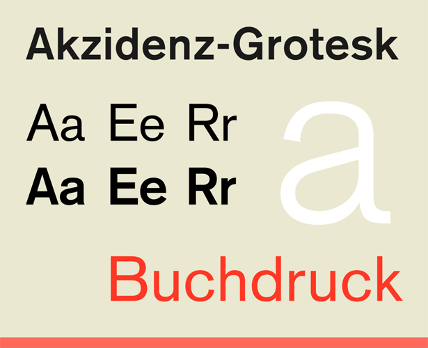 Akzidenz Grotesk was created in 1898 by H. Berthold AG type foundry, and was originally called "Accidenz-Grotesk". It's been speculated that the typeface was derived from either Didot or Walbaum, which have similar looks if their serifs are removed. The official report, though, is that it was based on Royal Grotesk light, designed by Ferdinand Theinhardt (which was later merged into Berthold). Modern iterations of the typeface are descendants of a late-1950s project at Berthold to enlarge the type family, though these new typefaces retain the idiosyncrasies of the original.
Strengths
Akzidenz Grotesk was created in 1898 by H. Berthold AG type foundry, and was originally called "Accidenz-Grotesk". It's been speculated that the typeface was derived from either Didot or Walbaum, which have similar looks if their serifs are removed. The official report, though, is that it was based on Royal Grotesk light, designed by Ferdinand Theinhardt (which was later merged into Berthold). Modern iterations of the typeface are descendants of a late-1950s project at Berthold to enlarge the type family, though these new typefaces retain the idiosyncrasies of the original.
StrengthsAkzidenz-Grotesk is a versatile typeface, suitable for both headlines and body copy. The slight idiosyncrasies present in the typeface give it a bit more visual interest than other, similar neo-grotesques. Best Uses
It's suitable for use in virtually any project.
Avenir
Avenir is a geometric sans-serif typeface designed in 1988 by Adrian Frutiger. The name, Avenir, means "future" in French. It was designed to be a more humanistic version of traditional geometric typefaces like Futura. Upon release, it was available in three weights, using Frutiger's two-digit weight and width naming convention: 45 (book) /46 (oblique), 55 (text) /56 (oblique), and 75 (bold) /76 (oblique). Three more weights were later added.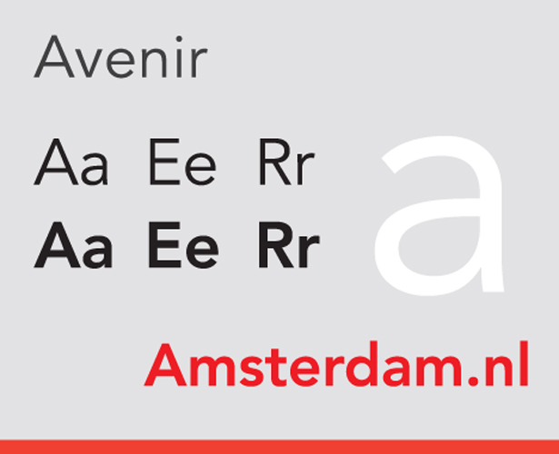 Avenir is a relatively new typeface, but it's become widely used. LG uses it for the buttons on most of their cell phones. BBC Two uses Avenir in its logo and identity. Dwell magazine started using it in 2007, and the upcoming J.J. Abrams film Super 8 also uses it for titles.
Strengths
Avenir is a relatively new typeface, but it's become widely used. LG uses it for the buttons on most of their cell phones. BBC Two uses Avenir in its logo and identity. Dwell magazine started using it in 2007, and the upcoming J.J. Abrams film Super 8 also uses it for titles.
StrengthsAvenir's greatest strengths are its simplicity and balance. It bridges the gap between geometric and humanist sans-serifs, making it a versatile, modern choice. Best Uses
Avenir is suitable for both headline and body copy. Improvements in hinting have made it better for on-screen viewing at smaller sizes.
Baskerville
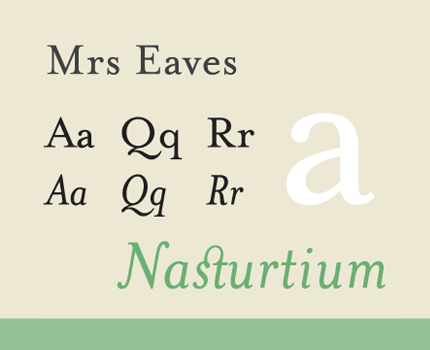
Baskerville is a transition serif typeface that falls somewhere between classical typefaces like Caslon and modern serifs like Didot. It was created by John Baskerville as an attempt to improve upon the typefaces created by William Caslon. To that end, it has more contrast between the thick and thin strokes of the letterforms, as well as sharper serifs and a more vertical axis to rounded letters. The characters are also more regular, and the rounded strokes are more circular.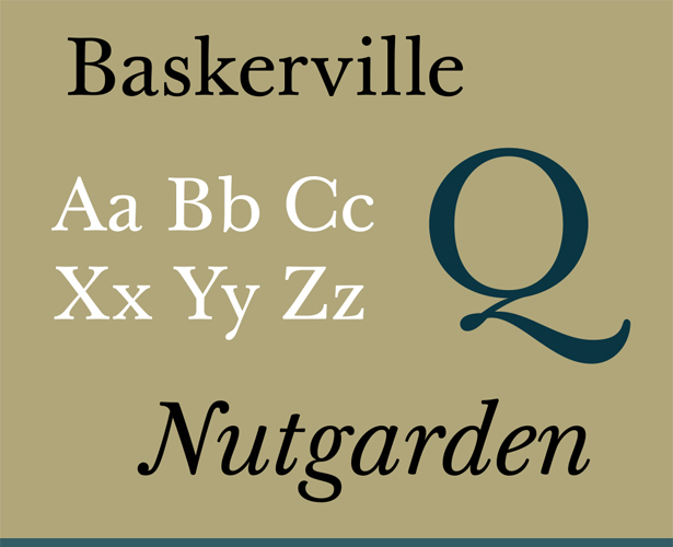 Baskerville was created in 1757, and then revived by Bruce Rogers for the Harvard University Press in 1917. The original typeface was used by John Baskerville to print a folio Bible. His rivals of the time were intimidated by the perfection of his work, and some claimed that the stark contrasts of his typefaces would damage the eyes. Others admired him, including Fournier, Bodoni, and even Benjamin Franklin.
Baskerville was also revived in England in 1923 by Stanley Morison for the British Monotype Company. In 1996, it was used by Zuzana Licko as the basis for the Mrs Eaves typeface. A free version of Baskerville, called Open Baskerville, has also been created.
Strengths
Baskerville was created in 1757, and then revived by Bruce Rogers for the Harvard University Press in 1917. The original typeface was used by John Baskerville to print a folio Bible. His rivals of the time were intimidated by the perfection of his work, and some claimed that the stark contrasts of his typefaces would damage the eyes. Others admired him, including Fournier, Bodoni, and even Benjamin Franklin.
Baskerville was also revived in England in 1923 by Stanley Morison for the British Monotype Company. In 1996, it was used by Zuzana Licko as the basis for the Mrs Eaves typeface. A free version of Baskerville, called Open Baskerville, has also been created.
StrengthsThe clarity and consistency of the letterforms are what make Baskerville such a readable typeface. It's widely used in documents, and has a traditional, professional look. The University of Birmingham uses it for many of its documents, and a modified version can be seen in some of the Canadian government's corporate identity materials (including in the "Canada" wordmark). Best Uses
Baskerville is excellent for body copy, and is suitable for use in books, newsletters, newspapers, and other printed materials. It's also a fairly common typeface, making it suitable for use on the web, though backup typefaces also need to be specified.
Bembo
Bembo is an old style serif, based on a humanist typeface created by Francesco Griffo in the late 15th century. It has a number of characteristics of humanist typefaces, including minimal variation between the weights of thin and thick strokes; a small x-height; short, bracketed serifs; angled top serifs on lower-case letters; and ascenders that are taller than capital letters.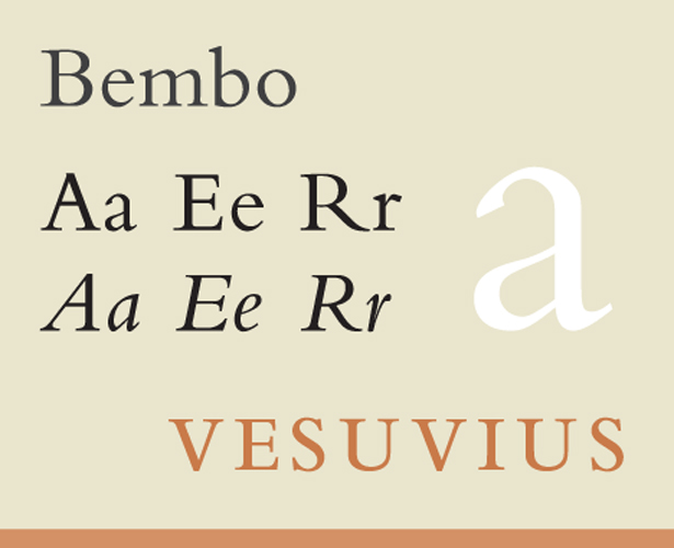 Bembo was revived by the Monotype Corporation in 1929, under the direction of Stanley Morison. The original typeface was first used in February of 1496, though, in a 60-page book about a journey to Mount Aetna, called Petri Bembi de Aetna Angelum Chalabrilem liber, written by Pietro Bembo. Francesco Griffo later cut the first italic types, for Aldus Manutius.
Since the original typeface had no italic cut with it, it's rumored that renowned calligrapher Alfred Fairbank was commissioned by Stanley Fairbank to create an italic for Bembo. Fairbank maintains that he created the type independently and then sold it to Monotype, but in either case, the metal type for an italic version of Bembo was released in 1929.
Strengths
Bembo was revived by the Monotype Corporation in 1929, under the direction of Stanley Morison. The original typeface was first used in February of 1496, though, in a 60-page book about a journey to Mount Aetna, called Petri Bembi de Aetna Angelum Chalabrilem liber, written by Pietro Bembo. Francesco Griffo later cut the first italic types, for Aldus Manutius.
Since the original typeface had no italic cut with it, it's rumored that renowned calligrapher Alfred Fairbank was commissioned by Stanley Fairbank to create an italic for Bembo. Fairbank maintains that he created the type independently and then sold it to Monotype, but in either case, the metal type for an italic version of Bembo was released in 1929.
StrengthsBembo is considered a good classical typeface, with a strong humanist, Old Style look. It's perfect for use in designs where classic beauty or formal tradition are important. Best Uses
Bembo is considered a good choice for book typography.
Bickham Script Pro
Bickham Script Pro is a script typeface based on English round hand writing common in the 18th century, and specifically on the engravings of George Bickham. It's an ornate, romantic typeface, available in regular, bold, and semibold weights. Bickham Script Pro was created by Richard Lipton in 1997, and is available as part of the Adobe Type Library.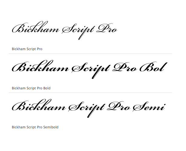 Strengths
Bickham Script Pro is excellent for formal, elegant designs, especially those reminiscent of its origin in the 18th century. It also includes a number of OpenType features, including discretionary ligatures, swashes, superscripts, stylistic alternates, and cast-sensitive glyph connectors. The contextual changes that occur to the characters as one types make it an especially versatile typeface, and improves your designs effortlessly. Best Uses
Bickham Script is purely a display typeface, perfect for headings and subheads. It's commonly seen in logos, menus, invitations, annual reports, and packaging, in primarily formal, elegant designs.
Bodoni
Bodoni is a modern serif typeface, with high contrast between thin and thick stroke weights, and a slightly condensed shape. It was based on the work of John Baskerville, but has taken his ideas to a more extreme conclusion. There are a few variations on Bodoni, some with more transitional shapes (including ITC Bodoni and Bodoni Old Face), and some more modern.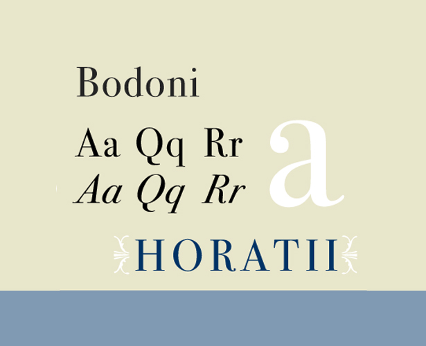 Bodoni was first designed by Giambattista Bodoni in 1798. In addition to the influence from Baskerville, Bodoni was also influenced heavily by the work of Pierre Simon Fournier and Firmin Didot.
Strengths
Bodoni was first designed by Giambattista Bodoni in 1798. In addition to the influence from Baskerville, Bodoni was also influenced heavily by the work of Pierre Simon Fournier and Firmin Didot.
StrengthsBodoni, for the most part, is best suited to larger font sizes. Because of the extreme variation between thin and thick strokes, it can degrade at small sizes and become illegible (specifically, it creates an effect known as "dazzle"). There are some typeface variations though, that are optimized for use at smaller sizes (including Bodoni Old Face at 9 points, ITC Bodoni 12 at 12 points, and ITC Bodoni 7 at 7 points). Best Uses
Bodoni is well-suited for use in modern designs where a serif typeface is desired. It's a great serif for use in headlines and subheads, though some variations can be used for body copy, too. Some of its more recognizable uses can be found in the logo for grunge band Nirvana, and on the Mamma Mia! posters.
Caslon
Caslon is a set of serif typefaces with the irregularity common of Dutch Baroque types. It has short ascenders and descenders, bracketed serifs, and is moderately-high contrast. The italics have a rhythmic calligraphic stroke, and some of the lowercase italics have the suggestion of a swash.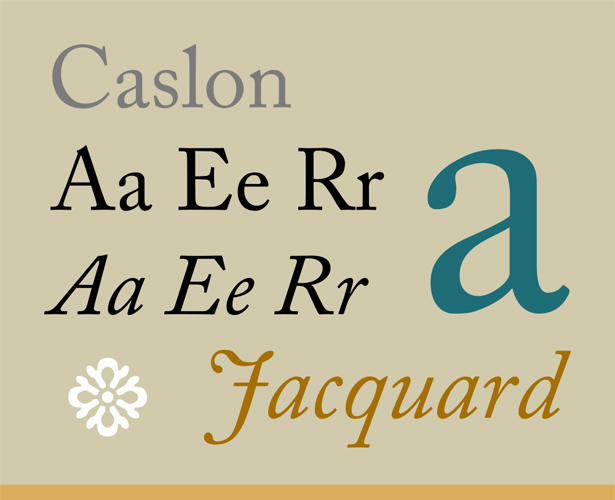 The first Caslon typeface was designed in 1722. It was similar to Dutch Fell types by Voskens, and also by the typefaces cut by Van Dyck, another Dutchman. The Caslon types were used throughout the British Empire, including British North America. The decayed appearance common in a lot of early American printing is often thought to be caused by the oxidation that resulted from long exposure to seawater during the transport of metal type from England to America. Caslon was used extensively, and perhaps most famously in the printing of the U.S. Declaration of Independence.
Strengths
The first Caslon typeface was designed in 1722. It was similar to Dutch Fell types by Voskens, and also by the typefaces cut by Van Dyck, another Dutchman. The Caslon types were used throughout the British Empire, including British North America. The decayed appearance common in a lot of early American printing is often thought to be caused by the oxidation that resulted from long exposure to seawater during the transport of metal type from England to America. Caslon was used extensively, and perhaps most famously in the printing of the U.S. Declaration of Independence.
StrengthsCaslon is sometimes considered a great universal typeface. There was even a common rule of thumb among printers and typesetters, "When in doubt, use Caslon." It's a versatile typeface that can be used equally well in headings or in body copy. The wide variety of weights and styles available make it even more versatile. Best Uses
Caslon can be used for virtually any kind of typesetting, from body copy to headlines, and is quite legible at small sizes.
Clarendon
Clarendon is a slab-serif typeface, and is considered to be the first registered typeface. There's only moderate contrast between thick and thin strokes, common of slab-serifs. It was originally designed by Robert Besley for the Fann Street Foundry in 1845. It was later copied heavily by other foundries. Clarendon was used heavily during World War I by the German Empire, and was commonly used in wanted posters in the American Old West. More recently, it was used by the US National Parks Service on traffic signs, and became the typeface of choice by the Ruby Tuesday restaurant chain when they relaunched their corporate identity in 2008.
Strengths
Clarendon was used heavily during World War I by the German Empire, and was commonly used in wanted posters in the American Old West. More recently, it was used by the US National Parks Service on traffic signs, and became the typeface of choice by the Ruby Tuesday restaurant chain when they relaunched their corporate identity in 2008.
StrengthsClarendon has strong letterforms common to slab serifs. It's also a very readable typeface, which makes it appropriate for use at somewhat smaller sizes. Best Uses
Strong letterforms make Clarendon a great choice for things like signs, logos, and headlines. It's already used by companies like Sony and Wells Fargo in their logos.
Franklin Gothic
Franklin Gothic is a relatively high profile grotesque sans serif typeface. In addition to Franklin Gothic, the News Gothic, Alternate Gothic, Monotone Gothic and Lightline Gothic typefaces are essentially just different weights of the original. Franklin Gothic itself is an extra-bold typeface, with a traditional double-story "a" and "g".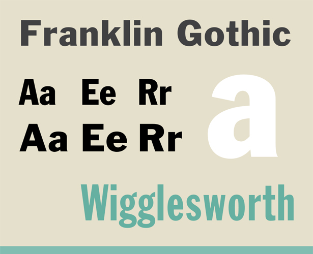 Franklin Gothic was first created in 1902. "Gothic" at that time just meant sans serif. It briefly fell out of popularity in the 1930s with the rise of Futura and Kabel, but was then rediscovered by American designers in the 1940s, and has remained popular since.
Strengths
Franklin Gothic was first created in 1902. "Gothic" at that time just meant sans serif. It briefly fell out of popularity in the 1930s with the rise of Futura and Kabel, but was then rediscovered by American designers in the 1940s, and has remained popular since.
StrengthsFranklin Gothic is quite a strong typeface, stylistically, though the addition of related typefaces makes it much more versatile. Best Uses
Franklin Gothic is well-suited to display use due to its weight. Other variations of the typeface, though, can be used for body copy, especially in onscreen situations.
Frutiger
Frutiger is a sans serif typeface designed by Adrian Frutiger. There are also serif and ornamental varieties of Frutiger, including Frutiger Serif, Frutiger Stones, and Frutiger Symbols. Frutiger was originally commissioned in 1968 by the Charles De Gaulle International Airport for their directional sign system. Frutiger was originally called Roissy (the airport is located in Roissy, France), and was completed in 1975.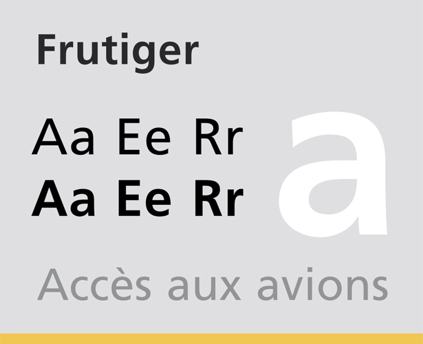 Strengths
Frutiger was designed to have the rationality and cleanliness of Univers (also designed by Adrian Frutiger), but with the proportional and organic aspects of Gill Sans. Because of this, Frutiger is both distinctive and legible, with a modern appearance. Apertures of the typeface are wide and ascenders and descenders are prominent, making it easy to distinguish letters from each other. Best Uses
Because of its excellent legibility, Frutiger is suitable for a variety of uses. It's especially well-suited for signs though, as its readable from a distance, and from varying angles.
Futura
Futura is a geometric sans-serif typeface that was commissioned by the Bauer type foundry in 1927. Originally, it included Light, Medium, Bold, and Bold Oblique fonts, and then later Light Oblique, Medium Oblique, Demibold, Demibold Oblique, Book, Extra Bold, and Extra Bold Italic fonts were released.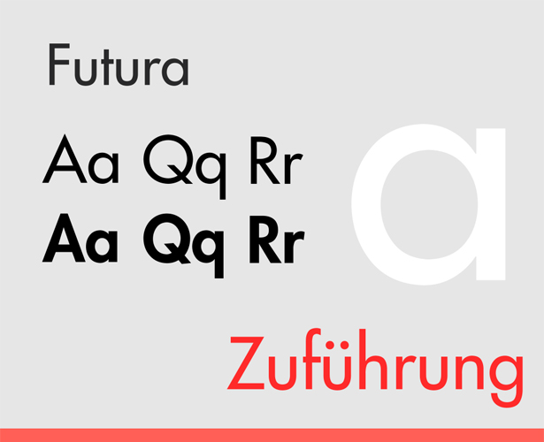 Futura was designed by Paul Renner. While he wasn't associated with the Bauhaus, he shared the idea that a modern typeface should express modern models, rather than simply reviving an older design.
Strengths
Futura was designed by Paul Renner. While he wasn't associated with the Bauhaus, he shared the idea that a modern typeface should express modern models, rather than simply reviving an older design.
StrengthsFutura has an efficient, forward appearance, and is derived from simple geometric forms. This is evident in the obvious influence of near-perfect circles, squares, and triangles. All non-essential elements were removed from the typeface, and the uppercase characters have proportions similar to classical Roman capitals. Best Uses
Futura is an excellent choice for advertising copy. It was used by IKEA until 2010, Volkswagen, Shell Petrol, and HP in their advertising and branding. West Anderson uses Futura for all of his films, and it was also Stanley Kubrick's favorite font. It's well suited to any modern design, for both headings and short copy.
Garamond
Garamond is an old-style serif typeface, named after punch-cutter Claude Garamond. Adobe Garamond and Stempel Garamond were both based on this original typeface from the 16th century, and Granjon and Sabon were heavily influenced by it. There are a few unique characteristics of Garamond, including the small bowl of the lowercase "a" and the small eye of the "e". Garamond is one of the most legible serif typefaces, especially for use in print applications. It's also one of the most eco-friendly typefaces in terms of ink usage. The original punches and matrices were sold to Christopher Plantin upon the death of Claude Garamond, and were in turn used in many printers, adding to its rise in popularity. Garamond revivals were created as early as 1900.
Strengths
Garamond is one of the most legible serif typefaces, especially for use in print applications. It's also one of the most eco-friendly typefaces in terms of ink usage. The original punches and matrices were sold to Christopher Plantin upon the death of Claude Garamond, and were in turn used in many printers, adding to its rise in popularity. Garamond revivals were created as early as 1900.
StrengthsGaramond's greatest strength is its legibility and readability. Best Uses
Garamond is an excellent choice for printed materials, including books and reports, due to its high legibility in print.
Gill Sans
Gill Sans is a humanist sans-serif typeface created in 1926 by Eric Gill. It was developed further, into a complete type family, after being commissioned by Stanley Morison to compete with the families of Erbar, Futura, and Kabel. In 1928, Gill Sans was released by Monotype Corporation.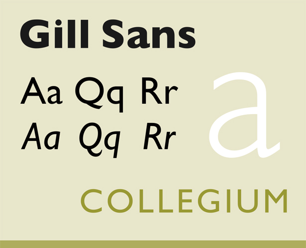 The uppercase characters of Gill Sans are based on Roman capitals like those found in Caslon and Baskerville. There are fourteen styles in the family. Gill Sans is distributed as a system font with Mac OS X and is bundled with some Microsoft products as Gill Sans MT.
Strengths
The uppercase characters of Gill Sans are based on Roman capitals like those found in Caslon and Baskerville. There are fourteen styles in the family. Gill Sans is distributed as a system font with Mac OS X and is bundled with some Microsoft products as Gill Sans MT.
StrengthsGill Sans has a less mechanical feel to it than typefaces like Futura, because of its basis in Roman tradition. The lowercase letters are modeled on the lowercase Carolignian script, which is especially noticeable in the two-story lowercase "a" and "g". This basis in traditional, classical typefaces gives Gill Sans a more refined look than many other sans serif typefaces. Best Uses
Gill Sans is ideal for display uses, and can be used successfully as a text font at larger sizes. It's best suited for modern designs, though it can be combined successfully with more traditional typefaces for classic designs.
Helvetica
Helvetica is probably the most commonly used typeface in all of graphic design, and almost certainly the most widely used sans serif. It was developed by Max Miedinger in 1957 with Eduard Hoffman, for the Haas Typefoundry. There are dozens of variations and numerous typefaces have been based on it.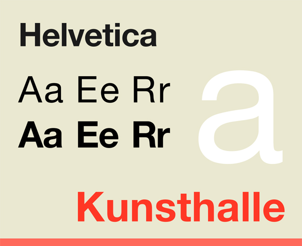 Helvetica is often considered a "neutral" typeface, in that it takes on the mood and attitude of its surroundings. Used in a modern setting, it appears modern. And yet it can blend into a classic setting effortlessly, too. It's largely because of this chameleon-like ability that Helvetica has become so widely used.
Strengths
Helvetica is often considered a "neutral" typeface, in that it takes on the mood and attitude of its surroundings. Used in a modern setting, it appears modern. And yet it can blend into a classic setting effortlessly, too. It's largely because of this chameleon-like ability that Helvetica has become so widely used.
StrengthsAs mentioned, Helvetica's ability to be used in virtually any circumstance is probably its greatest strength. It also has excellent letterforms and kerning. Best Uses
Helvetica could be argued to be the most versatile typeface out there. It's literally suitable for virtually any kind of design application, and looks good at both large and small sizes. It's used in numerous logotypes (including those for American Airlines, American Apparel, 3M, Verizon Wireless, Motorola, Panasonic, Target, Toyota, Microsoft, and many, many others). It's commonly seen online for both body copy and headlines, and can be seen in use on signs around the world.
Lucida Sans/Lucida Grande
Lucida Sans is a humanist, sans-serif typeface that is part of the larger Lucida type family (which includes serif, blackletter, console, and other variations). It was designed by Chalres Bigelow and Kris Holmes in 1985 as a complement to the Lucida Serif typeface. Technically, Lucida Grande is part of the Lucida Sans type family (which also includes Lucida Sans Typewriter, a monospaced typeface, and Lucida Sans Unicode, which is based on Lucida Sans regular but with additional characters).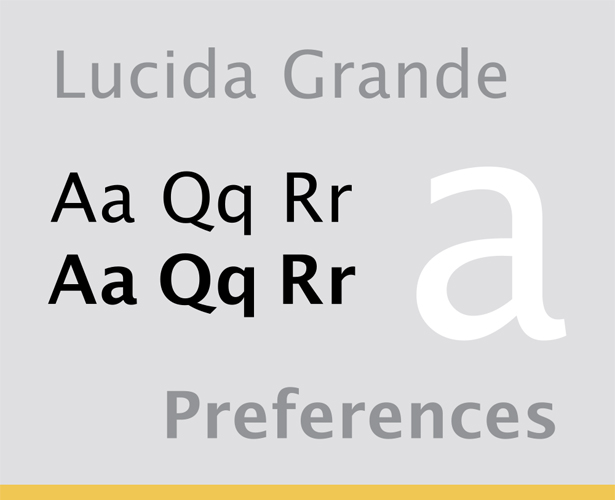 Strengths
Lucida Grande and Lucida Sans are both highly legible, even at small sizes. Because of this, they're heavily used for body copy and large blocks of small text. Best Uses
Lucida Grande and Lucida Sans are both commonly seen as the primary typeface for body text on various websites and blogs, Facebook being just one example. It's most recognizable, though, for its use throughout the user interface of Mac OS X.
Minion
Minion is an old style serif typeface, inspired by late Renaissance-era typefaces. It was designed in 1990 by Robert Slimbach for Adobe Systems. One unique feature of Minion is the support of Regular and Display optical sizes, meant to optimize the legibility by using different stroke contrasts and details, in the Regular and Italic versions of the typeface.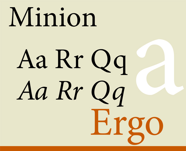 The Minion Expert font package includes small caps, ligatures, old style ligatures, and swash glyphs that aren't included in the regular Minion package. There's also a Cyrillic version of Minion available.
Strengths
The Minion Expert font package includes small caps, ligatures, old style ligatures, and swash glyphs that aren't included in the regular Minion package. There's also a Cyrillic version of Minion available.
StrengthsThe different optical sizes available with Minion are one of its greatest strengths, making it considerably more versatile. Best Uses
Minion is an excellent choice for printed copy, and is used for typesetting books and journals. It has also been used in various logotypes, including MathWorks' Matlab and Brown University.
Myriad
Myriad is a humanist sans-serif typeface created specifically for Adobe Systems by Robert Slimbach and Carol Twombly. It's easily distinguishable from other sans-serif fonts because of its special "y" descender and slanting "e"cut.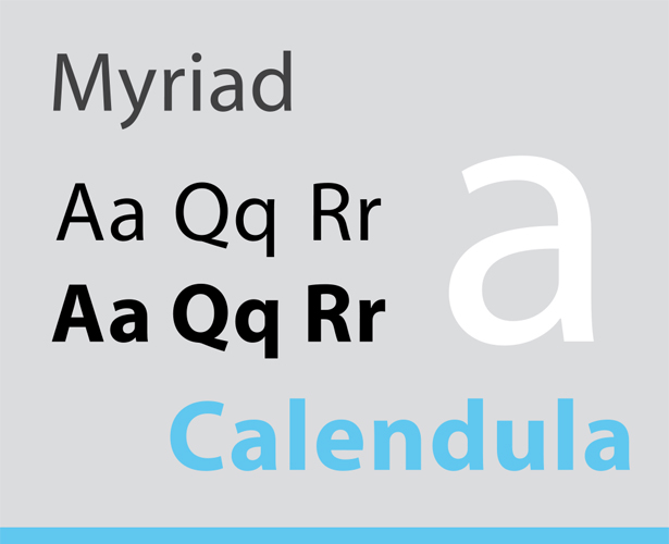 Originally, Myriad was offered in two weights, with complementary italics for each. Later, a condensed version was released, and then a "Headline" version. Additional variations have since ben released, including Myriad Web and Myriad Pro.
Strengths
Originally, Myriad was offered in two weights, with complementary italics for each. Later, a condensed version was released, and then a "Headline" version. Additional variations have since ben released, including Myriad Web and Myriad Pro.
StrengthsMyriad's greatest strength is the letterforms it includes that set it apart from other sans-serif typefaces, which are often too similar to be easily recognizable. Best Uses
Myriad is recognizable as the typeface of choice for Apple's branding efforts. It's well-suited to modern designs, especially if you want to evoke Apple's corporate branding.
Optima
Optima is a unique sans-serif typeface, in that it uses varying stroke weights more commonly found in serif typefaces. In addition to the varying stroke weights, it also has subtle swelling at its terminals, reminiscent of a glyphic serif. The italic version of Optima is really just an oblique, without any specialized italic letterforms (like a single-story "a"), which is more typical of realist sans-serif typefaces like Helvetica.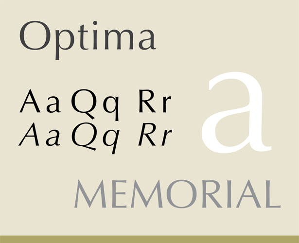 Optima was designed by Hermann Zapf in the mid-50s, for the D. Stempel AG Foundry. Linotype owns the trademark to Optima, though the typeface is widely imitated (Bitstream's Zapf Humanist is one such example, as well as the free MgOpen Cosmetica).
Strengths
Optima was designed by Hermann Zapf in the mid-50s, for the D. Stempel AG Foundry. Linotype owns the trademark to Optima, though the typeface is widely imitated (Bitstream's Zapf Humanist is one such example, as well as the free MgOpen Cosmetica).
StrengthsOptima's similarity to serif typefaces gives it a more classic appearance than most sans serifs. It also improves legibility at some sizes. Best Uses
Optima is an elegant if conservative type choice, and is well-suited to understated designs. Most famously, it's been used for the Vietnam Veterans Memorial, and by the 2008 John McCain presidential campaign. It's also the official branding typeface of Estée Lauder Companies and Aston Martin.
Palatino
Palatino started out as an old style serif typeface designed by Hermann Zapf. It was released in 1948 by Linotype. A revised version was released in 1999, also designed by Zapf, called Palatino Linotype. This new family included extended Latin, Greek, and Cyrillic characters.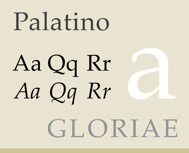 The original Palatino was based on humanist typefaces from the Italian Renaissance, and was named after 16th century Italian calligraphy master Giambattista Palatino. Palatino has larger proportions than most Renaissance-inspired type, and because of that is much easier to read.
Strengths
The original Palatino was based on humanist typefaces from the Italian Renaissance, and was named after 16th century Italian calligraphy master Giambattista Palatino. Palatino has larger proportions than most Renaissance-inspired type, and because of that is much easier to read.
StrengthsPalatino's greatest strength is its readability. Best Uses
Palatino is widely used for body copy, especially in books and similar printed materials.
Rockwell
Rockwell is a slab serif, with no real variation in stroke weight. It was designed in-house at Monotype in 1934, supervised by Frank Hinman Pierpont. It's a geometric typeface, with upper- and lowercase "O" more of a circle than an ellipse. The serif at the apex of the uppercase "A" is a distinctive feature of Rockwell that sets it apart from many other serif type faces.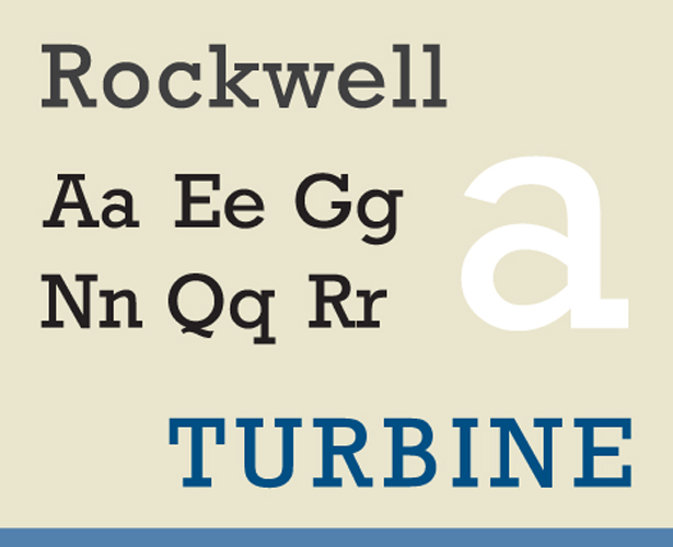 Strengths
The geometric forms of Rockwell make it more similar to sans-serif typefaces, making it a good choice for combining with geometric sans serifs. Best Uses
Rockwell is best-suited for use as a display typeface due to its thick, monoweighted strokes.
Sabon
Sabon is an old style serif typeface designed by Jan Tschichold between 1964 and 1967. It was released jointly by Linotype, Monotype, and Stempel foundries in 1967. It's based on typefaces designed by Claude Garamond, particularly the one printed by Konrad Berner of Frankfurt, as well as the italics by Robert Grandjon.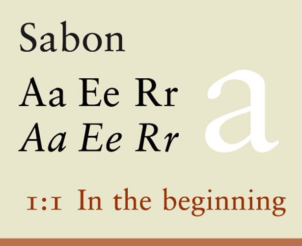 One of the distinguishing features of Sabon is that the roman, italic, and bold weights all take up the same width when typeset. It's an unusual feature, but meant that only one set of copyfitting data is needed for all three styles.
Strengths
One of the distinguishing features of Sabon is that the roman, italic, and bold weights all take up the same width when typeset. It's an unusual feature, but meant that only one set of copyfitting data is needed for all three styles.
StrengthsSabon is a highly legible typeface, with moderate contrast between thick and thin strokes. That makes it suitable for use in a variety of sizes. Best Uses
Sabon is a favorite for typesetting book copy, and is well-suited to any traditional or formal design.
Times New Roman
Times New Roman was commissioned by the British newspaper The Times in 1931 after the paper was criticized by Stanley Morison for being typographically antiquated and poorly printed. It was created by Cameron S. Latham of Monotype, under the supervision of Morison.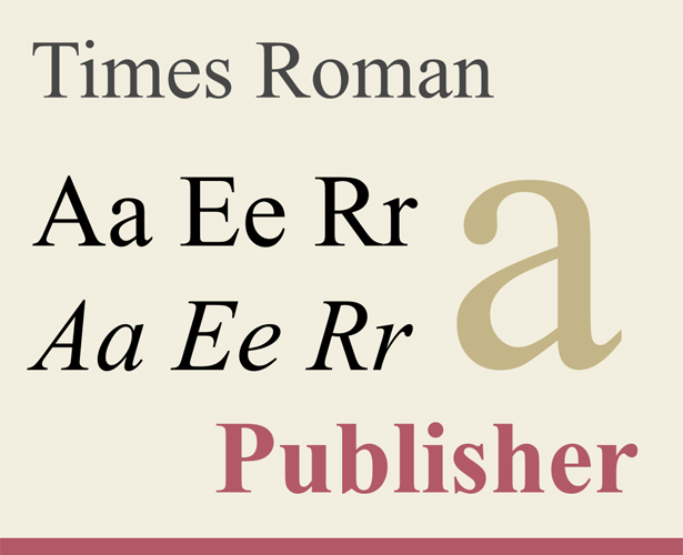 The name "Times New Roman" was used because the former font of The Times was called "Times Old Roman". It was based on another typeface by Morison, called Plantin, but revisions were made to make it more economical in terms of space and to increase legibility. Times New Roman is still widely used in book typography, and it has served as the basis for a number of other typeface, including Georgia.
Strengths
The name "Times New Roman" was used because the former font of The Times was called "Times Old Roman". It was based on another typeface by Morison, called Plantin, but revisions were made to make it more economical in terms of space and to increase legibility. Times New Roman is still widely used in book typography, and it has served as the basis for a number of other typeface, including Georgia.
StrengthsThe ubiquitous nature of Times New Roman has made it an ideal choice for situations where fonts can't be embedded. It's also highly readable, even at smaller sizes. Best Uses
Times New Roman is best suited for body copy, both online and off.
Univers
Univers is a neo-grotesque sans serif typeface that was designed by Adrian Frutiger in 1954, and released by Deberny & Piegnot in 1957. It was then acquired by Haas in 1972, and later by D. Stempel AG and then Linotype.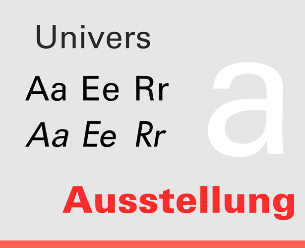 Univers is based on the 1898 typeface Akzidenz-Grotesk, which was also the basis for Helvetica (the two typefaces are sometimes confused). The entire Univers type family consists of 44 faces, with 16 uniquely numbered weight, width, and position combinations. Twenty of these fonts offer oblique characters, while eight support Central European character sets and another eight support Cyrillic characters.
Strengths
Univers is based on the 1898 typeface Akzidenz-Grotesk, which was also the basis for Helvetica (the two typefaces are sometimes confused). The entire Univers type family consists of 44 faces, with 16 uniquely numbered weight, width, and position combinations. Twenty of these fonts offer oblique characters, while eight support Central European character sets and another eight support Cyrillic characters.
StrengthsThe largest strength of Univers is its diversity, which is further enhanced by the number of weights available. It also has some of the same neutral character of Helvetica. Best Uses
Univers is well-suited to a variety of designs, especially modern designs. It works well as both body copy and display.
Close calls
There are a lot more typefaces that are commonly used by designers the world over. Below is just a partial list of some additional popular choices (feel free to add more in the comments!): Antique Olive Avant Garde
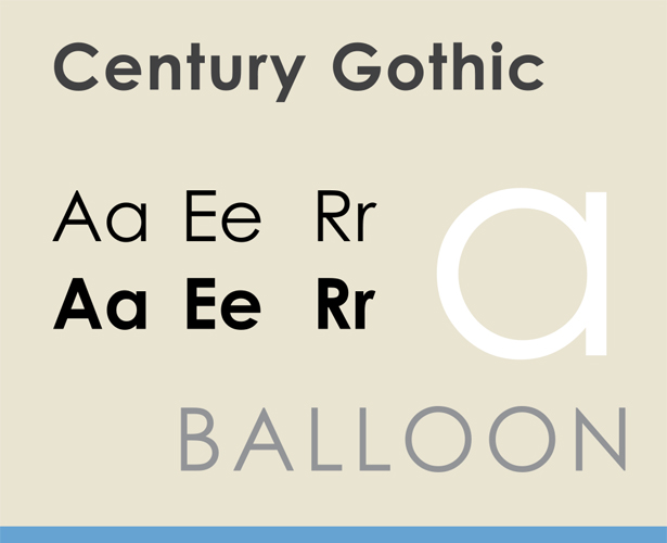
 Century Gothic
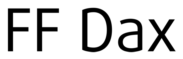
 Dax
Dax
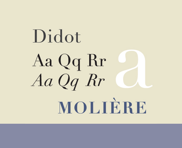
 Didot
Didot
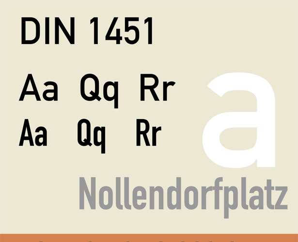
 Din
Din
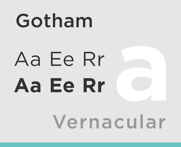
 Gotham
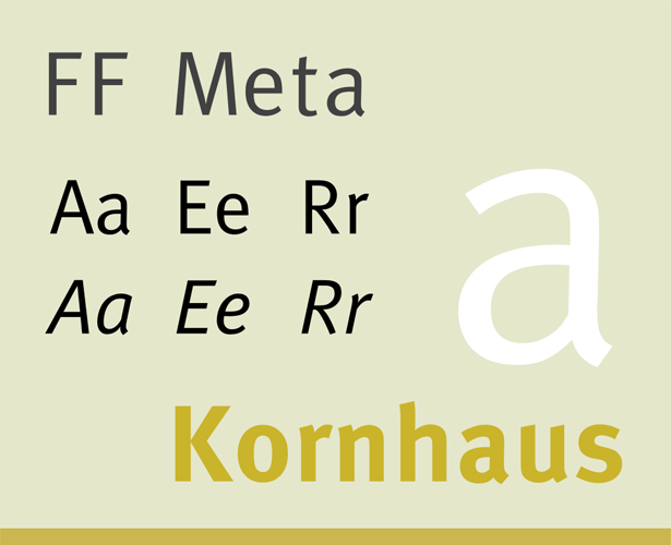
 Meta
Meta
 Mrs Eaves
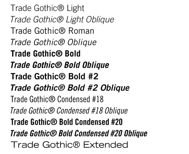
 Trade Gothic
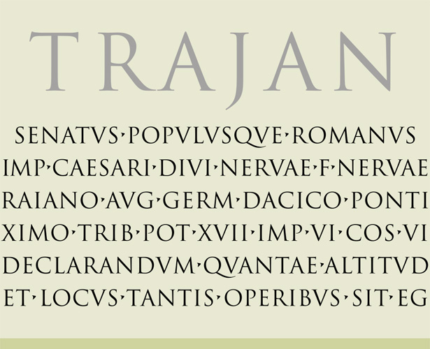
 Trajan
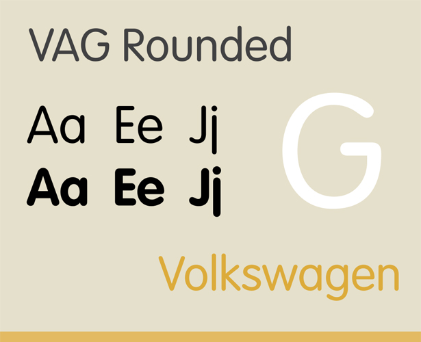
 VAG Rounded
 Warnock
 What do you think of these fonts? Have we missed any of your old time favorites? Go ahead and add them in the comments below.


Read Next

3 Essential Design Trends, May 2024
Integrated navigation elements, interactive typography, and digital overprints are three website design trends making…

How to Write World-Beating Web Content
Writing for the web is different from all other formats. We typically do not read to any real depth on the web; we…
By Louise North

20 Best New Websites, April 2024
Welcome to our sites of the month for April. With some websites, the details make all the difference, while in others,…

Exciting New Tools for Designers, April 2024
Welcome to our April tools collection. There are no practical jokes here, just practical gadgets, services, and apps to…

How Web Designers Can Stay Relevant in the Age of AI
The digital landscape is evolving rapidly. With the advent of AI, every sector is witnessing a revolution, including…
By Louise North

14 Top UX Tools for Designers in 2024
User Experience (UX) is one of the most important fields of design, so it should come as no surprise that there are a…
By Simon Sterne

What Negative Effects Does a Bad Website Design Have On My Business?
Consumer expectations for a responsive, immersive, and visually appealing website experience have never been higher. In…

10+ Best Resources & Tools for Web Designers (2024 update)
Is searching for the best web design tools to suit your needs akin to having a recurring bad dream? Does each…
By WDD Staff

3 Essential Design Trends, April 2024
Ready to jump into some amazing new design ideas for Spring? Our roundup has everything from UX to color trends…

How to Plan Your First Successful Website
Planning a new website can be exciting and — if you’re anything like me — a little daunting. Whether you’re an…
By Simon Sterne

15 Best New Fonts, March 2024
Welcome to March’s edition of our roundup of the best new fonts for designers. This month’s compilation includes…
By Ben Moss

LimeWire Developer APIs Herald a New Era of AI Integration
Generative AI is a fascinating technology. Far from the design killer some people feared, it is an empowering and…
By WDD Staff