 Many sites that require login credentials enforce a security setting often referred to as password complexity requirements. These requirements ensure that user passwords are sufficiently strong and cannot be easily broken.
What constitutes a strong password? Well, that depends on who you ask. However, traditional factors that contribute to a password's strength include it's length, complexity, and unpredictability. To ensure password strength, many sites require user passwords to be alphanumeric in addition to being a certain length.
In this tutorial, we'll construct a form that gives the user live feedback as to whether their password has sufficiently met the complexity requirements we will establish.
Before we begin, let's get take a sneak peak at what our final product will look like (click for a demo):
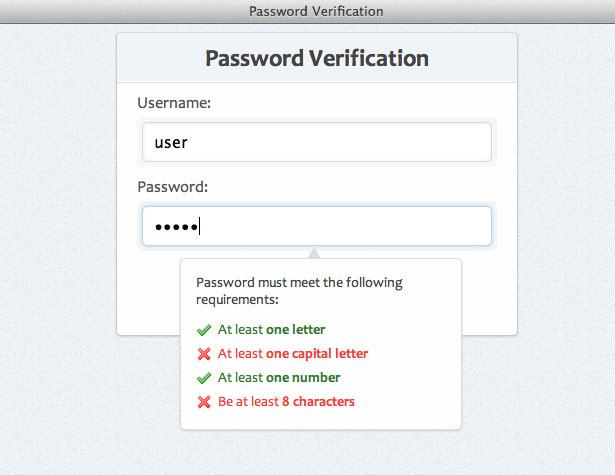 Please note: The purpose of this tutorial is to show how a simple script can be written using javascript and jQuery to enforce password complexity requirements. You'll be able to add additional requirements to the script if needed; however, note that form validation (server- and client-side), form submission, and other topics are not covered in this example.
Step 1: Starter HTML
First we want to get our basic HTML starter code. We'll use the following:<!DOCTYPE html> <html> <head> <title>Password Verification</title> </head> <body> <div id="container"> <-- Form HTML Here --> </div> </body> </html>
Step 2: Form HTML
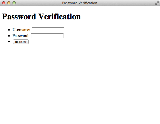
Now let's add the markup that will be used for our form. We will wrap our form elements in list items for better structure and organization.<h1>Password Verification</h1> <form> <ul> <li> <label for="username">Username:</label> <span><input id="username" name="username" type="text" /></span> </li> <li> <label for="pswd">Password:</label> <span><input id="pswd" type="password" name="pswd" /></span> </li> <li> <button type="submit">Register</button> </li> </ul> </form>Here's an explanation of the code we used:
spanelements - these will be used for visual styling of our input elements (as you'll see later on in the CSS)type="password"- this is an HTML5 attribute for form elements. In supported browsers, the characters in this field will be replaced by black dots thus hiding the actual password on-screen.
Step 3: Password information box HTML
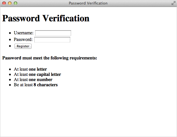
Now let's add the HTML that will inform the user which complexity requirements are being met. This box will be hidden by default and only appear when the "password" field is in focus.<div id="pswd_info"> <h4>Password must meet the following requirements:</h4> <ul> <li id="letter" class="invalid">At least <strong>one letter</strong></li> <li id="capital" class="invalid">At least <strong>one capital letter</strong></li> <li id="number" class="invalid">At least <strong>one number</strong></li> <li id="length" class="invalid">Be at least <strong>8 characters</strong></li> </ul> </div>Each list item is given a specific ID attribute. These IDs will be used to target each complexity requirement and show the user if the requirement has been met or not. Also, each element will be styled as "valid" if the user's password has met the requirement or invalid if they haven't met it (if the input field is blank, none of the requirements have been met; hence the default class of "invalid"). Here's what we have so far:
Step 4: Create background style
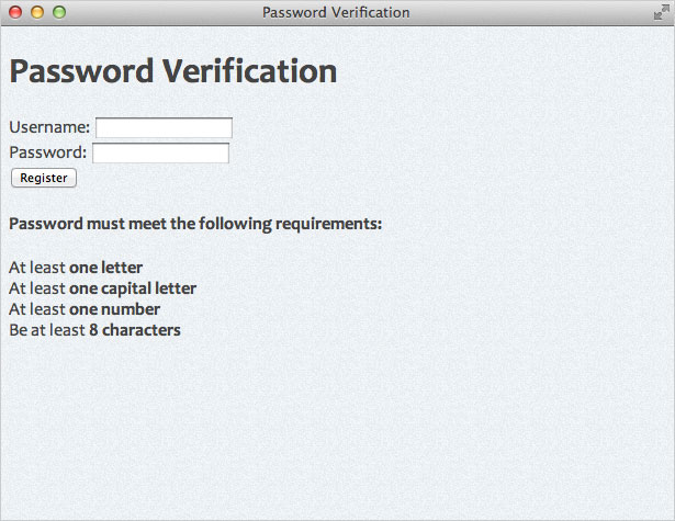
We are going to give our page elements some basic styling. Here's an overview of what we'll do in our CSS:- Add a background color - I used #EDF1F4
- Add a background image with texture (created in Photoshop)
- Setup our font stack - We'll use a nice sans-serif font stack
- Remove/modify some browser defaults
body {
 background:#edf1f4 url(bg.jpg);
 font-family: "Segoe UI", Candara, "Bitstream Vera Sans", "DejaVu Sans", "Bitstream Vera Sans", "Trebuchet MS", Verdana, "Verdana Ref", sans serif;
 font-size:16px;
 color:#444;
}
ul, li {
 margin:0;
 padding:0;
 list-style-type:none;
}
Step 5: Create background style
Now we will style our main container and center it in the page. We'll also applying some styles to our H1 tag.#container {
width:400px;
padding:0px;
background:#fefefe;
margin:0 auto;
border:1px solid #c4cddb;
border-top-color:#d3dbde;
border-bottom-color:#bfc9dc;
box-shadow:0 1px 1px #ccc;
border-radius:5px;
position:relative;
}
h1 {
margin:0;
padding:10px 0;
font-size:24px;
text-align:center;
background:#eff4f7;
border-bottom:1px solid #dde0e7;
box-shadow:0 -1px 0 #fff inset;
border-radius:5px 5px 0 0; /* otherwise we get some uncut corners with container div */
text-shadow:1px 1px 0 #fff;
}
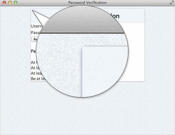
It's important to note that we have to give our H1 tag a border radius on its top two corners. If we don't, the H1's background color will overlap the rounded corners of it's parent element (#container) and it will look like this:
 Adding
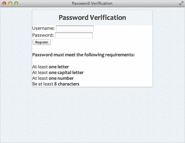
 border-radius to the H1 element assures our top corners will remain rounded. Here's what we have so far:
Step 6: CSS styles for the form
Now let's style our various form elements starting with the list elements inside the form:form ul li {
margin:10px 20px;
}
form ul li:last-child {
text-align:center;
margin:20px 0 25px 0;
We used the :last-child selector to select the last item in the list (button) and give it some extra spacing. (Note this selector is not supported in some legacy browsers). Next, let's style our input elements:
input {
 padding:10px 10px;
 border:1px solid #d5d9da;
 border-radius:5px;
 box-shadow: 0 0 5px #e8e9eb inset;
 width:328px; /* 400 (#container) - 40 (li margins) - 10 (span paddings) - 20 (input paddings) - 2 (input borders) */
 font-size:1em;
 outline:0; /* remove webkit focus styles */
}
input:focus {
 border:1px solid #b9d4e9;
 border-top-color:#b6d5ea;
 border-bottom-color:#b8d4ea;
 box-shadow:0 0 5px #b9d4e9;
Notice that we calculated our input element's width by taking the #container width (400px) and subtracting the margins, paddings, and borders applied to the input's parent elements. We also used the outline property to remove the default WebKit focus styles. Lastly let's apply some styles to our other form elements:
label {
 color:#555;
}
#container span {
 background:#f6f6f6;
 padding:3px 5px;
 display:block;
 border-radius:5px;
 margin-top:5px;
}
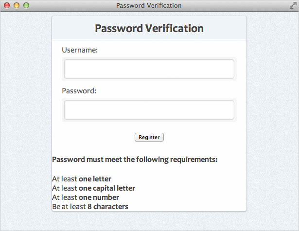
Now we have something that looks like this:
Step 7: Button Styles
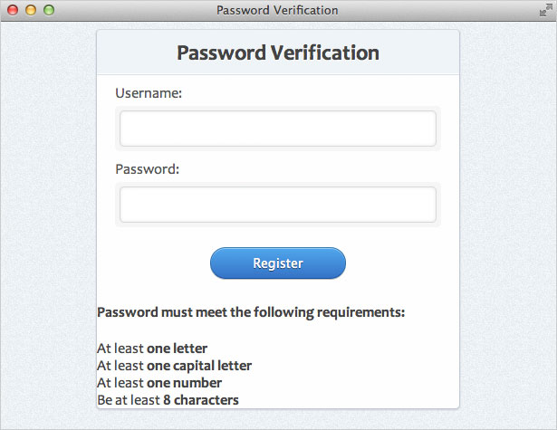
Now we are going to style our button element. We'll use some CSS3 styles so users with newer browsers get a better experience. If you're looking for a great resource when creating background gradients in CSS3, check out Ultimate CSS Gradient Generator.button {
background: #57a9eb; /* Old browsers */
background: -moz-linear-gradient(top, #57a9eb 0%, #3a76c4 100%); /* FF3.6+ */
background: -webkit-gradient(linear, left top, left bottom, color-stop(0%,#57a9eb), color-stop(100%,#3a76c4)); /* Chrome,Safari4+ */
background: -webkit-linear-gradient(top, #57a9eb 0%,#3a76c4 100%); /* Chrome10+,Safari5.1+ */
background: -o-linear-gradient(top, #57a9eb 0%,#3a76c4 100%); /* Opera 11.10+ */
background: -ms-linear-gradient(top, #57a9eb 0%,#3a76c4 100%); /* IE10+ */
background: linear-gradient(top, #57a9eb 0%,#3a76c4 100%); /* W3C */
filter: progid:DXImageTransform.Microsoft.gradient( startColorstr='#57a9eb', endColorstr='#3a76c4',GradientType=0 ); /* IE6-9 */
border:1px solid #326fa9;
border-top-color:#3e80b1;
border-bottom-color:#1e549d;
color:#fff;
text-shadow:0 1px 0 #1e3c5e;
font-size:.875em;
padding:8px 15px;
width:150px;
border-radius:20px;
box-shadow:0 1px 0 #bbb, 0 1px 0 #9cccf3 inset;
}
button:active {
background: #3a76c4; /* Old browsers */
background: -moz-linear-gradient(top, #3a76c4 0%, #57a9eb 100%); /* FF3.6+ */
background: -webkit-gradient(linear, left top, left bottom, color-stop(0%,#3a76c4), color-stop(100%,#57a9eb)); /* Chrome,Safari4+ */
background: -webkit-linear-gradient(top, #3a76c4 0%,#57a9eb 100%); /* Chrome10+,Safari5.1+ */
background: -o-linear-gradient(top, #3a76c4 0%,#57a9eb 100%); /* Opera 11.10+ */
background: -ms-linear-gradient(top, #3a76c4 0%,#57a9eb 100%); /* IE10+ */
background: linear-gradient(top, #3a76c4 0%,#57a9eb 100%); /* W3C */
filter: progid:DXImageTransform.Microsoft.gradient( startColorstr='#3a76c4', endColorstr='#57a9eb',GradientType=0 ); /* IE6-9 */
box-shadow:none;
text-shadow:0 -1px 0 #1e3c5e;
}
Step 8: Password Information Box
Now we are going to style the box that informs users if they are meeting the password requirements. First, we will style the containing element (#pswd_info).#pswd_info {
position:absolute;
bottom:-75px;
bottom: -115px\9; /* IE Specific */
right:55px;
width:250px;
padding:15px;
background:#fefefe;
font-size:.875em;
border-radius:5px;
box-shadow:0 1px 3px #ccc;
border:1px solid #ddd;
}
Now let's add some style to the H4 element:
#pswd_info h4 {
 margin:0 0 10px 0;
 padding:0;
 font-weight:normal;
}
Lastly, we are going to use the CSS ::before selector to add an "up-pointing triangle". This is a geometric character which can be inserted using it's corresponding UNICODE entity. Normally in HTML you would use the character's HTML entity (▲). However, because we are adding it in CSS, we must use the UNICODE value (25B2) preceded by a backslash.
#pswd_info::before {
 content: "\25B2";
 position:absolute;
 top:-12px;
 left:45%;
 font-size:14px;
 line-height:14px;
 color:#ddd;
 text-shadow:none;
 display:block;
}
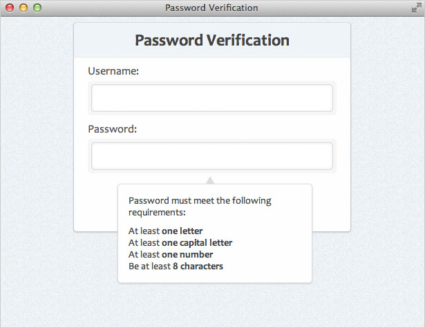
Now we have this:
Step 9: Valid and invalid states
Let's add some styles to our requirements. If the requirement has been met, we'll give it a class of "valid". If it hasn't been met, it will get a class of "invalid" (default class). As for the icons, I am using two 16x16 pixel icons from the Silk Icon Set..invalid {
background:url(../images/invalid.png) no-repeat 0 50%;
padding-left:22px;
line-height:24px;
color:#ec3f41;
}
.valid {
background:url(../images/valid.png) no-repeat 0 50%;
padding-left:22px;
line-height:24px;
color:#3a7d34;
}
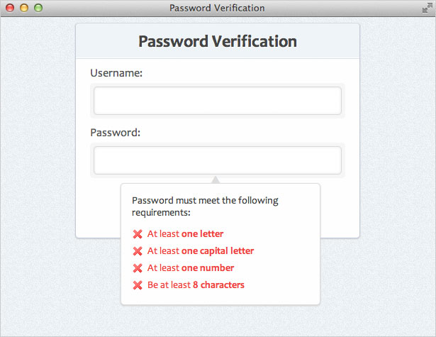
Because we haven't included the JavaScript functionality that will dynamically change the "valid" and "invalid" classes, all requirements will appear as invalid (we'll change this later). Here's what we have so far:
Hide the Box
Now that we have everything styled exactly how we want it, we're going to hide the password information box. We'll toggle it's visibility to the user using JavaScript. So let's add the following rule:#pswd_info {
display:none;
}
Step 10: Grasping the scope
Here is what we want to accomplish with our script:- When the password field is selected (:focus), show it
- Every time the user types a new character in the password field, check and see if that character fulfills one of the following password complexity rules:
- At least one letter
- At least one capital letter
- At least one number
- At least eight characters in length
- If it does, mark that rule as "valid"
- If it doesn't, mark that rule as "invalid"
- When the password field is not selected (':blur'), hide it
Step 11: Getting jQuery setup
First, we need to add jQuery to our page. We'll use the hosted version. We also want to link to our "script.js" file, which is where we will write the code needed for our password verification test. So, add the following to your<head> tag:
<script src="https://code.jquery.com/jquery-1.7.min.js"></script>
<script src="script.js"></script>
In our "script.js" file, we'll start with some basic jQuery starter code for our script:
$(document).ready(function() {

 //code here

});
Step 12: Setting up the event triggers
Essentially we have three events we will be listening for:- "Keyup" on the password input field
(triggers whenever the user pushes a key on the keyboard) - "Focus" on the password input field
(triggers whenever the password field is selected by the user) - "Blur" on the password input field
(triggers whenever the password field is unselected)
$('input[type=password]').keyup(function() {
 // keyup event code here
});
$('input[type=password]').focus(function() {
 // focus code here
});
$('input[type=password]').blur(function() {
 // blur code here
});
We can chain all the events together and type the following:
$('input[type=password]').keyup(function() {
 // keyup code here
}).focus(function() {
 // focus code here
}).blur(function() {
 // blur code here
});
So, with that knowledge, let's create our code that will show or hide our password information box depending on whether the password input field is selected by the user or not:
$('input[type=password]').keyup(function() {
 // keyup code here
}).focus(function() {
 $('#pswd_info').show();
}).blur(function() {
 $('#pswd_info').hide();
});
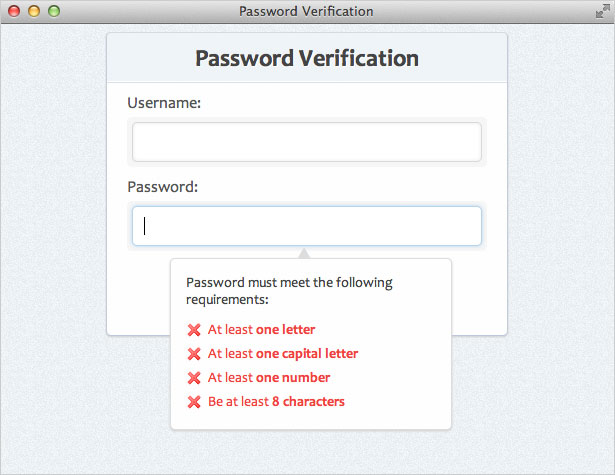
You will now notice that by clicking in the password input field, the password information box will be visible. Likewise, by clicking outside the password input field, the password information box will be hidden.
Step 13: Checking the complexity rules
All we need to do now is have the script check the value in the password field every time a new character is entered (using the 'keyup' event). So, inside the$('input[type=password]').keyup function we'll add the following code:
// set password variable
var pswd = $(this).val();
This sets up a variable named 'pswd' that stores the current password field value every time there is a keyup event. We will use this value in checking each of our complexity rules.
Validating the length
Now, inside the same keyup function, let's add the following://validate the length
if ( pswd.length < 8 ) {
$('#length').removeClass('valid').addClass('invalid');
} else {
$('#length').removeClass('invalid').addClass('valid');
}
This checks to see if the length of the current password value is smaller than 8 characters. If it is, it's get an 'invalid' class. If it's bigger than 8 characters, it gets a 'valid' class.
Validating with regular expressions
As you saw above, we simply have an if/else statement that tests to see if the complexity requirement has been met. If the complexity requirement is met, we give it's ID in the password box a class of "valid". If it is not met, it gets a class of "invalid". The rest of our requirements will require we use regular expressions to test the complexity rules. So, let's add the following://validate letter
if ( pswd.match(/[A-z]/) ) {
$('#letter').removeClass('invalid').addClass('valid');
} else {
$('#letter').removeClass('valid').addClass('invalid');
}
//validate capital letter
if ( pswd.match(/[A-Z]/) ) {
$('#capital').removeClass('invalid').addClass('valid');
} else {
$('#capital').removeClass('valid').addClass('invalid');
}
//validate number
if ( pswd.match(/\d/) ) {
$('#number').removeClass('invalid').addClass('valid');
} else {
$('#number').removeClass('valid').addClass('invalid');
}
Here is an explanation of the three if/else statements we used:
- [A-z]
- This expressions checks to make sure at least one letter of A through Z (uppercase) or a through z (lowercase) has been entered
- [A-Z]
- This expressions checks to make sure at least one uppercase letter has been entered
- \d
- This will check for any digits 0 through 9
Step 14: Test it out
That's all there is to it! You can add more to this if you want. You could add more complexity rules, you could add a submission method, or you could add whatever else you deem necessary.
Jim Nielsen
Jim Nielsen currently lives in NYC working as a designer for an enterprise software startup. He loves to ski, read, eat street tacos, take road trips to the tunes of Bob Dylan, and transform complexity into simplicity. On the internet, you can find him on twitter and his personal site.
Read Next
3 Essential Design Trends, May 2024
Integrated navigation elements, interactive typography, and digital overprints are three website design trends making…
How to Write World-Beating Web Content
Writing for the web is different from all other formats. We typically do not read to any real depth on the web; we…
By Louise North
20 Best New Websites, April 2024
Welcome to our sites of the month for April. With some websites, the details make all the difference, while in others,…
Exciting New Tools for Designers, April 2024
Welcome to our April tools collection. There are no practical jokes here, just practical gadgets, services, and apps to…
How Web Designers Can Stay Relevant in the Age of AI
The digital landscape is evolving rapidly. With the advent of AI, every sector is witnessing a revolution, including…
By Louise North
14 Top UX Tools for Designers in 2024
User Experience (UX) is one of the most important fields of design, so it should come as no surprise that there are a…
By Simon Sterne
What Negative Effects Does a Bad Website Design Have On My Business?
Consumer expectations for a responsive, immersive, and visually appealing website experience have never been higher. In…
10+ Best Resources & Tools for Web Designers (2024 update)
Is searching for the best web design tools to suit your needs akin to having a recurring bad dream? Does each…
By WDD Staff
3 Essential Design Trends, April 2024
Ready to jump into some amazing new design ideas for Spring? Our roundup has everything from UX to color trends…
How to Plan Your First Successful Website
Planning a new website can be exciting and — if you’re anything like me — a little daunting. Whether you’re an…
By Simon Sterne
15 Best New Fonts, March 2024
Welcome to March’s edition of our roundup of the best new fonts for designers. This month’s compilation includes…
By Ben Moss
LimeWire Developer APIs Herald a New Era of AI Integration
Generative AI is a fascinating technology. Far from the design killer some people feared, it is an empowering and…
By WDD Staff


