
 In this tutorial we're going to be designing an iPhone user interface for a forum and chat based mobile application.
The app involves a handful of everyday touch interface elements, such as buttons, input fields and touch gestures.
We will be covering various Photoshop tools, layer styles and of course tackling any design constraints; as well making the design pixel-perfect and beautiful enough to be worthy of a place on an iPhone screen.
The design was put together using Photoshop CS5.5, however all recent versions of Photoshop will work wonderfully.
In this tutorial we're going to be designing an iPhone user interface for a forum and chat based mobile application.
The app involves a handful of everyday touch interface elements, such as buttons, input fields and touch gestures.
We will be covering various Photoshop tools, layer styles and of course tackling any design constraints; as well making the design pixel-perfect and beautiful enough to be worthy of a place on an iPhone screen.
The design was put together using Photoshop CS5.5, however all recent versions of Photoshop will work wonderfully.
App screen requirements
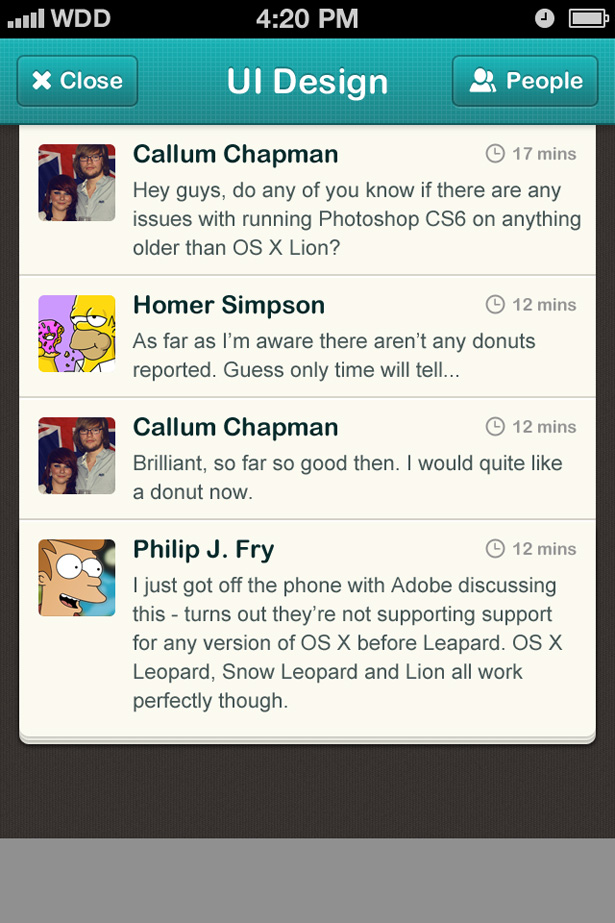
We're just going to be creating one screen in this tutorial. The screen is going to be the main chat screen for a chat-based application, much like a public chatroom but on your phone. The requirements of this screen are:- A header — this is the chatroom you are currently in.
- A back/close/topics button — to go back to the previous screen.
- A people button — this shows who is currently in the chatroom.
- A list of messages — messages must have avatar & timestamp.
- A way of viewing users profiles and reporting messages.
- A text field to write your messages.
- A send button to post your messages.
Planning, sketching and wireframing
As with any user interface project, planning, sketching, and wireframing your interface is essential. It quite often rules out any silly ideas (although they might not seem silly in your head!) before putting digital concepts and mockups together. What could seem like a brilliant solution to fixing a problem in your head could ultimately not work at all in real practice, which is why wireframing before starting a project is such an important step. Grab a pen and your favorite pad and begin sketching.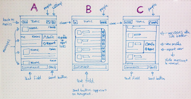 As you can see from the above image, I spent just a few minutes putting together three different concepts; usually this process takes days or sometimes weeks, but as we're only designing one screen and the purpose of the app is simple, sketching these shouldn't take long! They are mostly very similar, but each one has its unique differences, which I'll sum up below.
Sketch A
Inspired by the original Twitter UI for iPhone, this UI allow users to swipe on a message to view more options, such as "View Profile" and "Report User" — a fun and space-saving way to allow more content on this screen. I toyed with the idea of having a settings button in the navigation bar in this screen, but decided to follow my normal rule of "Less Is More" — it's unlikely the user will be accessing settings every time they use the app so it's not needed here.Sketch B
This concept is a little more compact, with the "View Profile" and "Report User" buttons as static icons to the right of the messages. I played with the idea of not having a "Send" button here, and instead make use of the send button on the iOS keyboard. I decided against this as most apps (including iOS standard apps such as messages) have the keyboard send button as well as the additional send button next the text input field. I like to keep my interfaces consistent with others on the App Store.Sketch C
Sketch C is the sketch I have decided to go ahead with — instead of a back button we have a close button. I think this makes it more obvious that once you click close, you will no longer be a part of that conversation (unlike messaging apps, where you go back, and can return to still see all of those previous messages). The people button shows a list of users currently in the chatroom, and I have readopted the idea of having the slide to view more features element (like the Twitter app) to allow the user to view the user's profile or report them. With this done, it's time to move on to putting something together in Photoshop!Step 1: Status and navigation bar
Before we go ahead with this step, we need to create our document. The standard iPhone screen size (at Retina resolution) is 640px wide and 960px high with a resolution of 326ppi. I tend to always start with a white background in my designs. The first step is to put in the default iOS status bar. The status bar is the bar at the top of your iPhone that tells you important information such as your signal, carrier, time, and battery life. There are three options here: a black bar, a low transparency black bar or the silver bar.
If you want to make your app design look like the real deal, you can grab the status bar from the Retina iPhone GUI PSD kit found here. Simply download and open the PSD, and drag the bar you want over to your PSD document. Position it at the top of your canvas.
The first step is to put in the default iOS status bar. The status bar is the bar at the top of your iPhone that tells you important information such as your signal, carrier, time, and battery life. There are three options here: a black bar, a low transparency black bar or the silver bar.
If you want to make your app design look like the real deal, you can grab the status bar from the Retina iPhone GUI PSD kit found here. Simply download and open the PSD, and drag the bar you want over to your PSD document. Position it at the top of your canvas.
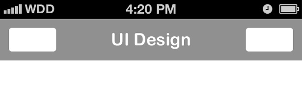
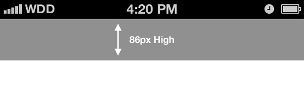 The navigation bar is next on our to-do list. The standard navigation bar is 86px high, and spans the whole width of your iPhone (640px). Again, you can drag this element over from the aforementioned PSD kit, or you can create this manually (my preferred option as there are no attached styles). Select the Rectangle Shape Tool and place a 640 x 86px rectangle onto your canvas.
Step 2: Navigation bar buttons
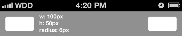 Referring back to our wireframes, we have two buttons on our nav bar. Select the Rounded Rectangle Shape Tool (remember to always use shape tools for shapes in UI design, it makes it much easier to scale our document for lower resolutions!). I've used dimensions 100 x 50px with a corner radius of 6px.
Place this shape on to both your left and right sides of your navigation bar, and position them nicely.
Referring back to our wireframes, we have two buttons on our nav bar. Select the Rounded Rectangle Shape Tool (remember to always use shape tools for shapes in UI design, it makes it much easier to scale our document for lower resolutions!). I've used dimensions 100 x 50px with a corner radius of 6px.
Place this shape on to both your left and right sides of your navigation bar, and position them nicely.
Step 3: Style selection
 It's time to begin choosing our design style. This app will allow people to chat and meet new people, and allow people to have fun doing so. For that reason, I feel a fun, quirky color scheme and typography here is important to help get that point across.
Select the Type Tool and choose a typeface that matches the image you have in your head. I chose the bubbly Arial Rounded MT Bold. Type your topic name (I chose "UI Design") and align it central on your navigation bar.
It's time to begin choosing our design style. This app will allow people to chat and meet new people, and allow people to have fun doing so. For that reason, I feel a fun, quirky color scheme and typography here is important to help get that point across.
Select the Type Tool and choose a typeface that matches the image you have in your head. I chose the bubbly Arial Rounded MT Bold. Type your topic name (I chose "UI Design") and align it central on your navigation bar.
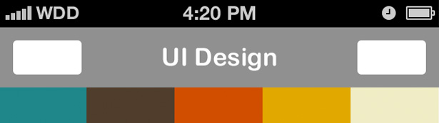 Continuing with the fun theme we have selected for the app, it's time to choose some colors. I personally use Colour Lovers to help inspire my color choices when I'm designing. In this particular case I searched for "fun" and within seconds I was presented with lots of different options and inspiring palettes to use as a base for my design.
I ended up picking one called Playroom. It is important to think about what colors you will need when selecting a palette; I find picking something light, something dark, and something bright is always a good starting point. It's important to have good contrast in your design.
Continuing with the fun theme we have selected for the app, it's time to choose some colors. I personally use Colour Lovers to help inspire my color choices when I'm designing. In this particular case I searched for "fun" and within seconds I was presented with lots of different options and inspiring palettes to use as a base for my design.
I ended up picking one called Playroom. It is important to think about what colors you will need when selecting a palette; I find picking something light, something dark, and something bright is always a good starting point. It's important to have good contrast in your design.
Step 4: Navigation bar styling
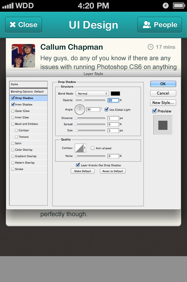
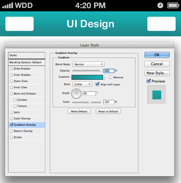 We're now going to move back onto our navigation bar and give it the color it deserves. Select the navigation bar layer (I hope you've been keeping your layers organized!), right-click and select Blending Options. This is the home of the most powerful Photoshop tools when it comes to creating pixel perfect interface designs. From here you can add shadows, gradients, patterns, and stokes, with the ability to copy and paste these styles onto other layers.
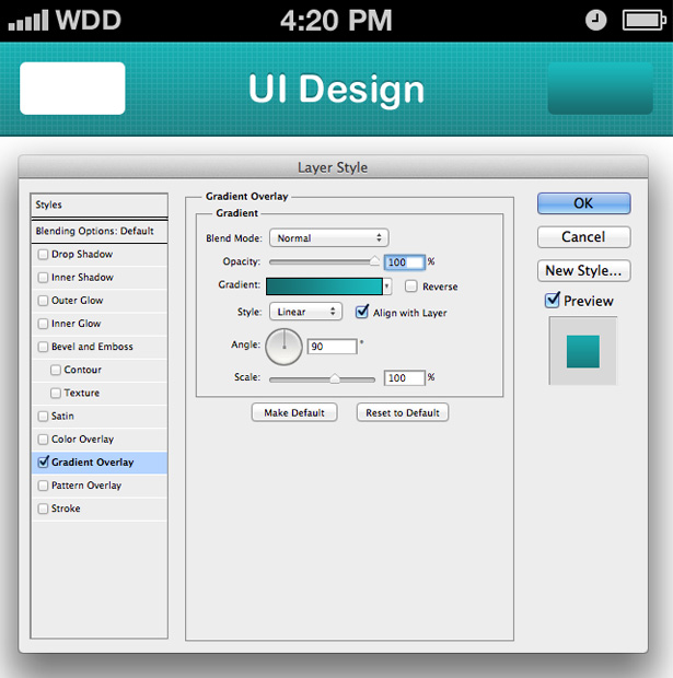
First of all we're going to add a gradient to our bar, so click on Gradient Overlay. I've selected the turquoise color as the one I want to use for my navigation bar. It's bright and packs a powerful punch, and will make our design easy to remember. Apply a 90 degree angle gradient going from light (top) to dark (bottom).
We're now going to move back onto our navigation bar and give it the color it deserves. Select the navigation bar layer (I hope you've been keeping your layers organized!), right-click and select Blending Options. This is the home of the most powerful Photoshop tools when it comes to creating pixel perfect interface designs. From here you can add shadows, gradients, patterns, and stokes, with the ability to copy and paste these styles onto other layers.
First of all we're going to add a gradient to our bar, so click on Gradient Overlay. I've selected the turquoise color as the one I want to use for my navigation bar. It's bright and packs a powerful punch, and will make our design easy to remember. Apply a 90 degree angle gradient going from light (top) to dark (bottom).
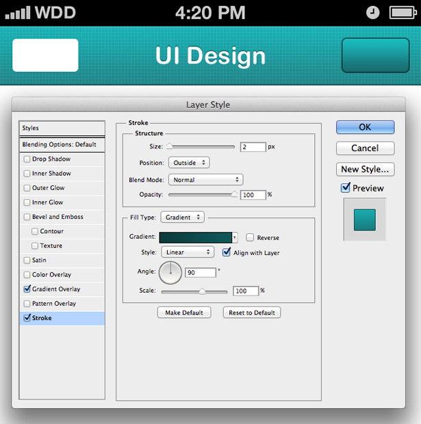
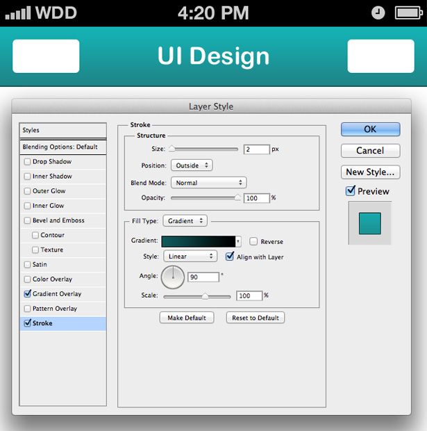 Now click on the Stroke panel. Change the size of your stroke to 2 instead of the default 3. A tip is to always try to avoid odd numbers in UI design, especially on mobile devices. This will only make for more work for both the designer and the developer when it comes to scaling the work (you can't half 3 pixels as half a pixel doesn't exist!).
Change the fill type of your stroke to gradient, and make sure the stroke is going to appear on the outside of your shape. Select a dark turquoise color for the bottom of your stroke and black for the top. Because the stroke is on the outside of our navigation bar, the black part of the stroke will not show on top of the status bar, and therefore all the user will be able to see is the stroke at the bottom.
Now click on the Stroke panel. Change the size of your stroke to 2 instead of the default 3. A tip is to always try to avoid odd numbers in UI design, especially on mobile devices. This will only make for more work for both the designer and the developer when it comes to scaling the work (you can't half 3 pixels as half a pixel doesn't exist!).
Change the fill type of your stroke to gradient, and make sure the stroke is going to appear on the outside of your shape. Select a dark turquoise color for the bottom of your stroke and black for the top. Because the stroke is on the outside of our navigation bar, the black part of the stroke will not show on top of the status bar, and therefore all the user will be able to see is the stroke at the bottom.
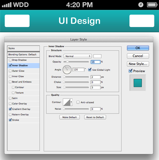 Select the Inner Shadow panel and apply a 15% opacity white shadow onto your bar. This will appear at the top of your bar, and give it a lovely highlight, making it appear more 3D. I gave my shadow a distance of 2px and a size of 3px.
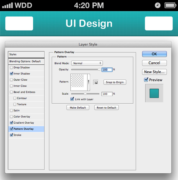 Now it's time to really make our navigation bar pop. By using patterns, we can add a lot of depth to our design. I'm using a white grid pattern on my navigation bar. If you want to use this pattern, you can download a collection of them for free at Premium Pixels.
Step 5: Typography shadowing
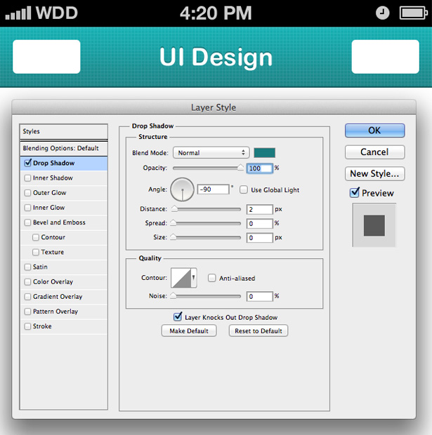 To give our typography some depth, open the blending options panel and apply a drop shadow. Change the angle to -90 (make sure Use Global Style isn't checked here otherwise all shadows in your design will change to -90) and use the same color you used for the bottom of your navigation bars stroke. Give the shadow a distance of 2px and drop the size to 0px. This gives a clean cut drop shadow above your text instantly making it more interesting.
Step 6: Navigation bar button styling
 We're now going to apply some awesome styles to our navigation bars buttons. We want these buttons to tie in well with our navigation bar, but at the same time they need to stand out well enough for the user to instantly recognize that they are buttons. To do this, we're going to use more layer styles to give them a 3D, eye-popping effect.
Open up the blending options panel and click on gradient overlay. Give your button a light (top) to dark (bottom) gradient using colors from your navigation bar. The light color was selected from the highlight of my nav bar, and the dark color was selected from the bottom stroke of my nav bar.
We're now going to apply some awesome styles to our navigation bars buttons. We want these buttons to tie in well with our navigation bar, but at the same time they need to stand out well enough for the user to instantly recognize that they are buttons. To do this, we're going to use more layer styles to give them a 3D, eye-popping effect.
Open up the blending options panel and click on gradient overlay. Give your button a light (top) to dark (bottom) gradient using colors from your navigation bar. The light color was selected from the highlight of my nav bar, and the dark color was selected from the bottom stroke of my nav bar.
 Select the stroke panel and change the size of your stroke to 2px, with an outside position. Change the fill type to gradient and the angle to 90 degrees. Change the gradient colors from light (top) to dark (bottom), basing the colors on the colors already used for your navigation bar and buttons. Immediately you can see that this stroke gives your button a 3D look, as if it is coming out of the navigation bar instead of sitting on top of it.
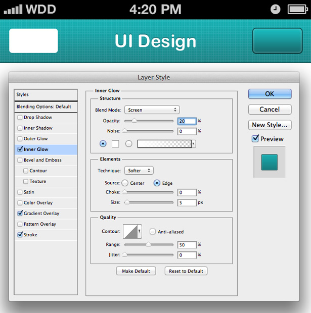 To spruce the button up a little more and make it even more visually appealing, we're going to add an inner glow to the button. Click on the inner glow panel and change the blend mode to screen. Drop the opacity to 20% and make sure noise is set to 0%. Change the default yellow glow to white and make sure the size is still set to the 5px default. This should give your button a nice inner glow, making the button look really touchable!
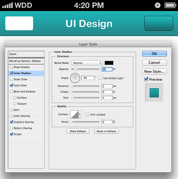 We're now going to add an inner shadow to make our button slightly more realistic. Change the opacity to 15% and select black as your color. Drop the distance to 2px and the size to 4px. Now change the angle to -90 degrees (making sure Use Global Light isn't selected). This gives the bottom of your button a slight shadow, hiding some of the bottom inner glow we just applied. In real life, this area would be shaded so it was important to hide the inner glow here.
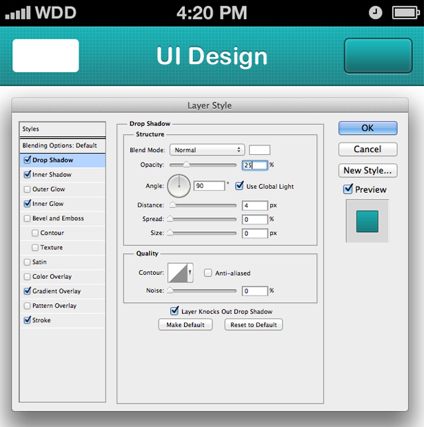 To finish off the styling of our button we're going to add a drop shadow. Select the drop shadow panel and change the color to white with a opacity of 25%. This shadow is going to act as a highlight below our stroke, so change the distance to 4px (2px to cover the stroke area, and 2px which will be seen below the stroke).
Step 7: Button labels
 A button without its label is pointless, so now we're going to spend a little bit of time to finish our buttons off. First of all, right click on your styled button and select the Copy Layer Style option. Now right click on your un-styled button and select the Paste Layer Style option.
We're going to continue work on our right button first. This button will be labelled "People" and we want to use an icon of 2+ people. For the sake of this tutorial, I'm going to be using icons made by creative studio Yummygum; you can find the pack I used at IconSweets.com - I'll be using icons from this pack throughout the tutorial.
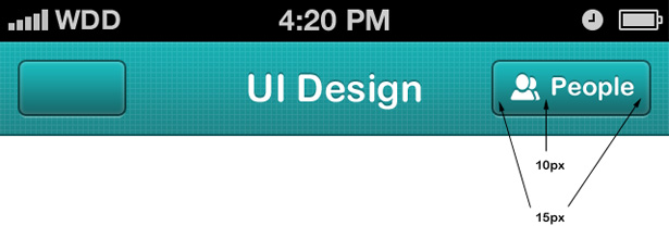
Using the same font you used for the navigation bar title, type your buttons label out. Resize and position it onto your button, and then place your icon of choice (or make your own) into your document. Position these two layers equally over your button. I have spaced my layers out so there are 15px either side of them and the button, and 10px in between the icon and text. Paste the layer style from your nav bar topic text onto both your icon and button label. If you need to resize your button length, use the Direct Selection Tool to select the 4 anchor points on the right, and then drag. You can hold the shift-key down to keep this modification straight.
Repeat this process with the button on the left side of your navigation bar, this time using a cross icon and the word "Close". To add a little more styling to my buttons I lowered the opacity of the two background shapes to 95%, this allows a little bit of the grid pattern beneath it to shine through.
A button without its label is pointless, so now we're going to spend a little bit of time to finish our buttons off. First of all, right click on your styled button and select the Copy Layer Style option. Now right click on your un-styled button and select the Paste Layer Style option.
We're going to continue work on our right button first. This button will be labelled "People" and we want to use an icon of 2+ people. For the sake of this tutorial, I'm going to be using icons made by creative studio Yummygum; you can find the pack I used at IconSweets.com - I'll be using icons from this pack throughout the tutorial.
Using the same font you used for the navigation bar title, type your buttons label out. Resize and position it onto your button, and then place your icon of choice (or make your own) into your document. Position these two layers equally over your button. I have spaced my layers out so there are 15px either side of them and the button, and 10px in between the icon and text. Paste the layer style from your nav bar topic text onto both your icon and button label. If you need to resize your button length, use the Direct Selection Tool to select the 4 anchor points on the right, and then drag. You can hold the shift-key down to keep this modification straight.
Repeat this process with the button on the left side of your navigation bar, this time using a cross icon and the word "Close". To add a little more styling to my buttons I lowered the opacity of the two background shapes to 95%, this allows a little bit of the grid pattern beneath it to shine through.
Step 8: Text field bar
 It's now time to pay some attention to the rest of our screen. Grab the Rectangle Shape Tool and using the same dimensions of our navigation bar (640 x 86px) place a shape on to your canvas. Position it at the bottom of the screen.
Step 9: The background
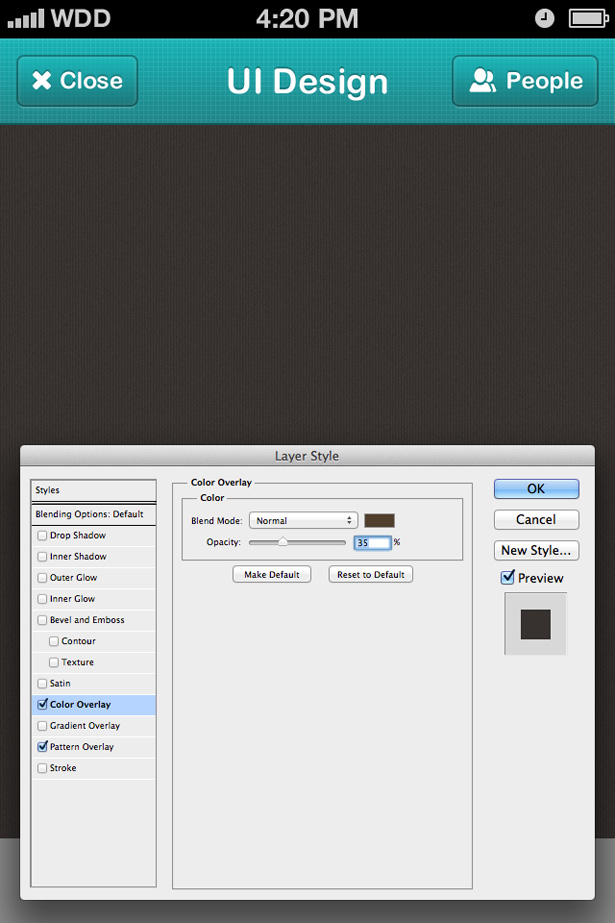 We're now going to work on the background of our design. Open up the blending options panel for your background layer and choose a pattern to fill it up. I used a dark pattern with vertical lines going through it from Subtle Patterns - you can download the full pattern set here which I highly recommend.
If you want to add some of your own colors to the pattern you have chosen, you can do so by using the color overlay style. I applied a brown (from my color palette I chose earlier) at 35%. This opacity is low enough for your texture/pattern to show through yet high enough to tint the color or your background.
We're now going to work on the background of our design. Open up the blending options panel for your background layer and choose a pattern to fill it up. I used a dark pattern with vertical lines going through it from Subtle Patterns - you can download the full pattern set here which I highly recommend.
If you want to add some of your own colors to the pattern you have chosen, you can do so by using the color overlay style. I applied a brown (from my color palette I chose earlier) at 35%. This opacity is low enough for your texture/pattern to show through yet high enough to tint the color or your background.
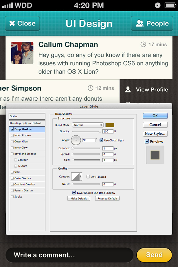
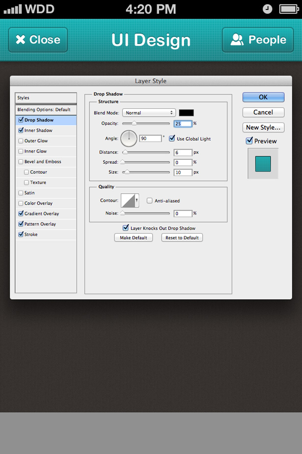 Now we have a dark background, you'll see the point where our navigation bar meets our background image doesn't look quite as good. You can easily fix this by applying a shadow style to your navigation bar, which will make it appear as if it is above your background.
Reopen the blending options panel for your navigation bar and select the drop shadow panel. Make sure black is selected and change the opacity to 25%. Increase both the distance to 6px and the size to 10px, and click OK. You may need to experiment with these options as results will vary depending on the color and type of texture/pattern you have selected for your background.
Now we have a dark background, you'll see the point where our navigation bar meets our background image doesn't look quite as good. You can easily fix this by applying a shadow style to your navigation bar, which will make it appear as if it is above your background.
Reopen the blending options panel for your navigation bar and select the drop shadow panel. Make sure black is selected and change the opacity to 25%. Increase both the distance to 6px and the size to 10px, and click OK. You may need to experiment with these options as results will vary depending on the color and type of texture/pattern you have selected for your background.
Step 10: Messages
 Now that we've got the background and top navigation bar complete, we're going to concentrate on getting the main content of the app laid out. Select the Rectangle Shape Tool and place a rectangle onto your canvas. The width I used was 600px, allowing for 20px to show at each side of the shape. I used a much lighter version of the yellow/creme color from the color palette I picked earlier.
Select the Rounded Rectangle Shape Tool and change the dimensions to 80 x 80px, and the radius to 6px. Place the shape (which is to be used as our avatar shape) onto your canvas and position it correctly. To keep my design consistent, I have allowed 20px to sit between the edges of my message background shape and my avatar shape.
Using the text tool, write your name and a message; I used Arial Rounded MT Bold for my name and normal Arial for my message text—format your text so that it fits nicely into your message background box.
Now that we've got the background and top navigation bar complete, we're going to concentrate on getting the main content of the app laid out. Select the Rectangle Shape Tool and place a rectangle onto your canvas. The width I used was 600px, allowing for 20px to show at each side of the shape. I used a much lighter version of the yellow/creme color from the color palette I picked earlier.
Select the Rounded Rectangle Shape Tool and change the dimensions to 80 x 80px, and the radius to 6px. Place the shape (which is to be used as our avatar shape) onto your canvas and position it correctly. To keep my design consistent, I have allowed 20px to sit between the edges of my message background shape and my avatar shape.
Using the text tool, write your name and a message; I used Arial Rounded MT Bold for my name and normal Arial for my message text—format your text so that it fits nicely into your message background box.
 We're now going to add some style to our message using just color; I changed the color of my name to a dark turquoise (very close to black) and a washed out turquoise inspired by my navigation bar.
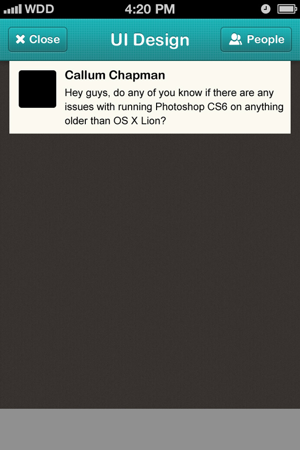
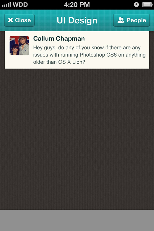
I then inserted a picture of myself by going to File > Place. Once inserted, I resized the image and placed it above my black avatar box that we created earlier. To save cutting the image out, and also to give you the option to move or resize your avatar at a later date, right click on it and select the Create Clipping Mask option. This will link your avatar image to your avatar black box and will only show what is over the black box. You'll find by using the Move Tool that you can still move and resize this image.
We're now going to add some style to our message using just color; I changed the color of my name to a dark turquoise (very close to black) and a washed out turquoise inspired by my navigation bar.
I then inserted a picture of myself by going to File > Place. Once inserted, I resized the image and placed it above my black avatar box that we created earlier. To save cutting the image out, and also to give you the option to move or resize your avatar at a later date, right click on it and select the Create Clipping Mask option. This will link your avatar image to your avatar black box and will only show what is over the black box. You'll find by using the Move Tool that you can still move and resize this image.
 Using another IconSweets icon, I created a nice little timestamp. I had to reduce my icon size—you can do this by going to Edit > Transform > Free Transform and changing the dimensions (either by pixels or percentage). I used 70% in both width and height to keep proportions. I added some text, and voila. Be sure to select a color that is easy to read but doesn't shout for attention.
Step 11: Duplicate messages
 Duplicate your message boxes beneath one another, leaving a 2px gap between each background box. You can do this by either clicking and dragging your layers over the New Layer icon, or alternatively you can press Cmd + Shift + Down Arrow at the same time to duplicate and nudge the layers down.
Change all of the content in your message boxes, as if it were a real conversation. If you need to resize your background boxes, use the Direct Selection Tool and resize them using the anchor points. This keeps all of the edges nice and sharp.
Duplicate your message boxes beneath one another, leaving a 2px gap between each background box. You can do this by either clicking and dragging your layers over the New Layer icon, or alternatively you can press Cmd + Shift + Down Arrow at the same time to duplicate and nudge the layers down.
Change all of the content in your message boxes, as if it were a real conversation. If you need to resize your background boxes, use the Direct Selection Tool and resize them using the anchor points. This keeps all of the edges nice and sharp.
Step 12: Message styling
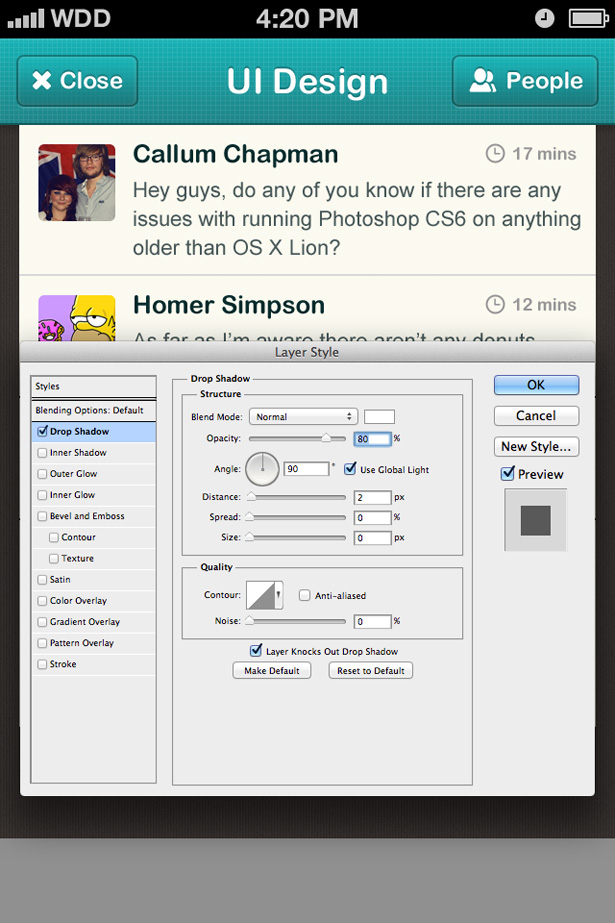 With that done, we can now concentrate on bringing our message boxes to life. Open up the blending options panel and select the drop shadow panel. Change the blend mode to normal, and select white as your color. Increase the opacity to 80% instead of the standard 75% and give the shadow a distance of 2px. This will hide the 2px gap we left between each of the message box backgrounds.
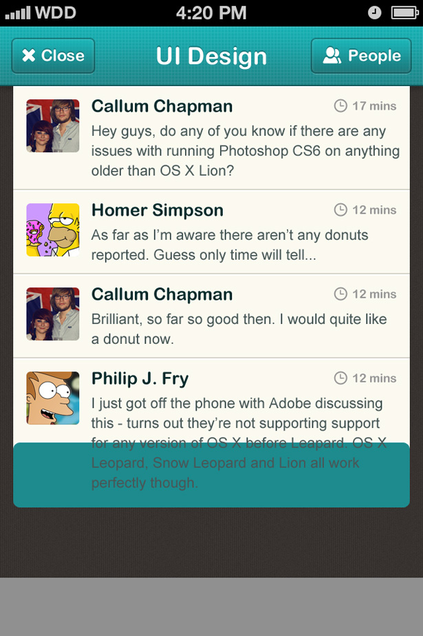
 Copy and paste the above layer style onto all of your message box background layers. You should end up with something like above.
Step 13: Adding rounded corners
 To make our design more interesting, and also to add more depth, we're going to add rounded corners to the bottom of our messages and make it appear as if it is paper piled upon more paper.
Select the Rounded Rectangle Tool and give it a radius of 10px. Change the width to 600px (or whatever width you used for your message box backgrounds) and a height that doesn't exceed the height of your bottom message box background. I used a bright color here so that it is easily visible.
To make our design more interesting, and also to add more depth, we're going to add rounded corners to the bottom of our messages and make it appear as if it is paper piled upon more paper.
Select the Rounded Rectangle Tool and give it a radius of 10px. Change the width to 600px (or whatever width you used for your message box backgrounds) and a height that doesn't exceed the height of your bottom message box background. I used a bright color here so that it is easily visible.
 Using the Direct Selection Tool, select the contents of your vector shape layer (the rounded box we just drew) and go to Edit > Copy. Click on the vector shape layer of your bottom message box background and go to Edit > Paste. This will paste the contents of the shape layer onto your other shape layer. You can now delete the shape we drew in the previous step. You should still see the shape visible.
Open up the blending options of the bottom message box background and apply a drop shadow. Change the color to black, the opacity to 25%, the distance to 1px and the size to 3px. This will create a nice subtle drop shadow.
Duplicate this layer and nudge it down 5px. Reposition the layer so that it sits beneath your original. You should end up with something similar to below. As you can see, this is a simple way to create an overlapping paper look.
Repeat the step again so that you have three pieces of paper instead of just two. You may want to give your bottom piece of paper a slightly more noticeable drop shadow.
Using the Direct Selection Tool, select the contents of your vector shape layer (the rounded box we just drew) and go to Edit > Copy. Click on the vector shape layer of your bottom message box background and go to Edit > Paste. This will paste the contents of the shape layer onto your other shape layer. You can now delete the shape we drew in the previous step. You should still see the shape visible.
Open up the blending options of the bottom message box background and apply a drop shadow. Change the color to black, the opacity to 25%, the distance to 1px and the size to 3px. This will create a nice subtle drop shadow.
Duplicate this layer and nudge it down 5px. Reposition the layer so that it sits beneath your original. You should end up with something similar to below. As you can see, this is a simple way to create an overlapping paper look.
Repeat the step again so that you have three pieces of paper instead of just two. You may want to give your bottom piece of paper a slightly more noticeable drop shadow.
Step 14: Navigation bar shadow
 You probably noticed that whilst designing our message boxes, we hid most of the drop shadow that our navigation bar was casting onto our background. To replace this you can either position your messages beneath the navigation bar (the easy option but unrealistic) or complete the following step.
Select the Rectangular Marquee Tool and draw a skinny line at the top of your messages similar to above. Fill it with black on a new layer.
You probably noticed that whilst designing our message boxes, we hid most of the drop shadow that our navigation bar was casting onto our background. To replace this you can either position your messages beneath the navigation bar (the easy option but unrealistic) or complete the following step.
Select the Rectangular Marquee Tool and draw a skinny line at the top of your messages similar to above. Fill it with black on a new layer.
 Go to Filter > Blur > Gaussian Blur and apply the blur. This will now act as a shadow—just cut out any bits of the blur that are overlapping the edges of your message box background.
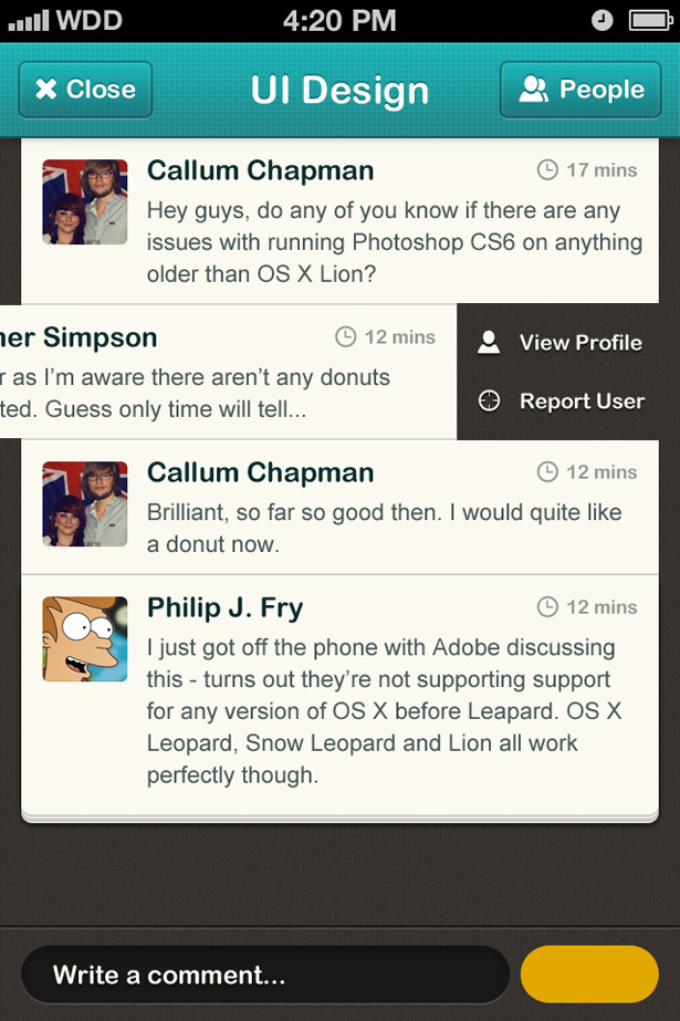
Step 15: Profile and report buttons
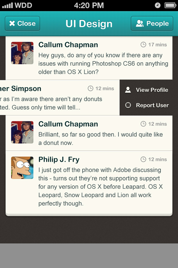
 Referring back to our wireframes, we had decided to allow users to swipe a message to the left to reveal more buttons. In this case, those buttons allow the user to view the message posters profile, or report the message poster.
Select the layers that make up one of your messages (I'm choosing Homer Simpsons message) and using the shift key and arrow keys, nudge your message 10px at a time to the left. Using the text tool, write your labels, and then select some icons to correspond with those labels. I chose an individual person for profile, and a target for report (as if you're shooting them down - I thought this was quite fun!).
To give this area more depth, I added a black drop shadow to both the icons and text.
Referring back to our wireframes, we had decided to allow users to swipe a message to the left to reveal more buttons. In this case, those buttons allow the user to view the message posters profile, or report the message poster.
Select the layers that make up one of your messages (I'm choosing Homer Simpsons message) and using the shift key and arrow keys, nudge your message 10px at a time to the left. Using the text tool, write your labels, and then select some icons to correspond with those labels. I chose an individual person for profile, and a target for report (as if you're shooting them down - I thought this was quite fun!).
To give this area more depth, I added a black drop shadow to both the icons and text.
Step 16: Text field bar
 The text field bar is one of the most important elements on this screen. Users need to be able to input their messages with ease and no confusion (which is why I removed the hidden send button in the initial sketched concepts).
To start off, locate your background layer and copy the layer styles. Paste these layer styles onto the text field bar layer that we created earlier. Open the blending options for this layer up and select the stroke panel. Apply a 2px stroke on the outside of your shape using solid black as your color. As the stroke is on the outside, and the shape is touching three edges of your canvas, only the stroke on top of the shape will show.
Now select the inner shadow tab and change the blend mode to normal, the color to white, the opacity to 10% and the distance to 2px. Make sure the angle is set to the global light default (90 degrees) and click OK. This gives us a nice highlight below our black stroke. With these two simple 2px lines applied, our text field bar already looks well separated from the rest of the background, even though it has the same background!
The text field bar is one of the most important elements on this screen. Users need to be able to input their messages with ease and no confusion (which is why I removed the hidden send button in the initial sketched concepts).
To start off, locate your background layer and copy the layer styles. Paste these layer styles onto the text field bar layer that we created earlier. Open the blending options for this layer up and select the stroke panel. Apply a 2px stroke on the outside of your shape using solid black as your color. As the stroke is on the outside, and the shape is touching three edges of your canvas, only the stroke on top of the shape will show.
Now select the inner shadow tab and change the blend mode to normal, the color to white, the opacity to 10% and the distance to 2px. Make sure the angle is set to the global light default (90 degrees) and click OK. This gives us a nice highlight below our black stroke. With these two simple 2px lines applied, our text field bar already looks well separated from the rest of the background, even though it has the same background!
 Select the Rounded Rectangle Tool. Give your tool a high radius, I used 50px; this will give it very round (circular) ends. Place a shape onto your bar, I used 460x54px as my dimensions. Make sure the left side of your text field shape is 20px away from the left side of your canvas to keep the design spacing consistent.
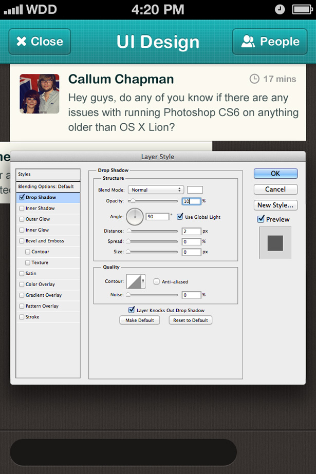
Fill the shape with a dark color (I used a brown selected from a dark pixel in the background) and then open up the layer styles panel. Apply a 2px white drop shadow to your text field with an opacity of 10%.
Select the Rounded Rectangle Tool. Give your tool a high radius, I used 50px; this will give it very round (circular) ends. Place a shape onto your bar, I used 460x54px as my dimensions. Make sure the left side of your text field shape is 20px away from the left side of your canvas to keep the design spacing consistent.
Fill the shape with a dark color (I used a brown selected from a dark pixel in the background) and then open up the layer styles panel. Apply a 2px white drop shadow to your text field with an opacity of 10%.
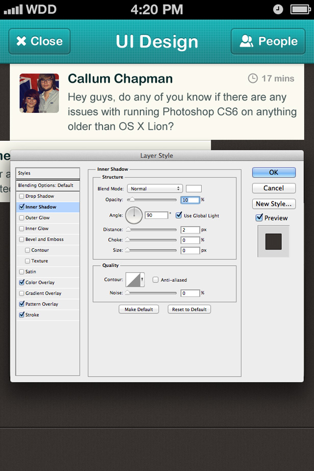
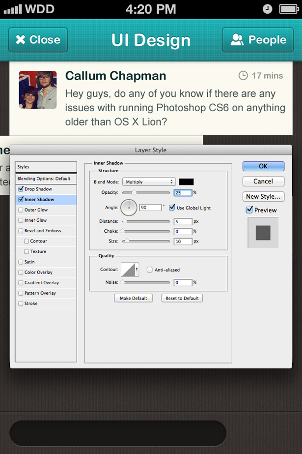 Click on the inner shadow panel and apply an inner shadow to your text field shape. This will give it a lot more depth and make it look as if it is cut into the bars background. Use black with a blend mode of multiply and an opacity of 25%. I used 5px as my distance and 10px as my size, although you may want to experiment here.
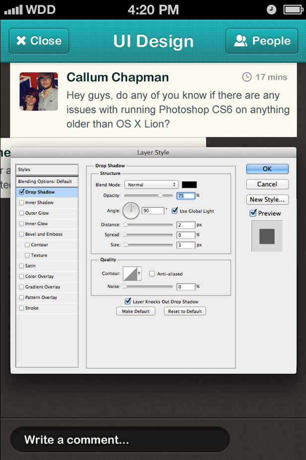 Using the text tool and equipped with Arial Rounded MT Bold, type "Write a comment..." and position it into your text field box. Open up the blending options for your new text layer and apply a black drop shadow with an opacity of 75%, distance of 2px and size of 3px.
Step 17: Text field button
 Reselect the Rounded Rectangle Shape Tool and using the same radius settings and height we previously used, place a shape onto your text field bar background. Resize the length of your button so that it sits 10px from your text field and 20px from the right edge of the canvas.
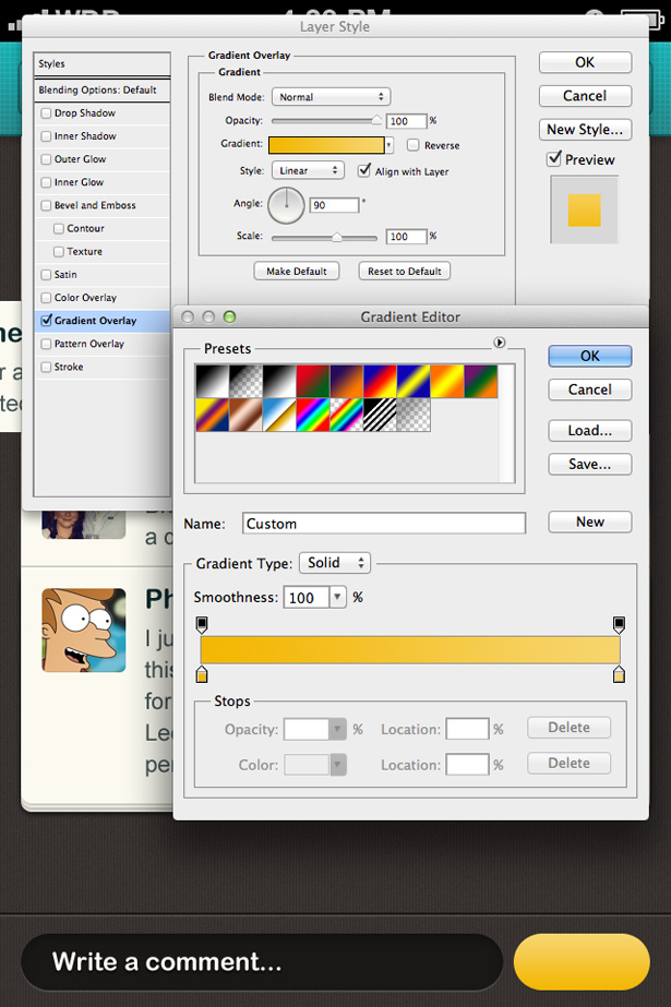 Right click on your new button shape layer and select blending options. Select the gradient overlay panel and apply a gradient from light (top) to dark (bottom). I used the magnificent yellow color that was in the color palette I selected earlier.
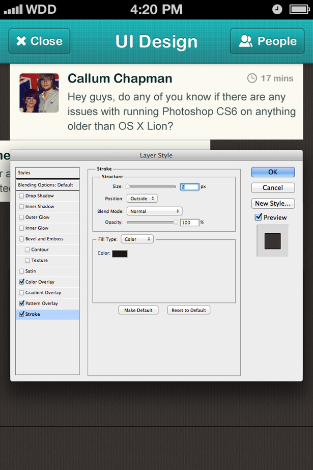
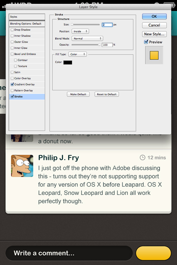 To keep our design consistent, I'm going to apply a stroke to our button that makes it look as if it is coming out of the background, much like we did with the buttons in the navigation bar. This time I used solid black instead of a gradient stroke as the background is much darker and isn't filled with a gradient. I used a 2px stroke on the inside of my shape with 100% opacity.
 Select the text tool and type "Send" onto your button. Open the blending options for your new text layer and apply a brown drop shadow to your text with a distance of 1px and size of 3px.
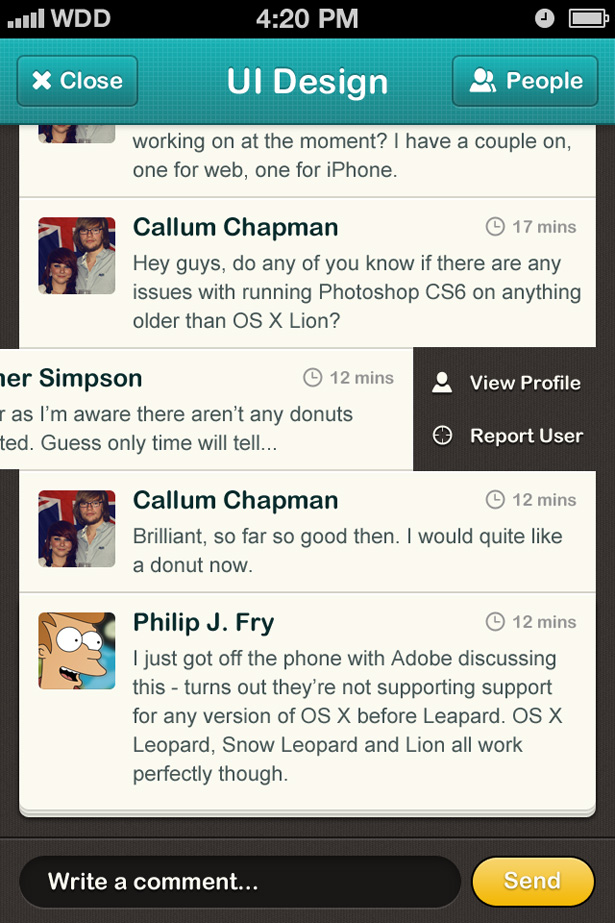 And with that finished, we're all done! We'd love to see your results, so please feel free to post them in the comments section below. If you want to see the design at full resolution, you can see that here.


Read Next

3 Essential Design Trends, May 2024
Integrated navigation elements, interactive typography, and digital overprints are three website design trends making…

How to Write World-Beating Web Content
Writing for the web is different from all other formats. We typically do not read to any real depth on the web; we…
By Louise North

20 Best New Websites, April 2024
Welcome to our sites of the month for April. With some websites, the details make all the difference, while in others,…

Exciting New Tools for Designers, April 2024
Welcome to our April tools collection. There are no practical jokes here, just practical gadgets, services, and apps to…

How Web Designers Can Stay Relevant in the Age of AI
The digital landscape is evolving rapidly. With the advent of AI, every sector is witnessing a revolution, including…
By Louise North

14 Top UX Tools for Designers in 2024
User Experience (UX) is one of the most important fields of design, so it should come as no surprise that there are a…
By Simon Sterne

What Negative Effects Does a Bad Website Design Have On My Business?
Consumer expectations for a responsive, immersive, and visually appealing website experience have never been higher. In…

10+ Best Resources & Tools for Web Designers (2024 update)
Is searching for the best web design tools to suit your needs akin to having a recurring bad dream? Does each…
By WDD Staff

3 Essential Design Trends, April 2024
Ready to jump into some amazing new design ideas for Spring? Our roundup has everything from UX to color trends…

How to Plan Your First Successful Website
Planning a new website can be exciting and — if you’re anything like me — a little daunting. Whether you’re an…
By Simon Sterne

15 Best New Fonts, March 2024
Welcome to March’s edition of our roundup of the best new fonts for designers. This month’s compilation includes…
By Ben Moss

LimeWire Developer APIs Herald a New Era of AI Integration
Generative AI is a fascinating technology. Far from the design killer some people feared, it is an empowering and…
By WDD Staff