 The relationship between text and the rest of a page is one of the key characteristics of any design.
Rhythm, emphasis and tone are all compromised without correctly scaled type. However, selecting text sizes is often both a painstaking and frustrating experience, with no standardized starting point to inform us.
As a result we frequently find web designers falling back on the default options presented by applications — 8pt, 10pt, 12pt, 14pt, 18pt — for want of a better solution.
That better solution is to set type sizes not by individual whim, but according to a predetermined system; a system that is simple to use, practical to implement on the web and most importantly, flexible enough to allow designers a full range of expression. Cue: the Lucas Sequence.
Lucas Sequences
The Fibonacci Sequence — first recorded in the West during the 13th century by Leonardo Fibonacci — is the following set of integers (whole numbers): 0, 1, 1, 2, 3, 5, 8, 13, 21, 34, 55, 89, 144, 233, 377, 610, 987… ad infinitum The sequence was named for Fibonacci by the eminent 19th century French mathematician François Édouard Lucas who produced a similar sequence of his own, that he referred to as Lucas Numbers: 2, 1, 3, 4, 7, 11, 18, 29, 47, 76, 123, 199, 322, 521, 843… ad infinitum The Fibonacci Sequence and Lucas Numbers are both specific variations of the generic Lucas Sequence. Lucas Sequences and integer sequences in general have been the subject of a lifetime of study for numerous accomplished mathematicians, so we're going to summarize the concept as follows:- Any given number in the sequence is the sum of the two preceding numbers as described in this formula: n = n-1 + n-2
- The first two numbers in the sequence — known as seed numbers — are selected arbitrarily.
Why use a Lucas Sequence to set type?
Lucas Sequences, particularly in the form of the Fibonacci Sequence bear a close relationship to the Golden Ratio, which is repeated throughout nature in shells, spider's webs, cloud formations and numerous other natural wonders. There is strong evidence to suggest that anything we find visually appealing is due to that form's relationship to the golden ratio. More importantly, Lucas Sequences provide us with a scalable framework for setting type that is both graceful and rhythmic.Determining our first seed number
There is much debate over the correct body text size for a website. 12px is still the most common, but it's not unusual to see anything from 10px to 16px. This is substantially born from a lack of understanding of what font measurements actually mean. Strangely, for those of us accustomed to standardization — or at least aspirations of standardization — there is no standard measure in type design; two different type designers, drawing exactly the same design into font production software are likely to draw it at different sizes. The variation between different typefaces is, unsurprisingly, all too common.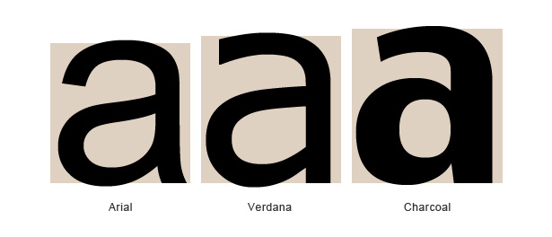 The answer to where to begin is infuriatingly simple; our default text size will be 1em, meaning that our first seed number will be 1.
There are a number of key benefits to using 1em as our starting point: as a relative unit of measurement an em is well suited to responsive design; by using ems and multiples of ems we can resize our whole scheme by changing the base font size; finally it is a neat conceptual fit with our Lucas sequence and will serve to remind us of the precise integer sequence if we need to revisit the design later.
There's nothing inherently wrong with using percentages instead of ems, or even pixels or points, but the em is more than likely the future of web design, so we may as well get used to it.
Determining our second seed number
There are numerous strategies open to us for determining our second seed number. Some designers have a specific preference and would pick 1.2em or the like. Other designers, who enjoy the mysticism of the Golden Ratio might like to use 1.618em. A more practical solution is to determine the second seed number using the line-height of the body text. However because line-height is usually dictated by the length of the line and line length is determined by a grid it is more suited to print, or non-responsive web design. Because we're looking to the future, and the future is responsive, it won't work for us. What we're left with, partly by a process of elimination and partly due to its appropriateness, is the type's x-height. Or more specifically, the relationship of the x-height to the rest of the glyph. One characteristic of good design is the repetition of key elements, and carrying the proportions of the type through to the page as a whole is a great opportunity to both acknowledge the work of the type designer and imbue our design with some of the typeface's character.Finding our x-height
To find the x-height of your font, we need to open up something like Photoshop or Illustrator and add some text that includes an ascender (e.g. 'd') and the letter 'x'. If you're using a bitmap editor like Photoshop, set the text as large as possible to ensure you get an accurate result. In these examples I've set the font to 500pt in order to measure it. Next, measure the height from the ascender line to the baseline and the height from the top of the x to the baseline.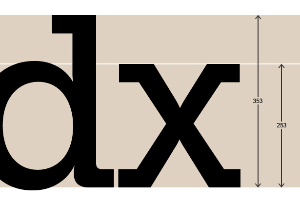 Of course, if you're lucky enough to have access to good font design software you can simply open up the font file you'll be using and read off the x-height and ascender height.
Now divide the x-height by the ascender height to find the x-height as a percentage of the whole:
x-height / ascender height * 100 = second seed number
In the case of the font in the example (which is Museo Slab) the result is:
253 / 353 = 0.71671388
or 0.716em
Why are we not measuring from the top of the ascender to the bottom of the descender? Because characters don't tend to have both an ascender and descender (an occasional exception being the letter 'f') and consequently the relationships within the shapes that comprise typeface's design are based on the relationship between the x-height and one longer stem. It is possible to measure the descender instead, but as the cap-height (the height of the capitals) is usually very close to the ascender that's my preference. If you find yourself using a typeface with a more dominant quality — the contrast in the thickness of different strokes for example — you might want to use that value in place of the ascender to x-height ratio.
The determination of how to arrive at your second seed number is one of the key design decisions you're going to have to make, however it's not something to agonize over; pick a number out of a hat if you prefer, and move on, the good stuff is yet to come.
It's worth noting that if you switch the equation around and divide the ascender height by the x-height you'll end up with a number greater than one. In that case your sequence will be steeper and a little more dramatic.
Creating our sequence
So, we have our two seed numbers: 1em and 0.716em and we have the formula n = n-1 + n-2: 1 + 0.716 = 1.7160.716 + 1.716 = 2.432
1.716 + 2.432 = 4.148
etc. Which results in the following sequence: 1, 0.716, 1.716, 2.432, 4.148, 6.58, 10.728, 17.308, 28.036… ad infinitum
The design bit
So far, we've picked our way through some basic, but useful mathematics, and we've arrived at a sequence that gives us a range of sizes from 1em to 28.036em and beyond if necessary. We're now able to use these values as our type sizes sequentially to create a well proportioned type scheme: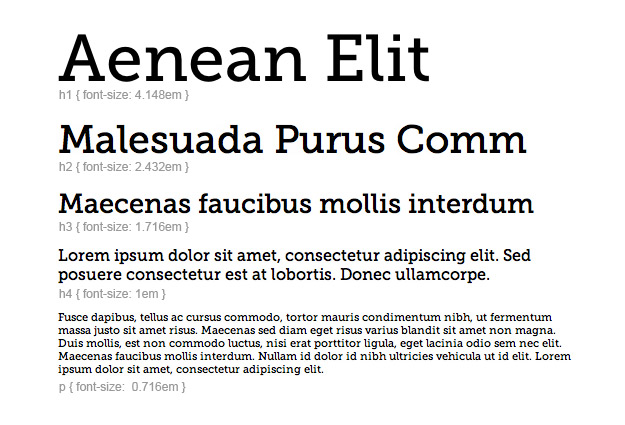 You'll notice that we start with p set to 0.716 and h4 set to 1, despite the fact that that is not sequentially correct. The reason is that in terms of hierarchy h4 is more important than p. Our Lucas Sequence must not dictate hierarchy on the page, it dictates the scale relationships of different elements. Only your content can dictate hierarchy.
Because we're not restricted to consecutive values in our sequence and are able to pick and choose which integers we use, we always achieve rhythm and structure with the same sequence. Even if we take a very dramatic approach:
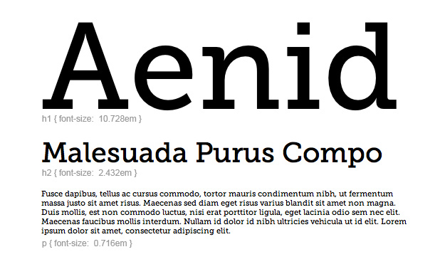 Exactly the same Lucas sequence can also be used to create a more reserved, business-like scheme:
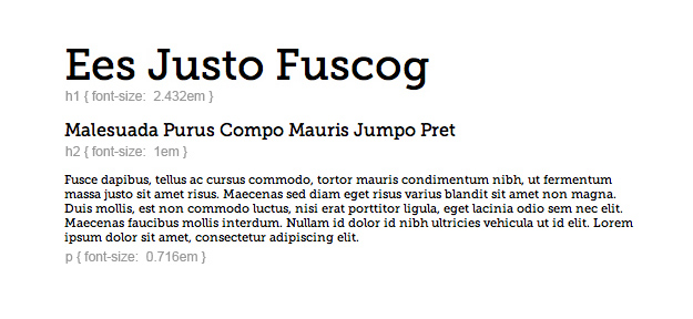 The essence of this system is that the relationships of scale are maintained, the hierarchy is proportionate, but there is a huge amount of variety available to the designer. This is where you must earn your money: by selecting the sizes on the scale to create hierarchy and emphasis.
Flexibility
Frequently, type size is dictated by more than emphasis: issues of accessibility arise if we're talking about an audience with visual difficulties; the sheer volume of content may throw up restrictions; we may need to be flexible — literally — when designing a fluid layout. Fortunately, CSS handles this situation with ease. Because we're using ems for our sizes we can set up our type using our Lucas Sequence and then scale the whole, by setting a default size on the body tag, retaining the rhythm of our design, but increasing or decreasing the actual values.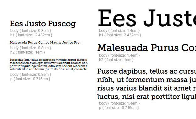 Notice in this image that the p, h2 and h1 sizes remain the same, all drawn from our sequence. It is the variation on the font-size of the body tag (0.8em on the left and 1.4em on the right) that cascades down, creating radically different results.
Finally
As dependent on underlying mathematics as this system is, it's important to acknowledge that design cannot be reduced to a set of equations. This method of sizing type gives you a structure with which to work, and will help you create well proportioned type schemes, but it's down to you as a designer to use the system as a tool, not as a crutch. The notes and scales in music, even Jazz, can be reduced to a set of equations that describe their relationship, but it takes someone like John Coltrane to bring those relationships to life.Ben Moss
Ben Moss has designed and coded work for award-winning startups, and global names including IBM, UBS, and the FBI. When he’s not in front of a screen he’s probably out trail-running.
Read Next
3 Essential Design Trends, May 2024
Integrated navigation elements, interactive typography, and digital overprints are three website design trends making…
How to Write World-Beating Web Content
Writing for the web is different from all other formats. We typically do not read to any real depth on the web; we…
By Louise North
20 Best New Websites, April 2024
Welcome to our sites of the month for April. With some websites, the details make all the difference, while in others,…
Exciting New Tools for Designers, April 2024
Welcome to our April tools collection. There are no practical jokes here, just practical gadgets, services, and apps to…
How Web Designers Can Stay Relevant in the Age of AI
The digital landscape is evolving rapidly. With the advent of AI, every sector is witnessing a revolution, including…
By Louise North
14 Top UX Tools for Designers in 2024
User Experience (UX) is one of the most important fields of design, so it should come as no surprise that there are a…
By Simon Sterne
What Negative Effects Does a Bad Website Design Have On My Business?
Consumer expectations for a responsive, immersive, and visually appealing website experience have never been higher. In…
10+ Best Resources & Tools for Web Designers (2024 update)
Is searching for the best web design tools to suit your needs akin to having a recurring bad dream? Does each…
By WDD Staff
3 Essential Design Trends, April 2024
Ready to jump into some amazing new design ideas for Spring? Our roundup has everything from UX to color trends…
How to Plan Your First Successful Website
Planning a new website can be exciting and — if you’re anything like me — a little daunting. Whether you’re an…
By Simon Sterne
15 Best New Fonts, March 2024
Welcome to March’s edition of our roundup of the best new fonts for designers. This month’s compilation includes…
By Ben Moss
LimeWire Developer APIs Herald a New Era of AI Integration
Generative AI is a fascinating technology. Far from the design killer some people feared, it is an empowering and…
By WDD Staff


