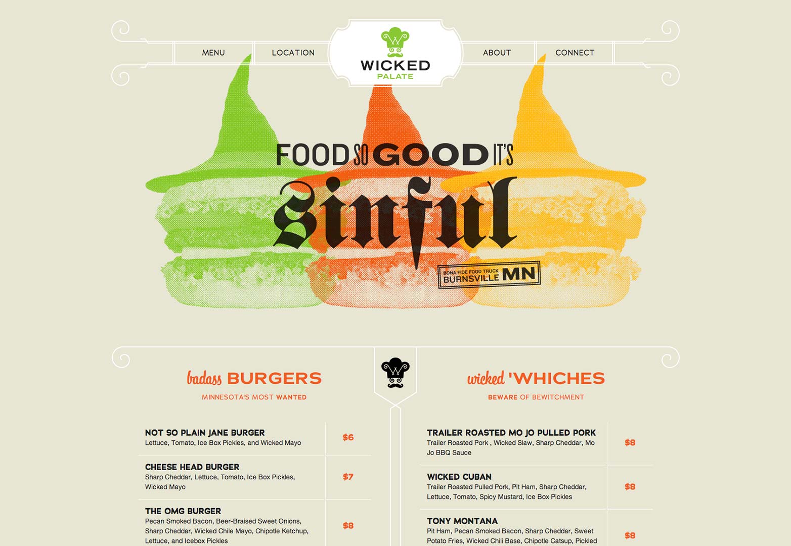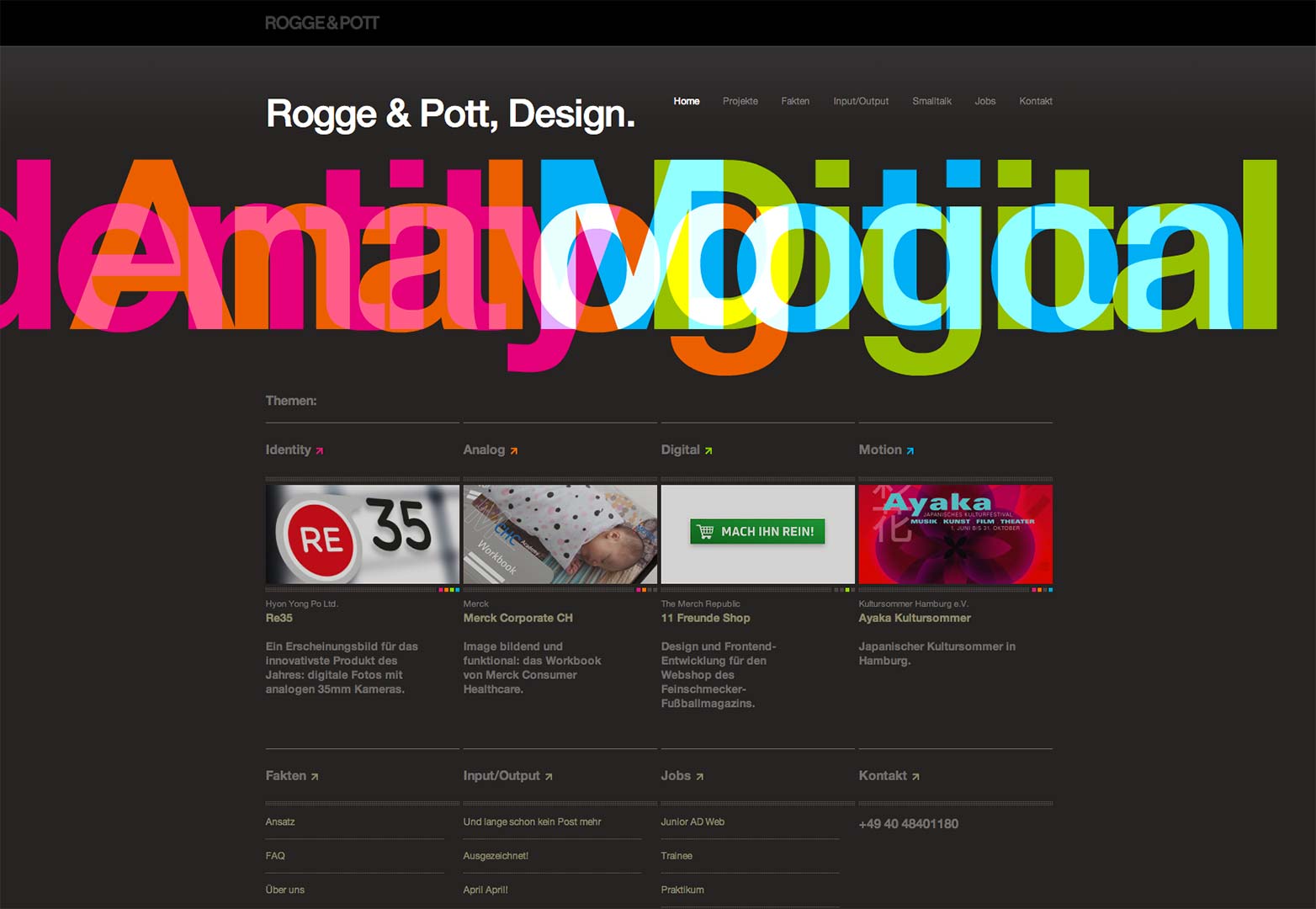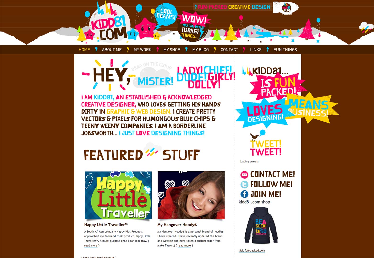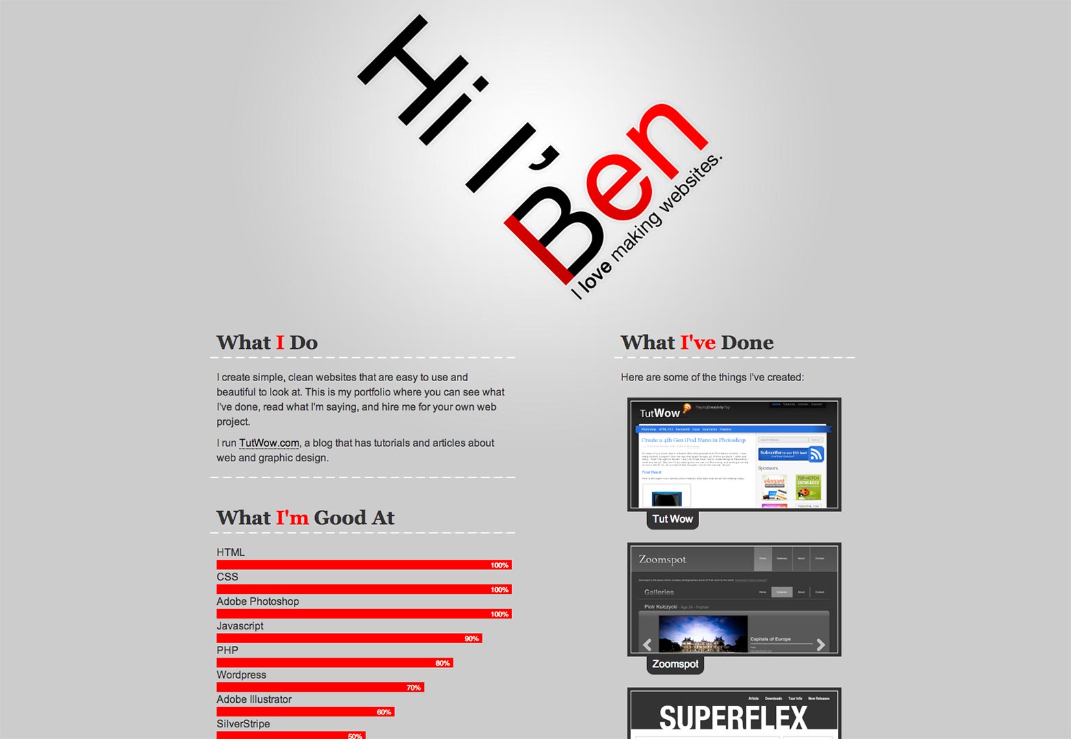
 The internet, after you get past all the coding, is littered with different approaches to typography. There are a plethora of typefaces scattered all over the internet and searching for the right font can leave your head buzzing with all the options to choose from.
Admittedly the first thing I notice on a site other than the design is the font; unconsciously I ask myself does it work, can I read it without straining my eyes and do I like it? Of course, my preference doesn’t matter because it isn’t my site or design, but having a grade “A” typeface that the majority will find attractive is important and we all know that some fonts are a lot better than others.
Other than graphics, your typographic choices are one of the most essential aspects of your design, regardless of how much or how little textual information you are actually displaying. The wrong typographic choice can leave your design not only lacking and just plain boring, but it can also deliver the wrong idea to viewers. To aid you in your future design projects, here are a few things to consider when choosing typography that will help improve your designs in the long run.
Message
First and probably foremost, you should be thinking about the message that you want your design to convey.
You should always be thinking about what you are trying to say no matter what or who you are designing for. This doesn’t just go for the typography but also for your graphics (but that is for another time). For example, if you are designing an event flyer for a relief effort or some type of health awareness you need to make sure your chosen typography correlates with that message of hope and aid. You wouldn’t want to use a font that you would generally see being used for a club flyer now would you? So, picking out a font that works with your message and helps bring it to life, is the way you want to go.
If you’re not sure, asking yourself does this work is the first step you should take and if you still don’t know ask those around you, friends and family are always willing to give feedback.
Another thing you should remember when figuring out what typography will work best for your design is that the message can also include the concept of the design. In other words, happy messages should be accompanied by light, airy and soft shaped fonts while a message with a dark theme, let’s say Halloween, would be better accompanied by hard edged, sketchy shaped fonts.
Legibility
Illegible typography or any typography that hurts your eyes upon viewing it is a big red flag. I don’t care how cool it looks; don’t go around downloading funky fonts because your project is going to suffer dearly.
Of course there are some exceptions of using funky and nearly illegible fonts such as for night club promotions, anything geared towards children or if you are trying to get a specific look such as the large renaissance type letters that you would see if you read Chaucer. Unless you just have the urge to use fonts like Soda, Bored or Akka, a client demands it, or you for some reason have nothing better to use, don't do it.
I'll be the first to admit that I do have some of these interesting fonts downloaded, but I rarely use them. If you do decide to use a funky font, use it sparingly, as in use it to pull in your audience by using it as a header but then utilize a more legible font for the rest of the information, this way you are creating a dynamic in your design. Remember if you want to use funky fonts use them to your advantage instead of disadvantage.
Promotion awareness
Be aware of what the design is promoting when making your choices. This is sort of in the same vein as the message except instead of figuring out what the design is meant to say you need to remember there is some entity, whether a business, company, group or one person backing this thing.
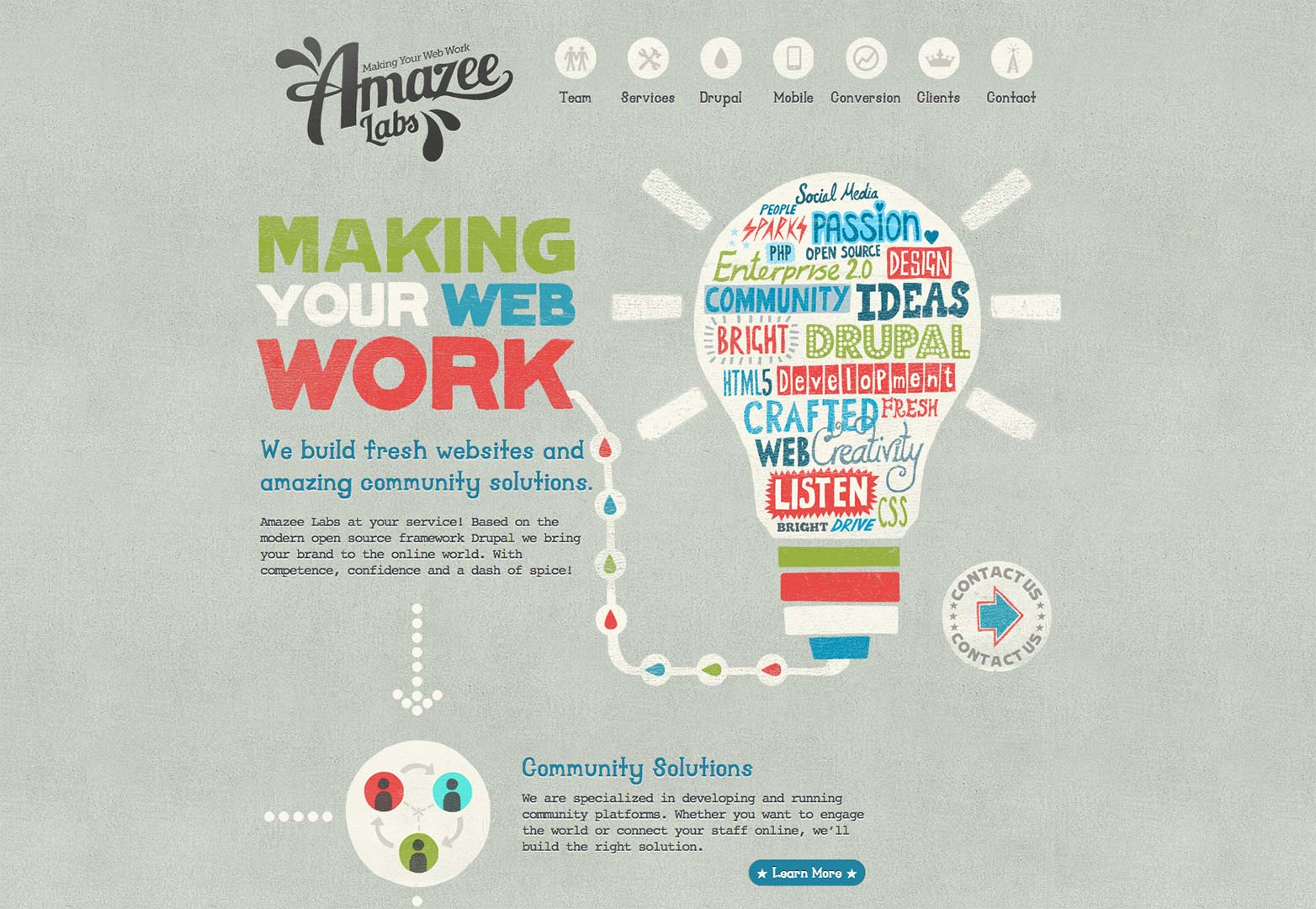
Personality is everything and so is the appearance of your typography. Have you ever been browsing the internet and pulled up a website that was less than stellar and looked like a scam site though it was a supposed to be a corporate site? Well with the wrong choice, like with these poorly designed websites, you might be sending out the wrong idea about the promoters.
More formal business design projects should try to stick with sleek and traditional typefaces instead of trying to be flashy or use kitschy and childish fonts like Papyrus. Just because James Cameron used the font for Avatar doesn’t mean you should too.
Even if you have an informal design in the works try to stay away from this type of typographic choice, especially if you want you or the people you are doing this for to be taken seriously.
Placement and size
Where you put your typography and how big you make it is unbelievably important in creating an effective design.
No one wants to strain their eyes to read anything and no one wants to see a design covered in huge words. Finding a balance is the goal when designing and figuring out what is the most important information is the first step to achieve a design with well-placed and sized typography.
You’ll want to make sure the sizes chosen throughout the design compliment not only the rest of the information but the space it is consuming.
As a general rule the event name or whatever is the main focus should be the largest size with the details about half the title’s size, you can make the details smaller depending on importance. In other words create a hierarchy with your words. Keep in mind this does depend on the design so you may need to experiment a bit, there is never a set placement method.
As far as placement of your font, try to keep it balanced, in other words don’t throw something in four separate corners because then your design has been compromised and made distracting.
Color
This is the easiest part. Pick a color that is readable and stands out from your background.
Contrasting colors are your friends and using effects like strokes and glows can make your color and typography more eye-catching and easier to read. Essentially you need to pick a color to not only get people to stop and look but to also bring your information to the forefront of the design.
Conclusion
During your hunt for the right typography remember it is essential to find a typographic approach that fits the mood and aesthetic of your design.
Decide if you want to use a decorative, modern, san serif, script or some other category of typeface, just make sure it works.
Don’t be afraid to mix and match different types of typography, just don’t get too crazy. Experiment and don’t think you have to follow any design rules; the point of designing is to try out new things and to create what you envision.
Lastly, try looking up typography inspiration to get yourself inspired and if you can’t find anything you like create your own typography; you’ll be glad you did.
When you’re designing do you tend to plan out what you want the typography to look like or do you experiment along the way? In either case, what is your go-to font to use when it comes to designing? Let us know in the comments.

