 One feature that can make a logo shine more than any other is hidden meaning.
Remember the last time you saw a logo that made you go 'Ahaaa!'? So, that's what I'm going to approach in this article, the cherry on the top of the logo cake.
There are plenty of articles that skirt around this topic on the web, but too many think that hidden meaning is just about negative space; that's wrong.
There's much more to hidden meaning than just using negative space. While negative space does help to create good logos, it's the actual concept behind it that makes the big difference.
So what the heck? Let's take a look at some really cool examples. Even if you have seen these before, you'll probably end up learning something interesting by reading the details.
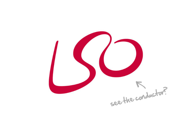
London Symphony Orchestra
Designed by The Partners, the London Symphony Orchestra logo is in its entirety a marvelous example of hidden meaning in logo design. Most likely the first thing you'll notice in this logo are the letters LSO, an acronym for the name of the company, but with an extra effort you'll also be able to visualize an orquestra conductor holding a baton in his hand.
This seems to me one of the best examples of hidden meaning, first because is hidden in plain sight, but more importantly, because the secondary element—the conductor—has a very strong conceptual connection with the essence of the business; which makes this logo very special.
Baskin-Robbins
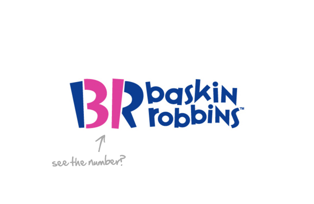
Back in 1953 Baskin-Robbins launched a quite innovative concept in the ice cream market by offering a total of 31 different flavors. The number 31 was present in the original logo, right in between the names Baskin and Robbins. One curious fact about this business concept is that the idea of having so many flavors came out of what later would become Ogilvy & Mather.
Why 31? Just so a customer could have a different flavor every day of the month.
Then later in 2005, using their 60th anniversary celebration as a good occasion to rebrand their identity, a new logo was created and even though the number 31 was removed from in between the names, it was strategically included as part of the identity itself. If not for the fact is in pink, most of the people would never notice the number is still there.
One side-effect of this design is that, with some effort, you can also read the number 12.
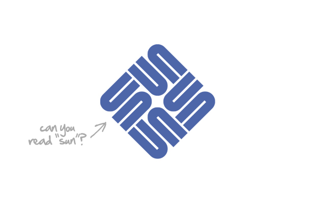
Sun Microsystems
Designed by Vaughan Pratt, professor of computer science at Stanford University, this logo is one of the best examples of a great logo designed by a "computer guy". The logo is an ambigram, a form of typographic design that allows a word to be read from different orientations. Can you see the word "SUN" spelled in the logo in four different directions?
This logo pretty much sums up my belief that anyone can design a really good logo.
Even if professor Pratt did not know anything about symbology when he was designing this logo, he really got it right, as the original version was designed in orange, a color associated with the sun. It was only later that they changed the color first to purple and finally to blue.
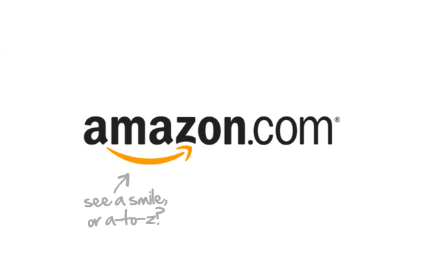
Amazon
Designed by Anthony Biles while at Turner Duckworth, the Amazon logo must be one of the most know logos of the web, specially considering the shear amount of traffic this site receives on a daily basis. And if not for a strategically placed arrow, this would be a pretty boring logo.
The arrow in the amazon logo represents the idea that Amazon store sells everything from A to Z, a brilliant concept that is also in the name of the business; as in the biodiversity one would find in the Amazon forest. But if that's not enough, the arrow also represents a smile suggesting the experience one will have when shopping at their online store.
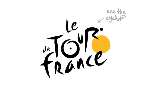
Le Tour de France
Made out of a custom-made handwritten type, Le Tour de France logo contains a hidden cyclist shaped by the letter "R" and "U" riding a cycle which wheels are made out of the letters "O". The last "O" is colored in yellow, the same color of the famous jersey given to the winner of the event. On a more subjective level, the yellow wheel also suggests the idea of a sun; quite appropriate as the event runs in the summer.
On a unrelated note, I can't avoid seeing a cyclops looking at me from the center of the logo. :)
Sony Vaio
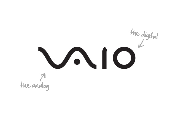
Designed by Timothy Hanley, the Sony Vaio logo is one of the best examples of hidden meaning that can only be seen if you understand a bit of how computers work; perhaps a logo made for computer geeks? The left side of the logo is made out of a wave symbol, representing the idea of analog technology. The right side of the logo is made out of the numbers "1" and "0", the two digits used in binary computing, the digital.
Oh, in case you're wondering, VAIO is an acronym for Video Audio Intelligent Organizer.
Toblerone
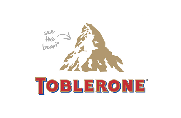
This world-famous Swiss chocolate has a hidden Bear in the snows of Matterhorn illustrated in their logo. The mountain is located in the border between Switzerland and Italy, so that explains why is it there, but what about the bear? That's a homage to the town of Bern, where the Toblerone was originally manufactured; and the bear is the official symbol of the town.
A curious fact about this logo is its name. The name Toblerone is a portmanteau, a word made out two or more words, and is the combination of the name of its creator "Tobler" with the word "torrone", a traditional type of nougat originating in Italy. By the way, that's a great technique to come up with good names for new businesses.
MyFonts
Designed by Underware, a Netherlands-based type studio, the MyFonts logo is composed of beautiful custom made handwriting type where the "My" part of the wordmark also doubles as a hand. That's what I call brilliant design, as it fits perfectly with the concept behind the name itself. Subjectively is saying that by using their site you are getting your hands on their fonts.
And oh, yeah, turn the logo upside down and "My" becomes a dinosaur. Not related, but funny!

Carrefour
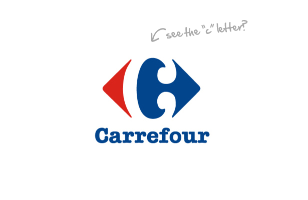
Designed by Miles Newlyn, the Carrefour logo has that sort of characteristic that once you see it, you won't be able to unsee it ever again. Sure that's a feature of every logo covered in this article, but it works specially well in in this case. The negative space letter "c" is positioned in such a central area of the logo that is practically impossible to not see it anymore.
The interesting story behind this brand is the fact that the Carrefour mark is composed by two arrows, pointing left and right, reflecting the literal meaning of the French word "carrefour" (it means "crossroads"). But also, in a more symbolic interpretation, the "crossroads" can be understood as the multiple choices of products offered by this supermarket chain.
Oh, and the logo uses colors of the French flag, the country where Carrefour was founded.
Fedex
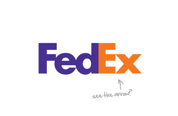
Designed by Lindon Leader, the Fedex logo with its hidden arrow is one of the finest examples of negative space. The design looks great, but the best part is that is conceptually linked to the essence of the business it represents. Using the words of Leader itself, the arrow is a symbol for speed and precision; both core values of FedEx.
For what it's worth, I believe this is the most know case of hidden meaning in logo design.
It's all about telling a story
As the above examples show, hidden meaning is not only about using negative space, but actually about exploring the concepts behind of what make a logo unique. In other words, creating hidden meaning is more about telling a interesting and compelling story.
Actually telling a good story is what makes a good logo more than any other visual feature. Even logos with no hidden meaning at all became great logos with a good story. Now take a look at your own logo. What do you think? Is there an interesting story there?
Did you already know the secret of these logos? Do people react with an 'Ahhhh!', when they see your logo? Let us know in the comments.
Ray Vellest
Ray Vellest is a brand identity specialist based in London and working with organizations and individuals from all over the world. Ray’s approach to identity design position his clients as leaders of their industries while creating a valuable long-term asset for their businesses. Follow @rayvellest on Twitter to keep up with his latest updates.

