

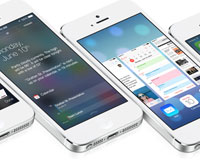
 There's been a lot of talk about iOS 7 since its unveiling earlier this month and most of it has been centered around the design, in particular the new icons. Now, as we've all had time to mull over the changes, questions are beginning to be asked about how they will affect the design of our own apps. As a result, a debate has broken out about how much of an influence iOS 7's new UI should have.
While some believe that apps should remain true to their own style and shouldn't be redesigned purely to match the look of iOS 7, others believe that apps should be redesigned in order to make them feel more native. To add to this, there appears to be some confusion over how strict Apple's iOS Human Interface Guidelines actually are.
In an effort to clear things up, I've taken a long look at the documents within Apple's iOS 7 Design Resources and will use this post to share some of my findings.
Understanding Apple's guidelines
With regards to the debate over whether all apps should now adopt a "flat" aesthetic, it's purely a matter of opinion. If you use custom UI elements in your design then ultimately stylistic decisions lie with you and your team. Although Apple do suggest that you revisit the use of drop shadows, gradients, and bezels, I've seen no evidence to suggest that this is a strict requirement.
In the snippet of text below, taken from the iOS 7 UI Transition Guide, more details are given on different levels of customization and how each will affect the amount of work that you need to do in order to prepare your apps for the transition.
Think of app customization as being divided into the following three types:
- Standard. The app contains only standard, uncustomized UI elements provided by UIKit.
- Custom. The app presents a completely custom UI that doesn’t include any UIKit UI elements.
- Hybrid. The app contains a mix of standard and custom elements, including standard elements that you customized using UIKit tinting and appearance-customization APIs.
For a standard app, you need to decide whether your visual and user experience designs still make sense in the iOS 7 environment. If you decide to keep the current layout and interaction model, most of the work involves making minor adjustments and ensuring that the app handles the new systemwide gestures correctly.
Custom apps—that is, apps that use no UIKit UI elements—require a more nuanced approach. For example, if you feel that the current UI and experience of the app is still appropriate, there may be very little to do. On the other hand, if you feel that the app’s personality and user experience should change in order to delight iOS 7 users, you have more work to do.
Hybrid apps vary in the amount of work required, depending on the customizations you did and how you combined custom and standard elements. In addition to revisiting the overall design of a hybrid app, you need to make sure that your customizations still work well and look good when they’re integrated with standard elements.
It's also noted at the end of the document quoted above that an app that mimics standard iOS 6 UI in a completely custom way is likely to require a lot of work because it will simply look out of date. This is certainly a prospect that you're going to want to consider.
Also taken from the iOS 7 UI Transition Guide is the text below, which features two lists — things every app must do and things every app should do. Given the change in language, I'd consider the first to be a list of strict requirements and the second to be a list of things that at the very least should be given some thought.
Things every app must do
- Update the app icon. In iOS 7, app icons are 120 x 120 pixels (high resolution).
- Update the launch image to include the status bar area if it doesn’t already do so.
- Support Retina display and iPhone 5 in all your artwork and designs, if you’re not already doing so.
Things every app should do
- Make sure that app content is discernible through translucent UI elements—such as bars and keyboards—and the transparent status bar. In iOS 7, view controllers use full-screen layout (to learn more, see Using View Controllers).
- Redesign custom bar button icons. In iOS 7, bar button icons are lighter in weight and have a different style.
- Prepare for borderless buttons by moving away from supplying button background images and by reassessing your layout.
- Examine your app for hard-coded UI values—such as sizes and positions—and replace them with those you derive dynamically from system-provided values. Use Auto Layout to help your app respond when layout changes are required. (If you’re new to Auto Layout, learn about it by reading Cocoa Auto Layout Guide.)
- Examine your app for places where the metrics and style changes of UIKit controls and views affect the layout and appearance. For example, switches are wider, grouped tables are no longer inset, and progress views are thinner. For more information on specific UI elements, see Bars and Bar Buttons, Controls, Content Views, and Temporary Views.
- Adopt Dynamic Type. In iOS 7, users can adjust the text size they see in apps. When you adopt Dynamic Type, you get text that responds appropriately to user-specified size changes. For more information, see Using Fonts.
- Make sure your app doesn’t respond inappropriately to the new Control Center gesture or to a navigation controller’s swipe to go back gesture, especially if you perform custom touch handling.
- Revisit the use of drop shadows, gradients, and bezels. Because the iOS 7 aesthetic is smooth and layered—with much less emphasis on using visual effects to make UI elements look physical—you may want to rethink these effects.
- If necessary, update your app to best practices for iOS 6—such as Auto Layout and storyboards—and ensure that the app uses no deprecated API.
iOS 7 doesn't mean the end of the ultra detailed app icon either. The snippet of text below, taken from the iOS Human Interface Guidelines, suggests there is still a place for realism. However, as mentioned above, all app icons will need to be updated.
If you want to portray real substances, do it accurately. Icons or images that represent real objects should also look as though they are made of real materials and have real mass. Realistic icons accurately replicate the characteristics of substances such as fabric, glass, paper, and metal, and convey an object’s weight and feel.
To summarise
Although there is a lot more to the documents within Apple's iOS 7 Design Resources, and I would recommend reading through them all, I felt that these three snippets in particular provide some much needed clarity. Apple's new approach may do it's best to shun drop shadows, gradients, and bezels, but it doesn't mean that you have to follow suit, and whether you should or not is purely a matter of opinion.
Regardless of what stylistic choices you make, as long as you carefully consider all of the above, then you should have no problem in successfully transitioning your apps to iOS 7.
Has this cleared up any concerns you had? Are you looking forward to making the transition? Let us know in the comments.


Read Next

3 Essential Design Trends, May 2024

How to Write World-Beating Web Content

20 Best New Websites, April 2024

Exciting New Tools for Designers, April 2024

How Web Designers Can Stay Relevant in the Age of AI

14 Top UX Tools for Designers in 2024

What Negative Effects Does a Bad Website Design Have On My Business?

10+ Best Resources & Tools for Web Designers (2024 update)

3 Essential Design Trends, April 2024

How to Plan Your First Successful Website

15 Best New Fonts, March 2024
