

CSS Selectors level 4
The level 3 selectors specification is well implemented in browsers and brought us useful selectors such as nth-child. Selectors Level 4 brings us even more ways to target content with CSS.The negation pseudo-class :not
The negation pseudo-class selector :not appears in level 3 but gets an upgrade in level 4. In level 3 you can pass a selector to say that you do not want the CSS applied to this element. To make all text except text with a class of intro bold you could use the following rule.p:not(.intro) { font-weight: normal; }
p:not(.intro, blockquote) { font-weight: normal; }
The relational pseudo-class :has
This pseudo-class takes a selector list as an argument and will match if any of those selectors would match one element. It is easiest to see with an example, in this example any a elements that contain an image will have the black border applied:a:has( > img ) { border: 1px solid #000; }
li:not(:has(p)) { padding-bottom: 1em; }
The matches-any pseudo-class :matches
This pseudo-class means that we can apply rules to groups of selectors, for example:p:matches(.alert, .error, .warn) { color: red; }
CSS Blend Modes
If you are familiar with Blend Modes in Photoshop then you might be interested in the Compositing and Blending Specification. This specification will allow us to apply blend modes to backgrounds and to any HTML elements right there in the browser. In the following CSS I have a box containing a background image. By adding a background color and then setting background-blend-mode to hue and multiply I can apply interesting effects to the images..box {
background-image: url(balloons.jpg);
}
.box2 {
background-color: red;
background-blend-mode: hue;
}
.box3 {
background-color: blue;
background-blend-mode: multiply;
}
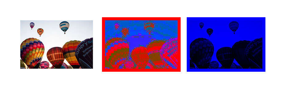 Using background-blend-mode
The mix-blend-mode property allows you to blend text on top of an image. In the below example I have an h1 then in .box2 I set to mix-blend-mode: screen.
Using background-blend-mode
The mix-blend-mode property allows you to blend text on top of an image. In the below example I have an h1 then in .box2 I set to mix-blend-mode: screen.
.box {
 background-image: url(balloons-large.jpg);
}
.box h1 {
 font-size: 140px;
 color: green;
}
.box2 h1 {
 mix-blend-mode: screen;
}
 Using mix-blend-mode
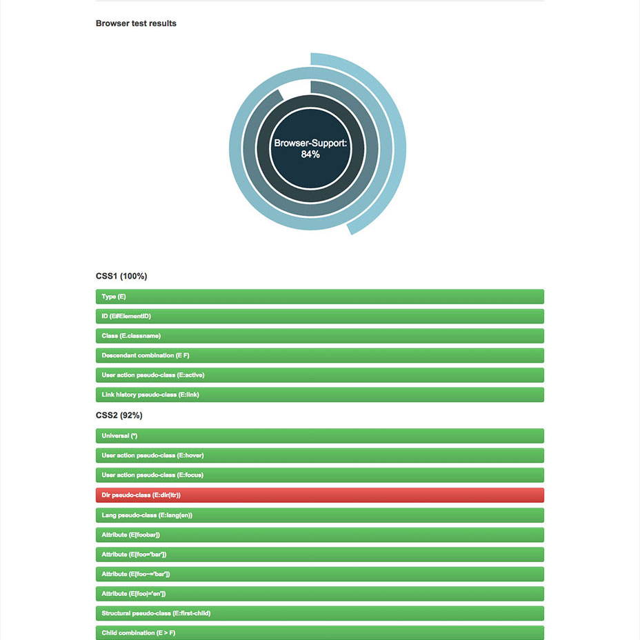
CSS Blend Modes actually have surprisingly good support in modern browsers other than Internet Explorer, see the support matrix for background-blend-mode, mix-blend-mode is available in Safari and Firefox, and behind the experimental features flag in Opera and Chrome. With careful use this is exactly the kind of specification you can start to play with to enhance your designs, as long as the fallback doesn’t leave things illegible in non-supporting browsers.
If you need to have fuller support for older browsers and so don't feel blend modes can be used in production yet, don’t forget that you can use these during development to avoid trips through Photoshop. Once you have finalised images and treatments create the production images in a graphics programme, replacing the CSS effects.
Find out more about using blend modes with this practical article on CSS Tricks, in the resources on the Adobe website and on the Dev Opera website.
Using mix-blend-mode
CSS Blend Modes actually have surprisingly good support in modern browsers other than Internet Explorer, see the support matrix for background-blend-mode, mix-blend-mode is available in Safari and Firefox, and behind the experimental features flag in Opera and Chrome. With careful use this is exactly the kind of specification you can start to play with to enhance your designs, as long as the fallback doesn’t leave things illegible in non-supporting browsers.
If you need to have fuller support for older browsers and so don't feel blend modes can be used in production yet, don’t forget that you can use these during development to avoid trips through Photoshop. Once you have finalised images and treatments create the production images in a graphics programme, replacing the CSS effects.
Find out more about using blend modes with this practical article on CSS Tricks, in the resources on the Adobe website and on the Dev Opera website.
The calc() function
The calc() function is part of the CSS Values and Units module level 3. It means you can do mathematical functions right inside your CSS. A simple use of calc() can be found if you want to position a background image from the bottom right of an element. Positioning an element 30px in from the top left is easy, you would use:.box {
background-image: url(check.png);
background-position: 30px 30px;
}
.box {
 background-image: url(check.png);
 background-position: calc(100% - 30px) calc(100% - 30px);
}
CSS Variables
A powerful feature of CSS pre-processors such as Sass, is the ability to use variables in our CSS. At a very simple level, we can save a lot of time by declaring the colors and fonts used in our design, then using a variable when using a particular color or font. If we then decide to tweak a font or the color palette we only need change those values in one place. CSS Variables, described in the CSS Custom Properties for Cascading Variables module level 1, brings this functionality into CSS.:root {
--color-main: #333333;
--color-alert: #ffecef;
}
.error { color: var(--color-alert); }
CSS Exclusions
We are all familiar with floats in CSS. The simplest example might be floating an image to allow text to flow around it. However, floats are fairly limited as the floated item always rises to the top, so while we can float an image left and wrap text to the right and below it, there’s no way to drop an image into the middle of the document and flow text all the way around, or position it at the bottom and let text flow round the top and side. Exclusions lets you wrap text around all sides of a positioned object. It doesn’t define a new method of positioning itself, so can be used in conjunction with other methods. In the example below I am absolutely positioning an element on top of a block of text, then declaring that element as an exclusion with the property wrap-flow with a value of both, so the text then respects the position of the element and flows round it..main {
position:relative;
}
.exclusion {
position: absolute;
top: 14em;
left: 14em;
width: 320px;
wrap-flow: both;
}
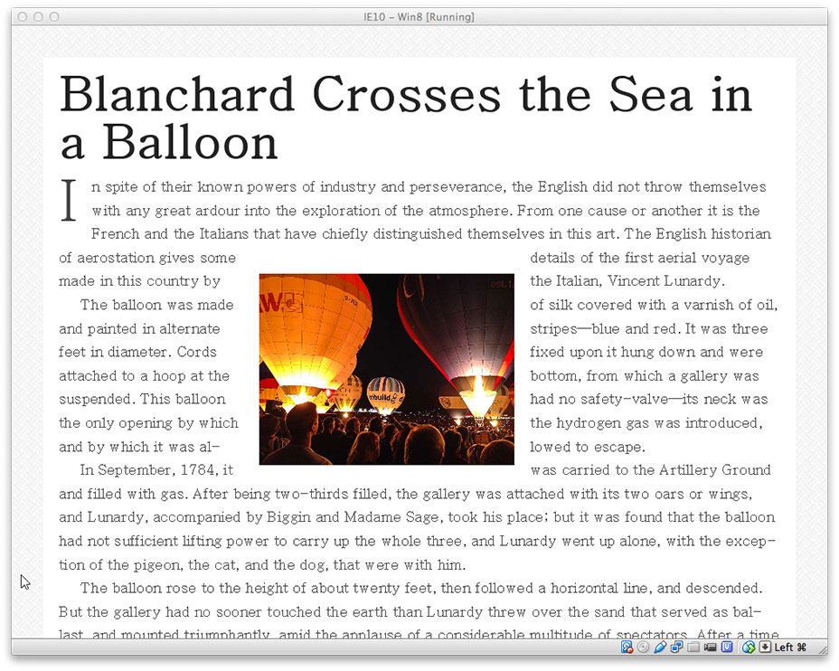 Exclusions in Internet Explorer
Browser support for exclusions and wrap-flow: both is currently limited to IE10+, requiring an -ms prefix. Note that Exclusions was until recently linked to the CSS Shapes specification that I look at next, so some of the information online conflates the two.
Exclusions in Internet Explorer
Browser support for exclusions and wrap-flow: both is currently limited to IE10+, requiring an -ms prefix. Note that Exclusions was until recently linked to the CSS Shapes specification that I look at next, so some of the information online conflates the two.
CSS Shapes
The Exclusions specification deals with wrapping text around rectangular objects. Shapes brings us the much more powerful ability to wrap text around non-rectangular objects, such as flowing text around a curve. Level 1 of the CSS Shapes specification defines a new property shape-outside. This property can be used on a floated element. In the below example I am using shape-outside to curve text around a floated image..shape {
width: 300px;
float: left;
shape-outside: circle(50%);
}
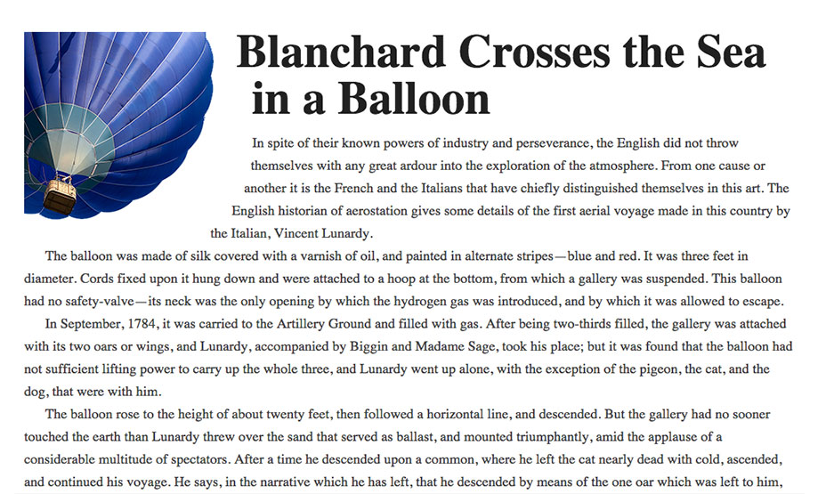 CSS Shapes allows us to curve text around the ballon image
Browser support for Shapes Level 1 includes Chrome and Safari, meaning that you could start to use it in stylesheets for iOS devices. Level 2 of the specification will allow you to shape text inside elements with the shape-inside property, so there is more to come from this feature.
Read more about Shapes in this A List Apart article by Sara Soueidan, and the accompanying resources.
CSS Shapes allows us to curve text around the ballon image
Browser support for Shapes Level 1 includes Chrome and Safari, meaning that you could start to use it in stylesheets for iOS devices. Level 2 of the specification will allow you to shape text inside elements with the shape-inside property, so there is more to come from this feature.
Read more about Shapes in this A List Apart article by Sara Soueidan, and the accompanying resources.
CSS Grid Layout
I have left my favourite until last. I’ve been a great fan of the emerging Grid Layout spec since the early implementation in Internet Explorer 10. CSS Grid Layout gives us a way to create proper grid structures with CSS and position our design onto that grid. Grid layout gives us a method of creating structures that are not unlike using tables for layout. However, being described in CSS and not in HTML they allow us to create layouts that can be redefined using media queries and adapt to different contexts. It lets us properly separate the order of elements in the source from their visual presentation. As a designer this means you are free to change the location of page elements as is best for your layout at different breakpoints and not need to compromise a sensibly structured document for your responsive design. Unlike with an HTML table-based layout, you can layer items on the grid. So one item can overlap another if required. In the example below we are declaring a grid on the element with a class of .wrapper. It has three 100 pixel wide columns with 10 px gutters and three rows. We position the boxes inside the grid by using line numbers before and after, above and below the area where we want the element to be displayed.<!DOCTYPE html>
<html>
<head>
<title>Grid Example</title>
<meta charset="utf-8">
<style>
body {
margin: 40px;
}
.wrapper {
display: grid;
grid-template-columns: 100px 10px 100px 10px 100px;
grid-template-rows: auto 10px auto;
background-color: #fff;
color: #444;
}
.box {
background-color: #444;
color: #fff;
border-radius: 5px;
padding: 20px;
font-size: 150%;
}
.a {
grid-column: 1 / 2;
grid-row: 1 / 2;
}
.b {
grid-column: 3 / 4;
grid-row: 1 / 2;
}
.c {
grid-column: 5 / 6;
grid-row: 1 / 2;
}
.d {
grid-column: 1 / 2;
grid-row: 3 / 4;
}
.e {
grid-column: 3 / 4;
grid-row: 3 / 4;
}
.f {
grid-column: 5 / 6;
grid-row: 3 / 4;
}
</style>
</head>
<body>
<div class="wrapper">
<div class="box a">A</div>
<div class="box b">B</div>
<div class="box c">C</div>
<div class="box d">D</div>
<div class="box e">E</div>
<div class="box f">F</div>
</div>
</body>
</html>
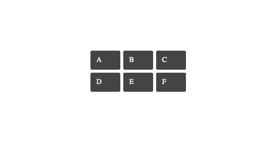 The grid example in Chrome
Browser support for the latest Grid Specification is limited to Chrome with the “experimental Web Platform features” flag enabled. There is a solid implementation of the initial version of the specification in Internet Explorer 10 and up.
Find out more about Grid Layout on my Grid by Example site, where you can see several Grid examples that work in Chrome, with experimental web platform features enabled. I also spoke last year at CSS Conf EU on Grid and you can see that video here.
The grid example in Chrome
Browser support for the latest Grid Specification is limited to Chrome with the “experimental Web Platform features” flag enabled. There is a solid implementation of the initial version of the specification in Internet Explorer 10 and up.
Find out more about Grid Layout on my Grid by Example site, where you can see several Grid examples that work in Chrome, with experimental web platform features enabled. I also spoke last year at CSS Conf EU on Grid and you can see that video here.
Do you have a favorite emerging specification not mentioned here?
I hope you've enjoyed this quick tour round some of the interesting, newer features of CSS. Use the linked resources to find out more about the features you have found most interesting. Let me know in the comments if you have a favorite upcoming CSS feature that you think people should know about, or additional great resources and examples for any of the features I have described. Featured image, uses balloon image via Shutterstock.Rachel Andrew
Rachel Andrew is a web developer, writer and speaker from the UK. She has been working on the web since 1996 and is co-founder of Perch CMS. Rachel writes about business and technology on her site at rachelandrew.co.uk and can be found on Twitter @rachelandrew.


Read Next

3 Essential Design Trends, May 2024
Integrated navigation elements, interactive typography, and digital overprints are three website design trends making…

How to Write World-Beating Web Content
Writing for the web is different from all other formats. We typically do not read to any real depth on the web; we…
By Louise North

20 Best New Websites, April 2024
Welcome to our sites of the month for April. With some websites, the details make all the difference, while in others,…

Exciting New Tools for Designers, April 2024
Welcome to our April tools collection. There are no practical jokes here, just practical gadgets, services, and apps to…

How Web Designers Can Stay Relevant in the Age of AI
The digital landscape is evolving rapidly. With the advent of AI, every sector is witnessing a revolution, including…
By Louise North

14 Top UX Tools for Designers in 2024
User Experience (UX) is one of the most important fields of design, so it should come as no surprise that there are a…
By Simon Sterne

What Negative Effects Does a Bad Website Design Have On My Business?
Consumer expectations for a responsive, immersive, and visually appealing website experience have never been higher. In…

10+ Best Resources & Tools for Web Designers (2024 update)
Is searching for the best web design tools to suit your needs akin to having a recurring bad dream? Does each…
By WDD Staff

3 Essential Design Trends, April 2024
Ready to jump into some amazing new design ideas for Spring? Our roundup has everything from UX to color trends…

How to Plan Your First Successful Website
Planning a new website can be exciting and — if you’re anything like me — a little daunting. Whether you’re an…
By Simon Sterne

15 Best New Fonts, March 2024
Welcome to March’s edition of our roundup of the best new fonts for designers. This month’s compilation includes…
By Ben Moss

LimeWire Developer APIs Herald a New Era of AI Integration
Generative AI is a fascinating technology. Far from the design killer some people feared, it is an empowering and…
By WDD Staff