

Scaling vs. fluid vs. responsive
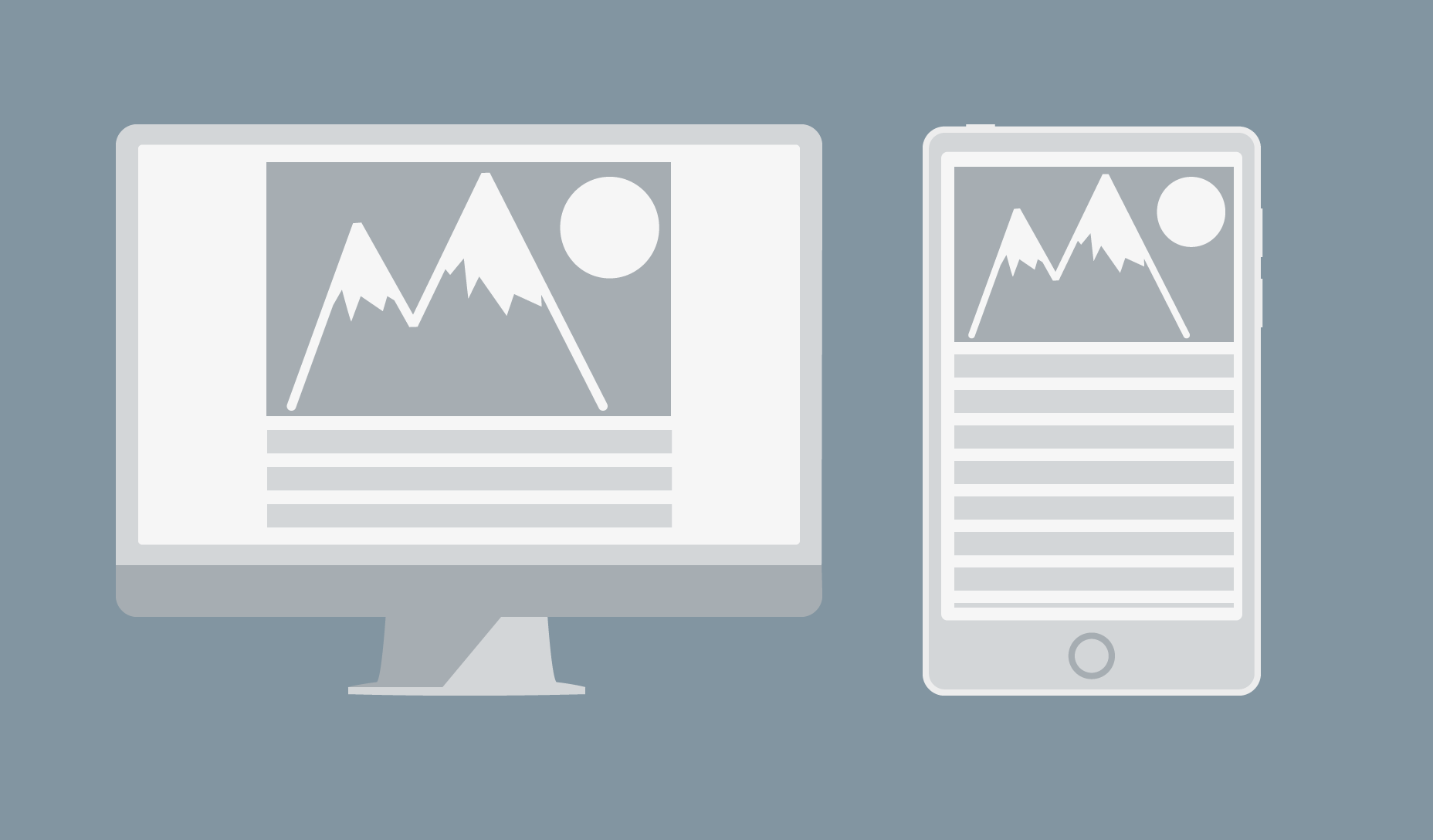
There is a lot of confusion over these terms and designers often incorrectly use them interchangeably. In truth, each of these are distinct evolutionary steps in layout technique that have emerged over time in line with advances in technology. Scaling layouts are designed to scale every element relative to every other element. They are responsive in the sense that they will scale the content dynamically in response to changes in the size of the viewport. The layout itself remains static, changing the size of every element to maintain a consistent appearance.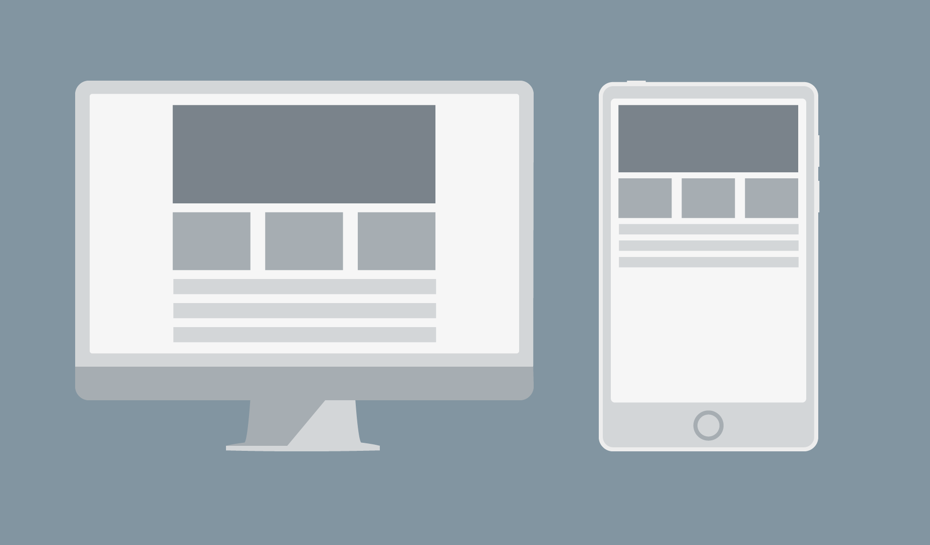 Above: example of a scaling layout at different resolutions: the design sacrifices readability for consistency.
Fluid layouts are different because they scale container elements relative to the size of the viewport. This is achieved by using relative units such as ems to overcome the problem of shrinking text. The design can be broken by the user scaling it.
Above: example of a scaling layout at different resolutions: the design sacrifices readability for consistency.
Fluid layouts are different because they scale container elements relative to the size of the viewport. This is achieved by using relative units such as ems to overcome the problem of shrinking text. The design can be broken by the user scaling it.
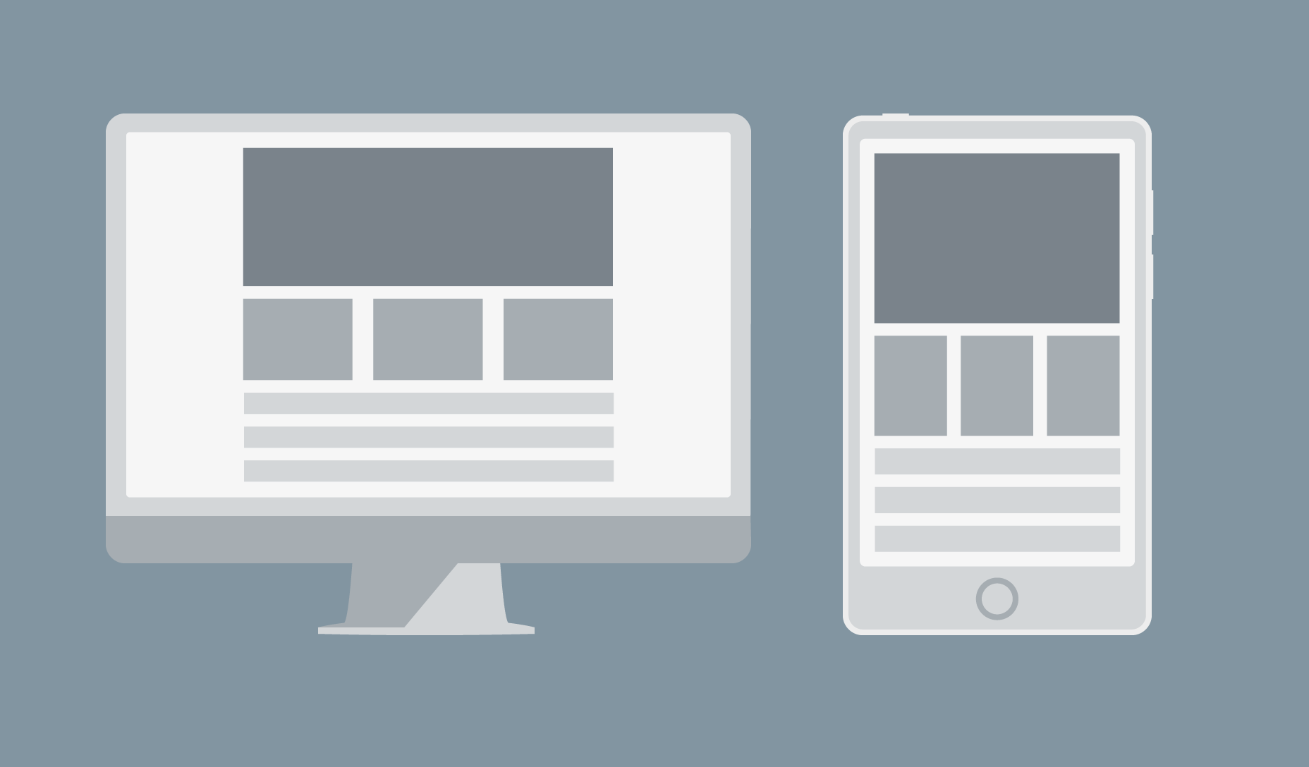 Above: example of a fluid layout at different resolutions: the design sacrifices consistency for readability.
Responsive layouts don’t scale anything. Instead, they change what is displayed depending on the size of the viewport.
Above: example of a fluid layout at different resolutions: the design sacrifices consistency for readability.
Responsive layouts don’t scale anything. Instead, they change what is displayed depending on the size of the viewport.
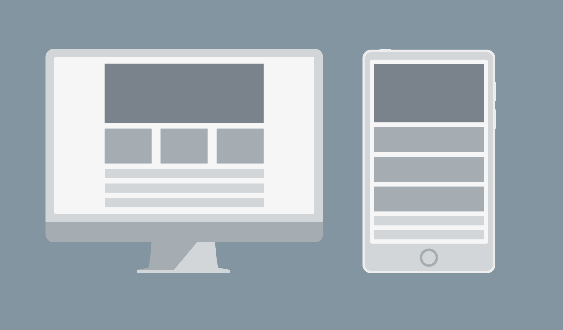 Above: an example of a responsive layout at different resolutions.
Disaster 1) Wrapping menus
If you use a navbar at the top of your page, a responsive design is supposed to “snap” it to a more compact format when the page is displayed on a small screen. But this does not always work perfectly if the display area is wider than the break point, but too small to display all the menu items in a single line. The result is a menu that wraps.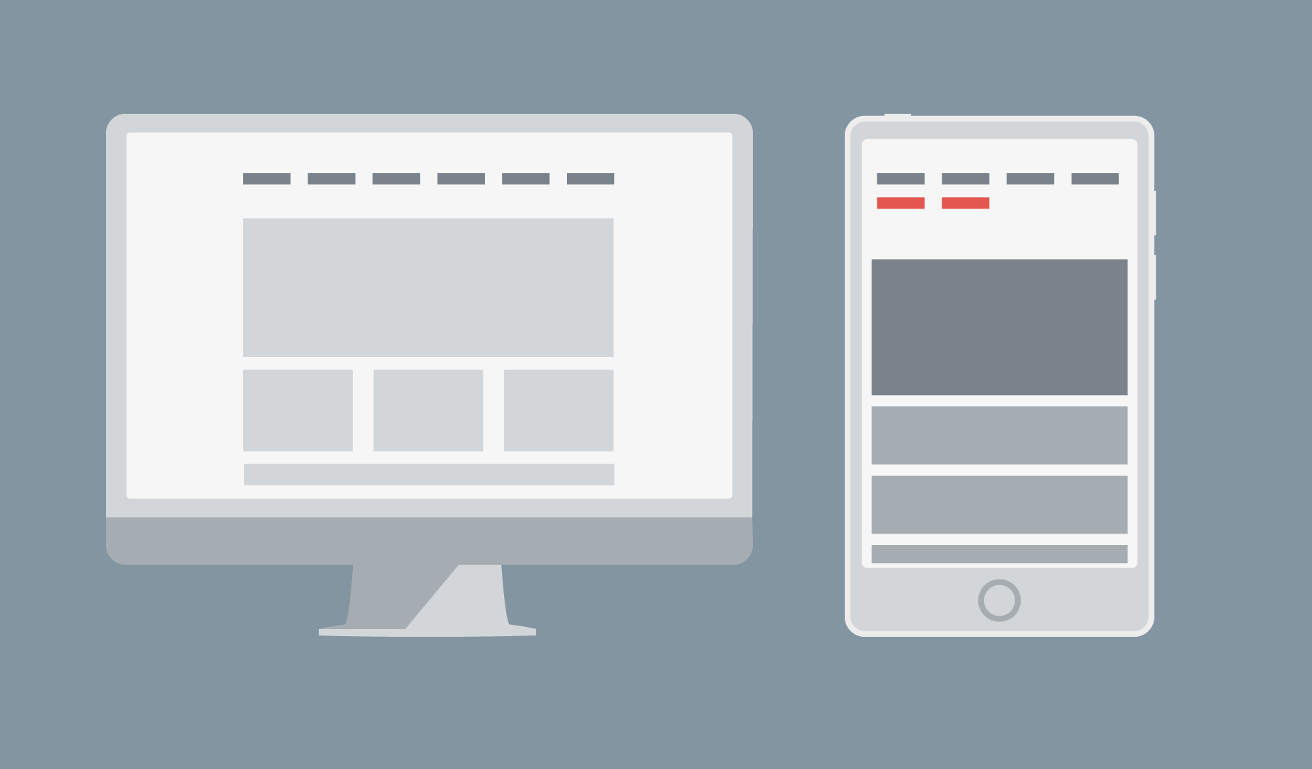 There are several ways to solve this problem. The first is to reduce the number of items displayed horizontally on the navbar by sorting them into categories and sub-categories. You can then use drop-down items to display the sub-categories when a category is selected.
The second way is to change the break point to a lower value. The actual number to use is the width at which your navbar starts to fail, not a specific device size.
The third way is to use a different menu for devices, such as a sliding drawer.
There are several ways to solve this problem. The first is to reduce the number of items displayed horizontally on the navbar by sorting them into categories and sub-categories. You can then use drop-down items to display the sub-categories when a category is selected.
The second way is to change the break point to a lower value. The actual number to use is the width at which your navbar starts to fail, not a specific device size.
The third way is to use a different menu for devices, such as a sliding drawer.
Disaster 2) Using fixed width images
Content areas are usually set to a size relative to the viewport. So when a fixed-width image is wider than the size of the area, image cropping occurs.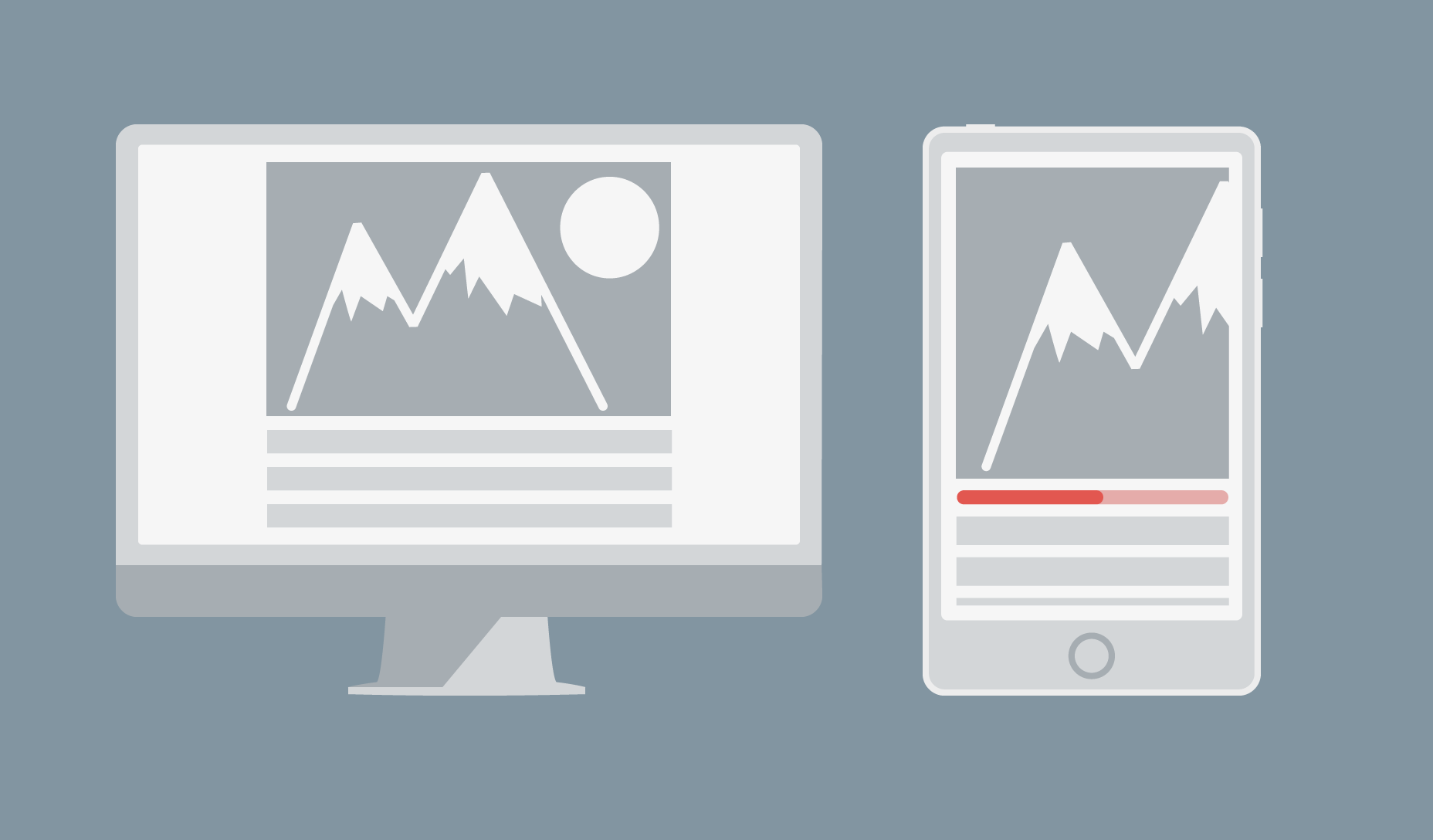 Above: example of a bad fixed-width image that is too large: now it has scroll bars and content is pushed off-screen.
You can avoid this problem by using relative units to set the width of the image, or if you use a framework that supports it (such as Bootstrap) you can use a responsive image class (eg: class="img-responsive").
Above: example of a bad fixed-width image that is too large: now it has scroll bars and content is pushed off-screen.
You can avoid this problem by using relative units to set the width of the image, or if you use a framework that supports it (such as Bootstrap) you can use a responsive image class (eg: class="img-responsive").
 Above: The same element with a responsive image class approach: now scroll bar is gone.
Disaster 3) Element distortion
This one is a bit more obscure, but essentially what happens when your layout is displayed on a small viewport is that any unhandled columns behave like rows. This is a problem because the distortion of the content unintentionally changes the hierarchy of your design.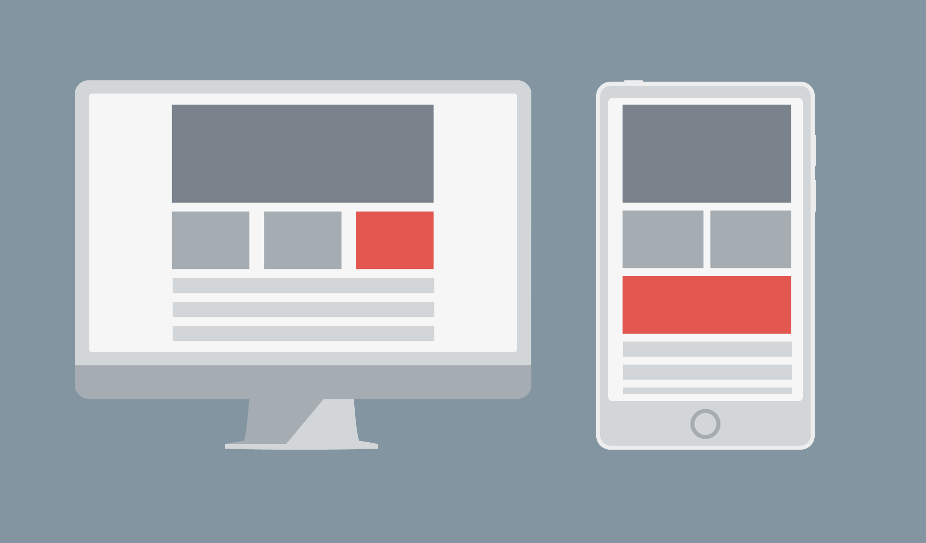 Above: column becomes a row, distorting content.
The solution is obvious, yet it is surprising how many people struggle with it: simply set the height, width, and padding of the element explicitly. If it moves out of position and covers other elements, you can force it to be where you want by wrapping it in a div and setting margins.
Above: column becomes a row, distorting content.
The solution is obvious, yet it is surprising how many people struggle with it: simply set the height, width, and padding of the element explicitly. If it moves out of position and covers other elements, you can force it to be where you want by wrapping it in a div and setting margins.
Planning helps avoid mistakes
This article has discussed only the 3 most commonly encountered responsive design disasters, but there are plenty of other ways for a good design to go wrong. Preventing errors is not too difficult. Modern browsers have built-in responsive layout testing, so plan your design well and test often.Emma Grant
Emma Grant is a professional freelance content writer from Ireland. Over the past three years she has travelled the world while running her business from her laptop. You find her at www.florencewritinggale.com


Read Next

3 Essential Design Trends, May 2024
Integrated navigation elements, interactive typography, and digital overprints are three website design trends making…

How to Write World-Beating Web Content
Writing for the web is different from all other formats. We typically do not read to any real depth on the web; we…
By Louise North

20 Best New Websites, April 2024
Welcome to our sites of the month for April. With some websites, the details make all the difference, while in others,…

Exciting New Tools for Designers, April 2024
Welcome to our April tools collection. There are no practical jokes here, just practical gadgets, services, and apps to…

How Web Designers Can Stay Relevant in the Age of AI
The digital landscape is evolving rapidly. With the advent of AI, every sector is witnessing a revolution, including…
By Louise North

14 Top UX Tools for Designers in 2024
User Experience (UX) is one of the most important fields of design, so it should come as no surprise that there are a…
By Simon Sterne

What Negative Effects Does a Bad Website Design Have On My Business?
Consumer expectations for a responsive, immersive, and visually appealing website experience have never been higher. In…

10+ Best Resources & Tools for Web Designers (2024 update)
Is searching for the best web design tools to suit your needs akin to having a recurring bad dream? Does each…
By WDD Staff

3 Essential Design Trends, April 2024
Ready to jump into some amazing new design ideas for Spring? Our roundup has everything from UX to color trends…

How to Plan Your First Successful Website
Planning a new website can be exciting and — if you’re anything like me — a little daunting. Whether you’re an…
By Simon Sterne

15 Best New Fonts, March 2024
Welcome to March’s edition of our roundup of the best new fonts for designers. This month’s compilation includes…
By Ben Moss

LimeWire Developer APIs Herald a New Era of AI Integration
Generative AI is a fascinating technology. Far from the design killer some people feared, it is an empowering and…
By WDD Staff