

I feel the need, the need for speed
Why does speed matter? Surely no one is on a 3G connection any longer? Nobody uses dial-up. If your client’s target demographic inhabit urban Manhattan, why should you care about rural Lesotho? The fact is, it’s a myth that we’re all on super-fast broadband, sold to us by companies that profit from the desire for ever increasing speeds. Most people spend at least two hours of every day on an inferior connection. I often find myself with most time to browse when commuting, when even a reliable 3G connection sounds like some far away dream. In April Google announced that mobile friendliness would be used as a ranking factor for searches conducted on devices it considers to be “mobile”. Even before that, speed was a factor in page ranking — both explicitly as part of Google’s calculations, and implicitly as a contributing factor to your bounce rate. In two identically ranked sites, an extra 1Kb could drop you from 3rd spot on Google, to 4th, or 5th. It could even drop you from 10th to 11th — in other words from page 1 to page 2 — with all of the associated impact on your client’s revenue.Do you really need that image?
The most highly optimized image there is, is no image at all. If you have five images on your site and you drop one, you’ve saved yourself 20%, perhaps more importantly, you’ve saved yourself an http request. If we dropped all images from our sites, we’d save ourselves 100%, and all five http requests. So why not do that? We don’t drop images from our sites because they communicate more effectively than text in the short term. They create an emotional connection that draws users into content. We know that users don’t read web pages. Very few people read in-depth content online. Images allow us to connect with, communicate, and reinforce a brand in a fraction of the time that text can manage. Images may be large, and unwieldy to download, but once rendered in the browser they are far more efficient than than text for establishing user engagement and reinforcing a brand message. Responsive images help us ensure that the emotional connection images build isn’t lost when the impatient user hits the back button.How about SVG?
SVG (Scaleable Vector Graphics) is one of the true pioneering technologies of the Web. It’s so far ahead of the curve that most designers still haven’t recognized its true potential. SVG — as the name implies — is vector based. This means that SVG graphics are constructed from points, angles, and distances. SVG is also — as the name implies — scaleable, meaning that it will display equally well on a 5k iMac or an Android smartphone, with no loss of quality and no change in file size. If you have a flat illustration, an icon, a logo, just about anything that can be displayed as an SVG, then SVG is the way to go. Most images on the Web are bitmaps. Generally speaking the way a bitmap works is to describe each pixel one at a time, its color (in RGB — red, green, and blue values) and in some cases its transparency. If you have an image measuring 100px by 100px, then you have an image with 10,000 pixels; if each pixel has 4 values to describe it, then the image has 40,000 bits of data associated with it. Sounds like a lot doesn’t it? Sometimes, that’s less than a vector graphic. Consider a 1px by 1px image; that would require 4 bits of data to record as a bitmap (red, green, blue and alpha values). Now consider the same square pixel recorded as a vector; that would require the x, y, width, and height of the rectangle, in addition to the RGBA values. Those are crude examples, but they’re accurate. Often, a vector version of an image — if we even have one available to us — exceeds the file size of the equivalent bitmap, and then bitmap is the only sensible choice.(Mis)using JavaScript
Like most problems in life (if your life is online) responsive images can be solved by JavaScript. In fact for a number of years JavaScript was the only way to solve the issue. JavaScript can test a user agent’s abilities, determine what kind of browser it is, and write a standard HTML image tag, containing the appropriate image. Web designers who object to using JavaScript typically do so because some people turn it off. However, that’s not really the case any longer, especially on the mobile web, but there are some persistent issues: writing an image with JavaScript means that the image won’t be parsed by search engine bots, and it will only render after the script as run, for example. The biggest issue with using JavaScript is that it’s a misuse of JavaScript’s core purpose. HTML holds data, CSS handles presentation, JavaScript handles functionality. When we break from those structured roles we start to encounter problems that require hacks to fix them. Images are data, and should be therefore be handled by HTML.The trouble with browsers
Since RWD was first thought up, images have been the biggest stumbling block. But now, we’re starting to find ways to solve the various problems. Techniques that are battle-hardened and successful enough to be considered best-practice. Dedicated developers have given up their time to lobby the WC3 for official solutions, and now, for the first time, responsive images are practical. The key to responsive images, is that they have been designed with a full awareness of the failings of the Web. Care has been taken to ensure that responsive image solutions do not break existing browsers, so that even in browsers that do not support responsive images, the code will fail silently and non-responsive, default images will be displayed. In this article we’ll be looking at two official responsive image HTML elements: srcset and picture. At present, Edge, Safari, and iOS Safari only support a subset of the srcset specification. Firefox, Chrome, Opera, Android Browser, and the forthcoming versions of Safari and iOS Safari fully support it. (We’ll discuss the differences below.) At present the picture element is fully supported by Firefox, Chrome, Opera, and Android Browser. Edge, Safari, and iOS Safari don’t support it, and they haven’t announced a timetable for implementing it. Even among browsers that do support the new code, there are inconsistencies as different browser manufacturers interpret the W3C specifications in different ways. For example, when specifying a change of image from small to large based on viewport size, some browsers will switch to the large image when the viewport is 1px larger than the small image’s preferred size, others will switch to the large image only when the viewport favored by the large image is fully matched. In summary, browsers are split into two camps: those that favor higher quality images where possible, and those that favor smaller downloads where possible. Browser manufacturers are still duking this one out, eventually someone’s implementation will be proven most popular — personally I hope it’s the latter, because as noted above performance is crucial to user experience. For now, the best option for web designers is to stick to the specification and don’t try to second guess the browser. After all, the default experience in the browser (higher quality, or faster downloads) is part of what a user selects a default browser for, so if the user is aware of the different approaches, then the browser preference is likely the user’s preference also.Responsive image best-practice (2015)
Throughout the Web’s history, we’ve used one element to indicate an image, the img element. In HTML5, the img element has undergone a subtle shift in its role, one that is designed to enable responsive images: the img element no longer represents an image, it is now a placeholder for an image. That distinction is important, because whilst an img element previously held a single set of image data — be that bitmap or vector — now an image can hold multiple sets of data. The img element (to recap for any non-coders) looks like this: The responsive image version of the img element looks like this: Barely any change at all. Looking at this code, you notice one important thing: the code is backwards compatible. If a browser happens along that doesn’t understand the srcset attribute, it will simply ignore it and render the image according to the original 1993 specification. What this means, is that we can now use responsive images in our markup, without the need for feature detection. In the new responsive img element, src is principally used as a default image and for browsers that don’t recognize srcset, whereas srcset contains all of the available high-res format images for that placeholder. When rendering the img element the browser will determine for itself which image file is the most appropriate.Using srcset
Now that we know that srcset will fail silently in browsers that don’t support it, we’re free to add an extra image: In this case, any browser that supports srcset will display image-b.jpg and any browser that does not support srcset will display image-a.jpg. It’s important to note that the browser will only download the image it decides it wants to display, it doesn’t download both images and then choose one. Sadly this doesn’t get us very far, because unless we’re demonstrating srcset support, there’s no practical application for switching images based on srcset support alone. The solution is to provide additional information to the browser about which image it should choose. In order to do that, we need to supply information about either available space, or pixel density.Using x-descriptor
The x-descriptor tells a browser how dense the pixels in an image are. If for example, you wanted to provide a retina-grade image with twice the number of pixels as a standard image, you’d specify the retina image in the srcset, followed by a space, and then the keyword “2x”. We have our image: In order to add a retina option for the browser, we add the following srcset: In this case, there are three possible outcomes:- if the browser does not support srcset it will use the image file specified in the src attribute;
- if the browser does support srcset, and has a screen capable of a double resolution, it will use the image specified in the srcset attribute;
- if the browser does support srcset but doesn’t have a high-res screen, it will use the image specified in the src attribute (when no “1x” image is specified in the srcset attribute, the src attribute is assumed to be that image option).
Using w-descriptor
The w-descriptor is a little more advanced than the x-descriptor. The w-descriptor works by telling the browser how many actual pixels exist on the x-axis (the width) of a particular image option. Edge, Safari, and iOS Safari do not support w-descriptor at the time of writing, so its usefulness is somewhat reduced. Let’s return to our original image: If this image is natively 1600 pixels wide and if we want to add a retina image, as we did with the x-descriptor above, we’d specify an image in the srcset attribute that is 3200 pixels wide: There is one major gotcha with the w-descriptor: although the src attribute is treated as the default when specifying images using the x-descriptor, it is ignored altogether by browsers that support srcset if you use the w-descriptor. When using the w-descriptor we have to specify the default explicitly by adding a second srcset image option, with its own w-descriptor, and separating them with a comma: Which leads us neatly onto…Using multiple images
Being able to specify a high resolution image option for the browser right in our HTML code is decidedly cool, but as you probably guessed, is gets even cooler when we specify multiple images. The goal of responsive images is to deliver the best quality image usable by the accessing device, but nothing more. So simply supplying a retina image isn’t adequate, we need to supply images at, for example, 1x, 1.5x, 2x, 2.5x, and 3x. Once again, here’s our original image markup: Here it is with a retina grade image supplied as an option for the browser: Here it is, this time with extra options in the srcset, separated by commas: Because keywords mean different things to different people, I find it advisable to name my images according to the x-descriptor to which they belong, both as a personal memory aid, and to ensure the different sizes are clear to other team members: Remember, we’re not telling the browser what image to display, we’re letting it know the options that are available to it, and allowing it to select for itself. The browser will only download one of these images. One gotcha with multiple images: don’t ever specify two images in the srcset attribute with a matching x-descriptor and w-descriptor, for example: It would be bad…Using sizes
The sizes attribute is a particularly interesting addition to the specification, because the sizes attribute takes its values relative to the viewport, not the image. Using the vw (viewport width) value, we specify the image area relative to the browser width — remember, the img element is now effectively just a placeholder, so we’re not specifying the actual size of the image, we’re specifying the size of placeholder that will contain the image. 100vw is 100% of the viewport width, 50vw is 50% of the viewport width, 25vw is 25% of the viewport width, etc. If we wanted to set the img width to half of the browser width, we’d use: This isn’t particularly useful, until we combine it with media queries…Using media queries
The sizes attribute becomes much more powerful when we combine it with media queries. We can separate multiple viewport widths using commas, and tell the browser which to use by using a CSS style media query. For example, imagine that we want an image to make up 80% of the width of our viewport on the majority of devices, but on small devices (like phones) with a width of 380px or less, we want to make the most of the space available by making up 100% of the width, we’d write that like this: Following this logic, any browser with a viewport of 380px or less will set the width of the image to 100% of the viewport. Any other browser will cause the media query to return false and the browser will move to the next value of the sizes attribute, which in this case is 80vw. As a general rule, I’m uncomfortable using media queries in HTML. Just as responsive image data belongs in HTML (not JavaScript), media queries belong in CSS (not HTML). However, the option is there for you if you need it.Responsive image best-practice (2016?)
I don’t know about you, but I’m pretty excited by the possibilities of srcset. It’s a simple solution to a difficult problem, and seems to deliver everything we need. But, like buses, you wait 20 years for an official solution to responsive images, and then two turn up at once. As well as the srcset attribute of the img element, we also have the picture element. The picture element is another placeholder, albeit a more traditional one. It has been engineered to mimic the video and audio elements in HTML5, so its syntax will be familiar to most. The picture element is intended to be used when you need more control than srcset can provide. Sadly, the picture element has far less browser support than srcset and it doesn’t always fail silently.Using the picture element
Here’s our original image element: Here’s our image nested inside a picture element:We can also specify a srcset for an img element inside a picture element:
Using the source element
The picture element doesn’t come to life until we add the source element:When selecting which file to use, the browser will start with the first source element, and move through the elements until it finds one whose media attribute resolves to true, it will then use that source element’s srcset. For example, we could specify different images for portrait and landscape formats:
We can also specify multiple images using x-descriptor and w-descriptor:
As with the use of media queries in the sizes attribute, I’d question the wisdom of controlling image versions based on style, in markup instead of a stylesheet. However, the option to use the media attribute is there if you need it.
Using type
The picture element really comes into its own when used to swap out different types of images. Imagine we have a standard PNG file, but we want to use a WebP file, which is typically 26% smaller — remember responsive images are about delivering the best image quality, at the smallest size — but currently only supported by Chrome, Opera, and the Android browser. We’ll need to use the type attribute to determine if WebP is supported:In this case, the browser will check if the WebP image format is supported. If it is, it will determine if the screen has enough pixel density to display the retina-image.webp image, if not it will display the image.webp image. If WebP isn’t supported the browser will jump straight to the img element and work through the srcset and src options in the way we’re already familiar with. The type attribute means that we can provide much smaller image formats where supported, resulting in a smaller file size.
Known issues
IE9 has a known issue, that prevents the picture element from failing silently. In order to handle IE9 you need to trick IE9 into thinking that the source elements are part of a video element:It’s an ugly solution, but better than no solution at all. We can only hope that the release of Windows 10 will hasten the demise of IE9, because while Edge doesn’t yet support the picture element, it doesn’t support it in the correct way (by ignoring it). There are polyfills that can help you support the picture element on IE, but my own preference is to avoid them. I distrust patching problems with JavaScript, it impacts performance and leads to less maintainable code. For this reason, I recommend avoiding the picture element for now. Unless you’re running a large-scale ecommerce site, the extra saving on download time that the WebP format offers is unlikely to outweigh the inconvenience of patching your markup with script. Once IE9 drops below 1%, which should happen at some point in the next year, the picture element will become viable. If you’re reading this in 2016, you’re probably good to go.
Creating responsive images
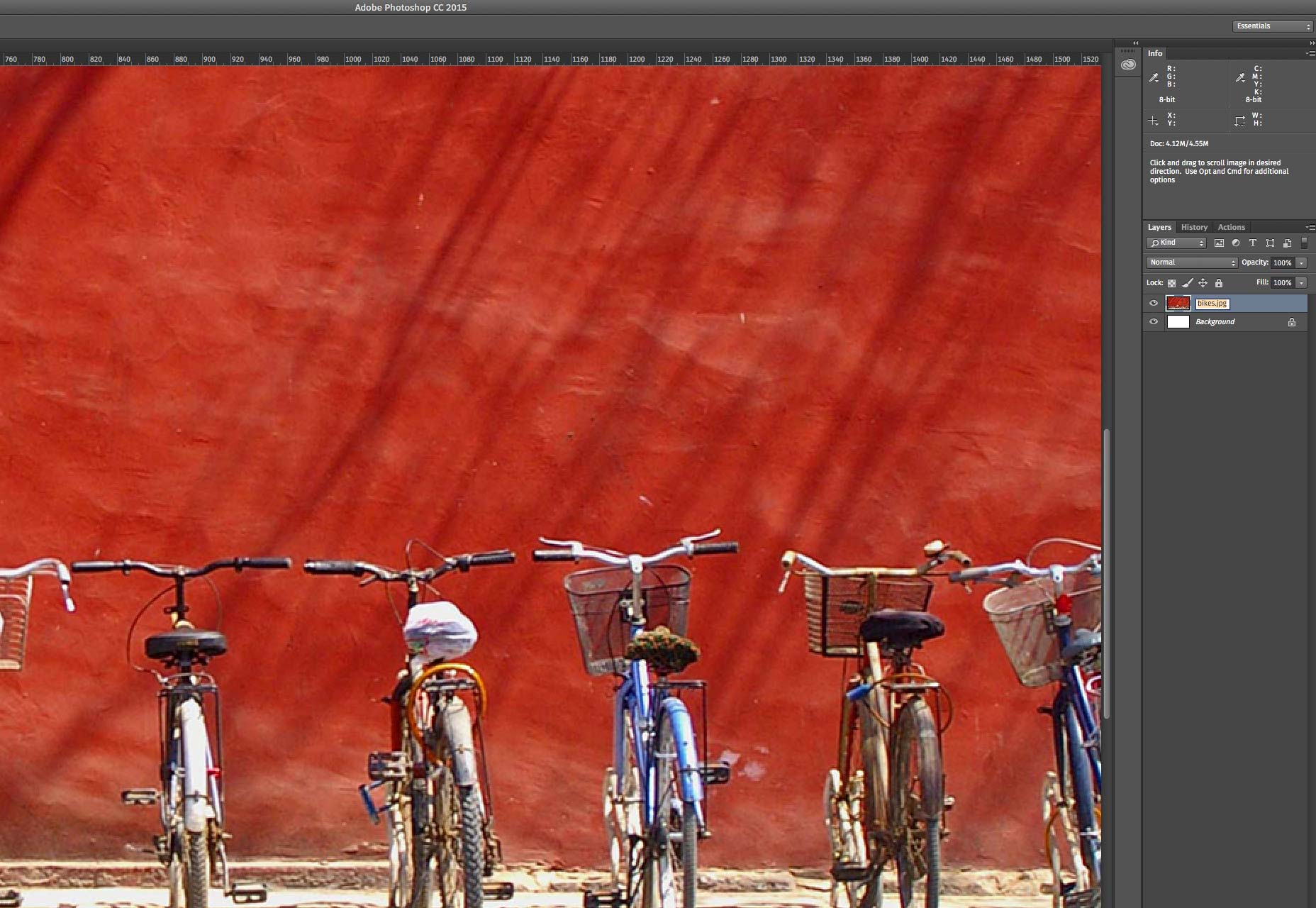
Unlike SVG, bitmap images don’t scale up. Our strategy for handling them, whether we’re using srcset or the picture element, is to supply a different image based on the browser’s capabilities. In order to handle that, we need to supply a variety of different image sizes. Most image editing applications have automated the process of exporting multiple versions of a single image. It doesn’t matter which application you use, provided you end up with multiple image sizes without having to manually resize and save each one. Adobe Photoshop is the de facto bitmap editor. It’s not a great choice for design work, but its image processing workflow is smooth and reliable. Generating multiple image resolutions in Photoshop is relatively straightforward:- Open up the image you want to generate multiple versions of, and place it on its own layer.
- Rename the layer as the name of the file you want to generate (including the extension).
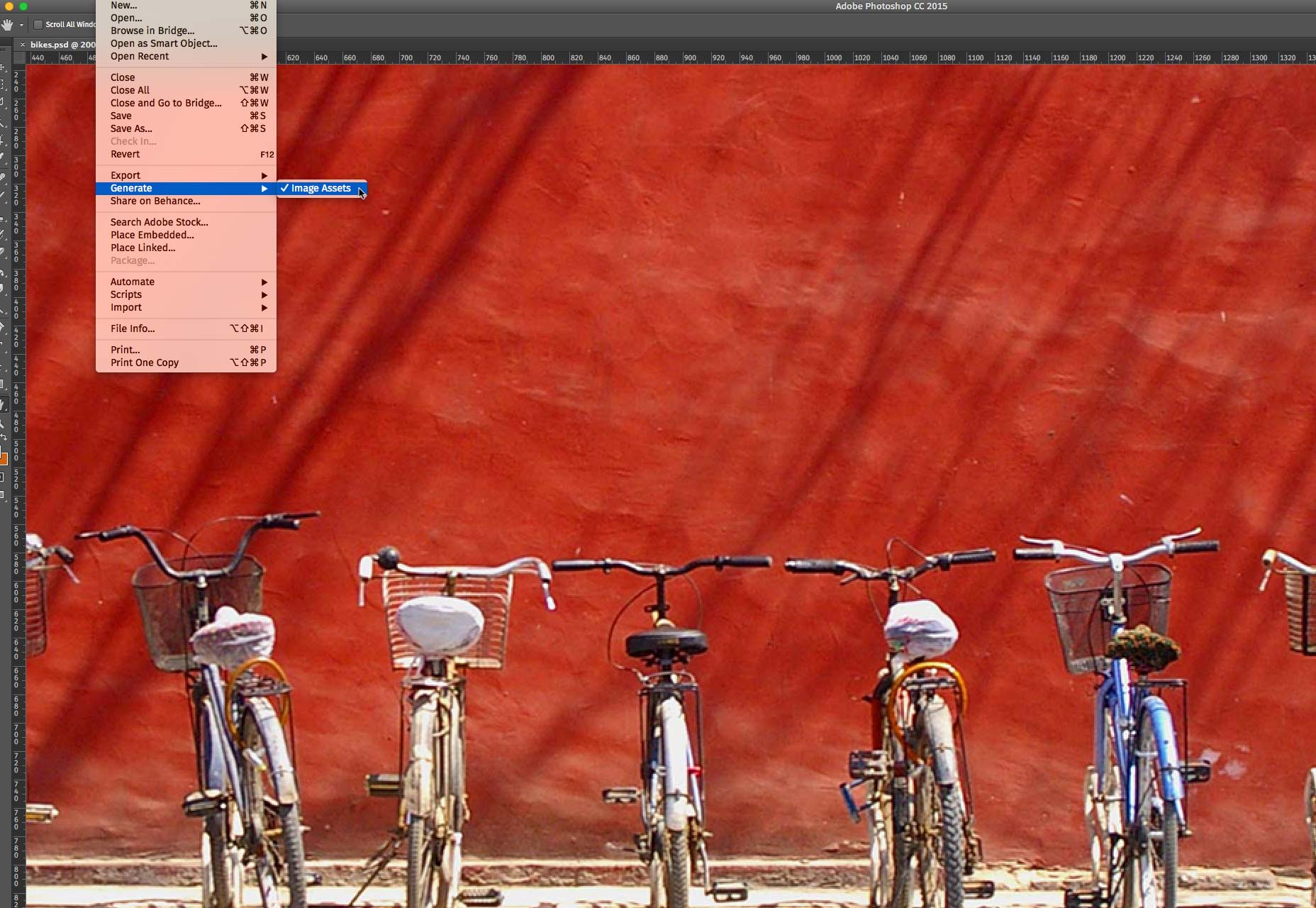
- Select File > Generate > Image Assets and a folder with your new image will be saved alongside your PSD.
- Rename the layer, specifying each image you want to generate preceded by its intended scale. You don’t need to repeat step 3, once you rename the layer the images will be generated automatically.
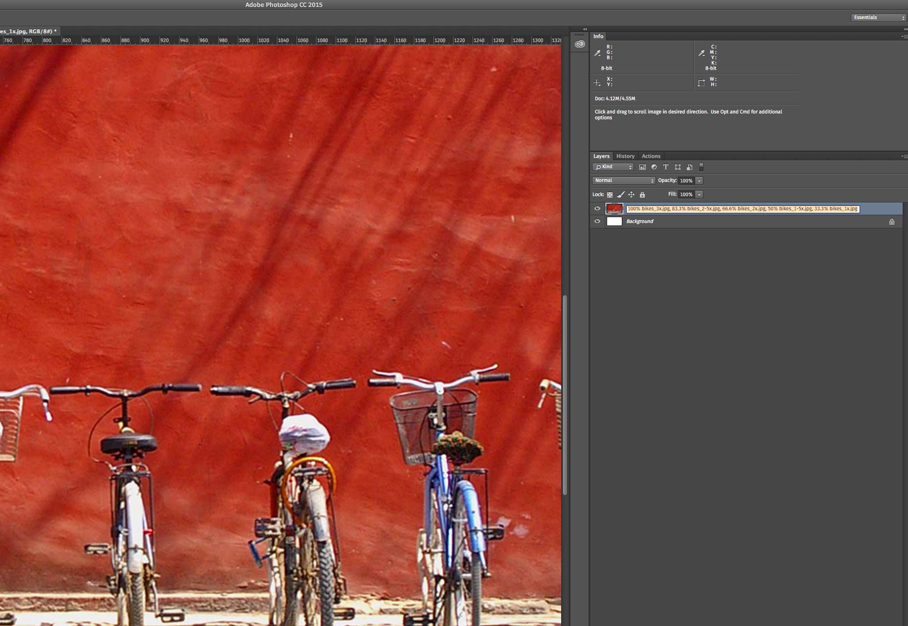
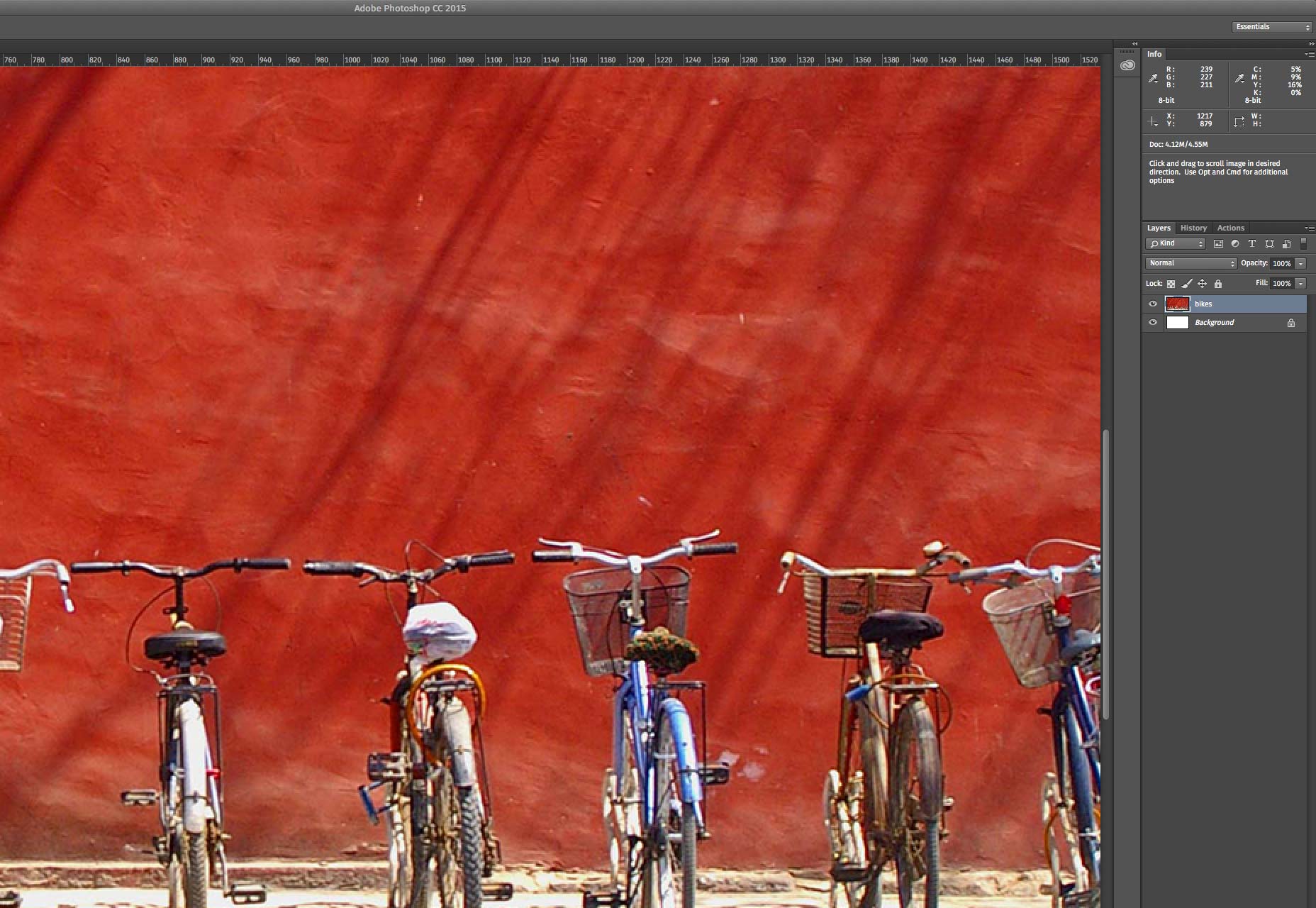
Credit for the image goes to Philip Collier. For more information on generating images in Photoshop, see here.
Based on these images, we can offer the browser five different options:
Conclusion
The img element has come a long way in 20 years. Or, to be more accurate, the img element was inadequate for 18 years, then sprinted for the line in the last two years, to the point that it is now relatively sophisticated. The important thing, is that we got to the solution(s). Of the two options available, srcset and picture, the former is by far the most supported. If you’re building 95% of the sites out there, then the superior support and simpler implementation of the srcset attribute is your best option. If you’re running a large ecommerce site, with thousands of product images, the extra work to serve the WebP format may be worthwhile, especially as support for the picture element increases over the next couple of years. The biggest weakness in the current options is that browsers don’t currently have a way of selecting an image based on their connection speed. We are forced to trust that more capable devices are also on superior connections. Ultimately, we can finally serve the highest quality images practically possible, at the smallest size. That means a better experience, in a shorter time, which can only be something to embrace. Featured image uses, mountain image and device image via Shutterstock.Paddi MacDonnell
Paddi MacDonnell is a designer and entrepreneur from Northern Ireland, follow her on Twitter.


Read Next

3 Essential Design Trends, May 2024
Integrated navigation elements, interactive typography, and digital overprints are three website design trends making…

How to Write World-Beating Web Content
Writing for the web is different from all other formats. We typically do not read to any real depth on the web; we…
By Louise North

20 Best New Websites, April 2024
Welcome to our sites of the month for April. With some websites, the details make all the difference, while in others,…

Exciting New Tools for Designers, April 2024
Welcome to our April tools collection. There are no practical jokes here, just practical gadgets, services, and apps to…

How Web Designers Can Stay Relevant in the Age of AI
The digital landscape is evolving rapidly. With the advent of AI, every sector is witnessing a revolution, including…
By Louise North

14 Top UX Tools for Designers in 2024
User Experience (UX) is one of the most important fields of design, so it should come as no surprise that there are a…
By Simon Sterne

What Negative Effects Does a Bad Website Design Have On My Business?
Consumer expectations for a responsive, immersive, and visually appealing website experience have never been higher. In…

10+ Best Resources & Tools for Web Designers (2024 update)
Is searching for the best web design tools to suit your needs akin to having a recurring bad dream? Does each…
By WDD Staff

3 Essential Design Trends, April 2024
Ready to jump into some amazing new design ideas for Spring? Our roundup has everything from UX to color trends…

How to Plan Your First Successful Website
Planning a new website can be exciting and — if you’re anything like me — a little daunting. Whether you’re an…
By Simon Sterne

15 Best New Fonts, March 2024
Welcome to March’s edition of our roundup of the best new fonts for designers. This month’s compilation includes…
By Ben Moss

LimeWire Developer APIs Herald a New Era of AI Integration
Generative AI is a fascinating technology. Far from the design killer some people feared, it is an empowering and…
By WDD Staff