

Design outside the box with narrative forms
The standard form is characterized by a few fields where leads fill in their basic contact details like their name, email address and phone number. It’s humdrum and very mundane…just because it’s typical doesn’t mean that it shouldn’t be messed with, though. On the contrary, try shaking things up for better conversions with narrative forms. Narrative forms, as the name implies, are forms that keep the conversation going; instead of simply ending the story when the site copy ends. These types of forms continue to engage your leads by prompting them to fill in the blanks in a form in the style of a first-person narrative. This makes the sign-up process way more personal!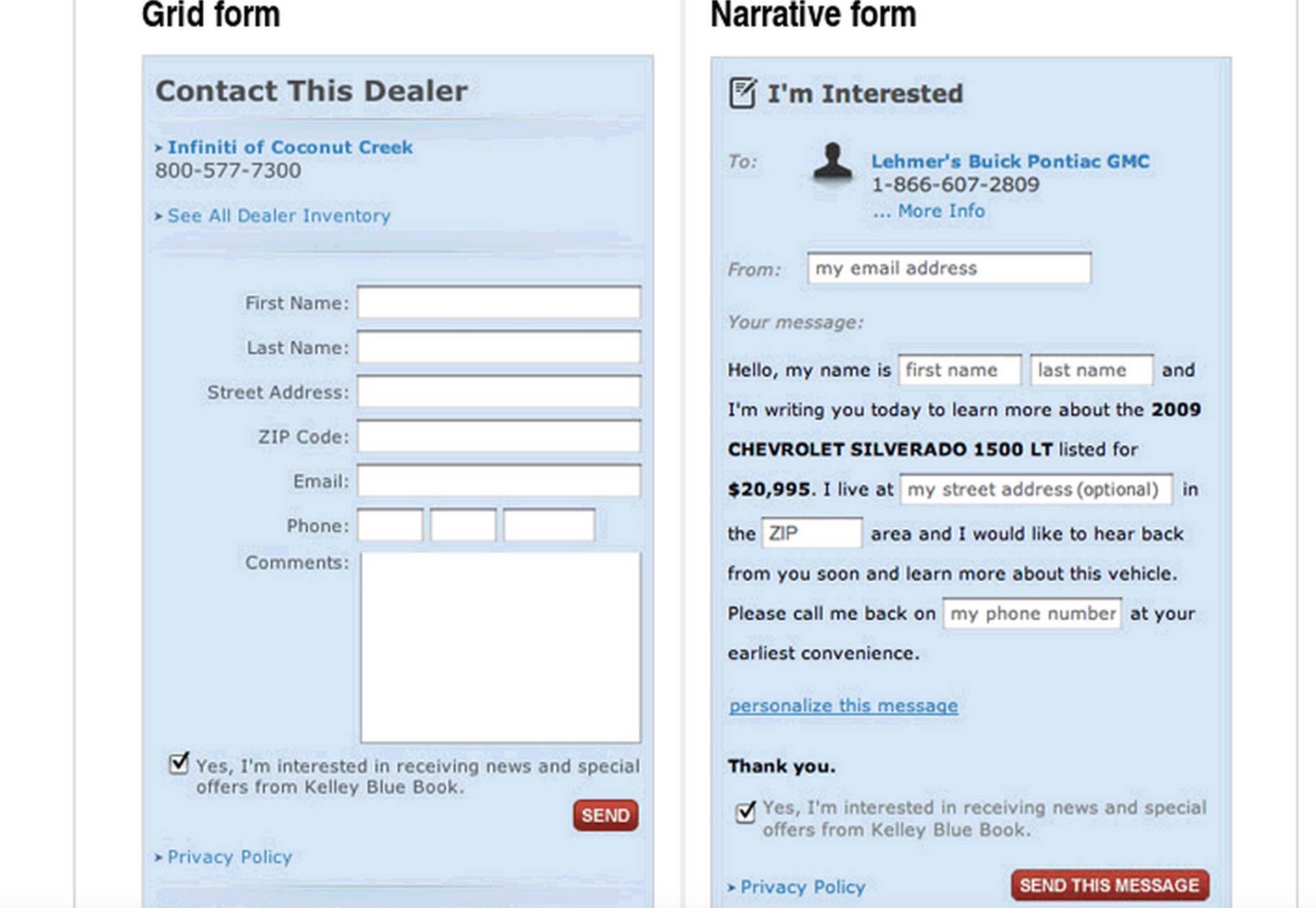 Vast.com, a site that lets users search for millions of cars for sale and real estate deals, experimented with narrative forms. They A/B tested their narrative form with the control, their standard grid form, and saw a conversion boost of between 25% to 40%. At the very least, including narration in the form produced a 25% conversion boost.
The next time you’re thinking of playing it safe when designing forms, don’t. Take this small, calculated risk, and it may pay off.
Vast.com, a site that lets users search for millions of cars for sale and real estate deals, experimented with narrative forms. They A/B tested their narrative form with the control, their standard grid form, and saw a conversion boost of between 25% to 40%. At the very least, including narration in the form produced a 25% conversion boost.
The next time you’re thinking of playing it safe when designing forms, don’t. Take this small, calculated risk, and it may pay off.
Use fewer (or more) fields
In the past few years, there’s been a debate about the specific form length that works best at boosting conversions. Newsflash: There actually isn’t a specific length that works better; shorter forms get more of a certain kind of conversion, while longer fields get more of another kind of conversion. Conventional wisdom dictates that fewer fields on a form boosts conversions. That’s true, but only in that fewer fields produce a greater quantity of conversions rather than a greater quantity of quality conversions.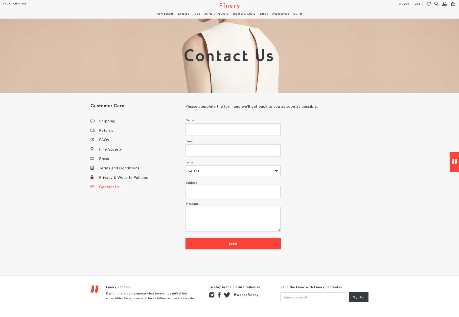 Finery’s form includes a drop down to specify why you’re contacting them. It’s an extra field, that could be omitted, but including it increases the quality of the message being sent.
Let’s look at this further. Say you have a really minimalist form that only asks for leads’ names, email addresses and phone numbers. You’ll get more conversions because the effort and time spent on inputting that info is minimal, yet the quality is questionable since you don’t know how relevant these leads are to your business. HubSpot found this to be true in its research.
On the other hand, if you have a longer form that asks for more than leads’ names, email addresses and phone numbers, you’ll have more detailed info on them, which leads to more higher-quality leads. With more info, a business can better tell if they can more easily market to them.
Finery’s form includes a drop down to specify why you’re contacting them. It’s an extra field, that could be omitted, but including it increases the quality of the message being sent.
Let’s look at this further. Say you have a really minimalist form that only asks for leads’ names, email addresses and phone numbers. You’ll get more conversions because the effort and time spent on inputting that info is minimal, yet the quality is questionable since you don’t know how relevant these leads are to your business. HubSpot found this to be true in its research.
On the other hand, if you have a longer form that asks for more than leads’ names, email addresses and phone numbers, you’ll have more detailed info on them, which leads to more higher-quality leads. With more info, a business can better tell if they can more easily market to them.
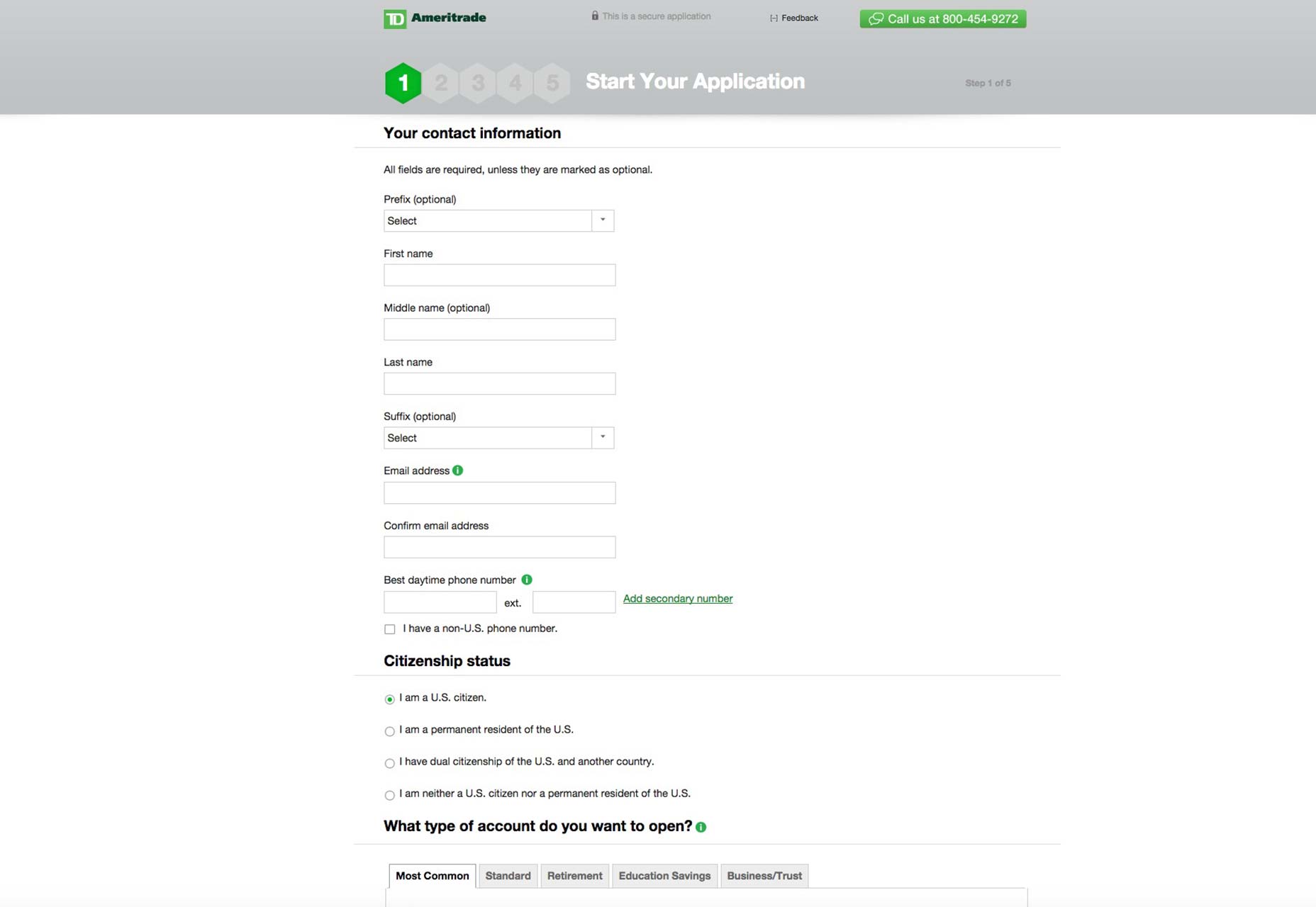
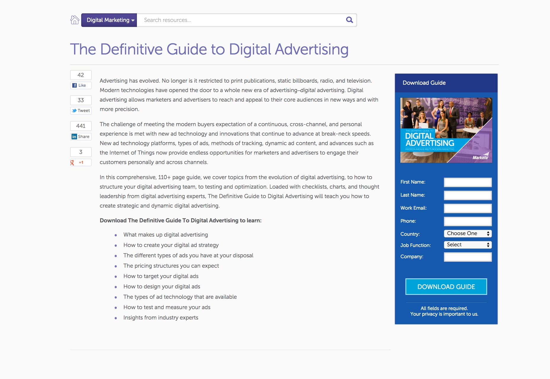 If your client has the goal of greater quantity of leads, then your forms should be relatively short, such as Marketo’s sign-up form for its free, downloadable guide to digital advertising. If your client has the goal of wanting a greater amount of high-quality leads, then it’s perfectly alright to lengthen your form by including more fields, so your client can get more info. Case in point: TD Ameritrade’s account sign-up form.
Only use clear labels and explanations
It’s stunning to discover that some designers still neglect the fundamentals of ensuring that users can actually make sense of a form straightaway.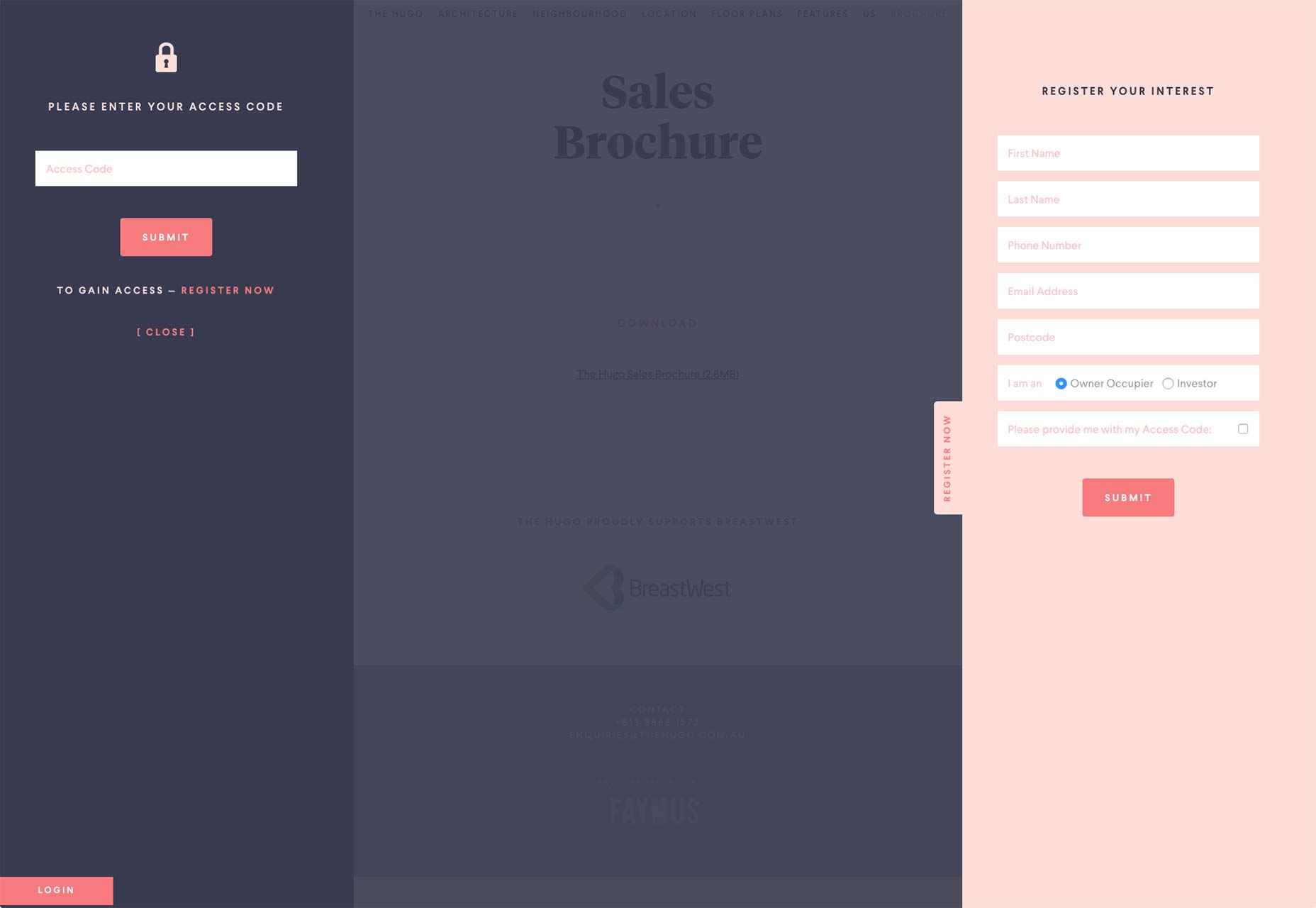 The registration form for TheHugo couldn’t be clearer.
The purpose of using clear labels and explanations in forms and their fields is to neutralize any potential input problems, many of which can stem from confusion in what to enter.
The registration form for TheHugo couldn’t be clearer.
The purpose of using clear labels and explanations in forms and their fields is to neutralize any potential input problems, many of which can stem from confusion in what to enter.
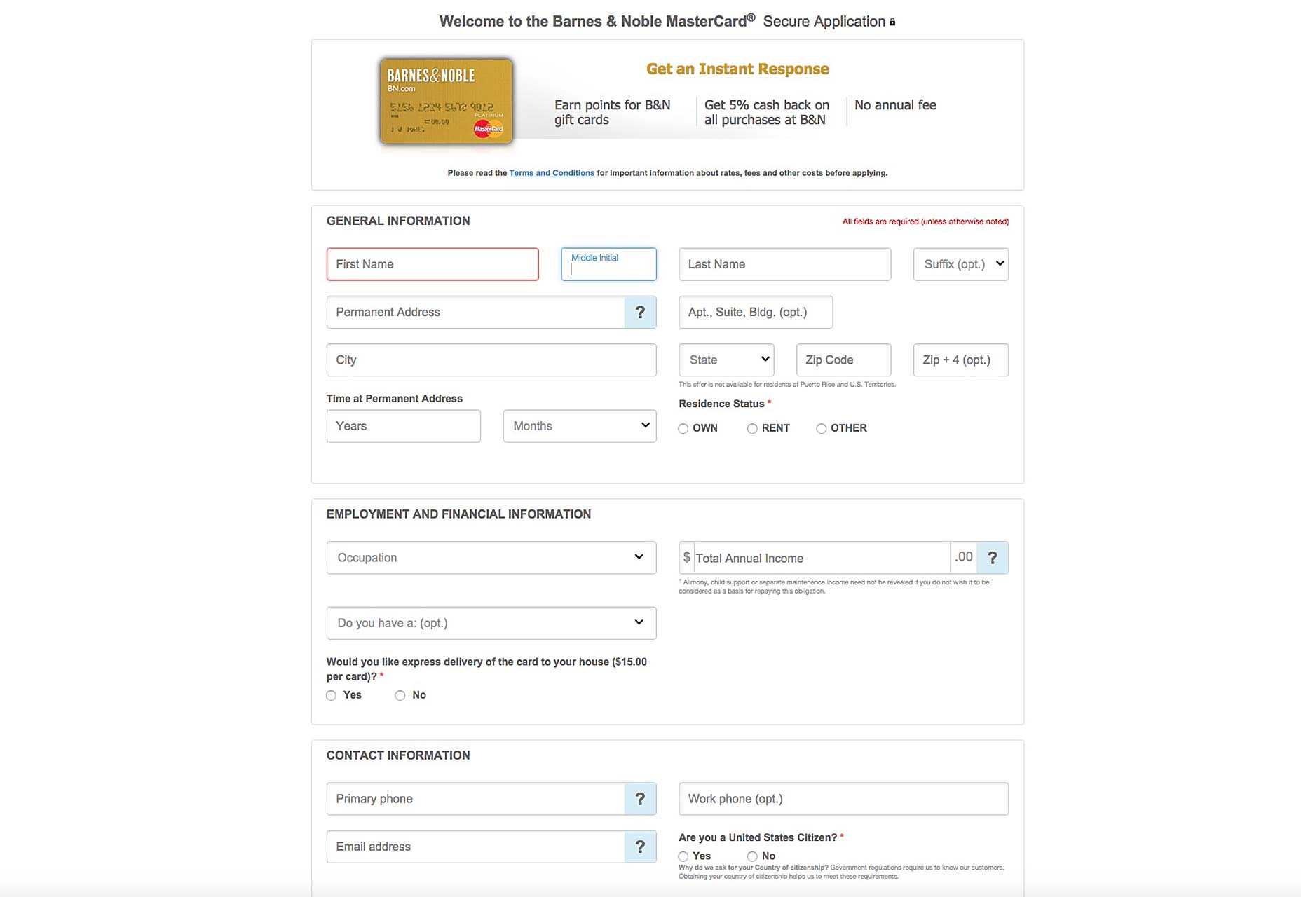 The sign-up page for the Barnes & Nobles MasterCard credit card is one such case where clarity dominates the form. Looking at the fields, we can immediately see how the understandable labels are inside the boxes and easy to read.
As a bonus, said labels don’t disappear when you start typing your info into the boxes; instead, they simply become smaller, change color, and are still readable. This allows users to always understand what’s expected of them to type into any box—even if they’ve started typing. Some forms have taken criticism for removing the labels once users begin typing.
Even the explanations—like the number of required fields to fill in and extra directions for specific fields—are placed outside the boxes and in different colors to promote easy reading.
The sign-up page for the Barnes & Nobles MasterCard credit card is one such case where clarity dominates the form. Looking at the fields, we can immediately see how the understandable labels are inside the boxes and easy to read.
As a bonus, said labels don’t disappear when you start typing your info into the boxes; instead, they simply become smaller, change color, and are still readable. This allows users to always understand what’s expected of them to type into any box—even if they’ve started typing. Some forms have taken criticism for removing the labels once users begin typing.
Even the explanations—like the number of required fields to fill in and extra directions for specific fields—are placed outside the boxes and in different colors to promote easy reading.
Do away with mandatory registration
If there’s anything that can kill conversions quickly when your customers are already all set to buy something from your client’s online store, it’s the dreaded registration process during checkout. Experience tells us that forcing customers to register or sign-in, which equals additional steps, prior to a purchase will lower conversion rates.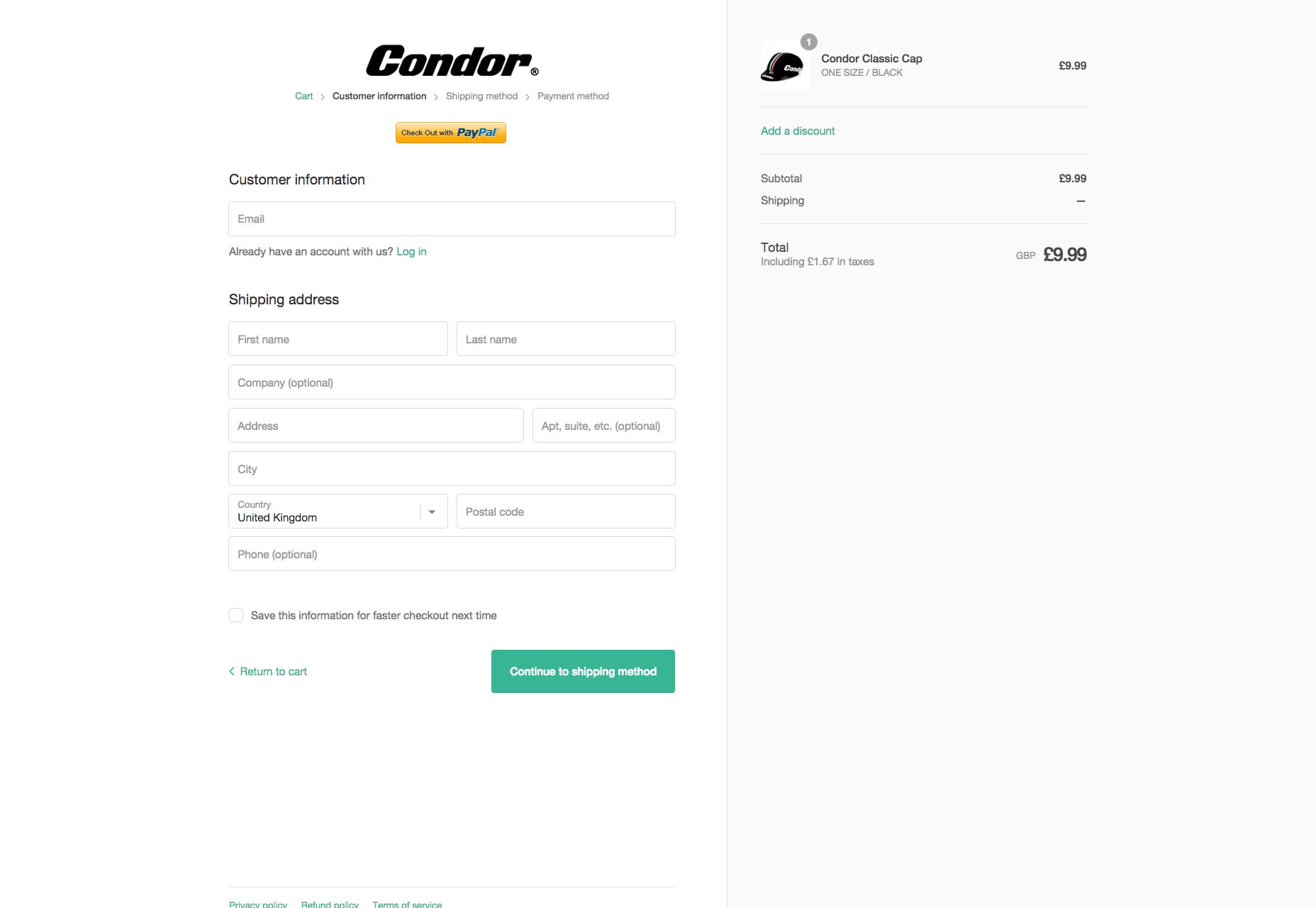 Condor’s checkout process doesn’t force you to register. Logging in to an account simplifies the checkout process, but the default form is for guests.
When designing forms for the checkout process, make them as short as possible to encourage the customer to go through with the purchase. Customers are rightly impatient when buying something, and no one wants to waste time on extra steps before they can properly check out.
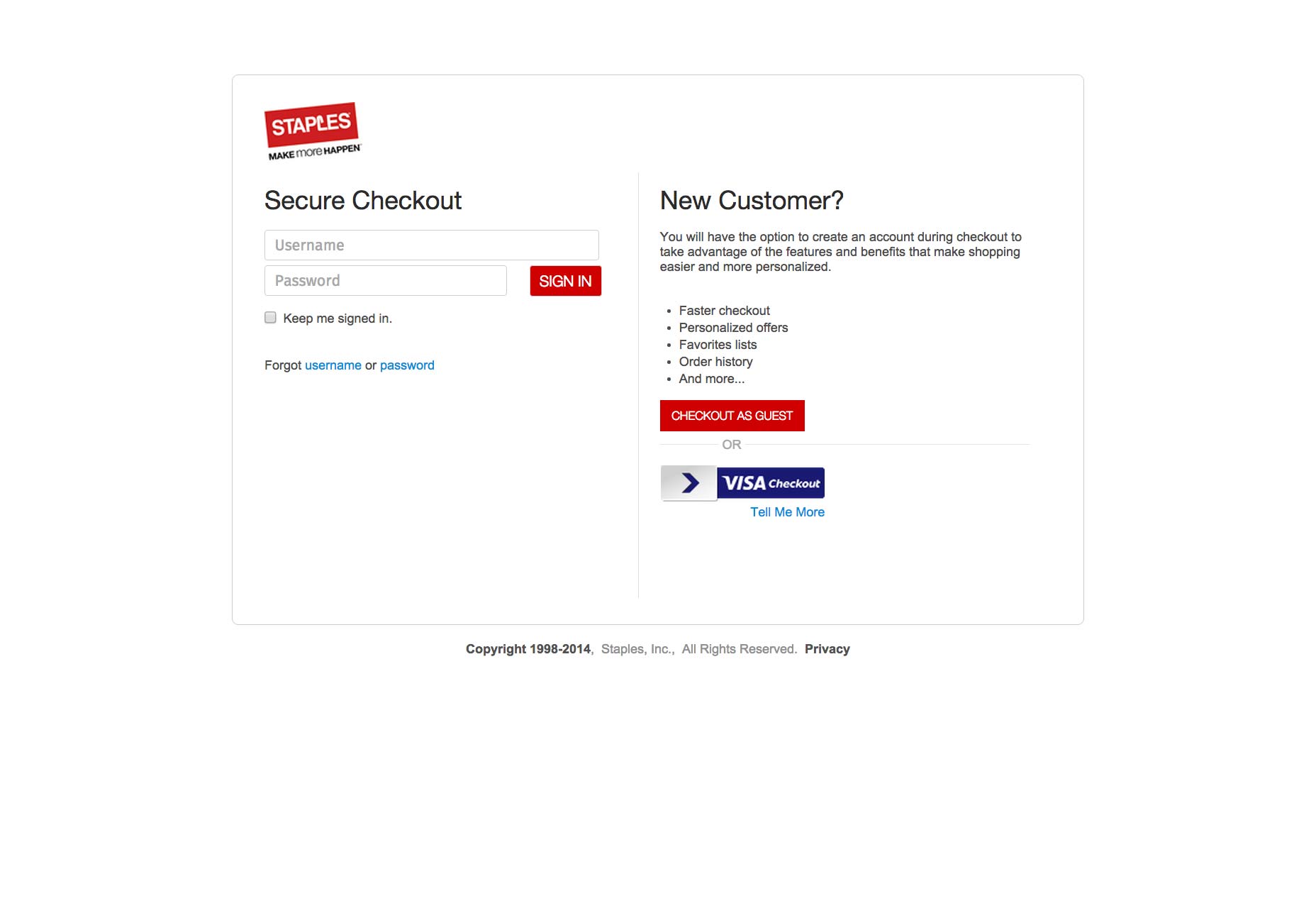
Staples understands this perfectly. The retailer of office supplies and electronics features an initial checkout page that doesn’t force shoppers to register again or force registration on new shoppers. Instead, it allows them to easily type in their username and password into two fields if they’re returning shoppers or go directly to the checkout-as-a-guest page, where they’ll just input basic shipping info, if they’re new customers. Such a setup makes things simpler for customers and gives them more freedom and control over the checkout process, which is always welcome.
Condor’s checkout process doesn’t force you to register. Logging in to an account simplifies the checkout process, but the default form is for guests.
When designing forms for the checkout process, make them as short as possible to encourage the customer to go through with the purchase. Customers are rightly impatient when buying something, and no one wants to waste time on extra steps before they can properly check out.
Staples understands this perfectly. The retailer of office supplies and electronics features an initial checkout page that doesn’t force shoppers to register again or force registration on new shoppers. Instead, it allows them to easily type in their username and password into two fields if they’re returning shoppers or go directly to the checkout-as-a-guest page, where they’ll just input basic shipping info, if they’re new customers. Such a setup makes things simpler for customers and gives them more freedom and control over the checkout process, which is always welcome.
Web form best practices
Designing smart, effective forms all comes down to incorporating these best practices into your design. There’s a reason that these approaches are best practices: they’ve been proven to work, which is also why you tend to see them in the sign-up forms of successful online stores. Badly designed forms will be a drag on the site’s conversion rate so logically, it makes sense to drastically improve the design of forms on any page to improve the conversion rate of the entire site. Remember that designing forms is just one aspect of broader web design, but it, too, should be guided by the principle of designing first and foremost for the user experience. All the tips discussed above are tried, tested and true ways to please your clients’ customers and therefore increase the conversion rates of your clients’ sites.Marc Schenker
Marc’s a copywriter who covers design news for Web Designer Depot. Find out more about him at thegloriouscompanyltd.com.


Read Next

3 Essential Design Trends, May 2024
Integrated navigation elements, interactive typography, and digital overprints are three website design trends making…

How to Write World-Beating Web Content
Writing for the web is different from all other formats. We typically do not read to any real depth on the web; we…
By Louise North

20 Best New Websites, April 2024
Welcome to our sites of the month for April. With some websites, the details make all the difference, while in others,…

Exciting New Tools for Designers, April 2024
Welcome to our April tools collection. There are no practical jokes here, just practical gadgets, services, and apps to…

How Web Designers Can Stay Relevant in the Age of AI
The digital landscape is evolving rapidly. With the advent of AI, every sector is witnessing a revolution, including…
By Louise North

14 Top UX Tools for Designers in 2024
User Experience (UX) is one of the most important fields of design, so it should come as no surprise that there are a…
By Simon Sterne

What Negative Effects Does a Bad Website Design Have On My Business?
Consumer expectations for a responsive, immersive, and visually appealing website experience have never been higher. In…

10+ Best Resources & Tools for Web Designers (2024 update)
Is searching for the best web design tools to suit your needs akin to having a recurring bad dream? Does each…
By WDD Staff

3 Essential Design Trends, April 2024
Ready to jump into some amazing new design ideas for Spring? Our roundup has everything from UX to color trends…

How to Plan Your First Successful Website
Planning a new website can be exciting and — if you’re anything like me — a little daunting. Whether you’re an…
By Simon Sterne

15 Best New Fonts, March 2024
Welcome to March’s edition of our roundup of the best new fonts for designers. This month’s compilation includes…
By Ben Moss

LimeWire Developer APIs Herald a New Era of AI Integration
Generative AI is a fascinating technology. Far from the design killer some people feared, it is an empowering and…
By WDD Staff