

So what does psychology have to do with it? When it comes to user experience, almost everything.
With so many device types and sizes and so many different ways to design websites for those devices, the user experience a designer creates is what determines overall success of the site and whether a user will return.
What is user psychology?
User psychology is the science behind what people want and need when they visit a website or mobile app. Psychology is rooted in everything from whether a user trusts your brand to how they feel about the message you are trying to convey.
And design is a big part of that. Everything from color to images to patterns to how the site works can impact those feelings and emotional connections.
Each of these elements should ultimately lead to an action from the user. Most psychology textbooks reference triggers that cause people to act and react. Those triggers also apply to web design, and even more particularly to mobile design, where a user almost always has to physically interact with a website to make something happen, such as the swipe or tap fingers on the screen.
- Reciprocation: if you do something for users, they will do something for you. (They sign up for a newsletter, you give them a freebie.)
- Framing: users will make comparisons between things. (Do I want this or that? Most users fall somewhere in the middle of all options.)
- Salience: users want what matters now. (That’s why e-commerce websites add related items to the screen during the shopping experience.)
- Social proof: users look to others to see what to do. (The influence of social media.)
- Scarcity: users want what they can’t have. (Limited number of items.)
- Contrast: What stands out in the user’s mind. (Design theory 101.)
Two different user experiences
While the triggers are the same regardless of the device, the user experience is not. Users overwhelmingly want the content to be the same regardless of device, but have different ideas of how to use and interact with that content.
Desktop websites are for reading and perusing. The reading and information gathering process may result in an action, but users often have a distinct reason for going to a website, such as work. Not all of these experiences are based on entertainment or pleasure and most of them may not be.
Desktop users are relatively still in their online interactions as well. Every action is done with a keyboard or mouse. There’s just not a lot of actual physical interaction with the device. (Few users will ever touch the screen.)
The user experience for mobile is significantly different. Users constantly touch the device – casing and screen. So the size of these elements and how they feel are quite important. This use of physical touch makes designing elements on the screen especially important, because they must be easy to touch, unlike desktop versions where the mouse click is always the same size.
Mobile device users often access websites with different intents. Entertainment or task completion activities are more common than reading and research actions. (Just think of how often you pull out your phone to play a game in line at the grocery store or respond to a text message.)
Physical differences also impact the psychology of mobile design. You have to consider lighting conditions, device size and touch options. How will these elements come together for an actual user?
User expectations
It all comes down to a central question: What does the mobile user want and expect?
Unlike with desktop websites, where users expect a visually dynamic and engaging experience that is relatively two-dimensional, mobile users want everything to feel real and live in the three-dimensional space.
Mobile users have come to expect certain things from the interface:
- Every action needs to be tappable. (And easy to see and tap.)
- Graphics and images should load fast, and might not be part of the mobile experience at all.
- Options need to be contextual. Users want to know what’s next and where they can go from here; they don’t need to know every possible option.
- Websites need to integrate with all mobile device functionality, such as mapping, calling and integration with other apps.
- Interactions have to be easy and follow generally accepted patterns. Mobile users have almost zero attention span. If elements don’t work the first time – and without a lot of thought or explanation – the user is lost.
How to design it
The actual secret is combining triggers and user expectations; then design for them. Let’s break down a few examples of sites that do this well and how they combine triggers and mobile expectations for an excellent user experience.
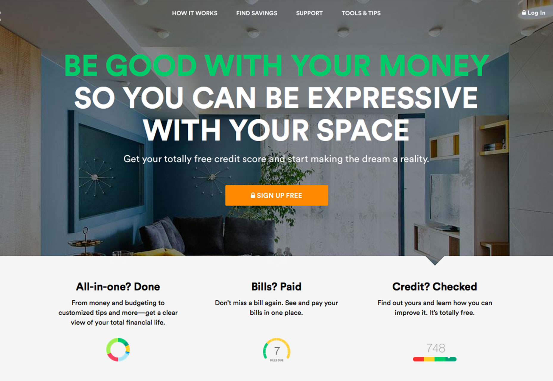
Mint
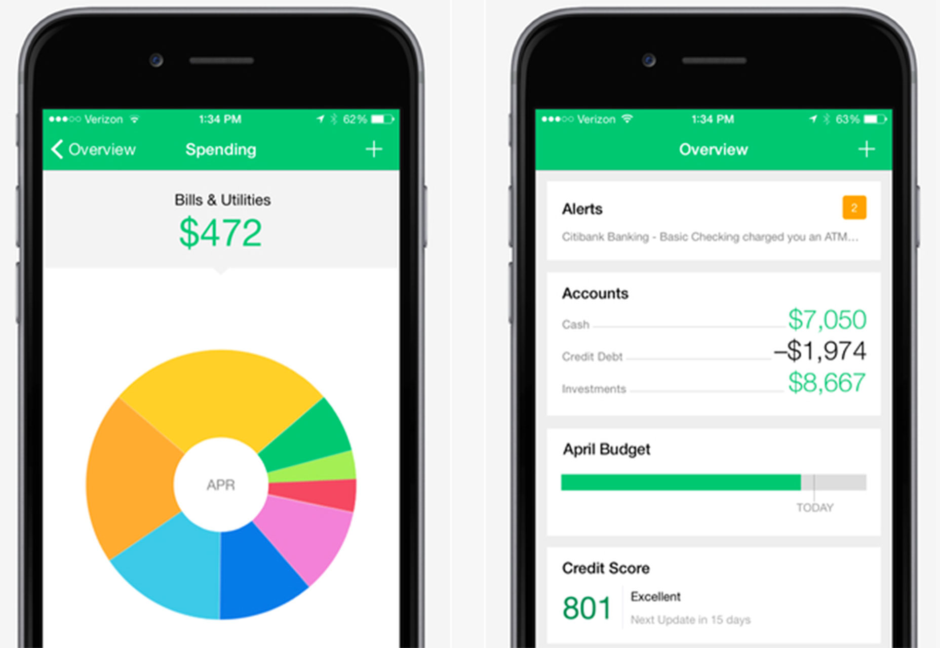
Mint uses a card-style interface where every box is a clickable element in its mobile app design, whereas the desktop version features more click-style links. Bright color and plenty of white space contribute to the streamlined mobile version as well.
Triggers: Framing and salience are the key triggers here, because as a free service mint is asking you to sign up for limited time offers based on things you likely are thinking about or need, from credit card to insurance offers.
Mobile expectations: Mint loads exceptionally fast with up-to-date user data. The mobile app drops many of the heavier images that appear in the desktop site and uses a simple vertical pattern for the user to track information. It also incorporates some nice UX tools such as thumbprint access on the iPhone and intuitive gesture control for moving between elements.
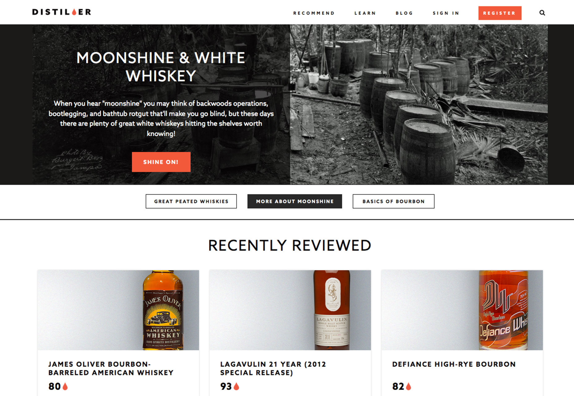
Distiller
Distiller uses a responsive framework so that content looks and feels almost exactly the same on both the desktop and mobile versions. What the site does though is maximize the potential of the mobile format, with unique ways to navigate the content.
Triggers: You can easily see the way this site uses contrast to create user engagement. The use of color and white space in both website variations is designed to create excitement and encourage calls-to-action. (Just look at the brightly colored buttons and prominent placements.)
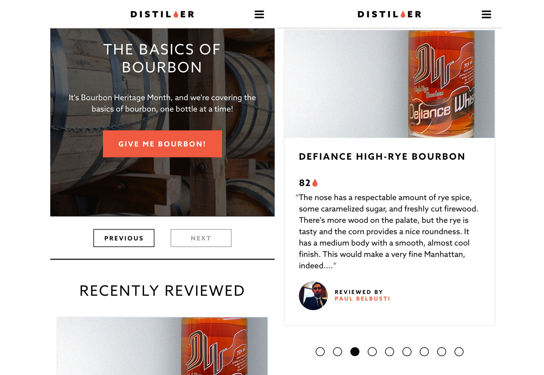
Mobile expectations: Distiller uses plenty of commonly accepted patterns to get users to engage, with a few subtle cues just in case the user might need help. Look at the second mobile screen, for example: The card-style elements (which are each unique links) can be swiped back and forth to see more content and a dot-style bar is used to show users how many elements are left. The navigation is also streamlined significantly and hidden in a hamburger icon so that users are not overwhelmed by options and can move freely on the mobile site.
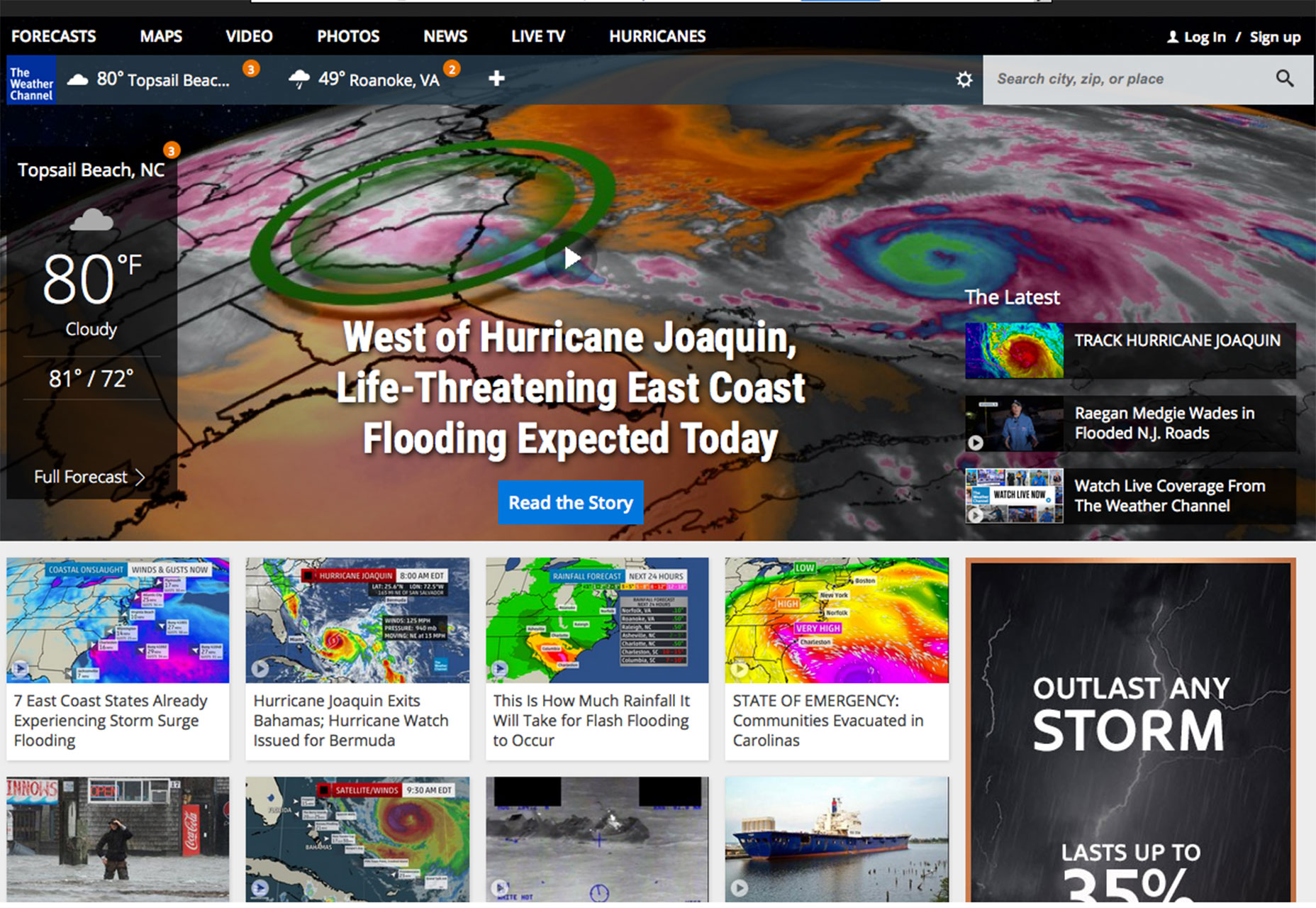
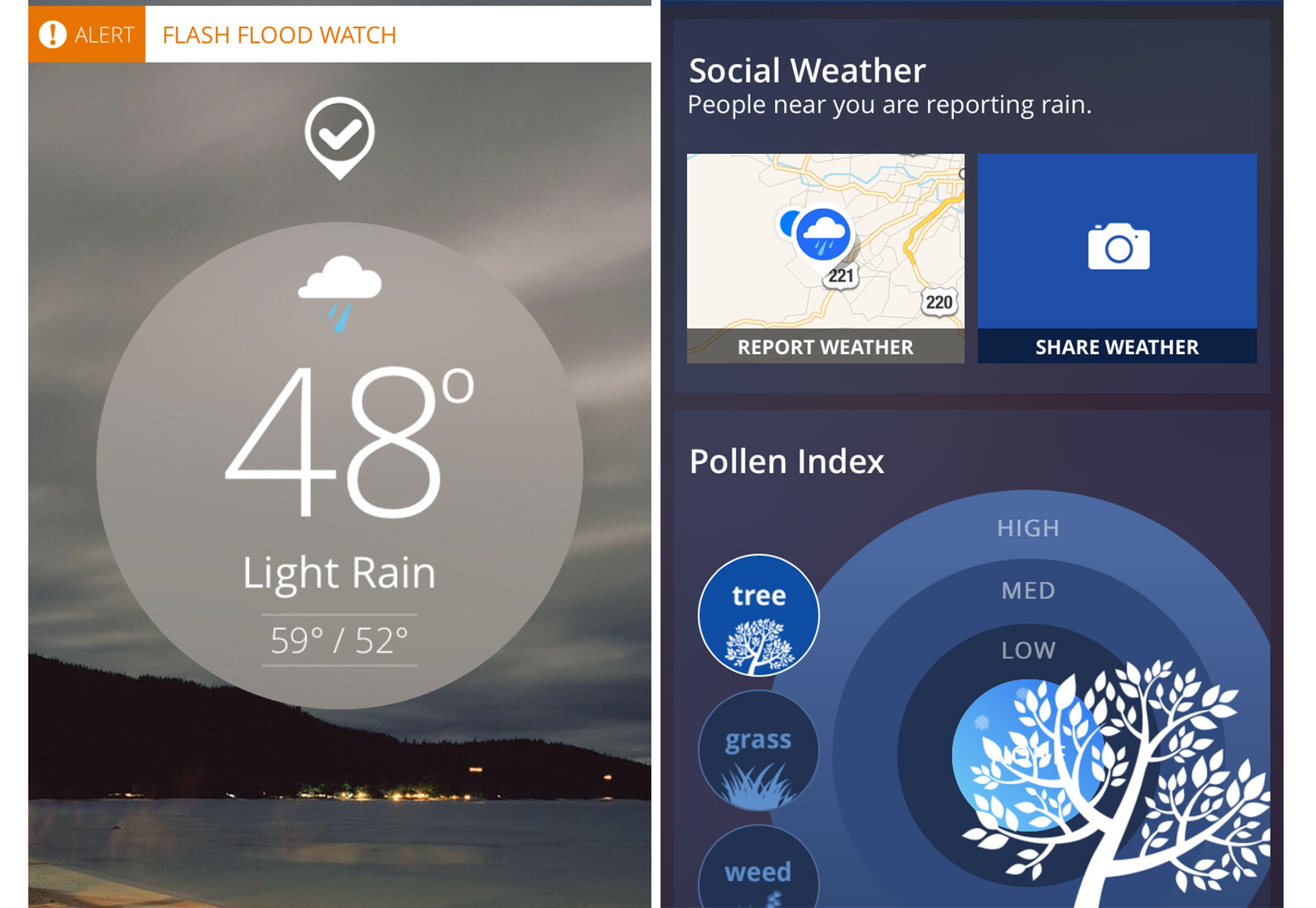
The Weather Channel
The Weather Channel provides the exact same content on its desktop site and mobile app, but the experiences are drastically different. The desktop site has more information to read and look through, while the app focuses on what the user needs to know now.
Triggers: Salience (mentioned above) and social proof are a big part of what makes The Weather Channel mobile app different. The opening screen is weather where the user is standing at this time. With a flick of the finger, users can report conditions, share on social media and become a part of the well known brand’s weather story.
Mobile expectations: The app uses a modern, flat, card-style design to make every element easy to tap. There’s no menu to speak of because the entire premise is contextual, leading users from one element to the next based on their choices.
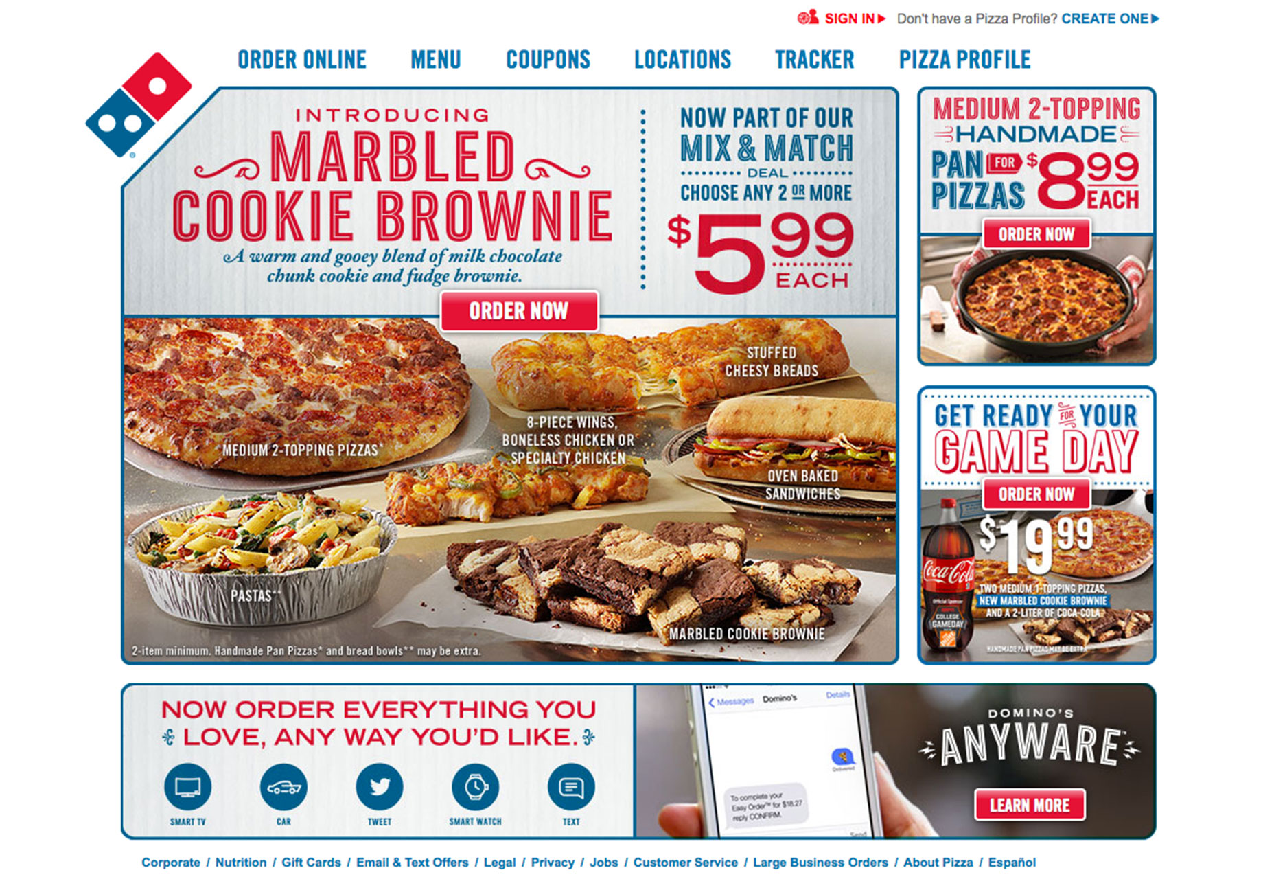
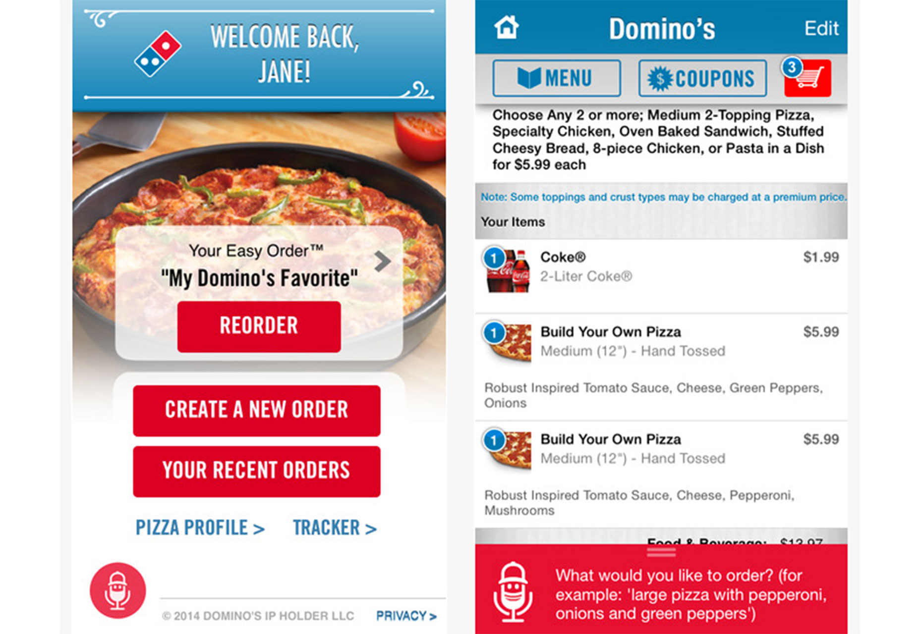
Domino’s Pizza
Domino’s Pizza has made a big, public deal about how easy it is to order. And they are right. While the desktop site has a very traditional feel, the app uses plenty of mobile specific user interface tools – such as voice ordering – to make the process easy.
Triggers: Reciprocation and framing are the keys to the buying experience, with plenty of offers and options to choose from. Plus, the mobile version remembers a user’s preferences to make the process that much easier.
Mobile expectations: While Domino’s does use some functionality that isn’t common among these types of apps, it is explained well (such as the voice ordering icon). Navigation is built in contextually and the app is designed with plenty of contrast and small images that load swiftly.
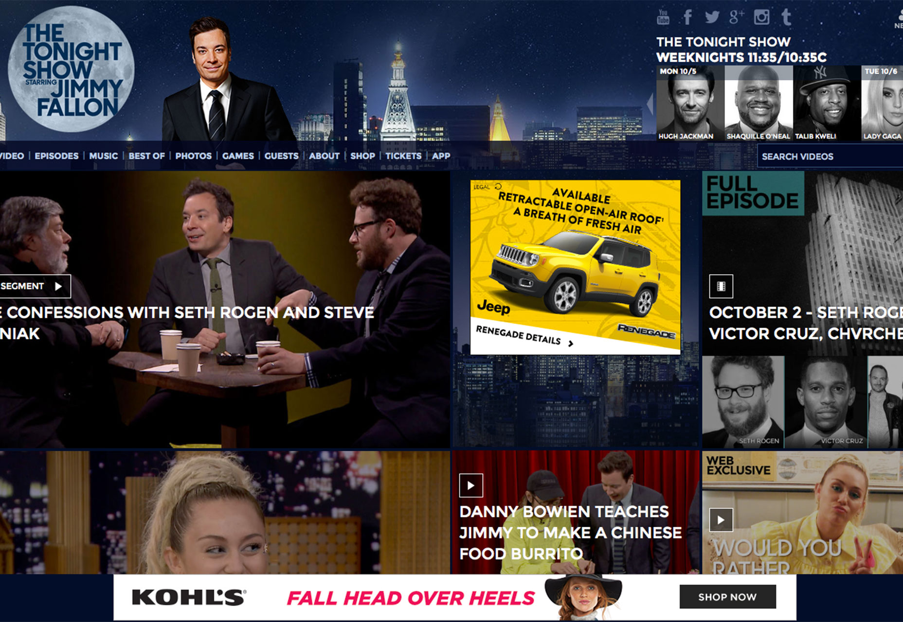
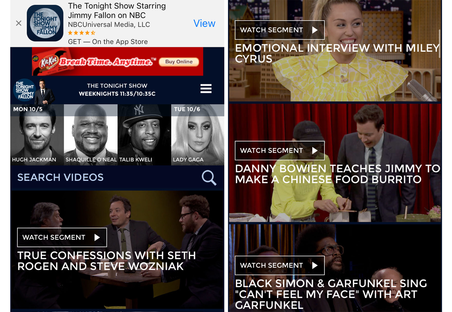
The Tonight Show
The Tonight Show is designed for entertaining users across devices. The desktop and responsive site, as well as the app, all look and function similarly. The mobile options are streamlined with a vertical hierarchy and elements are easy to take to watch.
Triggers: As with many other entertainment sites, salience and social proof are what keep people coming back. You want to be in the know with what is hot and trending and this is the place to find it.
Mobile expectations: One of the great little tricks on the mobile site is that it first asks the user if they want the app, as if to say “do you want the best experience we have to offer?” This is a great tool that users have come to expect. It’s easy to find the app because it is only one tap away and users don’t have to go looking for anything; it’s all right there in front of them.
Conclusion
Most users want and expect to find the same website content regardless of device, but they do often want the user experience to be tailored to the device they are using.
This device specific user experience will help increase user loyalty and those good feelings that most website owners hope users feel about them. Simply put, having a good desktop and experience and a good mobile user experience is important; they might not be the same thing.
Design for users by optimizing how they feel about, use and interact with their devices.
Carrie Cousins


Read Next

3 Essential Design Trends, May 2024

How to Write World-Beating Web Content

20 Best New Websites, April 2024

Exciting New Tools for Designers, April 2024

How Web Designers Can Stay Relevant in the Age of AI

14 Top UX Tools for Designers in 2024

What Negative Effects Does a Bad Website Design Have On My Business?

10+ Best Resources & Tools for Web Designers (2024 update)

3 Essential Design Trends, April 2024

How to Plan Your First Successful Website

15 Best New Fonts, March 2024
