

Symmetrical balance
One of the most common examples of balance that you come across when browsing websites is symmetry, though you may not realize it, because it’s so seamlessly presented. Symmetry is innately pleasing to the eye, and creates a design that’s aesthetically well-organized and harmonious. Symmetrical balance is defined by placing elements equally on either side of a horizontal or vertical central axis. In other words, both sides of an imaginary diving line across the middle of the page are essentially mirror images of each other. While some critics may write off this type of balance as boring or predictable, it has nonetheless stood the test of time and remains one of the best ways to show balance in web design.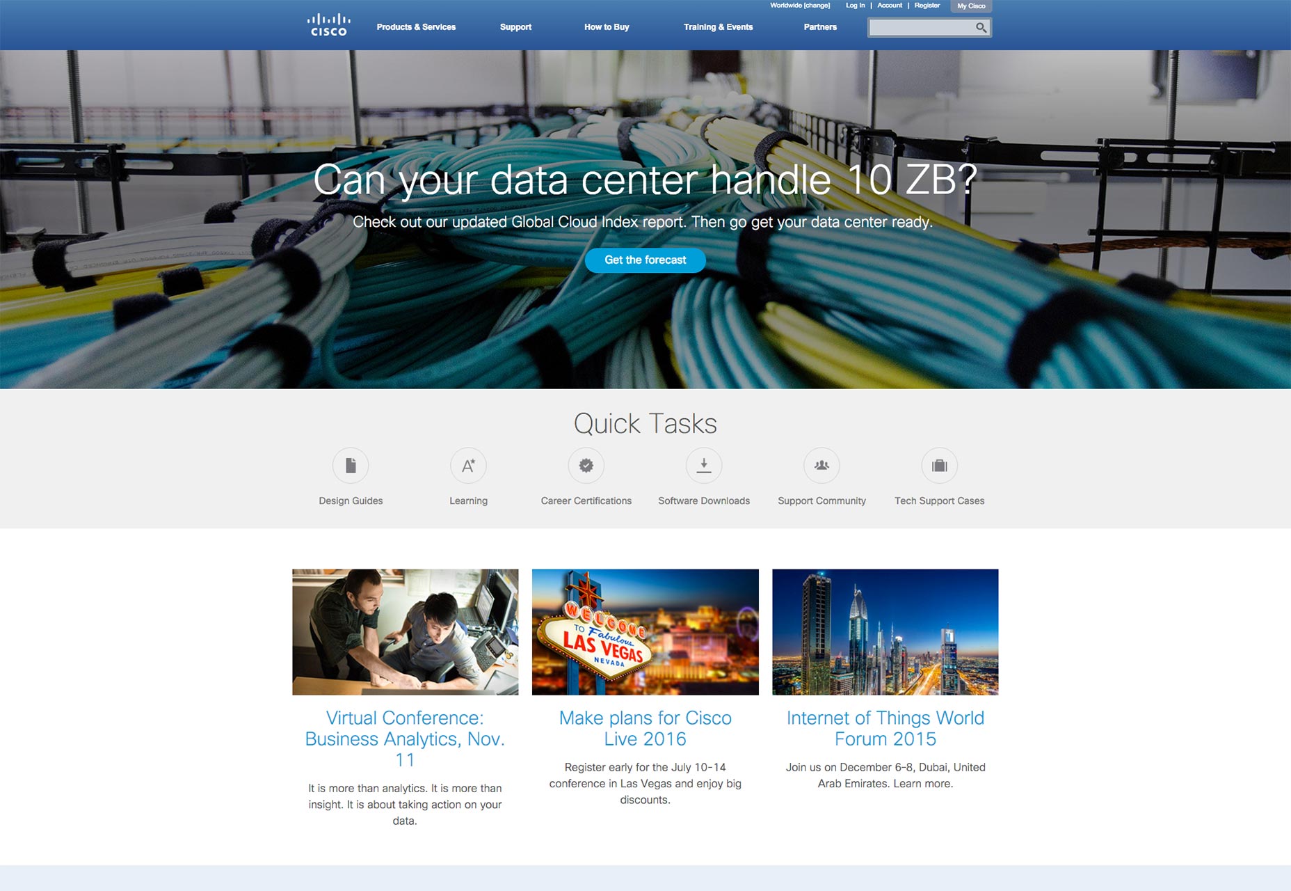 Cisco’s site has opted to go for this tried, tested and true approach to design. Note how the site is perfectly balanced across its vertical axis. If you took an imaginary line and divided it right down the middle of Cisco’s homepage, you’d notice the following:
- The same number of elements in the navigation bar (including search icon) on both sides
- The headline and subheadline are equally long on both sides
- The call to action button is perfectly centered
- The same number of elements under the “Quick Tasks” heading on both sides
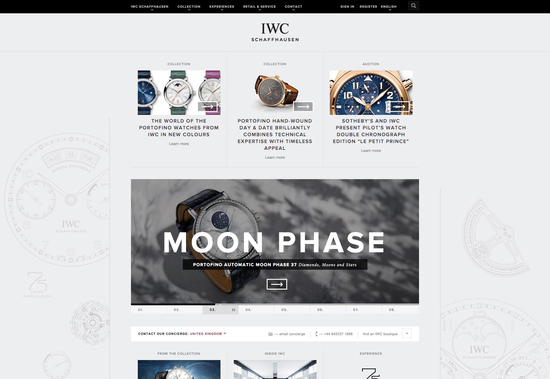 IWC Schaffhausen, the Swiss watchmaker, has a site that features horizontal, symmetrical balance. If we divide the page across a central axis down the middle, both sides have symmetry.
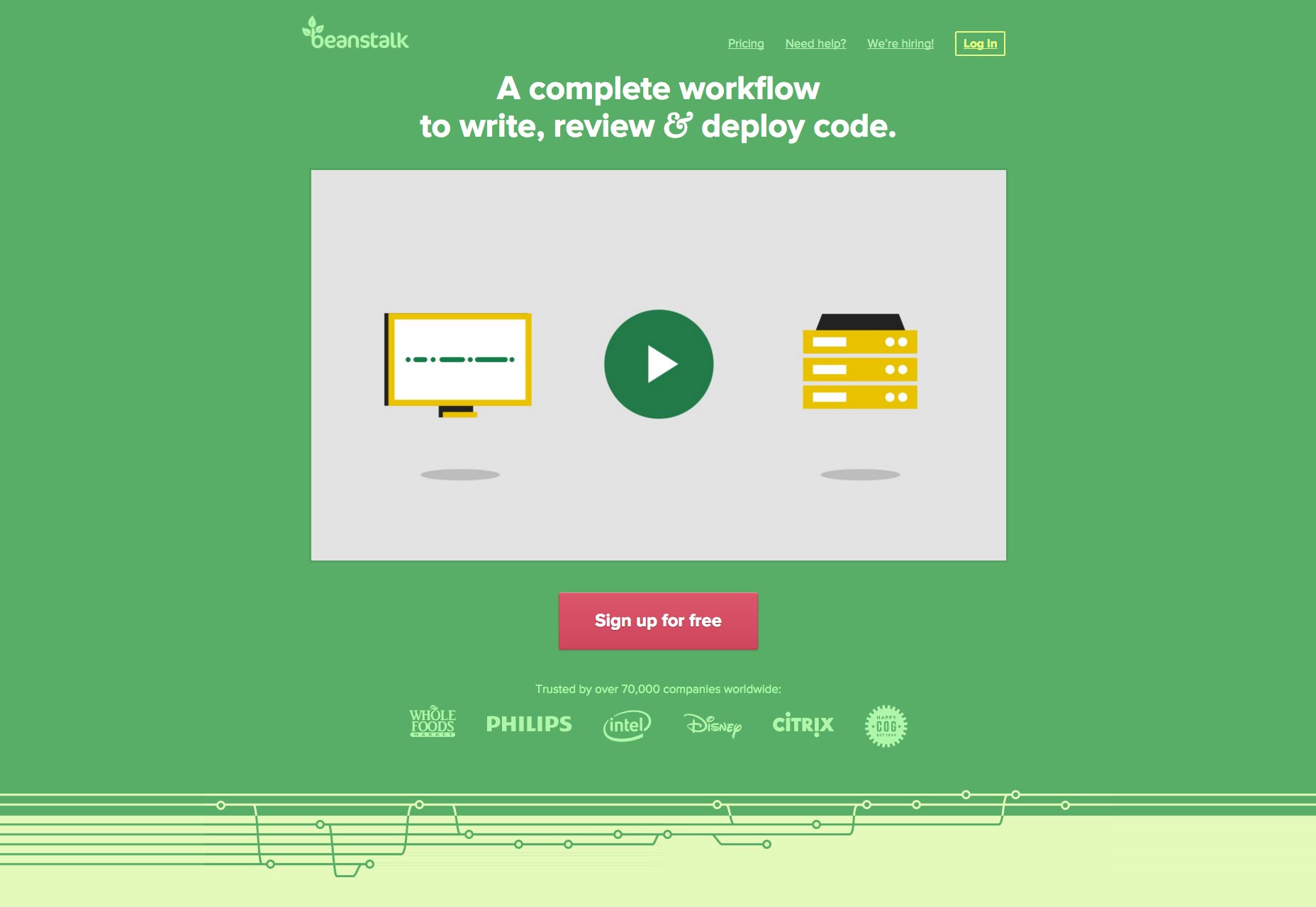 Same thing goes for the Beanstalk App website. Featuring a simple, minimal design, its central axis goes down the middle of the homepage, which leaves the two halves of the page with horizontal, symmetrical balance.
Asymmetrical balance
The polar opposite of symmetry, asymmetrical balance is possible too. Don’t be fooled by the fact that asymmetry means a lack of equivalence between parts! As you’ll soon see, asymmetrical balance achieves a system of counterweights in design as well… just not in ways you might expect. Asymmetry can be represented in a number of ways on a webpage. For instance, one half of the screen, vertically or horizontally, could boast a more intense element while the other half could have subtler elements. In spite of this inequality, both in strength and numbers, balance is created by the juxtaposition of the contradicting elements. In this way, asymmetry can be truly beautiful, perhaps more so than straightforward symmetry, because it plays on the concept of dissimilarity to create balance. That’s a design paradox, but one that works so well on any site. Asymmetrical balance is therefore more interesting and thought-provoking than predictable symmetry. It evokes themes of modernism, energy and wonder. Designers should take note, however, that creating asymmetry on a page requires more work than regular symmetry. After all, you’re having to represent relationships between design elements that are more complicated. Honda gives us a crystal clear example of asymmetry in web design. Below the fold, on its homepage, the company uses a card-based design, but this produces a somewhat disorganized look that, while visually appealing and colorful, creates a lack of equality on either side of a vertical or horizontal central axis. For one thing, the cards themselves are always different lengths, horizontally, and fail to always be stacked in any uniform column or row. This creates major asymmetry that’s very interesting to look at. It’s almost like a small maze on the homepage of the car company! There are also other interesting examples:
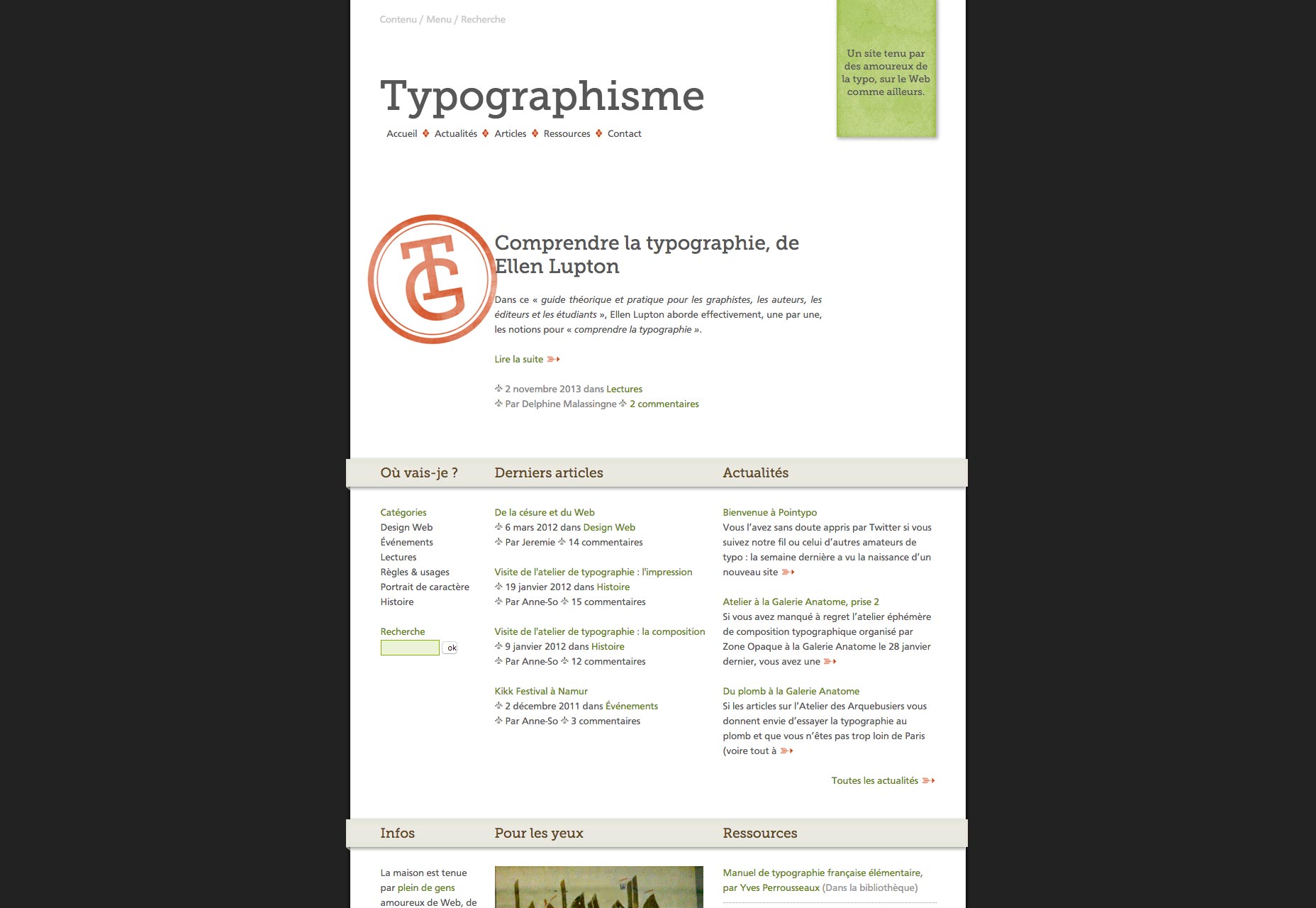 Typographisme is a picture-perfect case of asymmetry in web design. Its site features two elements that are lopsided. Both the TG logo and the green stamp in the right, upper corner create asymmetry.
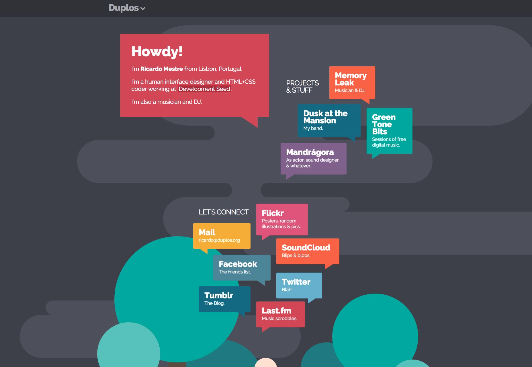 Duplos’ asymmetry is starker. Its site boasts a floating-elements design that won’t line up consistently with the other half, whether the central axis is vertical or horizontal. Overall, it produces an eye-catching appearance that’s interesting to take in.
Radial balance
Radial balance is pretty straightforward. As the name implies, radial balance occurs when all the design elements on a page emanate in equidistant points from a unifying, central point. So if you’d divide the page either vertically or horizontally along a central axis, both sides’ elements would be equally as far or near from the central point. Some of the most basic examples of radial balance are things like rays of sunlight coming from a central point or a pond that has a bunch of ripples on its surface. What makes this form of balance more special is that the radiating effect goes both ways: Just as the attention leads away from the central point, it also leads back to it due to the common center. Because of this, keeping a focal point is easy.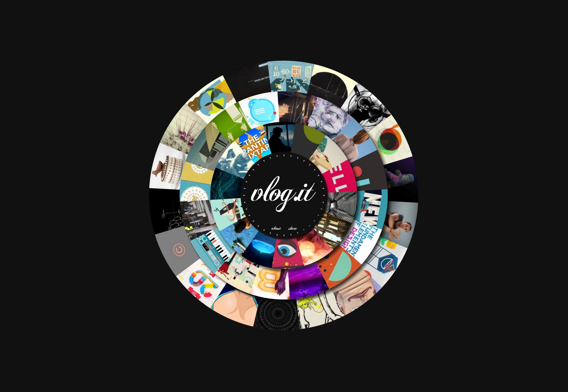 The best example of radial balance — which is quite rare on websites, especially homepages — is Vlog. It is the epitome of radial balance, as everything radiates outward from the central point of the white type of “Vlog.it”.
All kinds of balance
By now, it should be pretty obvious that all types of balance have some common bonds. There are uniform factors that consistently appear in any design that features attractive and interesting balance. Balance in web design is all around you. Chances are that you’ve neglected to appreciate it on all the different sites you’ve ever browsed throughout your life; but that’s only because balance isn’t really the first thing you think of when you navigate any site. Nonetheless, balance is important to site design. It doesn’t only provide aesthetic touches that are interesting from a visual standpoint. It also can help the user experience by making the visual information on a site easier to absorb, which is to say nothing of improving site navigation, too. Designers can strive to include better balance in their web design by paying extra close attention to harmony, counterweights and equidistance. The end result of good balance pays untold dividends for your clients and the user experience.Marc Schenker
Marc’s a copywriter who covers design news for Web Designer Depot. Find out more about him at thegloriouscompanyltd.com.


Read Next

3 Essential Design Trends, May 2024
Integrated navigation elements, interactive typography, and digital overprints are three website design trends making…

How to Write World-Beating Web Content
Writing for the web is different from all other formats. We typically do not read to any real depth on the web; we…
By Louise North

20 Best New Websites, April 2024
Welcome to our sites of the month for April. With some websites, the details make all the difference, while in others,…

Exciting New Tools for Designers, April 2024
Welcome to our April tools collection. There are no practical jokes here, just practical gadgets, services, and apps to…

How Web Designers Can Stay Relevant in the Age of AI
The digital landscape is evolving rapidly. With the advent of AI, every sector is witnessing a revolution, including…
By Louise North

14 Top UX Tools for Designers in 2024
User Experience (UX) is one of the most important fields of design, so it should come as no surprise that there are a…
By Simon Sterne

What Negative Effects Does a Bad Website Design Have On My Business?
Consumer expectations for a responsive, immersive, and visually appealing website experience have never been higher. In…

10+ Best Resources & Tools for Web Designers (2024 update)
Is searching for the best web design tools to suit your needs akin to having a recurring bad dream? Does each…
By WDD Staff

3 Essential Design Trends, April 2024
Ready to jump into some amazing new design ideas for Spring? Our roundup has everything from UX to color trends…

How to Plan Your First Successful Website
Planning a new website can be exciting and — if you’re anything like me — a little daunting. Whether you’re an…
By Simon Sterne

15 Best New Fonts, March 2024
Welcome to March’s edition of our roundup of the best new fonts for designers. This month’s compilation includes…
By Ben Moss

LimeWire Developer APIs Herald a New Era of AI Integration
Generative AI is a fascinating technology. Far from the design killer some people feared, it is an empowering and…
By WDD Staff