

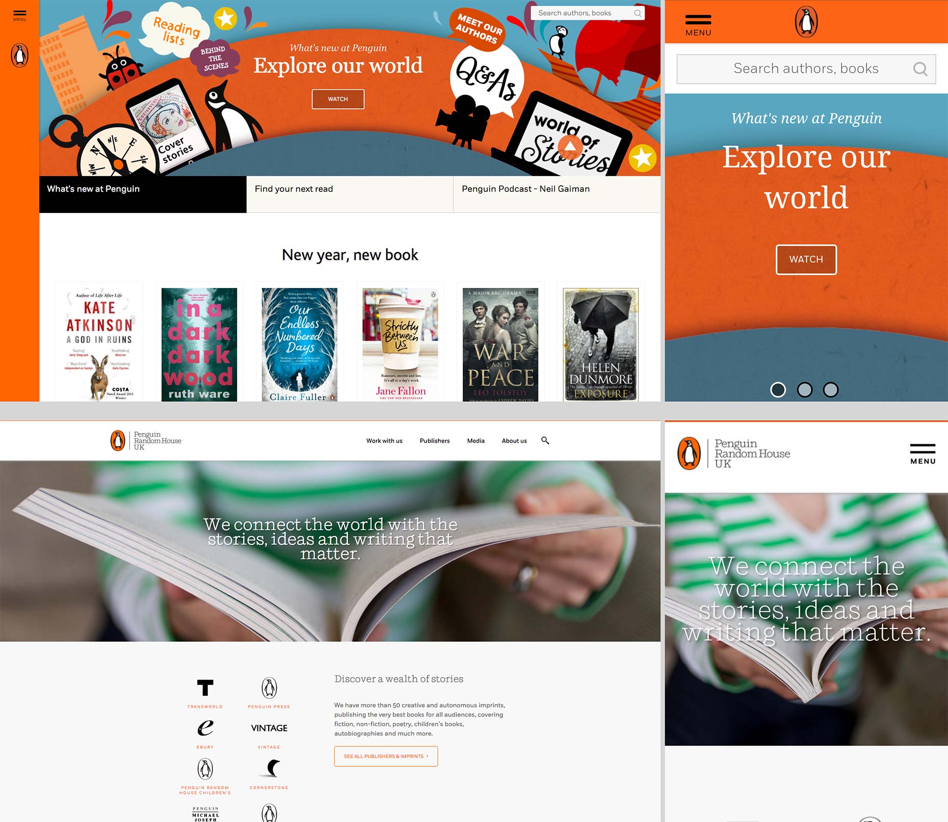 Penguin Random House’s relaunched websites; for consumers (top) and for business (bottom).
Design Week reports that PRH carried out research via its ‘consumer insights panel’ with up to 3,000 customers, including 200 face-to-face conversations. This led them to conclude that the primary goal of readers visiting the site was “to get closer to the authors and characters they love.”
As a result of this insight, the new consumer site focuses heavily on quality content, with writer profiles of authors such as Nick Hornby, and F. Scott Fitzgerald; and interactive content, such as podcast interviews with the likes of Neil Gaiman, and Elvis Costello.
Both sites are, as you’d expect, fully responsive. And the mobile sizes in particular are an excellent example of how to organize a lot of content in a small viewport. However, whether due to mis-communication between different agencies, or due to a tight build time—reportedly just 12 weeks—there are a number of issues that seriously compromise the site’s UX.
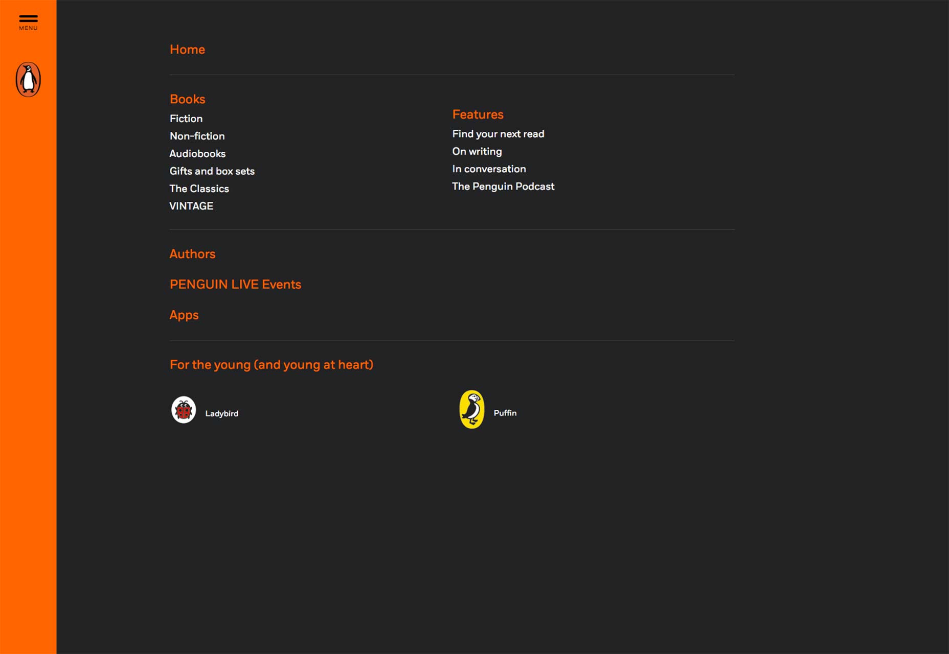
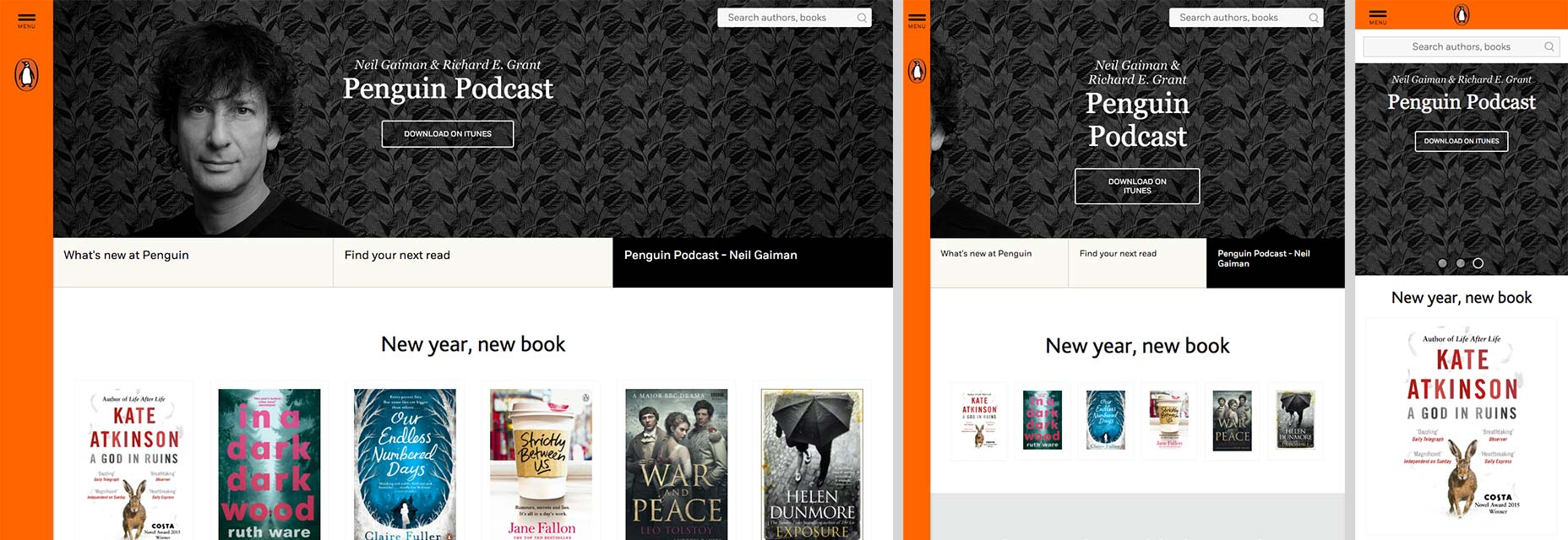
One of the Penguin brand’s most distinct signifiers is the bright orange spine on its books, which has been deftly employed on the consumer site as a navigation bar — vertical on the left for large screens, horizontal at the top for smaller screens. It uses a hamburger menu, even on desktop, to give quick access to links; the saving grace (for those that hate hamburgers) being that the links that are obfuscated are largely surplus to requirements, the site’s primary navigation being inline links.
Penguin Random House’s relaunched websites; for consumers (top) and for business (bottom).
Design Week reports that PRH carried out research via its ‘consumer insights panel’ with up to 3,000 customers, including 200 face-to-face conversations. This led them to conclude that the primary goal of readers visiting the site was “to get closer to the authors and characters they love.”
As a result of this insight, the new consumer site focuses heavily on quality content, with writer profiles of authors such as Nick Hornby, and F. Scott Fitzgerald; and interactive content, such as podcast interviews with the likes of Neil Gaiman, and Elvis Costello.
Both sites are, as you’d expect, fully responsive. And the mobile sizes in particular are an excellent example of how to organize a lot of content in a small viewport. However, whether due to mis-communication between different agencies, or due to a tight build time—reportedly just 12 weeks—there are a number of issues that seriously compromise the site’s UX.
One of the Penguin brand’s most distinct signifiers is the bright orange spine on its books, which has been deftly employed on the consumer site as a navigation bar — vertical on the left for large screens, horizontal at the top for smaller screens. It uses a hamburger menu, even on desktop, to give quick access to links; the saving grace (for those that hate hamburgers) being that the links that are obfuscated are largely surplus to requirements, the site’s primary navigation being inline links.
 Unfortunately the navigation is not as intuitive as it could (or should) be. The Explore our world banner that greets you when you arrive on the site features a number of speech bubbles with labels such as “Reading lists”, “Meet our authors”, and “Q&As”, there is even a play video button; the lack of a conventional menu means that these labels look for all the world like links, but they are not.
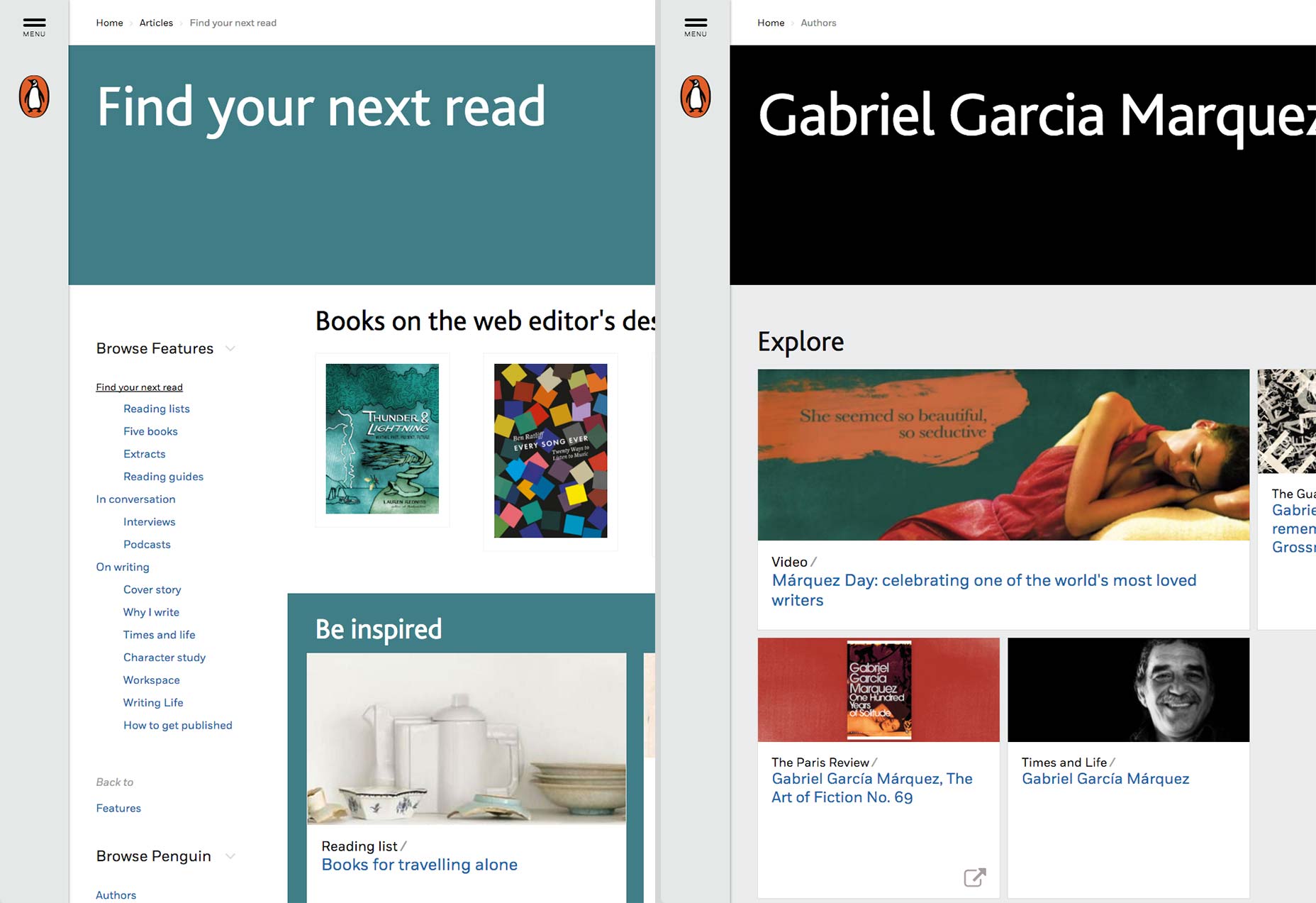
Navigation continues to be an issue as you move deeper into the site. If for example you click the Find your next read link, the breadcrumb navigation (which transforms to a select input for mobile) reads Home > Articles > Find your next read, with the first two acting as links. However, if you navigate to a writer’s profile the breadcrumbs read Home > Authors, with only the former acting as a link. To return to the authors’ page and select a different writer’s profile, you must first return to the Home, and then navigate back to the Authors, and finally the author profile; or rely on the browser’s back button. It’s a small usability issue that really should have been picked up at the quality assurance stage, and suggests that the 12 week build may have been a shade too ambitious.
Unfortunately the navigation is not as intuitive as it could (or should) be. The Explore our world banner that greets you when you arrive on the site features a number of speech bubbles with labels such as “Reading lists”, “Meet our authors”, and “Q&As”, there is even a play video button; the lack of a conventional menu means that these labels look for all the world like links, but they are not.
Navigation continues to be an issue as you move deeper into the site. If for example you click the Find your next read link, the breadcrumb navigation (which transforms to a select input for mobile) reads Home > Articles > Find your next read, with the first two acting as links. However, if you navigate to a writer’s profile the breadcrumbs read Home > Authors, with only the former acting as a link. To return to the authors’ page and select a different writer’s profile, you must first return to the Home, and then navigate back to the Authors, and finally the author profile; or rely on the browser’s back button. It’s a small usability issue that really should have been picked up at the quality assurance stage, and suggests that the 12 week build may have been a shade too ambitious.
 Breadcrumbs working correctly (left) and breadcrumbs only linking to the home page (right).
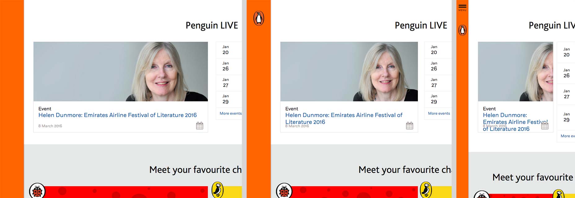
Further evidence of a rushed launch can be seen in the “Penguin LIVE” section of the home page. Clearly no one anticipated an event title as long as “Helen Dunmore: Emirates Airline Festival of Literature 2016” because while it works at desktop sizes, and it works on mobile, the line height breaks at some medium sizes, and at others the content in the box breaks altogether. It feels very much like the kind of error that crops up when there’s a mismatch between the anticipated content, and the actual content the client types into their shiny new CMS.
Breadcrumbs working correctly (left) and breadcrumbs only linking to the home page (right).
Further evidence of a rushed launch can be seen in the “Penguin LIVE” section of the home page. Clearly no one anticipated an event title as long as “Helen Dunmore: Emirates Airline Festival of Literature 2016” because while it works at desktop sizes, and it works on mobile, the line height breaks at some medium sizes, and at others the content in the box breaks altogether. It feels very much like the kind of error that crops up when there’s a mismatch between the anticipated content, and the actual content the client types into their shiny new CMS.
 Content breaking down before a media query kicks in and resorts the screen for mobile-specific sizes.
Another issue is that the site’s responsive layout is not matched by much of the artwork. The banner advertising a podcast interview between Neil Gaiman and Richard E. Grant features a portrait of the author. On mobile it becomes a shot of slightly gothic wallpaper, but at certain tablet sizes it’s a shot of a disembodied ear. background-position is not an advanced concept these days — in fact top left is the default behaviour, so someone broke this on purpose; again, it seems that either the CMS has been built without the flexibility to handle multiple artwork alignments, or no one has trained the content producers how to use it.
Content breaking down before a media query kicks in and resorts the screen for mobile-specific sizes.
Another issue is that the site’s responsive layout is not matched by much of the artwork. The banner advertising a podcast interview between Neil Gaiman and Richard E. Grant features a portrait of the author. On mobile it becomes a shot of slightly gothic wallpaper, but at certain tablet sizes it’s a shot of a disembodied ear. background-position is not an advanced concept these days — in fact top left is the default behaviour, so someone broke this on purpose; again, it seems that either the CMS has been built without the flexibility to handle multiple artwork alignments, or no one has trained the content producers how to use it.
 Neil Gaiman (left), an ear (center), spooky gothic wallpaper (right).
For designers, one of the most interesting aspects of the redesign is being able to compare and contrast the B2C consumer site with the B2B corporate site. The latter has subtler branding, more subdued typography, and its tone is far more businesslike. It’s less flawed than the consumer site, principally because it’s less ambitious.
What’s most successful about the PRH relaunch sites, especially the consumer site, is that at no point do you feel like you are being sold anything. It’s structured to encourage exploration and discovery; it trusts that the books, from which the publisher makes its money, will sell themselves.
Sadly, the joy of immersion in some excellent content, is too often jarred by small oversights in the UI; oversights that realistically could be fixed in an afternoon.
Of course it’s impossible to draw conclusions about a site design process the history of which we’re not directly party to. We don’t know how cooperative (or otherwise) the client was, how high the budget was, exactly what was stipulated in the brief. If we recognize that Dribbble shots are particularly easy to produce, then conversely we have to acknowledge that real builds are tough. That said, this feels like a site that needed a fraction more attention to detail.
This is a site that book lovers can get lost in; just not necessarily in the way they would like.
Neil Gaiman (left), an ear (center), spooky gothic wallpaper (right).
For designers, one of the most interesting aspects of the redesign is being able to compare and contrast the B2C consumer site with the B2B corporate site. The latter has subtler branding, more subdued typography, and its tone is far more businesslike. It’s less flawed than the consumer site, principally because it’s less ambitious.
What’s most successful about the PRH relaunch sites, especially the consumer site, is that at no point do you feel like you are being sold anything. It’s structured to encourage exploration and discovery; it trusts that the books, from which the publisher makes its money, will sell themselves.
Sadly, the joy of immersion in some excellent content, is too often jarred by small oversights in the UI; oversights that realistically could be fixed in an afternoon.
Of course it’s impossible to draw conclusions about a site design process the history of which we’re not directly party to. We don’t know how cooperative (or otherwise) the client was, how high the budget was, exactly what was stipulated in the brief. If we recognize that Dribbble shots are particularly easy to produce, then conversely we have to acknowledge that real builds are tough. That said, this feels like a site that needed a fraction more attention to detail.
This is a site that book lovers can get lost in; just not necessarily in the way they would like.
Ben Moss
Ben Moss has designed and coded work for award-winning startups, and global names including IBM, UBS, and the FBI. When he’s not in front of a screen he’s probably out trail-running.


Read Next

Exciting New Tools for Designers, May 2024
This year, we’ve seen a wave of groundbreaking apps and tools. AI is reshaping the industry, enhancing productivity,…

Using AI to Predict Design Trends
Design trends evolve at a blistering pace, especially in web design. On multi-month projects, you might work on a…
By Simon Sterne

15 Best New Fonts, April 2024
Just like web design, type design follows trends. And while there’s always room for an exciting outsider, we tend to…
By Ben Moss

3 Essential Design Trends, May 2024
Integrated navigation elements, interactive typography, and digital overprints are three website design trends making…

How to Write World-Beating Web Content
Writing for the web is different from all other formats. We typically do not read to any real depth on the web; we…
By Louise North

20 Best New Websites, April 2024
Welcome to our sites of the month for April. With some websites, the details make all the difference, while in others,…

Exciting New Tools for Designers, April 2024
Welcome to our April tools collection. There are no practical jokes here, just practical gadgets, services, and apps to…

How Web Designers Can Stay Relevant in the Age of AI
The digital landscape is evolving rapidly. With the advent of AI, every sector is witnessing a revolution, including…
By Louise North

14 Top UX Tools for Designers in 2024
User Experience (UX) is one of the most important fields of design, so it should come as no surprise that there are a…
By Simon Sterne

What Negative Effects Does a Bad Website Design Have On My Business?
Consumer expectations for a responsive, immersive, and visually appealing website experience have never been higher. In…

10+ Best Resources & Tools for Web Designers (2024 update)
Is searching for the best web design tools to suit your needs akin to having a recurring bad dream? Does each…
By WDD Staff

3 Essential Design Trends, April 2024
Ready to jump into some amazing new design ideas for Spring? Our roundup has everything from UX to color trends…