

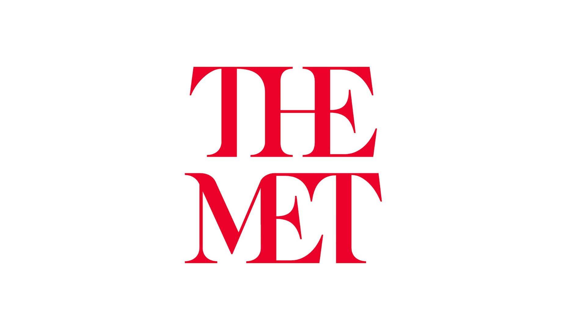
 The Met’s new logo embodies its nickname, which is what it’ll be known as from now on. Accordingly, the museum’s new logo is the words “THE” and “MET” stacked on top of each other in bright, red letters. This has prompted some critics to demean it as a “red double-decker bus that has stopped short, shoving the passengers into each other’s backs.” The criticism makes oblique reference to initial objections that the museum outsourced the rebrand to a London-based design studio—in fact, although the company in question, Wolff Olins, does indeed herald from London, the studio responsible was actually their New York office.
It’s quite a change when your logo used to be a single letter for the past 45 years, but it’s with good reason. The Met has a longer-term goal going forward: it wants to give its graphic identity a facelift to make the museum more navigable and aesthetically consistent for visitors.
The Met’s new logo embodies its nickname, which is what it’ll be known as from now on. Accordingly, the museum’s new logo is the words “THE” and “MET” stacked on top of each other in bright, red letters. This has prompted some critics to demean it as a “red double-decker bus that has stopped short, shoving the passengers into each other’s backs.” The criticism makes oblique reference to initial objections that the museum outsourced the rebrand to a London-based design studio—in fact, although the company in question, Wolff Olins, does indeed herald from London, the studio responsible was actually their New York office.
It’s quite a change when your logo used to be a single letter for the past 45 years, but it’s with good reason. The Met has a longer-term goal going forward: it wants to give its graphic identity a facelift to make the museum more navigable and aesthetically consistent for visitors.
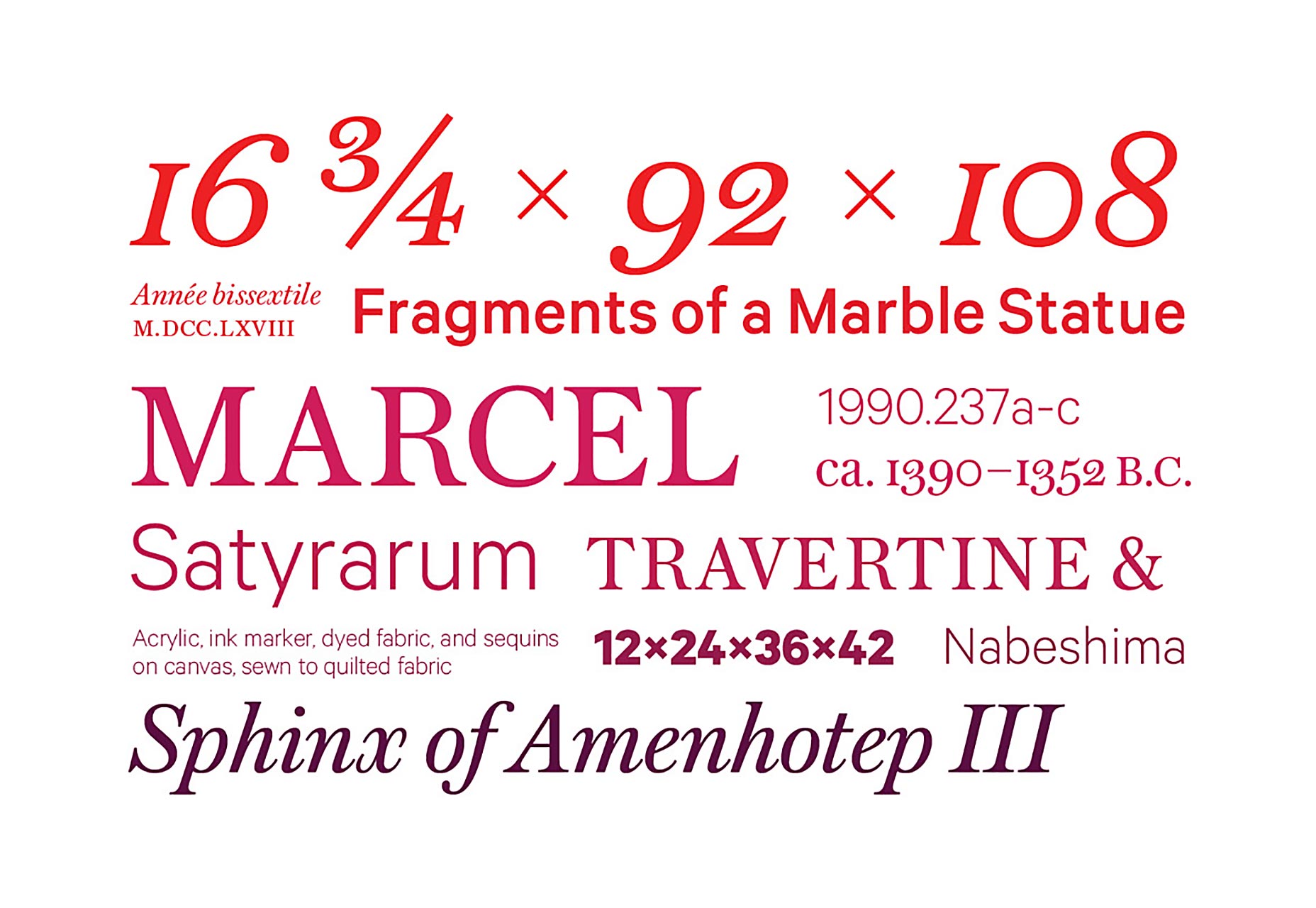
 The logo itself is a study in technique and fusion. Crafted by British designer Gareth Hague—also responsible for the controversial typeface used for London’s 2012 Olympics—it features a combination serif face, sans-serif touches, and calligraphic influences. The six letters form a design that’s clean, modern and stripped-down. The individual letters seamlessly flow from one to the next, like a collection of ligatures; think of the connections as making a bigger statement on the Met’s history that’s both subtle and significant. Since the Met features modern art and medieval pieces, the ligatures symbolize that the Met’s past is connected with its future.
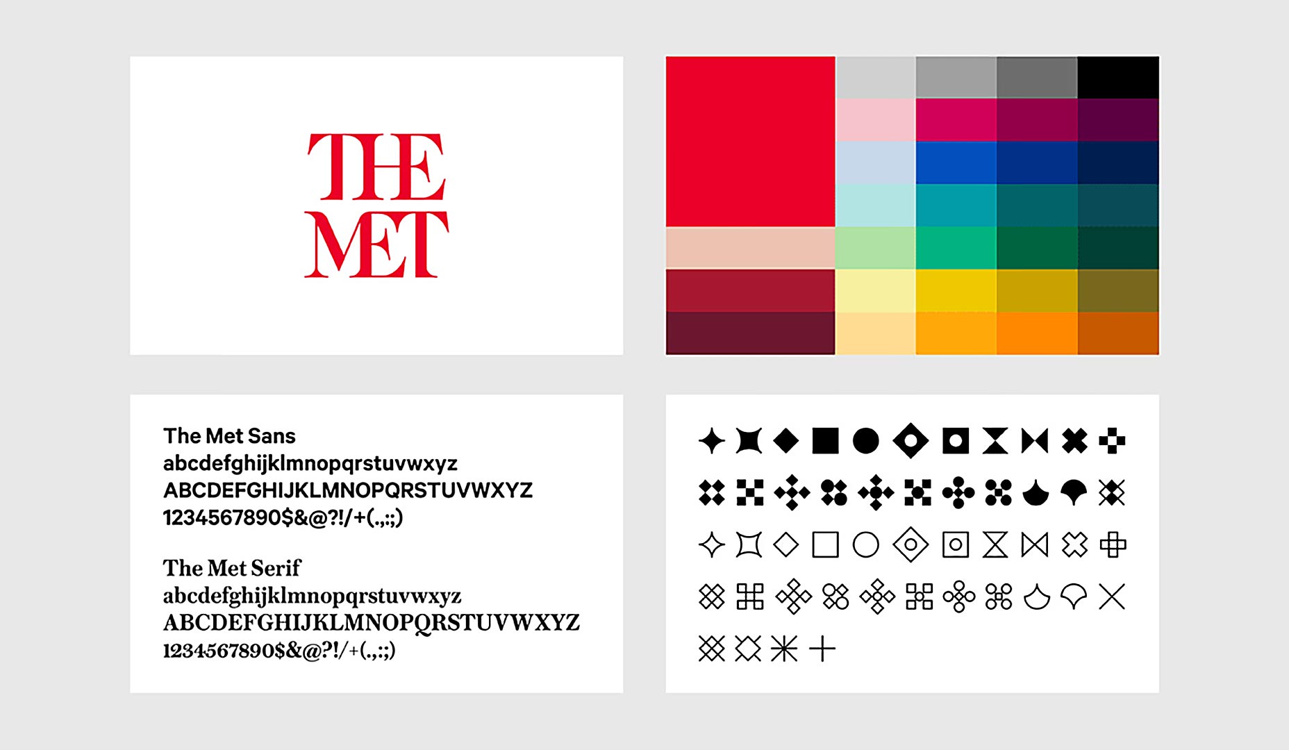
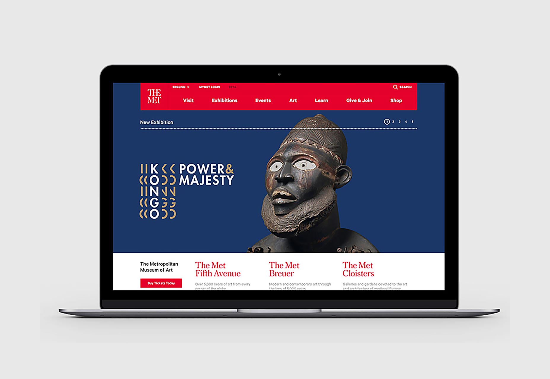
 The redesign includes two, distinct typefaces: Austin, a serif typeface and a sans serif typeface with Calibre influences. There’s also a bold and vibrant color palette along with a dotted line featuring diamond-shaped icons that are being dubbed “ornaments.” These design touches will be featured on the Met’s maps, digital platforms, signage and info material.
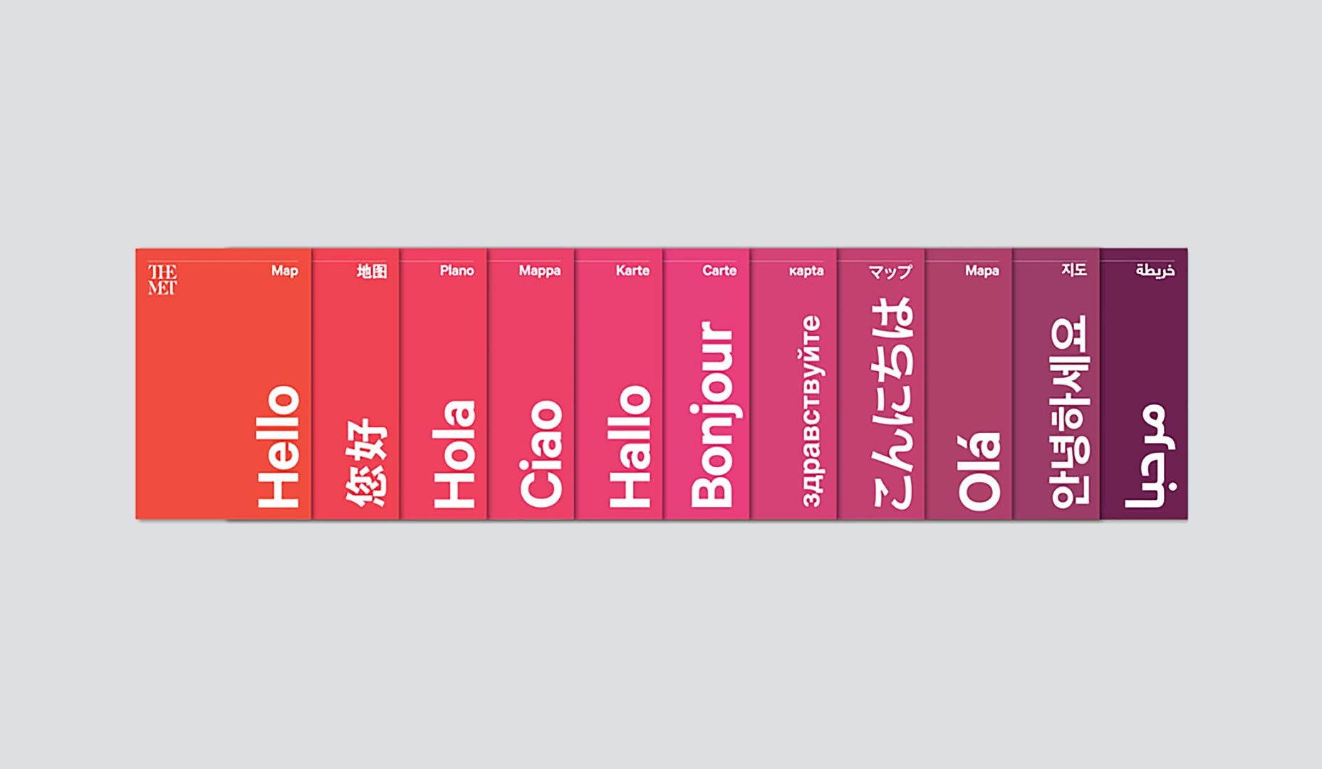
The philosophy behind the wider redesign was to focus on accessibility. The new brand’s designers say that they wanted to communicate accessibility to the museum’s visitors. Therefore, the typeface choice—as well as the color palette—is simple, friendly and global. For an institution as big as the Met, this redesign strategy makes sense, as simplicity is a way to link all of its different components for worldwide visitors of different backgrounds.
The redesign includes two, distinct typefaces: Austin, a serif typeface and a sans serif typeface with Calibre influences. There’s also a bold and vibrant color palette along with a dotted line featuring diamond-shaped icons that are being dubbed “ornaments.” These design touches will be featured on the Met’s maps, digital platforms, signage and info material.
The philosophy behind the wider redesign was to focus on accessibility. The new brand’s designers say that they wanted to communicate accessibility to the museum’s visitors. Therefore, the typeface choice—as well as the color palette—is simple, friendly and global. For an institution as big as the Met, this redesign strategy makes sense, as simplicity is a way to link all of its different components for worldwide visitors of different backgrounds.
 In total, this new design represents a broader, new brand identity for the Met. It’s the culmination of a two-year relationship between the Met and Wolff Olins. Whether or not the Met ultimately succeeds with the aims of its new logo is anyone’s guess at this point. One thing should be kept in mind, though: when longstanding designs change, the updates are often criticized, only to be gradually accepted as time wears on. It’ll be interesting to see if this happens with The Met’s new logo.
Marc Schenker
Marc’s a copywriter who covers design news for Web Designer Depot. Find out more about him at thegloriouscompanyltd.com.


Read Next

20 Best New Websites, April 2024
Welcome to our sites of the month for April. With some websites, the details make all the difference, while in others,…

Exciting New Tools for Designers, April 2024
Welcome to our April tools collection. There are no practical jokes here, just practical gadgets, services, and apps to…

14 Top UX Tools for Designers in 2024
User Experience (UX) is one of the most important fields of design, so it should come as no surprise that there are a…
By Simon Sterne

What Negative Effects Does a Bad Website Design Have On My Business?
Consumer expectations for a responsive, immersive, and visually appealing website experience have never been higher. In…

10+ Best Resources & Tools for Web Designers (2024 update)
Is searching for the best web design tools to suit your needs akin to having a recurring bad dream? Does each…
By WDD Staff

3 Essential Design Trends, April 2024
Ready to jump into some amazing new design ideas for Spring? Our roundup has everything from UX to color trends…

How to Plan Your First Successful Website
Planning a new website can be exciting and — if you’re anything like me — a little daunting. Whether you’re an…
By Simon Sterne

15 Best New Fonts, March 2024
Welcome to March’s edition of our roundup of the best new fonts for designers. This month’s compilation includes…
By Ben Moss

LimeWire Developer APIs Herald a New Era of AI Integration
Generative AI is a fascinating technology. Far from the design killer some people feared, it is an empowering and…
By WDD Staff

20 Best New Websites, March 2024
Welcome to our pick of sites for March. This month’s collection tends towards the simple and clean, which goes to show…

Exciting New Tools for Designers, March 2024
The fast-paced world of design never stops turning, and staying ahead of the curve is essential for creatives. As…

Web Tech Trends to Watch in 2024 and Beyond
It hardly seems possible given the radical transformations we’ve seen over the last few decades, but the web design…
By Louise North