

El Monstruo: vanquishing the monster with a text
El Monstruo is a partnership between UNICEF and ING Direct to promote donations to schools in developing nations. The site takes you on an animated journey into the lives of a group of schoolchildren – who are being chased away from their school by a ferocious monster. As El Monstruo chases you to the precipice of a cliff, the interactive storytelling comes in. An option to donate €1.20 to the schoolchildren (i.e. UNICEF) via SMS appears on screen. If you choose to donate, the animation continues with a happy ending – if not, well… The monster is a simple metaphor representing the barriers many schoolchildren face getting their education, and involving the site visitor in this way gives them a more immediate reward for their generosity. It’s using interactive design in a way that really reaches out to people’s sense of empathy.Slavery Footprint: follow the steps
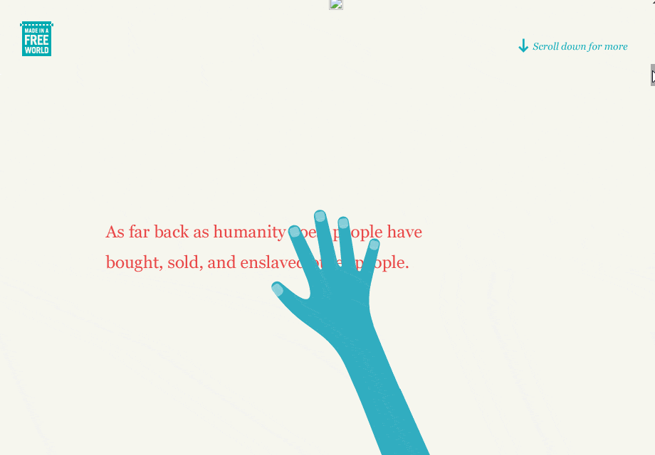 How many slaves work for you? It’s this simple question that’s the beginning of a journey through the chain of supply and forced labor in the modern world. Slavery Footprint walks you through how you could be supporting slavery, even without purchasing directly from companies that utilize sweatshops. They explain this chain of labour through interactive, scroll-through infographics.
But rather than just explaining this process in theory, Slavery Footprints runs a quick survey that calculates how much you rely on slave labor, based on factors like the food you eat, the property you live in and the country you’re from.
Slavery Footprint doesn’t just tell you a story about the modern state of slave labor – they use interactive design, data analysis and surveying to bring you into the story as a contributing factor. It’s a fantastic way to reach out to each site visitor on an individual level.
How many slaves work for you? It’s this simple question that’s the beginning of a journey through the chain of supply and forced labor in the modern world. Slavery Footprint walks you through how you could be supporting slavery, even without purchasing directly from companies that utilize sweatshops. They explain this chain of labour through interactive, scroll-through infographics.
But rather than just explaining this process in theory, Slavery Footprints runs a quick survey that calculates how much you rely on slave labor, based on factors like the food you eat, the property you live in and the country you’re from.
Slavery Footprint doesn’t just tell you a story about the modern state of slave labor – they use interactive design, data analysis and surveying to bring you into the story as a contributing factor. It’s a fantastic way to reach out to each site visitor on an individual level.
Supple: SEO haves and have nots
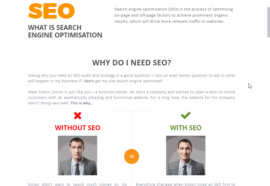 Supple is a digital marketing agency that helps business rank better on Google through Search Engine Optimization. It follows that their page explaining SEO should be as engaging as possible for potential customers.
Through smart use of illuminated hot spots, which visitors can click on to reveal key information about certain aspects of the page’s images and infographics, the site invites visitors to dig a little deeper into the world of SEO. There’s SVG animation to give the page dynamic vibrancy, and a sliding bar over some images that lets you take a look at the HTML behind an optimized site.
Supple is a digital marketing agency that helps business rank better on Google through Search Engine Optimization. It follows that their page explaining SEO should be as engaging as possible for potential customers.
Through smart use of illuminated hot spots, which visitors can click on to reveal key information about certain aspects of the page’s images and infographics, the site invites visitors to dig a little deeper into the world of SEO. There’s SVG animation to give the page dynamic vibrancy, and a sliding bar over some images that lets you take a look at the HTML behind an optimized site.
Inception Explained
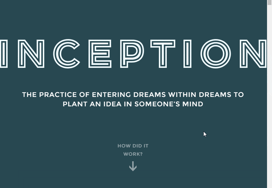 First things first: Inception IS a great movie. But it’s also confusing as hell. Luckily this website walks you through the plot with simple, interactive storytelling. The site color-codes each key character, and as you scroll down the page, the layers of dreams within dreams are represented one on top of the other.
Captions pop-up, explaining each level, whose dream characters are in and other necessary information. This is a very simple example of interactive storytelling – the site lets you move through the story at your own pace. Which really, really helps with a movie as confusing as Inception!
First things first: Inception IS a great movie. But it’s also confusing as hell. Luckily this website walks you through the plot with simple, interactive storytelling. The site color-codes each key character, and as you scroll down the page, the layers of dreams within dreams are represented one on top of the other.
Captions pop-up, explaining each level, whose dream characters are in and other necessary information. This is a very simple example of interactive storytelling – the site lets you move through the story at your own pace. Which really, really helps with a movie as confusing as Inception!
Coin: one card to rule them all
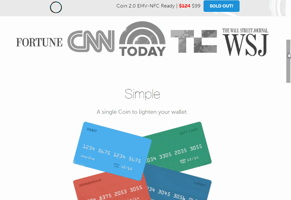 Is your wallet bursting at the seams with credit cards? Coin is a single card which you can upload and store all your credit cards on. Simply scroll through the stored cards, select one and then swipe, insert of tap-n-go as you would with any other card.
The whole reasoning behind the product is fusing all your cards into one convenient place – and that’s a simple message that’s visually represented in an even simpler way. As you scroll down the page, a mess of cards stack together and transform into Coin. It’s neat, minimalist storytelling, and very convincing.
Is your wallet bursting at the seams with credit cards? Coin is a single card which you can upload and store all your credit cards on. Simply scroll through the stored cards, select one and then swipe, insert of tap-n-go as you would with any other card.
The whole reasoning behind the product is fusing all your cards into one convenient place – and that’s a simple message that’s visually represented in an even simpler way. As you scroll down the page, a mess of cards stack together and transform into Coin. It’s neat, minimalist storytelling, and very convincing.
Bellroy: slim your wallet’s waistline
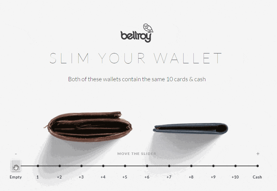 While we’re on the subject of wallet-slimming, you might want to consider slimming the wallet itself and not just its contents. Bellroy wallets are specially designed to take up less space, even when they’re filled with the same amount of cards as other wallets.
To show this, the Bellroy website gives their site visitors a sliding scale — from zero cards to ten — offering a side-by-side comparison between Bellroy and their competitors. Alongside a handful of other fantastic interactive animations, Bellroy’s site brings a bit of visitor involvement into what’s typically a very boring Us vs. The Competitors demonstration.
While we’re on the subject of wallet-slimming, you might want to consider slimming the wallet itself and not just its contents. Bellroy wallets are specially designed to take up less space, even when they’re filled with the same amount of cards as other wallets.
To show this, the Bellroy website gives their site visitors a sliding scale — from zero cards to ten — offering a side-by-side comparison between Bellroy and their competitors. Alongside a handful of other fantastic interactive animations, Bellroy’s site brings a bit of visitor involvement into what’s typically a very boring Us vs. The Competitors demonstration.
Babel the King: it’s raining cats
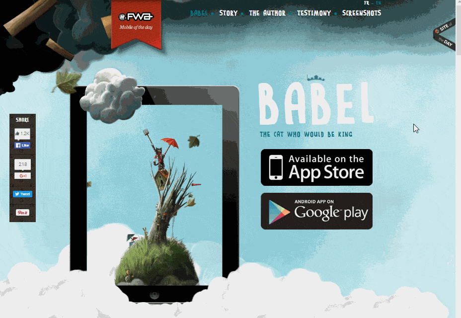 Babel the King is an interactive story available through the iTunes stores. Combining text, audio, animation and interactive elements, the game takes children ages 2-8 into the wonderful world of Babel, a cat that’s jealous of the clouds and spends his days trying to annoy them.
The website for the story/game offers a taste of what’s available from the download. As you scroll down the page, Babel falls through the sky alongside you and sheep trek weightlessly across the clouds.
The website is bursting with movement and life, and offers a great case study in really synchronizing your website with the product you’re selling.
Babel the King is an interactive story available through the iTunes stores. Combining text, audio, animation and interactive elements, the game takes children ages 2-8 into the wonderful world of Babel, a cat that’s jealous of the clouds and spends his days trying to annoy them.
The website for the story/game offers a taste of what’s available from the download. As you scroll down the page, Babel falls through the sky alongside you and sheep trek weightlessly across the clouds.
The website is bursting with movement and life, and offers a great case study in really synchronizing your website with the product you’re selling.
Bon voyage: Akita shows us How Data Travels Around The Globe
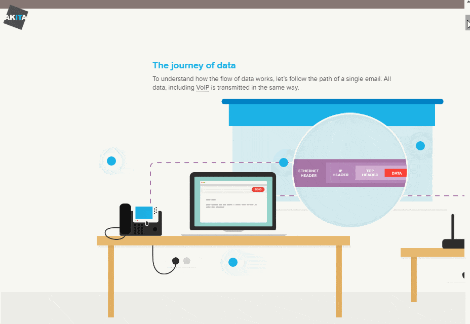 An email can feel like it’s sent pretty instantaneously, but how does it actually get from one person’s computer to another? IT support service Akita has developed a step-by-step journey to explain how data travels around the world.
The site allows you to scroll horizontally through the journey of an email, taking you from computer to telephone line to telephone exchange to data center, and more! It’s an effortless, interactive explanation of the movements data goes through to travel across the globe.
An email can feel like it’s sent pretty instantaneously, but how does it actually get from one person’s computer to another? IT support service Akita has developed a step-by-step journey to explain how data travels around the world.
The site allows you to scroll horizontally through the journey of an email, taking you from computer to telephone line to telephone exchange to data center, and more! It’s an effortless, interactive explanation of the movements data goes through to travel across the globe.
Ben The Bodyguard
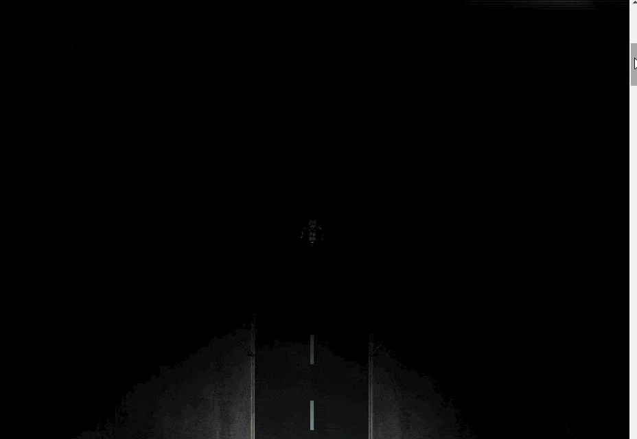 Ben The Bodyguard is an app for iPhone that helps you encrypt and protect private information on your device. The app’s branding centers around the character of “Ben”, a bodyguard with an unbeatable track record for protecting people.
As you scroll down the page, Ben walks down a dark (and dodgy-looking) street as he explains the perils of letting your private information fall into the wrong hands. It’s great storytelling, with a simple premise (a privacy app personified as a bodyguard) with interactive scrolling to deliver the app’s pitch.
Ben The Bodyguard is an app for iPhone that helps you encrypt and protect private information on your device. The app’s branding centers around the character of “Ben”, a bodyguard with an unbeatable track record for protecting people.
As you scroll down the page, Ben walks down a dark (and dodgy-looking) street as he explains the perils of letting your private information fall into the wrong hands. It’s great storytelling, with a simple premise (a privacy app personified as a bodyguard) with interactive scrolling to deliver the app’s pitch.
Nissan Note
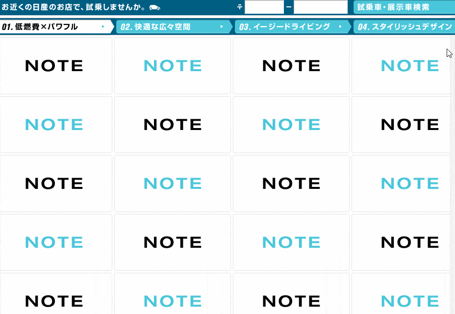 To sell their new car model, the Nissan Note, Nissan has employed scroll-down animation, reminiscent of an old-fashioned flip-book. Rather than running a video, the site displays a grid of panels displaying images that change slightly as you scroll down.
The effect is that site visitors can create a movie at their own pace. It’s an interactive story about the car’s features and a family traveling through countryside to the city. Have a play around with it and see what you think!
To sell their new car model, the Nissan Note, Nissan has employed scroll-down animation, reminiscent of an old-fashioned flip-book. Rather than running a video, the site displays a grid of panels displaying images that change slightly as you scroll down.
The effect is that site visitors can create a movie at their own pace. It’s an interactive story about the car’s features and a family traveling through countryside to the city. Have a play around with it and see what you think!
Every Last Drop: a trickling tale of water wastage
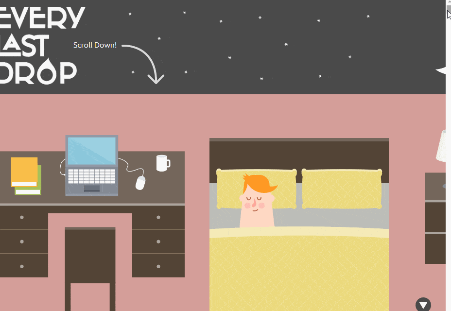 The website takes you through a single day of water usage, from the water you use in the shower to the total water used in the production of your clothes and food. It’s a simple, scroll-down story that takes you on an informative journey all the way into outer space!
With so much water used in a day, the story ends on a poignant note that over a billion people don’t have daily access to clean drinking water. Using interactive storytelling to deliver a powerful message, it’s a great example of just what good design can teach us.
The website takes you through a single day of water usage, from the water you use in the shower to the total water used in the production of your clothes and food. It’s a simple, scroll-down story that takes you on an informative journey all the way into outer space!
With so much water used in a day, the story ends on a poignant note that over a billion people don’t have daily access to clean drinking water. Using interactive storytelling to deliver a powerful message, it’s a great example of just what good design can teach us.
The Boat: a harrowing tale of escape and refuge
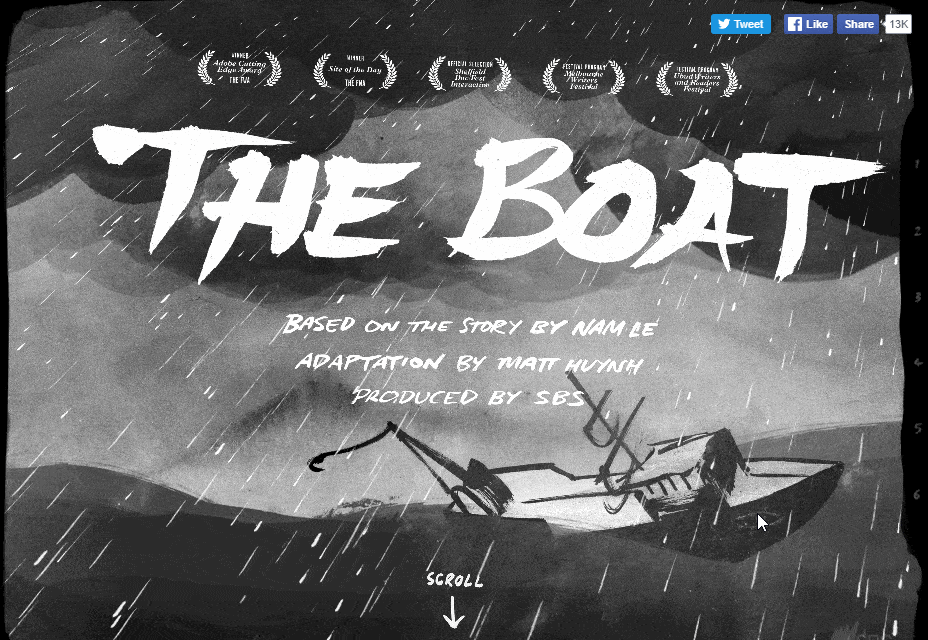 Nam Le’s acclaimed short story collect The Boat has been transformed into an interactive graphic novel at sbs.com.au, throwing you into the world of a rickety boat fighting the full force of the ocean as it escapes from the horrors of the Vietnam War.
Making use of text, sound design, illustration and animation, it’s a testament to what interactive storytelling can achieve. A memorable moment involves the text and illustrations themselves being tossed up and down the page as the characters depicted in them do the same on an ocean voyage.
Immersive and emotional, this tale of survival simply must be experienced.
Nam Le’s acclaimed short story collect The Boat has been transformed into an interactive graphic novel at sbs.com.au, throwing you into the world of a rickety boat fighting the full force of the ocean as it escapes from the horrors of the Vietnam War.
Making use of text, sound design, illustration and animation, it’s a testament to what interactive storytelling can achieve. A memorable moment involves the text and illustrations themselves being tossed up and down the page as the characters depicted in them do the same on an ocean voyage.
Immersive and emotional, this tale of survival simply must be experienced.
Saijo George
Saijo George works an SEO Strategy Director for Melbourne based award winning marketing agency Supple. When he is not reading up on web design and digital marketing, he is either working on side projects OR playing Helldivers / Hearthstone / Call Of Duty. You can find him on twitter : @Saijo_George and LinkedIn


Read Next

3 Essential Design Trends, May 2024
Integrated navigation elements, interactive typography, and digital overprints are three website design trends making…

How to Write World-Beating Web Content
Writing for the web is different from all other formats. We typically do not read to any real depth on the web; we…
By Louise North

20 Best New Websites, April 2024
Welcome to our sites of the month for April. With some websites, the details make all the difference, while in others,…

Exciting New Tools for Designers, April 2024
Welcome to our April tools collection. There are no practical jokes here, just practical gadgets, services, and apps to…

How Web Designers Can Stay Relevant in the Age of AI
The digital landscape is evolving rapidly. With the advent of AI, every sector is witnessing a revolution, including…
By Louise North

14 Top UX Tools for Designers in 2024
User Experience (UX) is one of the most important fields of design, so it should come as no surprise that there are a…
By Simon Sterne

What Negative Effects Does a Bad Website Design Have On My Business?
Consumer expectations for a responsive, immersive, and visually appealing website experience have never been higher. In…

10+ Best Resources & Tools for Web Designers (2024 update)
Is searching for the best web design tools to suit your needs akin to having a recurring bad dream? Does each…
By WDD Staff

3 Essential Design Trends, April 2024
Ready to jump into some amazing new design ideas for Spring? Our roundup has everything from UX to color trends…

How to Plan Your First Successful Website
Planning a new website can be exciting and — if you’re anything like me — a little daunting. Whether you’re an…
By Simon Sterne

15 Best New Fonts, March 2024
Welcome to March’s edition of our roundup of the best new fonts for designers. This month’s compilation includes…
By Ben Moss

LimeWire Developer APIs Herald a New Era of AI Integration
Generative AI is a fascinating technology. Far from the design killer some people feared, it is an empowering and…
By WDD Staff