

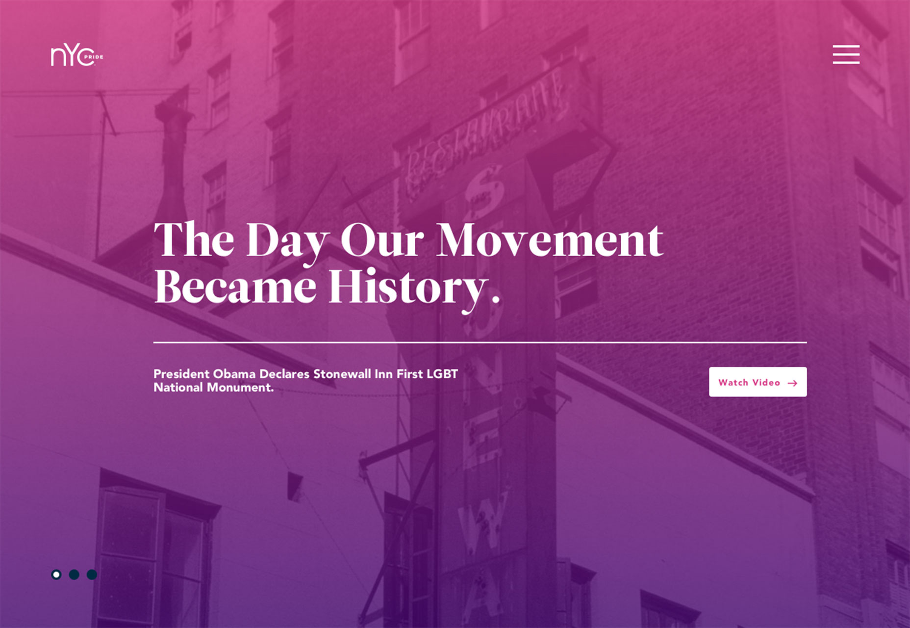
1. Color overlay on imagery
Color overlays are a visually interesting way to draw the eye when the art is less than stellar. It can be a good way to add color and intrigue to a plain photo, stock imagery or add color when the image is lacking that certain spark. Use of color overlays varies greatly. While bright colors are one of the most popular options, a muted or sepia overlay can change the mood of a project or add just the right vintage feel, such as with the Lyrix website, below. When it comes to color overlay, solid colors are typically the most popular option. Bright colors are common and many of the same hues that are popular with other design trends such as flat and material design are commonly used. (Here’s that layering of trends mentioned in the intro.) Finally, when thinking about a color overlay, consider a gradient, duotone or multi-color effect. This technique can work particularly well with an image that’s easily identifiable or with imagery that’s flat on its own, such as the photo for NYC Pride, below. The reason you are drawn into the website design is the bright color overlay, not the image itself. (Note with NYC Pride’s website, in particular, that another trend is making a comeback—the gradient. More gradients are starting to show up in design projects and we’ll look at this trend in greater detail next month.)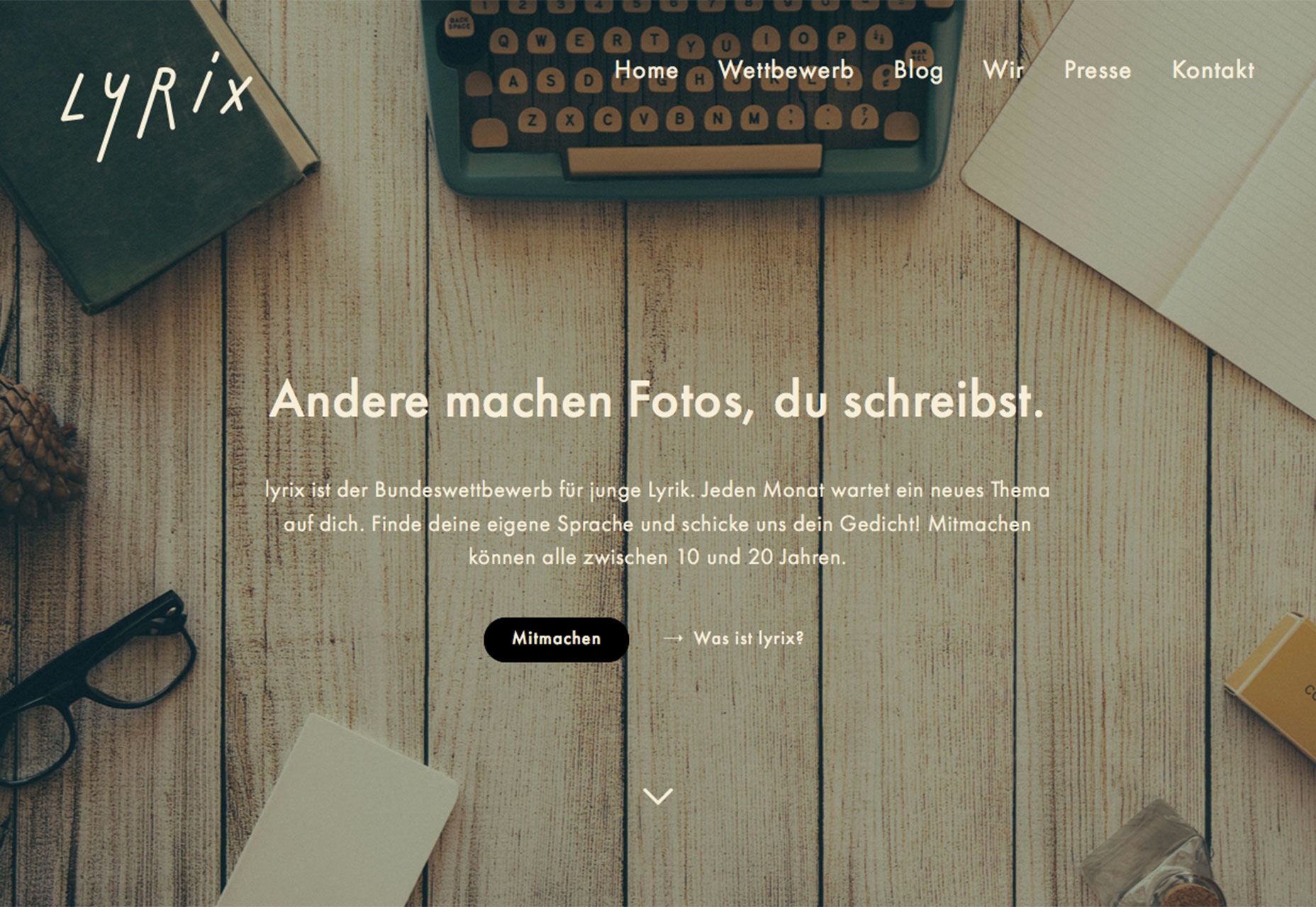
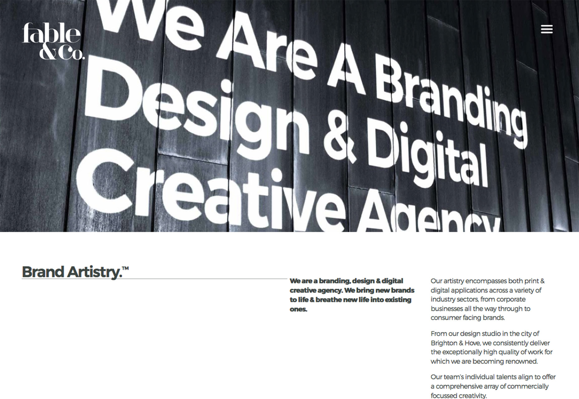
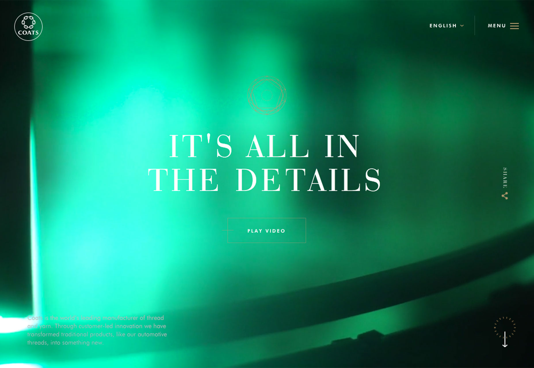
2. Tiny corner logos
For a while logos were one of the most dominant elements in a website design. Designers were using oversized version of brand names and logotypes to create interesting aesthetics. Now they are taking to opposite approach. Logos are being used smaller than ever. But that’s not the only commonality when it comes to the way small logos are being used. They also appear in the same location in almost every example of this trend – the top left corner. The placement is not that surprising. The top left is a common logo placement location in website design and has been for some time due the the idea that users will read the site from top left to right in an F-shaped pattern. What is surprising is how small the logos actually are in relationship to the rest of the design. In some instances, these logos are designed to symmetrically match the hamburger menu icon. So they are exceptionally small. The Brave People logo, for example below, is only slightly larger than the menu icon and is designed to look almost like an icon in itself, with white novelty text inside a black box. What’s nice about this technique is that it gives the rest of the images and text on the canvas plenty of room to be showcased. Brave People uses plenty of video snippets and layered boxes of information to draw users through the website design. Having a small logo helps the eyes stay in the right place and move through the content with ease. Coats uses a similar concept, balancing the tiny logo on side of the screen and the menu icon on the other. The design further carries the concept of the logo in iconography throughout the site so the user always has a visual reminder of what website they are on.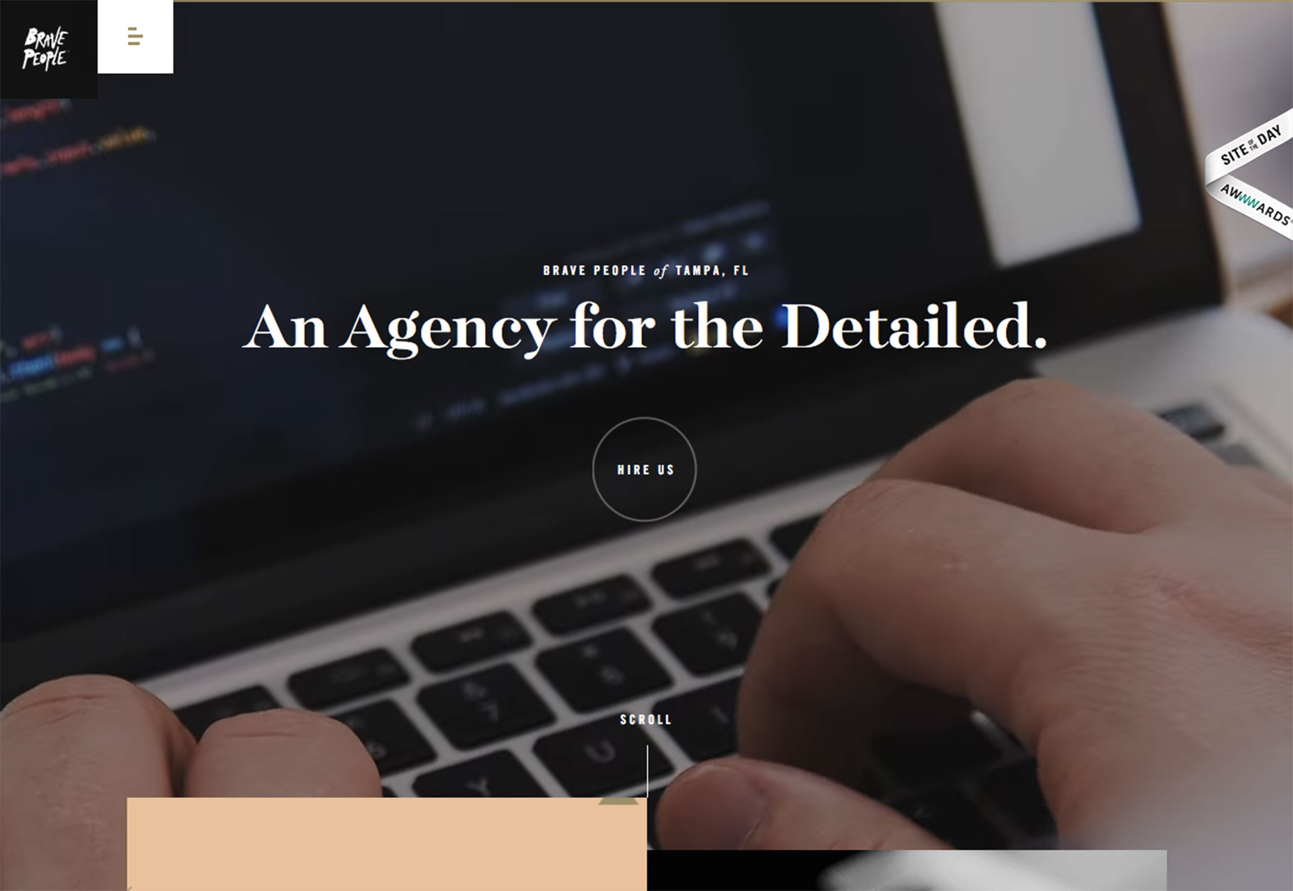
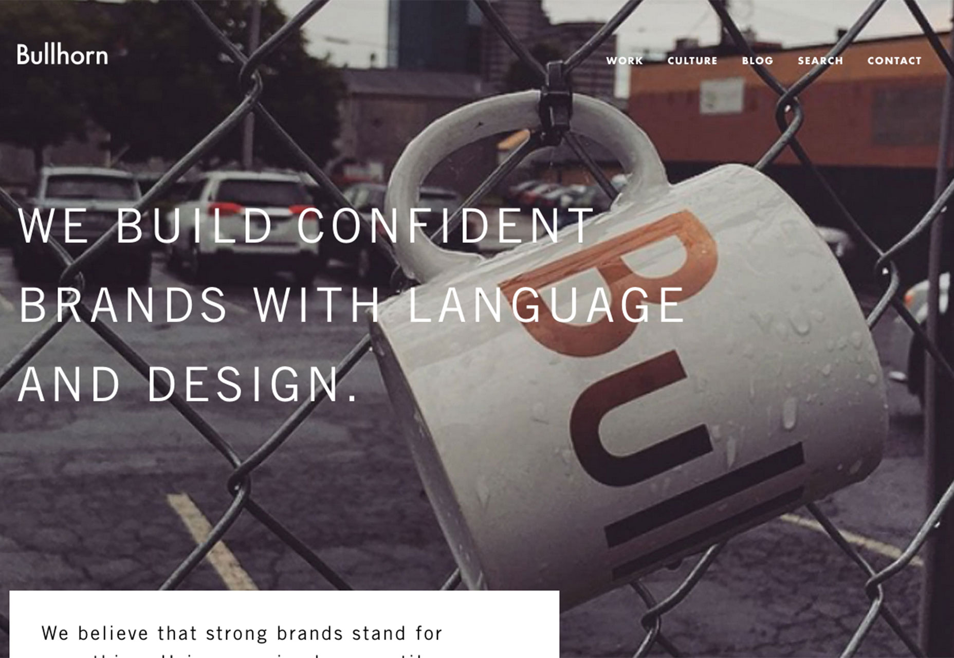
3. “Make you look” images or video
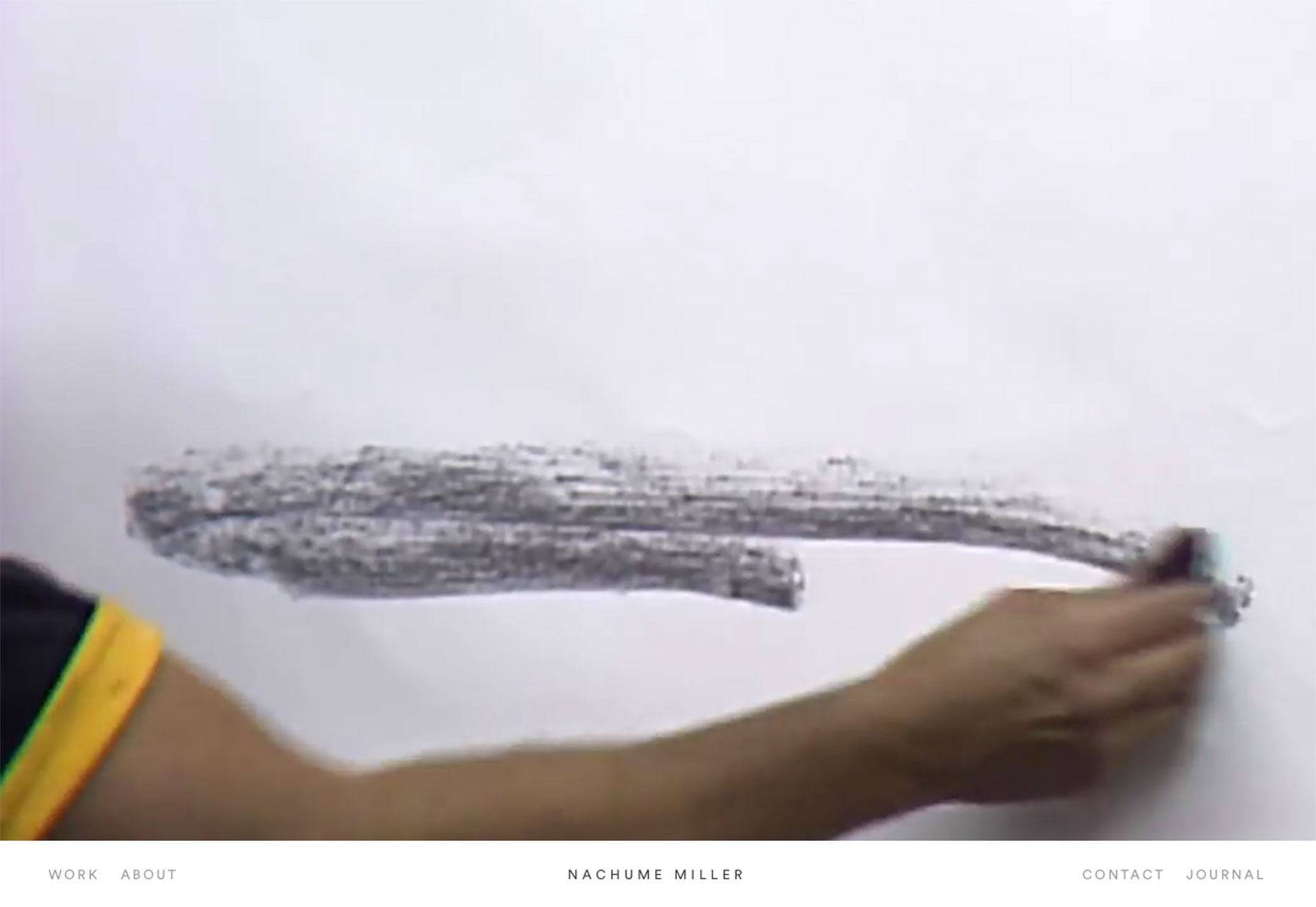
“Made you look!” That’s what many of the hero images and videos on websites are screaming as you land on them. Images that are odd, unusual or just require a little thought are becoming a popular way to draw users in and keep them on the website for a longer time period. You want to understand what is happening in the image or whether that’s a dog or wolf (Instynct, below), what an out of place element means (Bullhorn, below) or what is going to happen next as in the video painting for Nachume Miller (below). So what makes a make-you-look image? It has to be different and interesting. It has to be high quality and contain a visual that you don’t see every day. The visual should make you wonder about something, ask a question or desire to learn more. The image or video will grab your attention and hold it just a bit longer than a picture of a cheeseburger on the McDonald’s website. It’s that element of surprise or whimsy or wonder that makes it something users can turn away from. When you go back to it, or watch the entirety of a video loop or just can’t get the image out of your head, then you know it will make others look as well. (Go big and bold, or go home!)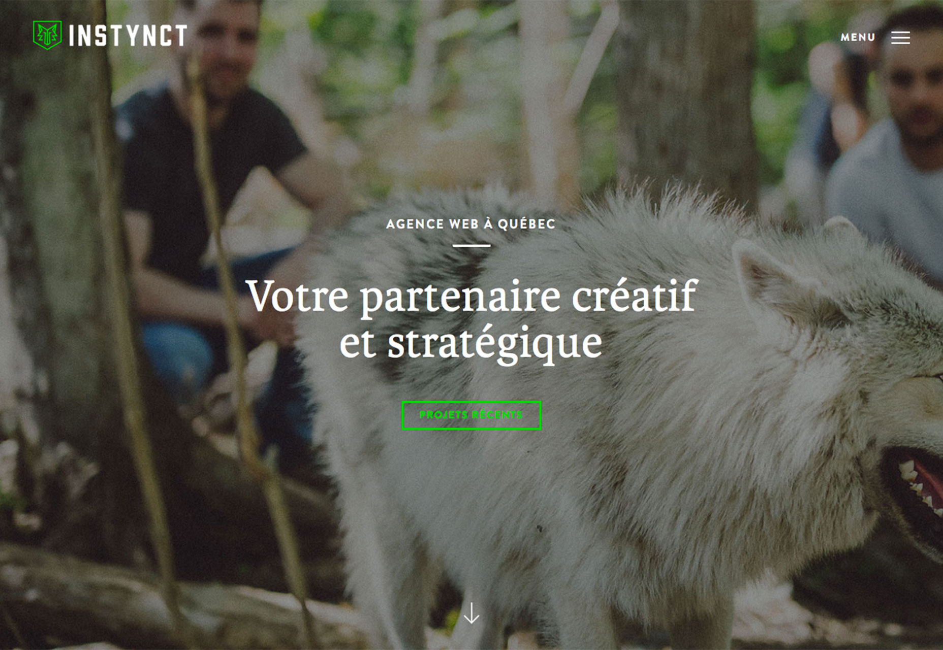
Conclusion
It’s fun to see multiple trend converge as many of these websites exemplify. Tiny logos might be one of the elements that most dominant right now. It’s one of those things you might not even notice until you start looking for it, and then you notice this concept being used everywhere. Plus, it really gives the design some room for other elements by getting the logo out of the way, which is why is works in combination with other trends so very well.What trends are you loving (or hating) right now? I’d love to see some of the websites that you are fascinated with. Drop me a link on Twitter; I’d love to hear from you.
Carrie Cousins
Carrie Cousins is a freelance writer with more than 10 years of experience in the communications industry, including writing for print and online publications, and design and editing. You can connect with Carrie on Twitter @carriecousins.


Read Next

3 Essential Design Trends, May 2024
Integrated navigation elements, interactive typography, and digital overprints are three website design trends making…

How to Write World-Beating Web Content
Writing for the web is different from all other formats. We typically do not read to any real depth on the web; we…
By Louise North

20 Best New Websites, April 2024
Welcome to our sites of the month for April. With some websites, the details make all the difference, while in others,…

Exciting New Tools for Designers, April 2024
Welcome to our April tools collection. There are no practical jokes here, just practical gadgets, services, and apps to…

How Web Designers Can Stay Relevant in the Age of AI
The digital landscape is evolving rapidly. With the advent of AI, every sector is witnessing a revolution, including…
By Louise North

14 Top UX Tools for Designers in 2024
User Experience (UX) is one of the most important fields of design, so it should come as no surprise that there are a…
By Simon Sterne

What Negative Effects Does a Bad Website Design Have On My Business?
Consumer expectations for a responsive, immersive, and visually appealing website experience have never been higher. In…

10+ Best Resources & Tools for Web Designers (2024 update)
Is searching for the best web design tools to suit your needs akin to having a recurring bad dream? Does each…
By WDD Staff

3 Essential Design Trends, April 2024
Ready to jump into some amazing new design ideas for Spring? Our roundup has everything from UX to color trends…

How to Plan Your First Successful Website
Planning a new website can be exciting and — if you’re anything like me — a little daunting. Whether you’re an…
By Simon Sterne

15 Best New Fonts, March 2024
Welcome to March’s edition of our roundup of the best new fonts for designers. This month’s compilation includes…
By Ben Moss

LimeWire Developer APIs Herald a New Era of AI Integration
Generative AI is a fascinating technology. Far from the design killer some people feared, it is an empowering and…
By WDD Staff