

Expressing brand values
Your values are core to any brand. They are what helps you translate what a brand is promising conceptually, to how a brand is keeping that promise experientially. Patagonia’s core values are: Quality, Integrity, Environmentalism, and Not bound by Convention. Their website is beautiful, with high quality photos of people wearing the products in adventurous places. However, if I knew nothing else about the brand than the website, they wouldn’t feel different from any other adventure brand trying to sell me a fleece jacket.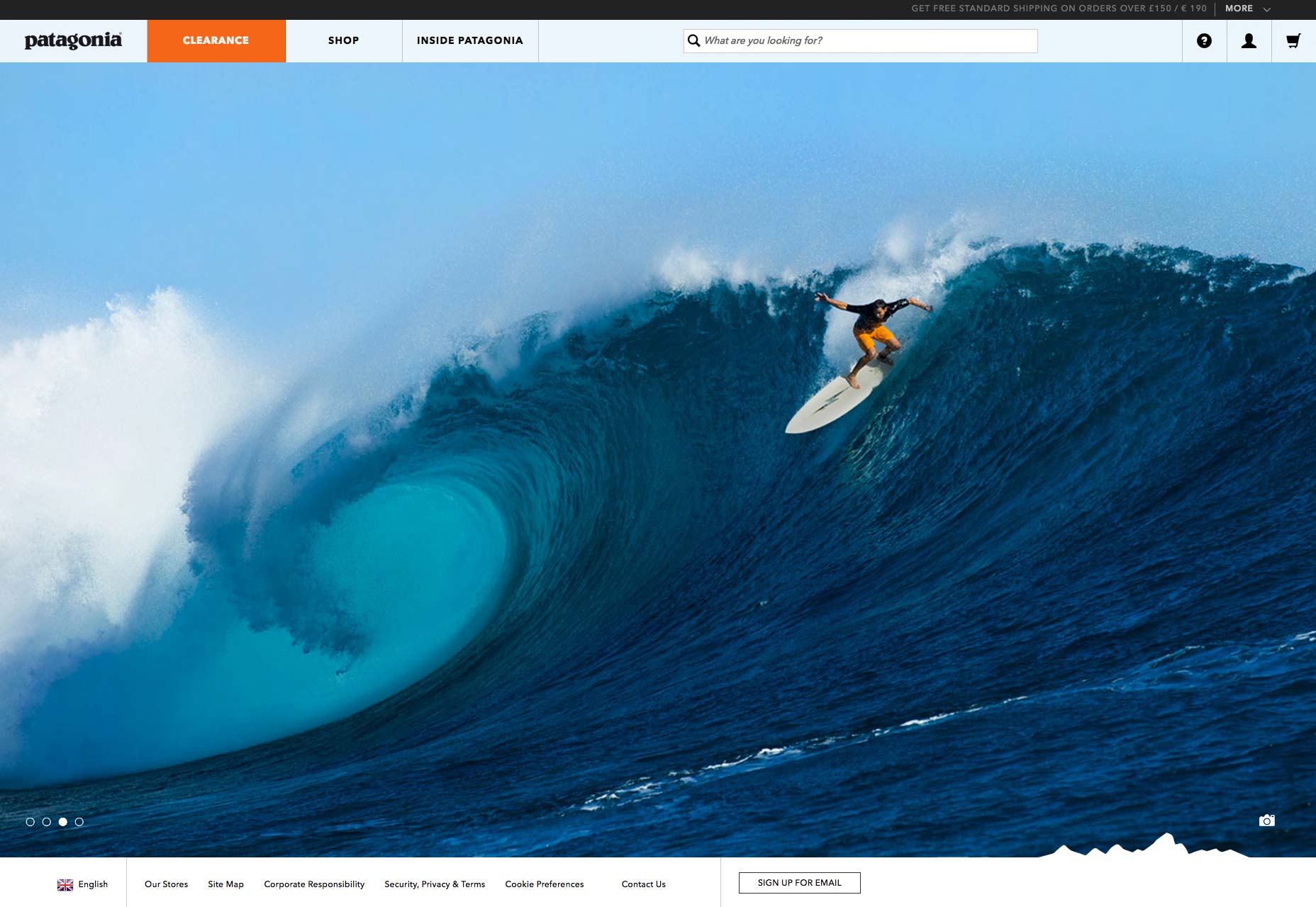 Their values are what makes Patagonia unique. Thinking about “Not bound by convention”, what can that look like as navigation? Right now the shop is organized by man, woman, child, etc; pretty conventional. Is there a different way to think about this where maybe everything is organized by item type without gender or age classification? Maybe that specific classification is actually about fit not gender/age, and so that selection can be done at point-of-purchase sizing.
Changing something to better express the brand values can change the way we understand the brand after an interaction.
Their values are what makes Patagonia unique. Thinking about “Not bound by convention”, what can that look like as navigation? Right now the shop is organized by man, woman, child, etc; pretty conventional. Is there a different way to think about this where maybe everything is organized by item type without gender or age classification? Maybe that specific classification is actually about fit not gender/age, and so that selection can be done at point-of-purchase sizing.
Changing something to better express the brand values can change the way we understand the brand after an interaction.
Values dictate interaction
Modern day consumers have much higher expectations of customer service experience. Either it’s not enough—all that is provided is a 1.800 number—or it’s too much—there’s a help chat box that keeps popping up every time you are on a new page. For some brands, where service is truly at its core, figuring out the right approach is incredibly important. One of Southwest’s values is “a servant heart”. Why then is the “Contact Us” only available on the footer for the general pages? When I need help, it’s usually because I have a question about my flight reservation. A better solution would be a slider on the side at all times that reads “Can I help you?” So that when I look at my flight reservation I can easily ask questions via chat.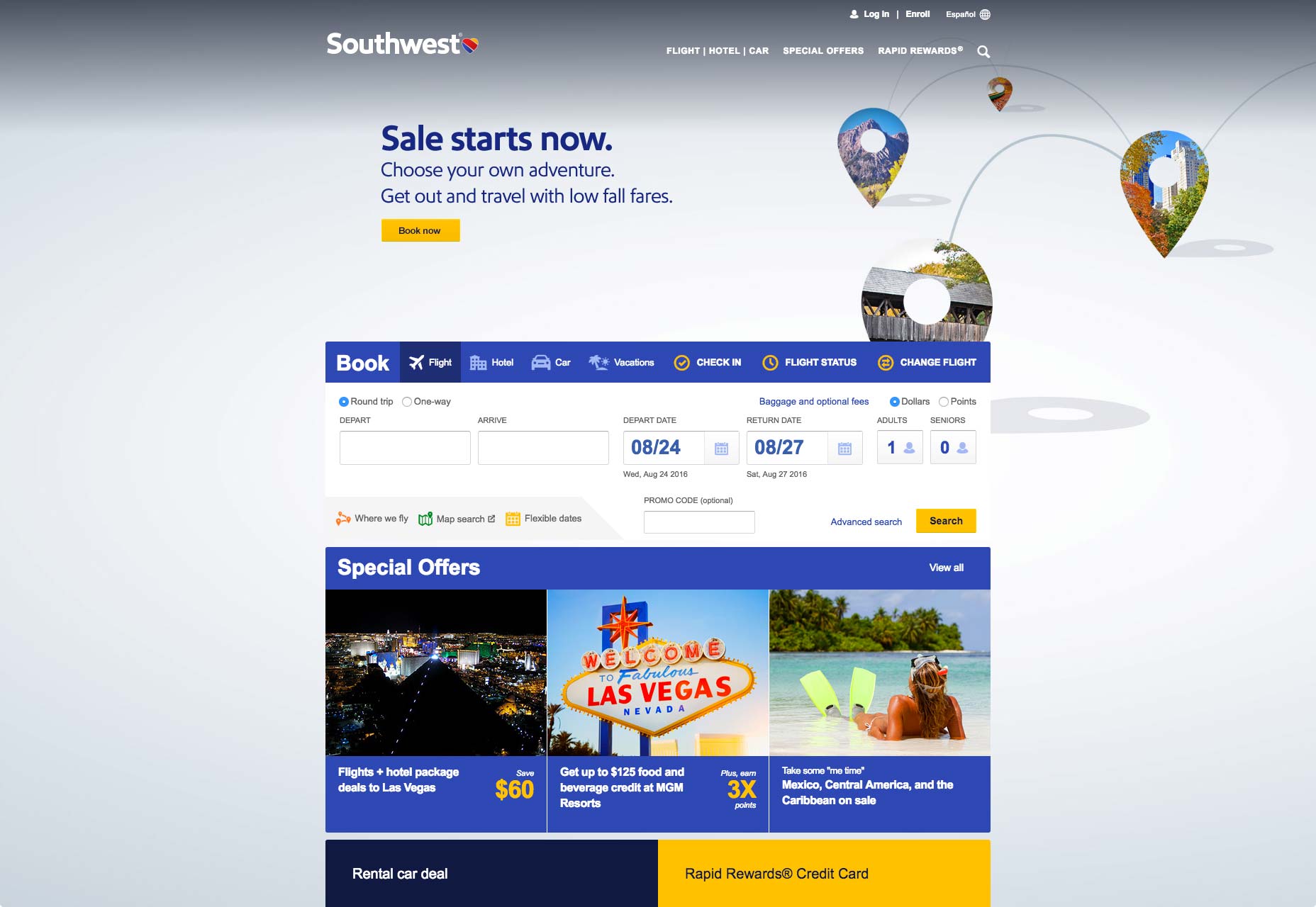 While many customers may decide never to contact Southwest via this channel, the point is that if they’d made it available, anytime, anywhere, it would demonstrate they encourage communication and appear to be proactive—really conveying the meaning behind that core value.
Engaging with physical space
For brands with digital and physical touchpoints, an important consideration is how they compliment each another. There are different expectations on each medium, and while they don’t always need to work together in unison, they should always be in harmony. The Los Angeles County Museum of Art (LACMA) has a mission statement to: “serve the public through the collection, conservation, exhibition and interpretation of significant works of art…” Their website is a solid information hub with pretty pictures and everything you’d need in order to visit the museum—however it’s not responsive. By building a mobile site that integrates ways for visitors to enhance their museum experience LACMA can further strengthen their mission to educate and engage the city of LA.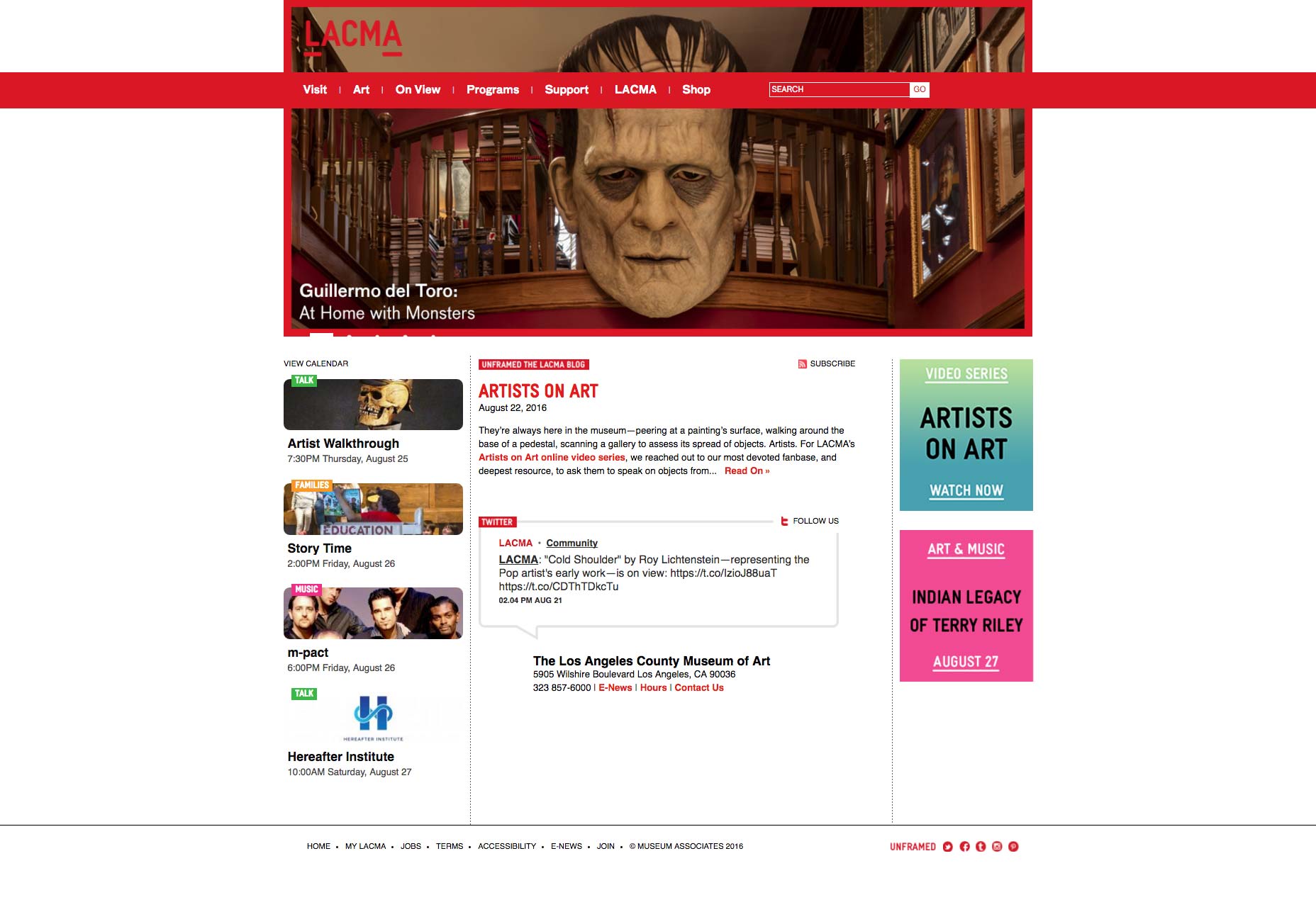 For example, could the audio tour be loaded on the website allowing a visitor to use their own cellphone and earbuds? Could QRS codes be added in the center of a room, and when a visitor scans them, it provides them with relevant information about the artwork in that room?
While it doesn’t always make sense for web and world to interact in this manner, LACMA’s mission suggests it’s about driving visitors to come to the museum. Adding in museum interactive aspects to the website would allow visitors to interact without having to download an app.
Many companies using WYSIWYGs cannot invest in custom web development, but these questions can help you to get to the next level of experience. Content development, choice in template, it’s important to consider what these are saying about your brand. While having a website may be table stakes, going beyond a pretty digital brochure can make it something truly meaningful.
For example, could the audio tour be loaded on the website allowing a visitor to use their own cellphone and earbuds? Could QRS codes be added in the center of a room, and when a visitor scans them, it provides them with relevant information about the artwork in that room?
While it doesn’t always make sense for web and world to interact in this manner, LACMA’s mission suggests it’s about driving visitors to come to the museum. Adding in museum interactive aspects to the website would allow visitors to interact without having to download an app.
Many companies using WYSIWYGs cannot invest in custom web development, but these questions can help you to get to the next level of experience. Content development, choice in template, it’s important to consider what these are saying about your brand. While having a website may be table stakes, going beyond a pretty digital brochure can make it something truly meaningful.
Jenna Isken
Based in LA, Jenna Isken is a strategist at global brand strategy, design and experience firm Siegel+Gale. Follow her on Twitter @jennaisken


Read Next

Using AI to Predict Design Trends
Design trends evolve at a blistering pace, especially in web design. On multi-month projects, you might work on a…
By Simon Sterne

15 Best New Fonts, April 2024
Just like web design, type design follows trends. And while there’s always room for an exciting outsider, we tend to…
By Ben Moss

3 Essential Design Trends, May 2024
Integrated navigation elements, interactive typography, and digital overprints are three website design trends making…

How to Write World-Beating Web Content
Writing for the web is different from all other formats. We typically do not read to any real depth on the web; we…
By Louise North

20 Best New Websites, April 2024
Welcome to our sites of the month for April. With some websites, the details make all the difference, while in others,…

Exciting New Tools for Designers, April 2024
Welcome to our April tools collection. There are no practical jokes here, just practical gadgets, services, and apps to…

How Web Designers Can Stay Relevant in the Age of AI
The digital landscape is evolving rapidly. With the advent of AI, every sector is witnessing a revolution, including…
By Louise North

14 Top UX Tools for Designers in 2024
User Experience (UX) is one of the most important fields of design, so it should come as no surprise that there are a…
By Simon Sterne

What Negative Effects Does a Bad Website Design Have On My Business?
Consumer expectations for a responsive, immersive, and visually appealing website experience have never been higher. In…

10+ Best Resources & Tools for Web Designers (2024 update)
Is searching for the best web design tools to suit your needs akin to having a recurring bad dream? Does each…
By WDD Staff

3 Essential Design Trends, April 2024
Ready to jump into some amazing new design ideas for Spring? Our roundup has everything from UX to color trends…

How to Plan Your First Successful Website
Planning a new website can be exciting and — if you’re anything like me — a little daunting. Whether you’re an…
By Simon Sterne