

Lindsey Bull
We start off with Lindsey Bull’s portfolio, a classic example of minimalism in action. The actual portfolio sections are kept wonderfully simple, allowing you to focus on the art, and the art alone.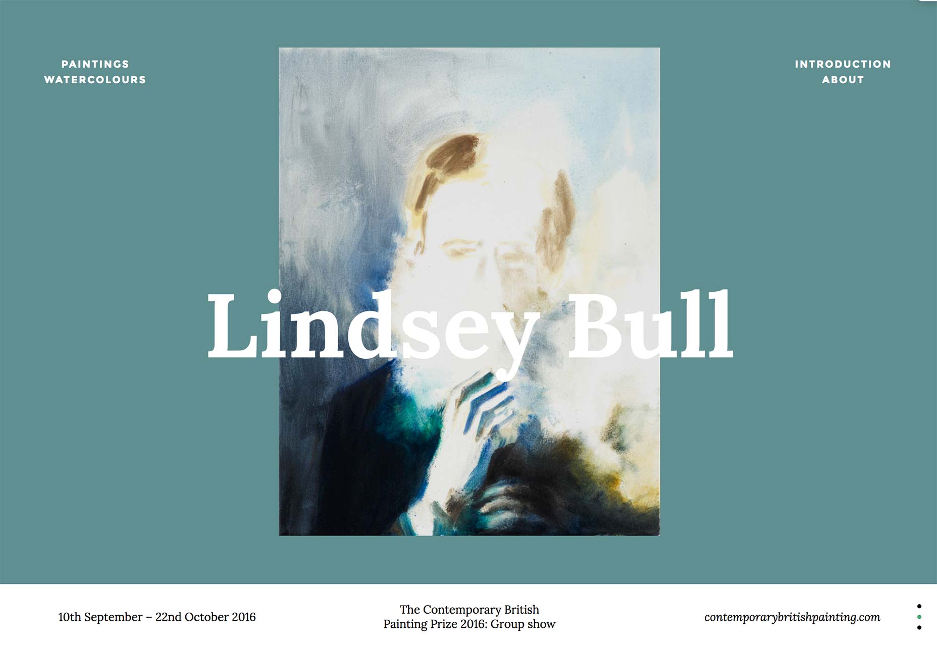
Eleni Debo
Continuing that minimalist theme, Eleni Debo’s portfolio showcases her illustrations with a simple masonry-style grid, and little else. But hey, with work like hers, who needs bells and whistles? The typography is fantastic too.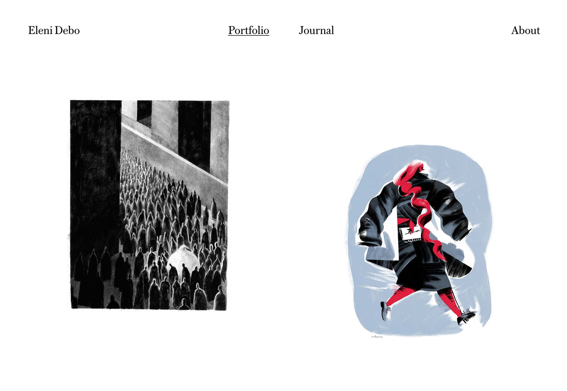
Imperial Woodpecker
Imperial Woodpecker embraces the background video when showing off their, well, videos. If you’ve read any of these articles before, you know I’m not a huge fan of sites that feel more like apps than sites, but I have to admit that IW uses this technique well. They even managed to make a three-column layout make sense.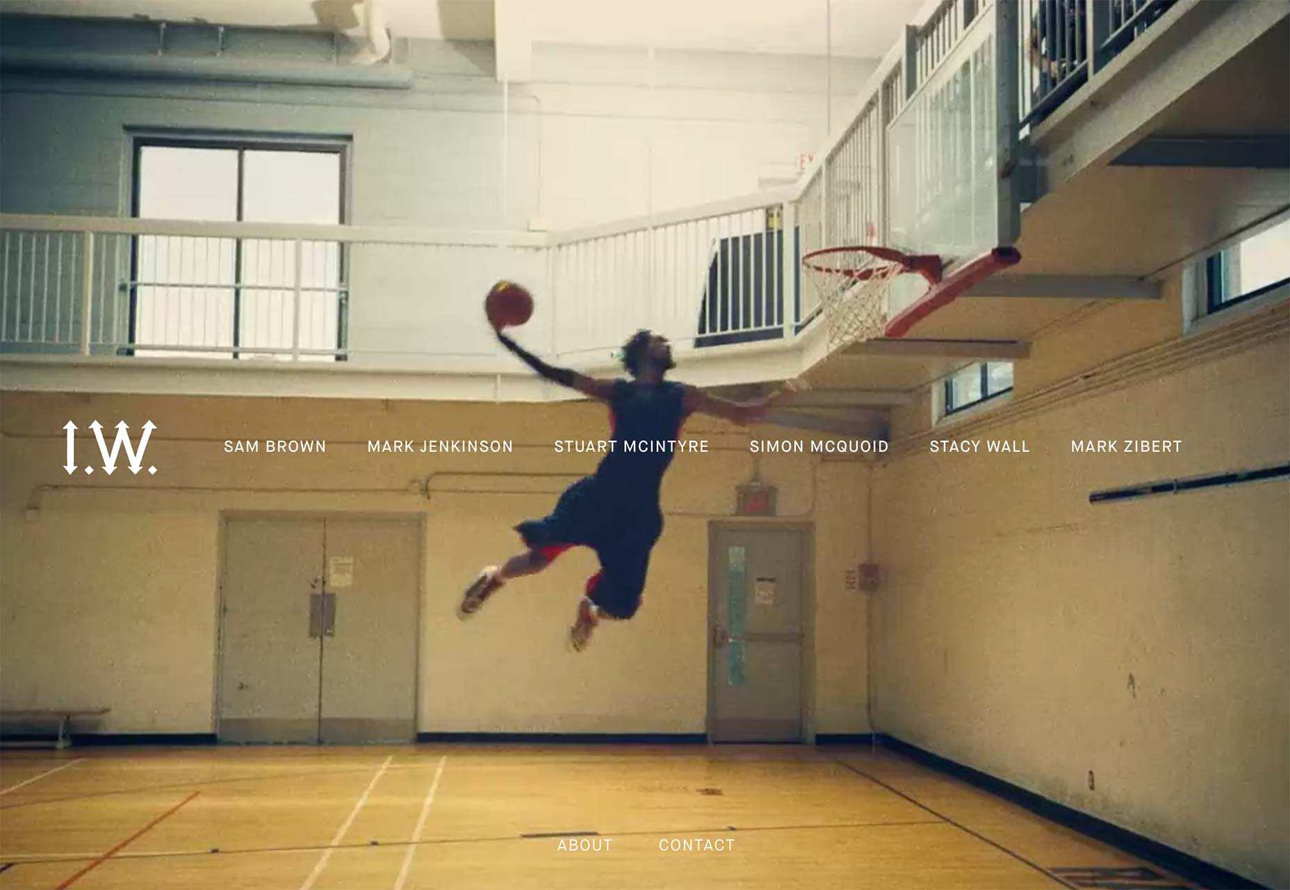
Joyce Wang
Joyce Wang’s portfolio is one of a small but growing list of sites that actually uses parallax effects in a good way. The extremely minimalist one-column portfolio is made a lot more interesting by the way the project’s titles don’t scroll with the images, and yet kind of do.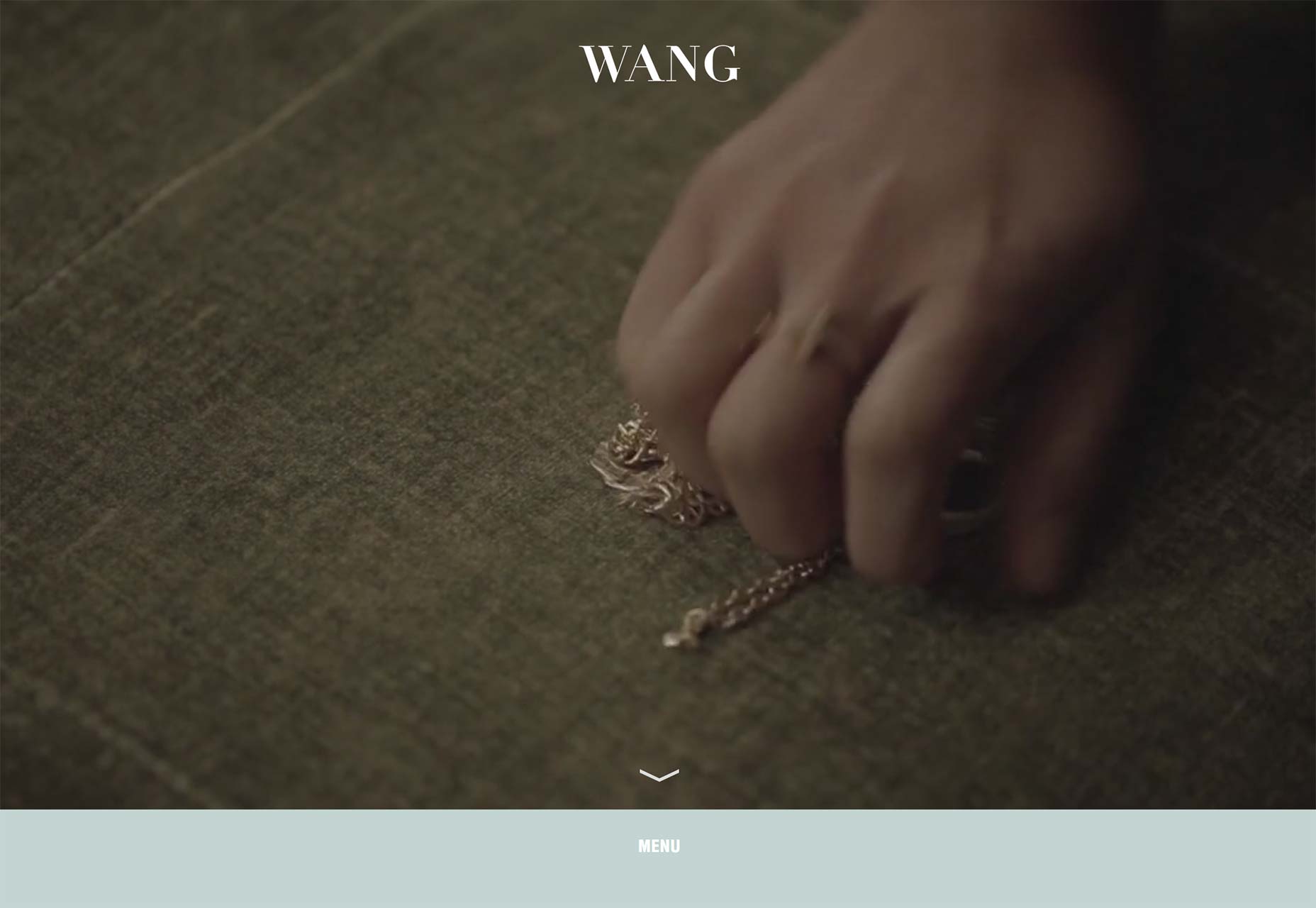
George Badea
Do you like lots of grays and “condensed” typefaces? Well what a coincidence, because George Badea has you covered with this stylish, beautiful, and mostly monochromatic portfolio.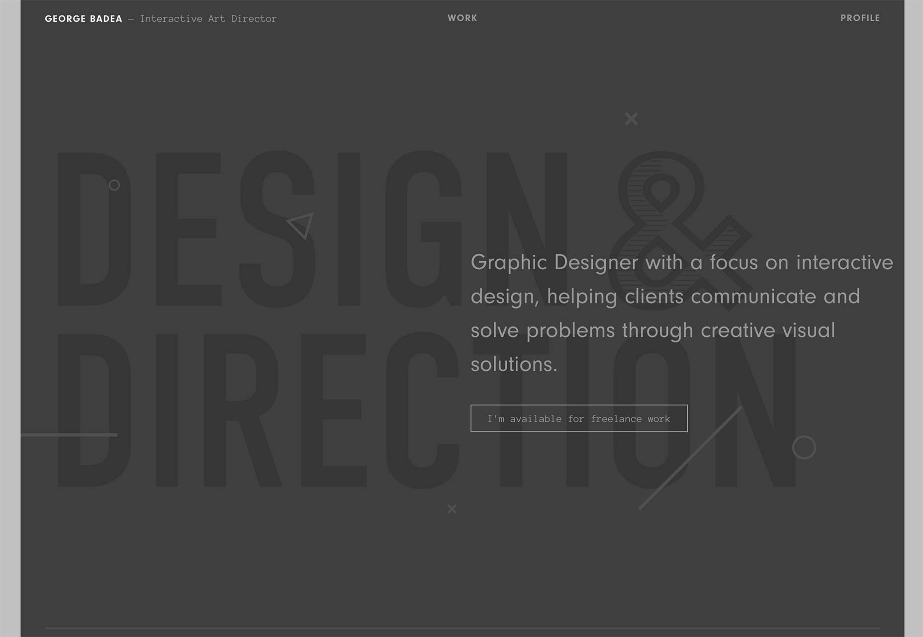
We Like Small
We Like Small combines asymmetry with lots of animation to make their design more eye-catching, and it works. Okay, it works as long as JavaScript is working, but it’s still a beautiful design.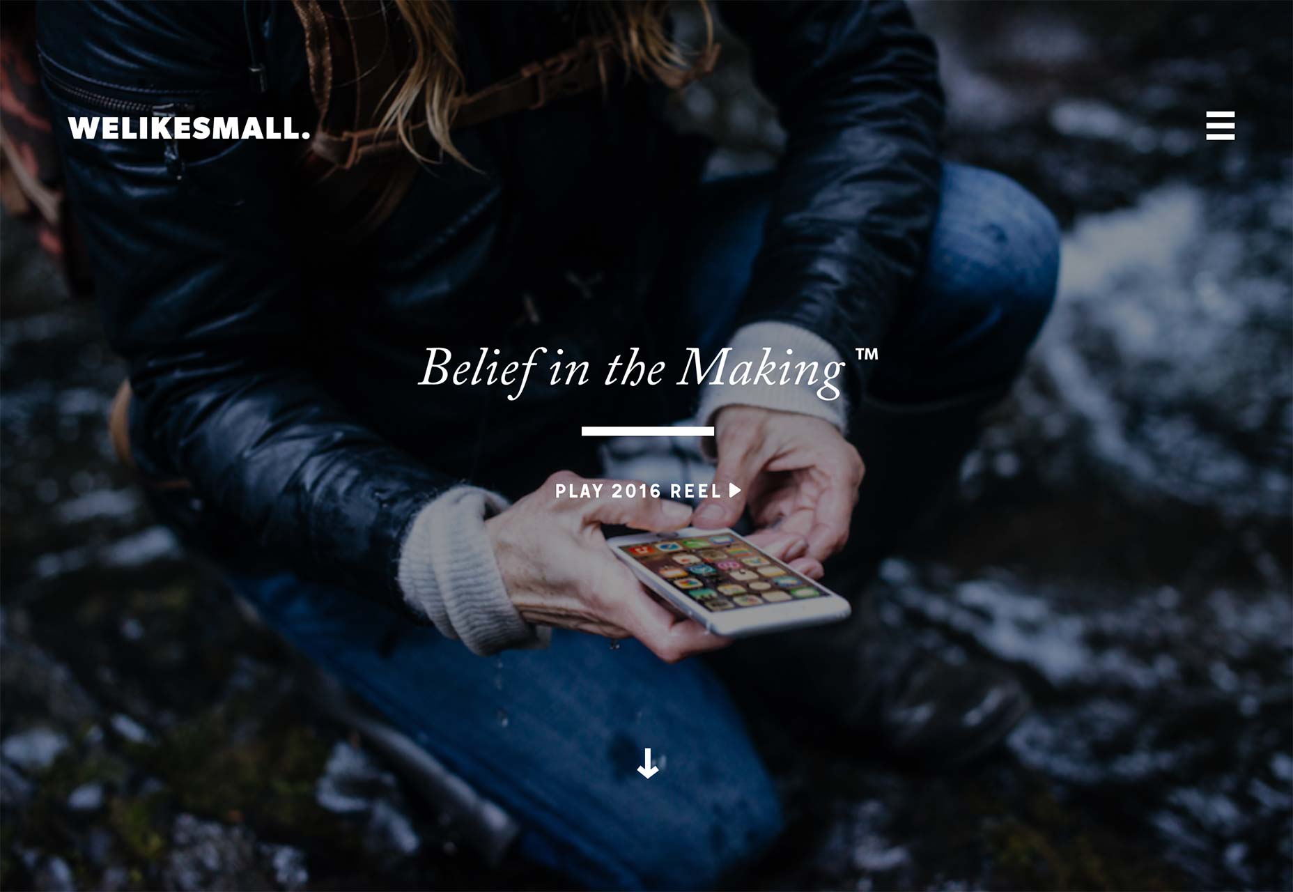
Spark and Craft
Spark and Craft is one of those sites that I’m featuring for execution over originality. Look at that type! Look at it!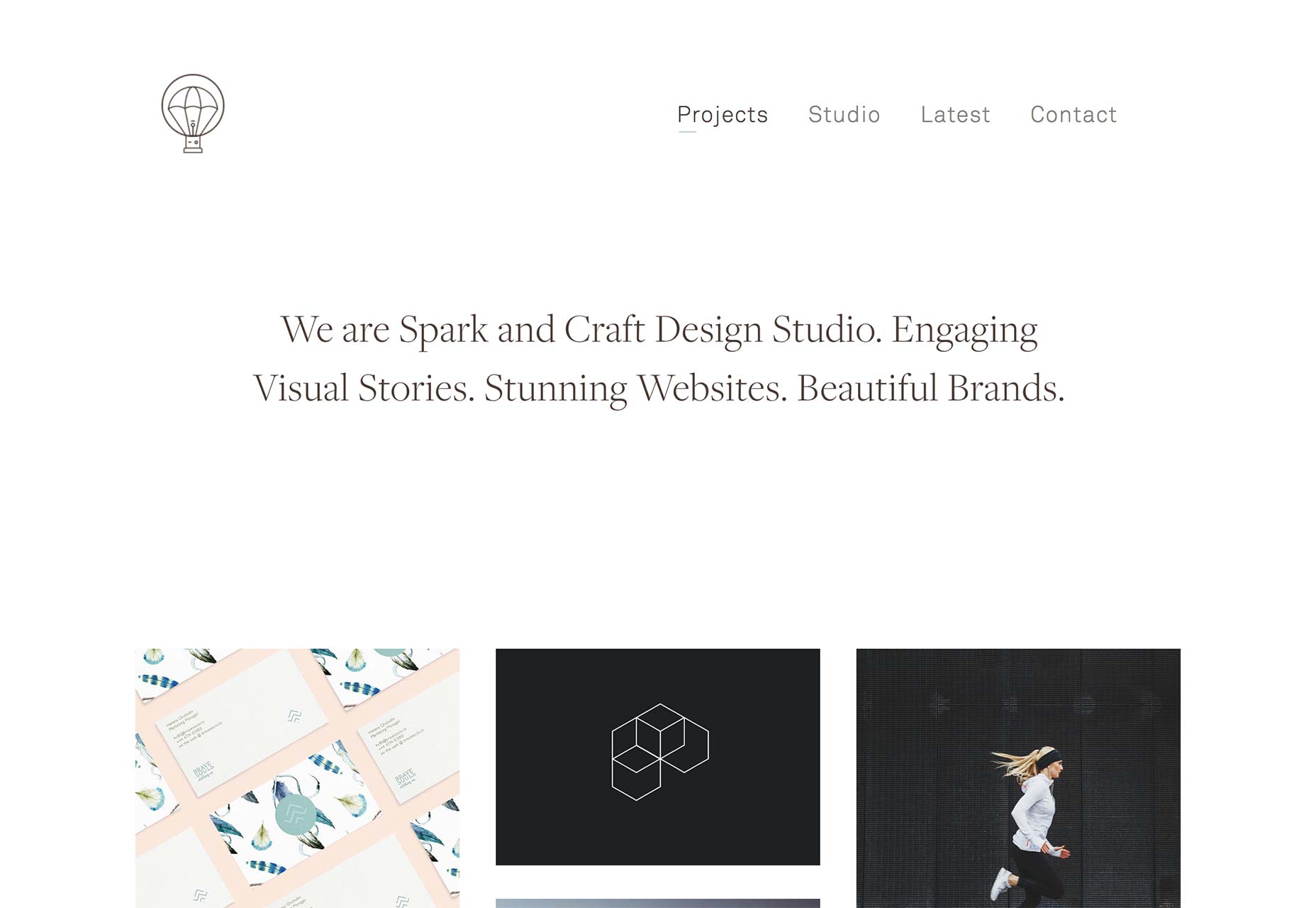
Only
Only: see above. Okay, that’s really lazy, but it’s the truth. The big difference is that this one screams “corporate-elegant” which is actually not that common if you think about it. It’s usually one or the other.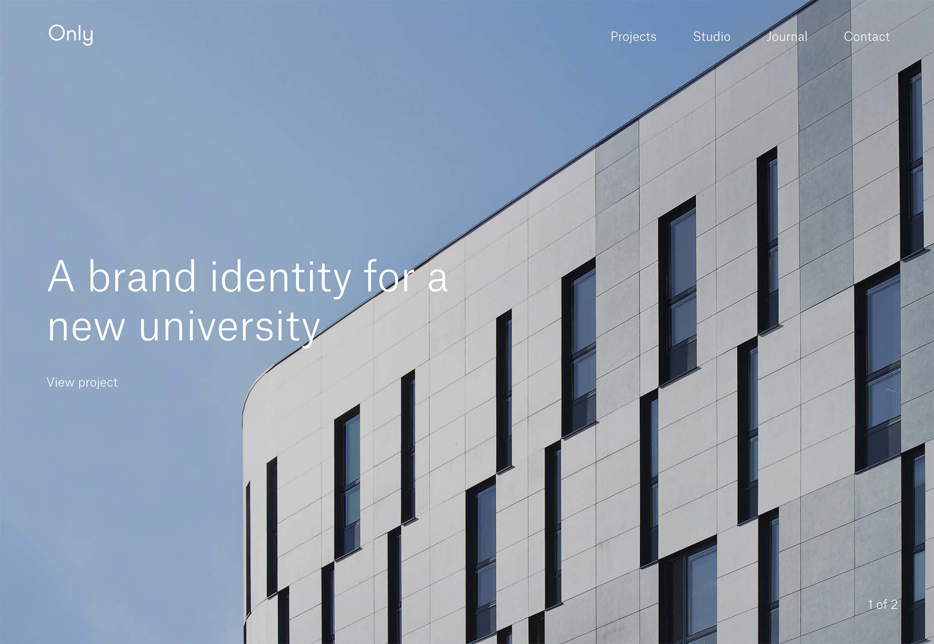
Mood/Wood
Mood/Wood brings us more minimalism, and a side-scrolling portfolio. It might not be the most user-friendly thing, but it does fit the tone of the site. It also showcases their branding work really well. It irks me to say this, but the HTML-as-Powerpoint philosophy of portfolio design might work really well in some cases. It’s usually not good UX, but it could be great marketing.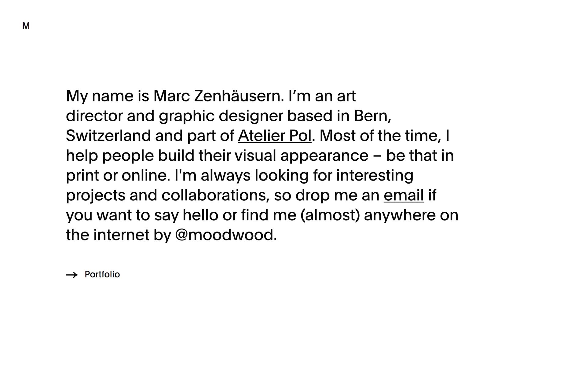
Sean Klassen
Sean Klassen’s one-page portfolio is a master class on pretty minimalism, dealing with small amounts of text on big screens, and making something look a little post-modern without making it unusable.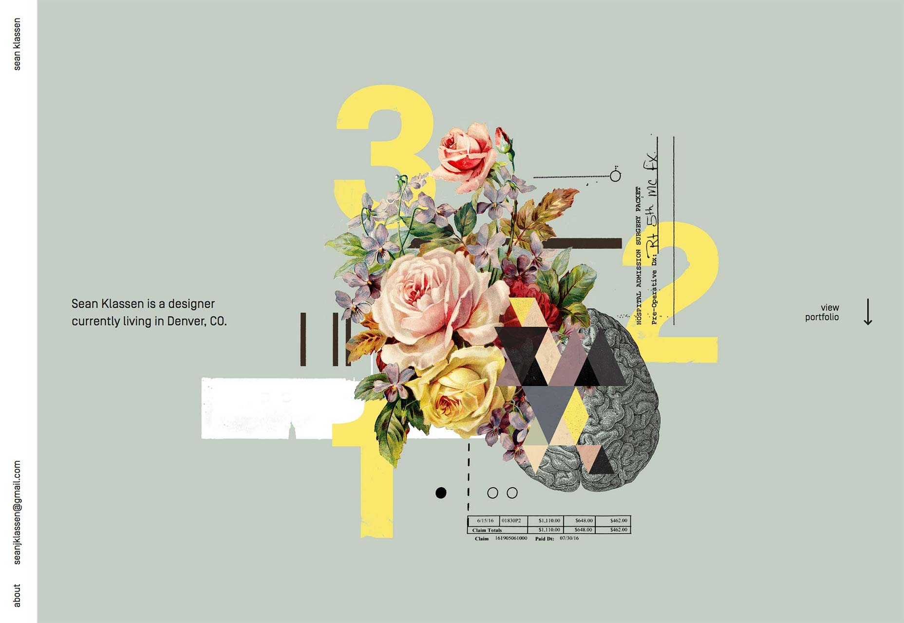
Bruno Imbrizi
I’m including Bruno Imbrizi’s portfolio for its creativity and meticulous aesthetic. It’s beautiful. Usability is another matter that we’re not going to talk about here. Still, go have a look. It’s like a point-and-click adventure. Just keep clicking until you find the information you want.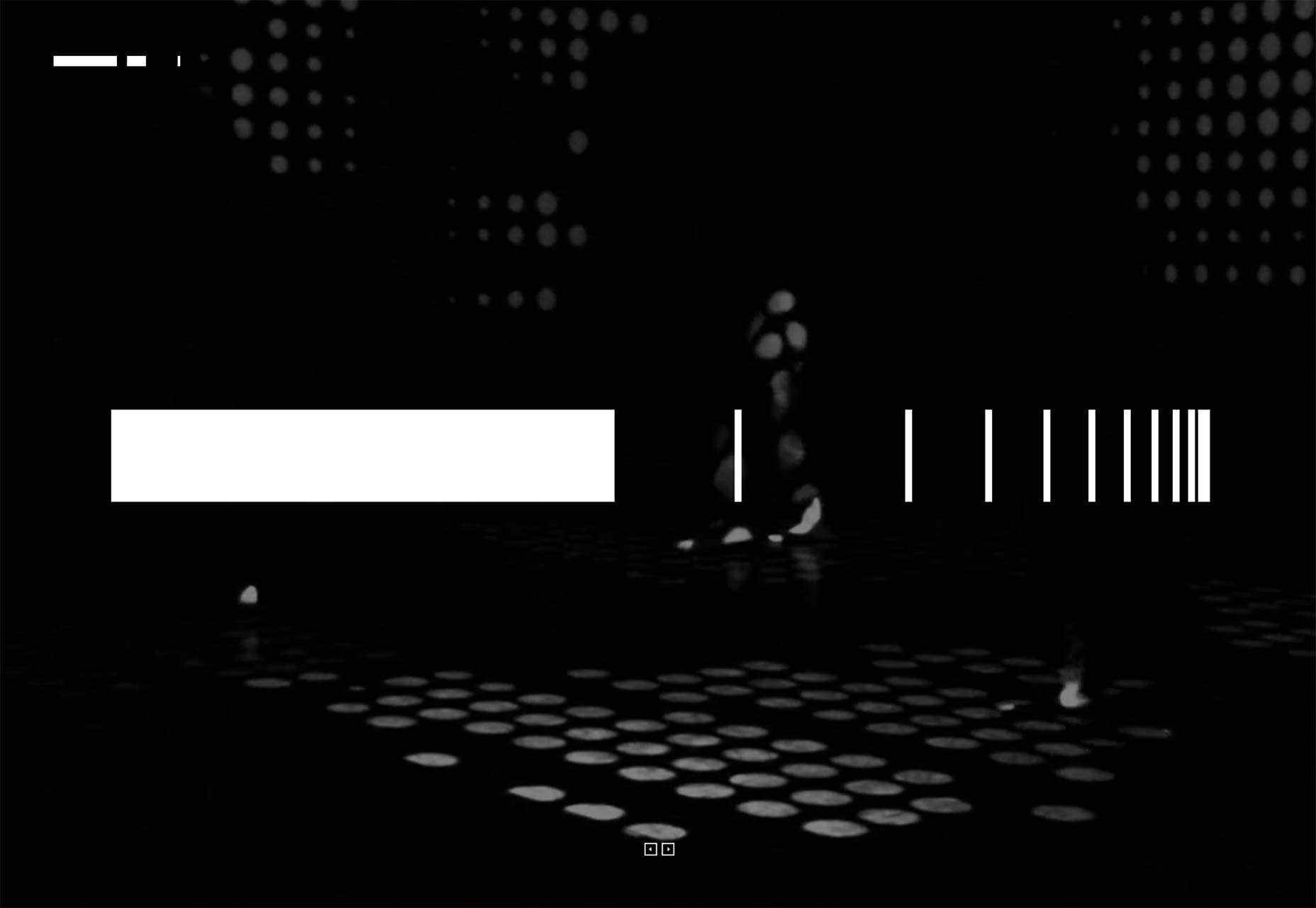
Colm McCarthy
Colm McCarthy’s portfolio brings us back to the classic tons-of-white-space-and-thin-type style that we all know and love. Just looking at it is fairly relaxing.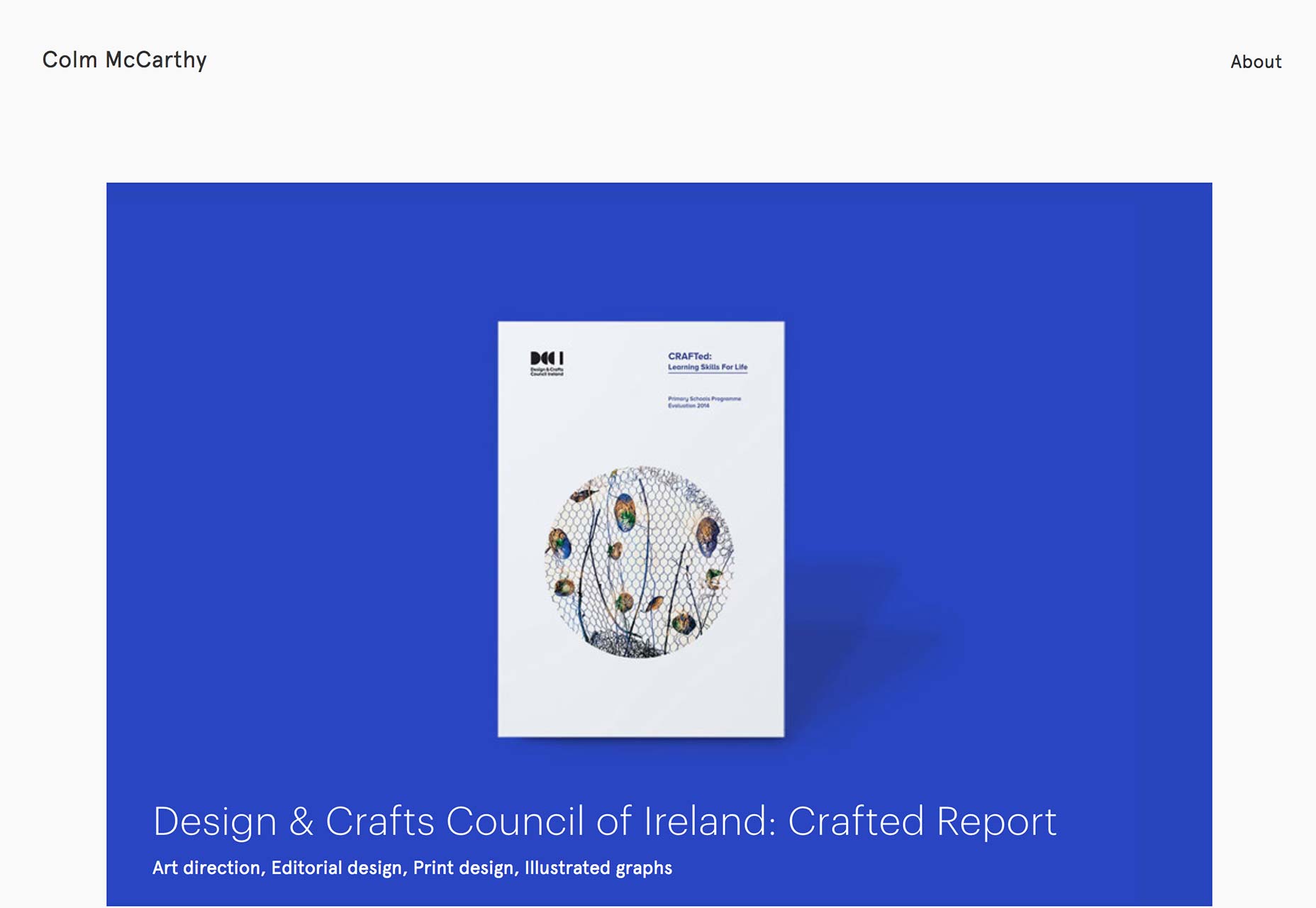
Jolien Roos
And we bring it back to unusable-but-pretty with Jolien Roos’ portfolio. You should look at it because it’s pretty. You shouldn’t totally hate the navigation because it reminds me of those old web pages where every nav button was planetoid orbiting something or other. You know, like the old Space Jam website.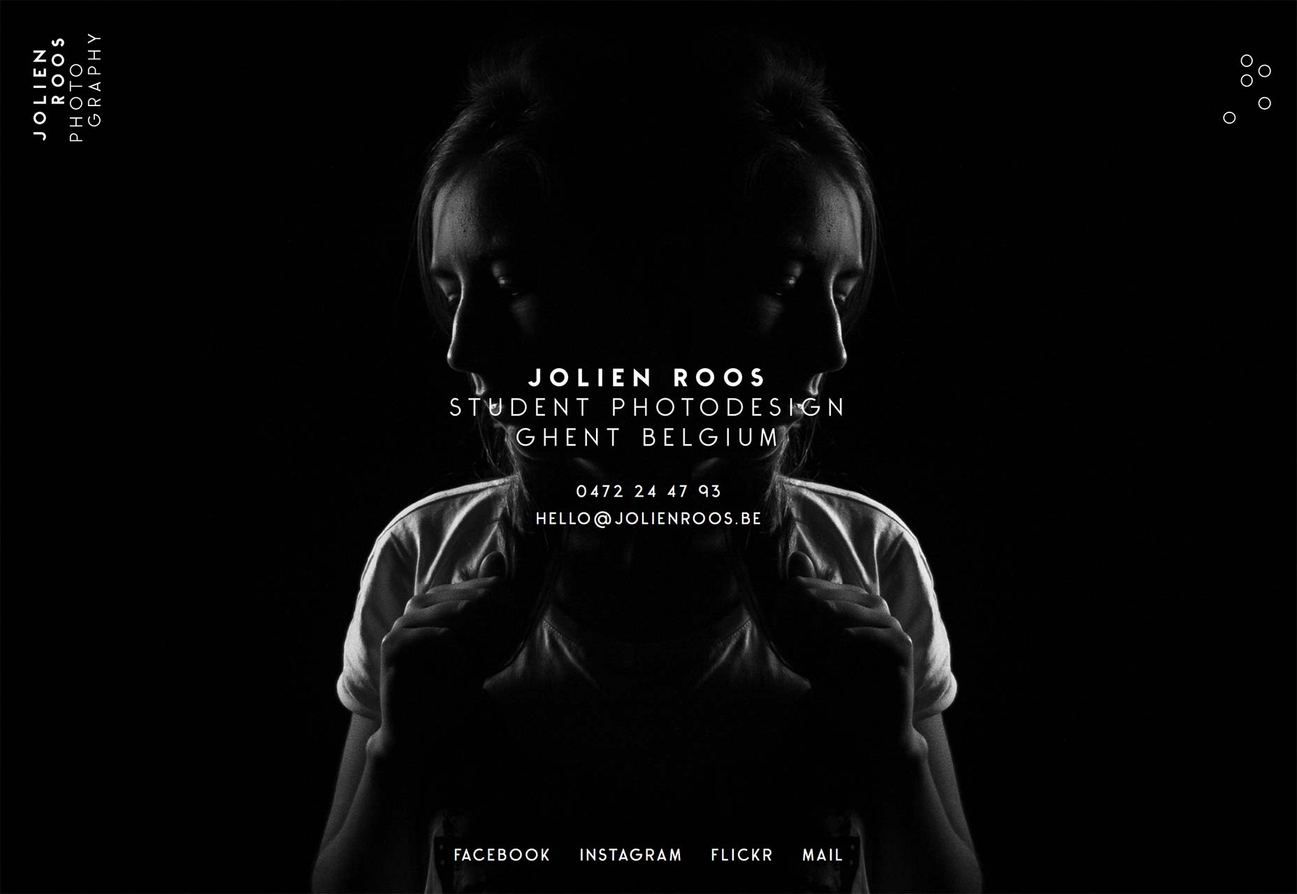
Bart van Lieshout
Bart van Lieshout’s portfolio is... quite yellow, at first. He takes an interesting approach in that his portfolio seems to be a mishmash of case studies and essays about what he does. It’s text-heavy, but if you really want your clients to get to know you, this is one way to do it.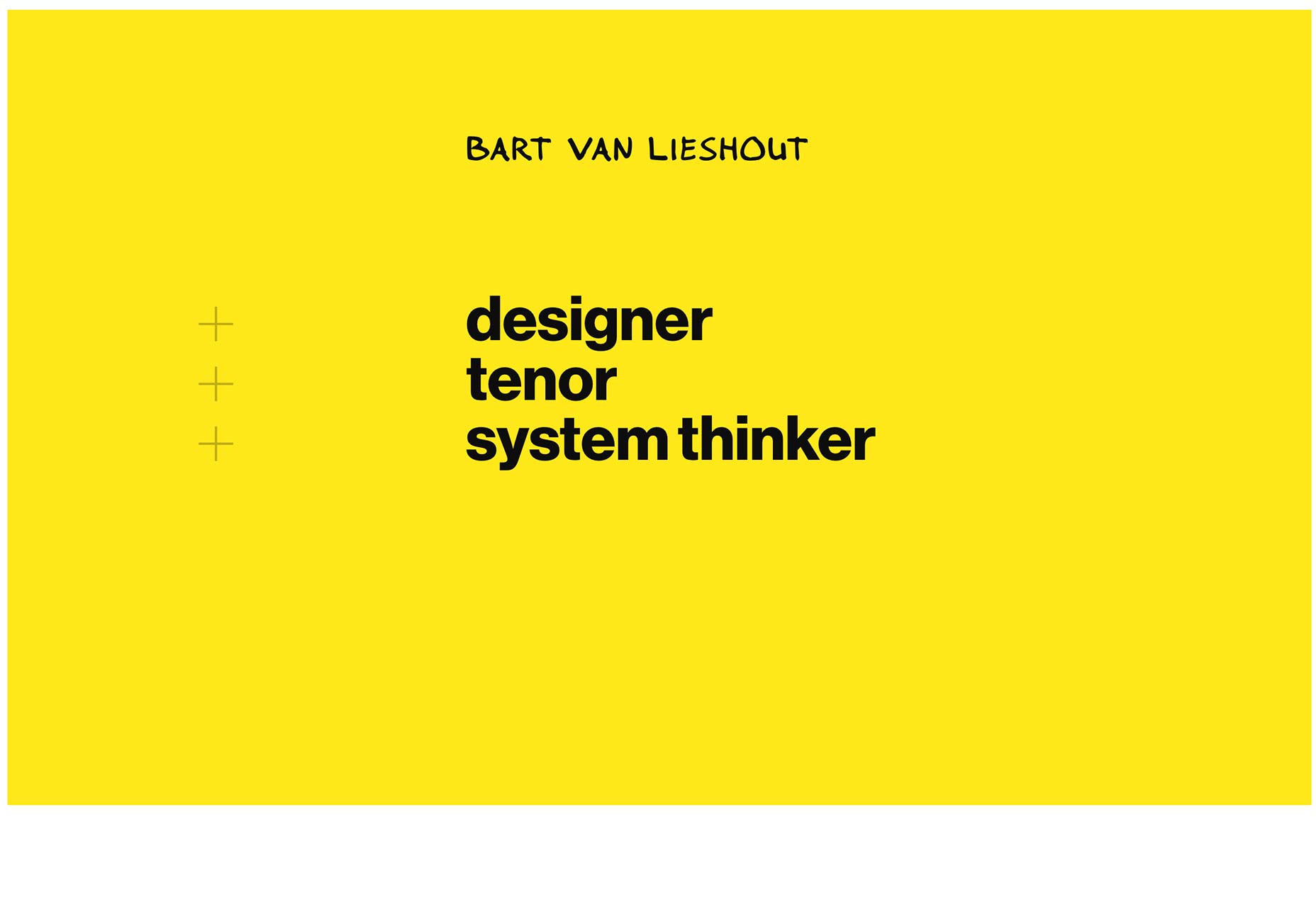
Nachume Miller
Nachume Miller’s art portfolio is simple, yet extremely well-executed. The decidedly modernist aesthetic of his site happens to be more than aesthetic preference, as his work is decidedly abstract. Ok, the artsy types would probably argue with me on that point, but to me, if I can’t see any recognizable shapes, it’s abstract.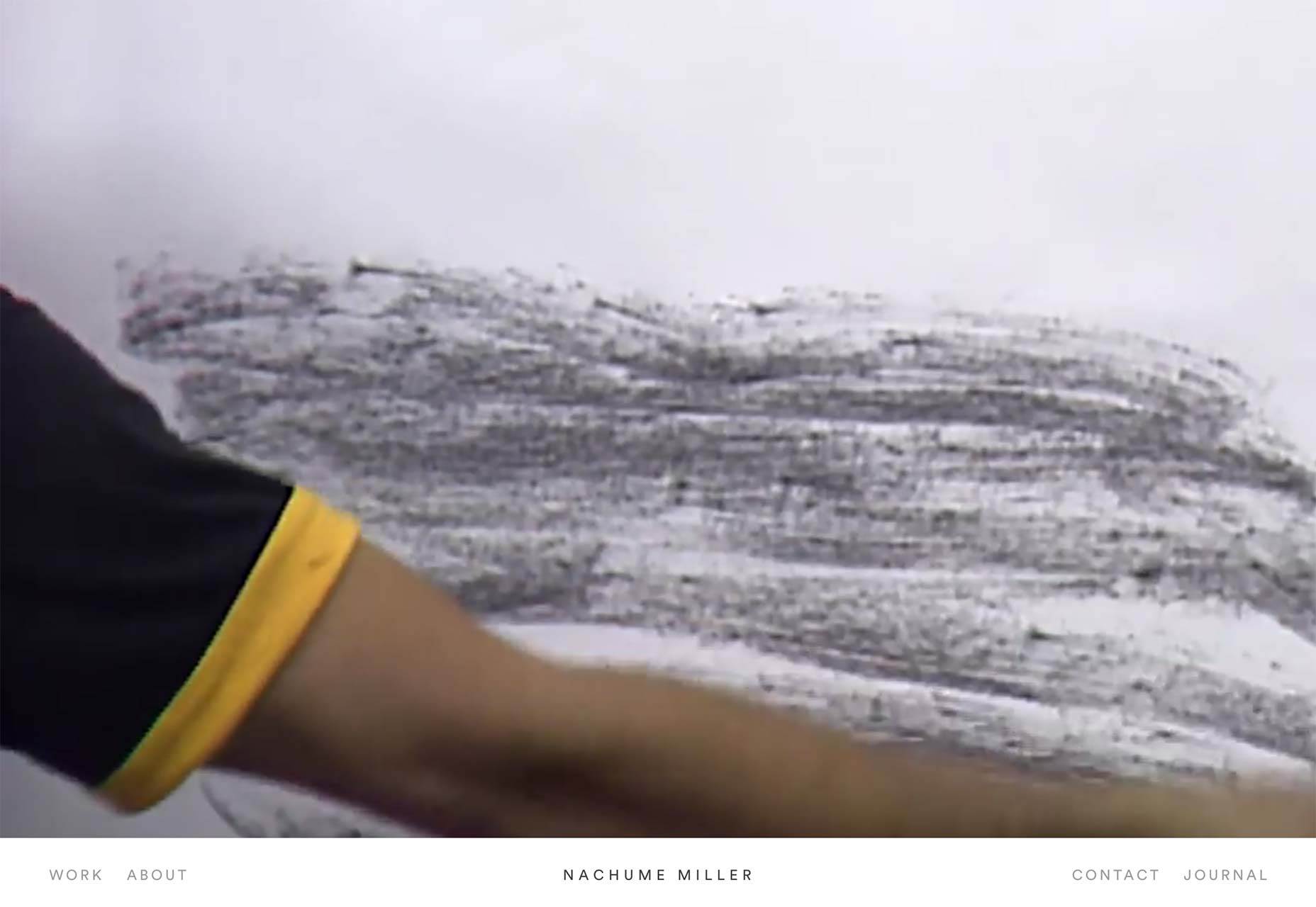
Myk Tongco
Myk Tongco’s portfolio is yet another that expands upon the use of parallax effects to show off his work effectively. This one-pager combines that with soft colors and distinctive—if occasionally hard to read—type.
Filip Benda
Filip Benda’s portfolio makes heavy use of colorful illustrations, and light use of parallax effects, to liven up what would be an otherwise fairly typical portfolio design. It looks good, it works good. Plus, there’s a 3D model of a Stargate in his portfolio, so he gets extra points from me, just for that.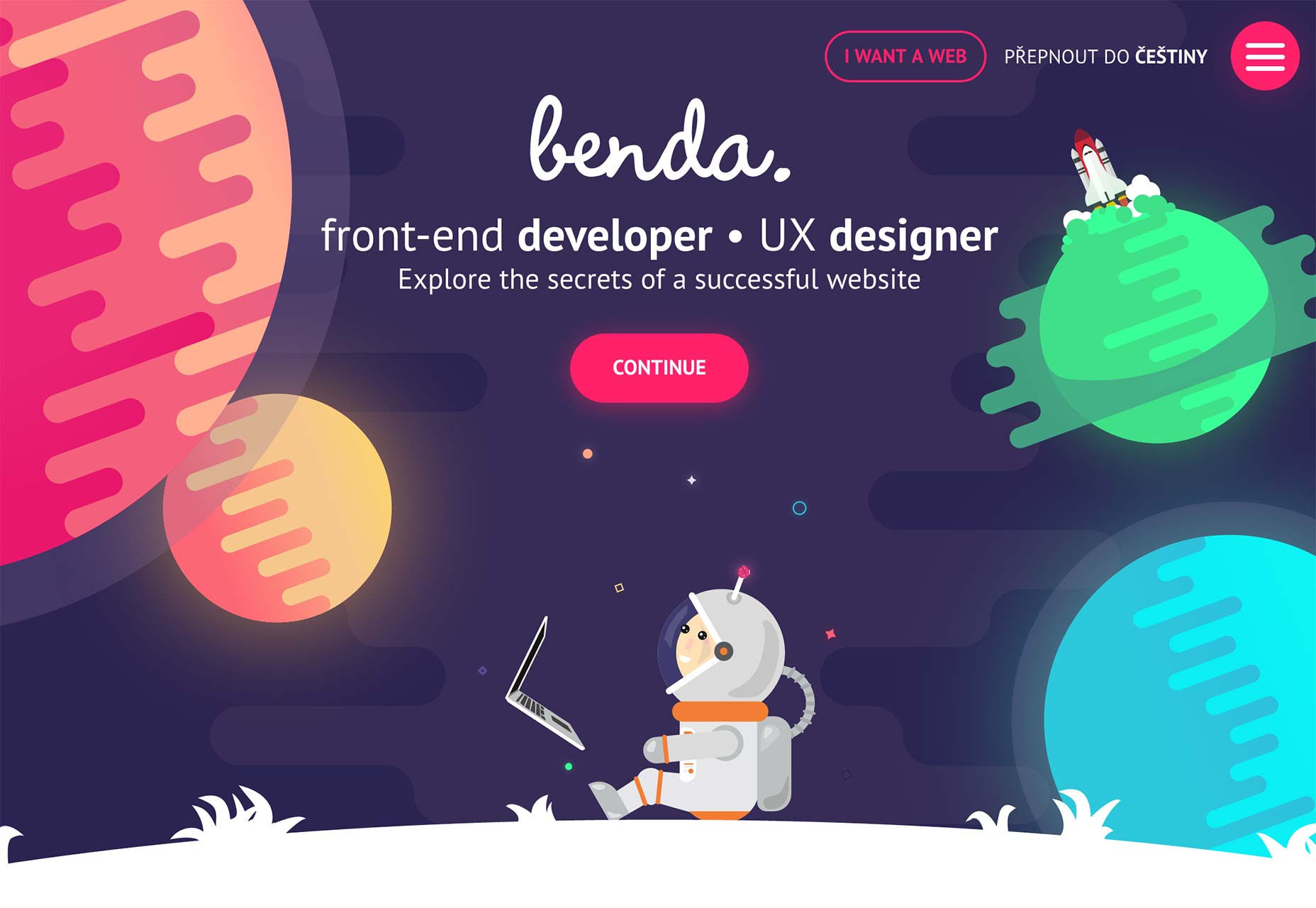
The Office of Visual Communication
The Office of Visual Communication is greyscale. It’s typographically stunning. It’s making fantastic use of white space. It has a fantastic name, I mean, really. I wish I’d thought of that. Just do yourself a favor and go look at it.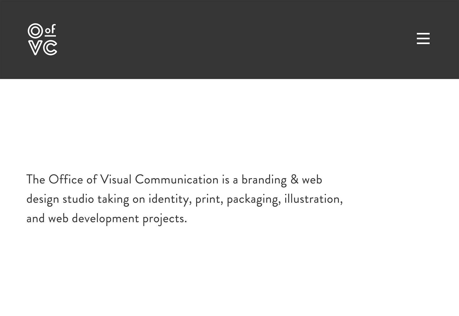
Luc van Loon
Luc van Loon has made one of those risky design decisions that I kind of love. Specifically, his portfolio has no pictures. Just text and an icon. You can either decide the description is interesting enough, or move on. The subtle animated background pattern is awesome too. It’s actually subtle enough I didn’t pay any attention to it at first, which is impressive. Normally that sort of thing is very distracting.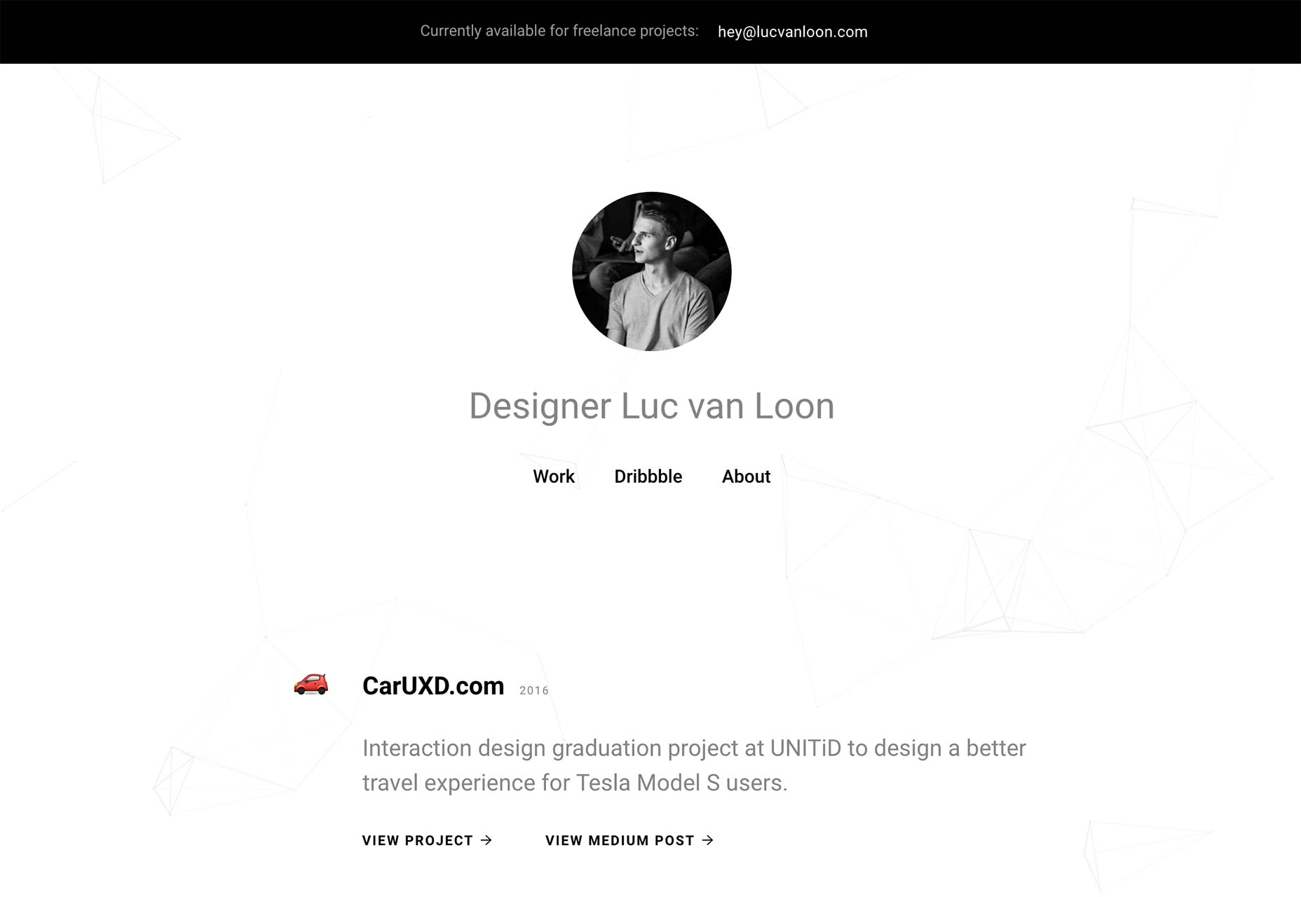
Lee Buckle
Lee Buckle’s portfolio might not be too original, but it looks good. Check it out, have a look at the great type, the fantastic use of a vertical timeline, and the excellent use of imagery and subtle backgrounds. And never, ever do the page loader thing.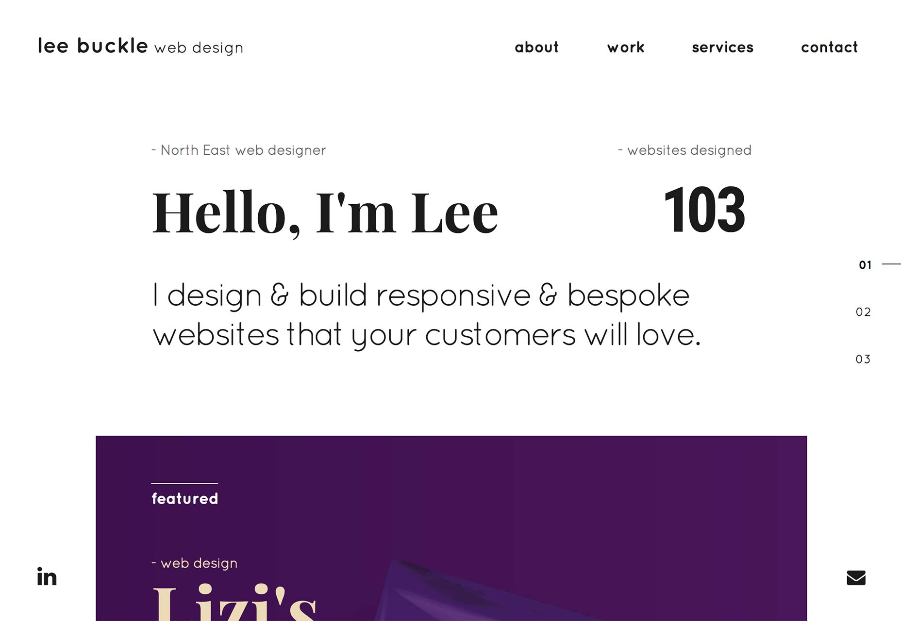
Lee Vaughan
Lee Vaughan’s portfolio is fairly typical, but incorporates some stylistic flourishes that definitely set his site apart. From the animated aurora on the home page, to his use of color, to the iconography featured on his blog, it’s the details that will make you remember this one.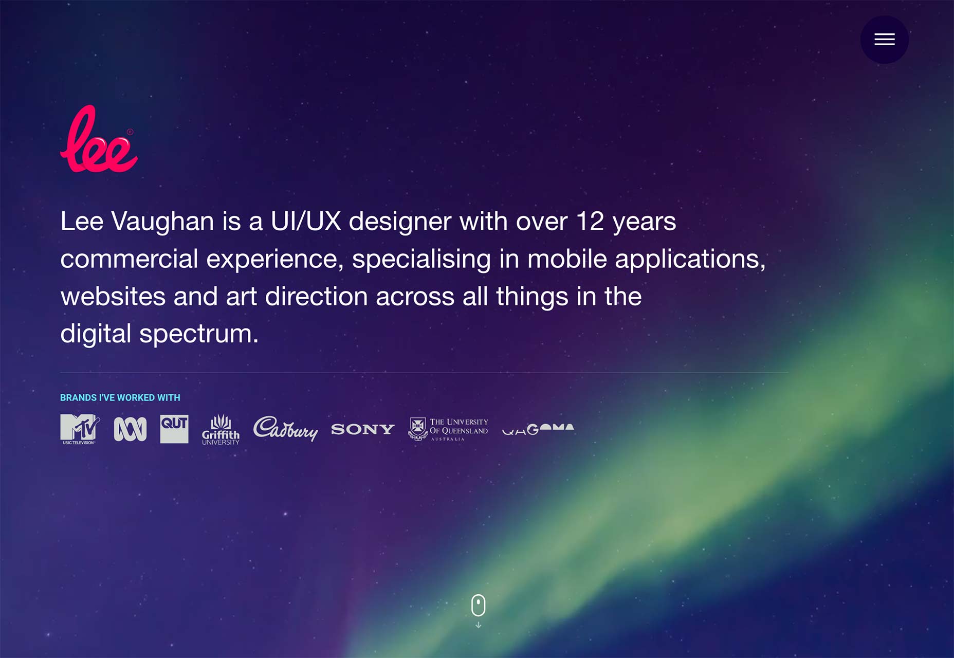
Vincent Mazza
Vincent Mazza’s one-pager distinguishes itself with bold colors and some light asymmetry all throughout. Light asymmetry isn’t a real thing that I know of, but if it did exist, this site would define it. The barely-there contrast in the navigation and contact form labels could make things difficult for some users, but overall, it’s a good-looking, fairly original portfolio.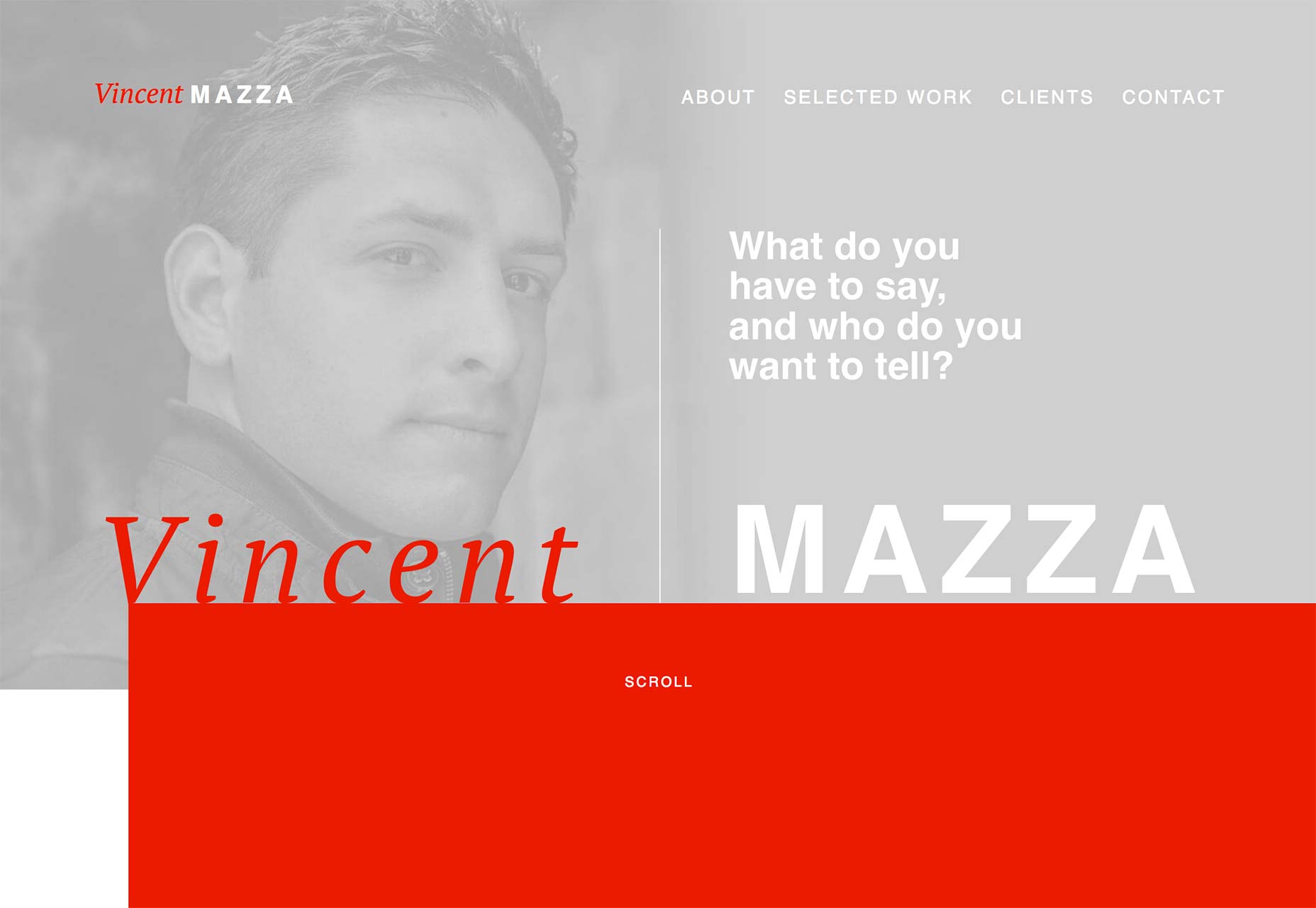
aughtfive
aughtfive takes an interesting approach that I’m going to call “textured flat design”. It’s not very catchy, but it is accurate. Basically, they brought in some subtle background textures to make their flat design look nice and retro. Combined with good type, illustrations, design flourishes, and a sepia filter, it all works very well. And no, this doesn’t count as skeuomorphism. Textures alone are not an attempt to emulate real-world objects in a digital interface… so there you go. This site is trend-backlash-compliant. More importantly, it’s beautiful and usable.
Michael But
Michael But’s portfolio... Okay, I narrowly managed to avoid making a tasteless Shadow Warrior joke when writing about Joyce Wang’s site above, but come on! This is too much. (I mean, it’s probably pronounced like “boot” or something, but sill...) That said, he’s a fantastic designer. Just look at that typography, the 2.5D style, the colors. He’s good at this. Heck, he managed to pull off a background pattern in 2016. That’s skill.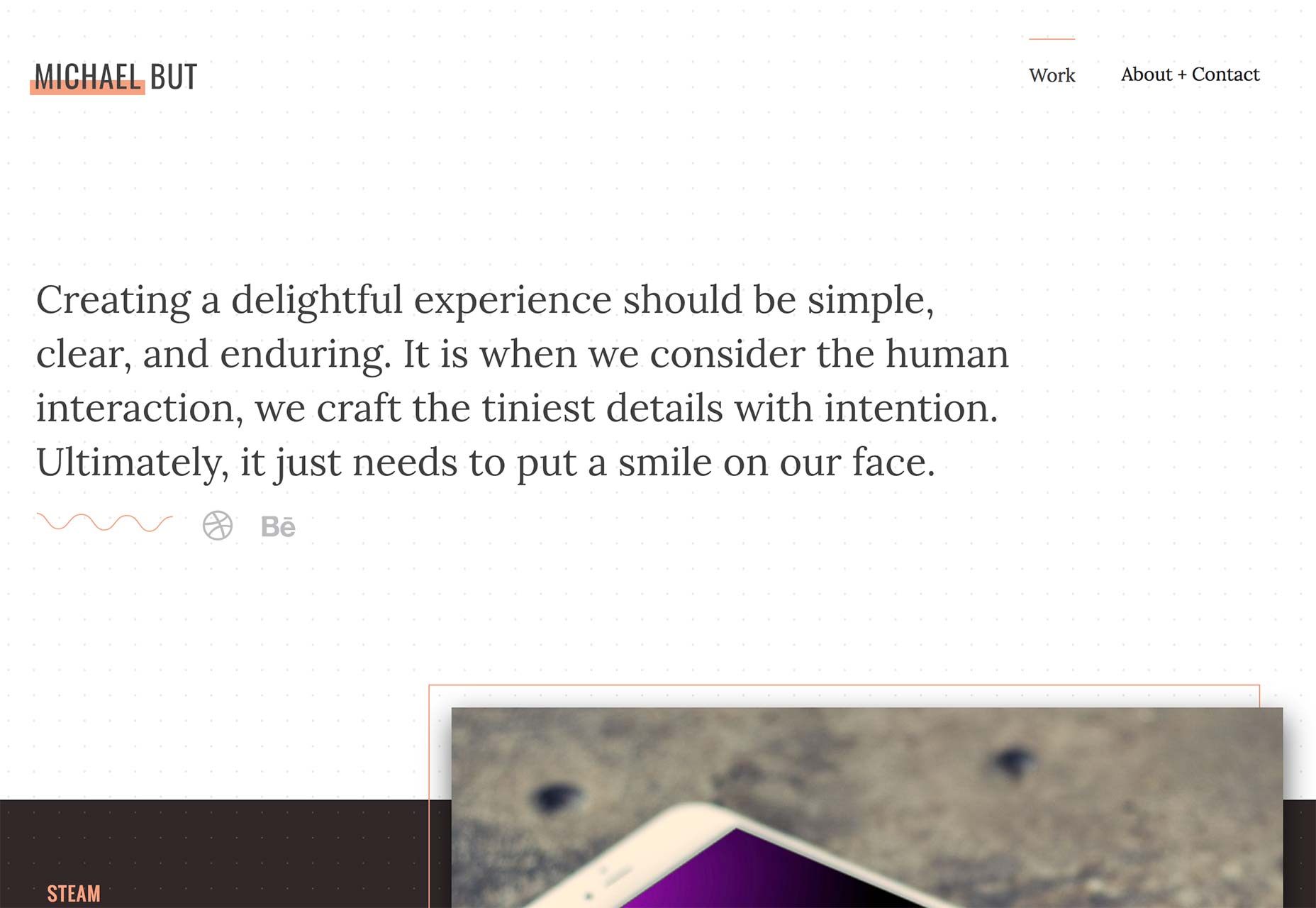
Ezequiel Bruni
Ezequiel Bruni is a web/UX designer, blogger, and aspiring photographer living in Mexico. When he’s not up to his finely-chiselled ears in wire-frames and front-end code, or ranting about the same, he indulges in beer, pizza, fantasy novels, and stand-up comedy.


Read Next

3 Essential Design Trends, May 2024
Integrated navigation elements, interactive typography, and digital overprints are three website design trends making…

How to Write World-Beating Web Content
Writing for the web is different from all other formats. We typically do not read to any real depth on the web; we…
By Louise North

20 Best New Websites, April 2024
Welcome to our sites of the month for April. With some websites, the details make all the difference, while in others,…

Exciting New Tools for Designers, April 2024
Welcome to our April tools collection. There are no practical jokes here, just practical gadgets, services, and apps to…

How Web Designers Can Stay Relevant in the Age of AI
The digital landscape is evolving rapidly. With the advent of AI, every sector is witnessing a revolution, including…
By Louise North

14 Top UX Tools for Designers in 2024
User Experience (UX) is one of the most important fields of design, so it should come as no surprise that there are a…
By Simon Sterne

What Negative Effects Does a Bad Website Design Have On My Business?
Consumer expectations for a responsive, immersive, and visually appealing website experience have never been higher. In…

10+ Best Resources & Tools for Web Designers (2024 update)
Is searching for the best web design tools to suit your needs akin to having a recurring bad dream? Does each…
By WDD Staff

3 Essential Design Trends, April 2024
Ready to jump into some amazing new design ideas for Spring? Our roundup has everything from UX to color trends…

How to Plan Your First Successful Website
Planning a new website can be exciting and — if you’re anything like me — a little daunting. Whether you’re an…
By Simon Sterne

15 Best New Fonts, March 2024
Welcome to March’s edition of our roundup of the best new fonts for designers. This month’s compilation includes…
By Ben Moss

LimeWire Developer APIs Herald a New Era of AI Integration
Generative AI is a fascinating technology. Far from the design killer some people feared, it is an empowering and…
By WDD Staff