

Include full product details and reviews
When designing your individual product pages on your retail app, be sure to give your shoppers everything they could want in the way of information. Although it’s mobile, they still want to be informed shoppers. You just have to make the most of your small screen real estate when designing individual product pages, so don’t waste space. Amazon offers a clever example of getting around the limited screen space issue: They’ve simply decided to design long-scrolling pages in the app to let users scroll down to absorb all of the rich information on every, single product page. Take the product page for the Saucony Original Men’s Shadow Original Sneaker.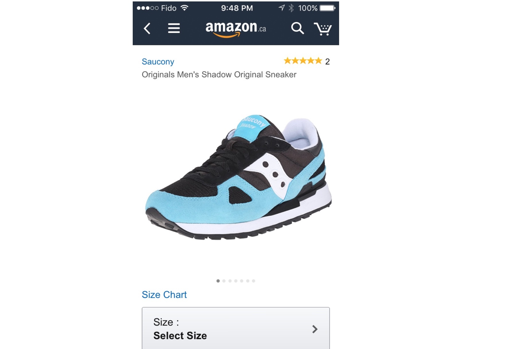 This long-scrolling page features the following full product details:
• High-quality and sharp images from various angles
This long-scrolling page features the following full product details:
• High-quality and sharp images from various angles• Size and color info
• The price range
• Incentive info (free returns)
• Huge and noticeable call to action buttons
• A description
• A detailed features list
• Related items recommendations
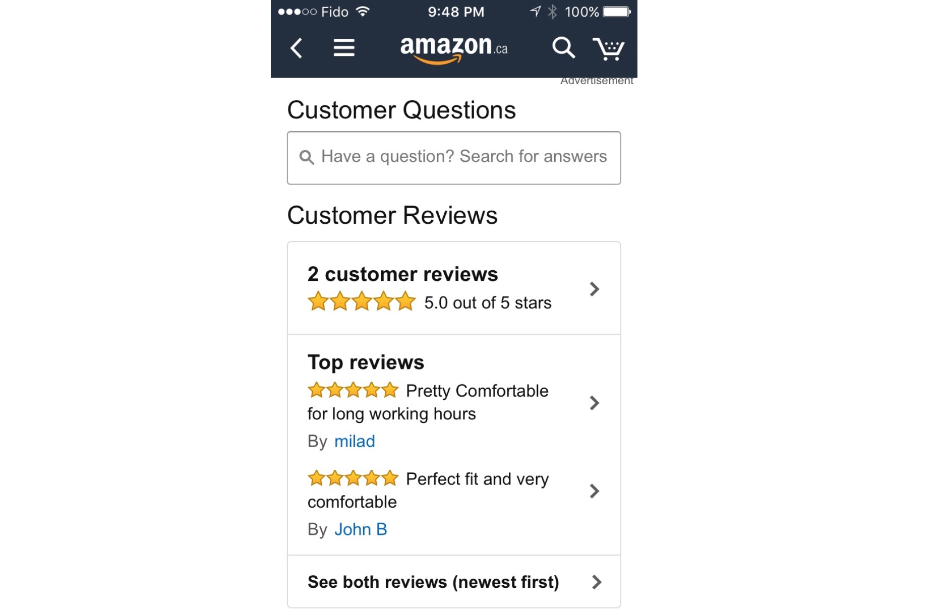
• Customer questions and reviews
 Getting all of this info inside of a retail app really improves the customer experience!
The customer reviews are helpful because they give added insight to potential buyers who want to know how people who’ve bought this item have found it.
If the world’s biggest online retailer has its product pages set up like this, chances are that it’s for good reasons, and to optimize conversions. Amazon offers designers a great template of how to design a mobile product page for success.
Getting all of this info inside of a retail app really improves the customer experience!
The customer reviews are helpful because they give added insight to potential buyers who want to know how people who’ve bought this item have found it.
If the world’s biggest online retailer has its product pages set up like this, chances are that it’s for good reasons, and to optimize conversions. Amazon offers designers a great template of how to design a mobile product page for success.
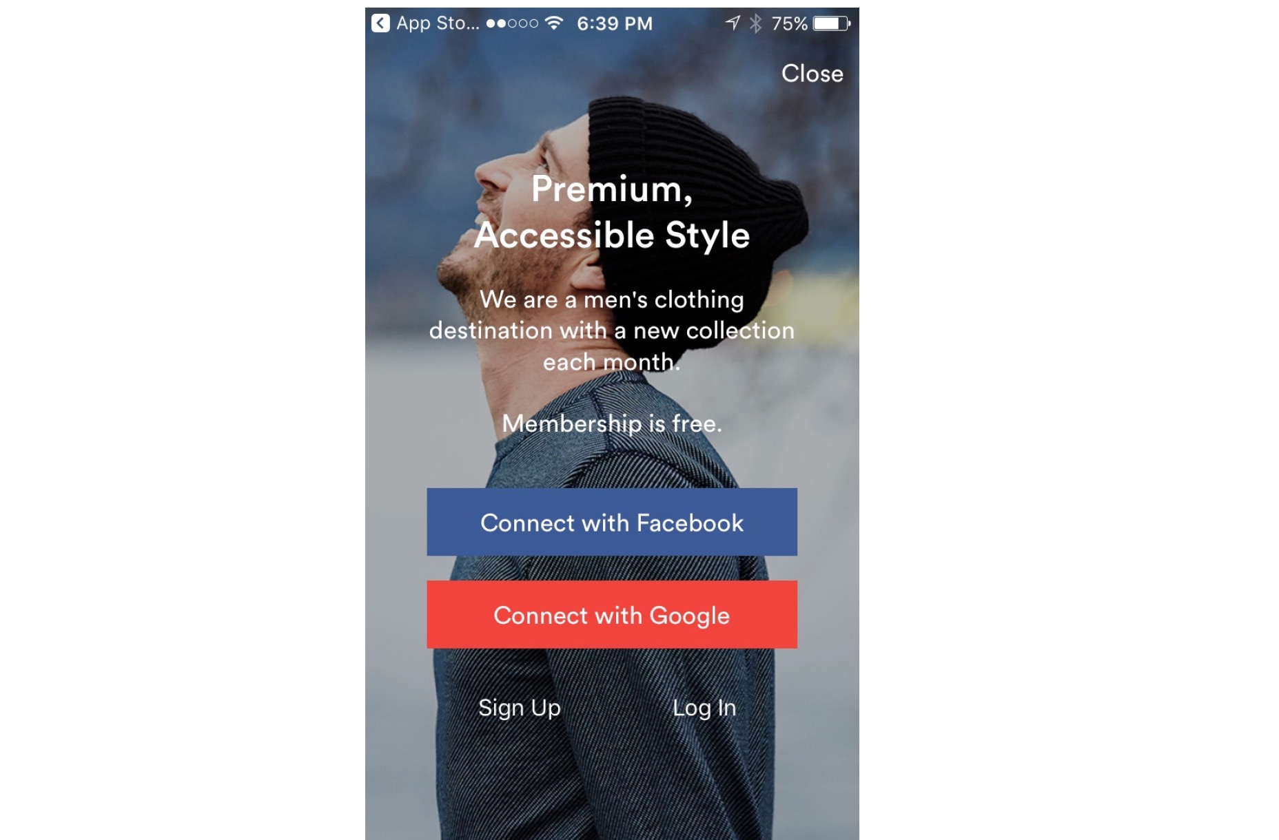
Cool it with the registration requests
A huge barrier to conversion is asking shoppers to register upfront. There’s a high risk that they’ll just leave right then and there. This is also true on the desktop. However, on mobile, your retail-app experience provides much smaller screen real estate, which makes registering an even larger hassle. That’s why, if you absolutely must ask your shoppers to register, you have to give something of extremely high value in return for their troubles. Research from the Nielsen/Norman Group bears this out, as so-called login walls where shoppers are prompted to register before getting further in the app are discouraged. Instead, you have three options: • Use the reciprocity principle to give shoppers a high-value reason for registering upfront• Utilize social login
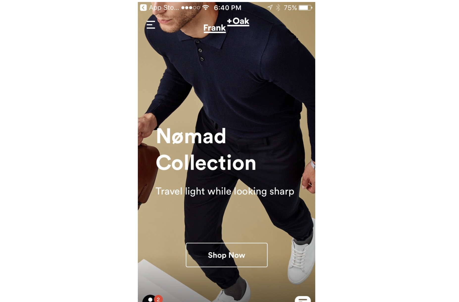
• Let them use a guest-checkout feature that doesn’t make them waste time registering before they can use your app When the brand for which you’re designing an app has low name recognition, then your benefit to get users to register has to be even greater than normal. Men’s retailer Frank + Oak doesn’t require you to register upfront. In fact, you can just go ahead and shop immediately. However, when you do have something in your cart that you want to check out, they prompt you to register, but allow for social login, which has been shown to reduce cart-abandonment rates, since your shoppers don’t have to think of — and remember — a new username and password.
Let shoppers totally control their shopping carts/baskets
Good UX means giving your users full control inside of the retail app. According to Google’s own retail app recommendations, it’s a best practice to empower shoppers to edit their own carts or baskets at any stage in their buying flow. If your shoppers have to go back a few steps in the buying flow — say, to one’s account page or a subsequent page — that causes frustration and leads to friction in what should ordinarily be a smooth conversion process. That frustration and friction can ultimately lead to abandonment and consequently fewer conversions and sales. In the Walmart app, shoppers can directly edit the quantity of purchased items right on the checkout page without having to return to any prior page in the buying flow. As a result, shoppers who want to change their mind about how many items to buy have the full freedom and control to adjust the quantity to their liking until the very last moment before they tap the check out button.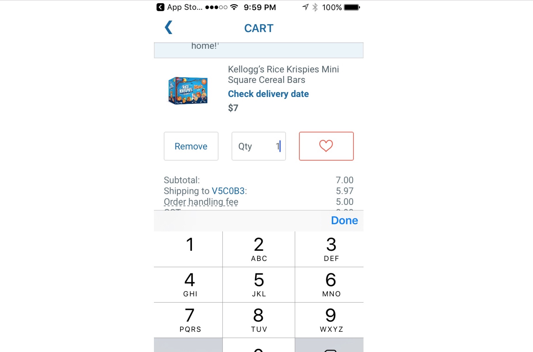 When designing buying flows, ensure that your shoppers can always edit the quantity of items at any point after they’ve already added a product to their cart or basket.
Don’t make it hard to find customer-service information
In mobile retail, great UX intimately ties into providing excellent customer service. A huge component of customer service is always ensuring that customers can see the online retailer’s contact info because they’ll likely have questions or comments that they want to communicate via email or phone. Making this info easy to find also acts as a way of boosting your app’s credibility. Wayfair’s app shows us how to display contact info readily, so that it puts the shopper’s mind at ease and provides great UX by offering contact info that’s very accessible. On their account page, shoppers can choose to email or directly call Wayfair in case they have questions or run into issues in their checkout process or broader app experience. Note how the contact info is near the top of the page; shoppers don’t even have to scroll down to locate it.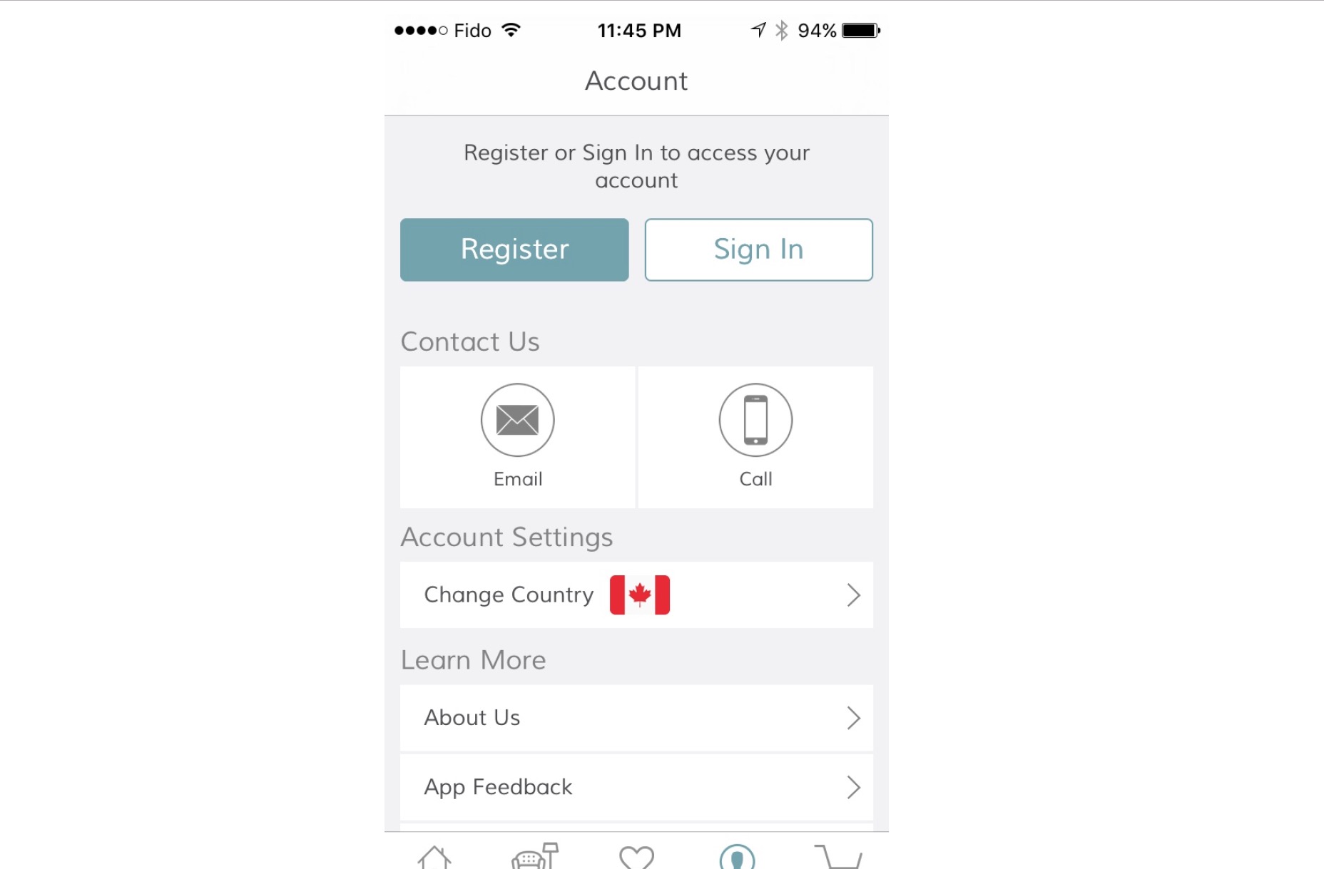 This is the epitome of usable design.
Shoppers are given choices as to how they want to get in touch with Wayfair—which also goes back to the design principle of giving your shoppers more control over their experience.
This is the epitome of usable design.
Shoppers are given choices as to how they want to get in touch with Wayfair—which also goes back to the design principle of giving your shoppers more control over their experience.
Retail apps are different from other apps
With no other apps do you have to design in such a way that directly affects conversions that matter the most to businesses, which is purchases for sales. That’s what makes nailing the design and UX for retail apps more urgent than other types of apps. Some best practices apply to desktop, such as ensuring that all contact info is always readily available. However, some of what to do — like using long-scrolling pages — may seem a bit counter-intuitive on mobile, given the smaller screen real estate and the need to have a faster page and experience. What matters most is designing for good mobile UX. When you do that, you can quickly determine what works and what doesn’t when designing for retail apps.Marc Schenker
Marc’s a copywriter who covers design news for Web Designer Depot. Find out more about him at thegloriouscompanyltd.com.


Read Next

Using AI to Predict Design Trends
Design trends evolve at a blistering pace, especially in web design. On multi-month projects, you might work on a…
By Simon Sterne

15 Best New Fonts, April 2024
Just like web design, type design follows trends. And while there’s always room for an exciting outsider, we tend to…
By Ben Moss

3 Essential Design Trends, May 2024
Integrated navigation elements, interactive typography, and digital overprints are three website design trends making…

How to Write World-Beating Web Content
Writing for the web is different from all other formats. We typically do not read to any real depth on the web; we…
By Louise North

20 Best New Websites, April 2024
Welcome to our sites of the month for April. With some websites, the details make all the difference, while in others,…

Exciting New Tools for Designers, April 2024
Welcome to our April tools collection. There are no practical jokes here, just practical gadgets, services, and apps to…

How Web Designers Can Stay Relevant in the Age of AI
The digital landscape is evolving rapidly. With the advent of AI, every sector is witnessing a revolution, including…
By Louise North

14 Top UX Tools for Designers in 2024
User Experience (UX) is one of the most important fields of design, so it should come as no surprise that there are a…
By Simon Sterne

What Negative Effects Does a Bad Website Design Have On My Business?
Consumer expectations for a responsive, immersive, and visually appealing website experience have never been higher. In…

10+ Best Resources & Tools for Web Designers (2024 update)
Is searching for the best web design tools to suit your needs akin to having a recurring bad dream? Does each…
By WDD Staff

3 Essential Design Trends, April 2024
Ready to jump into some amazing new design ideas for Spring? Our roundup has everything from UX to color trends…

How to Plan Your First Successful Website
Planning a new website can be exciting and — if you’re anything like me — a little daunting. Whether you’re an…
By Simon Sterne