
1. The color purple
Purple color palettes are traditionally somewhat rare. The color can be difficult to use in some situations and has such a range of emotional associations that many designers avoid it. Purple is not a common color option for brands either and might often be in conflict with the rest of the color palette. But that’s not stopping designers anymore. Bold, purple color palettes are popping up everywhere, and they are pretty impressive. Many of these design have a few commonalities that make purple a little easier to work with:- Monotone color schemes
- Simple design patterns without a lot of competing elements
- Minimal use of photography
- Space themes (always a popular option with purple)
- Use of darker purple hues (rather than pastels)
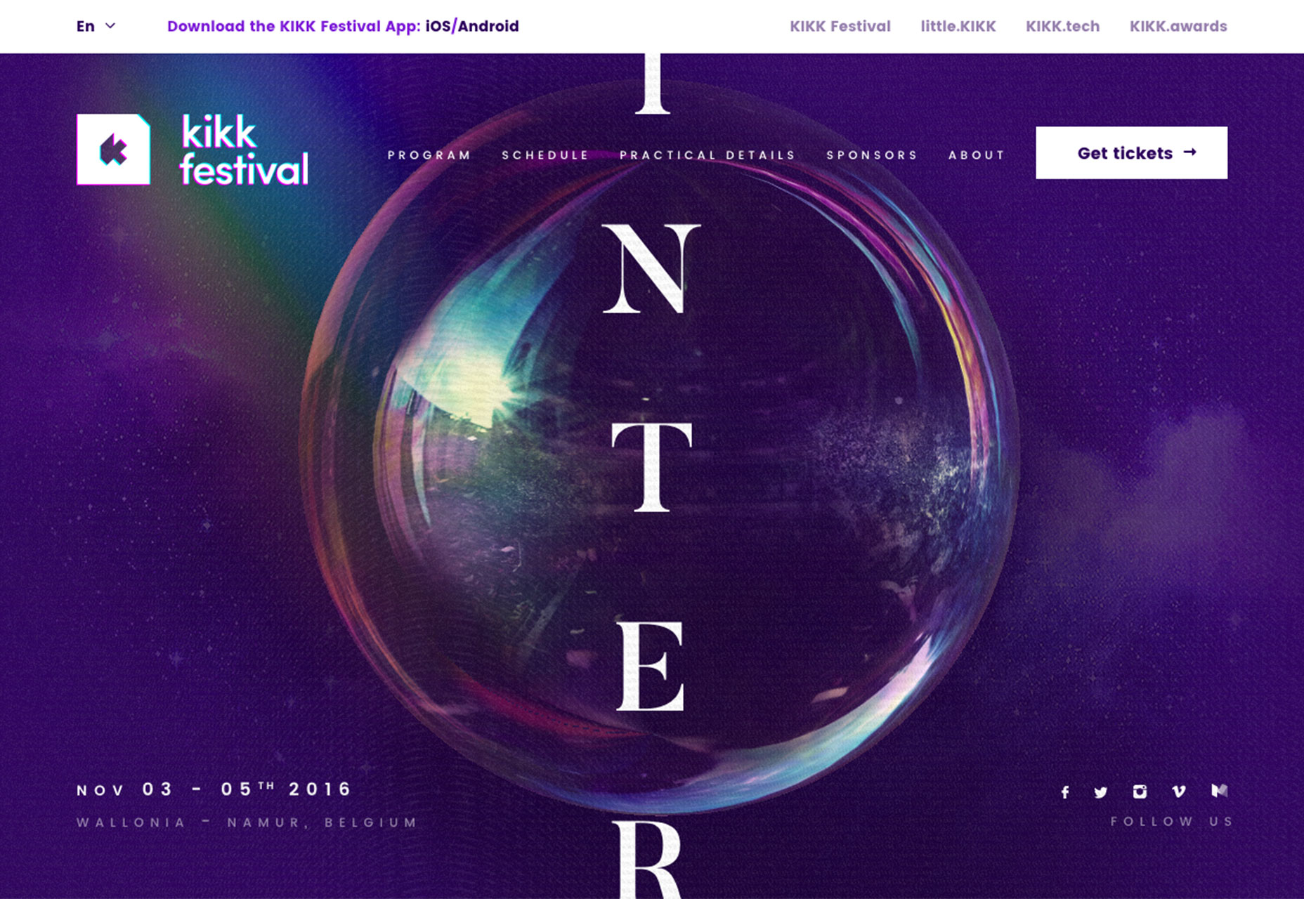 http://www.kikk.be/2016/
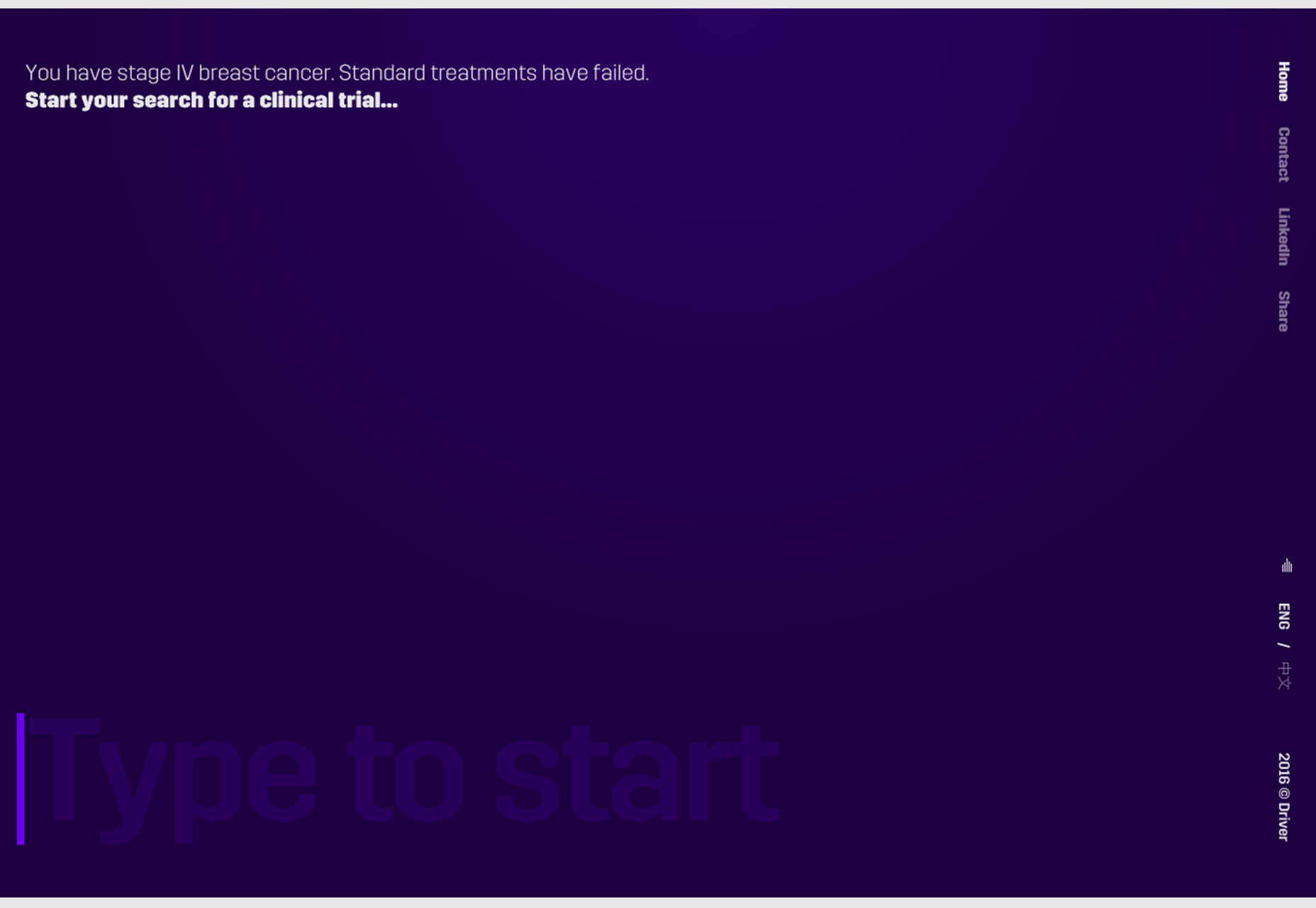 http://driver.xyz/
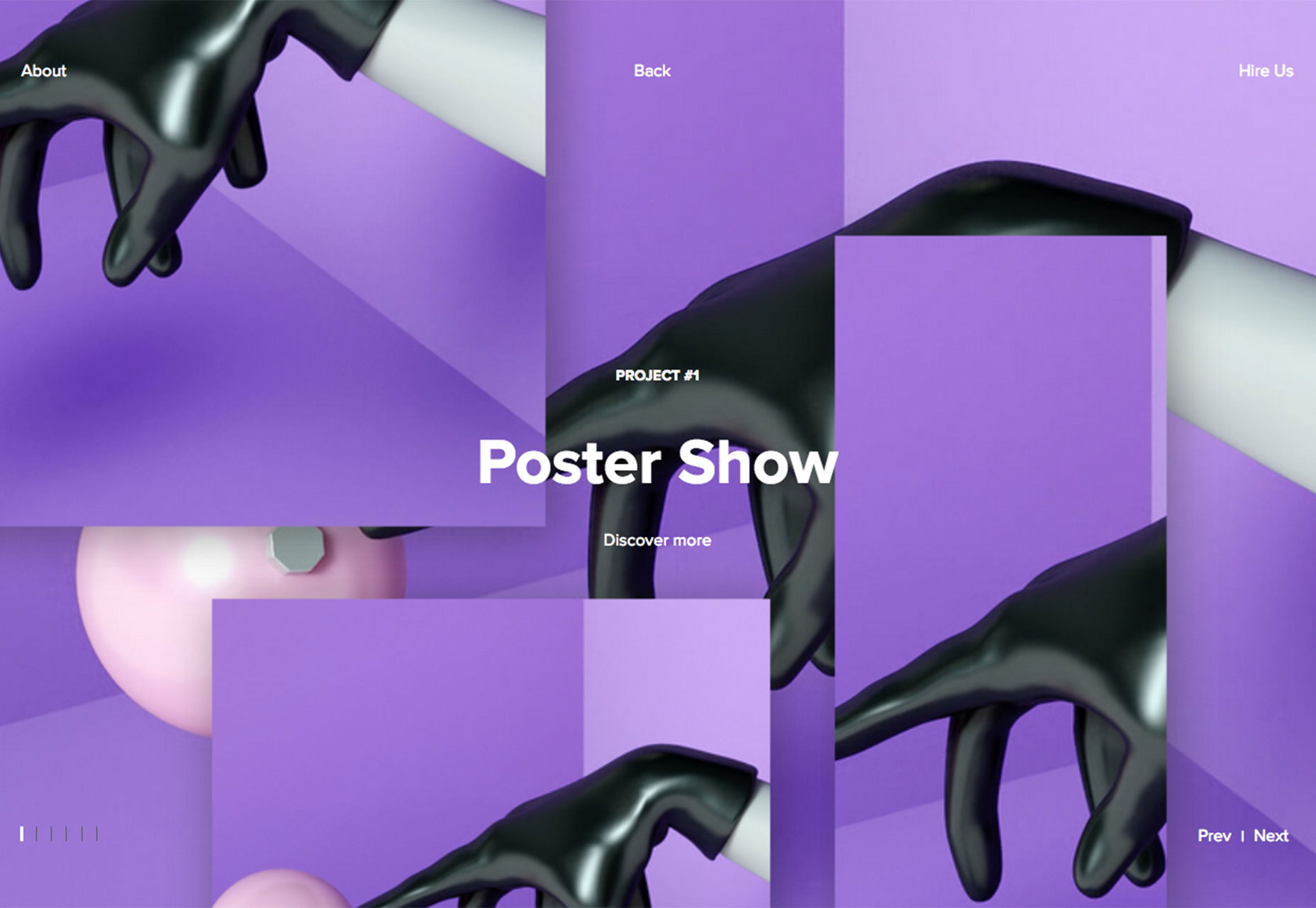 http://www.filippobello.com/en/
2. Giant buttons
A button can be the most important element in any design. Buttons do everything from take users to the next page, help complete a step in a path of actions, or submit information in a form. A button is the end goal of a call to action and completes a feedback loop between the user and the interface design. While button design has evolved some in recent years, there haven’t been many trends as big as this one: Designers are incorporating giant buttons into designs. (This is almost the exact opposite of the last button trend, ghost buttons.) Giant buttons are a fun alternative for users, but there is a trick to it. Users have to know the buttons are buttons. They can’t hide as a different type of design element. In each of the three examples below, clever hover animations are the secret to button identification. Each design takes a unique approach:- Bark Design: Large images display a headline and subhead as the user hovers indicating the potential for a click action.
- Mt. Cuba Center: The plant identification site uses hover actions so that buttons almost jump off the screen with color and by changing size. The animations are hard to miss and the imagery is so engaging that you want to click. (Almost every image is a link to more information.) There are two types of buttons in the design: Images that have a card-style look at the giant round purple button, shown below. What’s especially nice about the round button is that it looks like a button, but because it is so big you second guess it, but the hover state reveals the click option. That’s a fun element for users.
- Simon Foster: This portfolio site is interesting because elements that would not normally be used as buttons are just that. Each portfolio element is a button to more about the project. The simple black and white design comes to life with full color hover states that encourage users to click into each portfolio item.
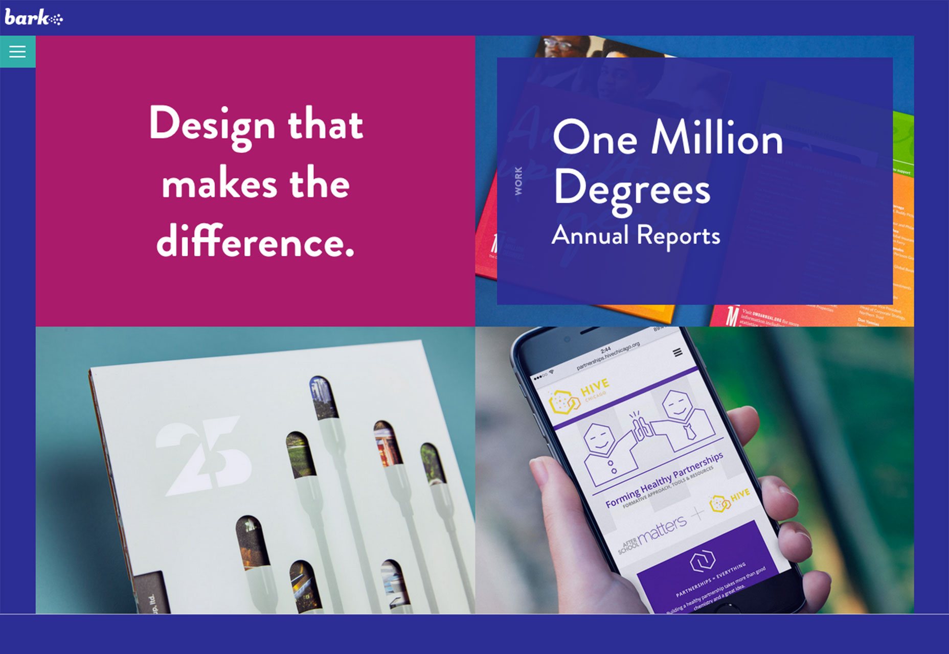 http://barkdesignchicago.com/
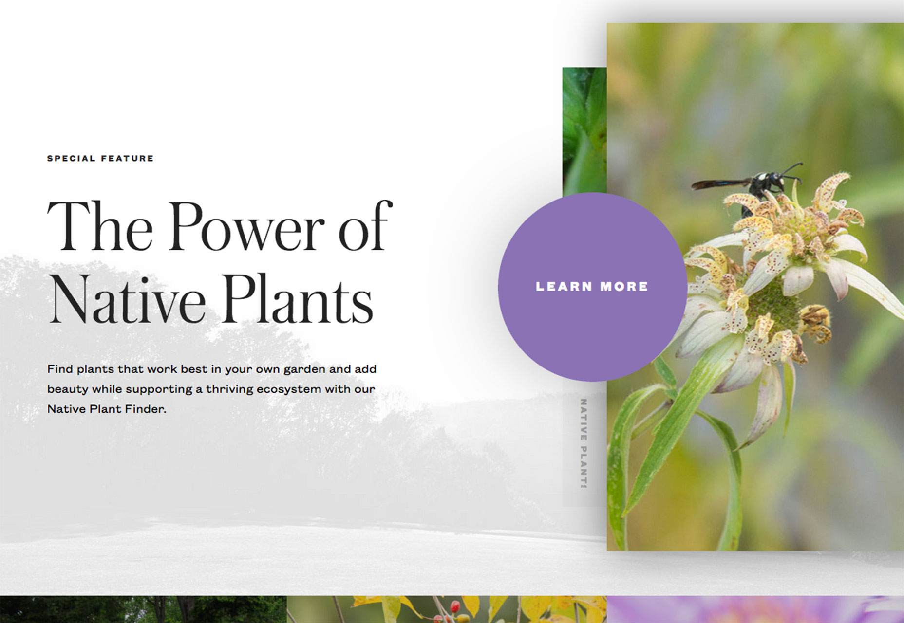 http://mtcubacenter.org/
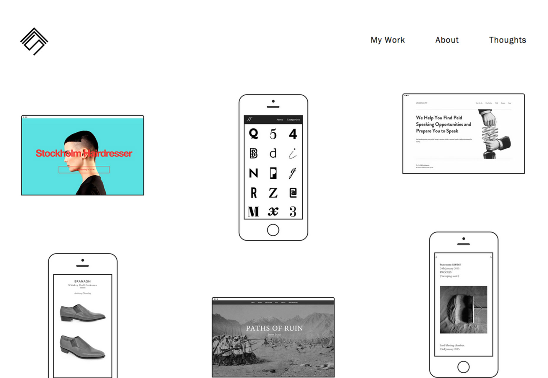 http://simonfosterdesign.com/home/
3. Geometric shapes
There are a number of ways to incorporate geometric shapes into a design project. You might use shapes as navigational elements, for buttons or background patterns. Cool geometry can also make an interesting overall aesthetic. The use of hard-edged and straight-line geometric shapes takes some of the softness out of a design and gives it a more impactful feel. Sean Klassen juxtaposes soft and hard imagery in his portfolio website, below, by using flowers and complementary geometric shapes in the same dominant visual. All that really ties the elements together is color, but somehow the soft, curved lines of the roses and hard angles of the triangles work together. Combining geometric shapes can also be a way to create a little something out of nothing when you are designing a website that really lacks visual information, such as The Graphic Design Conference, below. Shapes and bold color options can work together in a way that reminiscent of childhood. This subtle connotation can make a user feel fondly about a design. Finally, converting a common element into a combination of geometric shapes can create a more interesting visual. The mouse, for example, from Cobay.es, below, would not be nearly as intriguing if it were a stock art version of a white mouse. That’s an image that users have seen, but the geometric version is different and the animated effect with the moving shapes around it adds to that visual interest.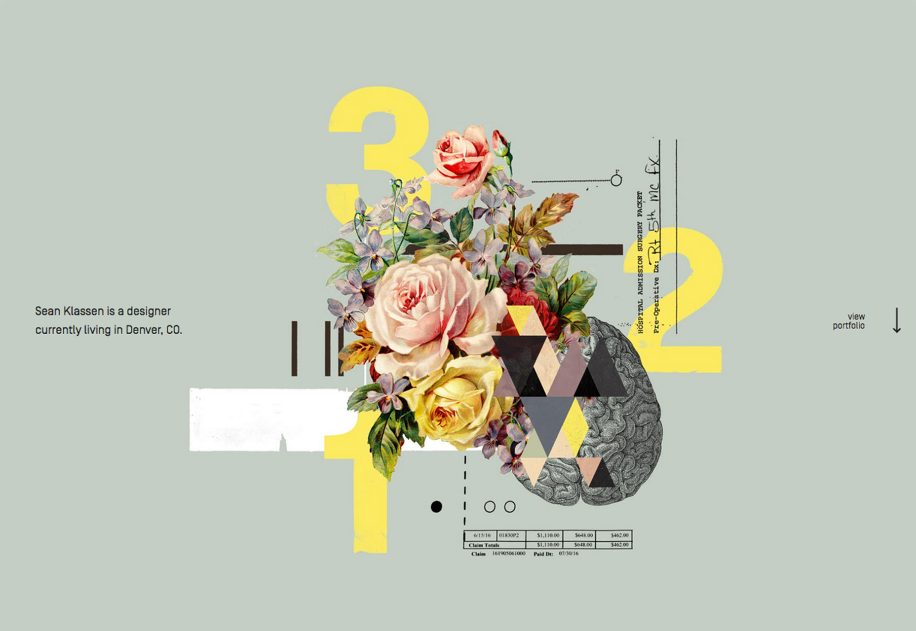 http://seanjklassen.com/
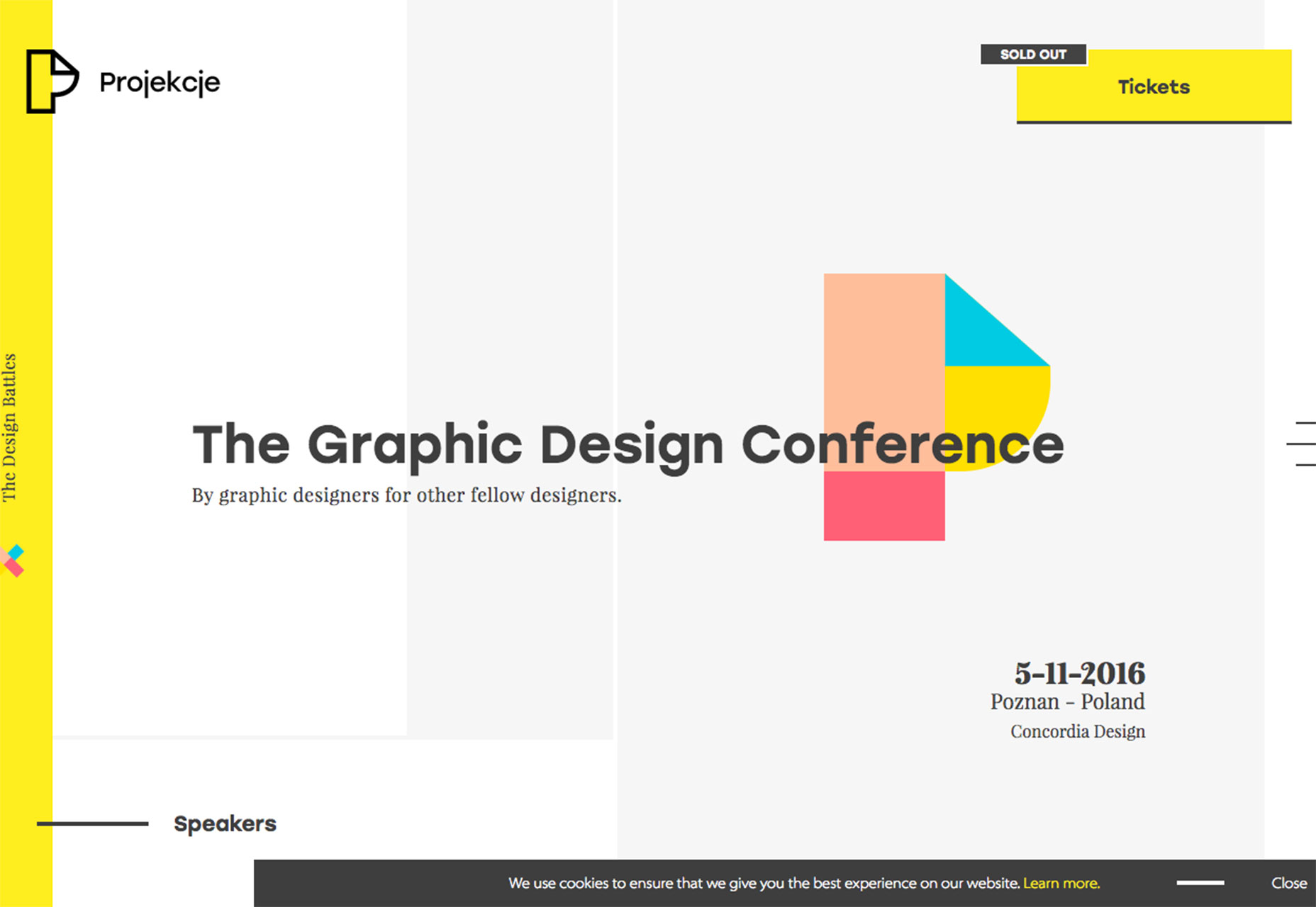 http://projections.pl/?lang=en
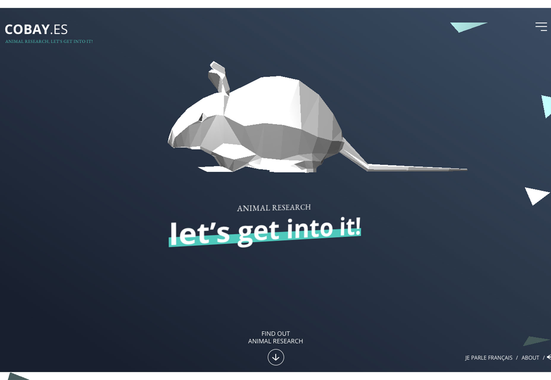 http://cobay.es/en/
Conclusion
Do these bold design decisions appeal to you? Each of the trends this month are interesting on their own because they take common elements and super-size them. Bold color, giant buttons and fun geometry are all usable techniques, even if you don’t design an entire project around any one technique. What trends are you loving (or hating) right now? I’d love to see some of the websites that you are fascinated with. Drop me a link on Twitter; I’d love to hear from you.Carrie Cousins
Carrie Cousins is a freelance writer with more than 10 years of experience in the communications industry, including writing for print and online publications, and design and editing. You can connect with Carrie on Twitter @carriecousins.
Read Next
3 Essential Design Trends, May 2024
Integrated navigation elements, interactive typography, and digital overprints are three website design trends making…
How to Write World-Beating Web Content
Writing for the web is different from all other formats. We typically do not read to any real depth on the web; we…
By Louise North
20 Best New Websites, April 2024
Welcome to our sites of the month for April. With some websites, the details make all the difference, while in others,…
Exciting New Tools for Designers, April 2024
Welcome to our April tools collection. There are no practical jokes here, just practical gadgets, services, and apps to…
How Web Designers Can Stay Relevant in the Age of AI
The digital landscape is evolving rapidly. With the advent of AI, every sector is witnessing a revolution, including…
By Louise North
14 Top UX Tools for Designers in 2024
User Experience (UX) is one of the most important fields of design, so it should come as no surprise that there are a…
By Simon Sterne
What Negative Effects Does a Bad Website Design Have On My Business?
Consumer expectations for a responsive, immersive, and visually appealing website experience have never been higher. In…
10+ Best Resources & Tools for Web Designers (2024 update)
Is searching for the best web design tools to suit your needs akin to having a recurring bad dream? Does each…
By WDD Staff
3 Essential Design Trends, April 2024
Ready to jump into some amazing new design ideas for Spring? Our roundup has everything from UX to color trends…
How to Plan Your First Successful Website
Planning a new website can be exciting and — if you’re anything like me — a little daunting. Whether you’re an…
By Simon Sterne
15 Best New Fonts, March 2024
Welcome to March’s edition of our roundup of the best new fonts for designers. This month’s compilation includes…
By Ben Moss
LimeWire Developer APIs Herald a New Era of AI Integration
Generative AI is a fascinating technology. Far from the design killer some people feared, it is an empowering and…
By WDD Staff


