Choice paralysis: 3 ways the number of choices impacts conversions


Friction
Friction is defined as anything that upsets or frustrates a user’s easy path to conversions on the landing page. Friction can be anything from an unattractive site that simply drives off visitors because it looks abysmal to a total lack of clarity regarding the ultimate page goal of the landing page. Of course, friction, more often than not, can also be caused by something like having too many choices on the page. When this occurs, as we saw in the jam experiment referenced above, visitors tend to abandon the purchase because they’re suffering from choice overload. Friction is poison to conversions, so anything you can do to keep it to a minimum is necessary. On a landing page, that means removing choices on the page, which can include: • No navigation menu at all• Only one call to action button
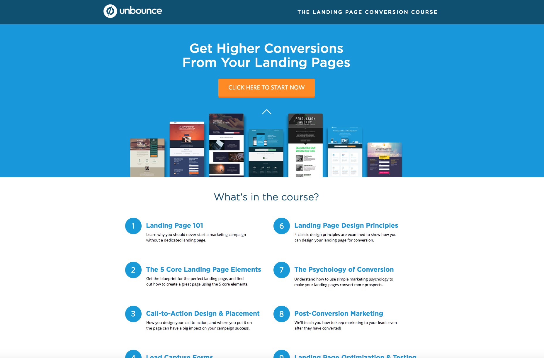
• No contact information Unsurprisingly, Unbounce (the specialists in landing-page design) show us how to design a landing page that’s free of friction. On their landing page for the landing-page conversion course, they’ve done away with ANYTHING at all that can cause friction to the goal of the page, which is people clicking the gigantic call to action button to begin reading the chapters in the course. Note how you absolutely can’t click on anything on the page except for the CTA, or the specific chapter headings. Now that boosts conversions.
Interference with the information architecture
Information architecture is defined as a site’s information backbone that essentially informs the entire user interface of a site. In other words, what your users see on the screen, or what they should see on the screen, is a direct result of the IA. Awesome IA means that the whole structure and organization of a site that define the relationship between your content and usability are excellent, too. In the case of a landing page, this means the content has to support the usability (read: visitors being able to efficiently and easily figure out what’s expected of them on the page). If your users can’t quickly determine what they’re supposed to do on the page because there are too many choices, then the content is the problem, and it ends up hampering the relationship between the content and usability. That’s another way of how too many choices can create an adverse impact on a site’s conversions. If users land on a page, yet their flow is interrupted due to excessive choices, chances are slim that they’ll complete the page’s goal, which is to convert. Take a look at this Wistia landing page. It’s information architecture is excellent and is a model of what you should be aiming for in IA. The page goal is clearly to sign up for a Wistia account, which is made clear by the big, noticeable headline. To facilitate that, there’s a giant form right underneath with a big call to action button to finish the purpose of the page’s content. In other words, when visitors look at this page, it’s impossible that they won’t know what to do, and that’s because the IA is on point. There’s to no other choice than to fill out the form!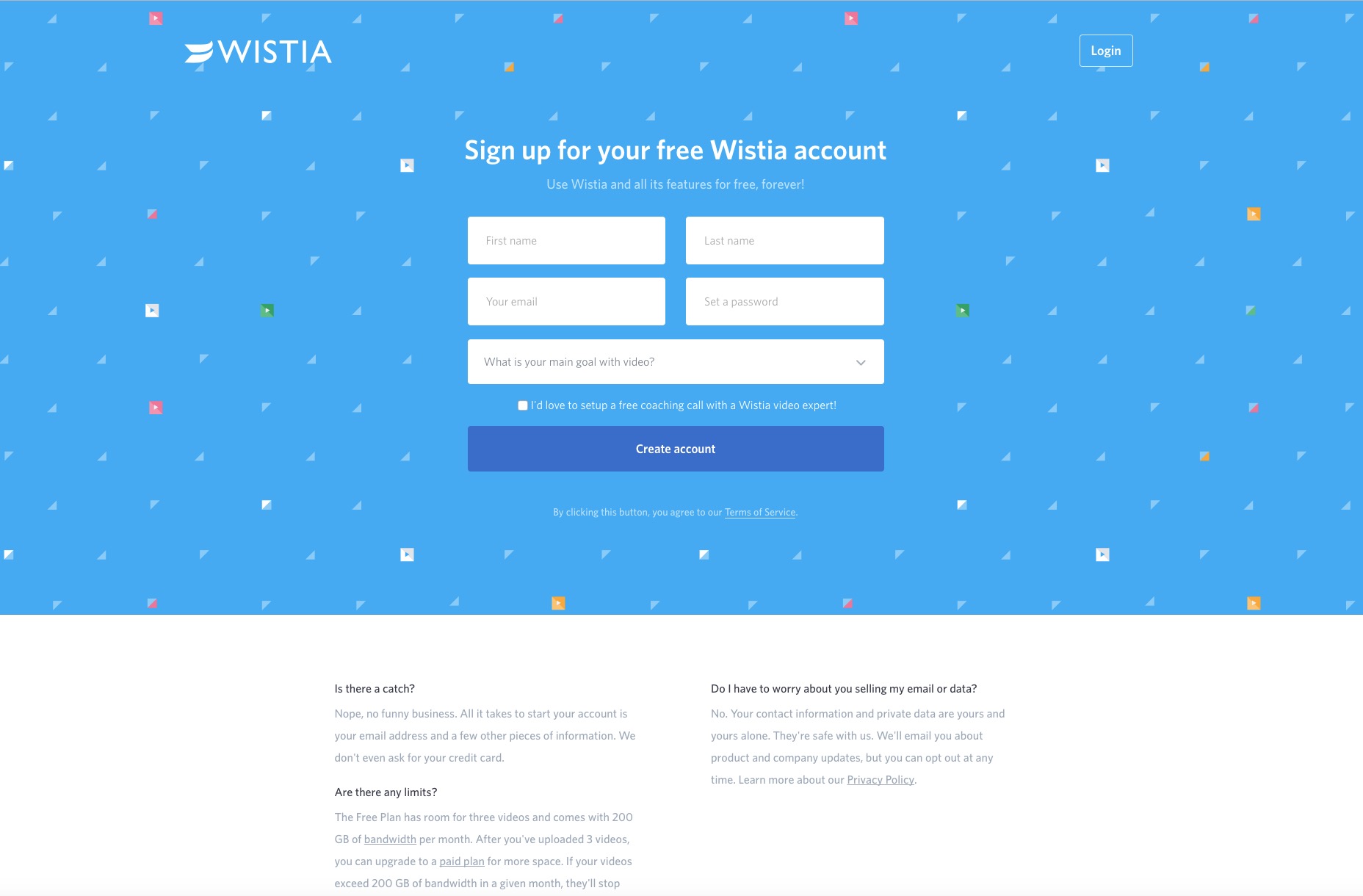
Cognitive load
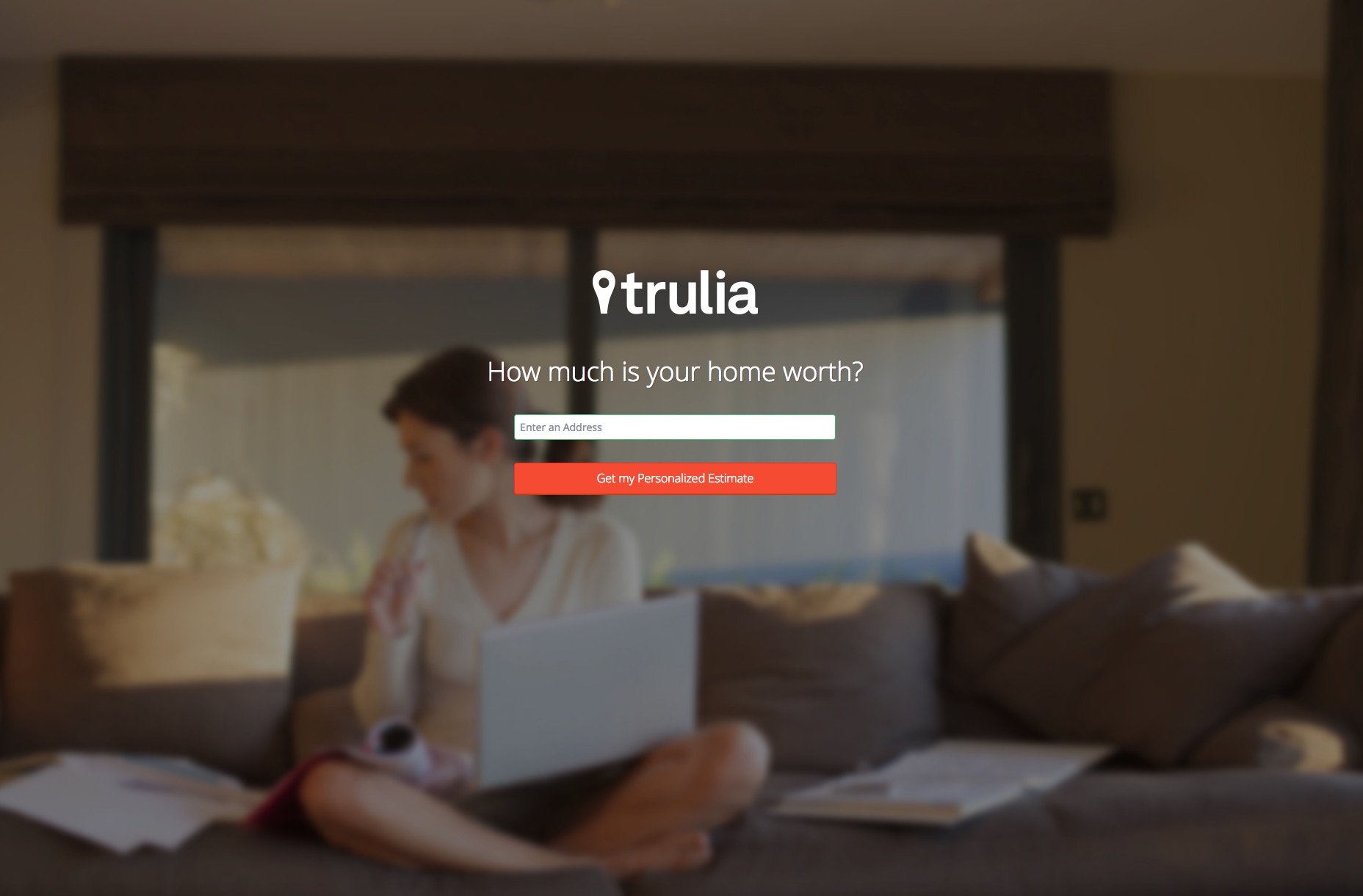
Cognitive load is usually defined as the total amount of mental processing power necessary to use a site. It impacts how easily (or hard) users can find content and complete certain tasks. It just stands to reason that, when you have more choices on a landing page, the cognitive load increases. Now, this is where it gets really interesting. Cognitive load can be categorized into two groups: intrinsic and extraneous. Here’s how the two are defined: • Intrinsic - The effort of taking in new information and being mindful of its own goals.• Extraneous - The mental processing that uses up mental resources, yet doesn’t contribute to helping users understand site content. Naturally, when you have too many choices on a landing page, you increase the extraneous cognitive load on users because you’re subjecting them to choices that don’t help them understand the landing page’s content. For example, if the landing page has internal links or a navigation menu, then these choices simply consume a user’s mental processing without helping him understand the page’s content. That would make inclusion of anything other than the bare minimum, the CTA, a problem. With too much cognitive load, users can’t therefore concentrate as efficiently on the ultimate goal of the page, which is to convert, thus driving conversions down. For an example of a landing page that doesn’t subject users to extraneous cognitive load, we look at Trulia. As far as cognitive load goes, this landing page is the perfect epitome of that. The page’s only goal is to get visitors to enter an address, so the site can look up its worth for them. That means there’s no extraneous cognitive load on this page at all! The only actions are: a) Enter your address
b) Click on the call to action button to get your answer The only mental process users undertake is to complete the goal of the page, which they can do in a matter of seconds.
Excessive choices and conversion kills
Psychology is a huge part of web design, including designing a landing page for your clients. You have to understand how users behave on the page when they’re faced with too many choices. Even a few choices can be too many when you consider that any choice that doesn’t support the page goal is excessive and therefore contributes to lower conversions. Case studies like this one—where lessening choices on a landing page boosted conversions by 19%—show that conversions are hurt when you have too many choices on the page. It’s best not to confuse your visitors or altogether tempt them to click away from the call to action on the page. When you design to have only minimal choices, you’re designing for higher conversions and landing-page success!Marc Schenker
Marc’s a copywriter who covers design news for Web Designer Depot. Find out more about him at thegloriouscompanyltd.com.


Read Next

3 Essential Design Trends, May 2024
Integrated navigation elements, interactive typography, and digital overprints are three website design trends making…

How to Write World-Beating Web Content
Writing for the web is different from all other formats. We typically do not read to any real depth on the web; we…
By Louise North

20 Best New Websites, April 2024
Welcome to our sites of the month for April. With some websites, the details make all the difference, while in others,…

Exciting New Tools for Designers, April 2024
Welcome to our April tools collection. There are no practical jokes here, just practical gadgets, services, and apps to…

How Web Designers Can Stay Relevant in the Age of AI
The digital landscape is evolving rapidly. With the advent of AI, every sector is witnessing a revolution, including…
By Louise North

14 Top UX Tools for Designers in 2024
User Experience (UX) is one of the most important fields of design, so it should come as no surprise that there are a…
By Simon Sterne

What Negative Effects Does a Bad Website Design Have On My Business?
Consumer expectations for a responsive, immersive, and visually appealing website experience have never been higher. In…

10+ Best Resources & Tools for Web Designers (2024 update)
Is searching for the best web design tools to suit your needs akin to having a recurring bad dream? Does each…
By WDD Staff

3 Essential Design Trends, April 2024
Ready to jump into some amazing new design ideas for Spring? Our roundup has everything from UX to color trends…

How to Plan Your First Successful Website
Planning a new website can be exciting and — if you’re anything like me — a little daunting. Whether you’re an…
By Simon Sterne

15 Best New Fonts, March 2024
Welcome to March’s edition of our roundup of the best new fonts for designers. This month’s compilation includes…
By Ben Moss

LimeWire Developer APIs Herald a New Era of AI Integration
Generative AI is a fascinating technology. Far from the design killer some people feared, it is an empowering and…
By WDD Staff