

1) White edges
More web designs are using white edges or framing around the perimeter of the design in the web browser. It’s a new twist on an old idea when more websites were built to certain sizes and framing was used for odd browser widths. It’s something that faded as more designers opted for responsive, full-width designs. The new twist with framing is interesting and is a nice way to create a canvas for the design. Most of the sites using this trend include a white—common, but not mandatory—edge around the design. It’s a few pixels wide and is commonly placed around three or four sides of the design. (Some are opting to leave the frame off the bottom of the design to encourage scrolling.) The nice thing about the white edge is that the design is clean with white lines that can help bring focus to strong color choices, draw the eye from the edge of the screen to other light elements (such as text boxes or calls to action) and edging can help create a background canvas for parallax scrolling or other animated effects. Camden Town Brewery does this exceptionally well. The white framing fills in between elements of the design to create depth and focus for the user. White separation sets apart each new content section on the screen and contributes to overall organization of the design. (Plus, white accents really bring out the strong red and black color palette to keep the combination from feeling too overwhelming.)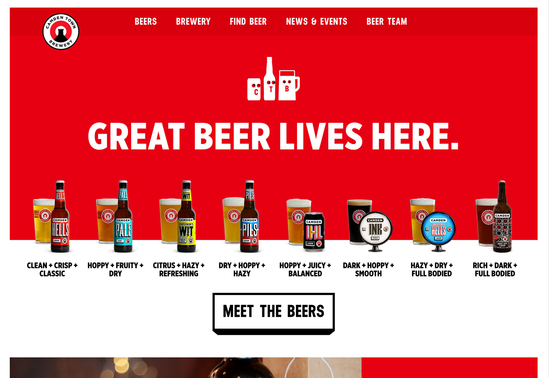
2) Cinemagraphs
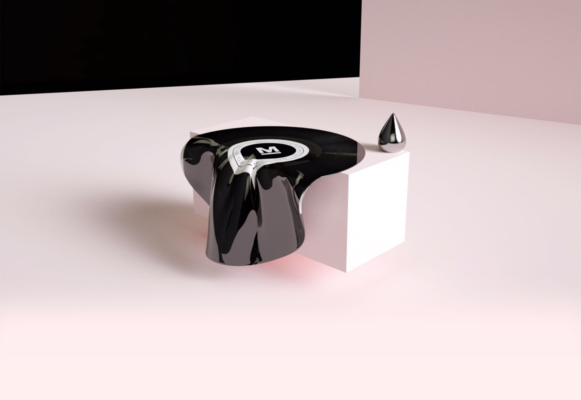
Cinemagraphs are photos with an element of motion in them. It can be anything from a photo of a person that blinks their eyes to the subtle cloud movement in the sky where nothing else moves. While the most common uses of the design trend still seem to be in advertisements and social media, web designers are beginning to incorporate this “live photo” technique as well. It works because users are intrigued by movement. It’s effective for many of the same reasons video is a good option to grab a user’s attention. Movement and action is engaging. It’s interesting. It feels real. When it comes to working with cinemagraphs, the bonus is that you can create a design with motion but without some of the high production that comes with a video project. The trick to making cinemagraphs work is to root the motion in reality. Even if the scene is more imagined, such as Monochrome Paris, the laws of physics should apply to movement on the screen. Water should flow downstream, for example, gravity should be a force in how movement occurs. The motion also needs to be simple and subtle. Too much movement, and a video might be a better option. What draws users into a cinemagraph is that element of surprise. What looks like a still photo in a hero image actually has something happening in it. That little divot will help draw people in, keep them engaged with the design longer and hopefully result in a website conversion.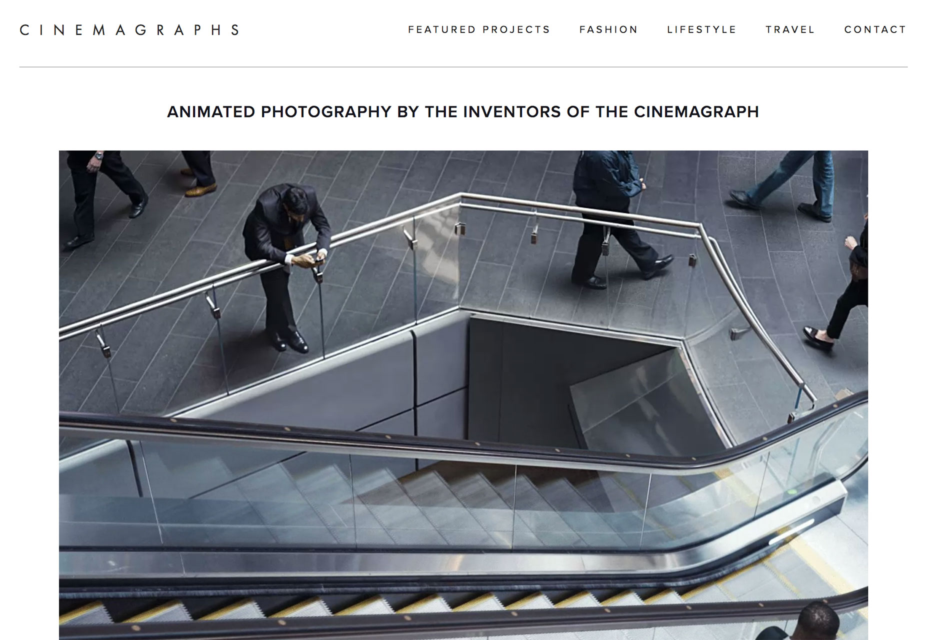
3) Tiny Loading Animations
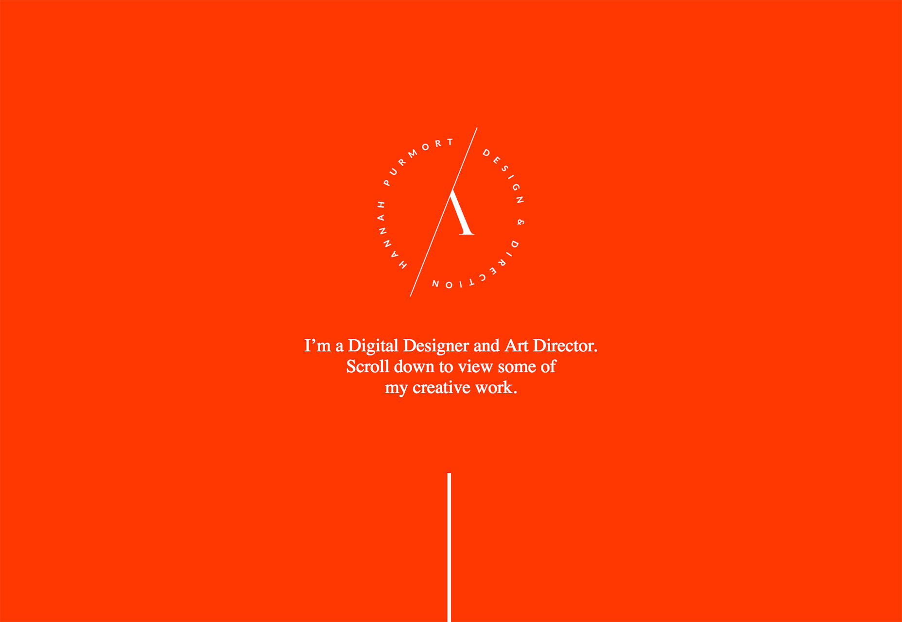
Load times are a big deal. But you can’t always account for the speed of the network a user is on; that’s where tiny loading animations can become a big deal. What’s different about the tiny loading animation trend is that it’s a sometimes you see it, sometimes you don’t design element. Either way the design team has taken special care to ensure that every user comes to the website with a positive experience. These tiny animations are identifiable by the fact that they aren’t really a part of the user experience that counts toward the overall website goal. They are a simple, small element that catches your attention for a quick second while the primary site design is served up. The cool thing about the trend is that these tiny loading animations really are tiny, from the size of the visual itself to the action on the screen, there’s not a lot to see, but what is there is absolutely delightful. Here are three great examples:- Hannah Purmort’s loading animation is a single moving stroke in the opposite color combination of the main screen. The stroke is carried through the design in the scroll effect as well.
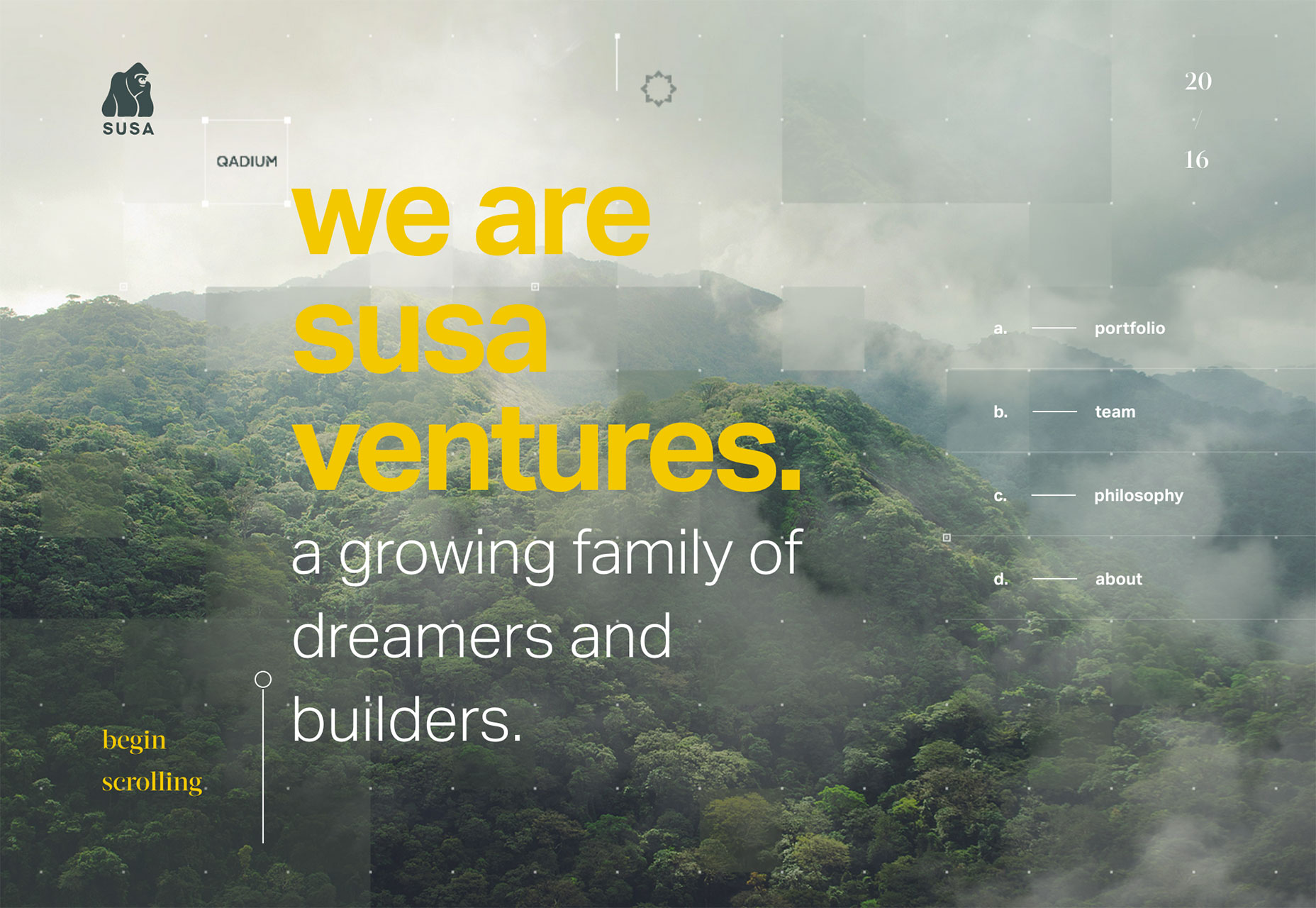
- Susa Ventures features a small icon with a tiny load bar. This one grabs your attention because the tiny gorilla is visually interesting and makes you curious about the website’s content.
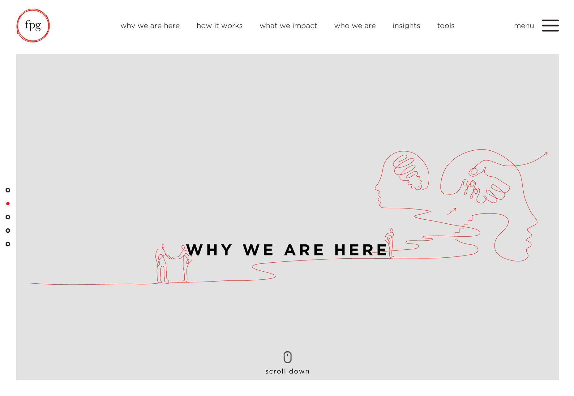
- FPG uses a sketch that appears to be drawn on the screen as the rest of the homepage loads. The only cue that it’s actually a loading animation is that the rest of the screen is much more elaborate once loaded with running video and even more sketches. The effect is seamless and is over almost before the user realizes that it has started.
Conclusion
Details are at the heart of every good design. It’s important to remember that designing (and accounting for) things that not every user will notice is important. That’s how each of these trends connect—through small design elements that aren’t an obvious part of the overall aesthetic. Those tiny elements might be the thing that really sets your website apart for a user. It might be the element of delight that brings someone back to your design. Details can be the differentiator between success and failure. What trends are you loving (or hating) right now? I’d love to see some of the websites that you are fascinated with. Drop me a link on Twitter; I’d love to hear from you.Carrie Cousins
Carrie Cousins is a freelance writer with more than 10 years of experience in the communications industry, including writing for print and online publications, and design and editing. You can connect with Carrie on Twitter @carriecousins.


Read Next

3 Essential Design Trends, May 2024
Integrated navigation elements, interactive typography, and digital overprints are three website design trends making…

How to Write World-Beating Web Content
Writing for the web is different from all other formats. We typically do not read to any real depth on the web; we…
By Louise North

20 Best New Websites, April 2024
Welcome to our sites of the month for April. With some websites, the details make all the difference, while in others,…

Exciting New Tools for Designers, April 2024
Welcome to our April tools collection. There are no practical jokes here, just practical gadgets, services, and apps to…

How Web Designers Can Stay Relevant in the Age of AI
The digital landscape is evolving rapidly. With the advent of AI, every sector is witnessing a revolution, including…
By Louise North

14 Top UX Tools for Designers in 2024
User Experience (UX) is one of the most important fields of design, so it should come as no surprise that there are a…
By Simon Sterne

What Negative Effects Does a Bad Website Design Have On My Business?
Consumer expectations for a responsive, immersive, and visually appealing website experience have never been higher. In…

10+ Best Resources & Tools for Web Designers (2024 update)
Is searching for the best web design tools to suit your needs akin to having a recurring bad dream? Does each…
By WDD Staff

3 Essential Design Trends, April 2024
Ready to jump into some amazing new design ideas for Spring? Our roundup has everything from UX to color trends…

How to Plan Your First Successful Website
Planning a new website can be exciting and — if you’re anything like me — a little daunting. Whether you’re an…
By Simon Sterne

15 Best New Fonts, March 2024
Welcome to March’s edition of our roundup of the best new fonts for designers. This month’s compilation includes…
By Ben Moss

LimeWire Developer APIs Herald a New Era of AI Integration
Generative AI is a fascinating technology. Far from the design killer some people feared, it is an empowering and…
By WDD Staff