
Brand reinforcement is a must
Okay, so first and foremost, your logo is your brand’s identity. It is a badge of pride, and a way to reinforce the principles and ideas that make up your organization. In that sense, it ought to be a straightforward platform for innovation. Yet, there are some expectations that a user has about what a logo should look like. Here are a couple of examples: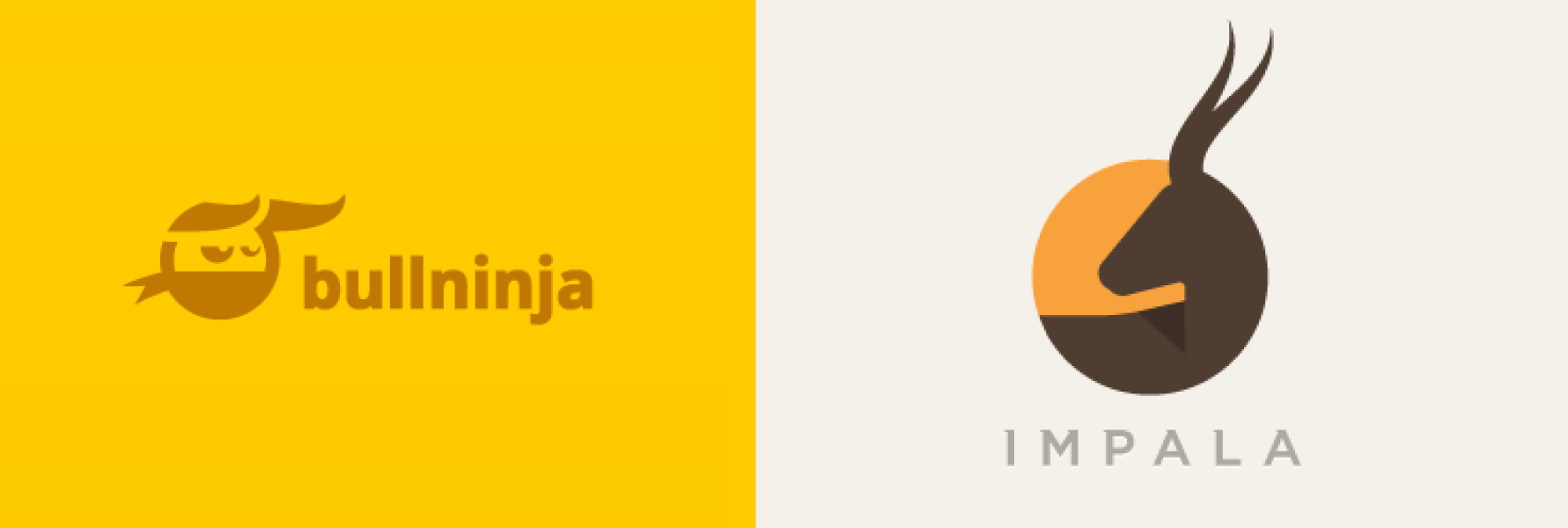 Your logo ought to reiterate the same ideas that the rest of your content and branding supports. Organization names have a lot to do with logo design as well. In the above examples, the designs reflect the subject matter in the name of the organizations.
This type of cognitive association also helps to reinforce brand identity.
As one of its primary purposes, the way in which you choose to reinforce your brand has a huge bearing on the success of a logo. Here’s your chance to introduce creativity and playfulness into your organization in a way that captures the attention of a potential visitor.
Do you have a fun work culture? Show us with your logo, but don’t take it so far that it is not immediately recognizable as a logo.
Your logo ought to reiterate the same ideas that the rest of your content and branding supports. Organization names have a lot to do with logo design as well. In the above examples, the designs reflect the subject matter in the name of the organizations.
This type of cognitive association also helps to reinforce brand identity.
As one of its primary purposes, the way in which you choose to reinforce your brand has a huge bearing on the success of a logo. Here’s your chance to introduce creativity and playfulness into your organization in a way that captures the attention of a potential visitor.
Do you have a fun work culture? Show us with your logo, but don’t take it so far that it is not immediately recognizable as a logo.
Alternative linking schemes
When designing the flow of a site, designers must account for the need to return to the homepage. Rather than providing a “home” button in the navigation bar, the logo has been the traditional method for providing users with a way to return home. This is a standard. But that doesn’t mean it’s the best possible way to go about things. You could theoretically link your logo to any page you deem appropriate. And since we’re talking about logo innovation, there are numerous ways to get sneaky (in a good way) with your logo linking scheme. [pullquote]Consider the advantages of directing users to your contact page when they click on the logo[/pullquote] Perhaps there is a page on your site with a particularly high conversion rate, and you’d like to increase traffic to that particular page. You could try linking your logo to that page instead of the homepage, and measuring the results. There’s a high probability this will confuse your users, but it doesn’t necessarily mean that there will be a detrimental impact on conversion performance, especially if you still provide a way of returning home. Consider the advantages of directing users to your contact page when they click on the logo: you know that the user is interested in staying on the site, because they’re clicking the logo, but you also know that they don’t necessarily know what they want if they’re returning to the homepage.Placement is important
Another standard in logo design has to do with placement. How many logos have you seen that have not been in the top left corner of the page? I bet you can count all of them on one or both hands. That’s because users expect it to be in the top left-hand corner. Expectation plays a huge role in usability. And while I may have advocated for the abuse of user expectations in the previous section, here it is an entirely different story: until someone proves me wrong, there’s no reason to believe that conversion and bounce rates would be negatively affected by an altered linking scheme; placement, on the other hand, could be a deal breaker. [pullquote]Expectation plays a huge role in usability.…placing the logo in any location other than the top left-hand corner will hurt your site[/pullquote] Case studies have shown that placing the logo in any location other than the top left-hand corner will hurt your site. NN Group found that centering your logos will make it roughly six times harder to return to the homepage of a site than left-aligned logos. That means that regardless of where your logo will take users, they just won’t click on it if it’s not in an easily recognizable location.Your logo is not arbitrary, but there’s room for innovation
Properly thought-out logo innovation can elevate an organization to a level beyond their competitors in the eyes of their target audience. And while innovation is almost always a good thing, there are ways that it can hurt you. User expectations don’t have to be met 100% of the time, but it is important to take into consideration the exact ways in which your innovations will affect your user base. Don’t make choices that will restrict users, or make it more difficult to convert. Remember that there are conventions and expectations in web design, and often, they can make or break a website’s performance. Do find ways to innovate that will excite users or direct them to corners of your website they may have never known existed without your intervention. If this means surprising them, don’t hesitate to do so. Anytime you innovate, be sure to track the performance of your changes on a level that will give you granular detail. Which users were negatively affected by your change? What were their expectations? You get the point.Yona Gidalevitz
Yona is Codal’s technical researcher & writer. He is responsible for content strategy, documentation, blogging, and editing. He works closely with Codal’s UX, development, marketing, and administrative teams to produce all manner of written content. You can check out his work on Codal’s blog, Usability Geek, Invisionapp, and Medgadget’s blog, among others. In his free time, Yona is an avid guitarist, cook, and traveler.


Read Next

3 Essential Design Trends, May 2024
Integrated navigation elements, interactive typography, and digital overprints are three website design trends making…

How to Write World-Beating Web Content
Writing for the web is different from all other formats. We typically do not read to any real depth on the web; we…
By Louise North

20 Best New Websites, April 2024
Welcome to our sites of the month for April. With some websites, the details make all the difference, while in others,…

Exciting New Tools for Designers, April 2024
Welcome to our April tools collection. There are no practical jokes here, just practical gadgets, services, and apps to…

How Web Designers Can Stay Relevant in the Age of AI
The digital landscape is evolving rapidly. With the advent of AI, every sector is witnessing a revolution, including…
By Louise North

14 Top UX Tools for Designers in 2024
User Experience (UX) is one of the most important fields of design, so it should come as no surprise that there are a…
By Simon Sterne

What Negative Effects Does a Bad Website Design Have On My Business?
Consumer expectations for a responsive, immersive, and visually appealing website experience have never been higher. In…

10+ Best Resources & Tools for Web Designers (2024 update)
Is searching for the best web design tools to suit your needs akin to having a recurring bad dream? Does each…
By WDD Staff

3 Essential Design Trends, April 2024
Ready to jump into some amazing new design ideas for Spring? Our roundup has everything from UX to color trends…

How to Plan Your First Successful Website
Planning a new website can be exciting and — if you’re anything like me — a little daunting. Whether you’re an…
By Simon Sterne

15 Best New Fonts, March 2024
Welcome to March’s edition of our roundup of the best new fonts for designers. This month’s compilation includes…
By Ben Moss

LimeWire Developer APIs Herald a New Era of AI Integration
Generative AI is a fascinating technology. Far from the design killer some people feared, it is an empowering and…
By WDD Staff