

Crop Strategically
The hero image does not have to fill the “first” screen on devices. Don’t get caught in that trap. Crop the image for impact based on the content therein. Consider the other elements that are important to users when they land on the page and make accommodations for those as well. Depending on this framework, that might mean the hero image is scaled to be larger or smaller than the browser window (let’s just consider more standard resolutions for sake of argument). Before you balk at the idea, consider it for a moment.- A shallow image will help preview other content.
- An unusually deep image will encourage users to scroll for more.
- Any unusual shape will draw attention.
Consider Animation
You don’t have to create a full-fledge cinematographic experience to add moving imagery to the hero header. The smallest touches of movement create just enough contrast to grab the eye. Subtle movements, such as the plane flying across the image for Bar Z Winery, provide that element of contrast without being overwhelming. It’s a simple alternative to some of the more flashy video headers that have become popular. The element of contrast is two-fold: The design is different that many of the others that users are exposed to and the subtle movement is delightful and rather unexpected. On the other hand, you can go all in with animation or video for a hero image. Movement can be particularly engaging and is a popular option. Use it in the same ways you would a still image when it comes to adding effects such as typography and calls to action.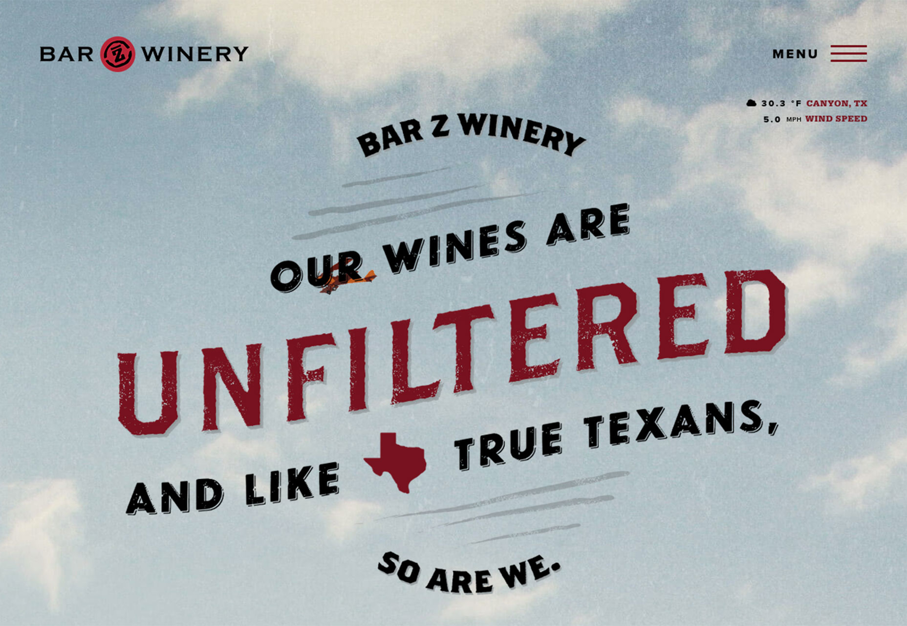
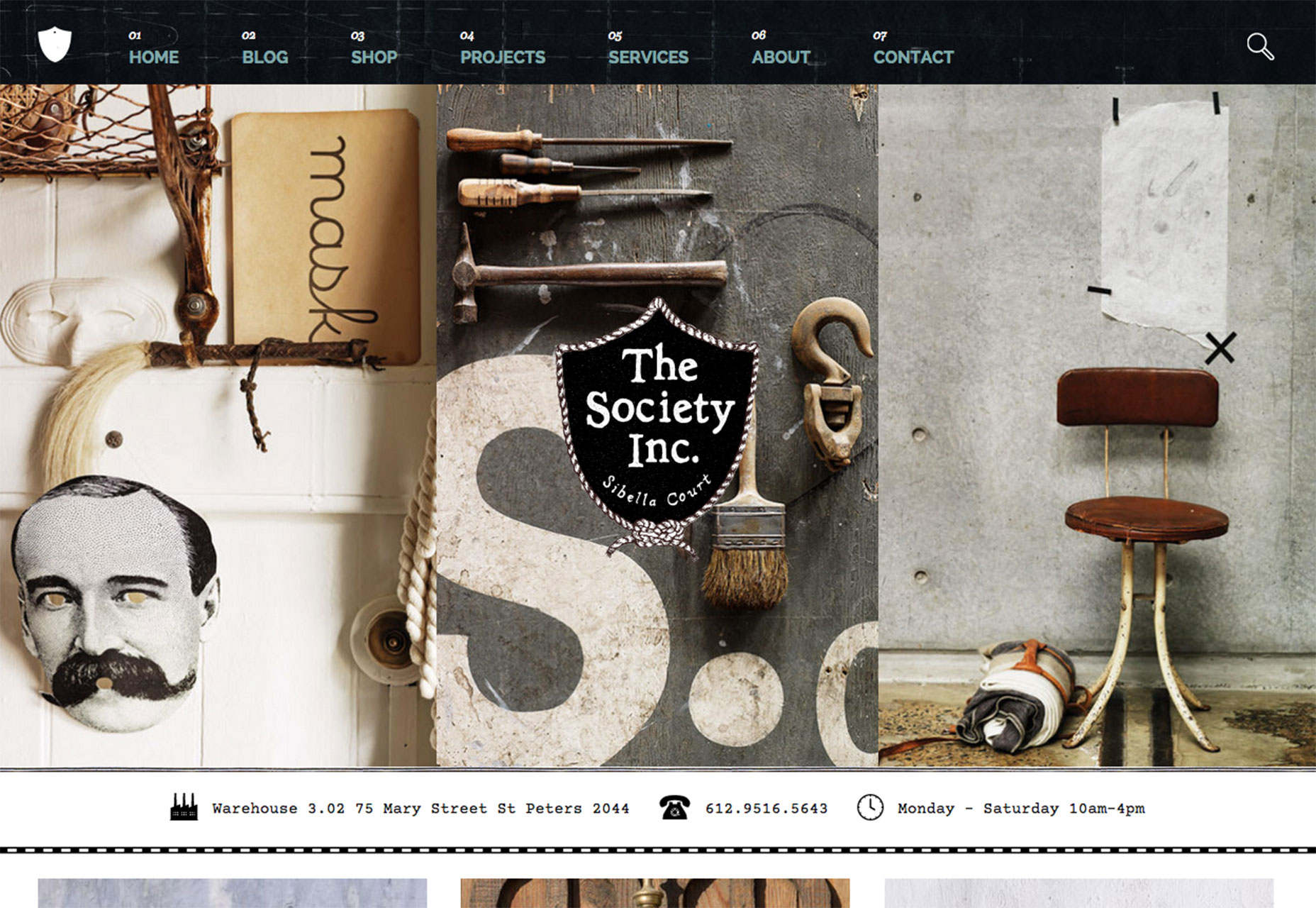
Think Bold Typography
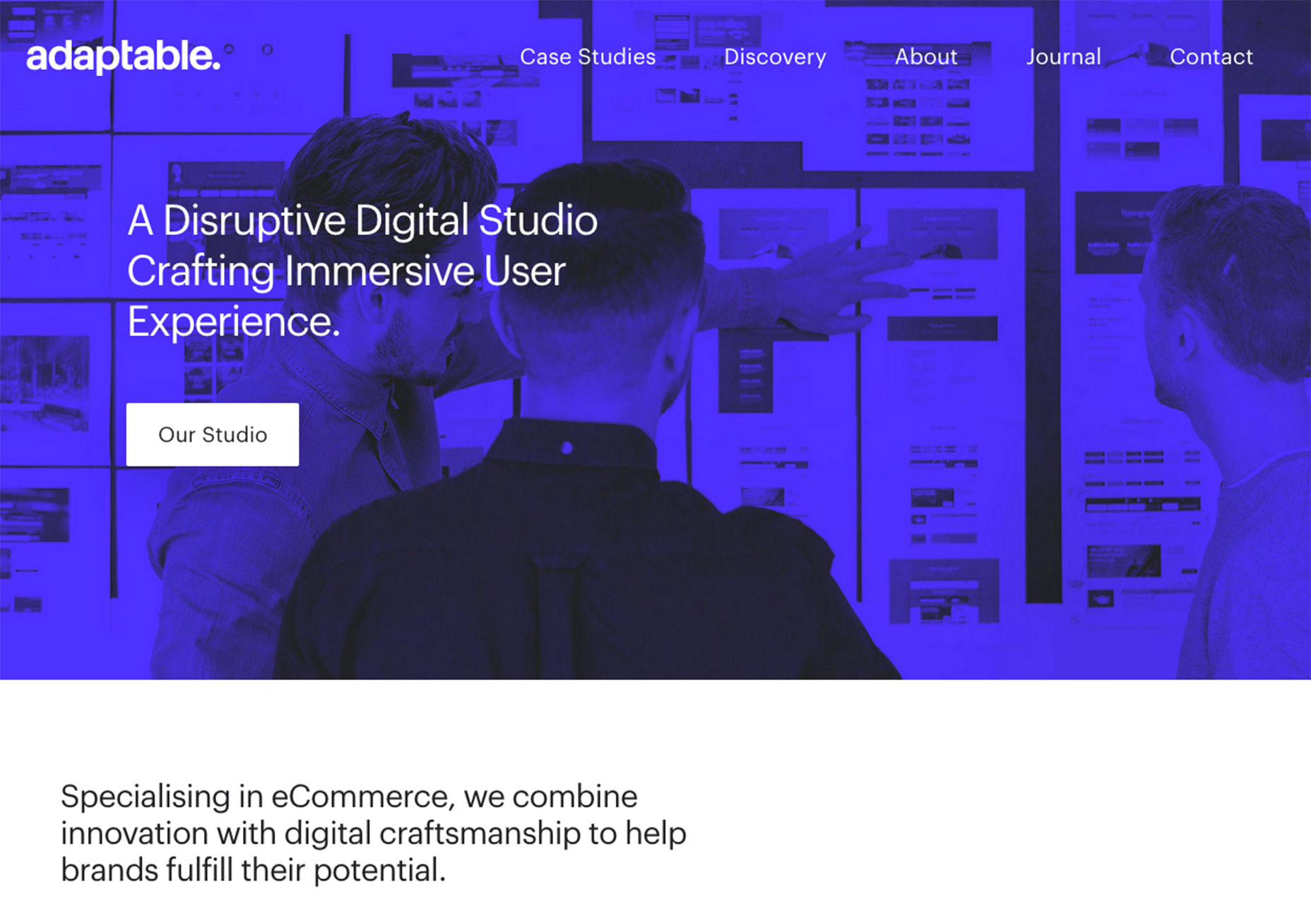
Typography in the hero image should wow the user. It needs to be bold, impactful and memorable. You can create this with both typeface selection and the words on the screen. (No Arial headers that say “Hello” here.) The combination of lettering style and messaging needs to have direct impact and appeal on the user. You’ve heard that people have shorter attention spans than goldfish; it’s your job to catch them with beautiful lettering and language. When it comes to bold type, the key elements of contrast are color and size.- The type needs to be a color that stands out from the background. Light on dark or dark on light are the best options when it comes to readability.
- Bold is a digression from the norm. Consider over- or undersized typography on the hero header for impact.
- Choose words with meaning. Unless it is key to your message, you don’t need a paragraph in the header. Opt for a few key words that entice users to learn more. (The number of words will impact how large or small lettering can be.)
Choose Color Carefully
A hero image might not be an image at all. It could be a color block or cool texture. Choose a color carefully that portrays the exact meaning you intend. A bold color hero header can impress users, but the wrong color can be a turn off. Bright, trendy options are a good alternative. The nice thing about this option is you can mix it up from time to time just by changing the background color. A big color background can also help reinforce brand identity—particularly if it has a strong color association—and lends itself to readability because of the simple nature of the design. Color is also an important consideration when used with another image or video. From colored typography to colored user interface elements, it is important to make sure that color choices in the image match the rest of the design. Much of this goes back to color theory and an understanding of the color wheel so that the image and color choices work together in the design. But what if the hero image and brand colors don’t mesh? Think creatively about how to use the parts in the hero image together. Try a color overlay on the photo; consider black and white for the image or text. Move high-color elements into a navigation bar that’s white or black to keep them off the actual image. When the image and the mandated colors don’t play well, the best option is to eliminate or separate the color.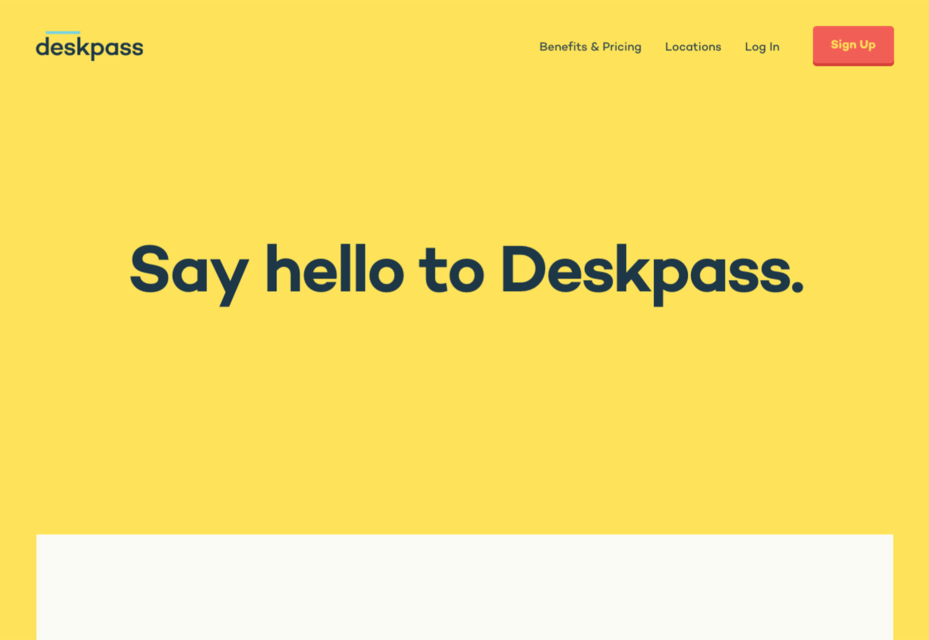
Think About Light and Dark Spaces
Accounting for dark and light spaces in an image might be the most difficult task when adding elements to create contrast in a hero image. Particularly with responsive formats and breakpoints, the placement of text or buttons on an image can change and you can’t always find a great location. What’s a designer to do?- Choose another image;
- opt for a different type family, size or color;
- add a color overlay;
- make the best of it.
Include a Distinct Call to Action
Don’t forget the CTA! What do you want users to do after they look at your cool hero image? Tell them. The call to action should be clear, whether it is to fill out a form, scroll for more content or to click a link to another page. It should include enough definition and contrast so that it is easily seen against the image background. (What’s the point in a CTA if no one sees it?) Color and size are of particular importance here. The color of the button (a common CTA cue) should stand out from the rest of the image. The words telling users what to do need to be exceptionally readable, simple and clear.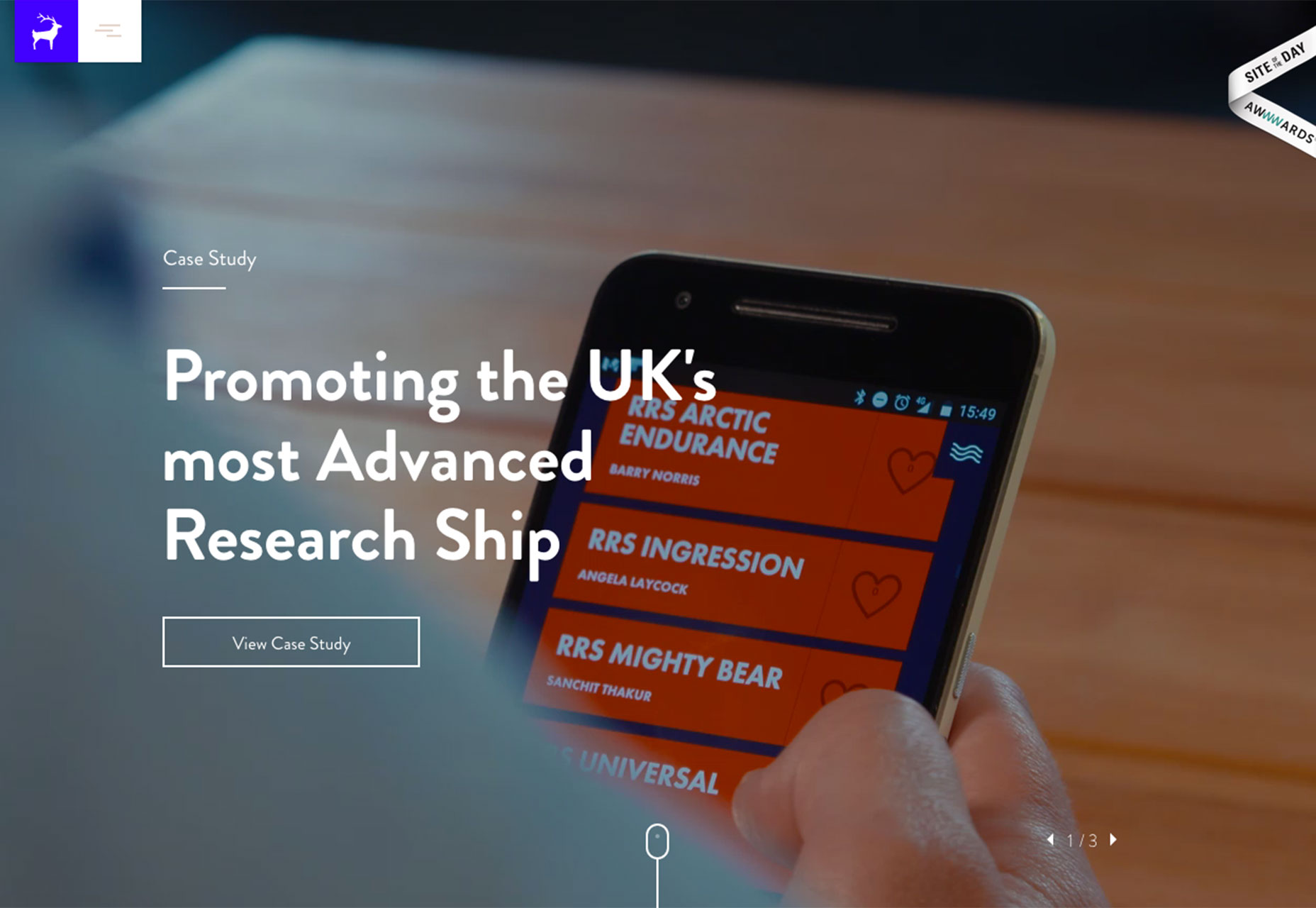
Conclusion
Contrast is one of the key techniques for any good design. It creates separation between elements and helps guide users toward the desired action. Take special care to create enough contrast when designing a hero image so that users know exactly what actions to take on the page. Peek at your metrics and if those conversions aren’t happening, rethink the amount of contrast in the design. It might be time to amp it up even more.Carrie Cousins
Carrie Cousins is a freelance writer with more than 10 years of experience in the communications industry, including writing for print and online publications, and design and editing. You can connect with Carrie on Twitter @carriecousins.


Read Next

3 Essential Design Trends, May 2024
Integrated navigation elements, interactive typography, and digital overprints are three website design trends making…

How to Write World-Beating Web Content
Writing for the web is different from all other formats. We typically do not read to any real depth on the web; we…
By Louise North

20 Best New Websites, April 2024
Welcome to our sites of the month for April. With some websites, the details make all the difference, while in others,…

Exciting New Tools for Designers, April 2024
Welcome to our April tools collection. There are no practical jokes here, just practical gadgets, services, and apps to…

How Web Designers Can Stay Relevant in the Age of AI
The digital landscape is evolving rapidly. With the advent of AI, every sector is witnessing a revolution, including…
By Louise North

14 Top UX Tools for Designers in 2024
User Experience (UX) is one of the most important fields of design, so it should come as no surprise that there are a…
By Simon Sterne

What Negative Effects Does a Bad Website Design Have On My Business?
Consumer expectations for a responsive, immersive, and visually appealing website experience have never been higher. In…

10+ Best Resources & Tools for Web Designers (2024 update)
Is searching for the best web design tools to suit your needs akin to having a recurring bad dream? Does each…
By WDD Staff

3 Essential Design Trends, April 2024
Ready to jump into some amazing new design ideas for Spring? Our roundup has everything from UX to color trends…

How to Plan Your First Successful Website
Planning a new website can be exciting and — if you’re anything like me — a little daunting. Whether you’re an…
By Simon Sterne

15 Best New Fonts, March 2024
Welcome to March’s edition of our roundup of the best new fonts for designers. This month’s compilation includes…
By Ben Moss

LimeWire Developer APIs Herald a New Era of AI Integration
Generative AI is a fascinating technology. Far from the design killer some people feared, it is an empowering and…
By WDD Staff