

Pre-process
1. Get as much information as possible (ask for three examples)
For me, nothing provides more clarity than seeing a real working example. When I am working with a new client, or on a brand new landing page for a product, I find as the easiest starting point is to ask the client to provide three or four inspirational pages, because this really helps both parties. Getting your client to put ideas onto the table gives you an opportunity to readily understand what they like, and what they expect from the finished design. If you’re working with multiple teams you should aim to spend as much time with the developers on a product as you do with your designer colleagues. What I’ve learned is that the key to making an effective design decision is to ensure you speak with the dev team as much as you can. In my case, there have been cases where a solution to a problem was found, that I couldn’t come up with by myself. The goal is to eliminate as many questions as possible before you move into development.2. Learn about personas
At first, I must say I was skeptical about personas, but now it all makes sense to me. So in complete contrast to my older process, I can see how personas are super important while working on product features, especially when the solution has many different edge cases. It helps you to understand who are you really designing for. I aim to have around four to five personas.3. Set up exact goals —what exactly should we track?
I think most designers/clients ignore this step, but one of the most important aspects of design for both parties is to understand the goals of the product you are designing. We tend to jump straight into pixels and quickly flesh out the UI of the project. If it’s a brand new website, or a new feature, be sure to set clear goals of what you want to achieve first. Since everything is trackable, speak about the exact points you’re going to track. For example, these could range from new sign ups, to a number of customers using Paypal vs. purchases with credit cards. Always make sure you know how high you’re aiming for at the start! (You’ll need this anyway for setting up funnels on Mixpanel later in this process.)4. Set up a project folder and start building a moodboard
There are plenty of sites for inspiration — Dribbble, Behance, Pttrns etc. It’s really easy to find similar projects to the one you’re working on. Additionally, there may be already a solution to a problem you’re experiencing and trying to solve. When I start working on a new project, I always setup a folder with folders named — Source Files, Screens & Export, Inspiration & Resources. I save everything I find on the internet to Inspiration folder to be able to use it later to create basic moodboards. This folder could be filled with anything from plugins, swatches or even full case studies from Behance.Going low fidelity
5. Whiteboard
If we want to add a new feature or redesign a process we sit down and everybody at the meeting starts sketching ideas on a whiteboard, paper or even an iPad. This action allows us to put everyone on the team in the designer’s position. Later we end up with two design options to see which one works the best. We always try to go through the whole experience and discuss most of the edge cases during this part of the process. It is really crucial to address them now as opposed to during the design phase, or even worse, during the development part. That’s when you can lose a lot time and energy.6. Map out all of your screens (what data a user needs to input)
This is the time to go beyond the whiteboard and list out all of the user’s inputs and stories. Write down what exactly a user should insert into a particular screen and how a user can achieve their desired goals.7. Write down all possible states
Because all dashboards, apps or websites’ forms have different states, this is another important step you shouldn’t forget. While designing we need to be sure to address all of them. It’s nice to have shiny graphs and cool profile pictures in our Sketch files or PSDs. However, most likely, users will see the opposite side of your app. Especially when they come to your product. It’s necessary to be prepared. Below is an example of how we deal with empty states in one of our data components.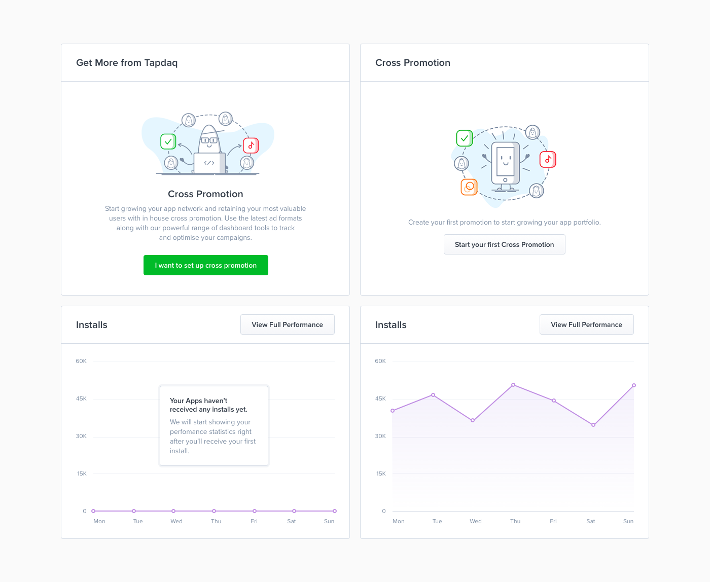
8. Prepare your first diagram
All of this leads to the final part of low fidelity. Thanks to the outcome of the whiteboard task we now know all of the possible states, user’s inputs and goals. To sum up all interactions I create a diagram and to be honest I’ve changed the style of doing this many times: Going from Sketch files with rasterized layouts to just rectangles symbolizing each page with their names below. That being said, the process was always painful, I usually end up in a situation where we want to change or add something later on in the process. With these solutions I’m usually forced to do many more steps; such as changing the positions of lines, arrows and images. Recently I’ve been using Camunda Modeler, which is a not exactly a design tool; it’s a simple app for creating technical diagrams. Which sounds odd, but this app is developed to help you build basic diagrams. Most importantly everything created is completely scalable. You can easily drag and drop any point and it will automatically create lines and arrows for you. You can also choose from different types of points which can be helpful for highlighting when, for example, a user receives an email from Intercom. Camunda exports to SVG which makes it easy to color trackable points in Sketch.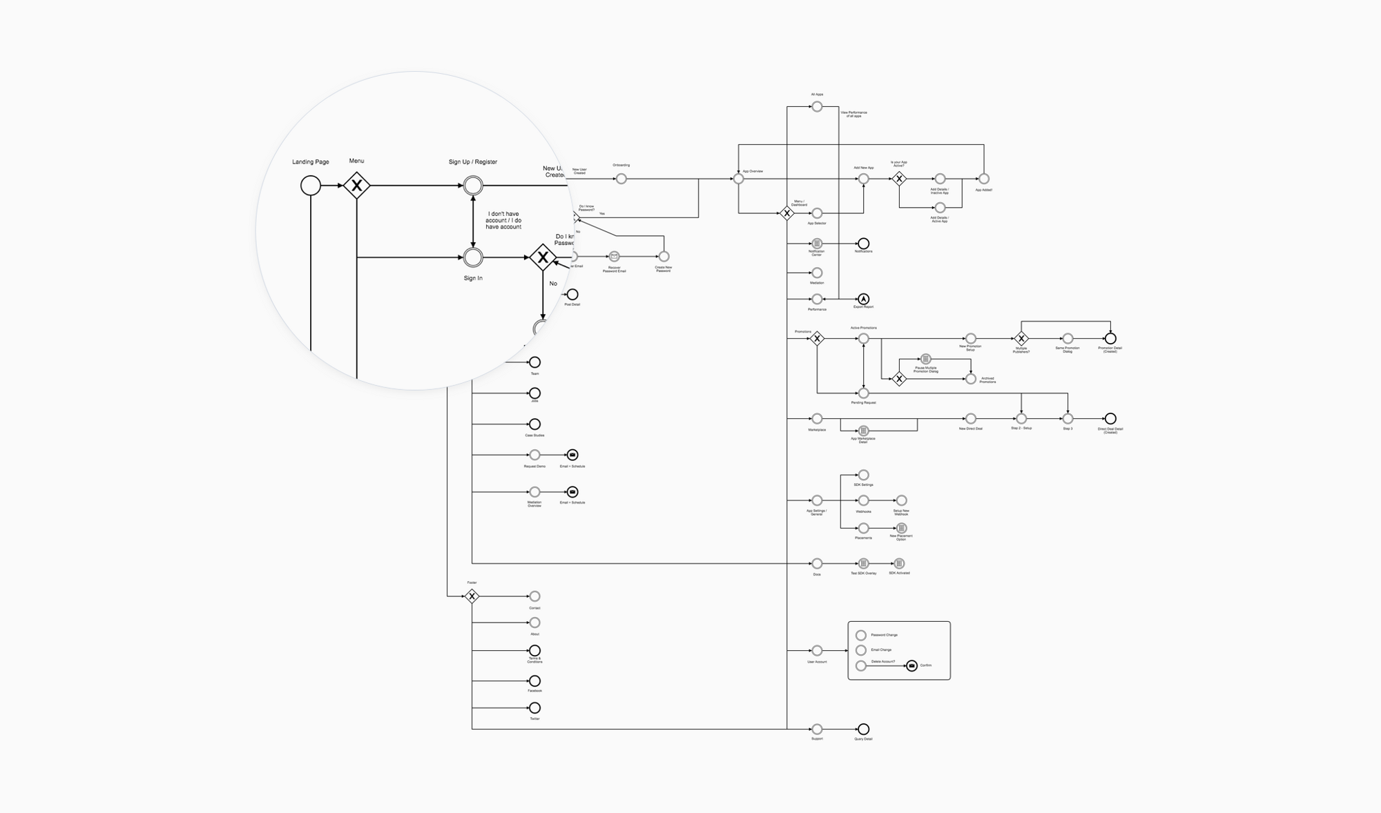
Work / Design
9. Moodboard
I’m able to start with the creation of mood board, as I collect all images to my Inspiration folder. I use mood boards mainly to discuss my thoughts with colleagues and describe some of the visual ideas, before I start with the pixel process.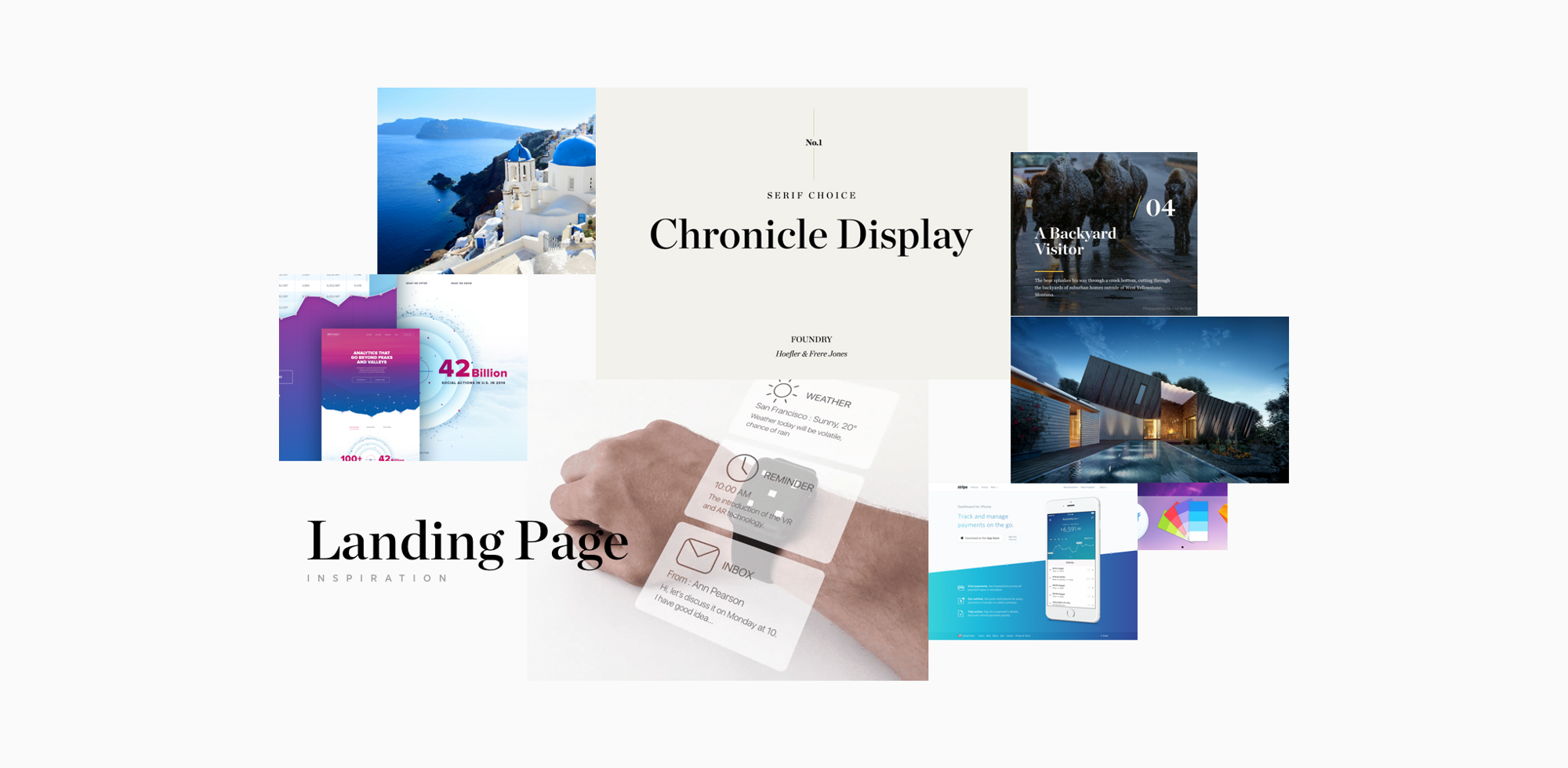
10. First draft
Designing is always an ongoing process. You’re going to iterate a lot along your way to a great result. With first draft is also a way of gathering feedback. You don’t have to come to pixel perfect design in order to start receiving feedback from your teammates, clients or potential users. To get their first thoughts and to start a discussion, I usually mix screens from our current designs. This allows us to start playing with real looking designs in less than a day. You can do a first simple prototype to test if things connect well together.11. Write your copy
Copy is one of the key aspects of users’ decisions and I take it as a crucial part of the design. There is nothing worse than a nice design with confusing dialogs where users are struggling to find the next step.12. First intern test
With your first draft you can quickly create a prototype in Marvel or Invision. This is something that I started doing recently and it turns out it’s another amazing validating aspect. With a prototype you can now easily set up a call with 3 or 4 people from your team and share the prototype link with them and try to ask a few questions while test on them particular flows/scenarios. This way you can easily test your questioning skills and obviously test your design decisions on real users without worrying about wasted resources and time. I tend to choose people who are not that much involved in dashboard development. Also try to avoid watching someone who has already had a chance to play with the prototype before.13. Etiquette
We all know how hard it is to stay tidy. How to deliver yet another feature. This usually leads to a messy Sketch or PSD files. I’ve learned a lot about the differences between working as a single designer in a startup, working in teams, or working on my own digital products. When you do work in a team, think about your PSD’s like you’re creating them for someone else. I use the rule that if you have more than 8 layers in a folder, then you should create a new one. I found one great plugin for Sketch, which saved me hours while I worked on my UI Kits: Rename It.
Tip : Put everything on the canvas. I’ve always struggled with designing nice headers while I the rest of the canvas was white. While designing I learned to put all the content in place first — just play with the layout and typography. It’s much easier to design nice details and play with the whole concept with the content in place.
I found one great plugin for Sketch, which saved me hours while I worked on my UI Kits: Rename It.
Tip : Put everything on the canvas. I’ve always struggled with designing nice headers while I the rest of the canvas was white. While designing I learned to put all the content in place first — just play with the layout and typography. It’s much easier to design nice details and play with the whole concept with the content in place.
14. Create UI elements and start playing with Lego
I’m probably late to the party and this will already sound outdated while I’m writing it. The reason why we haven’t done any wireframing on the journey here is simple. Sketch 39 comes with something that I have found incredible and that is “shapes with resizing properties”. This is something that makes designing easy for everyone on the team. Our Sketch file is pure drag-and-drop now. You can easily give any of your teammates a blank canvas and they can create almost hi-fidelity drafts. Thanks to this we are able to skip all wireframing tools and start with almost real looking pixels. This also goes hand in hand with us being able to actually convert wireframes to real designs. Any PM can create a wireframe and then I can easily take it over and transform to hi-fidelity.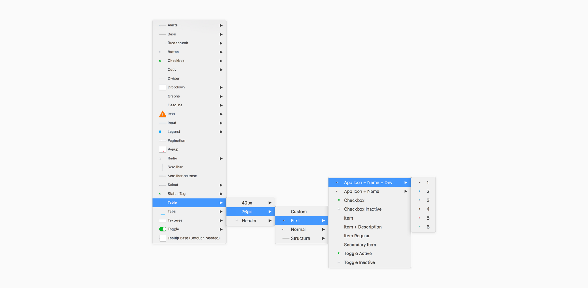
Assets & Delivery
When you’re done with designing and iterating based on first feedback you’re not done yet. Now comes the time to hand your designs over to your engineers/devs.15. Specifications
One my main aims is to always be able to communicate my decisions with the team and be able to reduce difficulty for our developers as much as I can in order to provide them with the best possible resources. That for me is definitely the most important part of my job as a designer. Since we documented all the interaction and have everything ready from the beginning of our process, creating specs is a piece of cake. I tend to write specs in Google Docs or below the screens in Sketch files. It’s nice to handle your designs with explanations of all features so anybody can grab your file in the future.16. Diagram
This technique is nice for printing out designs and discussing them with the team. But nowadays I think there are better options. Such as having ready the final prototype.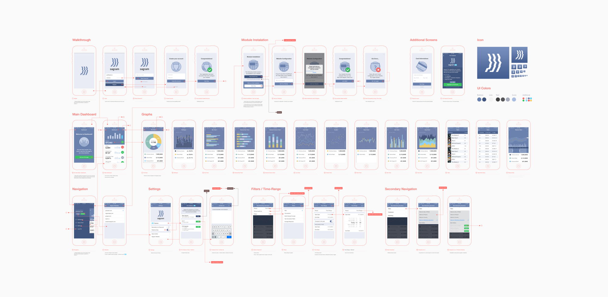
17. Final Prototype
One of the key things for me is to always have all interaction ready in prototype. I usually end up having 3–5 prototypes on the way to the final one for those little session with teammates or to show some particular flows. I tend to prepare all states in Sketch in one artboard and then duplicate those artboards to have every state ready when exporting. It’s great to add comments to parts of your designs to expand your specification much more so that even a copywriter can easily go and check in real pixels and flows if every copy and dialog works as required.18. Quicktime Video > Notes
When I’m not presenting stuff on Hangout to the team or a client I’m sending a screenshare video of me going through the prototype and explaining everything what I’ve designed. It’s a nice confirmation for me before any presentation that I know the answer on any question and possible fancy interactions I’ve decided to design. Could be also nicely used when working in remote teams. Everyone has access to replay the whole interaction thinking at anytime.19. Animate
As a nice final touch you can use After Effects or Principle. It’s good to explain how you want this or that to move.20. Styleguide
Another crucial point for engineers is to know how things will react in different scenarios. Think about error states of input or where to show error messages. Similarly how the disabled state of a submit button will look, where to put a spinner etc. It’s super easy for engineers go just through your Symbols artboard and style elements one by one before they even start coding all screens thanks to having a Sketch file as Lego blocks.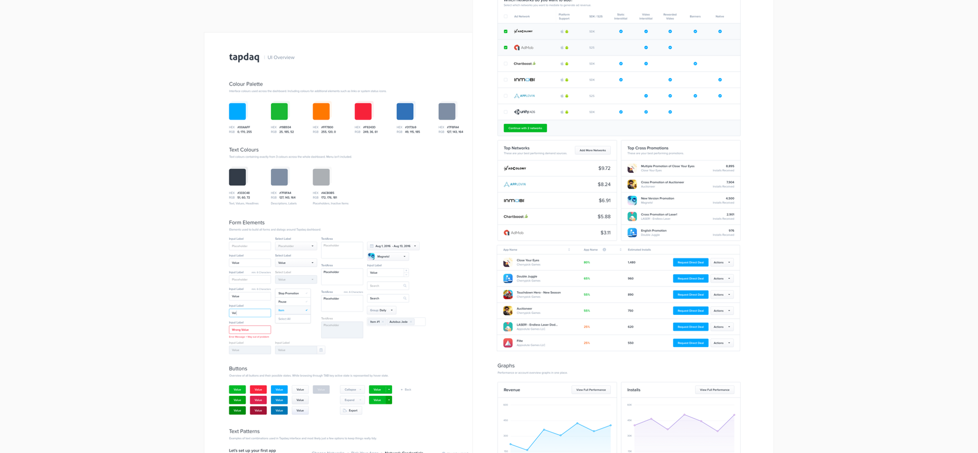
Final testing
Since we are done with handing over our designs to engineers we are able to focus on the last part of the process — testing our decisions!21. Inspectlet / HotJar
After the designs are turned into working code don’t forget to include your Inspectlet or HotJar JS snippets. I’m always excited (or frustrated) to see how users navigate through our dashboard or what are they doing on my portfolio page. Inspectlet is amazing in capturing all of your user session. Works great for bigger projects as well. It comes with easy “/page” filtering which helps you watch sessions of a particular feature or flow.22. Mixpanel
Mixpanel works great for validating our goals (those which we setup at the very beginning of our process). Mixpanel helps to see how many users complete particular flows. How many users dropped before setting up the account. How many people went from main landing page to store and to our most valuable product.23. Google Analytics
I’m not capable of coding big things, but at least I’m able to work with CSS files and with simple code. Lately I was interested to see where users click and while looking at Hotjar heatmaps so I’ve decided to setup basic click tracker in Google Analytics as well. You can easily track every of user’s clicks on your website as well. This helps me to easily map out user’s behavior. For example, I found out that people used top navigation on my site 5x more over the highlighted link in intro text. Sadly it doesn’t count clicks from users with AdBlock.24. Intercom
When we agreed on our initial flows we were talking about part of the flows where user receives an email from Intercom. Our responsibility here is to ensure that all copy and the message itself makes sense and is actually helpful for the visitor. Be sure that your emails are guiding your user to your keen result and always try to provide specific support articles and info how to continue in the flow.The last few words
25. Leave Dribbble behind
From what I’ve learned and how my design has changed over past 4 years, I’ve got to the point where Dribbble is not necessarily the place you want to create your designs for. I’ve always aimed to have nice pixels with sexy profile pictures, but that’s not what real users need and will use. Here’s an example, on the left you’ll see something I designed for Dribbble. On the right, you’ll see something I designed once I spent some time watching people editing their profiles and realised that my vision wasn’t delivering what they needed.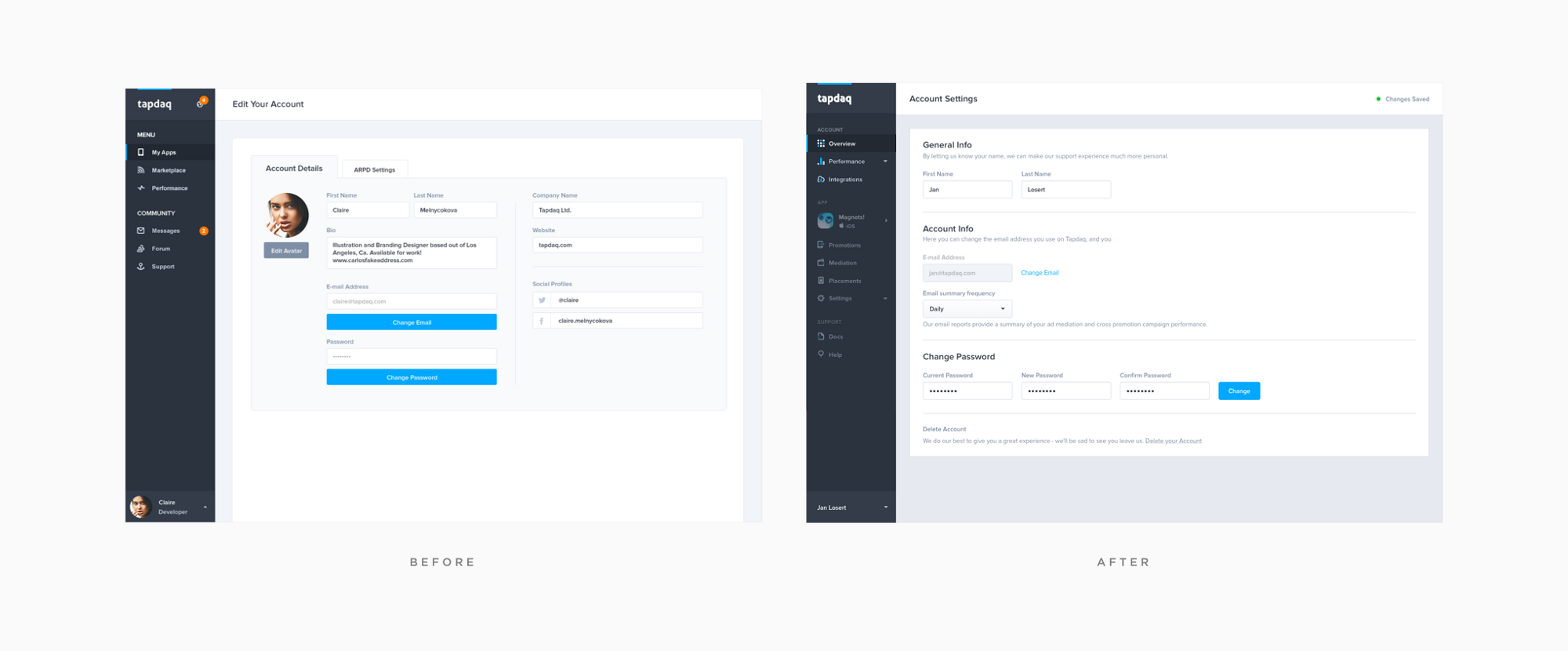 You may receive 500 likes for bright crazy animation of a potato or sliding pizza but what’s really important is that your users will find how to manage frequency of company emails or how to filter their performance analytics.
[-- This post was originally posted on Medium, republished with the author’s permission. --]
You may receive 500 likes for bright crazy animation of a potato or sliding pizza but what’s really important is that your users will find how to manage frequency of company emails or how to filter their performance analytics.
[-- This post was originally posted on Medium, republished with the author’s permission. --]
Jan Losert
Jan is a Lead Product Designer currently shaping the future of mobile advertising at Tapdaq, while traveling around the world. You can find his recent projects on Dribbble and Behance. He is also known for his digital product called Dashboard UI Kit.


Read Next

Using AI to Predict Design Trends
Design trends evolve at a blistering pace, especially in web design. On multi-month projects, you might work on a…
By Simon Sterne

15 Best New Fonts, April 2024
Just like web design, type design follows trends. And while there’s always room for an exciting outsider, we tend to…
By Ben Moss

3 Essential Design Trends, May 2024
Integrated navigation elements, interactive typography, and digital overprints are three website design trends making…

How to Write World-Beating Web Content
Writing for the web is different from all other formats. We typically do not read to any real depth on the web; we…
By Louise North

20 Best New Websites, April 2024
Welcome to our sites of the month for April. With some websites, the details make all the difference, while in others,…

Exciting New Tools for Designers, April 2024
Welcome to our April tools collection. There are no practical jokes here, just practical gadgets, services, and apps to…

How Web Designers Can Stay Relevant in the Age of AI
The digital landscape is evolving rapidly. With the advent of AI, every sector is witnessing a revolution, including…
By Louise North

14 Top UX Tools for Designers in 2024
User Experience (UX) is one of the most important fields of design, so it should come as no surprise that there are a…
By Simon Sterne

What Negative Effects Does a Bad Website Design Have On My Business?
Consumer expectations for a responsive, immersive, and visually appealing website experience have never been higher. In…

10+ Best Resources & Tools for Web Designers (2024 update)
Is searching for the best web design tools to suit your needs akin to having a recurring bad dream? Does each…
By WDD Staff

3 Essential Design Trends, April 2024
Ready to jump into some amazing new design ideas for Spring? Our roundup has everything from UX to color trends…

How to Plan Your First Successful Website
Planning a new website can be exciting and — if you’re anything like me — a little daunting. Whether you’re an…
By Simon Sterne