

- Enabling users to find information
- Enabling users to read that information
- Enabling users to understand where to click and where the destination is
A lack of clarity
One of the most stubborn errors designers continue to make on websites is not sympathizing with the need of users to clearly and easily understand what the site or its elements is about. The study identified these mistakes surrounding a lack of clarity:- Unexpected locations for content
- Competing links and categories
- Hidden fees and prices
UX problems
How easy your site visitors find that it is to actually use your site is integral to whether or not your site has good UX or not. The NN Group’s study found these UX-related design mistakes that just won’t go away:- Islands of information
- Link repetition
- Stranding users on microsites
- Inadequate search results
- Flawed filters and facets
 On the issue of search, unfortunately, a lot of sites still either fail to search the entire site for search terms or return results that fail to even match users’ search terms in the first place.
And while filters and facets (essentially filters for various attributes of objects in a set of content) are well-intentioned, they’re much of the time either tagged incorrectly or are insufficient, thereby creating confusion.
On the issue of search, unfortunately, a lot of sites still either fail to search the entire site for search terms or return results that fail to even match users’ search terms in the first place.
And while filters and facets (essentially filters for various attributes of objects in a set of content) are well-intentioned, they’re much of the time either tagged incorrectly or are insufficient, thereby creating confusion.
Information architecture foul-ups
Information architecture should, in many ways, be the heart and soul of good design. Essentially, it’s what helps users understand your site environment and content quickly, so they find what they want. It involves labeling, organizing and structuring your content in the clearest way possible. The usability study again found stubborn, repeated mistakes designers still make in this area, just as they did 20 years ago. These include:- Overwhelming users with excessive information
- Presenting users with hidden links
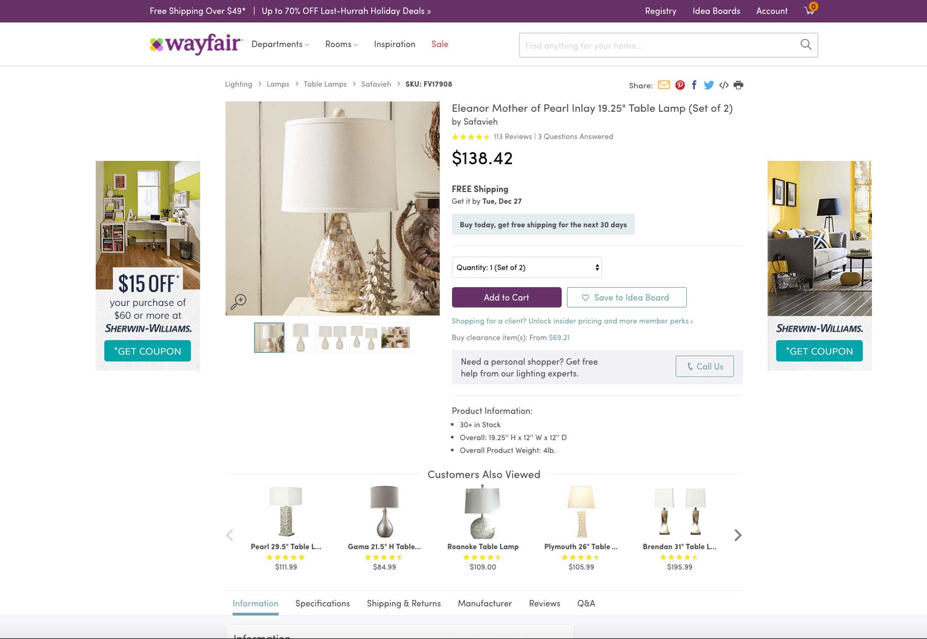
Wayfair.com is a case in point for how to present information to visitors. Note how its content is easily digestible, as it’s efficiently broken up.
 On the problem of hidden links, you’d be surprised at how many times designers hide links to relevant site content—for example, the menu of a restaurant—in the same column as ads leading to external links. The long and short of it is that most users won’t be able to find such relevant links amidst all the ads, which makes considering the placement of relevant links extremely vital to design.
Will it get better soon?
Part of the problem is that many designers just aren’t usability experts, but that’s no excuse. When you’re designing, you have to be obsessed with providing your users with a superb UX. Otherwise, your site’s usability, conversions, on-page time, and sales simply drop—and no client will tolerate that. It will be interesting to see if, in another 20 years, we still see studies like these, talking about how design errors from decades ago are still haunting our web-design community.Marc Schenker
Marc’s a copywriter who covers design news for Web Designer Depot. Find out more about him at thegloriouscompanyltd.com.


Read Next

3 Essential Design Trends, May 2024
Integrated navigation elements, interactive typography, and digital overprints are three website design trends making…

How to Write World-Beating Web Content
Writing for the web is different from all other formats. We typically do not read to any real depth on the web; we…
By Louise North

20 Best New Websites, April 2024
Welcome to our sites of the month for April. With some websites, the details make all the difference, while in others,…

Exciting New Tools for Designers, April 2024
Welcome to our April tools collection. There are no practical jokes here, just practical gadgets, services, and apps to…

How Web Designers Can Stay Relevant in the Age of AI
The digital landscape is evolving rapidly. With the advent of AI, every sector is witnessing a revolution, including…
By Louise North

14 Top UX Tools for Designers in 2024
User Experience (UX) is one of the most important fields of design, so it should come as no surprise that there are a…
By Simon Sterne

What Negative Effects Does a Bad Website Design Have On My Business?
Consumer expectations for a responsive, immersive, and visually appealing website experience have never been higher. In…

10+ Best Resources & Tools for Web Designers (2024 update)
Is searching for the best web design tools to suit your needs akin to having a recurring bad dream? Does each…
By WDD Staff

3 Essential Design Trends, April 2024
Ready to jump into some amazing new design ideas for Spring? Our roundup has everything from UX to color trends…

How to Plan Your First Successful Website
Planning a new website can be exciting and — if you’re anything like me — a little daunting. Whether you’re an…
By Simon Sterne

15 Best New Fonts, March 2024
Welcome to March’s edition of our roundup of the best new fonts for designers. This month’s compilation includes…
By Ben Moss

LimeWire Developer APIs Herald a New Era of AI Integration
Generative AI is a fascinating technology. Far from the design killer some people feared, it is an empowering and…
By WDD Staff