
1) Start with a grid
Good icon design starts with a solid foundation. A simple square block grid is all you need to start sketching an icon.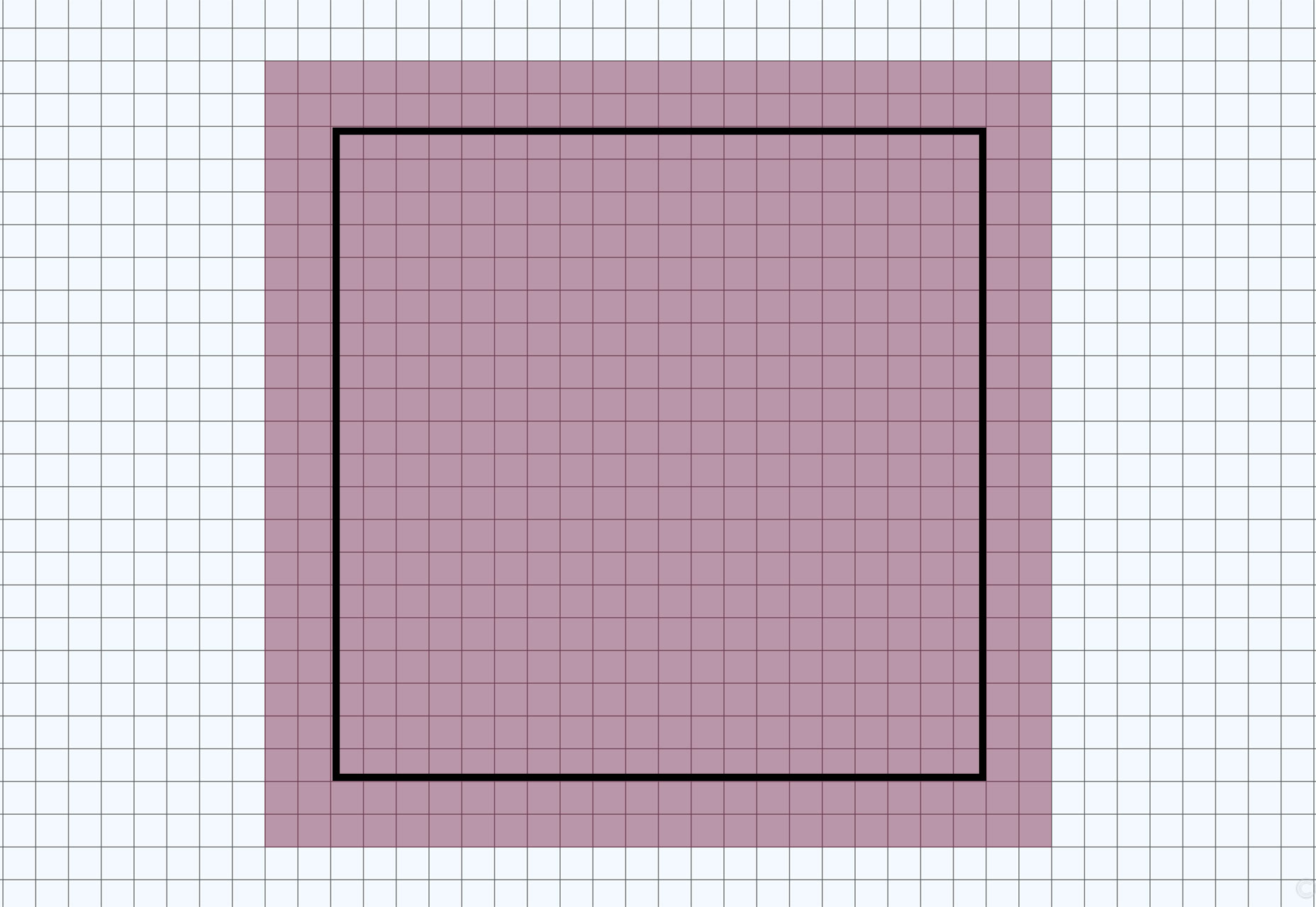 Use the same gridded paper you worked with in grade school to create icon sketches with pencil and paper or start with a square pixel grid in design software. You should probably design on a square canvas, as most icons end up needing to fit in in square spaces. (This includes everything from icons for apps to icons in website designs or for social media profiles.)
Once you have a grid, make sure to give yourself an element of white space around the perimeter. This will give you just enough flexibility to add a background if needed and keep the icon from getting cut off in applications that might have rounded edges or other types of beveling.
Just because your grid is square doesn’t mean your icon has to be. It can be round or more rectangular. Remember: As you design something that isn’t square, it should line up horizontally and vertically centered in the grid for ease of use later. It will also help you maintain a consistent scale for an icon set.
The grid is just to help you create a framework where you can design consistently. As a bonus you can also use the grid to help draw elements of the icon; use gridlines to draw straight angles or determine placement of strokes within the design.
Use the same gridded paper you worked with in grade school to create icon sketches with pencil and paper or start with a square pixel grid in design software. You should probably design on a square canvas, as most icons end up needing to fit in in square spaces. (This includes everything from icons for apps to icons in website designs or for social media profiles.)
Once you have a grid, make sure to give yourself an element of white space around the perimeter. This will give you just enough flexibility to add a background if needed and keep the icon from getting cut off in applications that might have rounded edges or other types of beveling.
Just because your grid is square doesn’t mean your icon has to be. It can be round or more rectangular. Remember: As you design something that isn’t square, it should line up horizontally and vertically centered in the grid for ease of use later. It will also help you maintain a consistent scale for an icon set.
The grid is just to help you create a framework where you can design consistently. As a bonus you can also use the grid to help draw elements of the icon; use gridlines to draw straight angles or determine placement of strokes within the design.
2) Build with geometry
Icons are often small, so building with elements that users recognize at a glance is important. That’s why so many icons are rooted in geometric shapes. Circles, squares and triangles are the most popular combinations of shapes. Users don’t have to think about them or question what they are. Each shape is simple and identifiable. Then they can be merged and connected to create other elements with that same geometric styling.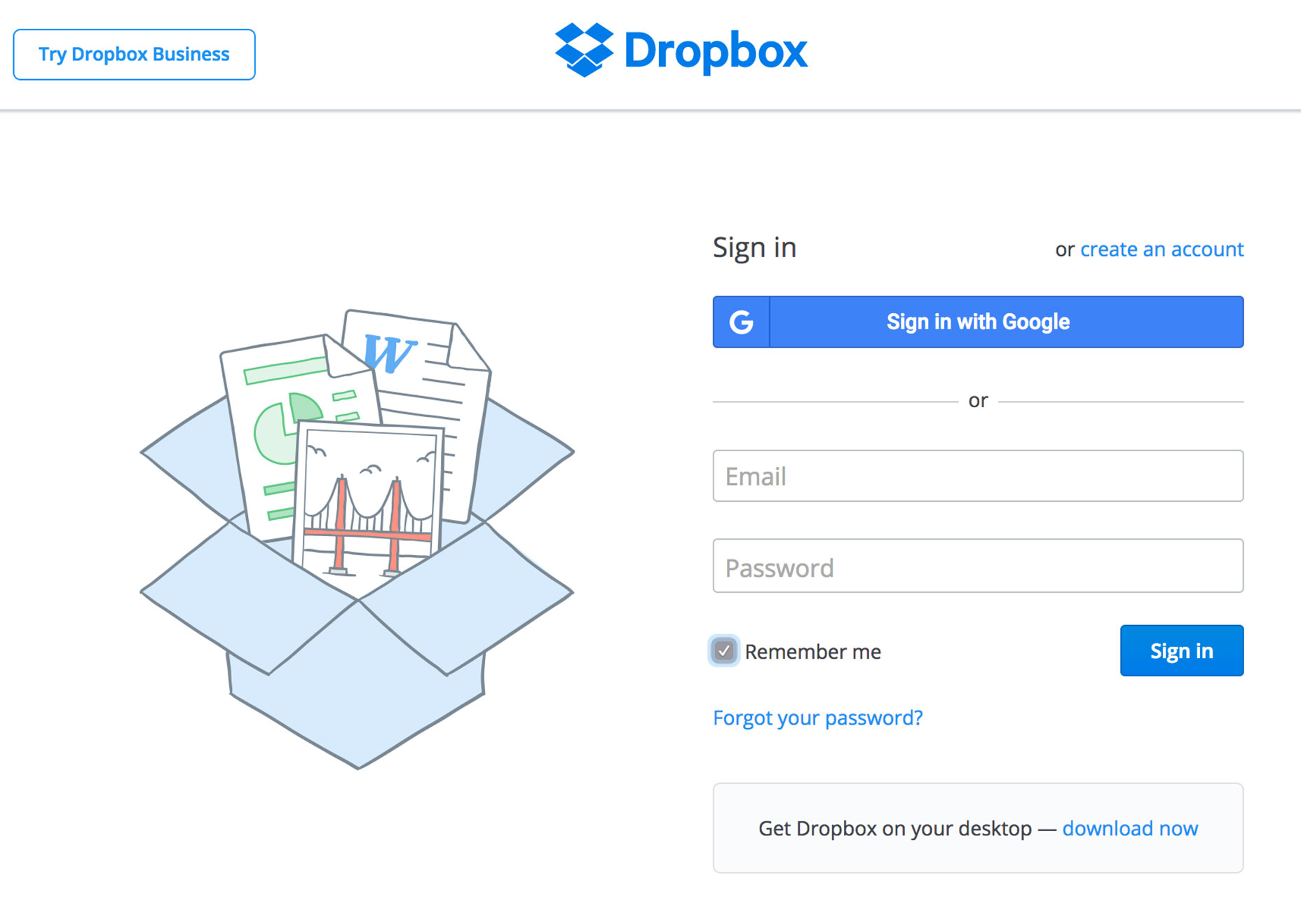 Look at the icon for Dropbox, for example. It is nothing more than a few squares linked together to form a box. The concept is creative, simple and easy to read at any size.
Another popular “geometric” option is to use a single, block letter as part of the iconography. While this doesn’t work well for widespread application, it can serve as a functional brand identifier. Facebook is a primary example of this icon usage in action.
Look at the icon for Dropbox, for example. It is nothing more than a few squares linked together to form a box. The concept is creative, simple and easy to read at any size.
Another popular “geometric” option is to use a single, block letter as part of the iconography. While this doesn’t work well for widespread application, it can serve as a functional brand identifier. Facebook is a primary example of this icon usage in action.
3) Create a unique shape
While starting with circles and squares is helpful, you want to create a shape that’s yours. This is most important if you are working with a brand-identifying icon. Even seemingly complicated icons often start with simple shapes that are morphed into something more unique. When it comes to uniqueness, there are a few design elements to think about.- Stay away from images. They won’t look good small.
- Stay away from text. Users won’t be able to read it.
- Some trends are worthwhile. Flat and almost flat icon styles work wonders.
- Work with straight lines and angles connected by points on the grid. Curves can get awkward quickly.
- The best icons work in color but are also recognizable as black and white outlines.
4) Give it plenty of room
Icons need plenty of space to breathe. Think of how icons are used. Particularly if you are designing an app icon that users will see on top of crazy wallpapers on their devices, the design needs to set inside the frame a bit to make it more readable and distinguishable. Within your grid, create a consistent border around the edge. Think of this space almost like you would when working with a bleed in print design. The color needs to extend to this part of the canvas, but it will likely be unseen.
5) Stick to brand colors
Don’t get crazy with icon color palettes just because you can. If you are creating something for brand work, stick to your color palette. While you may diverge from your normal brand logotype for an icon, color should stay consistent. If you are working on an icon set for a web design package or other use, start with black or white icons first. Then add color as you get closer to completing the design. By working with simple elements with high contrast – black on white or white on black – you really get a feel for how each icon looks in space. If it works independent of color, chances are greater that it will work well with color added also.6. Use consistent divots
Pay attention to every detail in the icon design. Did you cut out an angled corner in the design? Then consider doing it on all of the corners. While these tiny details might not seem important – they may not even be completely visible at the smallest sizes – they can add a classic flair to icons used in more graphic displays.7. Design for the smallest size
While icons could be used at almost any size, you want to craft the design so that it works at the smallest of sizes. Commonly favicon icons are uploaded at just 16 by 16 pixels. Is your icon decipherable at this size? If the answer is no, you have two choices:- Start over with the icon design.
- Create an alternate icon for tiny spaces, such as favicons.
8) Don’t decorate
Finally, keep it simple. Resist the urge to decorate your icon design. Some of the best apps still suffer from awkward icons. (Wunderlist immediately comes to mind. Just think of how much nicer it would look without the shadows and outlining.) Decoration just ends up looking awkward in these small spaces. It can also overwhelm the design. Think about icons as design accent marks, they aren’t the primary focus. If a user lingers on an icon too long because they are trying to work out the meaning of it, they can lose track of what they are supposed to do. Icons should signal quick interactions.Conclusion
Icon design can be a lot of fun if you have time to hone this skill. But if you aren’t an expert don’t worry. There are plenty of great shops out there that release icon sets for you to use in your projects. If you are just starting with icon design, it is worth downloading one of these sets. Toss the icons on a grid and pick them apart. You can learn a lot about how to better create your own simple shapes from this exercise.Carrie Cousins
Carrie Cousins is a freelance writer with more than 10 years of experience in the communications industry, including writing for print and online publications, and design and editing. You can connect with Carrie on Twitter @carriecousins.


Read Next

3 Essential Design Trends, May 2024
Integrated navigation elements, interactive typography, and digital overprints are three website design trends making…

How to Write World-Beating Web Content
Writing for the web is different from all other formats. We typically do not read to any real depth on the web; we…
By Louise North

20 Best New Websites, April 2024
Welcome to our sites of the month for April. With some websites, the details make all the difference, while in others,…

Exciting New Tools for Designers, April 2024
Welcome to our April tools collection. There are no practical jokes here, just practical gadgets, services, and apps to…

How Web Designers Can Stay Relevant in the Age of AI
The digital landscape is evolving rapidly. With the advent of AI, every sector is witnessing a revolution, including…
By Louise North

14 Top UX Tools for Designers in 2024
User Experience (UX) is one of the most important fields of design, so it should come as no surprise that there are a…
By Simon Sterne

What Negative Effects Does a Bad Website Design Have On My Business?
Consumer expectations for a responsive, immersive, and visually appealing website experience have never been higher. In…

10+ Best Resources & Tools for Web Designers (2024 update)
Is searching for the best web design tools to suit your needs akin to having a recurring bad dream? Does each…
By WDD Staff

3 Essential Design Trends, April 2024
Ready to jump into some amazing new design ideas for Spring? Our roundup has everything from UX to color trends…

How to Plan Your First Successful Website
Planning a new website can be exciting and — if you’re anything like me — a little daunting. Whether you’re an…
By Simon Sterne

15 Best New Fonts, March 2024
Welcome to March’s edition of our roundup of the best new fonts for designers. This month’s compilation includes…
By Ben Moss

LimeWire Developer APIs Herald a New Era of AI Integration
Generative AI is a fascinating technology. Far from the design killer some people feared, it is an empowering and…
By WDD Staff