

1. Creating a focus point through proportions
A good example of color proportions is the design of Viporte. As you scroll down on their home page, each section is decorated with a large letter in the center. The letter is filled with a beautiful color before the sections’ animations kick in. The color of the different images which animate in are related to the color of the letters. The focal point is most certainly on the center of the sections thanks in part to the focused use of color. Proportions vary—sometimes there is a little color and sometimes there is a lot of it. Either way, proportions are used to draw attention into a focal point. If the color was more evident all over the place within each section, the focal point wouldn’t be as clear.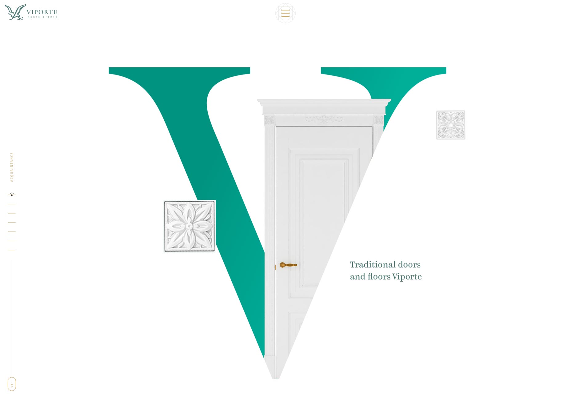
2. Catching attention through contrast
Another thing that color can manipulate is contrast. When the colors of the overall design are calm or mellow, adding a contrasting color will draw a lot of attention to the images. That’s exactly what’s happening within the design of Thinx. On the homepage, the overall color scheme of the interface is actually black and white. Yet, the design relies heavily on numerous photos. Especially at the top of the home page, the photos of the underwear feature a dark red background. Compared to everything else on the page, that's pretty bold. Without a doubt, the thing that stands out here is the dark red. The red has a much higher contrast against the black and white color scheme. I like using Thinx as an example because it goes to show that bright and neon colors are not the only ones suitable for drawing someone’s attention through contrast. It really is just a balancing act of two colors which will let one of them really stand out.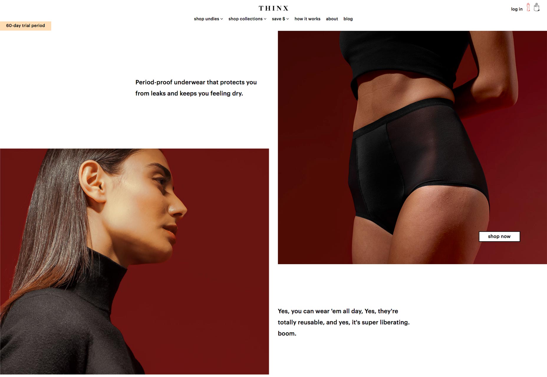
3. Using color to create UX patterns
The best way to create visual patterns is through consistency. Patterns, in turn, create relationships a user can get used to having. It’s the same way users are used to certina icons being related to certain actions, i.e a trash can means delete. Colors are a lot more subjective because every website or app can make their own meaning for colors. Let’s take the relationship with the color blue on Underbelly's portfolio website. It’s a simple example and it’s perfect to make my point. Anything clickable on Underbelly’s website is blue. Having used the website for a few seconds, it becomes clear quickly that their links are blue. And that’s how you create patterns through color. Patterns are good because they allow users and visitors to easily recognize something. The easier recognition becomes, the less people think and by now we all know how happy that makes Steve Krug.
4. Creating hierarchy through color
Another thing color can be good for is setting up a hierarchy. On Skore’s product page, just about every section has an elements of green to it. Not only is the green repetitive—which creates a recognizable pattern—it also helps distinguish the important parts of any given section. Often times it’s easy to explain hierarchy through size such font size. But the intensity of a color, as well as mount a color in use can be great in setting a hierarchy as well. In the example of Skore, the green has good contrast with the gray text and the white background. It stands out. Additionally, their color scheme does not rely on other accent colors making the green primary. All of that contributes to each section’s way to displaying hierarchy. Therefore, the green color helps guide user’s eyes towards the important elements providing a nice hierarchy within each section. The green elements tell a user where to look first.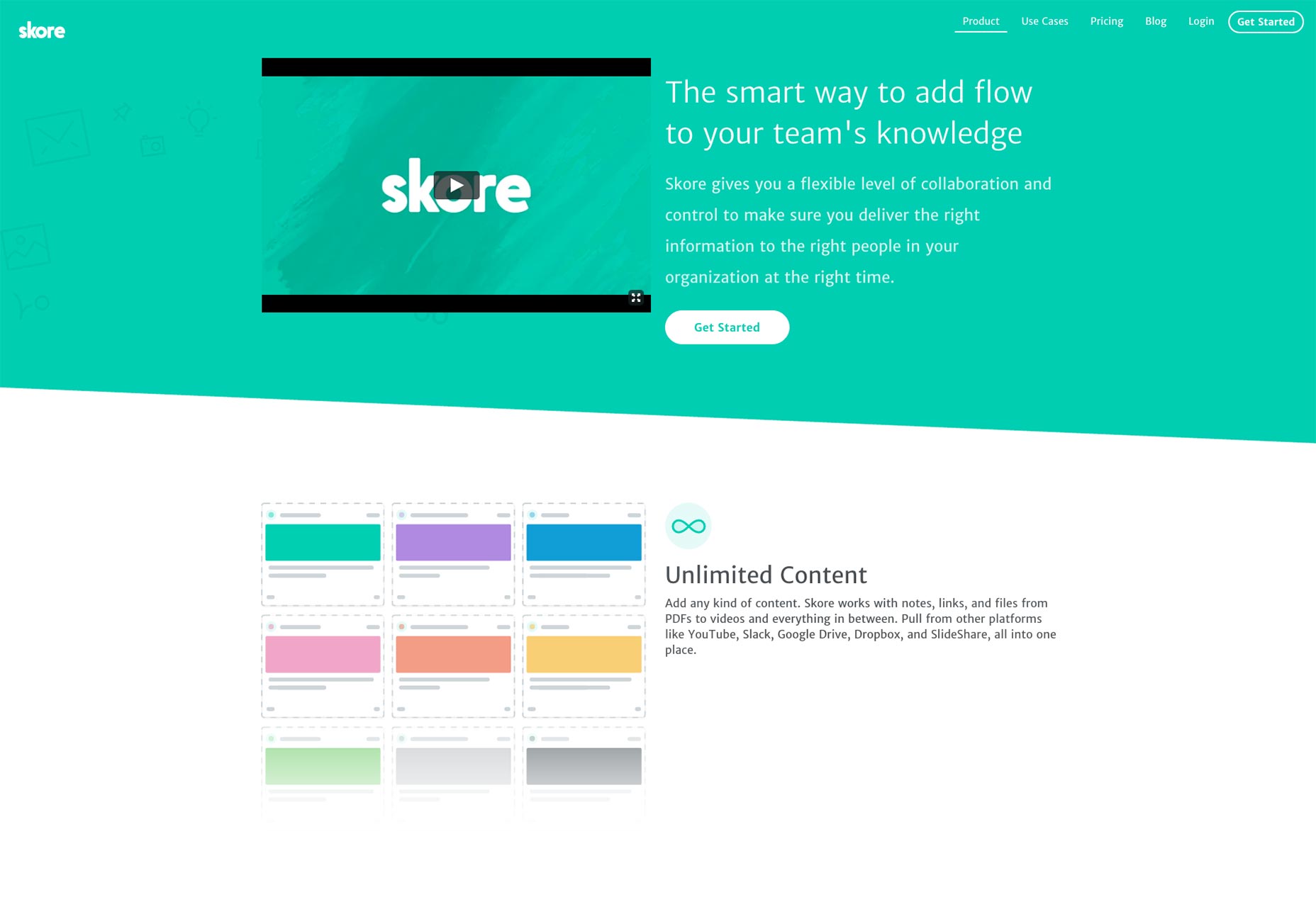
5. Utilizing similarities of color
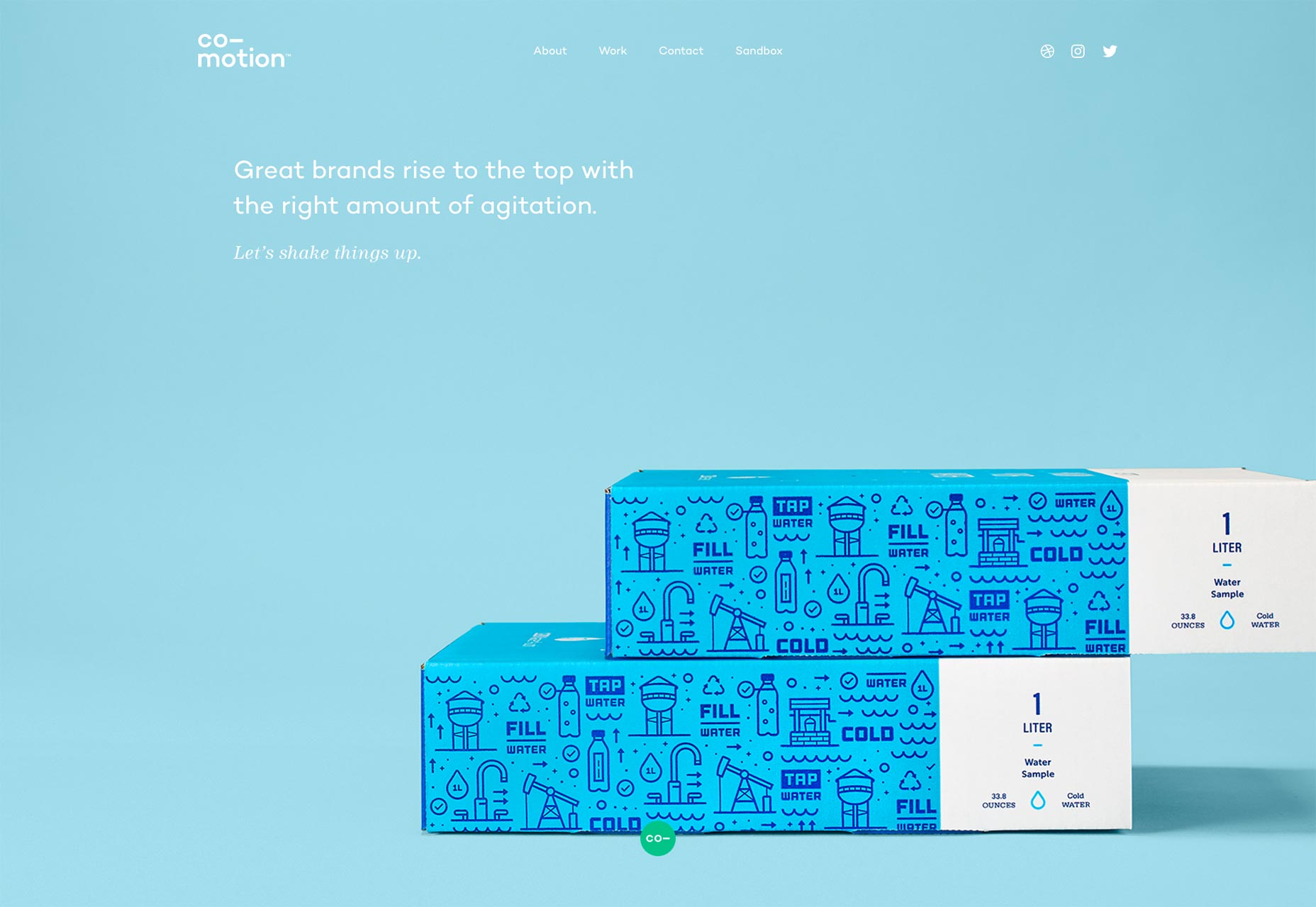
Off all the different things we do with color as designers, we mostly use it and reuse it in order to keep consistency in place within the design. Let’s take a look at InVision’s End of the Year landing page. At the top of the page there is a pink and violet gradient used as a background image. Further down the page the pink and violet are used for the button colors too. Additionally, the landing page reuses white over the pink and purple colored backgrounds. It also reuses the black and gray text color over the white backgrounds. If the colors were different each time, it would not look as great.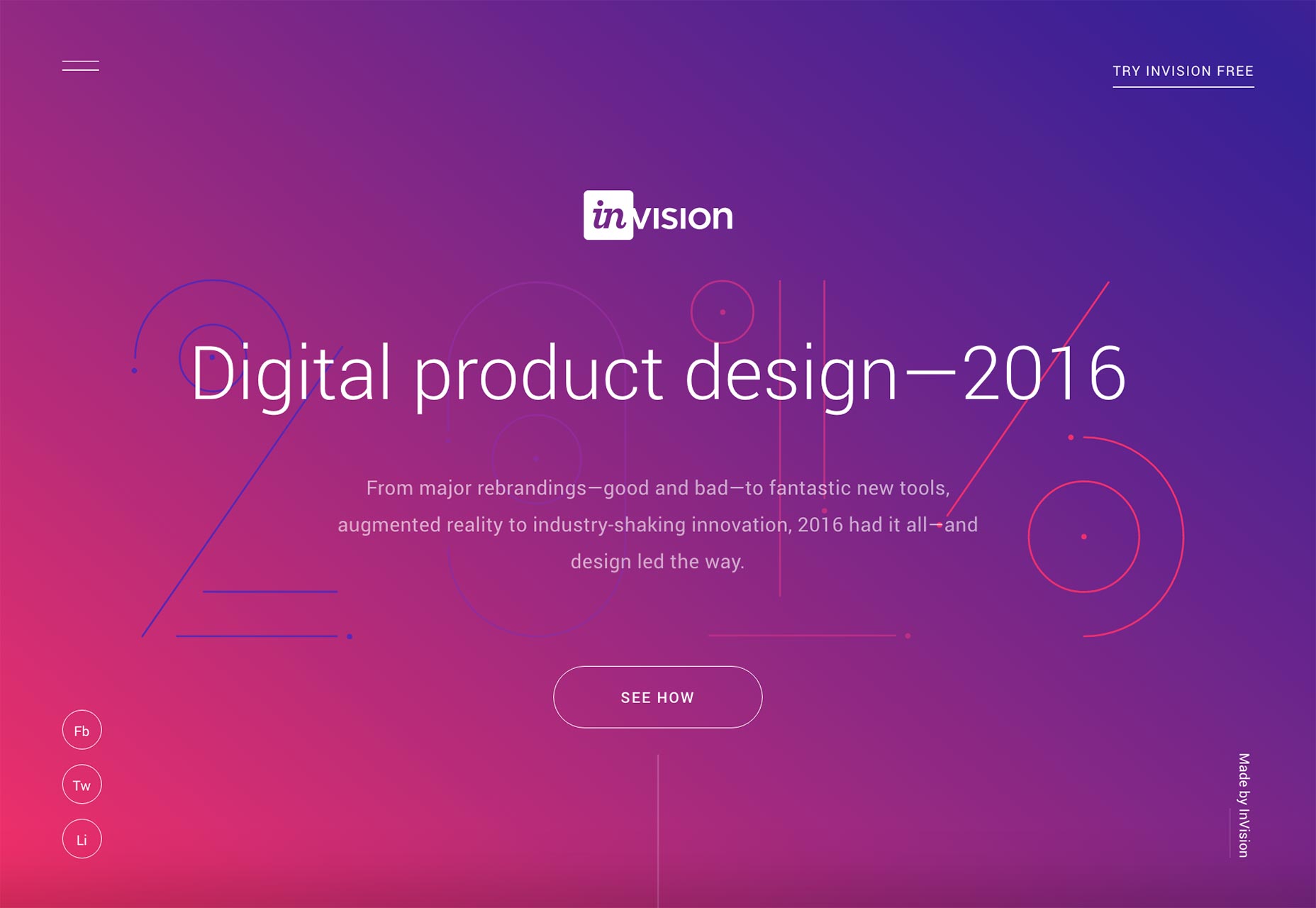 Let’s take a look at another example, specifically Co-motion. On their homepage, the creative studio uses a few different colors. But they are all similar enough in theirs tone to provide a cohesive flow. In this example, there is nothing that stands out specifically which can also be a good aim. In this case, the emphasis with color is made on a good and cohesive flow of the page, where you are trying to keep the user engaged and scrolling.
Conclusion
Color can be a great tool in helping to achieve various design goals. Color can help to define and establish a hierarchy and to provide a focus point. Color emphasis comes in various forms. Either way, working with color can be a whole lot of fun. Influencing where a visitor’s or user’s eyes are going can be easier with the help of a strategic color scheme.Paula Borowska
Paula is a freelance web designer who documents her travels with photos and words. She works with small companies to help them create products that change the lives for their customers all in the hopes of gaining more customers and retaining their current ones longer.


Read Next

3 Essential Design Trends, May 2024
Integrated navigation elements, interactive typography, and digital overprints are three website design trends making…

How to Write World-Beating Web Content
Writing for the web is different from all other formats. We typically do not read to any real depth on the web; we…
By Louise North

20 Best New Websites, April 2024
Welcome to our sites of the month for April. With some websites, the details make all the difference, while in others,…

Exciting New Tools for Designers, April 2024
Welcome to our April tools collection. There are no practical jokes here, just practical gadgets, services, and apps to…

How Web Designers Can Stay Relevant in the Age of AI
The digital landscape is evolving rapidly. With the advent of AI, every sector is witnessing a revolution, including…
By Louise North

14 Top UX Tools for Designers in 2024
User Experience (UX) is one of the most important fields of design, so it should come as no surprise that there are a…
By Simon Sterne

What Negative Effects Does a Bad Website Design Have On My Business?
Consumer expectations for a responsive, immersive, and visually appealing website experience have never been higher. In…

10+ Best Resources & Tools for Web Designers (2024 update)
Is searching for the best web design tools to suit your needs akin to having a recurring bad dream? Does each…
By WDD Staff

3 Essential Design Trends, April 2024
Ready to jump into some amazing new design ideas for Spring? Our roundup has everything from UX to color trends…

How to Plan Your First Successful Website
Planning a new website can be exciting and — if you’re anything like me — a little daunting. Whether you’re an…
By Simon Sterne

15 Best New Fonts, March 2024
Welcome to March’s edition of our roundup of the best new fonts for designers. This month’s compilation includes…
By Ben Moss

LimeWire Developer APIs Herald a New Era of AI Integration
Generative AI is a fascinating technology. Far from the design killer some people feared, it is an empowering and…
By WDD Staff