

1. Diamonds
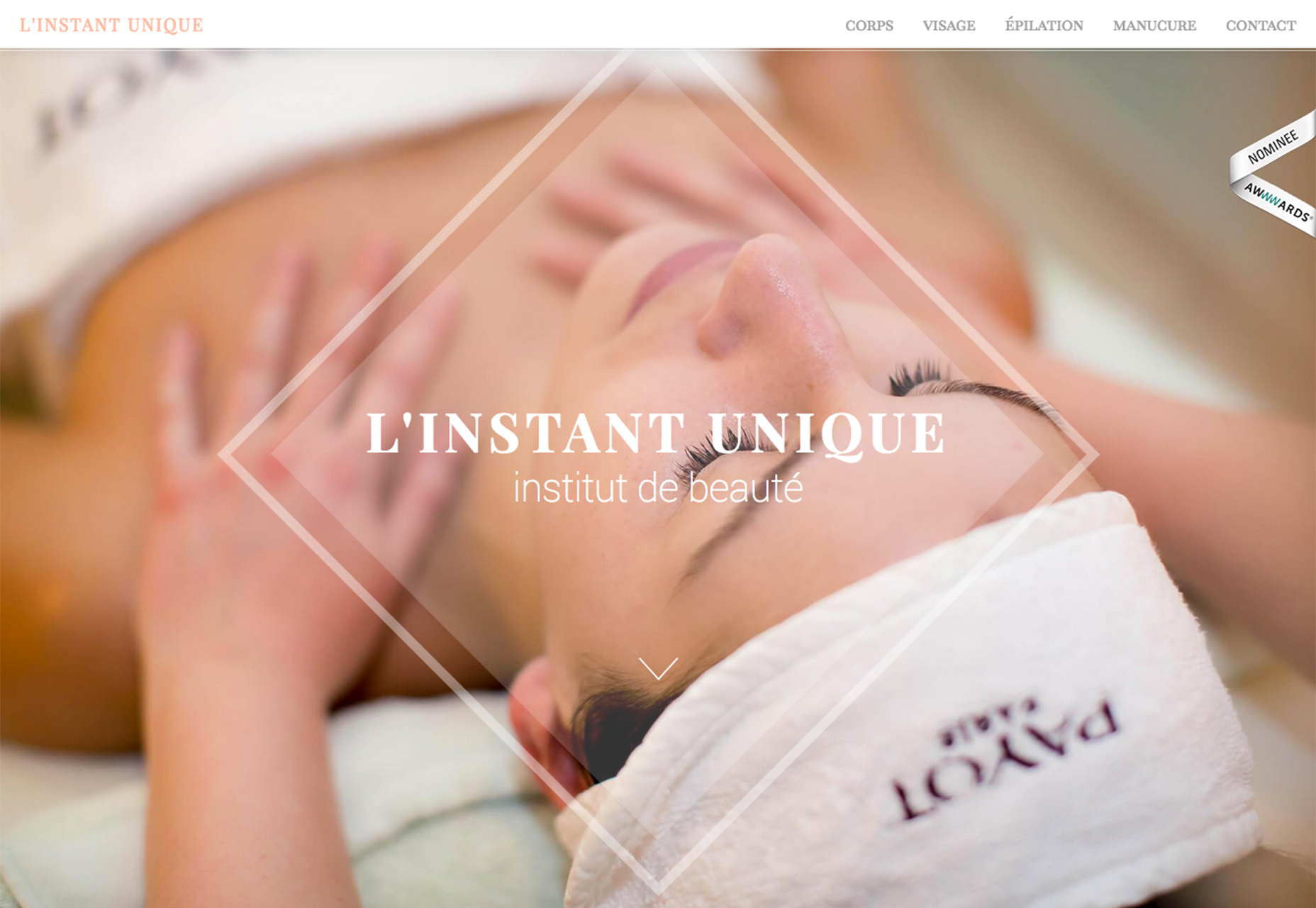
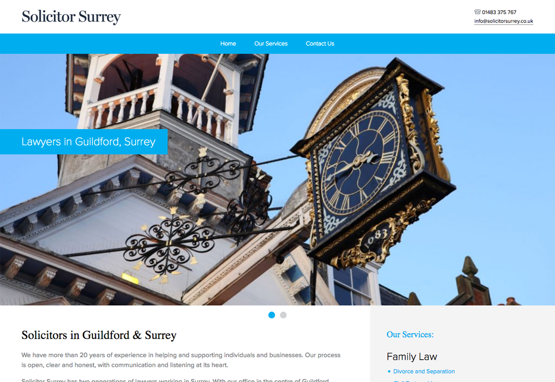
The simple diamond shape that you drew in elementary school is popping up in plenty of designs. From use as a container for photos to an outline for visual emphasis to the dominant part of a photograph, the shape has plenty of flexibility. And it simple. This style is no more than a square turned on its side. The sharp lines make for interesting reference points in the design and can add an element of motion or direction that doesn’t exist otherwise. The diamond stands out in these designs because it is so different. While the shape can be used in a number of ways, it can be somewhat tricky. As a photo frame, you’ll lose parts of an image on all four corners, so you’ll need images that have more of a center focal point so that the meaning is not lost. The layering of diamond-shaped photos in the Hannington Estate design does an excellent job of this. The user doesn’t feel like anything is missing from the images. As a border or visual element, the diamond shape can serve as a place to draw the eye. Linstant Unique does this by putting the text call to action inside a diamond frame. It’s more visually interesting than just putting the text on the image alone and draws the eye into the image. Finally, Solicitor Surry takes a totally different approach and uses a diamond shape in an image to add interest. A clock might not be that visually appealing on its own, but the shape helps draw users in to the image.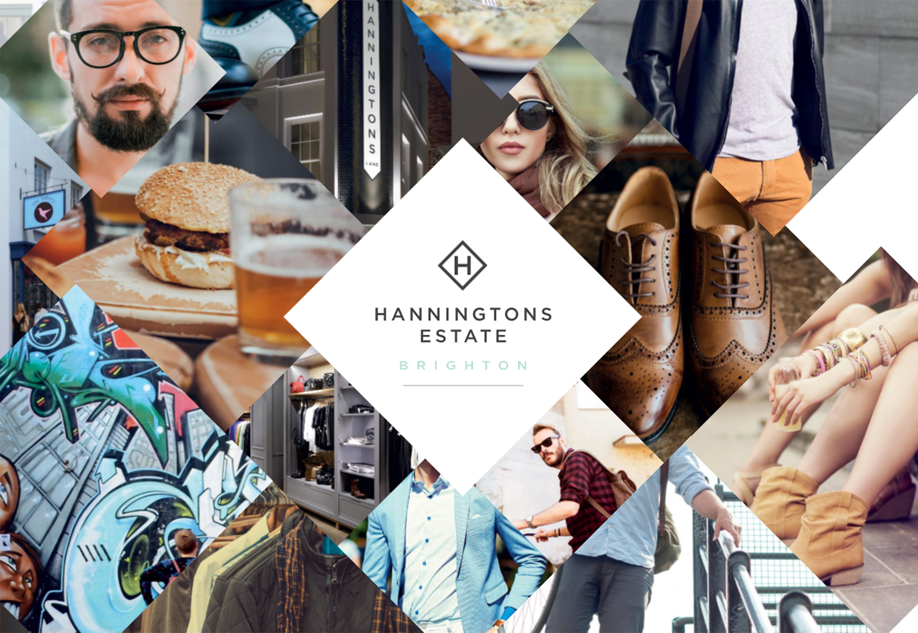
2. Asymmetrical Geometry
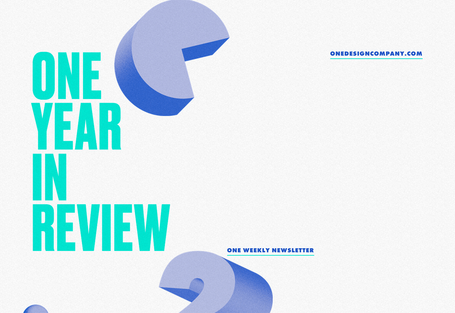
This might be one of the best trends to pop up in a while: asymmetrical shapes in design projects. Nothing gets more boring over time that a bunch of perfectly symmetrical designs. This trend can help anyone break out of that rut with interesting shapes that immediately make you rethink balance. Asymmetrical shapes are a good tool because they are so interesting and unexpected. They provide directional emphasis – note how the top left corner of the shape used in the Ghafari website leads you to the branding, and then down the page with extra white space. The biggest challenge with asymmetrical shapes is how to deal with the white or trapped spaces that they can sometimes create. (You’ll have to get creative there, but the examples below make it look easy.) The other challenge can be ensuring that the asymmetrical design still has balance. You’ll need to play with the weights of elements – and maybe use heavier typefaces to offset the bulk that an asymmetrical shape can carry. When starting with an asymmetrical shape design, keep the concept simple. The funky shape is your design trick in this case. Opt for shapes with color to balance a white background or layer shapes with images for a more Material Design-inspired look. Another option is to experiment with 3D shapes, such as One Year in Review. No matter what option you choose, asymmetry is a definite eye-catcher. It creates a fun, funkier first impression and helps users dive deeper into the overall design. Use it for websites that are less formal and that push the envelope somewhat with style and content.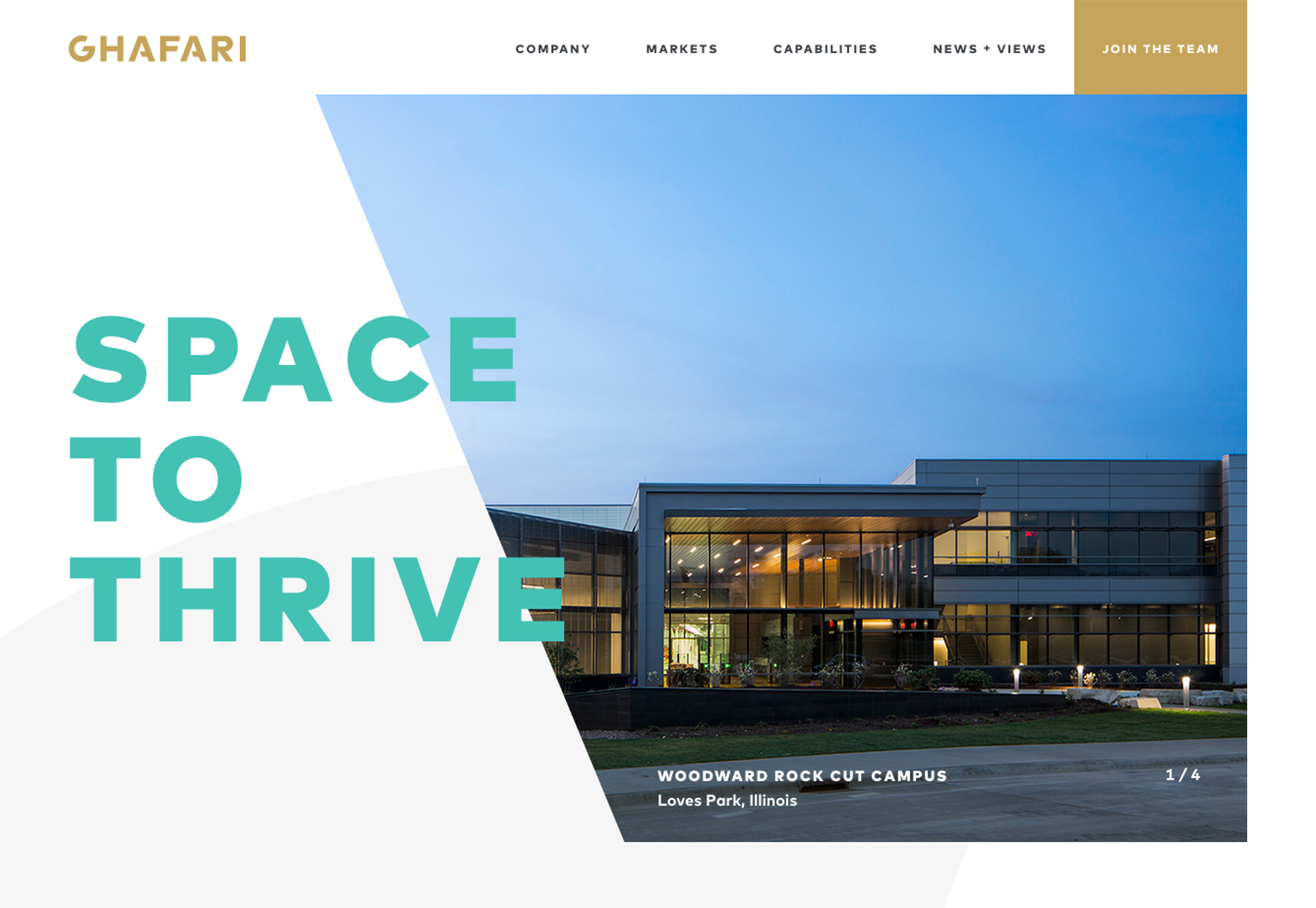
3. Layering
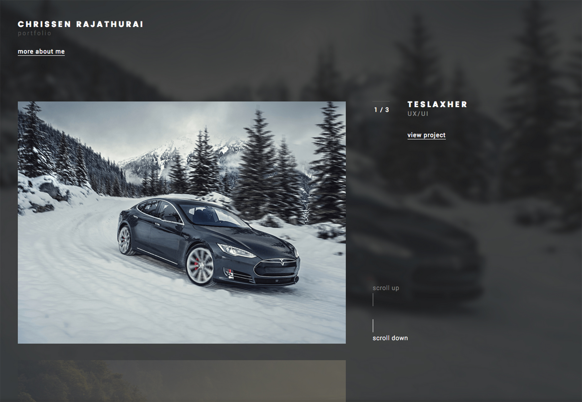
Layering various shapes adds extra dimension to almost any design project. More tactical design patterns have made this technique more popular and combining shapes in various layers is an easy way to start. The examples below show three different ways to do it.- Chrissen Rajathurai’s portfolio layers simple rectangles over a blurred, oversized background to bring focus and emphasis to each individual portfolio item and link. The layered effect is classic and stunning. Users want to keep moving through the design to see what other images come up next.
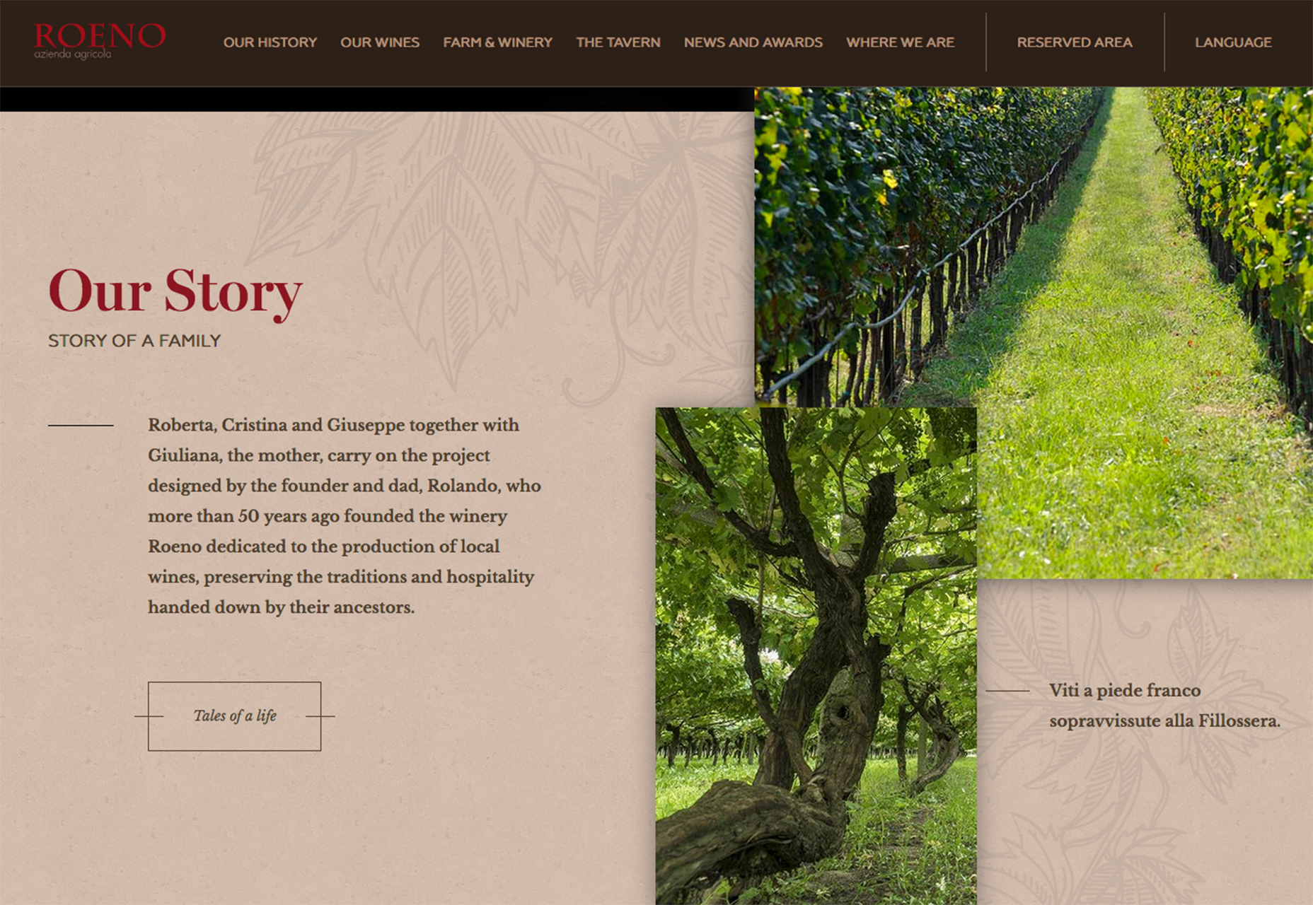
- Cantina Roeno layers images on an illustrated background below the scroll. The movement from the hero video homepage to phot layers makes the user slow down and look at the content on the screen. While the video is fast-paced and design for quick viewing the layered images – with interesting vertical orientation – background and text help users pause and take in the story of the winery.
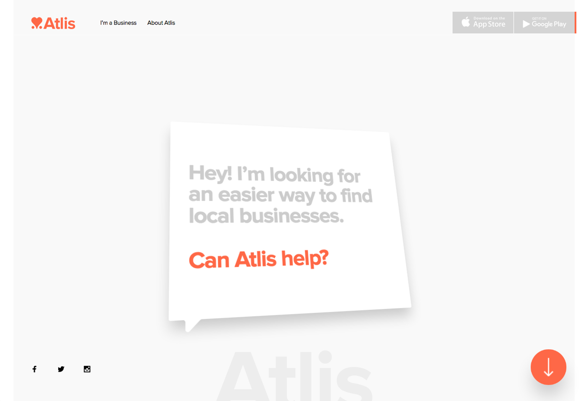
- Atlis takes a totally different approach. The design uses two geometric trends – layering in a very Material Design style – and asymmetry with a box that twists and turns in to more trapezoidal forms with hover actions. The design is so simple that you can’t help but look at it. It’s also quite complex with the stretchy movement of the “Can Atlis help?” box. Keep scrolling and even more shapes with varying degrees of asymmetry pop onto the screen. This deceivingly complex site design is a lot of fun to play with.
Conclusion
When planning your next project, think geometry! How can you use simple shapes in new and interesting ways to encourage engagement and give users something different to look at in the process. There are a lot of different ways to use geometry in design projects, pair shapes with interesting animation, color or imagery to create a design that showcases your content.And have fun. Geometric patterns have a lighter, less formal feel than some other design concepts. Use that to your advantage when using these techniques.
< p class="p4">What trends are you loving (or hating) right now? I’d love to see some of the websites that you are fascinated with. Drop me a link on Twitter; I’d love to hear from you.Carrie Cousins
Carrie Cousins is a freelance writer with more than 10 years of experience in the communications industry, including writing for print and online publications, and design and editing. You can connect with Carrie on Twitter @carriecousins.


Read Next

3 Essential Design Trends, May 2024
Integrated navigation elements, interactive typography, and digital overprints are three website design trends making…

How to Write World-Beating Web Content
Writing for the web is different from all other formats. We typically do not read to any real depth on the web; we…
By Louise North

20 Best New Websites, April 2024
Welcome to our sites of the month for April. With some websites, the details make all the difference, while in others,…

Exciting New Tools for Designers, April 2024
Welcome to our April tools collection. There are no practical jokes here, just practical gadgets, services, and apps to…

How Web Designers Can Stay Relevant in the Age of AI
The digital landscape is evolving rapidly. With the advent of AI, every sector is witnessing a revolution, including…
By Louise North

14 Top UX Tools for Designers in 2024
User Experience (UX) is one of the most important fields of design, so it should come as no surprise that there are a…
By Simon Sterne

What Negative Effects Does a Bad Website Design Have On My Business?
Consumer expectations for a responsive, immersive, and visually appealing website experience have never been higher. In…

10+ Best Resources & Tools for Web Designers (2024 update)
Is searching for the best web design tools to suit your needs akin to having a recurring bad dream? Does each…
By WDD Staff

3 Essential Design Trends, April 2024
Ready to jump into some amazing new design ideas for Spring? Our roundup has everything from UX to color trends…

How to Plan Your First Successful Website
Planning a new website can be exciting and — if you’re anything like me — a little daunting. Whether you’re an…
By Simon Sterne

15 Best New Fonts, March 2024
Welcome to March’s edition of our roundup of the best new fonts for designers. This month’s compilation includes…
By Ben Moss

LimeWire Developer APIs Herald a New Era of AI Integration
Generative AI is a fascinating technology. Far from the design killer some people feared, it is an empowering and…
By WDD Staff