• 23 Jul

    The use of typography in video allows us to reclaim the lost art of arranging typefaces in a way that would make an 18th century typesetter’s head spin.

    This type of art is also known as Kinetic typography.

    The text is presented in a manner intended to convey or evoke a particular idea or emotion.

    In this compilation we showcase 18 creative uses of kinetic typography which include short movies made with After Effects, stop motion animation and other techniques.

    If you have an example of kinetic typography that you would like to share with us, please feel free to post a link to it in the comments section.

    1. Stop and Think – Talking Head


    2. D-Tronics from Manny Garza


    3. Citizen Cope – Let the drummer kick it


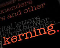
    4. Graphic Design: The Forgotten Web Standard


    5. Rockwell from Jordan Clarke


    6. Typography On My Mind from Toke Blicher Møller


    7. Habitat for Humanity by Motion Red


    8. Stop Motion by Twilight Arts


    9. Typography in Motion by I Love Typography


    10. Pieces by Sum 41 by CrispyGFX


    11. Typographie by Matcho80


    12. Zoolander Typography by Linzi Bergmann


    13. Women at the Well by Matthew Borrett


    14. Requiem for a Dream in Typography


    15. The Hush Sound – Lions Roar by Mig Reyes


    16. The City is at War by Lincoln Furrow


    17. Thank You for Smoking by FrontLine Pictures


    18. Typography Project by Stephen Siegel


    This post was written and compiled by Steven Snell and WDD. For more inspiration from typography, see Steven’s gallery site TypeInspire.

    Which ones are your favorites? Do you know of other great examples of kinetic typography? Share your videos with us!


  • 52 Comments »

     
    #1
    alfa
    July 23rd, 2009 at 6:51 am

    It was boring til I saw the Stephen Siegel one, great compilation nonetheless. Oh, I also think #8 is pretty smart :)


    #2
    Ms. 211
    July 23rd, 2009 at 7:37 am

    This was really superb.


    #3
    Jasmin Halkić
    July 23rd, 2009 at 7:38 am

    Very nice.


    #4
    olybop
    July 23rd, 2009 at 10:30 am

    very great selection ! thx for sharing
    in the same style :
    http://blog.gaborit-d.com/le-croisement-entre-la-musique-et-la-typographie/


    #5
    Simon
    July 23rd, 2009 at 11:00 am

    Letter wars! Check this out, one of the best I’ve ever seen: http://motionographer.com/theater/optix-inlingua/


    #6
    aledesign.it
    July 23rd, 2009 at 12:00 pm

    Oh my god! This is my preferite post!! I don’t have words… Fantastic…amazing!!!


    #7
    Jack
    July 23rd, 2009 at 12:49 pm

    These are pretty cool! :)


    #8
    David Ingledow
    July 23rd, 2009 at 1:18 pm

    How are these created?

     
    1 Reply
     
    #9
    Gui Moreira
    July 23rd, 2009 at 2:22 pm

    Just to update this post!
    http://www.youtube.com/watch?v=y9LlnLTH87U


    #10
    RoaldA
    July 23rd, 2009 at 2:29 pm

    awsome


    #11
    Mert TOL
    July 23rd, 2009 at 2:53 pm

    Nice collection mate. People can check this post too.. For more experimental examples.

    Link…


    #12
    Jacob
    July 23rd, 2009 at 3:01 pm

    nice videos! here is another really good one. http://www.youtube.com/watch?v=FqAF-Alc7CM


    #13
    Sep
    July 23rd, 2009 at 3:14 pm

    The last is the best


    #14
    Patrice
    July 23rd, 2009 at 3:21 pm

    Yup. Some very nice motions up there! I like this post.


    #15
    Caroline
    July 23rd, 2009 at 4:07 pm

    Reminds me of a very nice video I saw a few months ago, with kinetic typography, about the creative process. Absolutely worth a click!

    F is for FAIL : http://vimeo.com/3600380


    #16
    SarahB
    July 23rd, 2009 at 4:20 pm

    Comedy + Typography = AMAZING!!! http://www.youtube.com/watch?v=kcFQXKMIoxw


    #17
    davidkolbi
    July 23rd, 2009 at 4:27 pm

    it was awesome


    #18
    FLL
    July 23rd, 2009 at 4:31 pm

    this is really about all the things you can do with a mac, but there’s some nice typography.


    #19
    Cres
    July 23rd, 2009 at 4:49 pm

    The best typography in motion ever is the one of Pulp Fiction
    take a look
    http://www.youtube.com/watch?v=HePWBNcugf8
    =)


    #20
    Tinta Digital
    July 23rd, 2009 at 5:04 pm

    Look another one: http://www.youtube.com/watch?v=-CyPixDcNzk

    El Cuarteto de Nos, is a rock band from Uruguay.


    #21
    Kristian Matthews
    July 23rd, 2009 at 5:36 pm

    This gave me same great inspiration for my Creative Media diploma course that I’ll be starting soon. Thank you so much.


    #22
    Sean
    July 23rd, 2009 at 5:46 pm

    http://vimeo.com/1683225

    Easily one of my favorites. Starts out a bit slow, but by the chorus (1:00) the guy puts the pedal down and doesn’t let up.

     
    1 Reply
     
    #23
    dave
    July 23rd, 2009 at 6:12 pm

    I loved all the different uses of typography. Very nice post =)


    #24
    ThomasMoffett
    July 23rd, 2009 at 6:13 pm

    incredible…very time consuming….


    #25
    BebopDesigner
    July 23rd, 2009 at 6:17 pm

    Amazing collection! Loved the one from Requiem for a Dream and Graphic Design. Thanks for posting.


    #26
    Tim Gorichanaz
    July 23rd, 2009 at 6:39 pm

    “Brooklyn Go Hard” – Jay-Z ft. Santogold

    In case embed doesn’t work, here’s the URL: http://www.youtube.com/watch?v=QftcJtvLr8g

    This one’s a lot different than the other examples, but I think it’s worth sharing. It’s pretty bare-bones, but imagine if it were polished like the others. The guy who made it even released the .FLA (yes, it’s done in flash) so anyone can make their own version of it. Very cool.


    #27
    Axet
    July 23rd, 2009 at 6:53 pm

    I’ve seen a Typography in Motion video for Citizen Cope’s “Let The Drummer Kick” that’s similar, but better in my opinion, than the one in this blog post.

    Take a look: http://www.youtube.com/watch?v=xAuQmJzt_q0

    The similarities make me think that they were made by the same person, but that one (this one, I believe) is just a newer version.

     
    1 Reply
     
    #28
    Zeb
    July 23rd, 2009 at 7:04 pm

    Very nice collections !! Very good post ! :-)


    #29
    Adam
    July 23rd, 2009 at 8:10 pm

    Some great videos there – it’s amazing how important typography is in any form of design – it’s something I found out soon enough.


    #30
    Christina
    July 23rd, 2009 at 8:32 pm

    I knew I’d find you …. there -:))


    #31
    Mig Reyes
    July 23rd, 2009 at 9:11 pm

    Hey there, thanks for including Matt and I in this list. There’s definitely some great pieces on here, so we’re honored. Be sure to check out the work of MK12 where much of this trend started!


    #32
    Photoshop brushes floral
    July 23rd, 2009 at 10:07 pm

    Awesome animation. Love them all.


    #33
    QualityWhat
    July 23rd, 2009 at 10:08 pm

    This list needs some shortening. For a list of “Creative” examples, there sure are alot of the same type of animation and style here. Heck, some of these are really unpolished student work. The original pieces that all these films got their inspiration from isn’t even here.

    1, 4, 7, 8, 9 and 11. The rest are pretty much the same.


    #34
    Mimi
    July 24th, 2009 at 2:46 am

    Hmm.. most of them don’t seem to be working for me. I wonder what I am doing wrong! :)

     
    1 Reply
     
    #35
    Oliver
    July 24th, 2009 at 8:44 am

    Awesome…


    #36
    Zeynel Aslan
    July 24th, 2009 at 9:49 am

    I really impressed! Love them all.


    #37
    Ashely Adams : Sticker Printing
    July 24th, 2009 at 10:29 am

    Nice selection and thanks for sharing the list. It proves that typography, in any form of design, is important and it can actually “make or break” your creativity. But those working with kinetic typography should go easy as too much motion can sometime irritate your vision.


    #38
    RashidaPitaBread
    July 24th, 2009 at 10:45 am

    Love the post

    I’ve done a similar project in school to a French song
    http://www.youtube.com/watch?v=ZK3IksuJVVA


    #39
    Chris
    July 24th, 2009 at 7:22 pm

    With all do respect… i would very much like to know why this didn’t make the list:
    http://vimeo.com/1612411

    I think it goes heads and tails over at least 2 of the ones that did.


    #40
    Walter
    July 24th, 2009 at 7:25 pm

    @Chris: We had to choose just a few, there are too many videos out there and the post couldn’t be too long as it takes time to view each video.

    Also, we didn’t necessarily find the examples you found or other readers found.

    There are many good videos out there that didn’t make it into the list, so that’s where the links in the comments come really handy.

    Thanks for sharing yours!


    #41
    BongoBox
    July 24th, 2009 at 9:06 pm

    Devli’s Advocate:
    On a couple of these, you could take the soundtrack, look-and-feel, and/or animation style, and replace one with the other, and it’d work equally as well.

    In other words, some of these seem really pretty, but they don’t really work perfectly together to tell the story, they just seem like “good fits.”

    Then again, ask to see MY work…!
    :O


    #42
    designiac
    July 24th, 2009 at 10:14 pm

    I think the “Typography in Motion” by I Love Typography is the beat of this collection!


    #43
    Danh ba web 2.0
    July 26th, 2009 at 7:41 am

    Great ! Thanks a lot
    See more typography in motion: http://tr.im/u3qx


    #44
    Gustavs Cirulis
    July 28th, 2009 at 12:58 pm

    Great post! Had fun while having nothing to do. :)


    #45
    New Web Design
    July 28th, 2009 at 6:28 pm

    Some great typography videos here. All of them are good and I really like the last one. Thanks for sharing these.


    #46
    kristy
    July 31st, 2009 at 8:04 pm

    I love the stop motion piece – I found this music video a little while back that uses stop motion to beautifully recreate typography with paper and other found elements…thought you might enjoy…http://twoifbysee.blogspot.com/2009/05/cookie-machine-by-jeremy-hildebrant.html


    #47
    On Poster Printing
    August 2nd, 2009 at 3:16 am

    Kinetic typography seems to be growing more and more popular, even for use in commercials. This is not very surprising, though, considering the importance of typography in print and web designs. Kinetic typography is just the next step. The problem with many of these examples, though, is that the typography is almost unreadable at times because of the large amount of motion. Straining to read the message is definitely not something you want your viewers to be focusing on. Just as in all design, the rule “less is more” still applies.


    #48
    renato
    August 3rd, 2009 at 10:32 pm

    great post!


    #49
    Kevin Oh!
    September 10th, 2009 at 6:44 am

    Great post. New one by Eric Hutchinson “OK, It’s Alright With Me” is pretty sweet. Black and white video + kinetic type = simple yet effective.

    http://www.youtube.com/watch?v=j_y8zBwHAf4


    #50
    Harry
    September 13th, 2009 at 1:37 am

    Here’s a simple one that I did a few weeks back…

     
    1 Reply
     
    #51
    Web Design Kent
    November 9th, 2009 at 10:07 am

    suitably inspired!


    #52
    Eric Washburn
    November 10th, 2009 at 5:51 pm

    wow! great collection!

     
    Name (required)

    E-mail (required - never shown publicly)

    Web-site

    Your Comment (smaller size | larger size)

Home| Advertising| About| Contact

© 2010 All Rights Reserved