The header is likely the first thing a new visitor sees on a blog, so it is the first impression — but why is a blog header so much more important, or at least different, than the header of a basic website?
Blog headers need more functionality. Other web designs may differ in terms of their use and therefore, what's included in the website header and how it's presented can vary greatly.
With a blog specifically, though, there are best practices that can help the reader navigate through the blog and become better involved.
That's exactly what this article will do. We'll help you define what should be a part of a blog header and how to finally implement it, and then we'll look at twenty awesome examples that do just that.
To determine how a blog header should be designed and what to put into it, we need to ask a few questions about the blog:
- What mood needs to be set to attract the correct target audience?
- How can the first impression via the header communicate what the blog is all about?
- How can the blog's header give the first impression, "I'm different from the others."
- What pieces of content need to be immediately noticeable to create better action? (clicking on links, subscribing, etc.)
Let's dig a bit deeper...
What mood needs to be set to attract the correct target audience?
When a visitor first comes into any type of website, the first thing they determine is the blog's "personality" — and whether or not it's right for them.
This is essential for blog design, because blogs require the correct target audience to be successful.
For example: with content in the creative industry, a blog design should have a creative header to impress and inspire newcomers. A more technical or business blog will want a straight-forward, high-end header that is both aesthetically appealing, but yet fairly subtle.
How can the first impression via the header communicate what the blog is all about?
We have a part of this covered by developing the overall mood the header should create, but a header can do more than that to clarify to the new reader what this blog is about.
The very first impression discovers the personality of the blog, but what exactly is it all about? One could include a tagline with a logo that says it, or include a small paragraph/phrase telling the reader what this blog is and who it is for.
How can the blog's header give the first impression, "I'm different from the others"?
Another way to put this is, "How is this blog going to be remembered?"
If it will blend in to every other blog on the Internet, that's not a good blog theme at all. This is why the header is a prime place for the logo, tagline, and any other branding.
The overall look and the content presented at first glance is what will stick, if presented well enough.
What pieces of content need to be immediately noticeable to create better action? (clicking on links, subscribing, etc.)
The header should be overall simple in terms of content, but some forms of content can be present to help aid in their call to action. After a new reader judges the initial impression of the blog and decides to stay, they'll start looking for pieces of content and where to navigate.
When categories are immediately present, the viewer will look over them and find areas that interest them. When a search field is present or an RSS feed, they may not subscribe or do a search right away, of course, but they have made a subconscious note of its placement and where to find it in the future.
The options vary much beyond this, but basically any content placed in the header is the first impression for content, so it should be the most important and designed well.
Let's now take a look at a few great blog headers, and then discuss their benefits.
1. Tutorial9
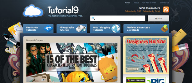
Tutorial9 features just about all of the benefits discussed above. The logo and tagline instantly display what the blog is about and how it can help the reader.
The primary navigation pieces are on huge, noticeable tabs with icons included to draw in the eye. This instantly leads the user to content and promotes them to dig deeper into the blog.
The background design is creative, and even has a theme of artistic creation — exactly what the tutorials are meant for. Furthermore, there is essential content to the right including the RSS feed, search form, the blog's pages, and more.
2. Home Design Find
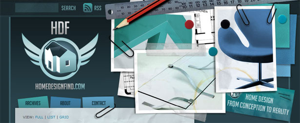
This header uses a great use of visual hierarchy to get the point across. The blog's title is nearly enough to tell the reader what it's all about, and it promotes staying and seeing in further detail what it's about.
The eye is then lead to the first set of navigation, where the about page is clearly noted, as well as the contact page. The images to the right then set the mood and provide inspiration for those interested in this blog's topic.
Finally, the images to the right lead the eye downward to a more descriptive phrase for the blog.
3. Blog Design Blog
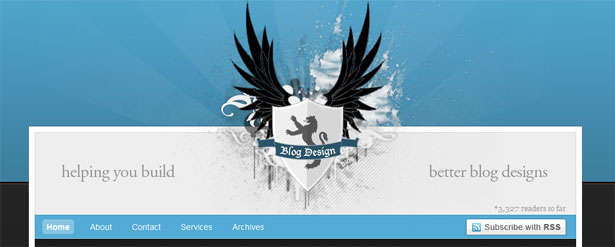
The most notable features of this header are the logo and tagline. The specific target audience of this blog makes it more unique, and by stating what the blog is all about at first glance, a new reader sees that and is convinced that it is different from others.
Down a bit further, and in smaller text, is the number of readers and link to the RSS feed, as well as primary navigation to further delve into what the blog is about, or into the content itself.
4. Kevin John Gomez
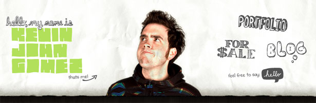
The hand-drawn appeal and photo makes this blog's theme feel personal, and matches the name of the website — the webmaster himself. This is a personal blog of a creative person, and the header communicates that perfectly.
The complete navigation is in the header, as it is limited navigation and is able to have more emphasis on it.
5. Naldz Graphics
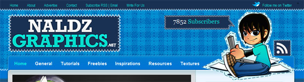
This header provides a great logo and effective use of content in the header. The largest part of the header is the logo, or blog name, and that makes it easy to remember.
The eye is then lead to the navigation, where the reader can dig deeper into the blog right then and there, or at least get an idea of what the blog is about. Navigation and categories are a great way to tell new readers what the blog is about, if they are well defined.
A graphic on the right helps set the mood of the blog, and also leads the eye to the number of subscribers and the RSS link. With a blog that has a moderate to high feed count, it is a good idea to show that count in the header, because it, in a way, validates the blog's content and gives it credibility.
There is also additional content on top, in a traditional place for this type of content so it can easily be found.
6. Pro Blog Design
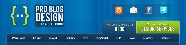
The two contrasting green elements in this header do more than one may think. Most see the logo with the green pop of color the left first, where they read the title of the blog and the headline. This is yet another great headline that tells new readers how this blog can help them.
Then, large over-sized tabs are put into focus with 1) their obvious size and 2) that other pop of green color. The other green tab tells the reader that this is not just a blog that can help give you a better blog design, but it has blog design services to offer. Above that, social media icons that the reader can take note of for later action.
7. Octwelve
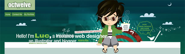
This illustrated creative header sets the mood for the blog quite quickly. The illustration is of the webmaster, and gives the blog a personal approach. We begin to get an idea about the content of the blog, before it is even presented.
This design puts a small introductory sentence right in the header, defining what exactly this blog is. The main navigation is right below the logo, so it is noticed almost immediately. There are also other details within the header that are fun, and lead the viewer into looking at the header longer.
8. Mark Forrester
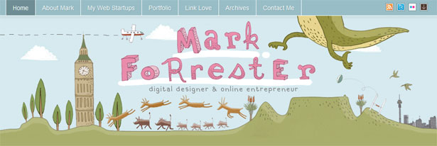
This fun, quirky, and creative header sets a mood, and is unique enough to really catch your attention.
The viewer at first glance is immediately examining the header and its fine details, and the story it presents. In that, comes the logo and tagline, where the view finds out what the blog is all about.
When done enjoying the header, they can see navigation up top and social bookmarks to the right. The header also leads nicely into the content, leading the visitor to scroll down and check out more.
9. Cult-Foo
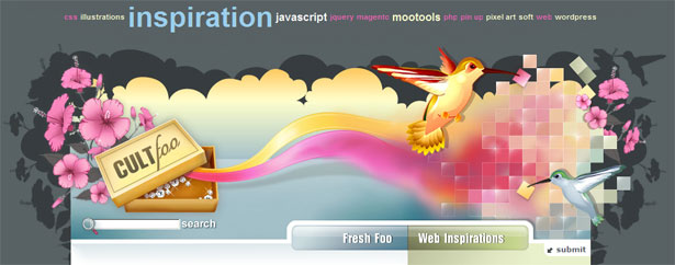
This is just a beautiful header that catches the attention of many readers daily. The mood is set as a creative and inspiring theme, and attracts just the right audience. The logo in this header is the "source" of the rest of the header — a box that leads out into the rest of the design.
The search bar is right below that for ease of access, and the two content areas are defined on the right.
The navigation is what's really cool about this header, though. It has more of a tag-cloud feel, with the larger categories being the larger text. This way, once a new reader sees the tag cloud, they see the biggest items first.
In return, they make a connection with these words and the blogs content. Now, the content featured on the blog has the most of what is now most memorable about its content. Be sure to check out the live version of this site: the header tag cloud area actually moved with the user's scrolling, with a decorative and yet unobtrusive border.
10. Vectips
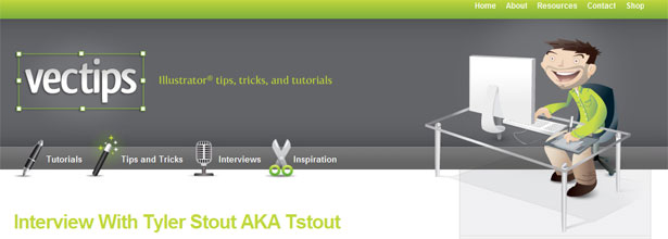
This header is rather minimalistic, which puts more emphasis on the bits of content it does hold. The logo is decorative and outlined in a contrasting color, making it memorable.
It is followed by a tag line that shares what the blog is about, and then simple navigation which further defines that. The navigation is great because it has individual icons to bring attention to each as the reader is skimming over them.
The fun illustration to the right sets the mood and leads the eye to the navigation up top.
11. Part Time Post

In contrast to Vectips, this header has a lot going on. The logo in the top left includes a tagline, and then leads the eye to navigation. Before clicking through the navigation though, the header continues to how the website can help its new visitors, and then below that features more navigation. Through this hierarchy, the reader just got a great overview of how to navigate throughout the website.
The illustration on the right then leads the viewer to take note of the RSS feed, and then the eye is lead further right to promote the company's Facebook fan page.
12. TutCandy
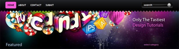
The biggest feature of the TutCandy header is its creative, colorful, and detailed imagery. With that, it sets the mood and creates credibility for a blog such as this. The name is intertwined within the colorful illustration, and can be considered the logo.
To the right there is a tagline that explains what the blog is, and how it is different: "Only the Tastiest Design Tutorials." Despite it primarily being a simple and fun play on words, there are a few keywords that strike the reader to cause positive judgment. "Only" — it's unique, original, one-of-a-kind.
It answers the "How is this blog different from others?" question. "Tastiest" — the tagline could have been "Tasty Design Tutorials." Not only does that sound a bit strange, but it does not imply any precedence over other design tutorials, or other tutorial blogs.
Above, there is also navigation concerning the blog, and a search bar to the right. Directly below, the content is defined and organized, leading the reader into digging deeper into the blog.
13. Yoast
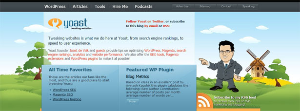
This blog provides great content in the header. The unique wireframe allows the header to contain graphics and sufficient content to make a connection with a new reader. The character and illustration behind him is one of the first things a new visitor will notice, and they make a good call by having the character point to the header content on the left.
After the eye is lead to the header content, they see the logo, and ways to subscribe or connect with the blog. It then reads just like a normal bit of "about page" content, except its featured right on the front page, meaning not only readers that are interested enough to go to the about page make that personal connection — instead, all new readers do. The content explains what the blog is about and then displays some popular and featured content.
Below the illustration to the right, the RSS feed is featured again, but this time with a more recognizable graphic. Notice how this second feed display shows to the right, after the reader would have just completed reading some content titles, a bit of about information, and after they've already made a connection with the blog.
14. That Indie Dude
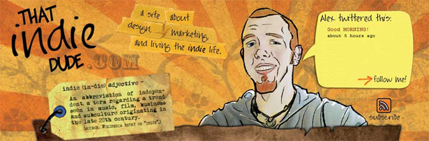
The character in this header, like all other headers with characters, provides a personal touch and acts as a great introduction to the blog. It is the first thing a new reader will notice, and its high quality, as well as the design features surrounding it, make a statement about the style of this designer and what to expect from him.
To the left is the logo, which further leads the eye to the tagline explaining the content featured on the blog. The eye is lead once again to a piece of content sharing the personality of the blog.
15. Ozon3
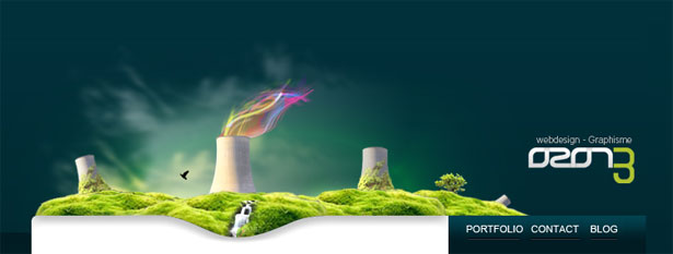
The theme of this header is unique, and in that sense it creates a memorable web design — a truly great first impression. After appreciating the illustration, the eye is lead to the logo for memorization of the brand, and then directly lead down to the primary navigation, and then to the content.
First time viewers can see that this blog is focused around a web design portfolio, and they discover this after truly viewing the designer's work on the header.
Despite its simplicity, this header is very effective in terms of visual hierarchy and sets a huge statement for viewers.
16. nDesign Studio
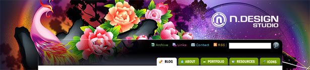
This colorful header is the main attraction to this web design, and the logo tells the visitor that it is a design studio.
The amazing header validates the designer's skills, and his brand. The navigation, feeds, and search bar are all very much intertwined with the header as well, making them one of the first noticeable elements.
The main navigation is in the form of tabs, and is first recognized as being a part of the header. Because it is in the form of tabs though, it seems connected to the content as well, bringing the visitor's eye down into the important content of the blog.
17. Web Designer Wall

This is another great blog by Nick La of nDesign Studio, and we see a similar technique: an amazing large background/header, validating the talents and expertise of the designer. The logo is larger here, providing a tagline connecting the blog's name to its purpose.
The rest of the content in the header is the initial navigation, contact/RSS, and the search bar. They are all decorated in a similar fashion to the header, connecting them.
These elements also have similar features to the content though (more plain background, paper-like texture) so they also feel as though they are a part of the content as well. This section of the header connects the introductory header to the content area.
18. Ma.tt
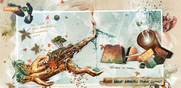
There seems to be an ultimate web design rule to not make headers over 200-250 pixels. This is a great rule to follow for many different reasons, but this header shows just how to effectively break that rule.
By not showing any content at first, Matt is using his design to make the biggest impression on the first-time viewer. Its elegant detail and creative ways create a memorable first impression.
The logo is large, and as the website is a name, it assumes the position of a personal blog. The RSS feed is also in the top left, telling the viewer that it is indeed a blog from the beginning. Finally, the navigation is what is seen last, and this provokes the visitor to continue through the blog.
19. Pixel Resort
The detailed illustration style of this header makes it fun, yet clean and professional. It is even animated as the scene goes through day and night, reminding the visitor to keep looking back up at the header, which features the logo (brand) and the navigation. This method can easily promote more activity in the blog.
Below the navigation that is put into the forefront, there is sub navigation with an arrow "connecting" it to the rest of the header. It helps further define categories, and helps the reader find the content that interests them best.
20. Webdesigner Depot

Ahh, yes — the blog you are currently viewing. Whether you're a first time visitor, or have been reading Webdesigner Depot for long, the header most definitely gets your attention.
What's great about this header is that it's not only a header with a creative appeal, but the elements within it state that it is a header with a creative appeal focused around computers, or the web. The laptop illustrations, the "www.", and other pieces of technology all bring in the target audience more specifically.
The header really doesn't have much to offer in terms of content, except for a hovering link back to the homepage. However, because it is so complex, any additional features may overwhelm the design and make it too cluttered.
This header is just perfect though: setting the mood, inspiring the viewer, and it is short enough that it leads the viewer down to the rest of the content.
Wrapping Up
Hopefully looking over these twenty examples can help many better define the questions presents in the beginning of this article, and help every web designer to pay better attention to blog headers.
Content to include in a header can vary greatly from blog to blog and it is important to keep in mind the goals of the blog, the theme, and what a first-time visitor would be looking for when visiting the blog.
Written exclusively for WDD by Kayla Knight.
Feel free to share your own tips for header design, as well as any additional examples.
WDD Staff


Read Next

3 Essential Design Trends, May 2024

How to Write World-Beating Web Content

20 Best New Websites, April 2024

Exciting New Tools for Designers, April 2024

How Web Designers Can Stay Relevant in the Age of AI

14 Top UX Tools for Designers in 2024

What Negative Effects Does a Bad Website Design Have On My Business?

10+ Best Resources & Tools for Web Designers (2024 update)

3 Essential Design Trends, April 2024

How to Plan Your First Successful Website

15 Best New Fonts, March 2024
