10 Best Web Design Trends of 2023

What website design techniques made the most impact in 2023? We've got a look back at the best trends of the year.

It’s hard to believe we are already closing the books on 2023, but not before we take one last look at the website design trends that shaped the year creatively.
Here are the 10 best trends we saw in website design that are still going strong and are great options for your projects going into 2024.
1. Pop-Out Navigation
One of the trendiest elements on 2023 helps bridge the gap between desktop and mobile design so that they are more consistent. Website designs that use pop-out navigation for all screen resolutions and device sizes.
This is something that we probably wouldn’t have recommended a few years ago, but users have become increasingly comfortable with this navigation style because of how popular it has become on mobile device sizes.
This navigation element most commonly uses a hamburger-style menu. The icon is often in the top right corner, with a logo in the left corner.
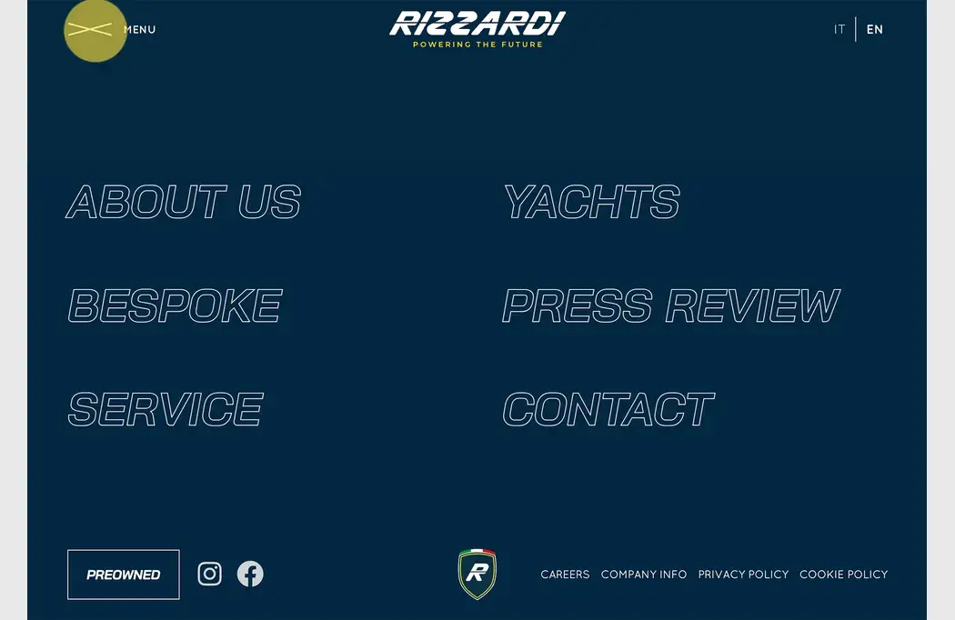
Example we love: Rizzardi Yachts exemplifies the most popular use of a full pop-out navigation style, other than the location of the hamburger icon (which is on the left side here). The menu opens to a full-screen list of options with branding at the top and interesting hover animations to encourage clicks. They also add the common footer information at the bottom of the pop-out screen, including social icons and website policies.
2. Serif Typography
In February, we showcased how beautiful serifs are becoming more prominent in website design. (It’s a great thing!)
While serifs have become much more common with websites, they still don’t come close to the usage of sans serifs. The right serifs can be beautiful and highly readable. They can also be used in various ways to create a design with a nice focus on typography, which isn’t the design’s only focus.
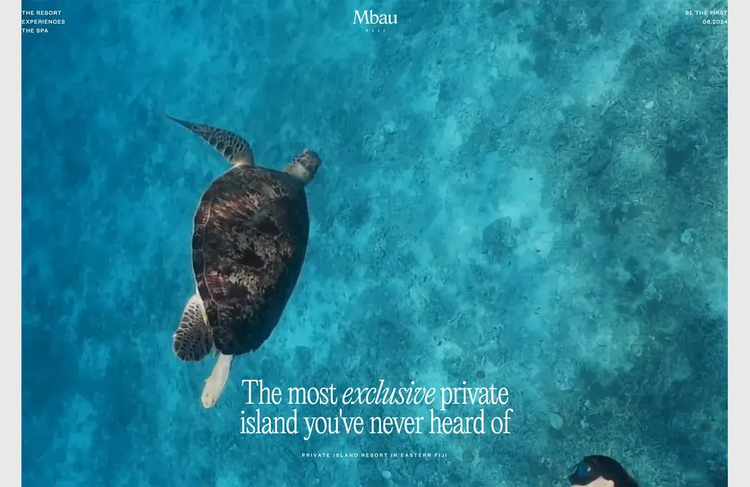
Example we love: Mbau goes super simple with a full-screen video that rolls behind a simple serif headline that never moves. This design feels elegant and classy, perfect for a travel site. Using “exclusive” in italics almost jumps off the screen because the design pulsates with that feeling.
3. Round, Animated Text Elements
A trend we first looked at in August still greatly impacts website design projects: Spinning circles of text. While these elements aren’t the easiest to read, they intrigue the user.
Usage can vary greatly by the design, but one thing is certain. It gets your attention, and designers seem to love this technique.
Circular motion accompanies text with the motion that spins clockwise to follow natural readability. Another commonality is that these elements often contain only a few words, further aiding readability.
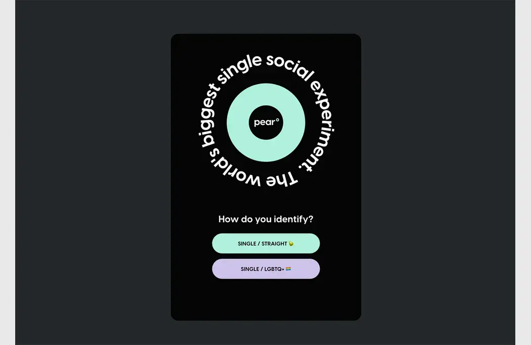
Example we love: Pear uses a quick motion ring of text next to branding to help draw the user in so that they focus on the quick call to action to get started with the app below.
4. Text and Motion
Two elements on most websites – text and motion – can be combined to create a more stellar interaction. While you may think that moving text isn’t for you, it’s more versatile than you might think.
The key is ensuring that you maintain readability so that your design still works for users.
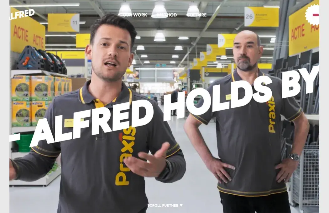
Example we love: Alfred does what you might expect when you think “text and motion.” The hero header includes a bold layer of text that scrolls from right to left. The font is highly readable, and because there aren’t a lot of words, reading in motion is a reasonable request of users. The moving text layer is on top of an animated video roll. While this could get overwhelming, the speed and content of each moving layer work together.
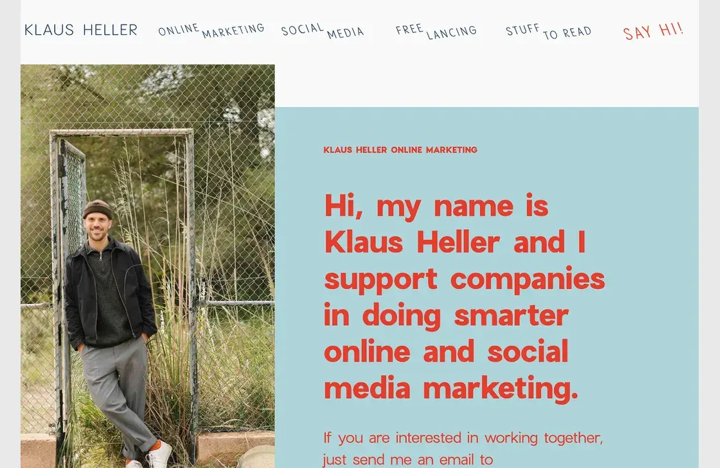
5. Vertical Photos or Videos
We first spotted this trend in March, and it is still going strong for good reason: Vertical photo and video is the norm on phones, but horizontal is the dominant ratio on desktop screens.
Designers are creating alternative design patterns to incorporate one photo or video size into projects for a more universal look and feel across devices. This can benefit responsive design but might create usability challenges for desktop users with less usual patterns.
The most common and easy way to use vertical imagery for desktop screens is a split-screen aesthetic. Text is placed on one half, with images or videos on the other.
The challenge comes with elements that stretch across – such as menus or navigation.
Example we love: Klaus Heller takes a different approach with a vertical image on the right without a 50-50 split screen. The text takes up more than two-thirds of the screen with a right-of-the-image placement.
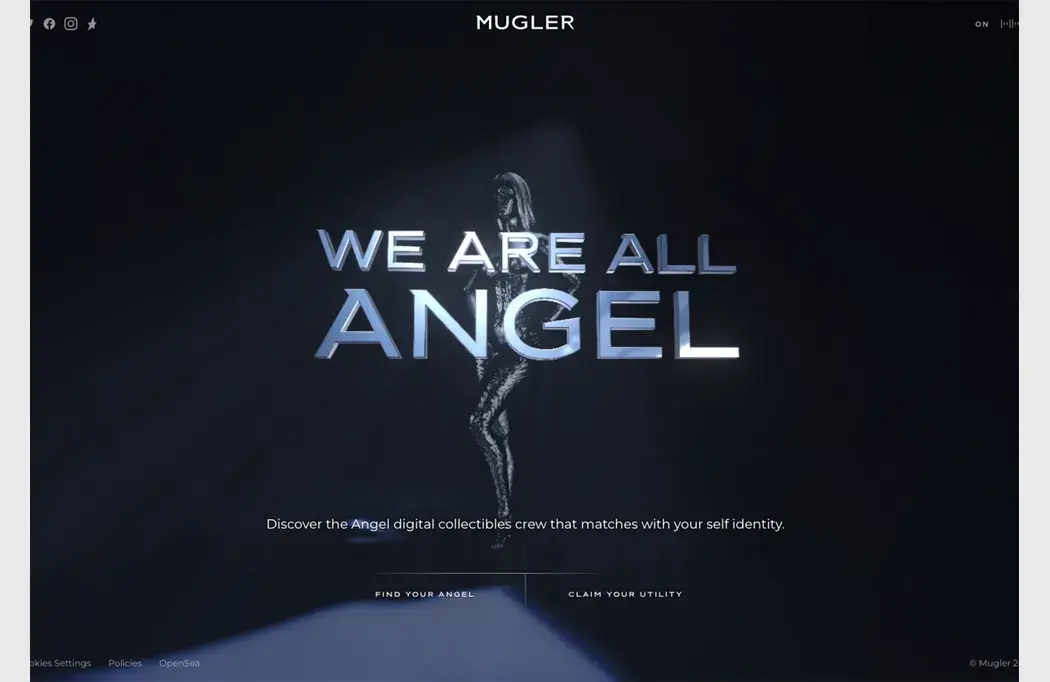
6. AI-Inspired Models and Imagery
You could call 2023 the year of AI, which also showed in website design.
AI-inspired models – that look incredibly similar – are all over projects that feature futuristic elements. There are other commonalities with this website design trend as well:
- Minimal aesthetics with plenty of open space
- Not much typography and with a futuristic flair
- Dark color for AI models so they aren’t fully identifiable
- Connection to brand or business with AI
- Used for smaller websites without a lot of pages
The challenge with this trend is that many of the AI models seem to look similar. There’s an odd humanization happening in these designs to make the computer models into people, but not so much so that they are real.
Example we love: Mugler has a liquid-like AI model for the company that does NFTs. The model is in the background and not super clear; she’s human but also very robotic.
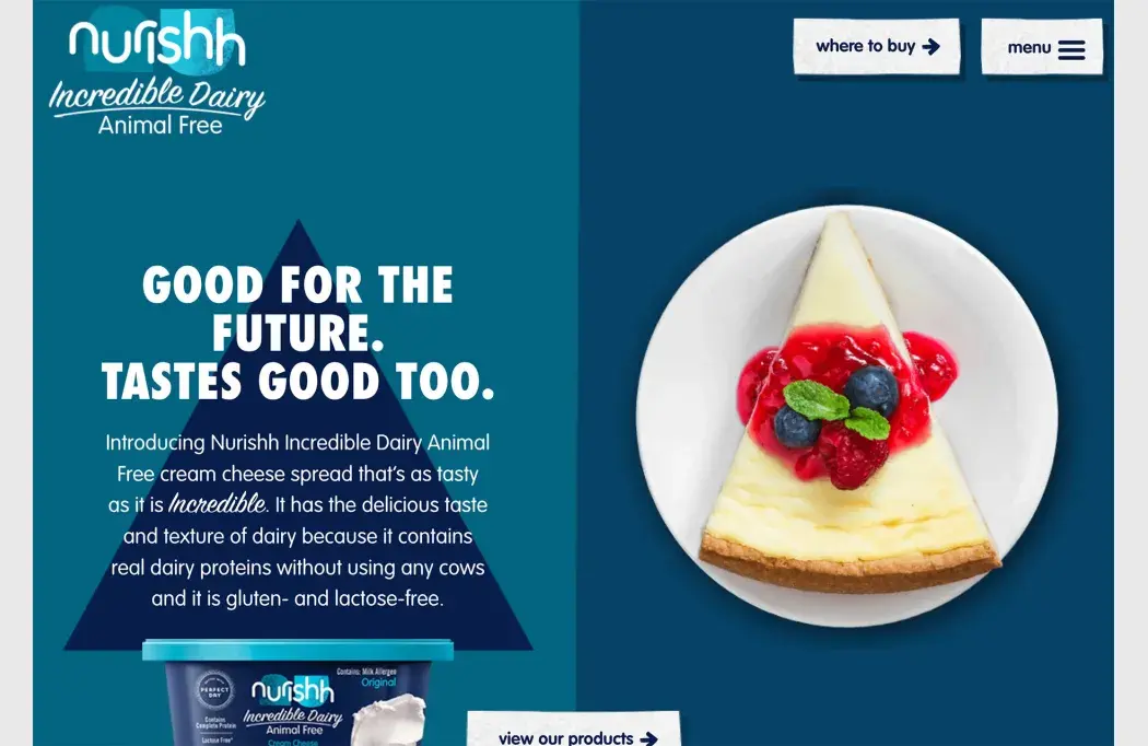
7. Beautiful Food Photography
This is a big one for restaurants or anyone selling food: The photography has to be amazing. Subpar images won’t cut it.
While this sounds like a no-brainer, food imagery is difficult to do well. Even when you have great images, the rest of the design around them can wash out food photos or detract from the product itself. It’s a lesson any website owner can learn from!
Example we love: Nurishh pairs a monotone palette to match the food container with something you might make with the product. The result is mouth-watering. Also, note the shapes on each side of the screen mirror each other, with the triangle on the left and the pie on the right.
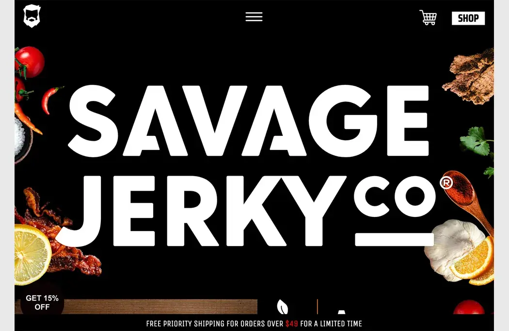
8. White on Black
First mentioned in our January roundup, white text on a black background is classic and timeless. Use this simple color(less) duo because it is simple, elegant, and works with practically any content.
With this trend, many designers are going for bold type styles that have an in-your-face approach. And it works beautifully!
Example we love: Savage Jerky goes big and bold with its brand name and very little else. The shop button is featured in a white highlight. This design is made to get your interest and facilitate a purchase.
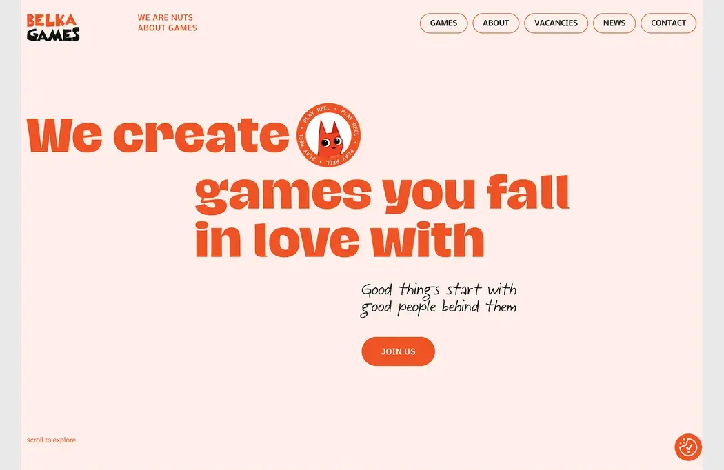
9. Monochrome Color Schemes
One-color design patterns can be beautiful and somewhat enchanting. With tints and tones of the same base color, a certain elegance comes with a monochrome color scheme.
You can do it in a few different ways – with background and foreground colors or patterns. With images. With text color. There are a lot of possibilities.
The trick to making it work is to use monochromacy to set the right feel but maintain readability. That means you will often use dark or light text elements with your otherwise single-color theme.
Example we love: Belka Games uses a coral theme with a very light background version of the color with a bold bright version for text elements (with black accents). Thanks to the color choice and font selection, it’s easy to read and has a fun feel.
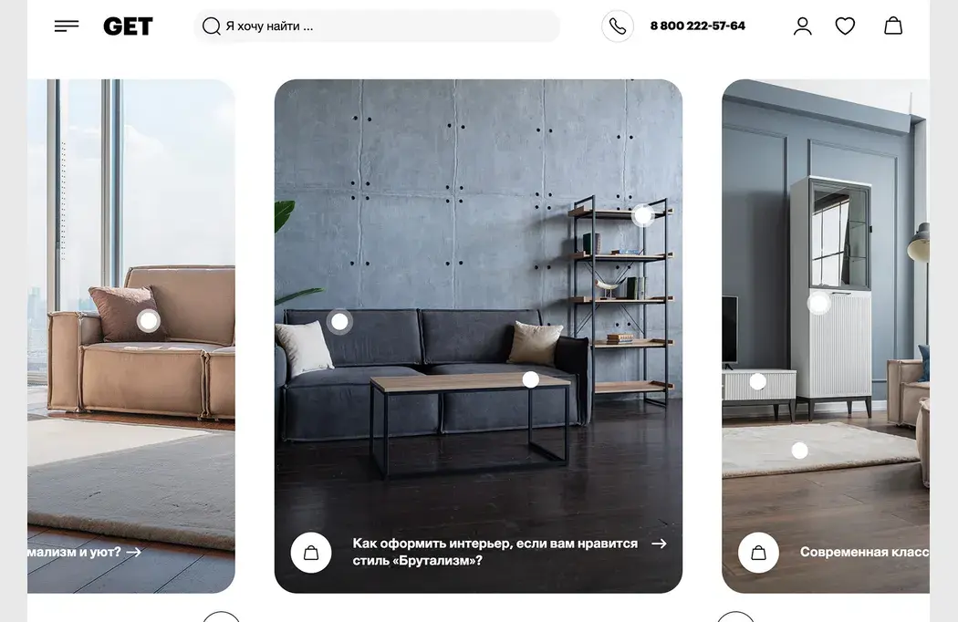
10. Card Elements with Curved Edges
Card elements keep evolving in different ways, and this website design trend is no exception with card-style elements that all have curved edges. (Most of them also seem to use the same degree of curvature.)
What’s nice about these cards is that they work with any other design style. Curved edge cards can be flat, have dimension or depth due to shadows, or include animation or hover effects. Content can be practically anything from images to text, video, and various combinations.
Example we love: GET has a simple card style, with oversized, vertical containers with curved edges. There are text and CTA elements in each. The cards do their job here, creating a visually stunning focal point for the homepage with interactive cues.
Conclusion
Looking back, 2023 was a strong year in website design. We saw plenty of new trends and techniques that are highly functional and usable! We hope for more of the same in 2024!
You can look back on all of our trends collections here.
Carrie Cousins


Read Next

15 Best New Fonts, July 2024

20 Best New Websites, July 2024

Top 7 WordPress Plugins for 2024: Enhance Your Site's Performance

Exciting New Tools for Designers, July 2024

3 Essential Design Trends, July 2024

15 Best New Fonts, June 2024

20 Best New Websites, June 2024

Exciting New Tools for Designers, June 2024

3 Essential Design Trends, June 2024

15 Best New Fonts, May 2024

How to Reduce The Carbon Footprint of Your Website
